Conversation


🥳 Feedback Received!
Thanks for taking a moment to share your thoughts — it genuinely helps us make each chapter sharper.
What happens next:
- Your feedback goes straight to our product team.
- We’ll use it to refine lessons, clarify examples, and make the program even more useful.
Appreciate you helping make this program better for everyone.
Ready for your next challenge? 👇
How Your Business Model Shapes Your Onboarding Strategy
Your monetization model fundamentally changes how you approach onboarding. Here's exactly what to do for each model.
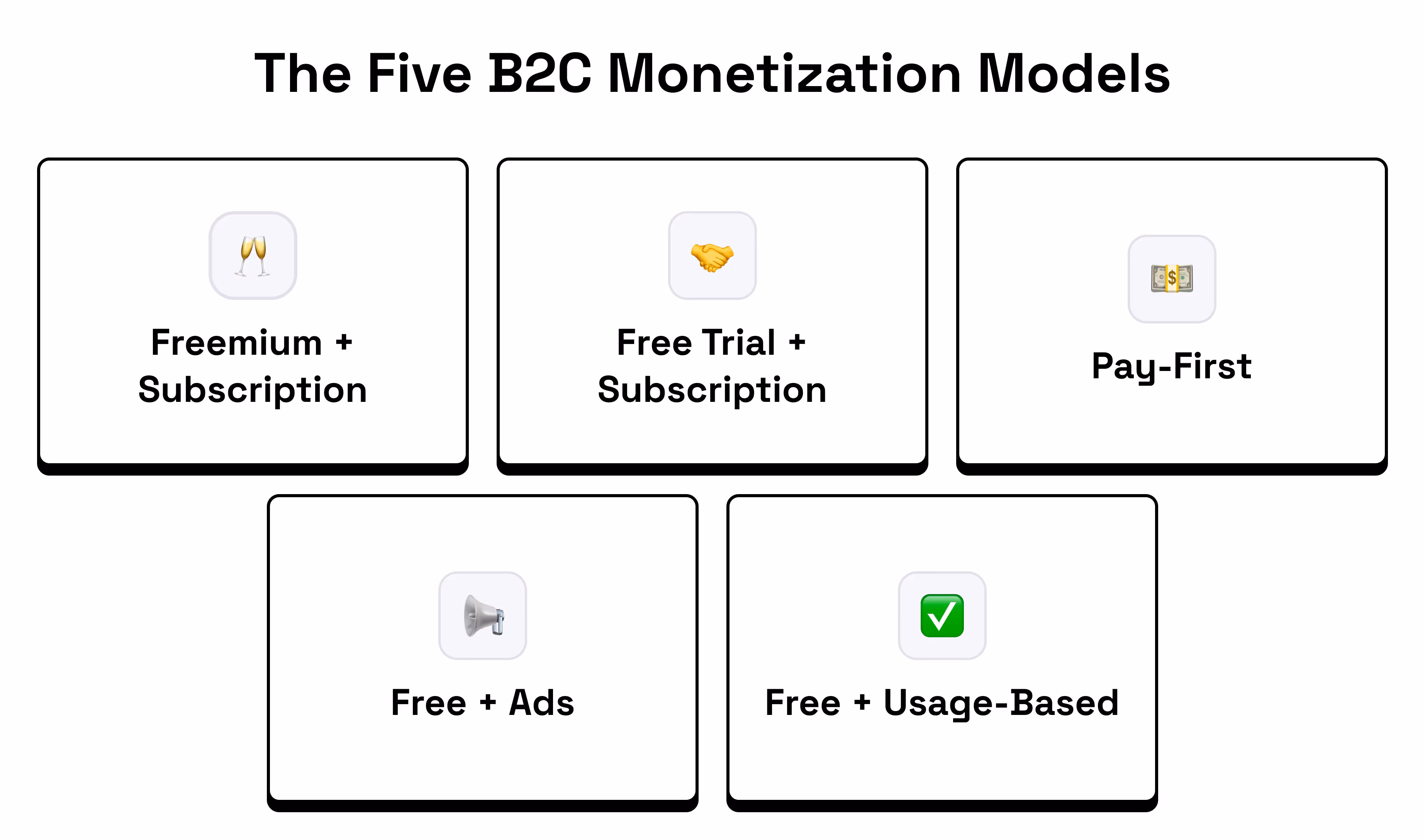
The Five B2C Monetization Models
Your business model fundamentally changes how you approach onboarding. Here's what works for each model.
Note: These aren't the only models out there. There are edge cases and hybrid models that combine elements from multiple categories, but these five cover the majority of B2C products.
1. Freemium Model
Structure: Free account with limited features plus paid upgrades
Examples: Spotify, Canva, Notion, Grammarly
Your strategy: Drive repeated engagement that builds trust and demonstrates value over time. In B2B, this often means helping teams adopt your tool as part of their workflow. Focus on helping users achieve success quickly (ideally before they hit their first upgrade prompt.)
Ensure users can experience meaningful value in the free tier. They should genuinely feel like the product works before being asked to upgrade. Like how Spotify’s product works for free, you just get hit with ads from time to time. Highlight your most compelling features early. Depending on your product, you may need to gate advanced functionality — just make sure you:
- Clearly show what users are missing (e.g. Grammarly-style upgrade prompts)
- Gate at moments of high intent or curiosity, not before value is proven
- Example: You’re using Notion and you’ve set up your project management system. Now you want to set up a Slack integration to notify team members when specific tasks are ready for them to review. That’s when you get hit with a premium upgrade prompt.
- Avoid gating so much that users bounce before they experience any success
Example: Canva (Freemium)
The first thing Canva does after you hand them your email is ask you one of my favorite onboarding questions, “What will you be using Canva for?” which helps them narrow in on what they’ll recommend and what the next onboarding question might be.
.avif)
Now they ask what you want to create so they can show you templates specifically for that. Notice how as you switch what your focus is, it changes the example images on the right.
.avif)
This is an interesting choice that I wouldn’t necessarily recommend out the gate. They likely went through numerous A/B tests to determine that it’s worth putting this here, but typically I’d show some value before trying to upsell your premium plan.
.avif)
I like this screen a lot. They throw you into the product but you don’t feel lost. You have a search bar as the hero of this section where you can search for whatever you’d like to create. Below it you see a variety of design options you can choose from. You all have some basic tool tips to the left.
.avif)
I decide I want to create a social media post for my new podcast and search it up. Immediately met with social media post templates. Notice how they’ve got “pro” attached to some of the templates, already tempting me to upgrade.
.avif)
I select a free one and can start designing right away. They have a brief walkthrough on the left to show me where everythings at.
.avif)
Now that I’ve started designing, I want to change my font. But notice how they gate all the non-standard fonts. Again teasing me to upgrade to pro. But for now I choose a free font and carry on.
.avif)
Aaaand boom. In just a few minutes I’ve got a custom social post I can use that already looks pretty solid. Canva does a great job of showing me their value while also teasing their premium plan throughout onboarding. Not only am I being poked to upgrade, but I’m also getting an understanding of what I’d get with premium (more fonts, more images, etc.)
2. Free Trial Model
Structure: Full access for limited time plus payment required to continue
Examples: Netflix, Adobe Creative Suite, Calm
Your strategy: Front-load value within the trial period and create multiple "wow moments" throughout.
Demonstrate your most impressive capability first. Build urgency and show increasing value over time.
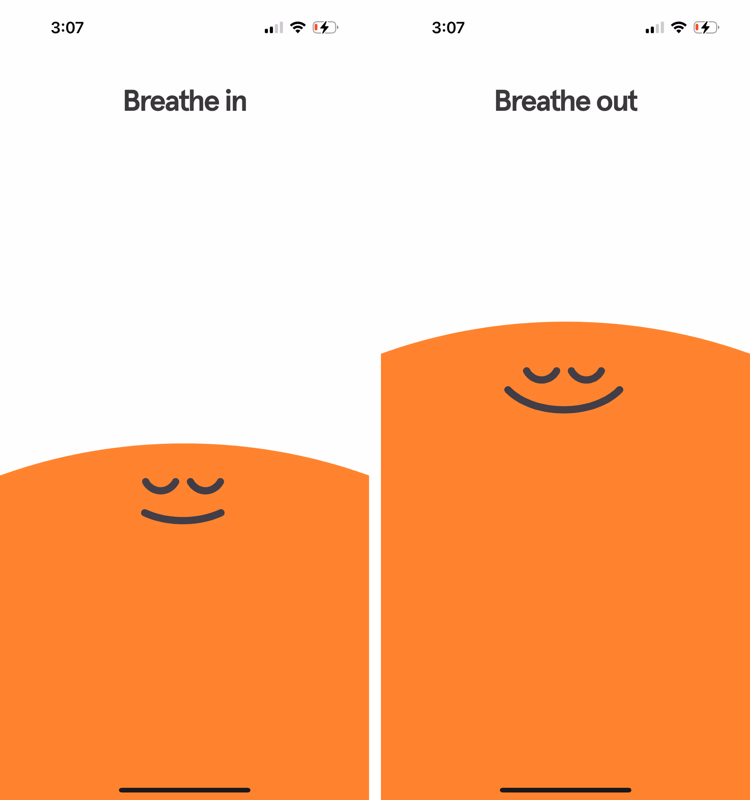
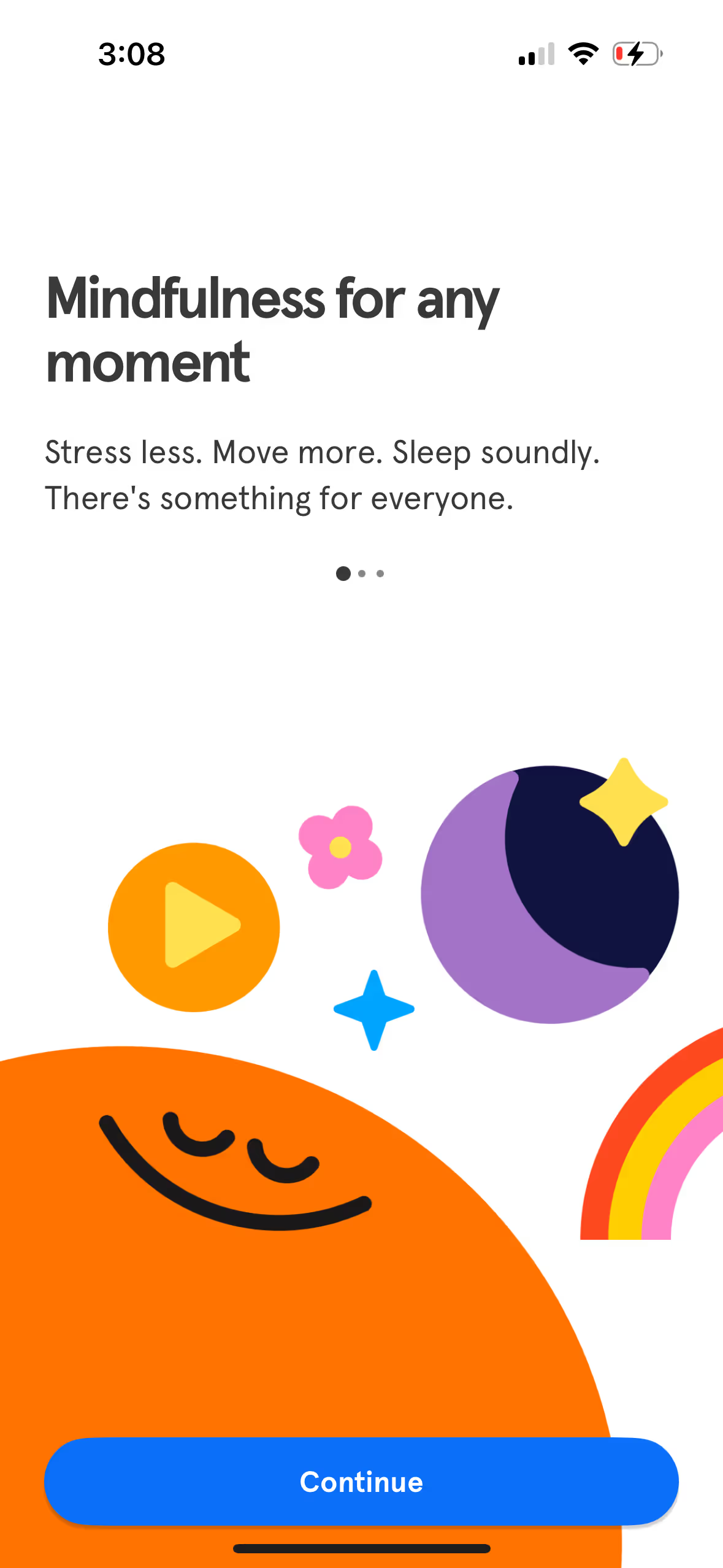
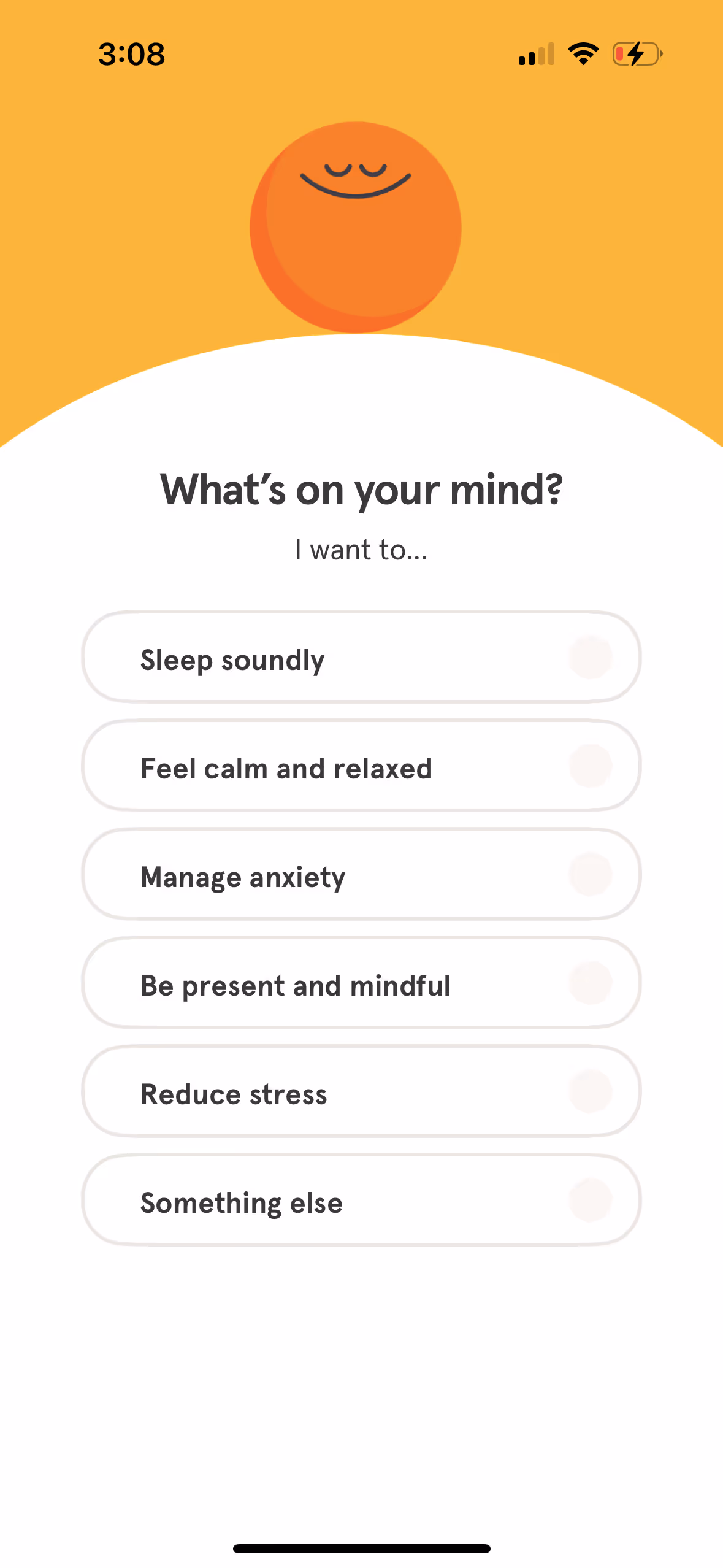
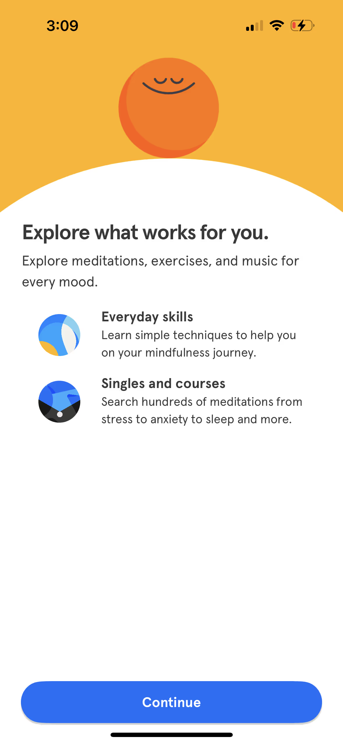
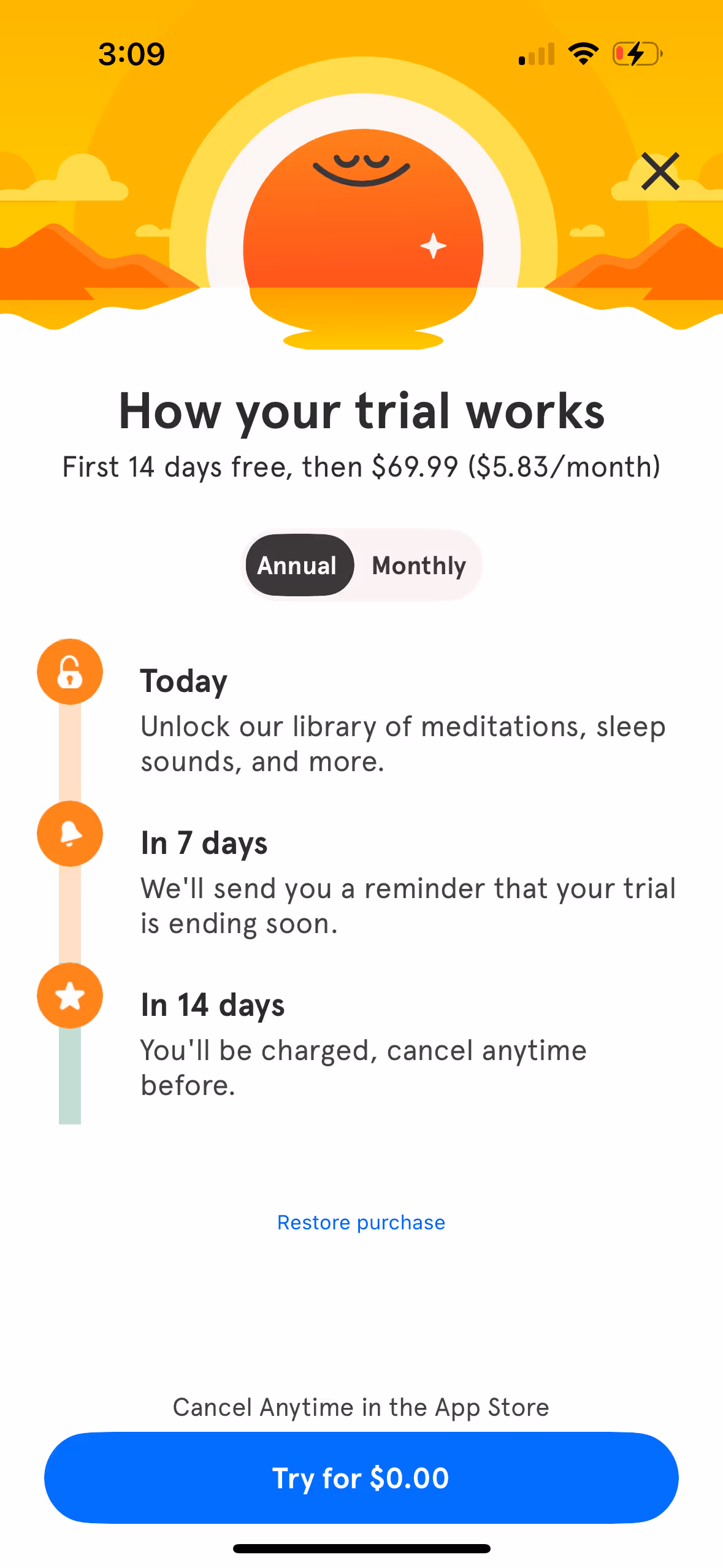
Example: Headspace (Free Trial)
Headspace has to be a bit more strategic with their onboarding since they can’t show value until after you’ve signed up for the free trial. I think what they do is pretty cool. To start, the first screen you see is this animated Breathe in, Breath out effect. You already get a sense of calm when you first open the app.
Then they ask you to create an account. This adds some friction to the flow, but they’ve likely gone through extensive testing and found that it’s fine to ask for this upfront.
Here they’re showing their value. Stress less, sleep better. Who wouldn’t want that?
This is one of my favorite screens. This screen simultaneously acts as a personalization question but also shows users every problem they solve.
And here they show you how it works. You can choose from one-off skills to learn or go through full courses.
This is the highest friction point in the flow, but they do a really good job of making it easy to click the CTA. What they do well:
- Show you a timeline of how the trial works, and tells you they’ll remind you 7 days prior to being charged. That’s great! Sometimes I forget what I sign up for.
- You can cancel anytime and they tell you exactly where to do that (app store).
- “Try for $0.00” makes this a no brainer.
You opt in to reminders about your trial ending, easing any leftover anxiety.
Now that you’ve signed up they can personalize things a little further. This question helps them figure out which session they’d recommend to me first.
I like this screen. It uses labor illusion to show that it’s actually personalizing your dashboard. If it immediately took you to the next screen, it wouldn’t feel like they really put in any work to make this for you.

This screen adds a little bit of excitement while also making you feel like you’re a part of the experience by having you tap on the screen. Your active participation makes you more likely to start the course they’re going to recommend.

And here’s the final screen. They’ve got a course ready for you to take right away. Much better than dumping you into a catalog of courses and making you choose one. People don’t like making decisions, especially if there’s risk of being wrong. So make decisions for your users whenever you can.
3. Pay-First Model
Structure: Payment required before product access
Examples: MasterClass, Superhuman, Ulysses
Your strategy: Justify their purchase decision immediately and ensure ongoing engagement. Focus on immediate value delivery and habit formation to prevent churn.
Important: For pay-first models, onboarding actually starts at the marketing level. You need to get users to their lightbulb moment WITHOUT using the product—through videos, testimonials, examples of real user creations, or demos that prove value before purchase.
Example: MasterClass (Pay-First)
Here’s an example. On the MasterClass homepage, you’re immediately met with a personalized quiz asking what topics you want to learn.
.avif)
Without putting your email in, it allows you to continue on with the quiz asking what else you’re interested in:
.avif)
Now it’s getting even more personalized and digging into specific topics within the overarching topic you’ve selected. This feels like I’m really going to get the exact courses I’d like to take.
.avif)
After you’ve answered some questions, it hits you with a course MasterClass is certain you’d like, and tells you that you can try out MasterClass risk free for 30 days. Sounds like a no brainer to me.
.avif)
Now they’re getting a sense of how much time you’ll spend on the platform. Based on what you choose, they’ll either recommend shorter or condensed courses vs. longer more in-depth courses.
.avif)
They’ve narrowed me down to 104 classes that I would be into. Wow, I can learn 104 new topics for only $10/mo? Steal. Now I have to click to see my recommendations.
.avif)
This final page accomplishes a lot:
- It gives me a curated list of recommended courses I’d like, in order by topic (if you continue to scroll you’ll see writing, design, and health and wellness courses in that order).
- I get hit with a bunch of social proof via celebrity experts that I recognize.
- And I see that it’s only $10/mo for all of this.
- They’ve successfully shown me the core value of the product without asking for my credit card or email and positioned Masterclass like a no brainer to sign up for.
.avif)
4. Free + Ad-Based Monetization
Structure: Free product monetized primarily through advertising revenue
Examples: YouTube, TikTok, Instagram, Twitter
Your strategy: Maximize time spent and engagement to increase ad revenue. Focus on habit formation and content consumption rather than any payment pressure.
Create immediate entertainment value and addictive engagement loops. The more time users spend, the more valuable they become. Build habits around daily usage and content discovery.
Example: YouTube
YouTube doesn’t need much of an explanation. You get sent a video from a friend or you want to search up something yourself and you can immediately watch it. No account creation needed. When you want to start saving videos or you want a curated feed, you can sign up for a free account. YouTube makes ad revenue whether you sign up for an account or not.
5. Usage-Based Model
Structure: Free to sign up and explore, pay per transaction or usage
Examples: Uber, Venmo, Robinhood, Cash App
Your strategy: Remove all barriers to first transaction while building trust and demonstrating ease of use. Focus on making the first paid action feel safe and valuable.
Get users comfortable with the core flow using free features first. Show social proof and security. Make the first transaction as small and low-risk as possible.
Example: Venmo (Usage-Based)
- Day 1: Set up account and see friends' public transactions (social proof)
- Week 1: Send $1 to a friend with a fun message
- Day 8: "Sarah sent you $1! Here's how easy it was for both of you"
- Month 1: "You've sent and received $200 with zero fees between friends"
Deliver Value Before Asking For Payment
You don't earn the right to ask for payment until you've delivered value.
This applies even to paid products. Just because someone paid doesn't mean they're committed. They still need to experience the value they paid for.
The common trap in freemium and trial models is gating too much too early or pressuring for payment before trust is earned. This backfires by creating frustration before value is demonstrated.
The fix: Treat onboarding as a trust-building phase. Once someone hits their lightbulb moment, they're far more likely to pay and stick around.
How Value Delivery Speed Affects Your Strategy
Beyond your business model, the speed at which your product delivers value fundamentally shapes your onboarding approach. Understanding your value delivery timeline helps you set realistic expectations and design the right experience.
Simple framework: The faster the value, the more you lean on the product to get users to their lightbulb moment. The slower the value, the more you have to use non-product assets to let users see the value and have that lightbulb moment. For example, you may want to use a sales demo if selling a complex product like construction accounting software.
Immediate Value Products (2-5 minutes to lightbulb moment):
These products can deliver meaningful results in a single action or short workflow. Users can experience the core benefit without setup, data input, or waiting.
Examples:
- Canva (create design),
- Venmo (send money),
- Grammarly (catch errors),
- ChatGPT (get answers),
- Instagram (post photo),
- Uber (book ride).
Strategy: Focus on getting to lightbulb moment in first session, then use emails to showcase advanced features and use cases.
Setup-Heavy Products (10-30 minutes to lightbulb moment):
These products require some configuration, data input, or learning before users can experience full value. The setup is necessary but the payoff is clear once complete.
Examples:
- Copilot (link bank accounts),
- Havenly (interior design consultation),
- Personal Capital (connect financial accounts),
- Mint (budget setup).
Ask yourself: "How can I get them to experience the core value WITHOUT having to go through the setup process?"
Example: Many analytics tools drop you into a demo/sandbox—basically a fake user account that already has data wired up so the user can test it out and run analyses. That's way more exciting and gets to the lightbulb moment without needing any setup.
Long-Term Value Products (Show future value immediately, realize over weeks/months):
These products deliver their primary value over time through consistency, data accumulation, or gradual improvement. The benefit can't be fully experienced in one session.
Ask yourself: "How can I get them to experience the core value without having to wait for results?"
Examples:
- Fitness apps: Show new users a transformation story of another user so they see what results await them
- Investment apps: While it may take years to see actual returns, during onboarding Betterment helps you set up your investment plan and shows projections of how much your investment will be worth after 1/5/30 years. No waiting for results—the user sees the finish line from the start
- Learning apps: Show skill assessment results and a clear learning path with milestone celebrations
Choosing Your Approach
If your product is simple and value is immediate:
- Focus on first session lightbulb moment
- Email sequence drives feature adoption and engagement
- Timeline: 3-15 minute first session + 14-day email follow-up
If your product requires setup or data:
- First session shows future value with sample data (interactive demo, transformation story, projected results)
- Email sequence guides through real setup process
- Timeline: 10-15 minute value preview + 14-day guided implementation
If your product depends on network effects:
- First session creates value with sample data or existing content
- Email sequence helps build real connections and usage
- Timeline: 5-10 minute social proof + 14-day network building
Action Steps for Section 2
Step 1: Identify your exact model
- Which of the four models describes your business?
- What's your average customer lifetime value? (This helps determine how much effort to invest in onboarding - higher LTV justifies more sophisticated sequences)
- How quickly can you deliver meaningful value?
Step 2: Set your onboarding goals
Based on your model:
- Freemium: What habit needs to form for eventual upgrade?
- Free trial: How can you front-load value within the trial period?
- Pay-first: What outcome did they pay to achieve?
- Free + ad-based: What engagement leads to sustained usage?
- Usage-based: What first transaction builds trust and demonstrates ease?
Step 3: Plan your value delivery timeline
- First session: What value can you deliver in 3-15 minutes?
- Email sequence: How will you build on that first success over 14 days?
- Long-term: What does success look like after 30 days?