
Introduction: Onboarding Flow
Overview
A good onboarding experience welcomes new users or customers into your product so they're excited to become recurring, repeat customers for life.
You could have the world's best landing page, but if your onboarding experience is poor, people will leave before they actually buy from you.
Specifically, onboarding is the full set of things a new user does between:
- When they first visit your site
- And when they become a regularly engaged user.
This experience happens in three phases:
- Their first visit to the site - The steps a user goes through from visiting the landing page to signing up/purchasing the product.
- Their first use — Everything the user experiences immediately upon signing up or buying for the first time. If you lose them here, odds are you'll lose them forever.
- Follow-on engagement — This includes the (1) messaging (emails, phone notifications, texts) that keep them engaged, plus (2) your sales and support outreach.
- These phases are unique to new users. You have to treat new users differently than your established customers.
A smooth onboarding flow gets more people to buy from you; it increases conversion rates throughout the funnel, which ultimately leads to a lower CAC. It will require a lot of testing, and the first rendition of what you create will not be the best-converting funnel. This is the case for every product we market.
A good funnel comes from iterating on a strong foundation — and that is what the onboarding experience you'll develop is meant to provide.
A brief warning (for SaaS apps in particular)
Most SaaS apps lose 95% of their new users after 90 days. That's insane.
When you lose a user's interest during onboarding, your first impression is complete, and they typically never return.
During onboarding, nearly everyone is skeptical of your product. Consider how many services they sign up for each month. Think about how many services waste their time with marketing tricks and poor products.
Yet onboarding is usually the most half-baked aspect of products. You get spammed with tooltips, then dumped into a boring home screen.
Why? Because there’s often no individual on a tech or marketing team who's responsible for it.
Either there are marketers acquiring users or product managers developing features. No one is sitting in between to onboard those users.
But, onboarding is a feature unto itself. It deserves resources dedicated to its thoughtful design, development, and optimization.
Onboarding strategy
When you onboard users, you want to welcome them into your product in a way that excites them to become lifelong customers. You achieve excitement through delightful onboarding experiences.
After someone visits your site, every page they land on must answer: “How do I get value out of this product?"
Then, you have to identify the obstacles that exist along the way to getting that value. And address them.
You can show value in three main ways:
Integrated walkthrough
Walk the user through one product feature at a time while having them fill out their profile or create a sample project in the process. For example, if you’re building a visual site design tool, have them choose a starting site template to begin designing with as you walk them through how to modify it.
Sample data and tooltips
Or you can throw them right into their account. If you do this, present them with pre-filled sample data to play with in places where they're expected to enter their own input. Pair this sample data with callouts that point out key features and explain why they’re valuable. And remind them that support and sales are just a click away.
Video
Finally, only if you can easily visualize your product's value — or if you have a very complex product that requires intricate explanation — make users watch an optional screen recording video. Keep the video short, get to the point quickly, skip the sales fluff, and make it watchable without audio (use captions).
Most users are really not going to want to watch your video, so focus on making your product self-evident to use before you resort to a video.
Regardless of which onboarding implementation you choose, recognize it's a distinct experience separate from what returning users experience.
So treat it with the gravitas it warrants; partition your engineering and product resources in earnest pursuit of making the onboarding easy, enticing, and productive.
In fact, these are the principles of onboarding design:
- Decrease friction (remove obstacles)
- Make it enticing
- Make it productive
Let's dive in. This is so important.
1. Decrease friction
In an onboarding experience, the next step should always be clear: “Where do I go from here?”
The next step must appear low-friction; it should be stupidly easy to take. This is how you build momentum toward the end of the funnel — when users pay you.
Obstacles increase friction. They’re usually pretty easy to identify. They are the steps in a user's journey that:
- Require the most work.
- Are the most boring to complete.
Here's an example of a bad interaction pattern: A user creates an account. Then they create, then immediately delete, a new project. Hmm.
What are they really trying to accomplish? Was there an intermediate feature they wanted to momentarily access? If so, why not extract that feature to stand alone so they don't waste their time with fake project creation?
You've found a hidden obstacle — unnecessary friction that site data likely wouldn't have revealed.
So your first task in developing your onboarding experience is to list every action users must take on their path toward the paid conversion event. For a website design tool, it might be:
- Enter their email and password.
- Create a sample site.
- Fool around with the design tool.
- Invite team members.
- Fully build a site.
- Enter their credit card.
- Publish the site.
One great way to see the real actions people take is with user recordings: videos of people actually using your site, in real-time. They reveal where people spend more time than they should. And what causes them to get stuck and give up.
We’re going to have you study user recordings later in the course, but we want to drive home the idea that you really need to break things down step-by-step.
For now, think about reducing friction by using these principles:
Reduce total workload
Only ask for what you need. For example, pre-fill form inputs with your best guess of what the user would enter, then prompt them to correct each guess. When’s the last time you had to type out your full address?
These days, almost every site uses Google to autocomplete addresses and credit cards. Here are some instructions for your engineers if your site doesn't already do this.
Another tactic: Defer asking for input until you absolutely need it. Do you really need their full name to create their account, or can you request that after they’re engaged? (Once a user is engaged, you can get away asking them for a lot more.)
Reduce choice anxiety
Hand-hold users through anxious moments.
For example, if users fill out a dating profile bio, you should accompany it with suggestions on how to fill it out:
Describe your unique interests and explain why you're passionate about them. (E.g., reading, skiing, and rock-climbing because you're intellectual and outdoorsy.)
Reduce perceived complexity
Use GIFs to make onboarding tasks feel less complicated. Break down the task and visually demonstrate each step.
You'll see us using this tactic throughout our course.
Forms
Forms are where anxieties tend to surface. So here are two more form friction tips:
Keep the end in sight
Always say “You’re almost done” at the top of a form. It’s been A/B tested heavily, and it works. It reminds people that form entry won’t go on forever.
Further, when a form is longer than 5 input fields, break it up across multiple pages. Don’t tell users how many form pages there are until they reach page 2! Only begin showing a progress indicator on page 2, which is now partially filled out since they already completed step 1.
But, generally, your form should never be more than 5 fields. The longer your form, the less people will actually fill it out.
Explain the value
Explain why inputs exist if it's not obvious.
For example, if you have a share button for inviting coworkers, say, "If you invite coworkers, you can instantly share your work without having to manage back-and-forth emails." Ahh, so that's why I shouldn't ignore this button!
2. Make it enticing
Onboarding experiences should never just be educational or enticing. They must always be both.
Whenever you educate new users, you must also entice them with your value props so they are willing to go through the education.
Tease them with how amazing life will be once they are fully onboarded.
To do this, think about the magical moment near the end of the funnel — when the user pays to get maximum value out of the product. Find a way to visualize this end state for them during the onboarding experience.
For example, look at how "dating" site Ashley Madison does it. They visualize the end goal (“finding a partner”) through a blurred background photo while asking you to painstakingly enter your profile details.
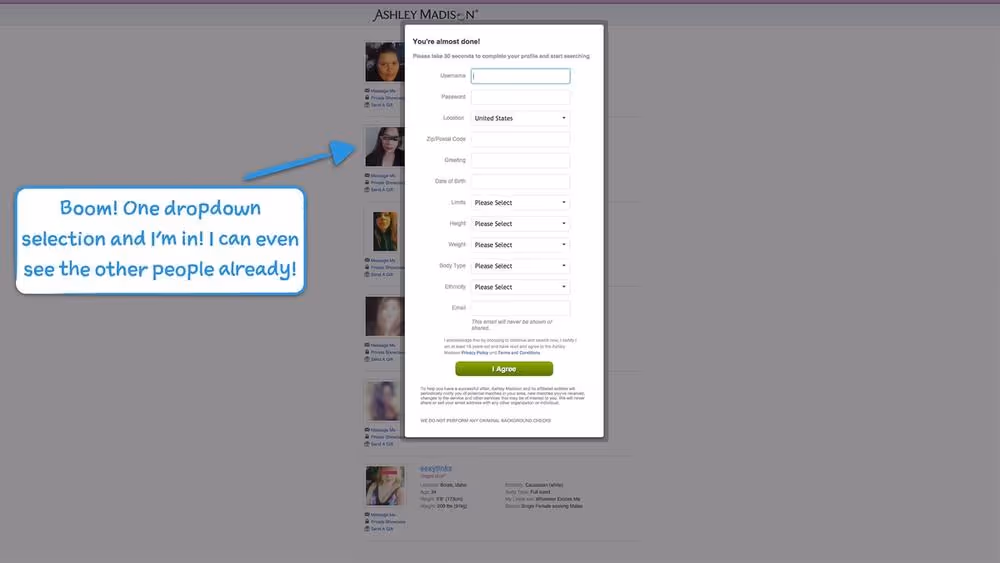
They're teasing you with their magical moment while you grind away at your profile.
This principle extends to your entire customer journey: Don't ask someone to do something until they’ve previewed the value they’ll get from doing it.
For example:
- Want someone to read your boring tooltips during a walkthrough? Wait until they engage with a feature before you explain it. That's when they'll care.
- Want someone to download your Chrome extension? Wait until they've become hooked by your web app. Then prompt them to download something new.
- Want someone to read your lengthy ebook? Wait until they've read one of your short, fantastic blog posts.
- Want someone to sign up for your newsletter? Don't ask them right when they visit your site. Let them read a few articles, without distraction, to let them learn you're worth subscribing to.
Minimize selling
Your goal is to get users into the habit of regularly using your app. Not to "hard sell" them. Don't force them to do things they don't want to do.
Once they begin depending on you, they will organically want what you’re selling. At this point, it’ll be much easier to convert them.
For now, get out of their way. But, do keep pricing within view: prominently link to your Pricing page and tease them with the benefits of upgrading whenever they start to bump up against the limits of their current plan.
Write out your pitch
If you don't have anything enticing to visualize, at least write a pitch for achieving the end goal. Place it alongside forms in your onboarding flow.
For example, if you’re a subscription service that helps people quit smoking, tell users how many other users successfully used this service to quit smoking forever:
“About 15% of the people who finish signing up wind up completing the course. Don’t be one of the quitters, because if you complete this, you then have a whopping 85% chance of quitting smoking for life. This is your chance.”
3. Make it productive
If your onboarding is part of an integrated walkthrough, don’t leave users empty-handed.
For example, if you’re an email app, have your walkthrough help the user clean up their inbox. This way, users accomplish something they care about while learning to use your app. It leaves them with a small dopamine hit. It delights them.
Another example: If you’re a project management app, have your walkthrough leave users with the scaffolding required to share their project with team members.
Nothing feels better than getting value out of a product within the first few minutes.