
Conversion Fixes
Once you can narrow down where a problem is in your funnel and why it's happening, you can start to brainstorm fixes.
Again, you need to narrow down the problem before brainstorming fixes.
With that said, we'll take a closer look at some of the most effective CRO tactics in our playbook. This is by no means an exhaustive list. But for those just beginning to optimize their funnels, this is a good starting point.
Tried-and-true CRO tactics
- Write tailored landing pages
- Add live chat to your landing page
- Shorten, remove, or reorder forms
- Add a drip email campaign
- Build trust with testimonials, reviews, or press
- Deliver the value sooner
- Target a different audience
- Gate content by asking for an email
Write tailored landing pages
Solves: poor conversion rates on landing pages.
If you're running one set of ads that target millennial moms and another set of ads that target exercise junkies, point the mom ads at a landing page built for moms.
Use photos of millennial moms and write copy that would resonate with them.
Point the exercise junkie ads at landing pages built just for them.
At Bell Curve, for Google Ads, we'll often make pages that are targeted directly to the keywords that someone searched on Google—pitching directly to them and their problem.
These approaches can boost conversion rates up to about 30%.
Add live chat to your landing page
Solves: poor conversion rates on landing pages.
Site visitors often have questions that you can't answer on your landing page. So they'll bounce. Even if the answer lives elsewhere on your site.
Use a live chat to keep them around.
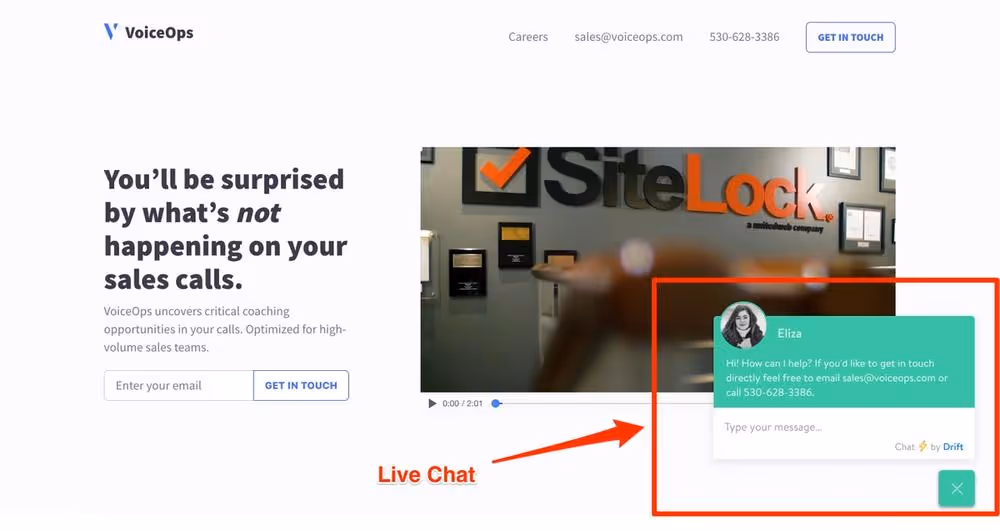
Live chat tools
- Intercom
- Olark
- Zopim
- Drift
- Drift is nice for companies with a sales team; you can set it up to prequalify leads with a chatbot, then schedule calls directly in chat.
We usually go with Intercom. But they're all good, and features vary depending on your budget.
Shorten, remove, or reorder forms
Solves: poor conversion rates for signup pages. Particularly for enterprise leads.
Compare these two forms.
Here's Form A.
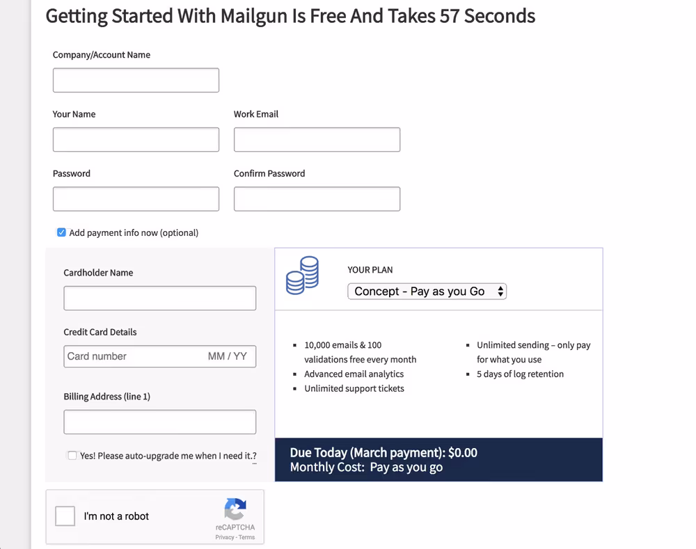
And here's Form B.
Form B should convert better by a long shot.
Long forms are daunting. People don't finish them. Remove fields you don't absolutely need. Prime culprits are company names and first and last names.
Don’t ask for usernames and email addresses. Use email addresses as the username. You don’t even have to require a password; throw someone into the product first so they can see the value of your product, then ask them to set a password (or email them later to set it).
Big win: ask for email addresses at the end.
Ask for a lead's email address only after asking your first qualifying questions in a form.
For example, if you're a wedding planner marketplace and people have to fill out a form to get matched, ask for their theme, location, budget, etc. first before asking for their email address.
This shows leads that you really understand their problems, and they get more invested the more they fill out the form. They won't want to throw away all the work they did, so they'll give you their email.
This advice works particularly well in Typeforms - and it applies to both B2B and B2C.
"But what if I need data, like company size, to figure out if I should spend more time on a lead?"
You can use a service like Clearbit or LiveRamp to fill in those blanks. Or you can ask users for it later in your funnel — when they fully understand the value of what you’re selling.
You want to remove the number of steps to getting their email.
Once you have the email, you can reach out to them again and again. Either directly or through drip emails (explained next).
Otherwise, you have to rely on someone coming back to your webpage on their own. They may never find you again.
Add a drip email campaign
Solves: poor conversion rates after people sign up
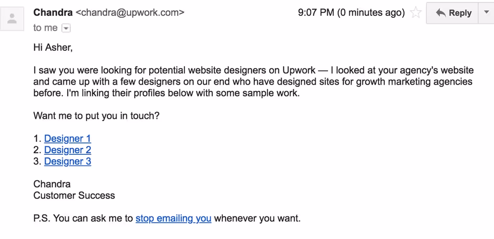
Drip campaigns are those emails you get every couple days after you sign up for a website. Most companies do them wrong; they send out a generic email that looks super salesy, pleading with you to come back.
Here's a bad one.
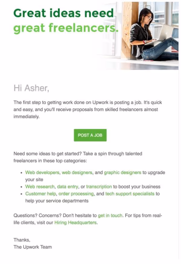
The key to good drip emails is to make it look as natural as possible, tailored to the person receiving the email based on what you know about them.
Do as much work for them as you can — to make it easy to move to the next step.
Also, use plain text. Not company branding. It performs better. Plain text emails looks like they’re coming from people they know—not a company trying to get them to buy something.
If your average LTV is high enough, you should be having actual salespeople sending your drip emails, customized to each person who has submitted their email.
For the UpWork example above, a better email would have read like this:
You can measure how well your drip campaign works by looking at open rates, clickthrough rates, and conversion rates from emails.
Hack: you can use Clearbit Reveal to figure out who's visiting your site, look up their email (also using Clearbit), and send them a "cold email" -- with the knowledge that they already know who you are.
Build trust
Solves: landing page conversion rates, poor conversion rates for short funnels.
Trust can take the form of logos of your high-profile customers, content that demonstrates your knowledge of a topic, customer testimonials, and more.
Sometimes it means adding an extra page to your funnel to educate your site visitors. Adding a step to your funnel is counterintuitive. Usually, you want to shorten your funnel, not lengthen it.
But it can be worth doing if your product if it’s complex or expensive.
Deliver the value that people expect. Sooner.
Solves: poor top-of-funnel conversion rates.
Imagine you clicked an ad that says "Find anyone's email. For free." And you end up at a page that looks like this.
It's pretty close to what you expect — but you can't actually find anyone's email yet. You have to create a free account, fill out your information, and jump through a couple hoops first.
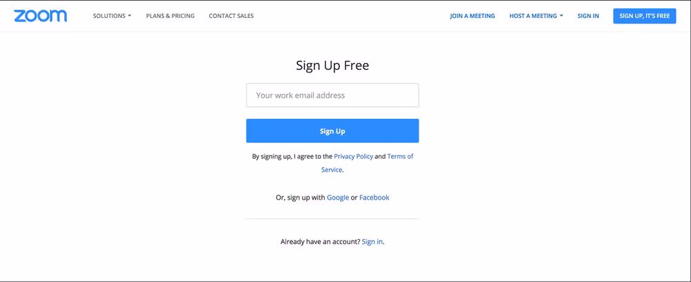
Now, imagine you clicked the same ad and ended up at this page:
Bam. You instantly search for emails, right on the landing page. Without friction.
Way better.
Get to the meat of your product as quickly as possible.
Use that to entice the user to actually add information and sign up.
Target a different audience
Solves: poor landing page conversion rates.
At Demand Curve, we usually test a few different audiences at once (recruiters, salespeople, etc.), and use UTM tags to track who performs best.
Here's what it looks like in Google Analytics. GA lets us compare success between different target markets really easily.
(Names and numbers changed — this is not a real client.)
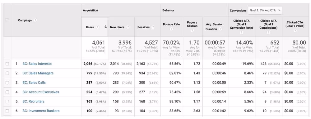
You'll see audiences that are super cheap to get to your site; it doesn't cost much to get them to click on an ad.
But sometimes they won't actually buy your product. And that's ultimately what matters.
Stop marketing to the poor performing audiences, and start marketing to the better performing audiences.
You might have to brainstorm new audiences to do this.
Make a mobile "gate page"
Solves: poor landing page conversion rates on mobile
Some products aren't built for mobile users — and it would be enormously expensive to make them mobile-friendly. Who's going to use a site that looks like this?
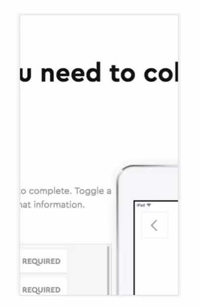
Here's a hack: just make the landing page mobile-friendly, and ask for an email.
Then, later, hit them with an email to catch them when they can actually use the site. On a real computer.