
Examples of Strong Branding
Headspace
Headspace is a mindfulness app with a mission to “improve the health and happiness of the world.” It does this by offering guided meditations to ease users’ stress.
Headspace isn’t the only meditation app on the market, but it’s one of the best known. Before apps like Headspace came around, though, the practice of meditation wasn’t very widespread. If you Googled “meditation,” you’d see dramatic silhouettes of yogis and monks in a far-off land.
This kind of imagery was a challenge for Headspace: people didn’t feel like they could meditate because it didn’t fit their lifestyle.
Wanting to make meditation accessible to everyone, Headspace’s creators needed to reframe meditation to make it more relatable. They accomplished this by defining their branding with three key features:
- A reassuring and positive brand voice. Headspace’s copy avoids using any spiritual jargon or idioms. It’s to the point, but still maintains a warm and friendly tone by framing itself as “your mind’s best friend.”
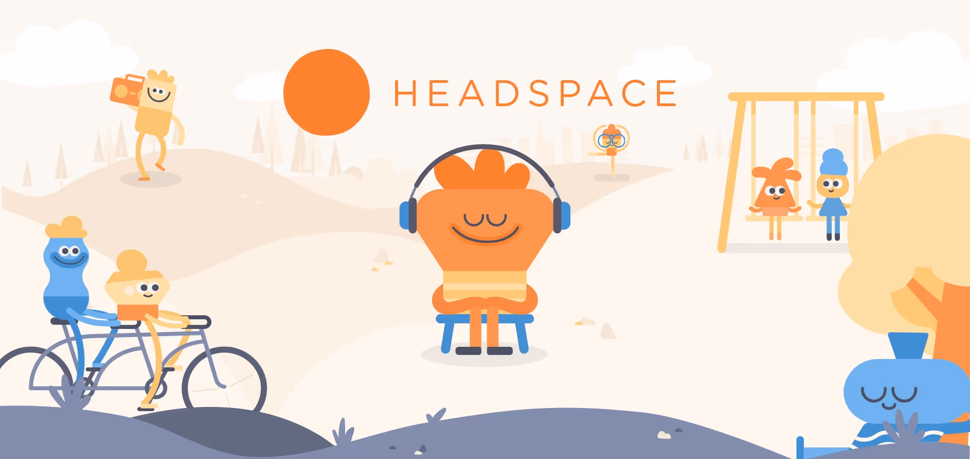
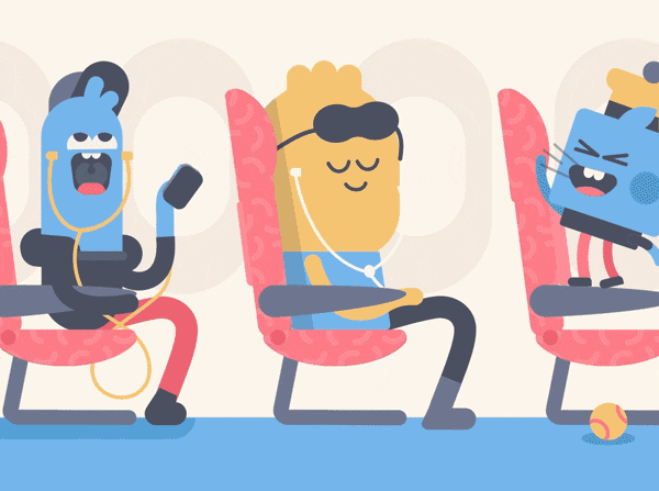
- Whimsical animated characters. To make meditation feel less foreign and unattainable, Headspace developed friendly-looking characters as a part of its brand design. The team’s product designers wanted these characters to be welcoming and inclusive, so they deliberately made them ambiguous—neither human nor one specific shape or size. Making them even more relatable, they appear in familiar everyday settings, like bedrooms, grocery stores, and on public transit.
- Visual metaphors about complex ideas. Mental health can be a heavy topic. So rather than addressing it and other complex subjects directly, Headspace relies on symbolic imagery. For example, it discusses dark thoughts by illustrating a few scenarios, but never explicitly naming them, e.g., the thought of keying someone’s car. These images, shown in Headspace’s whimsical style, make difficult or intimidating subjects more approachable.
Many stereotypes paint meditation as a mystical way to escape from reality for a certain type of person: those who are more spiritual, practice yoga, etc. Headspace flips this script with its warm, friendly, and relatable branding. It shows that anyone can benefit from meditation—and all it takes is a few minutes with the Headspace app.
BARK
The ecommerce subscription service BarkBox first launched in 2012 as a way to help dog owners pamper their canines with new treats and toys. After becoming wildly successful, it has since expanded to offer other dog-centric products and services under the umbrella BARK, with a mission to “make dogs as happy as they make us.”
There’s no doubt a large part of BARK’s success comes from its branding. It’s warm, lighthearted, and goofy—fitting traits to describe a company centered around man’s best friend. Some of the most well-known pet retailers, like Petco and Petsmart, have similarly friendly and casual brand personalities, but unlike BARK, they lack a clear narrative.
This is where BARK excels. Consider its flagship product, BarkBox. On the surface, it’s a monthly subscription box of dog treats and toys. But BARK injects personality by creating boxes around a unique theme every month, much to the delight of both dogs and their owners.
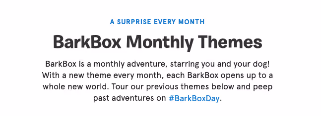
Though BarkBox could simply put together random collections of dog goodies, it’s carefully curated its boxes to tell a fun story—”a monthly adventure, starring you and your dog!” Here are a few examples of its past themes:
- Australian Outbark, an Australia-inspired collection with kangaroo and platypus dog toys
- The Muttcracker, a holiday box that plays off the world-famous ballet, “The Nutcracker”
- Bud Hounds, a set of “fur-twenty” toys shaped like bongs and joints in honor of 4/20
Product isn’t the only place where BARK infuses its branding; its personality also comes across in its content. BARK speaks the language of dog enthusiasts, using words like “zoomies” and “doggos” as well as silly puns and cartoons.
Here are a few examples from its website and emails:
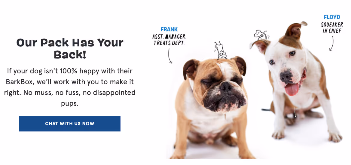
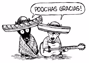
BARK’s content resonates with customers because it shows a clear appreciation for dogs and dog culture, just like its target audience. It’s not pompous or snarky; it’s quirky and joyful.
And by leaning into this branding more than other pet retailers, BARK has successfully expanded to a wider variety of products, like BARK Eats and BARK Bright. People become loyal customers because BARK’s branding shows a real passion for dogs, one that mirrors their own.
Zendesk
The customer service SaaS company Zendesk stood out when it first launched in 2007 with its bright green color palette, Buddha mascot, and playful messaging—a far cry from more stiff and formal B2B companies. Its mission: help businesses deliver exceptional customer service.
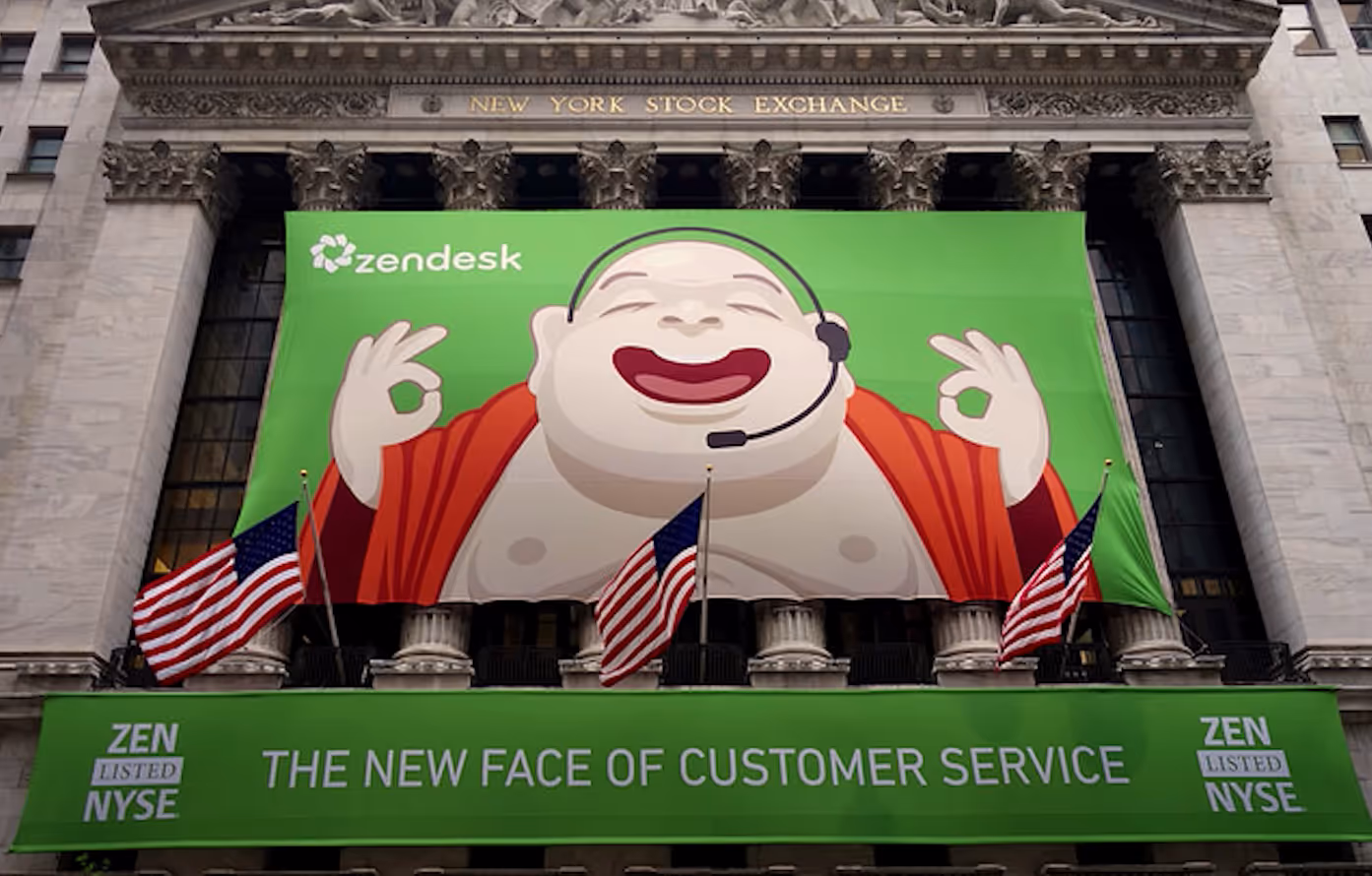
Though it was attention-grabbing, over time, Zendesk’s team realized the limitations of their branding. For one, their mascot was offensive, and trying to build a story around the character felt “weird.” It also clashed with their mission to create good service.
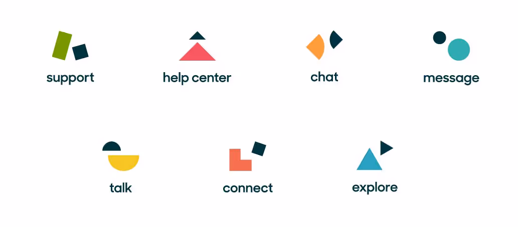
So in 2016, Zendesk rebranded. It shifted to a simpler geometric brand design, even creating mini-logos to represent each of its different services.
As a result, Zendesk could:
- Show off its expanded product offerings. Its previous motto “Love your helpdesk” was replaced with “Relationships are complicated”—pointing to the different ways Zendesk can help with customer service.
- Better connect with customers. Since Zendesk’s team had avoided creating stories around their old mascot for fear of offending people, getting rid of it meant new storytelling potential.
Throughout the rebrand, Zendesk’s voice remained the same. It continued its playful and conversational messaging, but with a new aesthetic that aligned better with its mission.
In Brandland, the company’s detailed style guide, Zendesk emphasizes the importance of communicating in a charming and “humblident” (that is, humble yet confident) voice. It doesn’t talk down to users, and it tries to avoid being hyperbolic. In fact, Brandland specifically advises against repeatedly calling Zendesk “the best.”
Here are a few examples of how this voice appears on its website:
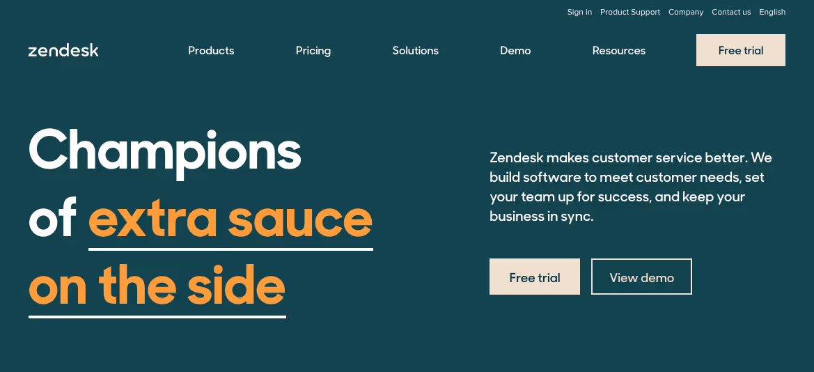
- Champions of awesome free trials (homepage)
- As a company, we roll up our sleeves to plant roots in the communities we call home. (about page)
- This is your gateway to the magical land of Zendesk, where we help you improve relationships with your customers. (demo page)
- Our sale just got Suite-r (homepage)
For better or worse, Zendesk’s original design and subsequent rebranding show how branding can shape perceptions of a company. They also show how brands can evolve over time. With its new design, Zendesk could better appeal to users without offending them, all the while continuing to differentiate itself from traditionally stuffy B2B branding.