Conversation


🥳 Feedback Received!
Thanks for taking a moment to share your thoughts — it genuinely helps us make each chapter sharper.
What happens next:
- Your feedback goes straight to our product team.
- We’ll use it to refine lessons, clarify examples, and make the program even more useful.
Appreciate you helping make this program better for everyone.
Ready for your next challenge? 👇
Project: Choose What to Test on Your Page
It's time to take the data you gathered in the last lesson and transfer it to a spreadsheet.
That makes it easy to look at as a whole. Use the same five categories used in the experience-based assessment. These are:
- Relevance
- Clarity
- Value
- Friction
- Distraction
Use any spreadsheet tool you like. Google Sheets works well. You can make real-time comments and edits, and share it with your team.
Here’s an incomplete example of what your spreadsheet should look like. Remember, your table may not contain all seven data sources, especially if you’re early in your startup phase.
But any data research is better than none.
Phase 1: Make Spreadsheet
Crack open this spreadsheet in a new tab. We're also putting a screenshot below.
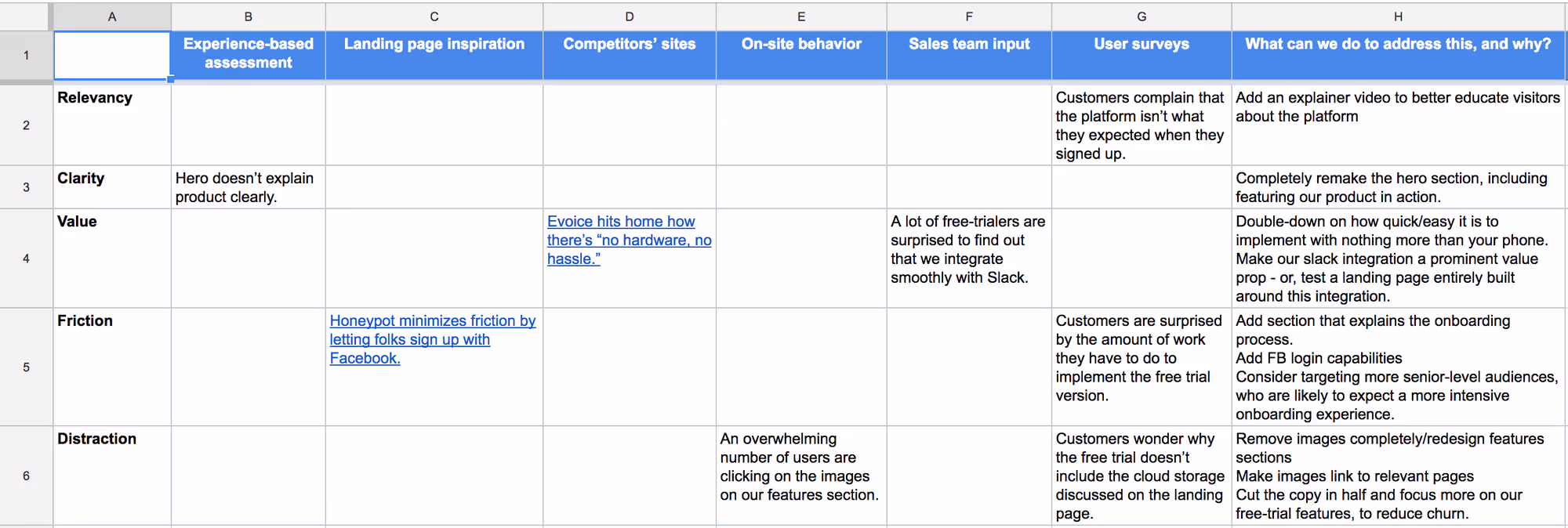
The first seven columns contain the data you gathered in the previous lesson. The last column is where you come up with solutions to address the problems identified by your data.
The bullet points you add to that column will decide what you test and how.
Phase 2: Come Up With Ideas
You might be able to come up with some ideas on your own. But here are a few tried-and-true macro variant strategies you can use for inspiration:
- Mimic sections of competitors' pages. You’ve already identified, in the table above, parts of your competitors sites that work. Mimic some of these page sections. By "sections," we don’t mean their words. We mean their layout tactics. This includes charts, sliders, GIFs, and other ways of displaying information. (Do not rip off their site. Only take inspiration.)
- Write to a new persona. Tailor your value props and copy to, say, mothers instead of teenagers. You could have misidentified your most valuable audience. In our table above, we recommend tailoring our copy to senior-level audiences. Beware: This type of variation will also likely change your ad targeting. For example, if you target moms with your A/B variant, you need to make sure you target that same audience with your ads.
- Cut the page in half. Less content sometimes means visitors will read more of it. They're less overwhelmed with information. Try removing everything that isn't critical. Be hyper concise.
- Take a stance. Choose one value prop that you embrace more than competitors. Build an entire page drawing that line in the sand. In other words, pick a narrow-minded fight and call out all the competitors who differ from your one, true way. Show visitors they're either with you or against you, and how being with you leads to a better outcome. Above, we recommended testing a landing page focused on our Slack integration.
- Combine micro-ideas. We’ve discussed the importance of implementing macro-variations vs. micro-variations. But a handful of micro-variations, focused on a singular goal, can be a valuable test. Here are some of the areas of your page you can test in one variant:
- Text— Header, subheader, feature headers, feature paragraphs
- Imagery— Header image, content images, background images
- CTA— CTA button design, placement, copy.
- One note on CTAs: if your page is long and informative, don't put the CTA in the hero section; we want to force visitors to learn more about the product before clicking through.
- If the variant is short, it's fine to leave the CTA in the hero section.
- Social proof— Try different quotes or different forms of social proof
- Forms— Number of fields, field layout, and field copy
- Order— The order of your page sections
- Design— Spacing, color, and font styling
- Offers— Introduce a time-sensitive discount
- Modal popups— Entice users to join your mailing list. This makes it easier for you to educate them—through emails—about your product.
Use one or two of these tactics and you’ll likely see little impact. Change several of these on your page, and what you have is a macro change. And a better chance of seeing real impact on your conversion rate.
Phase 3: Choose the best action items
Now that you have a complete table, it’s time to whittle that last column down to the ideas you want to test.
We share this table with our clients. We ask them to strike out any bullet point from that last column they don’t want to test (or don’t want to test yet). You should do the same with key stakeholders in your organization.
This step saves you considerable time and embarrassment. It's better to know what your team is comfortable with before you start designing.