Conversation


🥳 Feedback Received!
Thanks for taking a moment to share your thoughts — it genuinely helps us make each chapter sharper.
What happens next:
- Your feedback goes straight to our product team.
- We’ll use it to refine lessons, clarify examples, and make the program even more useful.
Appreciate you helping make this program better for everyone.
Ready for your next challenge? 👇
Core Elements of Ad Creatives
An ad creative is only made up of two components: text and visuals.
BUT there are infinite ways to arrange text and visuals.
Let's break this down further into:
- The hook/angle
- The visuals
- CTA
- The format
In this lesson, we'll cover the first three, and the next lesson we'll cover formats.
Let's dive in.
Hooks & Angles
Get in the mindset of your customer.
They're browsing Instagram, TikTok, or LinkedIn during a quiet moment. They're scrolling from cat video to cat video. Suddenly your ad pops up to disturb them.
The hook is that crucial first impression that either hooks them in or keeps them scrolling to the next cat video.
Whether it’s a video or static ad, the hook needs to accomplish the same two things:
- Grab your audience’s attention
- And get them curious about what you have to say.
And the angle has to sell the product in a compelling way.
The best ads don’t just grab attention. They frame the product in the most persuasive way possible.
Hooks and angles work together to drive conversions.
Hooks that work well:
- Pattern interrupts: unexpected visuals that break the norm. If you’re scrolling past a bunch of highly polished, high-production ads, then an ad shot with your iPhone at a weird angle is gonna make you stop and look.
- Ugly Ads: (more on these later)
- handwritten content, sticky notes, iPhone footage
- Ugly Ads: (more on these later)
- Curiosity gap: Leave out key details to create intrigue.
- “Nobody’s talking about this, but it’s so smart.”
- “Did you know 80% of people do this wrong?”
- “Did you know [X] is secretly ruining your [Y]”
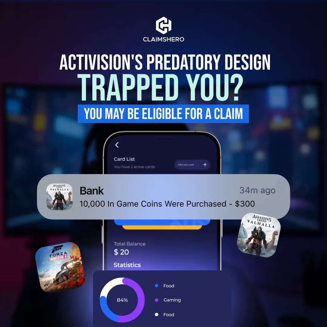
- Problem-agitate: Directly call out a pain point, twist the knife, and frame your product as the solution.
- “Can’t stay asleep? You might be losing years of your life because of it. SleepAid fixes this.”
- Social proof: Leverage testimonials, statistics, and credibility.
- “Join over 10,000+ professional marketers”
- “As seen on.. [techcrunch, YC, forbes]”
- “93% of people shown improvement after [X]”
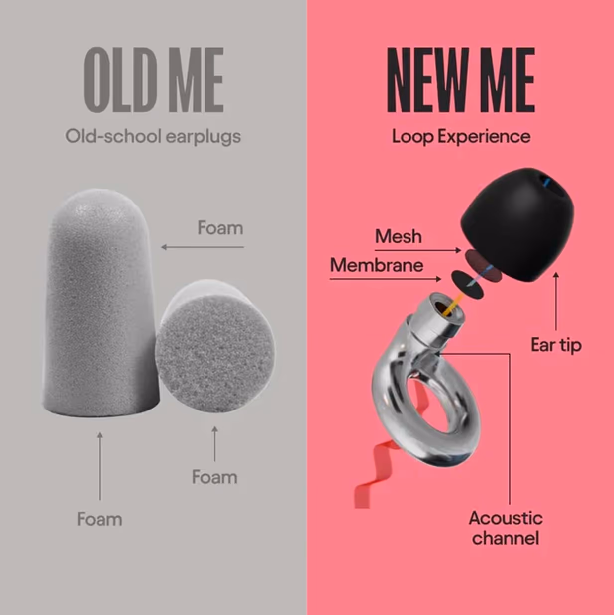
- This vs. That: Contrast between two things. Usually you vs. your competitor, or a generalized competitor (Blissy Pillowcase vs. Generic silk pillowcase)
- Us vs Them
- Before/After
- Problem → Solution
- Old way vs New way
- Contrarian Hook: Something that goes against common beliefs, “I didn’t think that was true”
- “Everything you’ve been told about [X] is wrong”
- “Stop using melatonin gummies. They actually harm your sleep. Use this instead.”
- “Why I stopped doing [popular thing] and what I do instead”
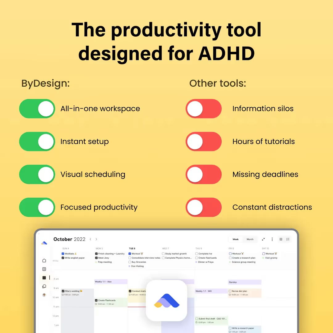
- Persona/identity callout: Call out who it’s for directly in the ad.
- “The productivity tool designed for ADHD”
- “CEO Starter Pack”
- “If you grew up in the 90s, you need this”
- Authority/credibility hook: Establish yourself as an expert in your field.
- “As a [doctor, scientist, 3x exited founder], I can tell you this works.”
- “We analyzed 10,000+ [X] and here’s what we found”
- POV hook: Make the reader feel like they’re part of the experience. Great for UGC style ads.
- “POV: It’s your first day at your dream job”
- “POV: You’re still using [outdated method], while everyone is doing this”
- Listicle: You can never go wrong with the classic structured list approach.
- “3 reasons why I’ll never do [x] again”
- “5 things you need to try out”
- “7 reasons why your marketing funnel isn’t working.”
💡 Pro tip: If you see a hook style you like but not a good example for your brand, copy the hook type and examples into ChatGPT/Claude/Grok, tell it a bit about your brand, and then ask it to generate 20 more ideas based on what it knows about your brand. Narrow in on what you like, then ask it to generate 20 more like the ones you like.
The visuals
The visuals in your ad are the first thing people see—they determine whether someone stops scrolling or keeps moving. Even with a strong hook, bad visuals can ruin an ad's performance.
Here’s how to make your ad visuals more effective, engaging, and high-converting.
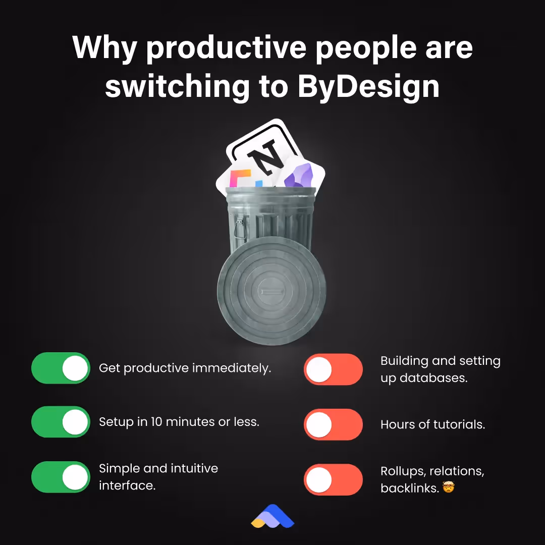
#1. Make It Instantly Understandable
People scroll fast. If your ad isn’t clear in 1 second, it’s too complicated.
The best ads make their value proposition obvious at a glance.
Example: Showing popular productivity apps in a trash can is far hookier than just showing an image of the product.
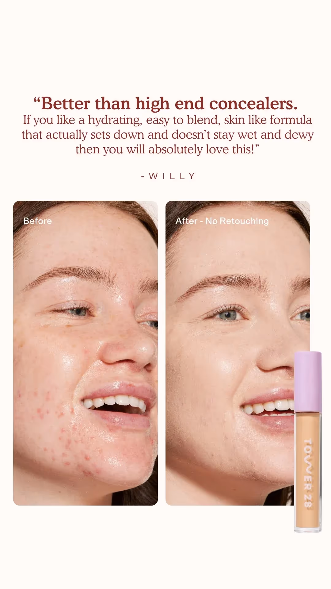
#2. Show, Don’t Tell
If your product solves a problem, literally show that problem being solved in your visuals.
A skincare ad shouldn’t just show a cream jar—it should show before-and-after skin transformation.
#3. Mimic Native Content
Your ad should blend into the platform it’s running on (TikTok, Instagram, Facebook, YouTube).
Ads that look like organic content tend to get higher engagement.
#4. Keep it clean & uncluttered
Too many elements = visual confusion = people skip your ad.
Less is more—focus on one key message per visual.
Here's an example where there's too much happening:
Here's a simplified version:

#5. Use contrast to stand out
Avoid muted or dull colors that blend in.
Bright colors, bold text, and clear subject focus = more visibility in crowded feeds.
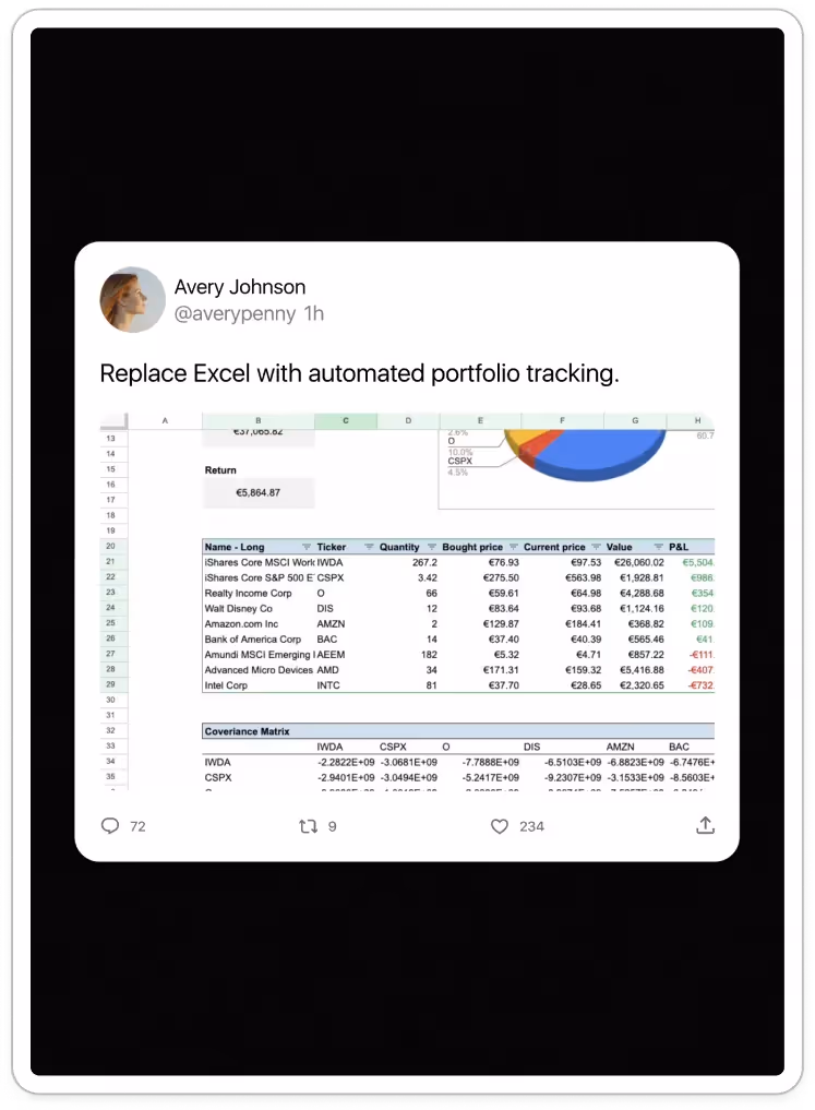
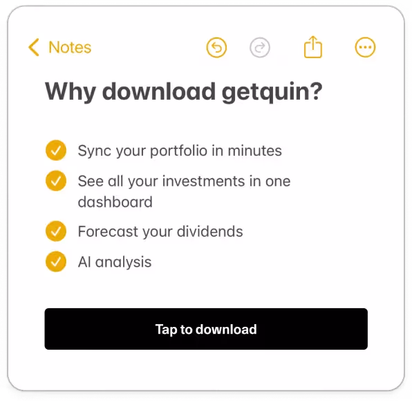
#6. Common interface hi-jacking
Use interfaces that people are already familiar with. If someone sees a text message exchange on their feed, they can’t help but stop and read it.
For example, Notes apps, text messages, slack threads, notifications, tweets, etc.
#7. Use visual hierarchy
What should be the first thing people read? Then the second? Then the third?
Bad visual hierarchy:

Everything is a similar size and is equally competing for your attention.
Different people will notice different things first.
Good visual hierarchy:

When you look at the above you'll first read the headline. That's because the image, logo, and filler text are all emphasized less.
This great reference really shows this off:
Here's a great table for Visual Hierarchy:
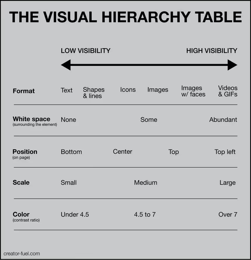
Make the most important things highly visible. Make the secondary things low visibility.
The CTA (Driving Action)
Here's an ad creative with a CTA:
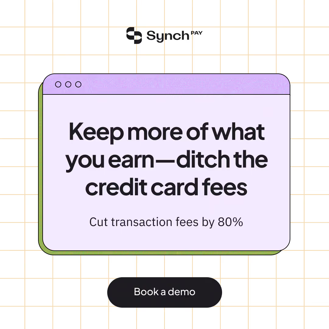
It's the "Book a demo" button at the bottom.
Not all ad creatives need a CTA, but they can help provide secondary information or push someone to the next action.
The Call-to-Action should be clear, concise, and compelling.
There should only be one CTA. What is the one action you want your users to take?
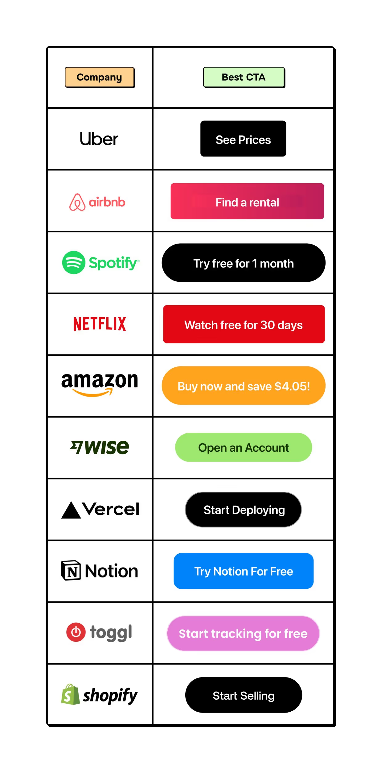
Examples of contextualized CTAs
Here are some CTAs contextualized to the specific companies:
Best practices:
- Use direct action words – "Shop Now," "Get Started," "Try It Free."
- Benefit-driven CTA – "Claim Your Free Trial Today."
- Create urgency – "Limited spots available – don’t miss out!"
Okay, now let's dive into the formats