Conversation


🥳 Feedback Received!
Thanks for taking a moment to share your thoughts — it genuinely helps us make each chapter sharper.
What happens next:
- Your feedback goes straight to our product team.
- We’ll use it to refine lessons, clarify examples, and make the program even more useful.
Appreciate you helping make this program better for everyone.
Ready for your next challenge? 👇
How to Create Quality Meta Ads
Check out the Ad Creative module for a deeper dive.
Your ad creatives are the most important part of your Meta ads strategy. That’s because they also handle targeting—as in, they help direct Meta's algorithm on who would be most likely to engage with your ad.
As discussed earlier, you should focus on testing a wide variety of ad creatives to find out what attracts users.
For Meta specifically, there are four important variables involved in creating good ads:
- Creative: The image or video used for your ad
- Copy: The words in and around the ad
- Audience: The specific group(s) of people you’re targeting
- The rest of the funnel: What happens after users click your ad
Here’s a look at some of these components.

You’ve probably seen some companies that take a more straightforward approach with their creatives, presenting their products exactly as is in their creatives. Then there are brands that create out-of-the-box ads, using more abstract imagery.
Which ads perform better? There’s no hard answer. Testing your Meta ads will require experimentation with all of the elements listed above. And you need to experiment a lot—don't expect to land on very affordable conversions with your first 5-10 ads.
For starters, we recommend creating ads that are very different from one another. See which one performs best. Then create more ads that follow the “winning” theme, and continue to test different variables along the way.
There are ultimately no hard rules for what makes an ad succeed on Meta. Our unit about Ad Creatives (specifically our lesson about Ad Design Guidelines) goes over important design principles, but here are several more best practices:
- Communicate a specific value prop. Show users how they’d benefit from your product or service. Some ideas here: feature happy customer testimonials as social proof, or show a before and after image of your product’s impact.
- Include a clear CTA. Users should understand what will happen by clicking on your ad—will they get a free sample or a discount off their total purchase?
- Note that for Instagram-specific assets, your creative copy is even more important since the ad text is less prominent (it appears below the creative instead of above).
- Speak to a specific user persona. Create ads with your target audience in mind—who they are and what they're looking for. Think of the key questions they might ask about your product, and then answer them in your ad.
- Create a sense of urgency. Motivate users to act on your ad immediately rather than giving them the room to second guess. Set a finite date of expiration or use a phrase like “Today only!”
- Use contrasting design elements. Contrasting colors make your ad more eye-catching. Your ads should stop users from continuing to scroll through their newsfeed or Stories.
- Include captions in your video ads. Since Meta ads don’t play with audio by default, captions help to get your message across silently.
Examples
Let’s look at some Meta ads to see what works and what doesn’t.
Here’s an offer ad from HelloFresh targeting churned customers.
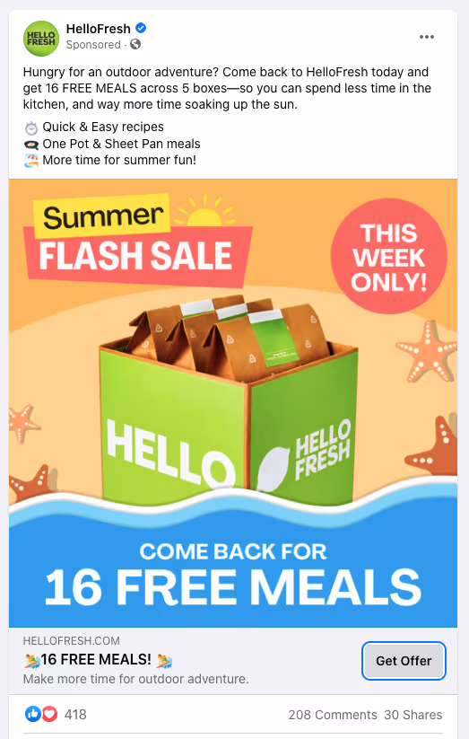
What makes this ad work?
- A bright, colorful summer theme ties the ad together and grabs users’ attention, with HelloFresh’s product displayed front and center.
- The body copy clearly communicates HelloFresh’s value prop: “less time in the kitchen, and way more time soaking up the sun.” It also uses emojis and short bullets in a quick, easy-to-read summary.
- The copy in the creative creates urgency—it’s a flash sale, and the offer is for this week only.
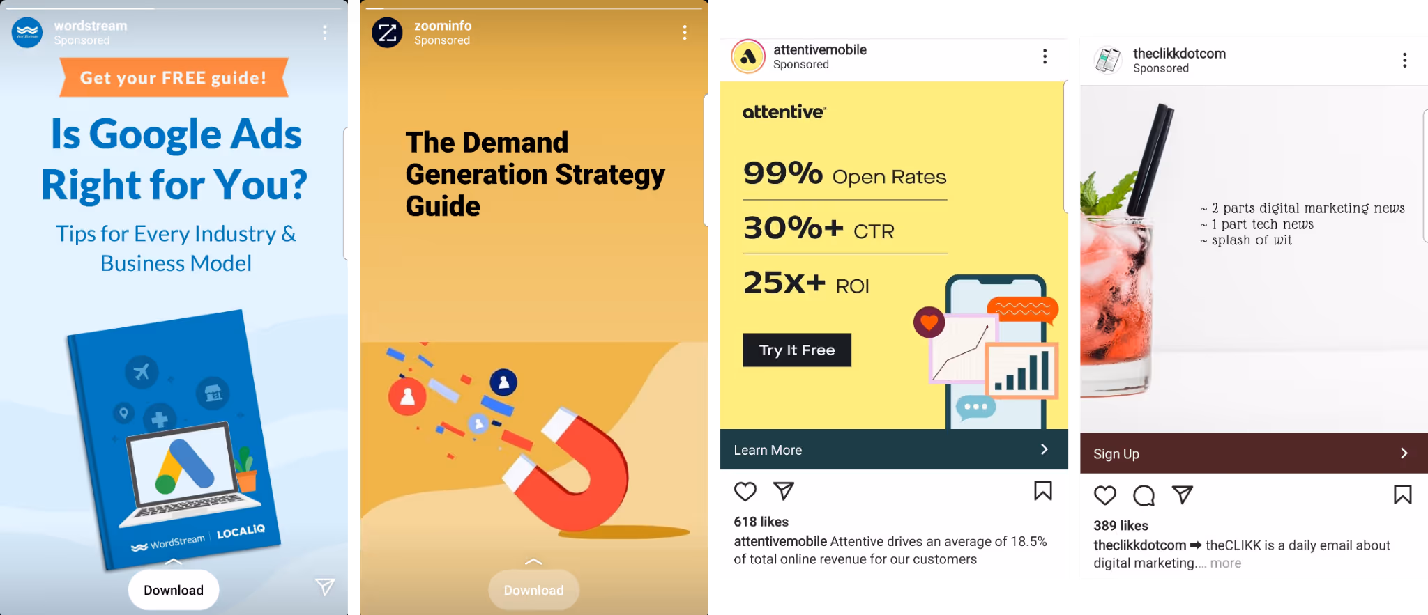
Now check out these prospecting ads from three different companies advertising some kind of scheduling software.
All three use a static image but take very different approaches.
- Left: The ad doesn’t visually hook users—there’s no illustration or graphic to pull users in. Instead, if they do stop to look at this ad, people must read several lines of text to get an idea of what it’s about. The red contrasting element in the corner might grab attention, but “New for 2021” doesn’t mean much without other context.
- Middle: The ad features a relevant calendar illustration that gives users a hint of what the company does. However, it’s not clear what exactly its main benefit is unless you read the surrounding ad copy. In this case, copy could be added to the image to spell out the main value prop and hook readers—ideally a short headline like “Free up your calendar!” Otherwise, users must stop to read the rest of the ad.
- Right: This ad is the best of both worlds: the creative shows a large headline above a relevant visual. The copy is short and simple (unlike the first ad’s), and the image clearly illustrates what the product does (Instagram scheduling).
Now take a look at this retargeting video from ClickUp using Instagram Stories.
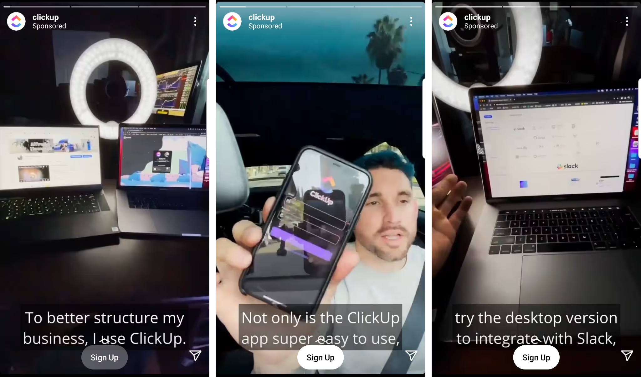
This ad works well because:
- It shows an actual human, who walks through how they use ClickUp. This feels a lot more relatable and engaging than simply showing screenshots of ClickUp’s software.
- A testimonial or quick product demo is especially useful for SaaS companies or products that need more explanation.
- It uses captions. Since sound doesn’t play by default on Instagram, captions help get your message across to viewers watching without audio.
- Watch out for the CTA button at the bottom of Stories. Ideally your captions are very clear and don’t overlap with this button, as they do in ClickUp’s ad.
Finally, a few examples of right column ads on Facebook from Superside (top) and Chargebee (bottom).
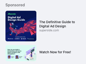
- Neither ad creative is 100% clear. Can you tell what company logos are in Superside’s ad? Or what the text says in Chargebee’s? The small image size makes them illegible.
- When including text in your ad, aim for fewer words so that they can be bigger and work for more ad placements. (Alternatively, create different versions of your ads for specific placements.)
- For Chargebee’s ad, no URL appears beside the creative—so users have no way of finding out what company is being advertised (or what you can watch for free) unless they click on it.
- A more descriptive headline like “Watch Chargebee's Free Webinar Now” tells users what they’ll get from clicking, all while fitting within Facebook’s 40-character limit.
Remember that the rest of the funnel, or what happens after someone clicks your ad, is just as important as the ad creative itself. Avoid simply leading users to your homepage—direct them instead to a very specific landing page that expands on the ad. Make it easy for visitors to take whatever next step you want them to.
For example, here’s a prospecting ad from the B2B sales tool Showpad and the page it leads to.
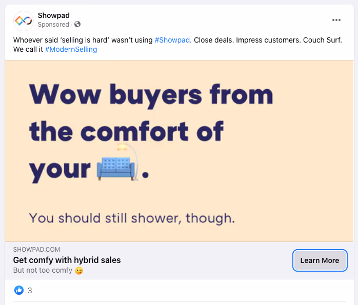
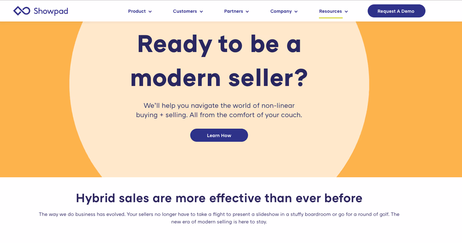
The ad leads to a landing page designed to educate users about hybrid sales. It’s a lot more informative than Showpad’s homepage, which features company logos and customer testimonials—elements that build social proof but don’t fully explain what Showpad does.
To increase your chance of getting conversions, send users to landing pages that build on the ads you’re serving, not your general homepage.