At our ads agency, we pulled performance across a bunch of accounts. We just looked at one thing:
“How many distinct ad creatives did this account test… and how well did it perform?”
And there was a really strong correlation:
- Accounts testing LOTS of meaningfully different ads had better CPA, higher ROAS, more stable performance.
- Accounts recycling the same 3–5 variations forever had chaotic results, random spikes, and fragile “winners” that died fast.
Meta’s Andromeda update basically hard-coded this reality into the platform. Targeting is commoditized and everyone’s running broad. Bidding is all automated and everyone’s on Advantage+.
The only edge you have left is creative.
(Ok, maybe not the only one, but one of the few).
Feed the system more distinct creative ideas and let it hunt for the perfect buyers.
Today’s newsletter is about what that actually means in practice:
- Why Andromeda rewards creative volume only if it’s meaningfully different
- The 3 neuroscience pillars of ads that actually work
- The anatomy of a high-performing ad: hooks, visuals, CTAs
- How to hold tension to win the click
Let’s get into it.
— Joey

Insense
Brought to your by Insense - Save 40+ hours on influencer + UGC campaigns
Their in-house team handles everything from:
- Influencer sourcing + campaign management
- Post-production - Andromeda-approved creatives
- Ideation and creative concepts
Join major brands like DRMTLGY, Revolut, OKX, and Flo Health who trust Insense for all their UGC and influencer marketing needs.
Book a free strategy call by Dec 12 for up to 10% OFF managed services.
Brought to you by Dreamdata
113% ROAS.
That's the return LinkedIn ads are delivering across Dreamdata customers, outperforming Google and Meta, and driving 36% of all SQLs.
But for B2B teams to capitalize on that performance, they need to know which specific companies are fueling those results. You can't optimize what you can't see.
Dreamdata integrates with LinkedIn Company Intelligence to eliminate the guesswork, revealing the exact companies engaging with and seeing your LinkedIn page content (both paid ads and organic posts).
This is how you turn ad spend into predictable revenue.
What the Andromeda Update Changed (And What It Didn’t)
Insight from Joey Noble — Demand Curve Creative Strategist
In the old world of Meta, you fought for advantages with hyper-granular audiences, lookalikes stacked in interests stacks, and constant tweaking of manual bid caps (and a lot more). The creative you were using just needed to not be terrible.
In 2025 (and beyond), things have changed. The algorithm is so good that you can just slap together a broad Advantage+ campaign and get better results than you’d get with the hyper-targeted strategy that used to work.
Now, creative is the only lever you still have full control over. Andromeda doesn’t “reward” you for testing more ads because Meta likes artists.
It rewards you because it’s a pattern-matching engine. It sees hundreds of signals: who engages with which creative, on which placement, at what time, with what downstream behavior. The wider and more varied your creative set, the more “surface area” you give it to find pockets of performance.
But here’s the thing: Meta doesn’t care how many files you upload. It cares how many distinct ideas you’re letting it test.
Cropping the same image slightly differently is not a new idea.
Changing a few words while keeping the same angle is not a new idea. (Take bigger swings first, test small word changes later)
And changing colors definitely won’t move the needle (most of the time).
From the system’s point of view, those are clones of the same ad. If you want Meta to actually help you, you need to feed it:
- Different hooks
- Different angles
- Different visual stories
- Different emotional triggers
If you test 30 creatives that all say “10% off, limited time” with the same product shot, you’re not leveraging Andromeda properly, and frankly won’t get any interesting learnings.
I’ve seen this play out so many times working as a creative strategist for Demand Curve’s ad agency. The ideas and strategies you’re about to learn come from that work — ads that have helped our clients generate millions in revenue, including YC’s VideoGen, which we 10x’d in under 90 days.
One of our top performers:
In this newsletter, we’ll tackle what makes up a high-performing ad and in my next one, we’ll tackle how to put this information to use.
With all that said, let’s dive into how to actually make high-performing ads.
What High-Performing Ads Have in Common
Consumer neuroscience studies keep finding the same pattern:
The ads that move markets score high on three dimensions:
- Attention
- Conversion to long-term memory
- Emotional engagement
Your job is to design creatives that hit all three.
Attention: Familiarity + Peculiarity
In a feed, your ad has ~0.3 seconds to answer, “Is this worth not scrolling to the next dopamine hit?”
What captures attention best is familiar-but-unexpected:
Familiar:
- Interfaces people know (texts, Notes app, tweets, Slack threads)
- Everyday settings (bathroom mirror, kitchen counter, Zoom call)
- Faces, hands, physical objects
Peculiar:
- Something off-pattern inside that familiarity
- A weird angle, a handwritten scribble, a jarring statement, an ugly Post-it, a meme
That’s why a quick iPhone video in a messy kitchen often outperforms the polished studio shot or a fake “Notes app” screenshot with a contrarian statement hooks harder than a glossy brand graphic.
Long-Term Memory: Peculiarity + Structure (and Often Humor)
The ads that keep paying you are the ones that are easiest for people to remember.
Memory is biased toward distinctiveness (this ad doesn’t blur into every other ad), coherent structure (the brain can retell the “story” in a sentence), and often humor (emotionally charged and shareable).
That’s why a single, sharp analogy (“It’s like Duolingo for addiction”) sticks, or a vivid testimonial line like, “My friends thought I’d had a facelift” outperforms a paragraph of benefits. Your ad creative can technically be designed beautifully, but if it doesn’t visually and narratively hook you, it’s still forgettable.
Emotional Engagement: Humor, Relief, Desire, Fear
People don’t convert because they processed your features spreadsheet.
They convert because your ad made them feel relief (finally, someone gets my problem), hope (this might actually work for someone like me), desire (I want that before/after state), FOMO (other people like me are already getting the benefit), or amusement (this brand “gets” my world).
Humor shows up repeatedly in the research because it lowers defenses, increases sharing, and it makes your brand feel human, not corporate.
And Meta’s job is to optimize delivery. Your job is to feed it creatives that trigger actual human responses along these three axes.
Hooks & Angles: The First Battle You Have to Win
At our agency, I always try to put myself in the shoes of my prospect. What are they doing in the moment they come across my ad?
They’re probably on the couch, half-watching Netflix, half-scrolling Instagram. Or they’re between calls, flicking through LinkedIn. Or in bed, doomscrolling TikTok while their partner yaps about the argument they overheard at the local grocery store.
Your ad is an interruption.
The hook has two jobs:
- Make them stop.
- Make them curious enough to keep watching/reading.
And the angle has one job: frame your product as the most compelling way to solve a specific problem or desire.
Great ads pair a sticky hook with a sharp angle.
Heres a sample of hook types that we’ve found reliably work, plus the kind of angle they pair best with. If you want to see the full table you can view here for free.
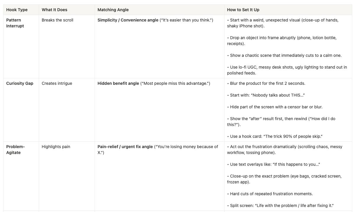
Concrete examples:
- Curiosity gap: “Nobody’s talking about this, but it’s quietly saving people $1,200/mo.”
- Problem-agitate: “Still waking up at 3 a.m. panicking about money? There’s a smarter way to plan your cash flow.”
- Us vs. Them: “Old way: 10 tools and 17 tabs. New way: one dashboard that actually makes sense.”
- Persona callout: “If you grew up in the 90s and your back hurts every morning, read this.”
When you’re feeding Meta, don’t test 50 copy variants of the same hook, test 5–10 radically different hooks on the same core outcome.
Visuals: What Can Make or Break Your Ads
You can have a world-class hook and still tank performance if your visuals fight against it.
Here’s the short list of visual rules that matter.
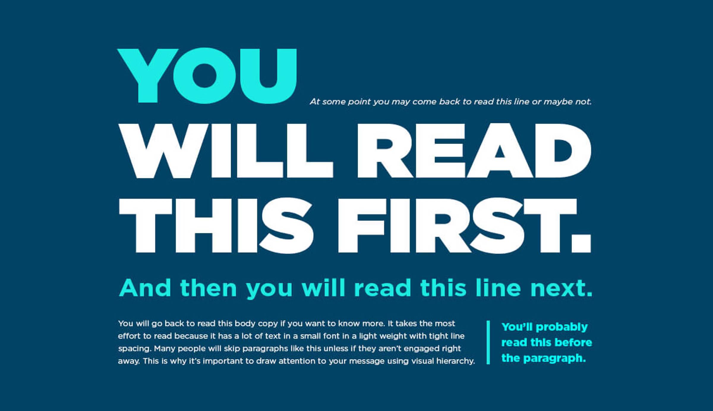
Make It Instantly Understandable
If someone can’t tell what this is about in 1 second, it’s too complex. You want one core idea per creative, one main visual subject, and one headline that actually says something.
Bad: showing a bottle of acne cream and talking about all of the scientific benefits
Better: showing the before and after of a pimply face to a clear face
Show, Don’t Tell
If your product solves a problem, show that problem being solved.
- Skincare: before/after faces, not jars on a white background.
- B2B SaaS: dashboard with an actual “Oh wow” number highlighted, not abstract graphs.
- Fitness: side-by-side “day 1 vs day 30,” not just a photo of a protein tub.
Mimic Native Content
Your ad shouldn’t scream “ad” at first glance.
- On TikTok: vertical, full-screen, people talking to the camera, native text overlays.
- On Instagram: static carousels, Notes app screenshots, tweet screenshots, selfie + text.
- On LinkedIn: simple stat graphics, quote tiles, clean carousels.
The more it blends with what your prospect is already consuming, the cheaper the cost of attention becomes.
Keep It Clean & Uncluttered
Too many elements create visual noise. Your prospects will scroll on by. That means remove decorative fluff that doesn’t help the message, use whitespace, and make one element clearly dominant.
Use Contrast to Stand Out
You’re not just fighting other brands. You’re fighting brain rot, babies, cats, memes, and friends’ selfies. Stand out with bold colors, strong shapes, and clear focal points. Avoid low contrast at all costs.
Common Interface Hijacking
Hijacking familiar interfaces is one of the easiest wins:
- Text message screenshots
- Notes app entries
- Slack threads / email threads
- Tweet screenshots
- Notification pop-ups
It works because the brain is already trained to stop and read these.
Visual Hierarchy
Decide exactly where you want the eyes to go:
- Main headline / core promise
- Supporting visual / proof
- CTA or next action
Make that order visually obvious:
- Biggest, boldest element = headline
- Secondary brightness/size = product visual or proof
- Tertiary = logo or CTA
If everything is shouting, nothing is heard.
CTAs: Don’t Overthink Them
CTAs aren’t the star of the show, but they do nudge action.
Principles:
- One ad = one CTA. Don’t offer five different actions.
- Use direct verbs: “Book a demo,” “Start a free trial,” “See how it works,” “Get the guide.”
- Where possible, bake the benefit in:
- “Start a free trial” → “Start your 7-day free trial”
- “Download” → “Download the 3-step playbook”
And remember: sometimes the “CTA” lives in the creative itself (big “See inside the app” overlay) more than the button.
Tension: The Final Piece
So far, we’ve talked about hooks, angles, and visuals.
There’s one more layer that’s often overlooked and decides whether any of the above pays off:
How long can you hold tension without ruining it?
Think of your ad like a horror or mystery movie:
- The hook is the cold open.
- The angle is the underlying story.
- Tension is you not explaining everything in the first 30 seconds.
Most ads die because they over-explain way too early. As my boss likes to say, they pop the balloon.
Outcome vs. Mechanism – Where People Mess Up the Most
The core rule: In your ads, you dangle the outcome, not the mechanism.
I’ll never forget when I was first writing ads for our Growth Program, I wanted to be as direct and outcome-focused as possible.
I wrote: “Learn to profitably acquire customers by figuring out which 1–2 channels to focus on.”
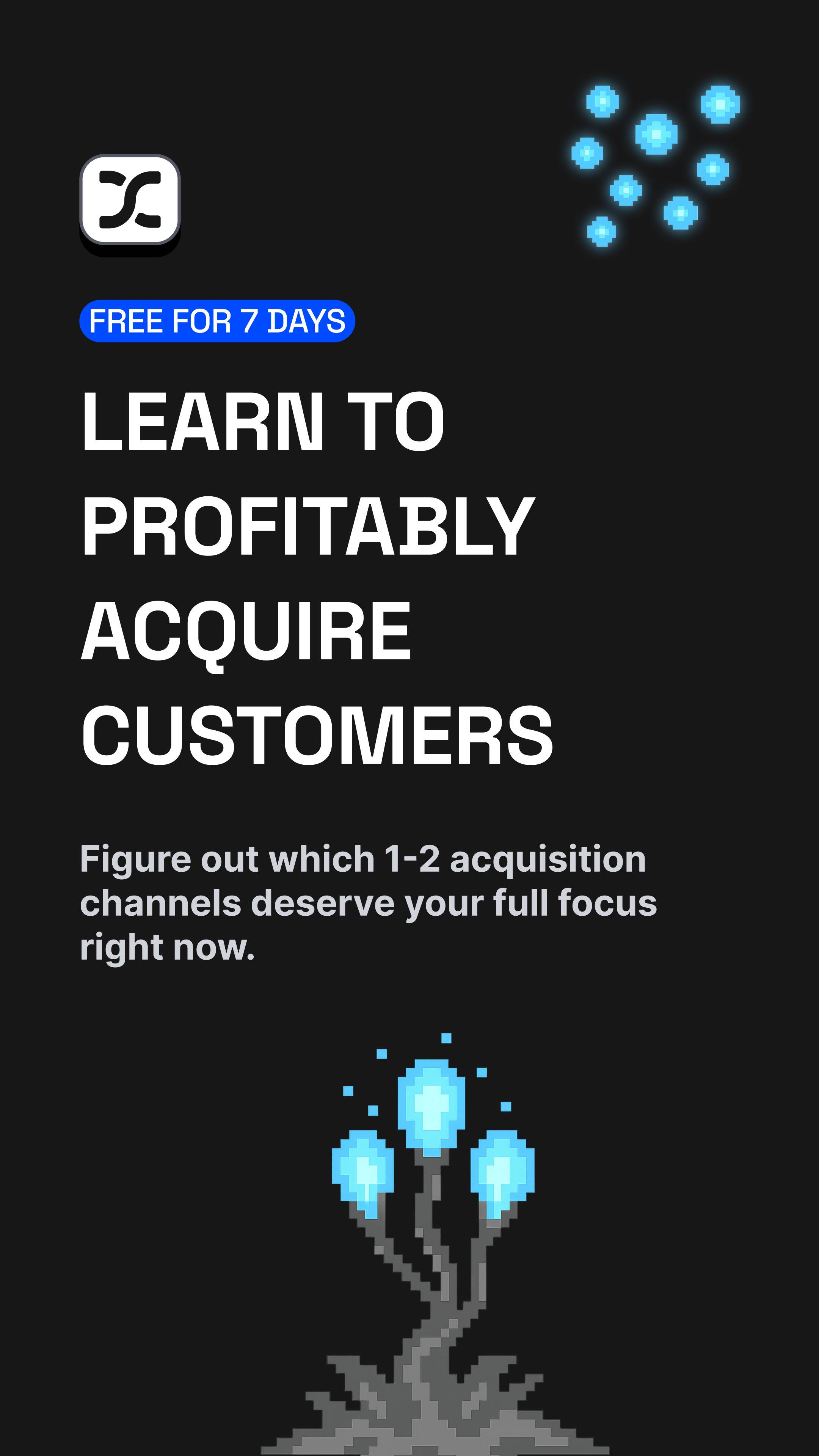
But when our CEO was reviewing them, he told me that I popped the balloon. I gave away all the sauce: profitably acquire customers and the mechanism: we help you narrow in on 1–2 channels.
There’s no mystery left. The reader goes, “Oh, okay, yeah, I’ve heard that before. I could probably ask ChatGPT about that.”
Here’s a better pattern that keeps the balloon inflated:
Headline: “Learn to profitably acquire customers.”
Subheadline: “Most startups waste months chasing the wrong channels. We’ll show you what to do differently”

Now I promised the outcome (profitable customer acquisition), hinted at the problem (wrong channels, wasted months), and didn’t reveal how the system actually solves that.
The curiosity is still intact. The “reveal” is pushed downstream to the LP, the VSL, the email. Where it belongs.
Your Audience Should Be Asking Questions, Not Nodding
Good storytelling makes the reader ask questions they don’t know the answer to.
Bad storytelling fills the ad with statements they already understand:
- “You need to pick the right channels.”
- “You should align your channel with your business model.”
No shit. Everyone knows that. There’s no tension there.
Instead, you want lines that create new questions:
- “There’s a reason some startups scale fast and others just spin their wheels.”
- Okay, what reason? Which bucket am I in?
- “Most founders follow a growth playbook that almost guarantees they stall out around 100 customers.”
- Wait, is that me? What’s wrong with the playbook?
You’re not dumping your framework into the ad. You’re naming the existence of a different way, and then stopping.
Don’t Shrink Your Value to One Boring Tip
Another subtle way I subtly killed tension when working on the ads: I summarized a complex system into one generic line in the ad.
For example:
“We built a system that shows you exactly which channels fit your business model.”
Two problems:
- I popped the balloon again. The “secret” is now “fit channel to model.” Now our prospect might think that’s something they can figure out easily (pro tip: it’s way more nuanced than what ChatGPT will tell you).
- I accidentally shrunk the perceived value of your system. It now sounds like one trick, not an in-depth process. Figuring out which channels fit your model is one of MANY jobs-to-be-done we solve.
Afterwards, I workshopped some stronger versions:
“We built a system that finds the fastest path to your first 100 customers.”
“Most founders keep swapping channels. The best ones engineer their growth stack on purpose.”
Still true. Way more tension. No mechanism revealed.
Where to Stop the Sentence
Learning the micro-skill of where to stop your copy is what really helped me upgrade my skills.
Take this basic ecom story:
“You’ve probably tried three different ‘miracle’ moisturizers this year.
For most people, week 2 is where everything falls apart…”
Stop there.
If you keep going:
“…because the real problem is your skin barrier, so you need to use our 3-step routine with X, Y, and Z ingredients…”
You’ve just explained the trick. You made it sound like something they can go copy with whatever’s already in their cabinet. This kills the urge to click through and see what’s actually different about your product.
Same thing for B2B:
“Most teams think they have a traffic problem.
The ones who grow fast usually have a completely different bottleneck…”
Stop there. If you add:
“…because their real issue is lead-to-opportunity conversion, so we help them redesign their entire pipeline with our 7-step framework…”
You turned a sharp, tense statement into a LinkedIn carousel bullet. The mystery’s gone.
The ad’s job is not to teach your entire framework.
The ad’s job is to make “I need to see the rest of this” feel inevitable.
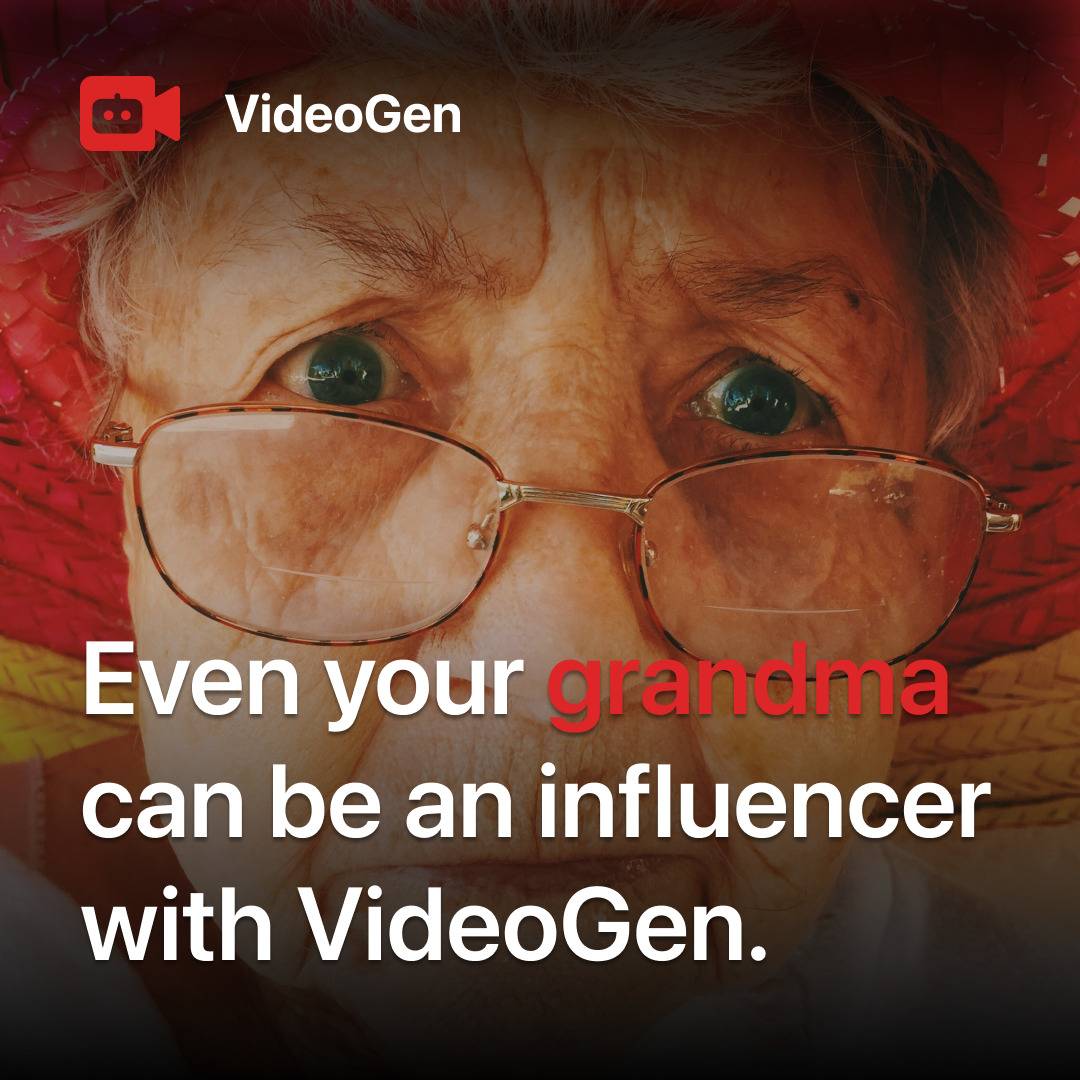
Let’s revisit my top performing ad from before:
This ad doesn’t pop the balloon because it only reveals the outcome (your grandma can be an influencer), not the mechanism (how VideoGen makes that possible).
The reader is left asking:
- Wait, how does my grandma become an influencer?
- What does VideoGen actually do?
- Is this real or just a provocative claim?
If it popped the balloon, it would say something like:
“Even your grandma can be an influencer with VideoGen’s AI video generator that turns text into professional videos in minutes.”
Now the mystery is gone. The reader goes “Oh, it’s an AI video tool. Got it.” No curiosity left.
How This Looks in Other Categories
Skincare / beauty (ecom)
A weak example might look like, “Clear your acne in 30 days with our 2-step salicylic acid system.”
You just told them the “system” is some ingredients they’ve seen in 50 other products.
A higher-tension version could be, “Why your skin always looks worse right after you ‘fix’ it.” or “Most routines make you feel better for a week, then nuke your progress. Here’s how people avoid that.”
Outcome = better skin.
Intrigue = “worse after you fix it”, “avoid that”.
No ingredients, no routine breakdown. That comes after the click.
Local service / gym / studio
Weak:
“Lose weight with our 6-week bootcamp.”
Mechanism is right there: bootcamp, 6 weeks. Generic.
Stronger:
“Most people quit in week 3. We built our entire program around that wall.”
“If you’ve fallen off every time you’ve tried, this is built for that moment.”
Now the story is about why week 3 is the danger zone and what you do differently there. That’s the reveal later.
Courses / coaching
Weak:
“Learn to scale your agency using our 5-step client acquisition framework.”
Sounds like every other “5-step” thing.
Stronger:
“Two ways agency owners try to grow: buy growth or wing it alone. There’s a third option nobody talks about.”
The third option is the tension. You don’t explain it in the ad. The click “buys” that explanation.
The “Don’t Pop the Balloon” Checklist
When you look at your ad copy, ask:
- Am I promising the outcome… or explaining the mechanism?
- Did I name frameworks or concepts… and then immediately define them to death?
- Does the subheadline add intrigue or quietly solve the puzzle?
- Could a smart reader walk away thinking, “Cool, I got the gist, I’ll just try that myself”?
If yes, you popped the balloon.
Quick fixes:
- Replace “how” lines with “why this matters” lines.
- Swap explanations for contrasts:
- “Two ways founders try to grow…” → “There’s a third way that combines the upside of both.”
- Cut any sentence that feels like it belongs in a lesson or module. Save that for the landing page or email.
Your best-performing ads will usually feel, when you read them back, like they’re holding something back on purpose.
Demand Curve Ads Agency
If you’re reading this thinking, ‘I understand the theory but have no idea how to apply this to my business,’ that’s exactly what we do at Demand Curve’s Ads Agency. We diagnose your specific bottleneck, figure out which hooks and formats will actually move the needle, and run the whole testing system for you. We’re opening a few spots for 2026—book a free strategy call with our senior ads team to see if we’re a good fit.
Conclusion
If you treat Meta like a lottery, Andromeda will happily set your budget on fire.
If you treat it like a creative lab—where your job is to ship more genuinely different ideas every month and learn from each—you’ll get compounding gains that most competitors will never see.
Next step for you:
- How many ideas are you really testing… and how many are just superficial tweaks?
- Pick 3–5 truly different hooks from the list above.
- Pair each with a strong, simple visual and a clean CTA.
- Don’t pop the balloon too early.
- Launch them side by side and let Andromeda do what it does best.
You handle the creativity. Let the machine handle the rest.
Joey Noble
Demand Curve Creative Strategist
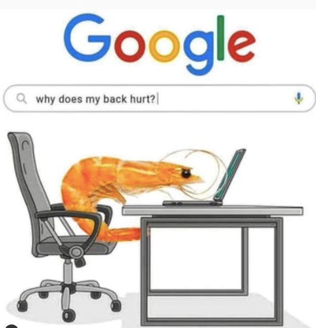
Something fun
Me asking Google why my back hurts while sitting like a boiled shrimp. From Cheezburger.