

The Tactics Vault
Each week we spend hours researching the best startup growth tactics.
We share the insights in our newsletter with 90,000 founders and marketers. Here's all of them.

Should You Take the Content Creation Plunge?
Insight from Gil Templeton — Demand Curve Staff Writer
Before we get into it, let’s level-set. You do not have to regularly create content. It’s a tall order, and it’s not for everyone (or every company). It can help you grow, but it’s not mandatory. And it’s a choice that requires lots of consideration.
So let’s say you’re at a traction-stage startup, and you’re working toward a major launch in a couple of months. There’s a great chance your time will be better spent on more valuable tasks.
All that said, if you DO commit to content creation (or you’re already married to the content game), please take the oath below, for your sake and your sanity.
Say it with us:
“I will not make bad content.
I will not make thinly veiled ads for my company.
I will not jump on trends that have nothing to do with my brand.
I will not push out filler to appease an arbitrary cadence or calendar.
I will not use AI slop in the place of original, interesting ideas.”
Because the worst thing you can do is commit real time and money to content creation, then fall straight into the trappings of bad content.
Remember, you aren’t competing with other founders or startups here. You’re competing with MrBeast, hilarious stand-up comedians, mind-melting guitar prodigies, nostalgic sports highlights reels, political rage-bait, thought-provoking articles from professional writers, insanely attractive people, and a million other things people can’t stop looking at.
So the bar for worthy content isn’t “good for a founder.” It’s “good enough to stop someone in their tracks.”
This might not be mind-blowing information, but if you look at the vast majority of content coming from businesses and founders, it’s completely unremarkable and not worth the trouble. So let’s promise not do that.
Budgeting Your Time & Effort
As Yoda once said, “Do or do not. There is no try.”
In that spirit, content creation is something you’ll need to commit real hours and intentions to. No half-assing. Whole-assing only.
In our opinion, you should start by committing 10+ hours a week (that number includes time spent by editors or contributors) for a test period of six months.
So whether you earmark one day of the workweek solely for content, or a solid hour + each day, you need to set time aside for it.
A breakdown of what those hours might look like:
40% Creating: Writing scripts, filming videos, recording a podcast, writing long-form blogs or newsletters, etc. The actual making of content.
30% Editing and Polishing: Tightening copy, cutting videos, editing photos, designing thumbnails, or working with an editor.
20% Distribution: Posting, repurposing to other channels (only after you have one down pat), formatting, scheduling, engaging.
10% Analysis and Experimentation: Reviewing what’s working, tweaking your approach, feeding your head with good examples that help you steal like an artist.
Knowing this is a serious investment, don’t keep going ad infinitum if you aren’t seeing measurable gains.
If after six months, you aren’t seeing signs of traction (no steady growth in views, no big uptick in followers, and no measurable lift in KPIs like leads, sign-ups, or sales), then it’s worth pausing and reconsidering. Content is an investment, but if it’s not compounding into results, it’s a distraction.
Watch-Out #1: Effort ≠ Performance
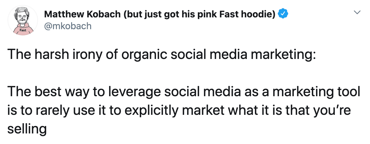
About a month ago, my dear friend, coworker, and collaborator at Demand Curve, Kevin DePopas, dropped a certified banger on LinkedIn that went “viral” by all measures.
It wasn’t a polished, produced video or a post that was months in the making. It was a lo-fi funny photo, paired with a caption that parodied the overwrought AI-inspired posts flooding LinkedIn. He said it maybe took 30 minutes to make.
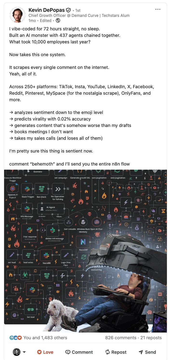
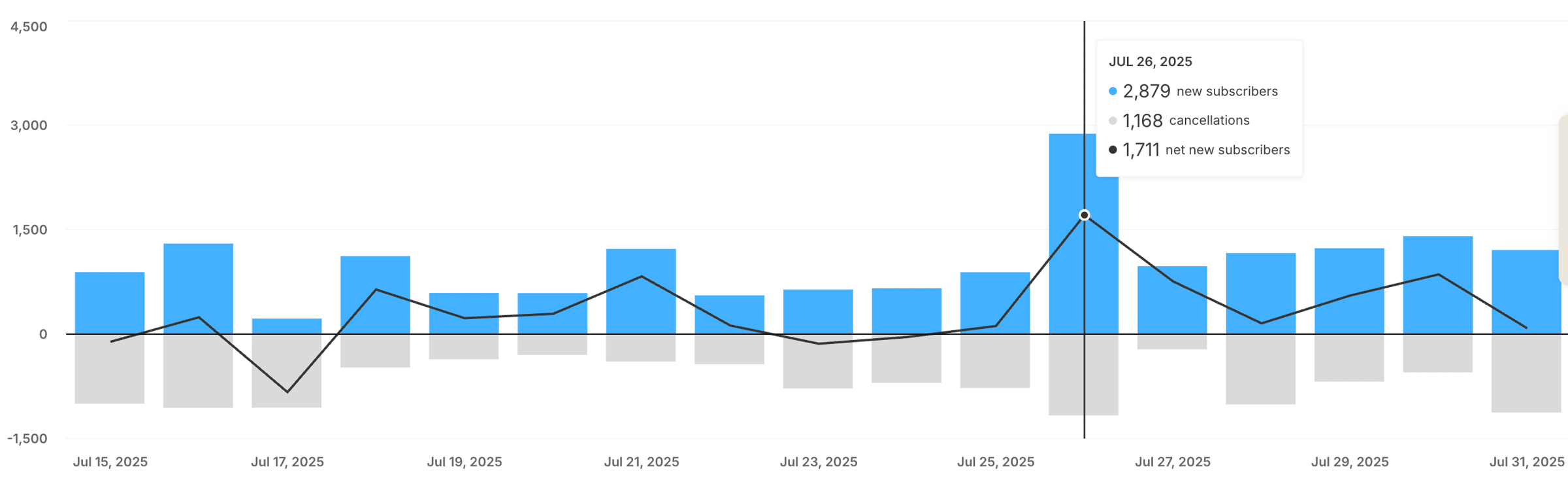
The result was tons of engagement (826 comments!?) and a visible spike in Growth Newsletter sign-ups the day he posted it (July 26) and the days following, presumably from viewers being brought into the fold via his post.
Now compare that with this video he produced around the same time. It had a solid script, professional editing, well-designed graphics, hours of labor, and an actual budget. It got 27 measly likes, ultimately a “flop” considering the significant effort.
This is one major paradox of content creation; More effort doesn’t equal more impact.
Distribution is governed by unpredictable algorithms, human psychology, and good ol’ fashioned luck. A post you fire off from the back of an Uber at midnight might outperform your professionally produced quarterly campaign. You won’t know until you know.
So if you find you’re pouring money into a low-engagement video content series, say $1,500 for an editor, $1,000 for design work, $1,000 on equipment or studio time, and a handful of valuable team hours, it’s worth comparing that with what $5,000 in Meta ads could get you.
At Facebook’s current cost per click (CPC) rates ($0.89 or so), that same $5,000 could drive more than 5,600 visits to your website. That’s likely way more valuable than 50 likes, a couple new followers, and maybe a few website visits.
If the ROI isn’t there on your organic content production, you’re probably better off treating it as an experiment and putting those dollars into paid reach instead.
We’re not saying you shouldn’t invest in polished, produced content, but it’s an experiment that requires validation to justify a continued effort and budget. Which brings us to our next point…
Watch-Out #2: Don’t Go Deep Before You Go Wide
Until you know what actually resonates, do not continually repeat or double-down on anything.
Think about this like baking a batch of cakes. If you were a baker trying out a new recipe, you wouldn’t bake ten cakes at once using this one unproven recipe.
A smart baker would experiment with one cake at a time. And only once they were happy with the results would they make a big batch.
So don’t be precious until you have actual traction. Try different tones, formats, and hooks until something sticks.
Once you see an uptick (whether that's engagement, shares, conversions, etc.) lean into it. Hard. Ride the S-curve, and repeat what works again and again until you see diminishing returns. It might seem lazy, but it’s actually good discipline.
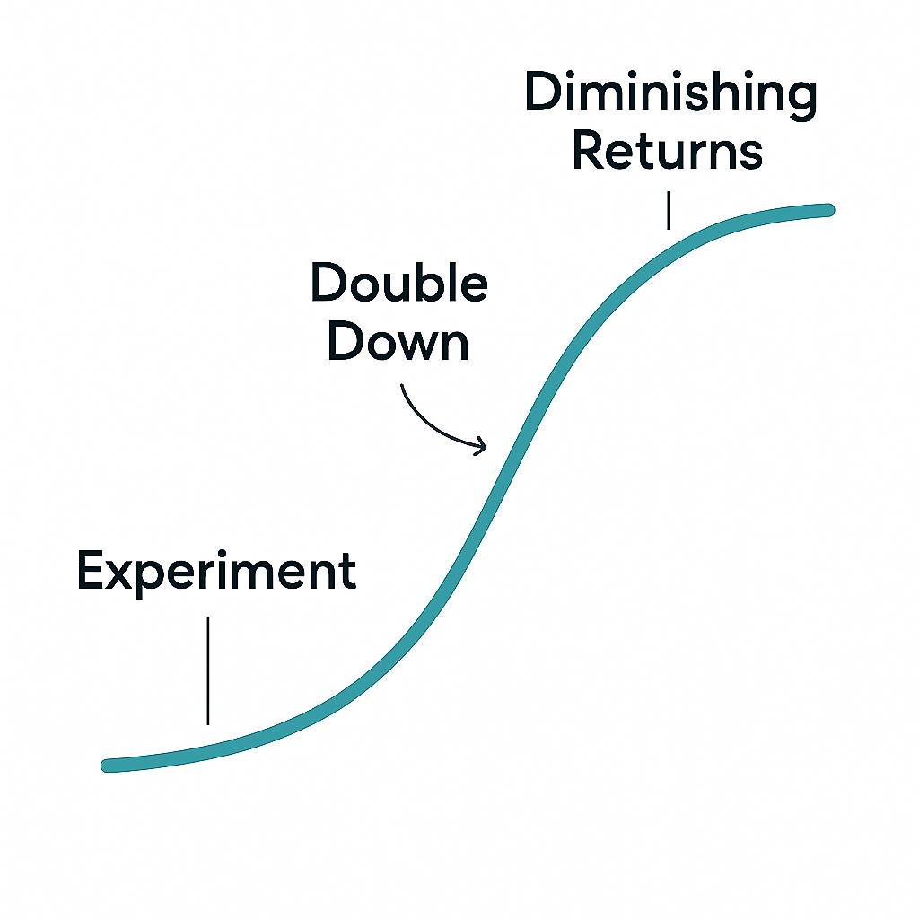
Once you have a certain format, tone, hook, etc. that’s working for you, make 80% of your content follow this exact approach, while saving 20% of your content for continued experimentation.
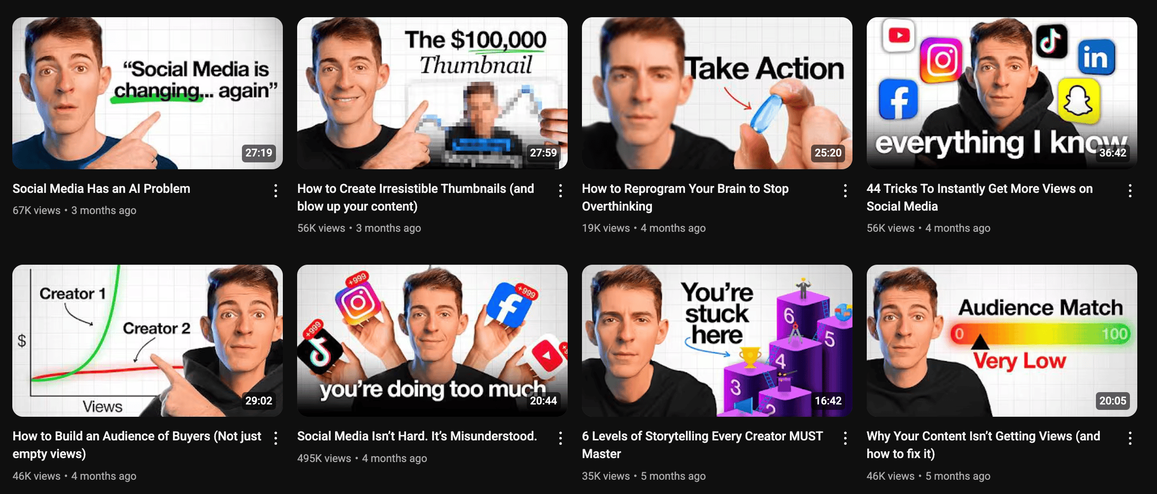
Many successful creators thrive by delivering the same proven style again and again. Look at these videos from creator Kane Kalloway on YouTube. Similar thumbnails, similar video length, similar video formats.
Another important note in this same spirit: make sure you gain traction on ONE platform before you try to show up everywhere.
That being said, when you’re in the “experiment” stage, make sure you’re trying different platforms, too. Don’t insist on creating YouTube content if it’s not gaining traction. Your videos might be stronger as Reels or TikToks. Again, you won’t know until you try.
The Takeaway
This is by no means an exhaustive guide on how to make great content (but for deep, tactical guidance on content marketing, our Growth Program 2.0 can help).
This is merely a way to help you decide whether a focused content creation effort is worth it for you, and to show you a couple high-level tips to keep you out of the tricky content quagmire if/when you do take the plunge.
If you’re going to commit, commit fully. And don’t be too precious with your approach or channel until you’ve got something that’s clearly working for you.
So experiment, double down, and repeat, until you're finally making content to your heart's content.
Gil Templeton
Demand Curve Staff Writer
Become a better marketer, in minutes.
Join 90,000 founders and marketers getting actionable, no-BS startup growth marketing advice each week.
Should You Take the Content Creation Plunge?
Insight from Gil Templeton — Demand Curve Staff Writer
Is It Time To Revisit Your Tagline?
Insight from Gil Templeton — Demand Curve Staff Writer
For all the changes in marketing and branding over the last several decades, the merits and tenets of a strong tagline remain largely unchanged in my book.
Your tagline should convey the greatest value you offer in a way that’s clear, differentiated, and emotionally resonant with your target…which can be a tall order to pack into five-ish words or fewer. That’s why it usually takes careful consideration and lots of iteration to get to a winner.
A good tagline is becoming more valuable as a way to differentiate in the increasingly competitive small business space. It can help you be a consistent, focused signal among the growing noise in your category.
For startups and smaller businesses, I’d urge you to lock down on one consistent tagline across messaging efforts. Some household brand names (who pay for lots of TV ads) might use short-lived campaign lines or wrap lines for a campaign or quarter. But for lesser-known companies with smaller marketing budgets, diverting focus tends to dilute your message.
There aren’t exactly hard-and-fast “rules” for when to use a tagline, but think of it like your company’s shortest boilerplate message. In those instances where you’re making a first impression or leaving people with one key takeaway, you can default to your tagline.
You can use your tagline in your:
- Hero logo lockup
- Ad campaigns
- Web headers and meta descriptions
- Signage at a trade show or conference
- Email signatures
- Social bios
- Product packaging
- Branded swag
- Loading screens or video intros
- Pitch decks
- Business cards or letterhead
How to Assess Your Current Tagline
If you already have a tagline, check yours against this basic criteria to see if you have a winner, or if you need to reconsider. This is an admittedly subjective topic, and there are outliers that might work well, but these three questions are here to serve as your sounding board and keep you honest.
1. Is your tagline clear?
This doesn’t mean it has to describe your company or call out your industry, but it should convey what you make possible, what you can make go away, or the shift someone feels after using you.
It should be focused and specific. Ask yourself (or better yet, ask someone else) “Does this convey the general gist of the value we provide?”
Taglines for a meal kit service:
Clear example: Solve dinner in 15 minutes.
Unclear example: Redefining how people eat at home.
Takeaway: The clear example conveys the benefit (saving time) and lets readers gather that it’s a meal kit/prep service. The unclear example is a grandiose nothing-burger that requires more context for any clear takeaway outside of “food.”
2. Does it differentiate the company?
This doesn’t have to be (and usually isn’t) an explicit claim, but it should either convey your unique POV or hint at what makes you unique inside the competitive set.
Ask if your closest competitor could credibly use your same line. If so, it’s probably not defensible. Differentiated taglines highlight a well-defined stance, benefit, or use case.
Taglines for a plant-based snack brand:
Differentiated example: Crave junk. Eat plants.
Undifferentiated example: Snacks you can feel good about
Takeaway: Differentiation in a tagline does not need to mirror your UVP or be a competitive message. The first example here is differentiated, simply because it takes a stance that feels unique, bold, and conveys their value for a specific use case. The bad tagline could live (and probably does live) across hundreds of brands.
3. Does it stir up an emotion?
The best taglines hit you in the gut. The easiest way to test it is by asking whether it makes a reader feel something beyond sheer understanding or comprehension.
It doesn’t have to make someone “emotional.” But ask yourself: Does it excite? Spark curiosity? Make them feel seen? Create a sense of connection? Provide a sense of relief? Make them proud? If your tagline does something like this, it’s pulling the emotional lever.
Taglines for a farmers’ market collective:
Emotional example: Know the folks feeding you.
Emotionally empty example: Farm-fresh food every week.
Takeaway: The strong example evokes a sense of deeper connection and delivers on that natural human desire. The weak example reduces the product(s) to a commodity with descriptive, emotionally empty copy.
(For more on avoiding descriptive copy and instead answering “What’s in it for me?” to your audience, see a fan-favorite Demand Curve resource here.)
Now, to evaluate your tagline:
Most good taglines can only deliver on one or two of these in spades. So instead of asking, “Does my tagline totally nail all three of these?” ask yourself, “Does it nail at least one of these really well? And do I avoid the common pitfalls of being unclear, undifferentiated, or emotionally flat?”
So if your tagline is clearly violating one of these no-nos (lacking clarity, sounding like anyone else, or being devoid of emotion), you should consider updating it.
In that same spirit, if your tagline doesn’t pull at least one of these three levers in a major way, you might want to try for a new one that does.
Tips for Writing a New Tagline
I’ll caveat things again by saying: there are many iconic and enduring taglines that violate a tip or two below, so think of these like general best practices to help you get to solid ground.
For your starting point, ask yourself what feeling, promise, or change you most want to embed in someone’s head. A tagline’s job is to convey your value in a few memorable words, so begin by exploring the core benefit, belief, or transformation your brand makes possible.
A lot of startups don’t have the luxury of mass brand awareness, so the rules here are slightly different than those for household names. For startups and smaller businesses in need of a hardworking, helpful tagline, follow these general tips when writing yours:
Tip 1: Make it as punchy as possible
As a copywriter who’s written lots of taglines over the last decade, I’ve noticed there’s a natural ceiling at about five words. A tag longer than five words is harder for people to repeat or remember, and it will likely pose issues down the road (your logo lockup, fitting into small spaces, lower recall, etc.).
But this doesn’t necessarily mean, “See what you can do in five words.” Try to get it down to three or four if possible, and judge every word as “guilty until proven innocent” to ensure it’s working hard for you. Your word count and character count are precious here. Make every one count.
To make your tagline as short as possible:
- Remove any qualifier words (really, truly, more, better, innovative, modern, etc.) that aren’t mission-critical.
- Ditch the throat-clearing setup words (“Helping you…”, “Designed to…”, “Making it easier to…”).
- Swap phrases for single words where possible (“Get rid of” → remove; “Move faster with” → accelerate.)
Example A: Payroll Software Company
Too verbose: Simplifying the way you pay employees.
Punchy: Make payroll stupid-simple.
Example B: E-Commerce SaaS
Too verbose: Sell your products across every channel.
Punchy: Sell everywhere.
Tip 2: Be singular
Your tagline should only make one point. You might be tempted to load it with multiple benefits, audiences, or ideas, but that will likely dilute your message.
A great tagline shines a bright spotlight on just one promise or benefit. Be so sharp and focused, the reader instantly knows what to take away.
Example A: Healthcare payment platform
Too scattered: Easier payments for doctors and patients
Singular: Simplify every care payment.
Example B: Fitness App
Too scattered: Track workouts. Count calories. Build confidence.
Singular: Get healthier every day.
Tip 3: Be actionable
There are plenty of great taglines that don’t do this, but using the imperative case and instructing people to do something is generally a strong approach; It’s certainly not THE only way to write a tagline, but it tends to keep you on the right track.
Some all-time classic taglines like “Think Different,” “Open Happiness,” and “Just Do It” embrace this angle to make their point.
You’ll notice I’ve naturally been doing this in my examples (taglines that begin with words like solve, crave, know, make, sell, simplify, get.)
Being actionable can do you several favors:
- It makes your tagline a call-to-action in itself, giving readers something to do or become instead of just giving them an idea to process.
- It puts the customer at the forefront, and shows them what they stand to gain as opposed to a self-important description of your company.
- It forces you to be clear. If you can tell someone what to do in a couple of words, it’s a good sign you’ve boiled down your value to a very focused form.
Example A: Travel-booking platform
Inactionable: Your fastest travel booking solution.
Actionable: Book travel faster.
Example B: Cloud storage SaaS
Inactionable: Better cloud-based file storage.
Actionable: Access files anywhere.
Tip 4: Play the numbers game
Much like naming a brand or writing a killer headline, the process for writing a tagline is largely a numbers game. You should really get a couple hundred options on the page before you whittle the list down to a few favorites to stress-test and consider.
First, go wide. Come at it from every possible angle and get as many types of ideas on the page as possible (aim for 200+). Riff with a partner or coworker for a few marathon sessions. Use LLMs to return tons of options. Keep going and going.
Then, go back through the list and choose 5 to 10 favorites. Rewrite them and rewrite them to ensure the idea is as short, clear, and compelling as possible.
Once you’ve got your final contenders, stress test them across various contexts (logo lockup, ad creative, etc.) to help you pick “the one.”
Then, ask a few trusted customers (or other trusted opinions outside of your company) if they “get it” and if they can repeat it easily.
If so, bag it and tag it. You've got your tagline.
Gil Templeton
Demand Curve Staff Writer
Become a better marketer, in minutes.
Join 90,000 founders and marketers getting actionable, no-BS startup growth marketing advice each week.
First, Some Background: How AI Rewrote the Rules of Search
Insight from Kevin DePopas, Demand Curve Chief Growth Officer + Gil Templeton, Demand Curve Staff Writer
Before we break down the Loop framework, let's get on the same page about why a new playbook is even necessary.
The core problem is that the traditional inbound marketing funnel (largely built on attracting organic traffic from search) isn't quite flowing like it used to. The evidence is mounting…
- The Rise of Zero-Click Search: Nearly 60% of Google searches now end without a click. Instead of browsing links, people are getting answers directly from generative AI.
- Scattered Customer Attention: Your audience’s attention is now fragmented across a dozen different channels like YouTube, TikTok, Reddit, and podcasts.
- The Declining Power of the Blog: Even HubSpot is now seeing 90% of their leads coming from non-blog sources, with YouTube leads up 100% and newsletter leads up 90%.
This is where the distinction between SEO and AEO becomes critical. Traditional SEO is largely determined by how well your site indexes on a single platform (mostly Google), driven by content quality, technical on-site SEO, and backlinks. AEO is different. LLMs don't merely pull from your website; they synthesize answers from data across multiple surfaces where your brand is mentioned and described.
Here's an example to make this concrete. In the pre-LLM era, getting your product mentioned in a Reddit comment or a YouTube video was great for awareness, but it wouldn't help your "SEO juice" without a direct backlink. In the LLM era, that's no longer true. Since AI models are trained on full video transcripts and entire comment threads, simple brand mentions now impact how you show up in AI answers. As HubSpot puts it, brand mentions are the new backlinks, and things like Reddit posts, YouTube videos, and reviews matter more than ever.
So like it or not, it appears we’re no longer just optimizing for Google's crawlers. We're also optimizing for a swarm of AI models that learn from the entire internet.
The top sources LLMs cite:

Decoding the Loop: A Founder's Translation
Seeing that list of sources can be overwhelming. The idea of managing your brand's presence across Reddit, YouTube, and a dozen other platforms feels like a tall order for most lean startup teams.
This is where HubSpot's Loop Marketing comes into play. It's a framework designed to bring order to this chaos by helping you tell a consistent, compelling story across all the surfaces AI models learn from.

HubSpot's framework is a cycle with four stages. Here's the official definition, and our translation of what it means for your AEO strategy.
1. Express
- HubSpot’s Definition: Define your brand’s unique taste, tone, and point of view before you bring in AI.
- Translation: Nail Down A Unified Message. Before you even think about creating content, it’s smart to decide on the single, consistent message you want AI crawlers to find everywhere. This is because LLMs appear to get more confident when the same story is repeated across multiple trusted surfaces. If your message is fragmented, so is their understanding of your value.
For example, let's say your company is a new AI note-taking app (like Fathom or Fireflies). If your website claims your key differentiator is "seamless integration with project management tools," a YouTube review you sponsored highlights its "superior transcription accuracy," and a Reddit thread praises its "unbeatable price," an LLM sees three different, conflicting signals. AEO experts are urging marketers to pick one core message and stick to it.
2. Tailor
- HubSpot’s Definition: Use AI to make your interactions with customers personal, contextual, and relevant at scale.
- Translation: Plan Your Content for Specific Audiences. This is the strategy phase. Once you have your core message (from the Express stage), “Tailor” is about using AI to identify your key customer segments and plan content that speaks directly to their pain points. The power of AI here is making this level of personalization feasible for a small team, where it might have previously been cost-prohibitive.
Continuing the AI note-taker example...Let's say you've decided your most strategic differentiator is "seamless integration." You analyze your user base and find three main archetypes: startup founders, enterprise sales execs, and growth marketers. The Tailor phase is where you can use AI to help brainstorm, outline, and create laser-focused landing pages, blog posts, Reddit threads, etc. for each of those segments, all reinforcing your chosen core differentiator.
3. Amplify
- HubSpot’s Definition: Diversify your content and distribute it across the channels and surfaces where both humans and bots will find it.
- Translation: Execute Your Plan on the Right Surfaces. If “Tailor” was the strategy, “Amplify” is the execution. This is where you take the content plans you created and deploy them on the high-value surfaces that LLMs are crawling. You’re strategically placing your tailored content where it will have the most impact for AEO.
4. Evolve
- HubSpot’s Definition: Use AI to iterate on your strategy quickly and effectively in real time.
- Translation: Measure and Adapt. This is the crucial feedback loop. Once you’ve amplified your content, you need to track what’s working. For example, if you launched a Reddit AEO strategy, the Evolve stage is where you check back in. Are you seeing an increase in brand mentions? Is your AEO score improving in tools like HubSpot’s AEO grader? This is where you analyze the data and decide whether to double down, pivot to a new surface, or refine your messaging.
This framework is general enough to be executed with any toolset. However, it's clear that HubSpot has intentionally built its product suite to power each stage of this loop, making it worth a look if you're searching for an integrated solution to manage the whole process.
So, What Now? Four AEO Topics We're Thinking About at Demand Curve
Look, we could attempt to give you a 7-step playbook on how to execute an AEO strategy. But frankly, we're learning AEO for the first time too, and it's top of mind considering the recent launch of Growth Program 2.0. So after digging into HubSpot's Loop framework and the broader conversation around AEO, here are the four big takeaways our team is discussing at Demand Curve.
1. Establish A Baseline
Before diving into a new strategy, it’s always smart to know your starting point. You can't improve what you don't measure, and AEO is no different. Since this is new territory for most of us, getting a clear baseline can feel a bit abstract.
To establish a baseline, we started with HubSpot’s free AEO Grader. The tool generates an AEO score out of 100 by scanning a URL, and provides an actionable checklist of recommendations. The score is based on factors that AI models prioritize, like content readability, author authority, and trustworthiness. It provides a quick snapshot of where a site stands before you make any changes.

2. Good AEO Starts with Good SEO
The idea of optimizing for a dozen new platforms is daunting, so our next question was, "Do we have to throw out our entire SEO playbook?"
The answer, thankfully, is no. As SEO expert Matt Kenyon explains, ranking in AI search largely boils down to "doing good SEO with a few important nuances." The established fundamentals are more important than ever.
AI models still need to find and understand your content. This means:
- Crawlability is key: AI crawlers like OpenAI’s GPTBot and Google’s crawlers need to be able to access your site. Your robots.txt file must allow them in. If you’re non-technical, it might be worth hiring someone to make sure your site can be crawled.
- Structure matters: A clear hierarchy of headings, bullet points, and tables makes your content easy for both humans and AI to parse. Groundbreaking, right?
- Schema is your friend: Using schema markup to explicitly label your content (e.g., as an article, organization, or product) is critical for helping AI understand exactly what it’s looking at.
The takeaway for us is that strong SEO practices are the foundation for any AEO strategy. So, if you're already doing that, you're in a great starting position.
3. We're Auditing Our Brand's Digital Footprint
HubSpot's framework points out that LLMs synthesize answers from data across multiple surfaces. While a backlink from an aggregator site like G2 or Crunchbase might not carry the same weight as an editorial link in traditional SEO, its role in AEO seems to be different.
LLMs build confidence by seeing the same story repeated across multiple, trusted platforms. This has us thinking about the importance of brand consistency everywhere. We're planning a sprint to audit and align our messaging on platforms like:
- Wikidata (the structured database behind Wikipedia)
- Business directories like G2, Crunchbase, and Google My Business
- Niche industry databases
If an AI model sees Demand Curve described consistently across our website, LinkedIn, G2, and YouTube transcripts, it's more likely to trust that narrative and repeat it in an answer. This makes auditing our "digital footprint" for consistency a new priority.
4. We're Systematizing Outreach for Brand Mentions
The idea that "brand mentions are the new backlinks" is probably the single biggest shift for us. While Demand Curve already has a decent SEO presence from nearly a decade of consistent content creation, our social presence outside of LinkedIn is, well…lacking. An unlinked mention in a Reddit comment or a mention in a creator's YouTube video now appears to be a powerful AEO signal.
With that in mind, our next step is to get more high-quality mentions on the surfaces that AI is trained on. This effort looks a lot like a traditional link-building or digital PR campaign, but the goal is different. We're planning to target creators on YouTube, Reddit, and high-signal newsletters to generate authentic conversation and mentions, whether linked or not.
A key part of this effort is making it easy for creators to talk about us (and make content about us). To that end, we're taking a page from our favorite creator marketing expert and building out media drop kits that give creators everything they need in one place: our core message, stats, unreleased brand assets & videos, curiosity-inducing storylines, etc.
The Bottom Line
Ultimately, HubSpot's Loop framework provides a solid mental model for organizing these efforts. Define your story (Express), tailor it (Tailor), seed it where it matters (Amplify), and measure the impact (Evolve). The inbound traffic playbook is no longer about winning a single algorithm on a single platform (we're looking at you Google). It's about shaping the entire conversation around your brand across the open internet.
The beauty of this approach is that you can execute it with any toolset, making it accessible to most teams. And while you can certainly run this play using your own stack, it’s worth noting HubSpot has built its entire marketing suite around the concept of Loop Marketing. So whether you patch together your own process or give Hubspot’s AI Marketing Suite a shot, it’s probably time to start thinking about your AEO strategy. Because the brands that move quickly will become the default answer in their niche.
Kevin DePopas
Demand Curve Chief Growth Officer
Gil Templeton
Demand Curve Staff Writer
Become a better marketer, in minutes.
Join 90,000 founders and marketers getting actionable, no-BS startup growth marketing advice each week.
First, Some Background: How AI Rewrote the Rules of Search
Insight from Kevin DePopas, Demand Curve Chief Growth Officer + Gil Templeton, Demand Curve Staff Writer
The Direct Sales Trap
Insight from Gil Templeton — Staff Writer, Demand Curve
Let's start with some math that might look appetizing on paper, but was actually limiting doopoll’s growth.
Right before they joined the Growth Program, enterprise contracts made up 75% of doopoll's revenue. These were great deals for the Welsh startup (multi-year commitments, low churn, high value) but each one required one of the co-founders, Marc or Steve, to personally close it. This meant non-stop meeting prep, flights, and handshakes to make sales.
The other 25% of their revenue came from SMEs paying between £9 and £100 per month. This segment had potential for systematic growth, but the founders had been too busy flying around to meetings to stop and figure it out.
That’s when Marc had the realization they could either keep grinding on big enterprise sales, or they could build a system that sold to the masses while they slept.
They chose the system.
Step 1: Getting Outside Help
In early 2019, Marc did something smart. He admitted he didn't know how to build a growth engine.
He’d read about Gil Akos at Astra going through the Demand Curve Growth Program and spoke with him after reading our guides.
The entire program cost about the same as four days of consultant time, so he joined.
"We were fairly green to this model," Marc wrote.
They set three goals:
1. Find a channel that reliably brings in paying customers.
2. Keep customer acquisition cost below lifetime value.
3. Increase conversion from website visitor to paying customer.
This made sense, but they didn’t know how to do it without wasting months on avoidable mistakes. Enter the Growth Program.
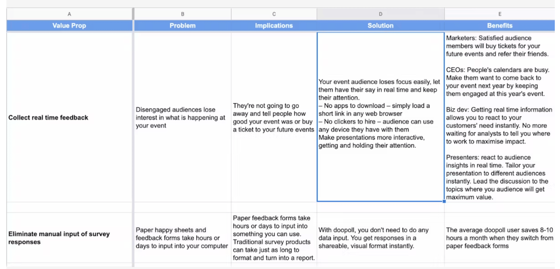
Step 2: The Value Prop Reality Check
So many startups struggle to develop clear, compelling value propositions. This is one of the fundamental building blocks for growth, and it’s why we help founders build the systems to convey value in an effective way.
Strong value propositions can be the difference between stumbling out of the gate and having people beat down your door to buy what you’re selling.
And like so many founders, Marc thought he knew why customers bought doopoll. He’d pitched hundreds of them personally. But when he reviewed his work with his Demand Curve coach (a resource available for VIP Plan subscribers), the feedback was harsh but enlightening.
The final version of the value prop worksheet was “almost unrecognizable from draft 1.”
It became the foundation for the rest of the work. The copy changes, funnel fixes, and pricing decisions later in this story all stemmed from these clarified value propositions.
Step 3: Competitor Intel
Marc spent two full days going deep on analyzing competitors.
He signed up for each one of them, captured full onboarding flows, analyzed ad copy, documented their pricing psychology, and more.
"There were things that were bad and things that I loved about each of them," he wrote.
He said SurveyMonkey's Genius tool was "genuinely something I’m jealous of."
Founders often skip this part because it’s time-consuming, and they think they already know the space. But Marc’s teardown of the competition revealed real gaps and opportunities for growth.
Step 4: Finding What’s Broken
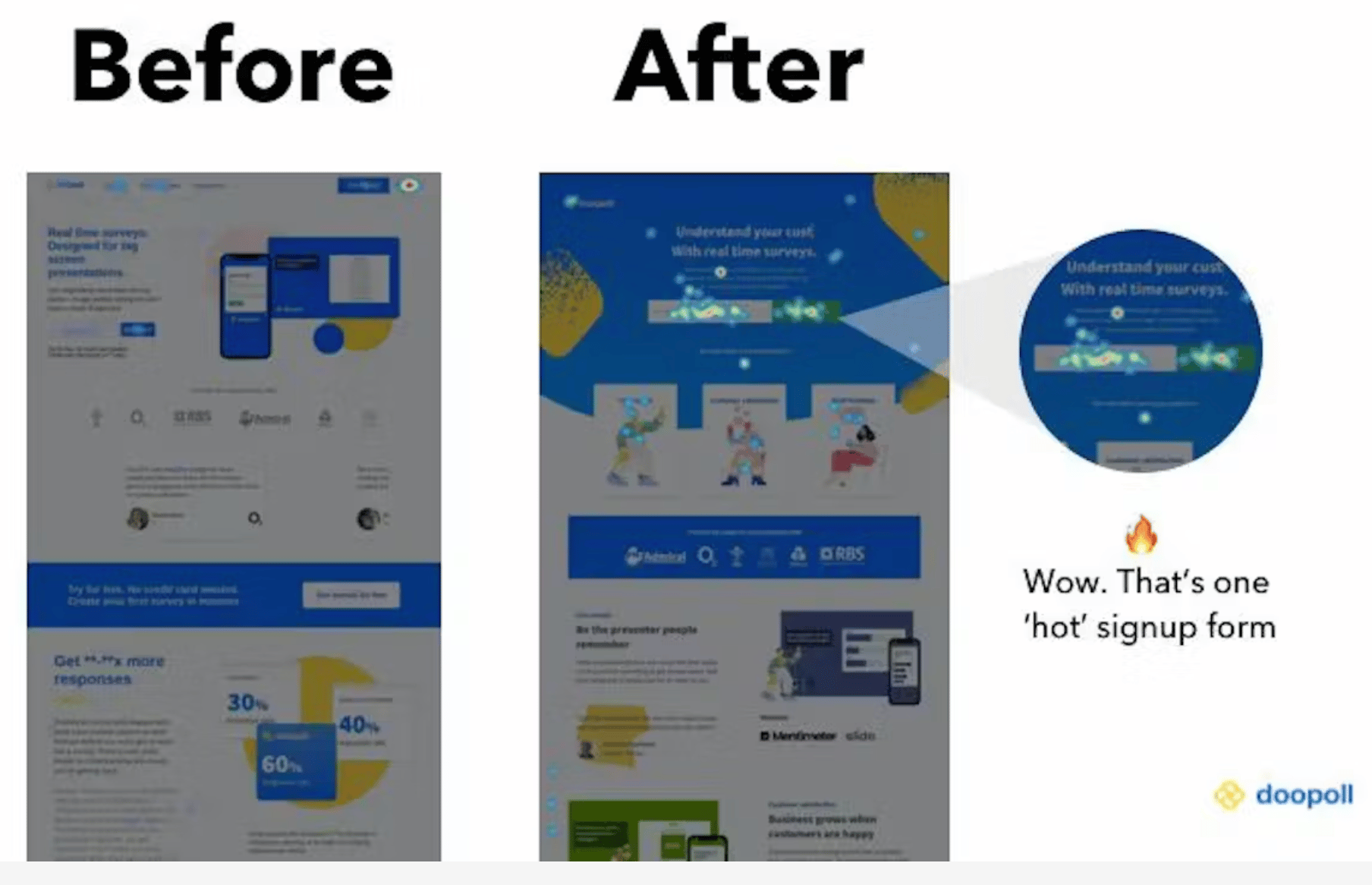
This is where Marc discovered how broken their funnel actually was.
He installed Hotjar to watch user behavior. Then he did a first-time user test on himself.
His painful observation was that users were confused. "It's not obvious that I can create surveys. Our buttons say 'poll' but our marketing says 'survey.'"
Super basic stuff, but it was killing their conversions.
Then he watched Fullstory sessions from people who didn't convert. It was rough. Users clicked around, got lost, and left.
"You have no idea how hard your 'simple' product is to use…until you’ve watched users (who didn't make it) try to use it."
Step 5: Rewriting Everything
Marc started his career as a journalist. He could certainly write, but at the time, he didn’t know how to write copy for an effective landing page.
He drafted a new landing page and sent it to his Demand Curve coach for review. It came back covered in edits.
"It stung," Marc admitted. But the rewrite pulled directly from the refined value props. It might not have won any points for creativity, but it was extremely clear and compelling.
The results were immediate, and they saw conversions jump.
Step 6: The Failed Tattoo Campaign
Before joining the Growth Program, Marc tried cold outreach. It involved sending emails with the subject line:
"I want to work with you so bad I got a {firstName} tattoo on my arm."
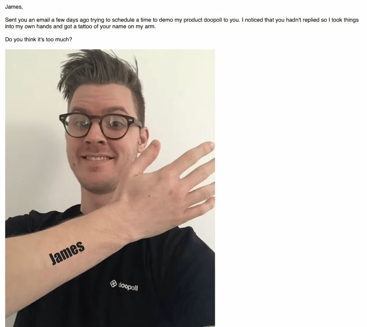
The responses were...mixed.
A few loved it. Most ignored it. Others were actively hostile toward it.
When his coach suggested trying cold outreach again, Marc was skeptical. But their approach was going to be different: short, plain-text emails to well-targeted segments.
Results improved. People replied without the backlash, but it still didn’t clear the bar. They didn’t have a repeatable growth engine yet.
Step 7: Turning the Ad Faucet On
Setting up Google Ads and Facebook Ads took 21 days. Then Marc hit "go."
"The rush of seeing a huge stream of people from all over the world was hypnotic and addictive," he wrote.
For 14 days, traffic poured in. They doubled their ad spend to get meaningful data.
Then reality hit: very few actually converted to paying customers.
Marc described it perfectly, "The come-down is a killer."
Step 8: The Power of the Pause
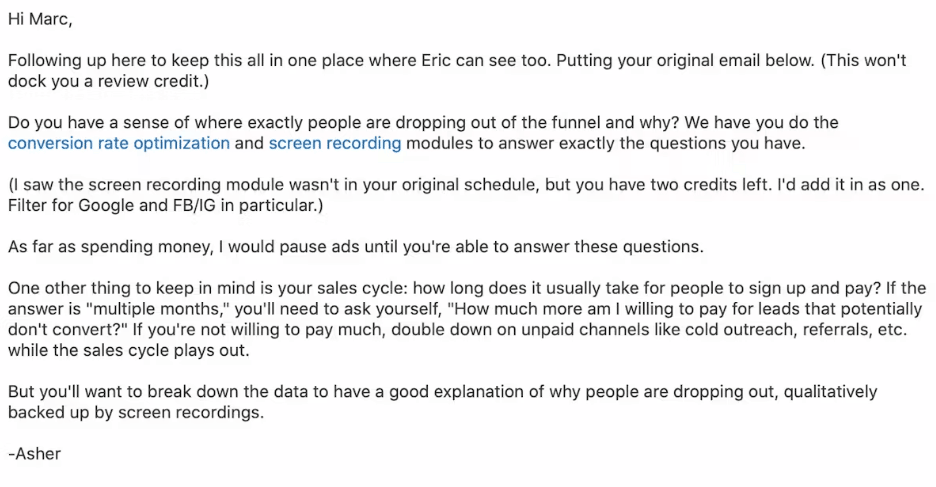
Marc was panicking and burning cash with just a few sales. He asked his Demand Curve coach for help.
His coach’s advice was to turn off the ads. Fix the funnel. Then turn the ads back on.
"Taking that advice was one of the smartest things I've ever done," Marc wrote.
With ads off, he could turn his focus to why people weren't converting.
See the actual email from their Demand Curve coach below.
Step 9: The Freemium Model Breakthrough
Their data revealed the core problem: the 14-day trial didn't match the way people actually used doopoll.
For example, event organizers set up surveys weeks ahead of time, but the 14-day trial ended before they saw any value come to fruition.
Marc switched to freemium:
- Create unlimited surveys: Free
- First 10 responses: Free
- Pay when you see value: £39/month
Within 30 minutes of launching, they got their first conversion. Then another. Then another.
"We used to have a Slack bot that pinged us 'Tuscan Leather' by Drake when someone paid through Stripe," Marc wrote. "We had to turn it off. We were getting too many notifications."

Step 10: The Testing Cycle
Marc developed a systematic approach:
- Form a hypothesis and ship a change
- Run ads for 1–2 weeks to bring in ~200–300 users
- Pause ads
- Measure behavior and conversion
- Plan the next test
He was starting to practice what the Growth Program teaches: sustainable growth comes from stacking small, repeatable improvements, not going all-in on one silver bullet.
Step 11: The Big Swing
For one of their first major A/B tests, they didn't test something minor like CTA button colors. They completely rebuilt the landing page.
Marc stole inspiration from Notion's template gallery approach. "Hands up: we took heavy inspiration from what they did," he admitted.
The test ran for one week. The new page converted at 14%, up from 4%.
That's a 250% improvement from one test.
The Numbers That Matter
After six months (September 2019 to March 2020):
- MRR growth: 800%
- Monthly customer growth: 75% average
- Conversion rate: 4% → 14%
- CAC:LTV ratio: Around 1:1.5-2 (target was 1:3)
- Founder involvement in sales: Zero
But what matters most is this growth came from low-touch acquisition. The founders only talked to customers after they'd already paid. They no longer had to be in the room, selling to large clients only.
Three Lessons from Marc's Journey
Marc shared these three key takeaways from his transformation:
1. Growth is about systems rather than hacks
"A lot of people end up with poor results because they focus on tactics that worked for people they know. Strategy is more important, and a systematic approach to strategy is best of all."
2. Most people don't grow astronomically overnight
"It's usually the accumulation of small gains over time that makes an impact. If you take a systematic approach to growth, you don't need to get hung up on rapid growth figures."
3. Growth for a SaaS project is a whole business project
"Opportunities get missed when growth work isn't driven across teams, including product, marketing, sales, and customer success."
The Lesson For You
A lot of founders will read Marc’s story and go back to grinding out the wins. But grinding harder in a broken model doesn’t fix growth issues.
What worked for Marc (and what works for basically every founder we’ve met) is building a system that compounds. Not a huge heroic pivot or a lucky hack, but rather a steady run of the right changes, stacked week after week.
And that’s exactly what we teach in the Growth Program 2.0: many of those same frameworks Marc used to turn doopoll into a sustainable growth engine.
Gil Templeton
Staff Writer, Demand Curve
Become a better marketer, in minutes.
Join 90,000 founders and marketers getting actionable, no-BS startup growth marketing advice each week.
Tips & Use Cases for AI Imagery
Insight from Gil Templeton — Demand Curve Staff Writer
Before we get down to the nitty-gritty, let’s cover our bases with three big-picture pieces of advice on AI image generation. FYI, most of today’s lesson will draw from my personal experience with Midjourney, ChatGPT’s Sora, and just a little time with Google’s all-new Nano Banana.
Tip 1: Iterate. Iterate. Iterate.
If you’re new to this world, it’s easy to be impressed by your first shiny output, and it’s tempting to assume it’s good enough. But try to think of AI as an iterative tool that can help you work toward a desired outcome, not a magic “make it” button.
For example, I’ll often run the same exact starter prompt three times in Midjourney, which gives me twelve unique outputs. Seeing twelve potential paths all next to each other helps me weigh my options and choose the best starting point.
Sometimes you might see an outlier or a “happy accident” that wasn’t what you originally intended, but it ends up being your preferred output.
Other times, the majority of your outputs might fall flat or have something “lost in translation” like the example below. Only two of the twelve images (barely) understood my prompt of the front tires bouncing in the air, even though I explicitly stated that note in the prompt.

Of course iterating doesn’t stop there. As you keep refining, honing, coaching, and editing, you’ll need to keep weighing your options as you work toward a quality outcome.
Another important note: free trials are great for a quick test drive, but the credit limits can make you feel hesitant to experiment. I recommend starting with the lowest-tier paid plan to initially remove that gate, so you can feel free to iterate and get better instead of being precious about each output. It made a big difference for me.
Tip 2: Inconsistency kills
It’s not too hard to get an awesome one-off image. What’s harder is building a collection of visuals that all feel like they belong to the same brand or campaign. If someone visits your site or socials and sees a range of disparate, inconsistent visuals, you risk looking like an amateur operation.
One of the best ways to combat inconsistency is to create (and continually update) a library of reference images for certain projects or clients. Feeding these platforms strong references (whether it’s your past campaign shots, product imagery, or a specific artist’s style) provides important guidelines.
I’ll often take a “hero” image that nails the look and use it as a visual anchor, referencing it across multiple generations. For example, here’s an image I captured on a shoot (with the help of talented photographer Dan Escobar). Let’s say I wanted to re-use this image’s style for some new executions.

By uploading the reference image above to Midjourney as a "style reference," I can create a consistent, complementary image like the one below (after a little finessing, of course).

It might not be quite as amazing as the actual shot from a world-class photographer. But let’s compare that to the inconsistent output below, where I used the exact same prompt, without a reference image. This one would certainly clash with the first image(s) if you used it in the same campaign or webpage.

Midjourney also supports SREF codes, which allow you to create or choose an existing “Style REFerence” so every output has a similar vibe. This can save you hours.
Without these kinds of guardrails, you’ll get varying results: one output that looks on-brand, another that looks like weird AI stock imagery, and another that looks like it belongs to a different brand.
But a strong reference library and consistent style inputs will help you string together dozens of outputs that look cohesive and intentional.
Tip 3. Ask yourself the hard question
AI image & video generation is incredibly powerful and increasingly useful. However, it’s not the answer for every visual need out there.
People might rush to assume they never have to pay for a photoshoot again, or that users won't care if something is slightly unsettling/off-kilter in an AI-generated visual.
But before using AI-generated images (and videos) for your business, ask the hard question: Is this elevating how my brand is seen? Or cheapening it?
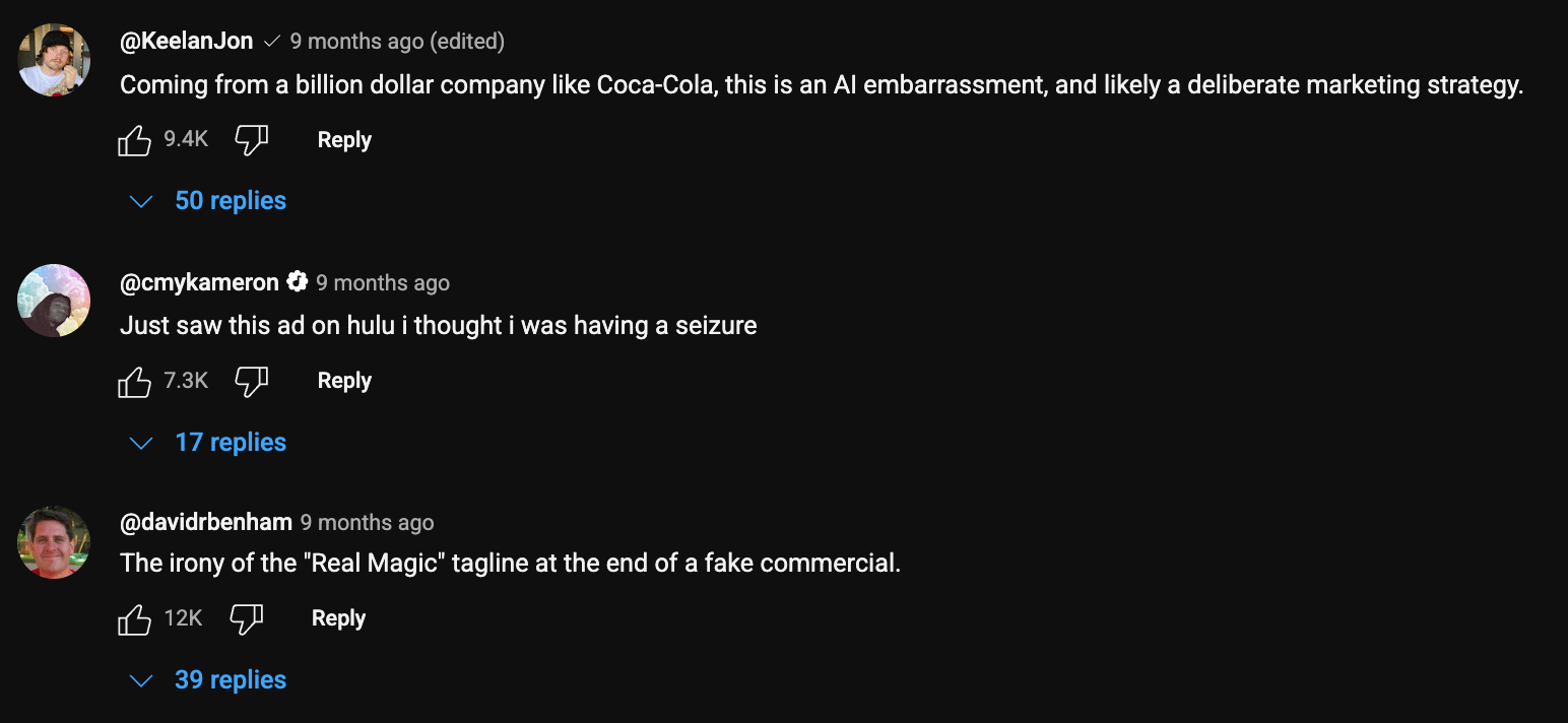
Big companies have made this mistake and seen the backlash. Vogue caused an uproar by allowing GUESS to run a magazine ad featuring an AI model. A24’s AI-generated promo materials for Civil War were replete with obvious AI “tells.” Coke’s AI 2024 holiday ad was a little unsettling, just look at the top comments on the YouTube video.
Sure, big companies are under more scrutiny to hit a higher standard, because they’re more visible and have more money (presumably to pay artists, talent, production houses, etc.). Smaller startups and tech-forward brands probably have more leeway, but without holding your outputs to a high standard of quality and consistency, it can erode trust and make you look cheap.
Context is everything here. If you’re an AI gaming startup and you generate a hyper-real dreamscape visual to use in a paid ad, you’re gravy. But other industries like healthcare, fashion, finance, and even food & bev can carry higher stakes.
I’m not saying you shouldn’t use AI-generated assets in these industries, but hold yourself to a high standard, and make sure you don't mislead. Missteps can damage trust and even invite regulatory heat.
Now let’s get into some relevant, simple use cases for how you can use AI to elevate your brand.
Use Case 1: Eye-Catching Product Photography
AI excels at transforming a flat, forgettable product shot into something entirely more beautiful or interesting. If you have a clear image of your product on a plain background (or maybe you already have a great image you’re looking to augment), you can take that “seed” and reimagine it across lifestyle scenes, hyper-stylized backdrops, and more.
In my experience, ChatGPT’s Sora does a great job of respecting the details and integrity of the product while inserting it into new contexts, so that’s what I’ll be using in these first two examples. There are other great options as well.
When you’re doing this, I would describe the scene you want to ChatGPT (or another chatbot of choice), and ask it to return a Sora prompt for you to use. Just as important as the prompt is the negative prompt (where you tell it not to distort the label, warp the text, etc.) so make sure you ask for a negative prompt to preserve your product’s integrity. And iterate, as always.
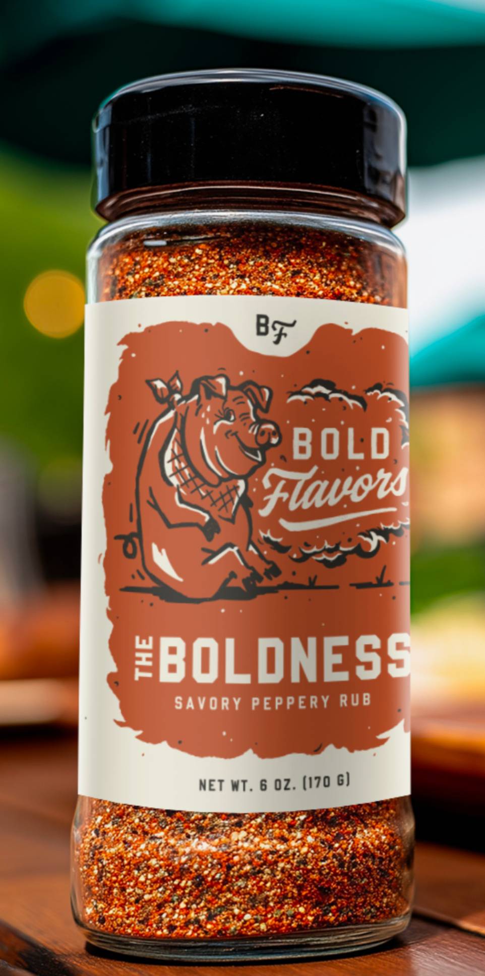
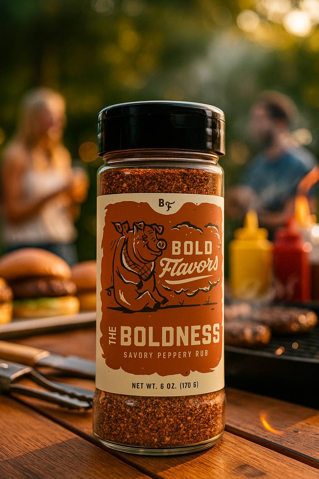
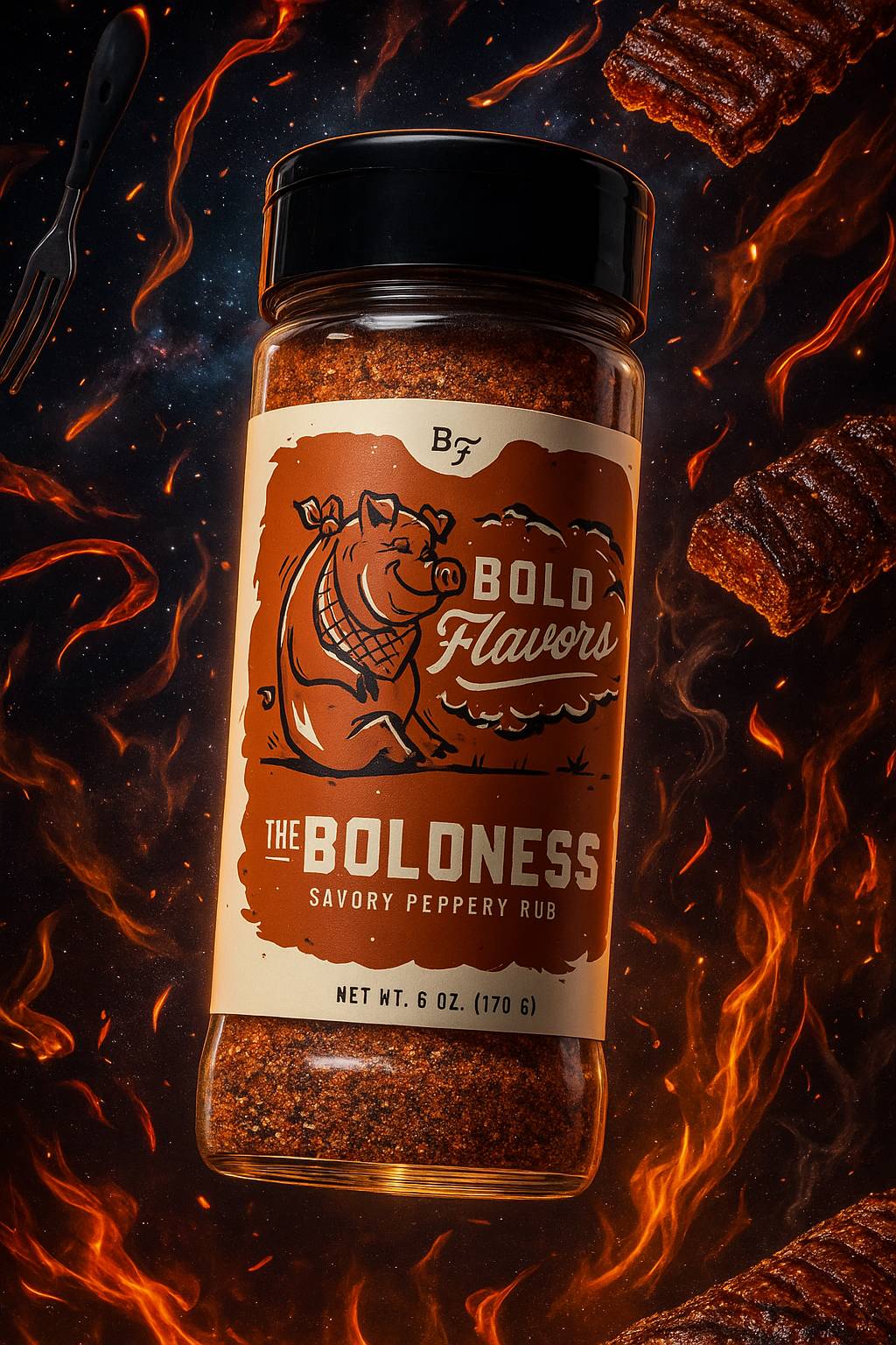
For these two product examples, I’ll be using this one mockup of my BBQ seasoning jar as my reference image (label made by a designer, but mocked up with AI). The label contains tons of small, hand-drawn details which is a challenge Sora still gets 99% right.
Example 1: Lifestyle Drop-In
Example 2: Surreal Brand World
Use Case 2: Professional Portraits & Headshots
This one is increasingly practical for remote teams (or individuals) who want to come across consistently and professionally.
On your “Meet the Team” pitch deck slide or your “About Us” page on your site, inconsistent headshots with different lighting, backdrops, and angles don’t exactly look polished or convey professionalism.
Even if you’re a solo freelancer, it helps to have a professional-looking headshot to represent yourself wherever people might see your avatar online: your LinkedIn page, portfolio, Gmail profile picture, featured image in press coverage, etc.
Below are two varying examples (an artistic portrait and a more typical corporate headshot) that can turn a regular old photo into something more impressive.
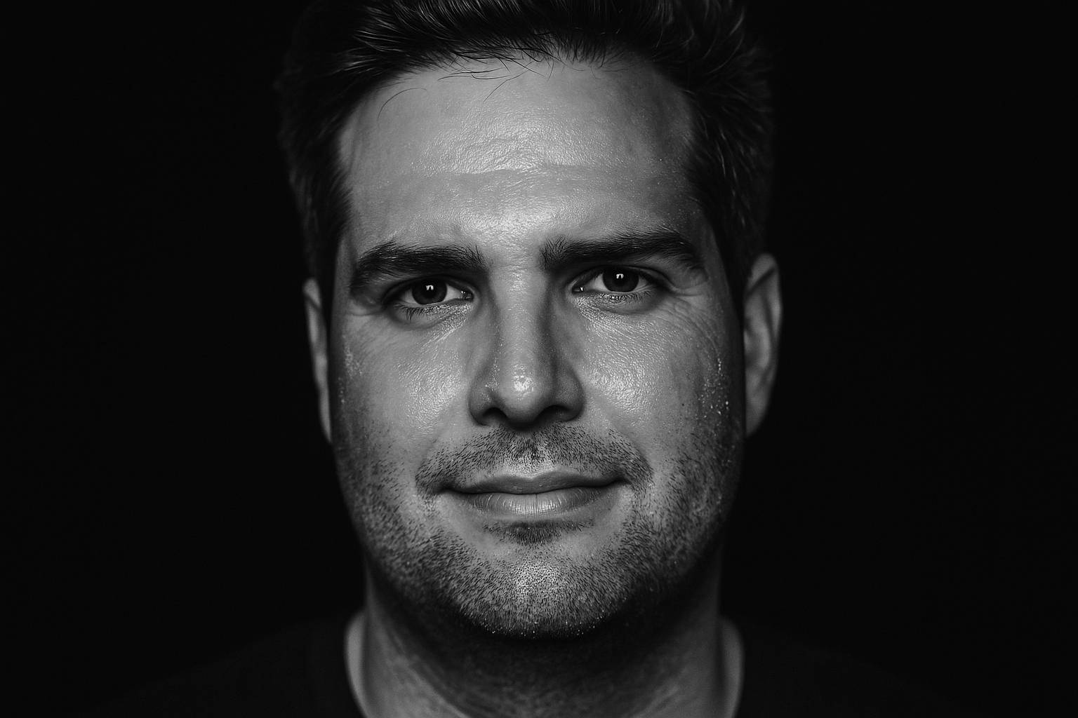
For these two examples, I’ll be using this photo of me below as the reference image. I used Sora to generate my examples here as well.

Example 1: High-Contrast Portrait
Example 2: Corporate Headshot

Use Case 3: Un-Stocking Photos
Whether it’s key visuals to complement text in a pitch deck, website imagery, a background on a headline-driven ad, or whatever else, sometimes you need images to do stock image-ish things.
Using AI instead of stock helps you circumvent typical stock licensing expenses while letting you build equity in a look that’s yours to own.
This is a case where a consistent style is absolutely key. The more you can own a defined, unique art direction lane, the more artful and high-end your assets will feel.
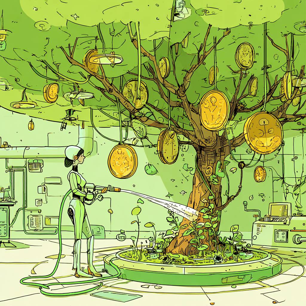
In this example, we’ll be looking at more abstract images, not ones featuring real products or humanity like prior examples. Think of this use case as a way to avoid and/or plus-up images like the one below.

Now let’s take this expected example above and make it into something a little more visually interesting and ownable with Midjourney (which I think does great with abstract/surreal prompts). I’ll take this reference image and cast it through a dimensional, textured, zany Memphis Design Revival style.
I fed my starter image into ChatGPT, asked it to cook up some prompts that translate this image through a bold Memphis Design Revival Style, ran several prompts several times, and ended up with this one I’m digging. I really went for it:

Now let’s try that same money tree stock image with more of a retro-futurist comic book illustration style. Ideally, you'd choose something as distinct as one of these looks and continue to sharpen your outputs as your needs grow.
The point is, you can “filter” about any image or concept through any style of art direction, photography, illustration, etc. you like. So don’t settle for boring. Choose a lane that feels right for your brand or project, and keep living into it.
The Takeaway
If you’re an AI image-generating beginner or novice, I hope you found this useful or at least thought-provoking. If you’re already an expert, you know this barely scratches the surface. It’s meant to be a quick, practical spark for curious readers. The truth is, the more you share ideas and experiments with others, the faster you learn, especially with AI tools.
Gil Templeton
Demand Curve Staff Writer
Become a better marketer, in minutes.
Join 90,000 founders and marketers getting actionable, no-BS startup growth marketing advice each week.
Tips & Use Cases for AI Imagery
Insight from Gil Templeton — Demand Curve Staff Writer
Running the Garmin Gamut
Insight from Gil Templeton — Staff Writer
To ground us, let’s go back to the beginning. Garmin (originally ProNav) was founded in 1989 in Kansas by two engineers, Gary Burrell and Min Kao. “Gar” and “Min” joined forces because they saw ripe opportunities in the emerging U.S. satellite nav market.
Their first product was a bulky boat GPS that retailed for $2,500, but throughout the next decade, they diversified their offerings across several markets.
1991: The ProNav GPS 100 takes off in marine markets.
1994: Garmin launches the GPS 155 which sets the standard for aviation nav.
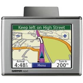
1998: Garmin introduces the StreetPilot, their first portable device for car navigation.
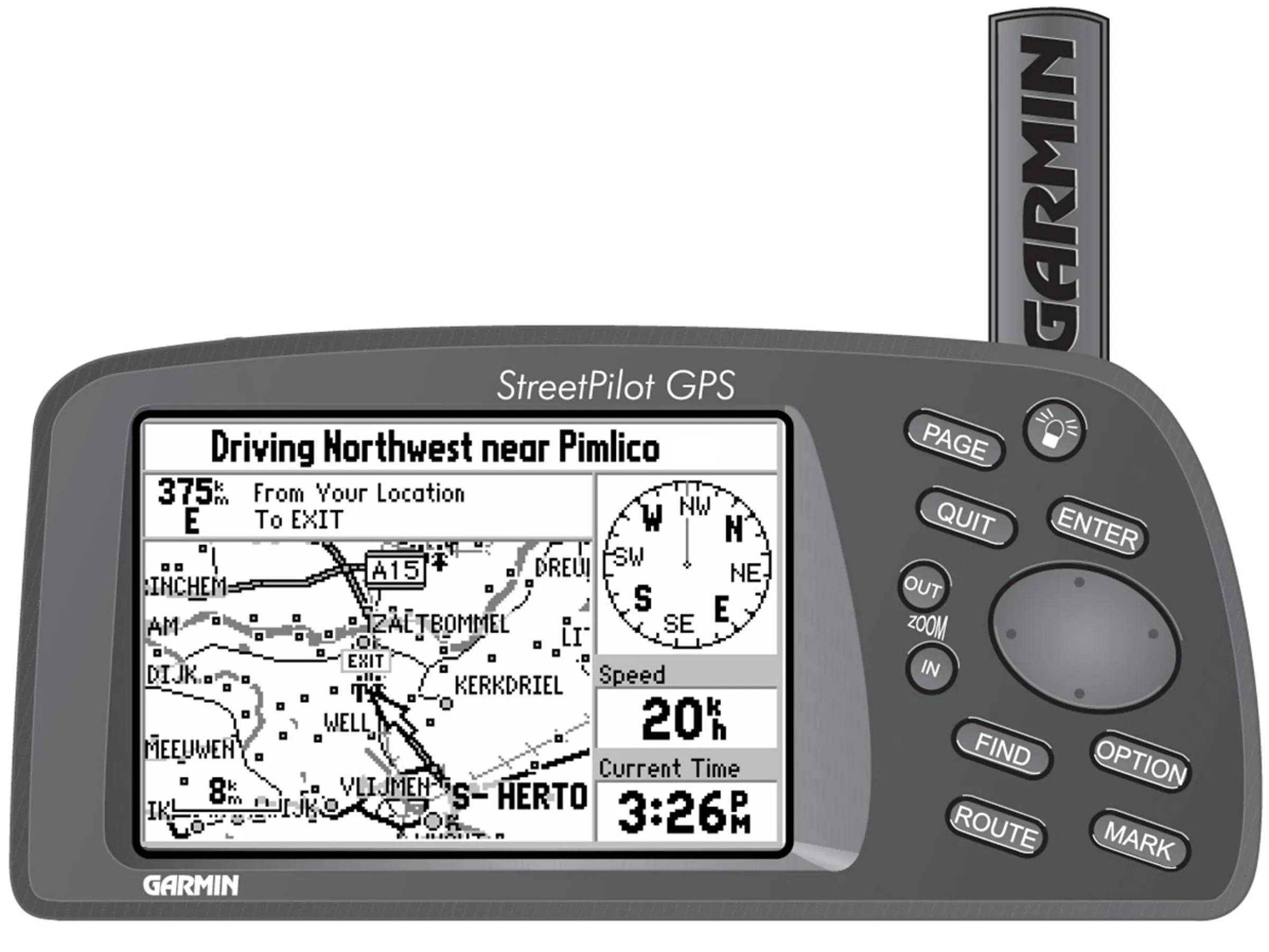
2005: Garmin launches the nüvi line. Its practical, user-friendly design helps it become the go-to driver GPS in the U.S.
With mass adoption of the nüvi, Garmin saw explosive growth in the period following the product's launch. In 2006, their total annual revenue was $1.77B, which was up 73% from their revenue just one year prior.
By this point, Garmin had officially made the leap from niche gadget company to mainstream tech staple, and they hit paydirt with a product that materially improved the driving experience for so many.
In 2007, about 70% of their sales were car GPS devices. And then their world got turned upside down…

The iPhone Blindside
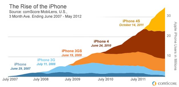
In mid-2007, Apple launched the iPhone and poured gas on the smartphone revolution. Within a year, 6 million iPhones were sold. By 2009, Apple had moved 20 million units thanks to the iPhone 3GS. Of course each of these was capable of running the rapidly-improving Google Maps app.
To smartphone owners, the main value prop of a standalone GPS disappeared into thin air. Who would fork over $300–$500 for a Garmin nüvi, when your smartphone did the exact same thing with real-time updates and was already in your pocket?
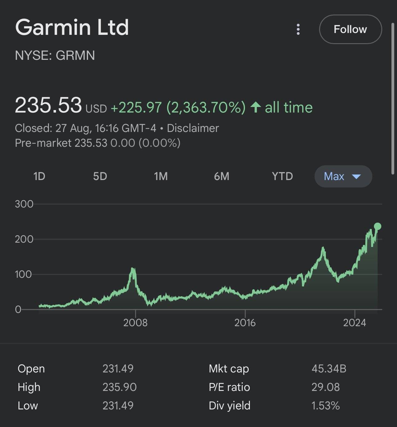
Garmin’s stock, which saw a huge pop after the success of the nüvi, plummeted in 2008. The combination of smartphones eroding its market share and the 2008 financial crisis combined to form the perfect storm. The car GPS had basically become a relic as quickly as it had risen to prominence.
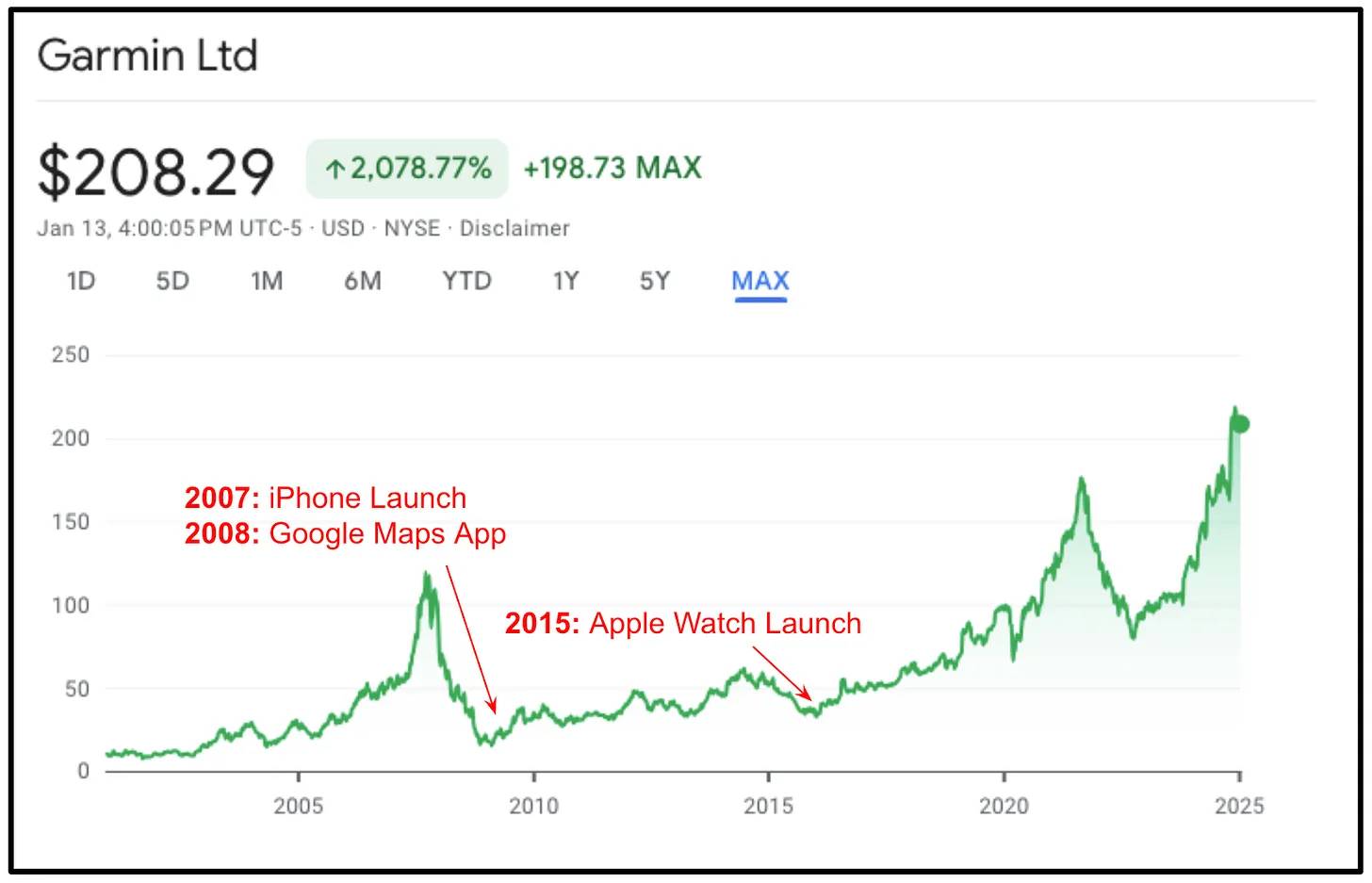
So many other companies in Garmin’s position then would have dug their heels in. They might have added traffic alerts, a sleek iPhone-esque UX, or a subscription billing model. But instead, Garmin read the writing on the wall, made a hard left turn, and hit the gas.
GPS: Global Pivoting System
In 2008, Garmin’s leadership team smartly acknowledged they were fighting a losing battle with their flagship car GPSs. Instead of trying to “build a better mousetrap” they looked to repurpose some of their core strengths and efficiencies to make the ultimate pivot.
They tapped into their engineering talent, general GPS prowess, and vertically-integrated model to make decisive, defining moves:
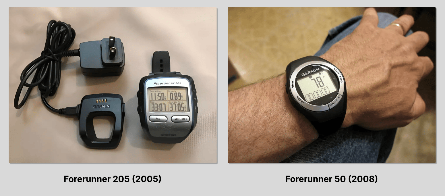
Focus on fitness & outdoors
Garmin had already launched the Forerunner five years prior in 2003, which was a wrist-worn GPS primarily for runners. It was a little clunky (and niche) but it had a strong cult following and continued to evolve through several iterations.
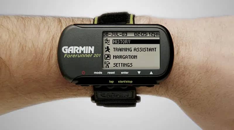
By 2008, the design of the Forerunner had taken the form of a more typical watch and no longer looked like a wrist-computer, perhaps signaling a coming-of-age for the product line.
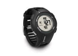
Garmin doubled down on their fitness and outdoor efforts. In 2011, they launched the Approach S1 at the PGA Merchandise show. The watch came pre-loaded with 14,000+ courses and helped golfers track their performance in a more accurate way.
“With the Approach S1 golf GPS watch, Garmin has once again created an entirely new category for fitness and outdoor recreation. Golfers who want their data and their device as streamlined as possible will find Approach S1 to be a sleek and simple hands-free solution to taking the guesswork out of their game.” — Dan Bartel, VP of Worldwide Sales, Garmin
In 2012, they launched the fēnix line, a smartwatch aimed at outdoorsy folks: mountaineers, hikers, hunters, cyclists, etc. Its rugged build and ABC sensors (altimeter, barometer, compass) made it an ideal backcountry companion.

In a weird way, the smartphone revolution enabled the success of Garmin’s new fitness and outdoor watches, because Garmin's new products required tech that had been downsized and commoditized for smartphone application.
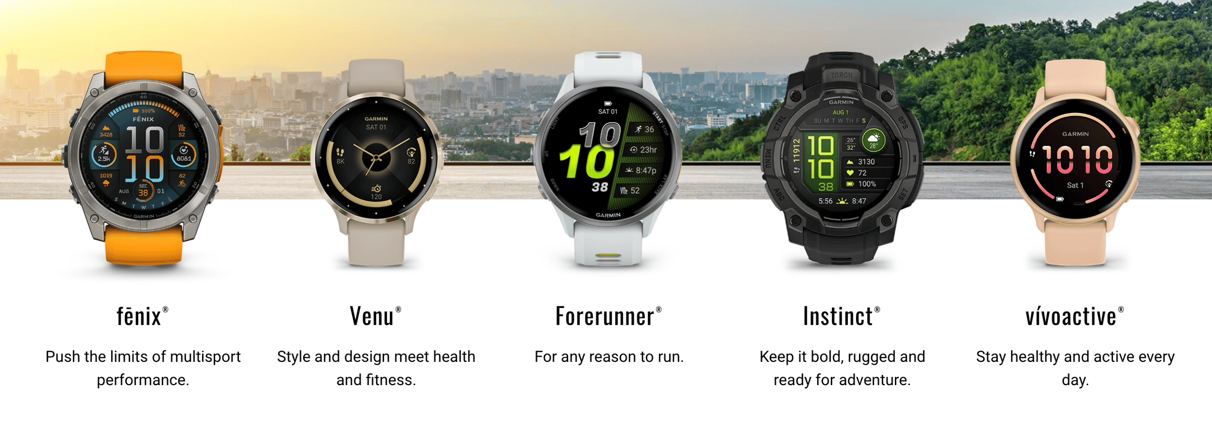
The Apple Watch wouldn’t launch until 2015, which posed yet another existential threat to Garmin’s outdoor and fitness-related options. But Garmin smartly continued to invest in performance and very specific use cases, whereas the Apple Watch was (and is) more of a generalist tech wearable.
In other words, Garmin hasn’t tried to be a smarter smartwatch for the masses. Instead, they’ve made each offering supremely useful for its niche, whether that’s insanely rich running data or more accurate backcountry coordinates or helping your uncle line up his approach shot.
Their wearables are fitness-first. Period. And they’ve never lost sight of that. Today, the lion’s share of Garmin’s annual revenue is fueled by their “outdoor and fitness” segment, which can be further divided into crystal-clear sub-categories (golf, running, mountaineering, even equestrian, etc.). This is a testament to Garmin’s focus and their ability to find product-market fit across several markets.
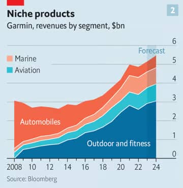
This chart shows another interesting takeaway: the growing presence of marine and aviation products in their revenue mix. Again, these serve well-defined, unique audiences (primarily boat owners and plane captains) and Garmin continues to reap rewards from fundamentally-sound seeds they planted long ago in these categories.
“Just as they had found a way to take GPS from the ocean to the air to the street, Garmin’s R&D team identified fitness as a niche market. They didn’t cling to the past. They invented a new future.” —Trung Phan
In last week’s Demand Curve Growth Newsletter about elevator pitches, we focused on proven ways to differentiate your brand in the “how” portion of your pitch. One of these paths was “You serve a specific niche better than anyone.”
Garmin is living proof that you don’t have to serve just one niche. They serve several at the same time, because each product stays laser-focused on a unique market. While they do appear to have more “generalist” fitness wearables offerings now, it’s clear what each line specializes in, and fitness (not tech) is still at the forefront.
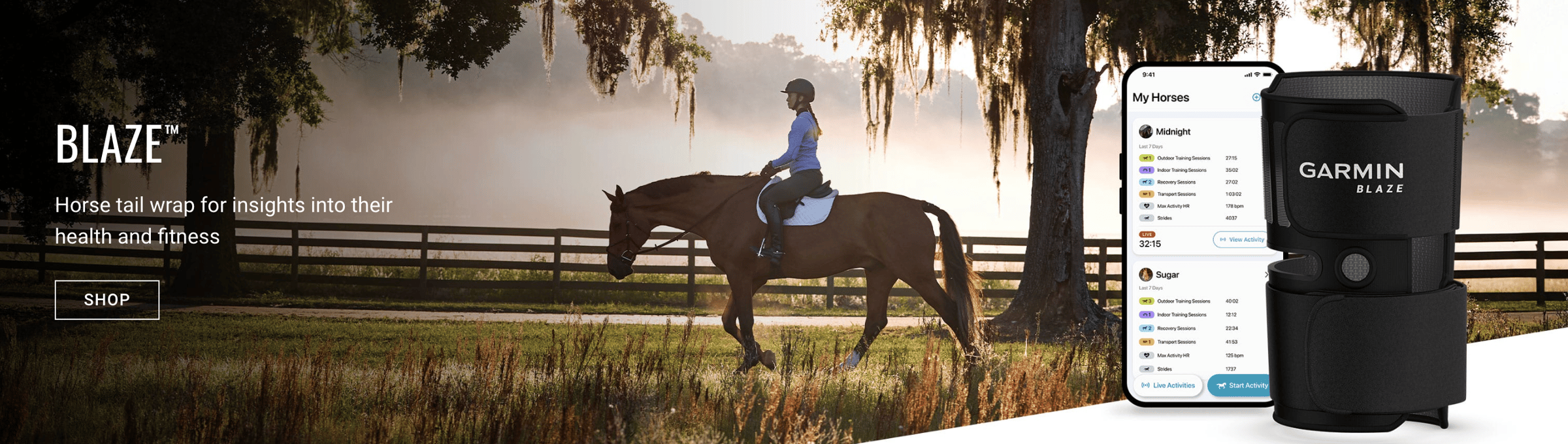
And if you want proof they’re still finding extremely well-defined opportunities, check out the Blaze horse tail wrap. Certainly not something they’ll be competing with Apple on.
Hitting the gas on R&D
Another bold choice that paid off was Garmin’s decision to go all-in on R&D when they realized their standalone car nav systems were passé. Other companies might have cut costs and retreated to survival mode, but Garmin went on the front foot.
As you can see in the chart below, Garmin decided to spend big bucks on R&D initiatives and hire more R&D-related staff after their 2008 gut-punch. They ramped up spending despite the fact their sales and stock had taken a tumble, signaling a calculated risk and “betting on themselves” to bounce back.
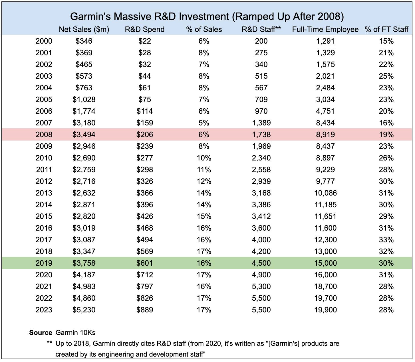
Even after the current CEO Clifton Pemble took over in 2013 (following Min Kao’s retirement), the focus on R&D spending remained strong and even increased further under Pemble’s guidance.
Garmin was in a strong position to make this big bet on R&D, largely due to their fiscally conservative ethos and good financial standing. Take a look at this excerpt from an interview with Min Kao back in 2012.
“Gary and I both are fiscally conservative by nature, and we managed our company accordingly. Our early success bred more success. We reinvested in the company and established disciplines like having cash in the bank, maintaining sufficient inventory levels, and staying debt-free. Those practices helped avoid a lot of hurdles.” — Min Kao, Founder & Former CEO, Garmin
On top of being financially set up to weather the storm, Garmin’s famed vertical integration helped them stay resilient. They make their own chips, software, and hardware. Not to mention their marketing, sales, and support teams are also in-house.
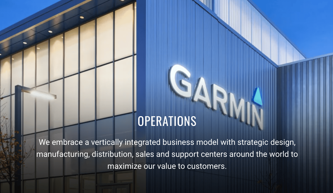
This philosophy of overarching alignment (and dare I say synergy) allowed them to create a focused, controlled pivot, where they could create efficiencies while insulating themselves from third-party delays and pricing volatility.
“Gary and I believed in our business model of vertical integration. By doing so, we have been able to have greater control over timelines, quality and service. It might have been easier in the short term to offload many of these functions, but in the long run, we've learned that by controlling the entire process, we’ve had higher levels of innovation, reduced risks, lower costs, and greater scalability.” — Min Kao, Founder & Former CEO, Garmin
Owning the stack meant Garmin could reuse their core GPS, mapping, and battery-management tech in entirely new product lines (like the Forerunner, Approach, fēnix) without reinventing the wheel.
It also meant they weren’t waiting around for third-party component makers to supply their parts, and they also weren’t on the hook to pay marked-up prices to these suppliers.
Three Main Takeaways
Garmin, a company built to simplify navigation, ironically proved it could navigate its own way through major disruption. Let’s take a look at three big lessons we can learn from Garmin’s pivot masterclass.
1. Don’t Fight the Tsunami
When the iPhone caught on, Garmin didn’t try to out-feature Apple on their GPS. Other hardware incumbents (think BlackBerry or TomTom) clung to their legacy and lost. Garmin rightfully realized that was a losing game, so they pivoted to new markets while they still had cash flow and credibility.
If you see a cultural or technological tidal wave coming, don’t hurry to build a taller sandcastle. Do what you can to build somewhere else, and quickly. For example, if AI threatens your specific SaaS edge, reframe your offering around plays that are harder for AI to encroach on.
2. Niche Is the Moat
Garmin didn’t pivot to make products for “everyone who needs a watch.” They built the Forerunner for runners, the Approach for golfers, the fēnix for outdoorsy folks, etc. Whereas the iPhone and Apple Watch won by going wide, Garmin’s fitness and outdoor products won loyalty because they solved very specific problems in depth.
So double down on specificity and depth in your positioning, especially if your business isn’t a mass-market product or service.
Don’t just say “all-rubber watchbands,” say “all-rubber watchbands that don’t scratch or scrape your laptop keyboard.” That tweak creates much more defensibility. (Free business idea for any takers. I’d buy a few.)
3. Bet on What You Do Best
Instead of slashing costs when sales collapsed, Garmin increased R&D spend. They treated the downturn as the right time to reinvest. It might have been risky on paper, but their vertical integration and healthy balance sheet gave them a fighting chance.
Nearly twenty years after the iPhone launched, Garmin's diversified product portfolio and strong stock performance suggest the big bet has paid off.
In hard times, invest in experiments that align with your DNA. Instead of cutting and burning, reallocate it to new bets that overlap with existing core strengths or capabilities.
Gil Templeton
Demand Curve Staff Writer
Become a better marketer, in minutes.
Join 90,000 founders and marketers getting actionable, no-BS startup growth marketing advice each week.
Best Practices for Better Pitches
Insight from Gil Templeton — Staff Writer
If you asked each person on your team to give your company’s elevator pitch, how similar would their answers be? (Please try it and reply to this email with your results).
I’d bet you’d get a mash-up of different features, founder stories, and scattershot narratives. But everyone should really be reading from the same “sheet music” no matter what.
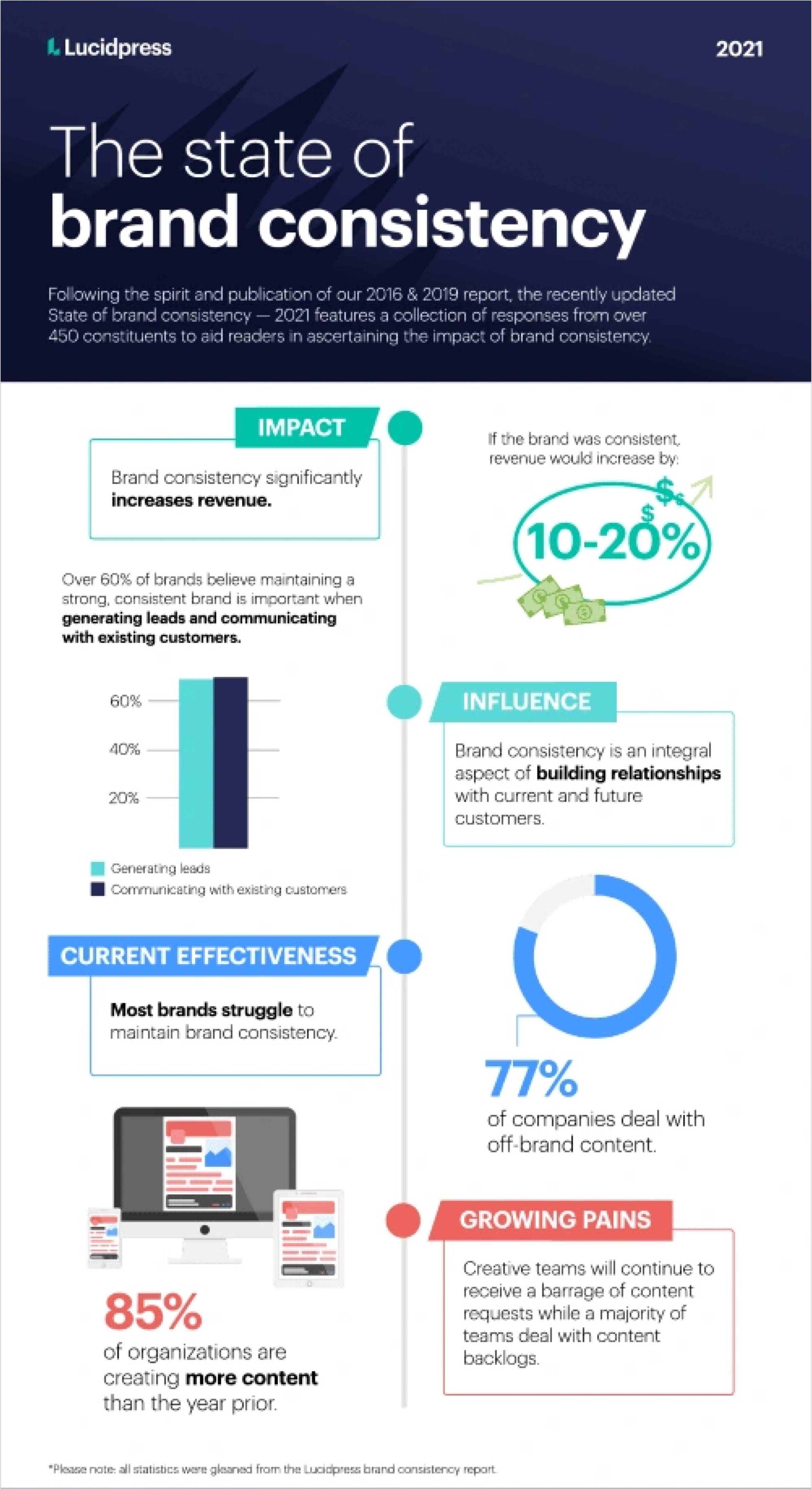
The more your team tells a similar story, the more you can create compounding momentum instead of pulling in different directions. A study showed that the average revenue increase attributed to high brand consistency is 10–20%, so the more consistently you can convey your narrative, the better.
Let’s look at a few evergreen tips that provide guidance on creating a consistent, compelling elevator pitch.
Tip 1: Aim for about 30 seconds and don’t go too far over that. That’s enough time to tell a story, but short enough to keep it laser-focused.
Tip 2: You (and your team) don’t need to memorize the pitch verbatim. It’s okay to put it in your own words, as long as the content and takeaways are the same.
Tip 3: Show, don’t tell. Use real numbers and irrefutable facts to make your points more credible and tangible.
Tip 4: Your pitch should answer three key questions, usually in this order:
- What is your company?
- What problem do you solve?
- What makes you different?
Now let’s expand on how to answer each of these three questions.
Pitch Part 1: What Is [Your Company]?
This is the simplest part, but because of its simplicity, it can be easy to fumble.
Your job at this juncture is to introduce the company in a matter-of-fact way. Set the table with literally one sentence about what your company is.
One way I like to think about this is: what would (or does) your Wikipedia page’s first sentence say?
Looking at Apple’s Wiki page, the first sentence reads, “Apple Inc. is an American multinational corporation and technology company headquartered in Cupertino, California.”
Just the facts, ma’am. Short, sweet, and straight.
Below are some examples, using made-up businesses across three industries that we’ll use throughout today’s newsletter.
- AI Marketing Startup Example: “We’re an AI platform that helps mid-sized e-commerce brands generate ads.”
- Workforce Training SaaS Tool Example: “We’re a B2B software company that improves the onboarding process.”
- CPG Drink Brand Example: “We’re a beverage company making clean energy drinks with mushrooms and adaptogens.”
That’s it. Check the box and move on.
Pitch Part 2: What Problem Do You Solve?
Now we move into your “why.” In this section, we explain the lock that your company holds the key to. This part is very similar to your problem statement.
It provides the context and stakes for what you do, and if you can define the problem clearly, it sets your solution up to look like the obvious choice.
Without this tension, there’s no story. So this is precisely where we introduce the “villain” your company helps people overcome.
This is important for founders and small startup teams who often get caught up in their own underwear, defaulting to features and nuances instead of telling the bigger story.
It’s easy to forget that no one wakes up thinking, “I want a new SaaS platform today.” What they think is: “Ughhhh, I can’t keep wasting all my time training these new hires.” So speak to that frustration or friction.
Clearly articulating the problem is an attention-grabbing “hook” that signals focus; it shows you aren’t trying to solve too many problems at once, and it means you have a good understanding of your target.
Let’s look at some examples, building on the fictional companies from part one.
Note: Including language like, “We exist to…” or “We solve this problem by…” can help you make the turn from illustrating the problem to showing your solution. Don’t get into claims or your UVP yet, though.
- AI Marketing Startup Example: “Creative teams are drowning in asset production all day, every day. We exist to help them automate iteration, so they can create assets faster and test more ideas without hiring up or burning out.”
- Workforce Training SaaS Tool Example: “Studies show most remote employees feel underwhelmed by the onboarding process. Our platform solves this problem by giving teams an interactive way to onboard without the faceless, boring modules and decks.”
- CPG Drink Brand Example: “Most energy drinks dump in synthetic caffeine, sucralose, and artificial ingredients that spike your system and make you crash. That’s why we built ours around lion’s mane mushrooms and adaptogens, providing a natural, gradual lift.”
Aim for 2 or 3 sentences here. Again, don’t overdo it, just explain that gap you fill.
Pitch Part 3: What Makes You Different?
Now it’s time to land this bad boy. If part two addressed your “why,” think of this section as your “how.”
This part should lean heavily into your unique value proposition (UVP) to show why you’re uniquely positioned to solve the problem better than anyone else.
This is your moment to make a sharp, specific claim only you can make. To do that, point to exactly how you deliver a better outcome.
Some strong examples of common differentiators are:
- You deliver faster, cheaper, or more reliably.
- “We give you a bespoke AI brand strategy in 60 seconds.”
- You provide access to something others don’t or won’t.
- “Our tool gives you real-time access to competitors’ pricing, not just historical data.”
- You solve the problem in a fundamentally different way.
- “Our wearable tracks focus instead of fitness.”
- You’ve made a deliberate tradeoff your audience values.
- “We only serve Series A startups, so you’re not competing with enterprise clients for support.”
- You serve a specific niche better than anyone.
- “We design seamless, slipless socks exclusively for marathon runners.”
Don’t fall into the trap of using vague phrases like “our team works hard,” “our customer service is amazing,” or “we’re building community.” These aren’t defensible positions, especially to a skeptical prospect or investor.
Let’s finish out our examples using the same companies from earlier:
- AI Marketing Startup Example: “Unlike other AI marketing tools that generate generic ad outputs and require tons of manual cleanup, our platform integrates directly with your brand guidelines and ad account, so every asset created is on-brand and optimized to perform.”
- Workforce Training SaaS Tool Example: “Instead of dumping content on new hires and hoping it sticks, we tailor bespoke onboarding paths to each employee with real job KPIs in mind, helping new hires actually ramp up and hit targets 23% sooner, on average."
- CPG Drink Brand Example: “Most functional beverages that contain mushrooms require refrigeration and go bad after a few weeks. So we created a shelf-stable product that stays fresh for two months at room temperature, cutting refrigeration costs, opening new retail doors, and making the product travel-friendly.”
Part 3.5: Your Call To Action
At the very end of your pitch, make sure to include a call to action (CTA) instead of giving a blank stare and expecting your audience to know what you want them to do.
This should be an actionable request for a next step. It might be to schedule a meeting, exchange contact information, sign up for a free trial, ask if they’d like a demo, open the floor for further questions, or whatever step you’d like them to take next.
After you do that, pause and listen. The strength of an elevator pitch is not necessarily in “closing the deal” like it might seem on Shark Tank. It’s in opening the dialogue, getting your audience talking and asking questions, and ultimately deciding if you might be a good fit for each other.
The Takeaway: Your Pitch Is Your Growth Engine
Your elevator pitch is a conversion tool that scales with every interaction your team has with the outside world.
Your sales team is pitching prospects. Your marketing team is conveying value props creatively. Your recruiters are selling candidates on why they should join. Your CEO is pitching investors. Your engineers are explaining what you build to potential partners.
When everyone's telling the same focused story, you create a multiplier effect where every touchpoint reinforces your positioning.
But if your pitch is inconsistent, you're essentially running constant A/B tests (and C/D/E/etc. tests) across every conversation, diluting the message and confusing your audience.
Here's what a tight, aligned pitch can do:
- Faster sales cycles: Prospects quickly “get it” and immediately understand your value. No need for lengthy descriptions or follow-up calls to paint the big picture.
- Sales & marketing consistency: Your marketing team can hit the same notes as your sales team, creating congruency and momentum across the two.
- Rock-solid fundraising narrative: Investors will hear the same compelling story no matter if they’re talking to your CEO or intern.
- Better team alignment: New hires can confidently represent your company from day one, and tenured employees can stop inadvertently telling different versions of your story.
On the other hand, a weak (or inconsistent) pitch doesn’t only confuse your audience. It can tell investors that you might have trouble selling and recruiting in the future. In an article about elevator pitches from best-selling author and VC Sean Wise (who claims to have heard 20,000+ pitches), Sean makes a good point:
“How well you communicate [your pitch] to investors is a proxy for how well you’ll be able to sell to early adopters, and how likely you are to recruit top talent. Failing to deliver may signal to investors that you don’t have the business acumen to succeed.” — Sean Wise
Knowing how crucial this 30-second “script” is, it’s worth your time to ask three people on your team to explain what, why and how your company does what it does, in about 30 seconds. Time them and make note of the variations between responses.
Then use the exercise above to craft your Rosetta Stone of an elevator pitch, and turn every team member into a force multiplier.
Gil Templeton
Demand Curve Staff Writer
Become a better marketer, in minutes.
Join 90,000 founders and marketers getting actionable, no-BS startup growth marketing advice each week.
The Cracker Barrel-Roll
Insight from Gil Templeton — Staff Writer
It’s getting a little too predictable.
A company updates their logo and branding with a stripped-down, “simplified” version.
The public reacts negatively and gets worked up.
Then the news cycle changes, people move on with their lives, and everyone gets used to the new brand identity over time.
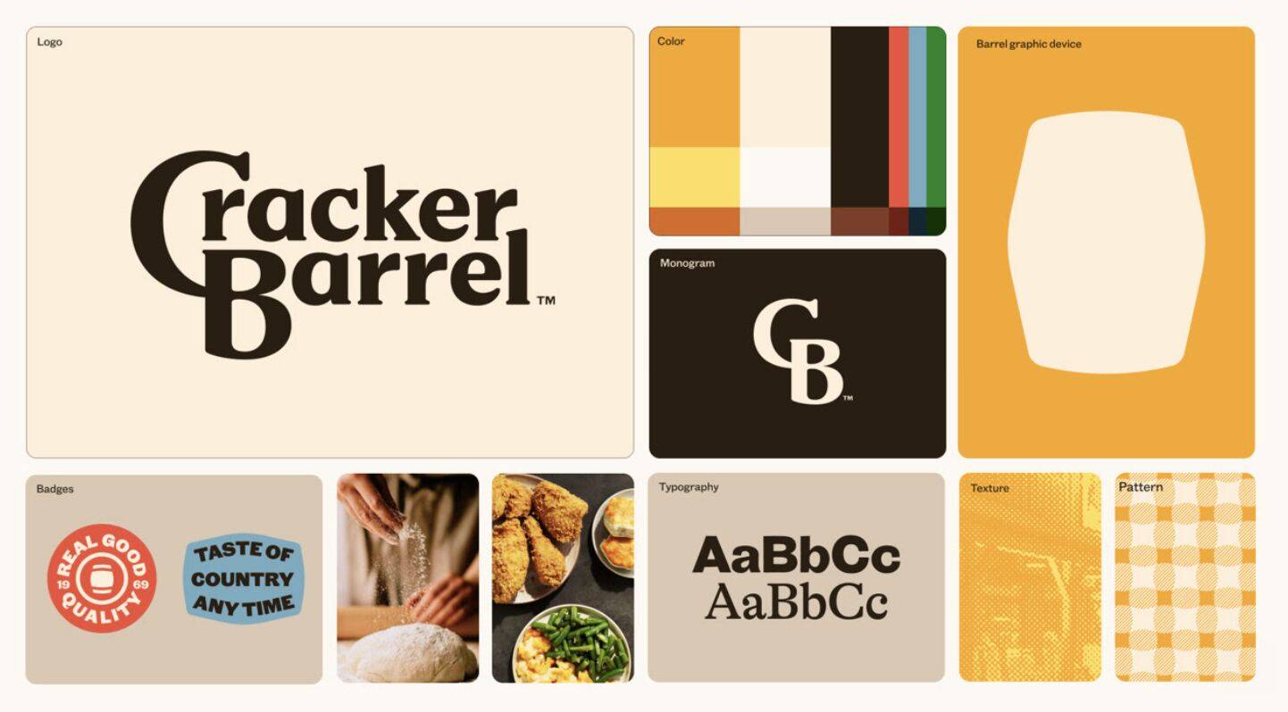
Last week’s unlucky headliner was Cracker Barrel, the southern roadside staple known for its nostalgic appeal, rustic country store, beloved peg game, and healthy portions of unhealthy food.
Their rebrand went viral with a few key visuals making the rounds: namely before-and-after comparisons of the logo and interior.
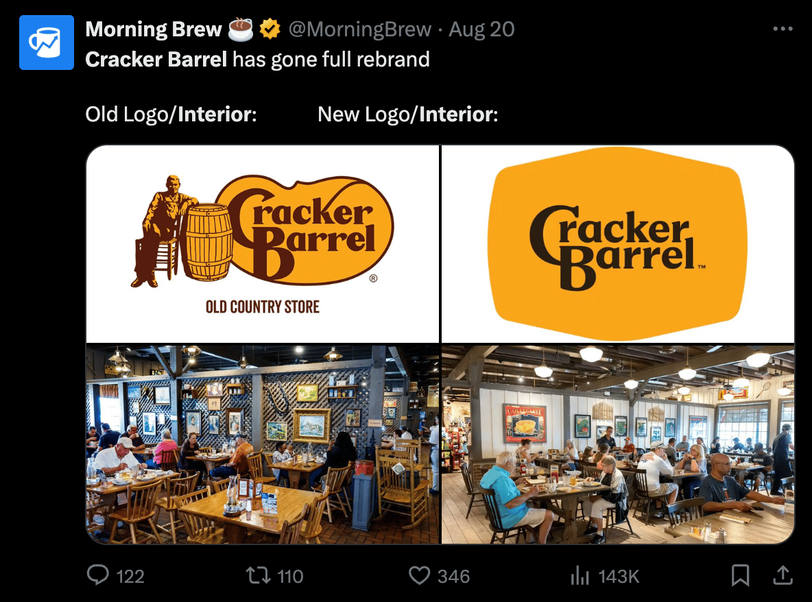
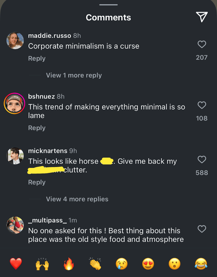
The memes poured in. Their already-weak stock took a tumble. And the comments sections were flooded with rip-roaring rage, like these comments screenshotted from Food52’s post.
Obviously, this sweeping rebrand includes interior updates, new menus, a new tagline of “All The More” and plenty more, but the logo has been the lightning rod at the center of the PR storm.
On the contrary, there were also some well-argued takes from people explaining why the update made sense to them.
Medium published a short-and-sweet article titled, “Why Cracker Barrel’s New Logo Actually Hit The Mark.”
“The old logo…does not work well on anything other than a big sign. It doesn’t shrink down well, it doesn’t look good on the web, and it doesn’t look good on a phone. It has no real brandable elements to it except the wordmark.” — Brad Thomas, Medium
Graphic Design publication The Dieline ran an article titled, ”Cracker Barrel’s Perfectly Fine Brand Refresh Courts Controversy," and you can practically hear the exhausted “here we go again” eyeroll in the headline.
Another take from digital designer Peter Laudermilch on LinkedIn made a fair point about the runaway narrative:
“When a new identity gets flattened into a static screenshot for social commentary, of course it looks bland. You’re seeing it stripped of motion, context, and personality—the visual equivalent of an out-of-context soundbite.”
To that point, when you look at more of these new brand elements together below (even without motion), the new Cracker Barrel brand ecosystem starts to come to life.
Cracker Barrel clearly felt it was time to signal a big change with their rebrand, even if they stood to catch some initial heat for it. Let’s look at what might have forced their hand.
Even Nostalgia Needs Modernizing Sometimes
For all the people commenting various versions of, “They didn’t need to change anything!” Let's look at some numbers that suggest otherwise.
I’m not saying this exact execution was the exact right answer to their problems, but we all know the definition of insanity. And when business is down for a few years, you can’t keep doing the same thing, expecting different results.
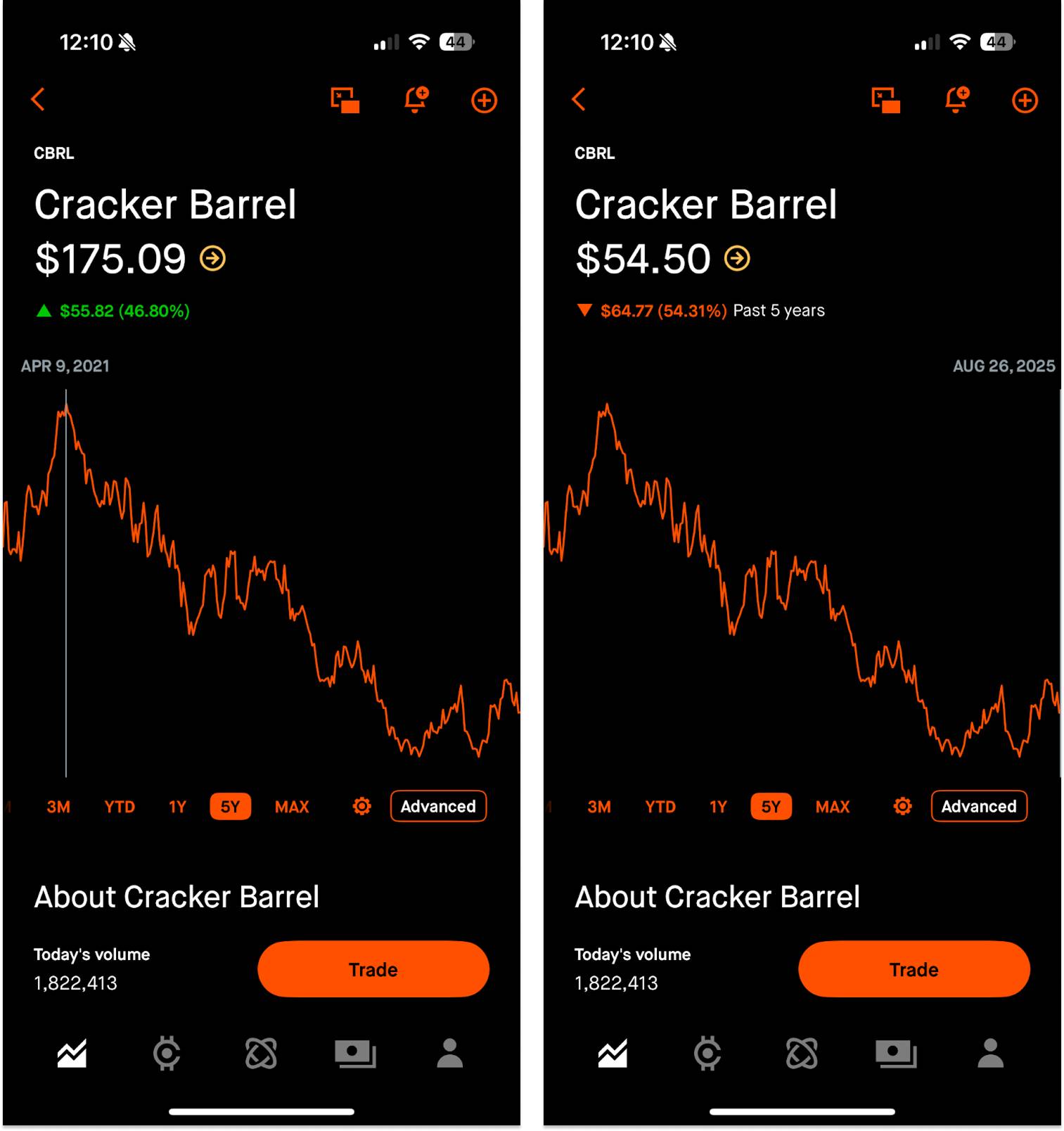
For one, their stock has generally been on the slide since 2021. And a topical Forbes article from Monday suggests Cracker Barrel exhibits weak growth, very weak profitability, and very weak downturn resilience.
To add insult to injury, transactions across the foodservice sector declined 7% year-over-year during the first quarter of 2025, signaling a tough time for the industry in general.
In the least surprising news ever, Cracker Barrel has trouble attracting younger customers. They cater to an older crowd who is aging out and dining out less. 2023 company data showed 43% of guests are at least 55 years old. For reference, around 80% of Applebee's customers in 2023 were under the age of 60.
The Cracker Barrel CEO, Julie Felss Masino, added a little more context when she was interviewed on Good Morning America, citing tariff costs and managers pleading for remodels as additional reasons to reexamine the brand at this time.
"Cracker Barrel needs to feel like the Cracker Barrel for today and for tomorrow.” — Julie Felss Masino, CEO, Cracker Barrel
Their rationale for a major change likely stemmed from a convergence of harsh Cracker Barrel business realities, mounting restaurant industry headwinds, an aging customer base, and a brand that visually harkens back to the pre-smartphone era.
“Phone Eats First”
This trend of visual simplification largely stems from brands needing to flex across a thousand dynamic use cases, because logos don’t just hang on creaky signs above front porches anymore.
In addition to high-touch dynamic pieces, think about favicons, YouTube thumbnails, App Store icons, and other pixel-pinching needs that require maximum clarity.
This simplification is more about survival than a pure stylistic choice. What I’m saying is: minimalism is becoming more necessary, because you’re increasingly likely to meet brands through a small screen than through a fully-fledged physical experience.
Without ever seeing firsthand proof of Cracker Barrel’s existence, you might:
- See a paid social ad for Cracker Barrel
- Search for a nearby location
- Check the hours
- Browse the menu
- Order online
- Get your food delivered
…all through your phone.
If it feels like logos are looking more and more similar, it’s probably because we’re looking at our phones more (and consequently driving more traffic through phones than desktops as of 2018).
These clear-at-a-glance logos are the answer to a seismic societal shift where the default digital spaces are getting smaller.
A brand is bigger than a logo, but a logo is an important visual anchor and symbol. If your logo is chock-full of tiny details and elements that are nightmarish at small sizes or quick glances (like Cracker Barrel’s old logo) you might need to rip the proverbial Band-Aid off, absorb a little expected backlash, and lean into other things that can breathe more life into a modern brand: UX, product, content, community, etc.
Traits of a Modernized Logo
While not present in every single example, below are five common attributes of simplified, modern logos designed to withstand digital pressures. Logos are notoriously subjective, but these characteristics generally ensure more appropriate digital applications.
- Colors reduced: From complex palettes to a hue or two
- Flat design: 3D bevels and shadows stripped away
- Wordmark: Brand names/abbreviations prioritized over symbols
- Serifs removed: Cleaner, more legible, more neutral
- Increased spacing: For breathability on small screens
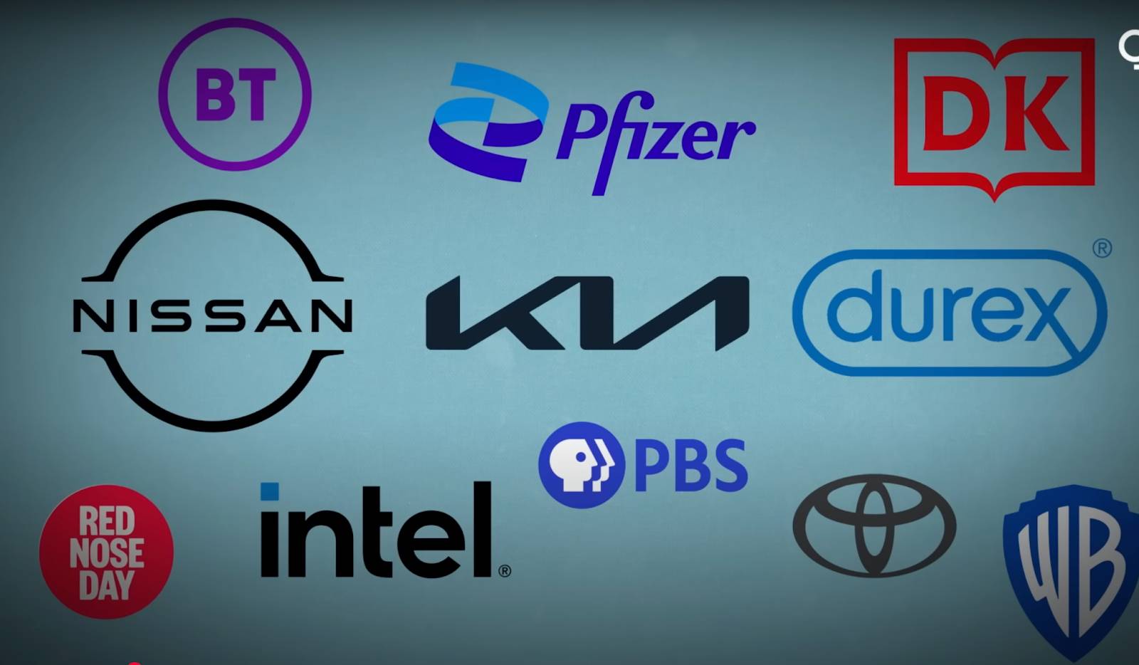
And it’s not just companies with a strong physical presence (restaurants, cars, CPG, etc.) that have needed some digital honing over time. Take a look at some of these digital-first companies whose old logos look zany and unrefined compared to their restrained appearance today.
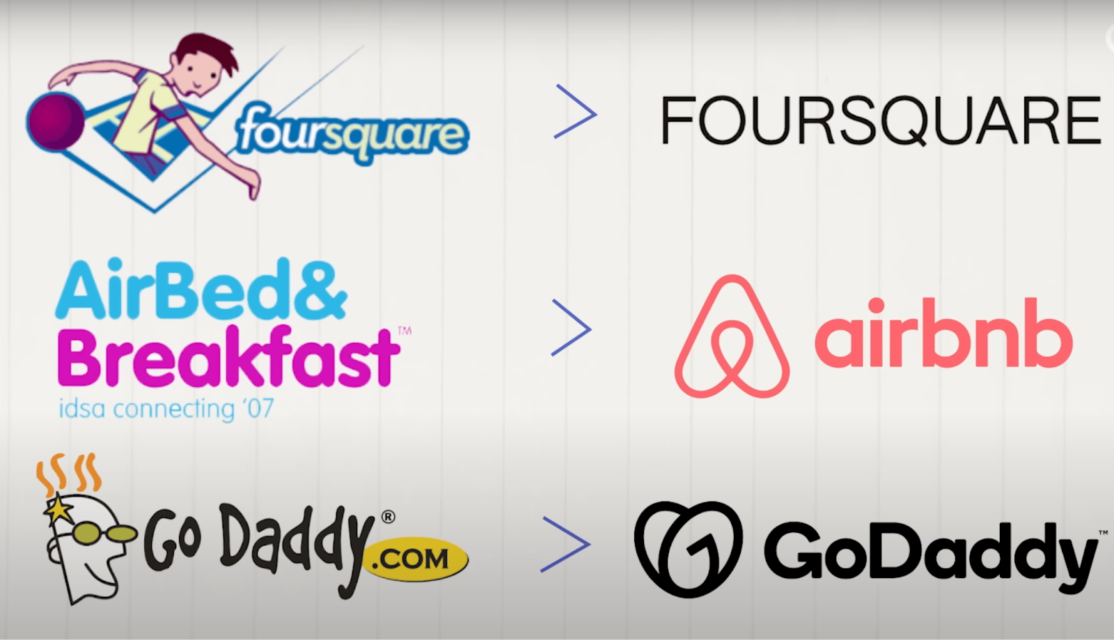
Take a peek at Uber’s journey. Throughout the years, they’ve simplified their name, embraced a max-contrast color scheme, and eventually re-embraced their wordmark. They’ve been a phone-first company since their founding, and they’ve still seen plenty of sweeping visual changes throughout 15 years.
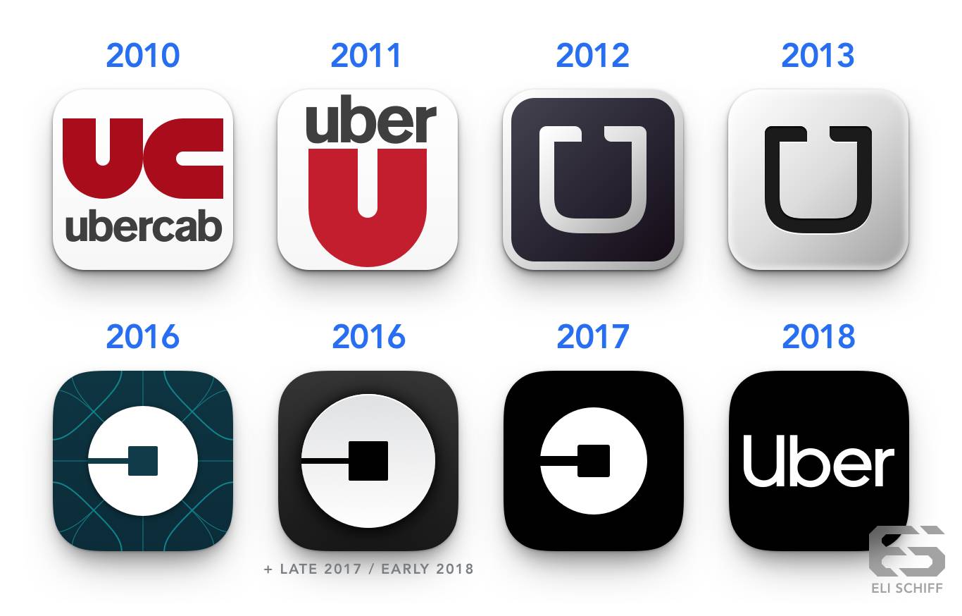
And now, Cracker Barrel. Whose evolution doesn’t seem quite as crazy, given the context of these previous examples. Even though I do feel like the wordmark could be about 20% bigger inside the barrel.
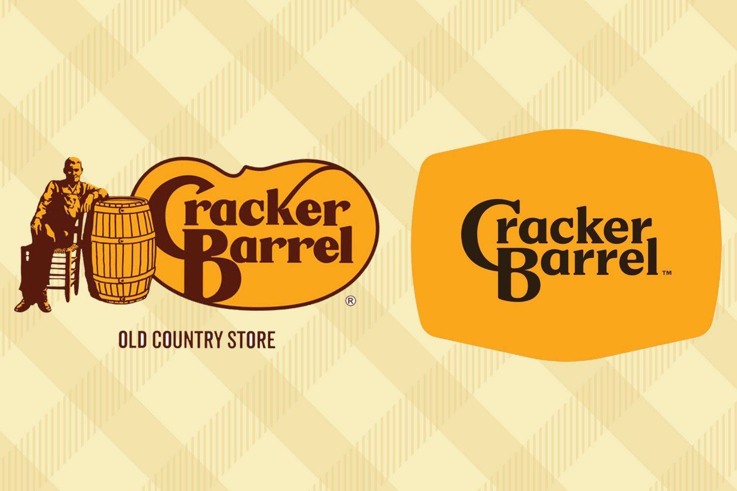
The Takeaway: Today’s Great Logos Do No Harm.
While founders and marketers love a genius, gorgeous, eye-catching logo, that’s not necessarily what users need, even if they think they do. Instead of going for the single prettiest mark, look for a resilient one that stays strong across platforms and is easy to remember.
A strong logo can’t carry a business like an amazing user experience or product, but a weak logo can chip away at it, especially on small screens and fast-moving videos. In that sense, your logo’s job isn’t to impress (like it might have been in the past). Its job is to anchor your brand without tripping anyone up.
Right now, everyone’s got something to say about Cracker Barrel’s logo. And there’s certainly a chance this runaway narrative harms the brand long-term. But if this new mark eventually blends in, helps elevate the brand’s everyday experience, and never distracts customers (at least for a second time), it will be a win.
Gil Templeton
Demand Curve Staff Writer
Become a better marketer, in minutes.
Join 90,000 founders and marketers getting actionable, no-BS startup growth marketing advice each week.
Product-Market Fit For a King
Insight from Gil Templeton — Staff Writer
As someone who drives a base model 2011 4Runner (or “2Runner” since it has no 4-wheel drive), I don’t need a lot in a car. I want something reliable, with enough room to access two car seats, and Bluetooth capabilities to play music from my phone.
As I waded into the car market earlier this year to probe for an upgrade, I was disheartened by my experience (and yes, I’m still rocking my 2Runner today).
For one, the prices were prohibitive for many models. Period.
Second, there were too many over-tech’d features solving non-existent problems. I don’t want to drag a tiny area on a huge screen to adjust my air vents. I don’t need to make wild hand gestures to turn the volume down. (Hot take alert) I don’t think automatic lift gates solve more problems than they cause. And I definitely don’t want to pay extra for all that stuff.
Third, the new car designs felt generally unexciting and indistinct from one another. Looking for a reasonable SUV to accommodate my family of four felt like playing an expert-level game of “Spot the Difference.”

These forces I felt are the exact gaps in the market Slate exploited. They saw these unmet needs hiding in plain sight: drivers feeling priced out, fed up with frilly features, and craving something more “their own.”
The Slate truck is a textbook case of product-market fit (PMF) covered in depth in the Five Fits Framework. It addresses what a large portion of the market was asking for (especially EVs under $40,000), while the rest of the category did tone-deaf things like charge drivers to use their own heated seats. Within one month of launching, 100,000+ buyers had reserved their Slate, showing signs of strong PMF.
It’s a reminder that PMF doesn’t need to come from “more.” So much of the time, it comes from sharpening your focus and pouncing on the spaces competitors leave open. Having a strong PMF is so important, a study showed startups are twice as likely to fail from lacking it (34%) than from financial problems (16%).
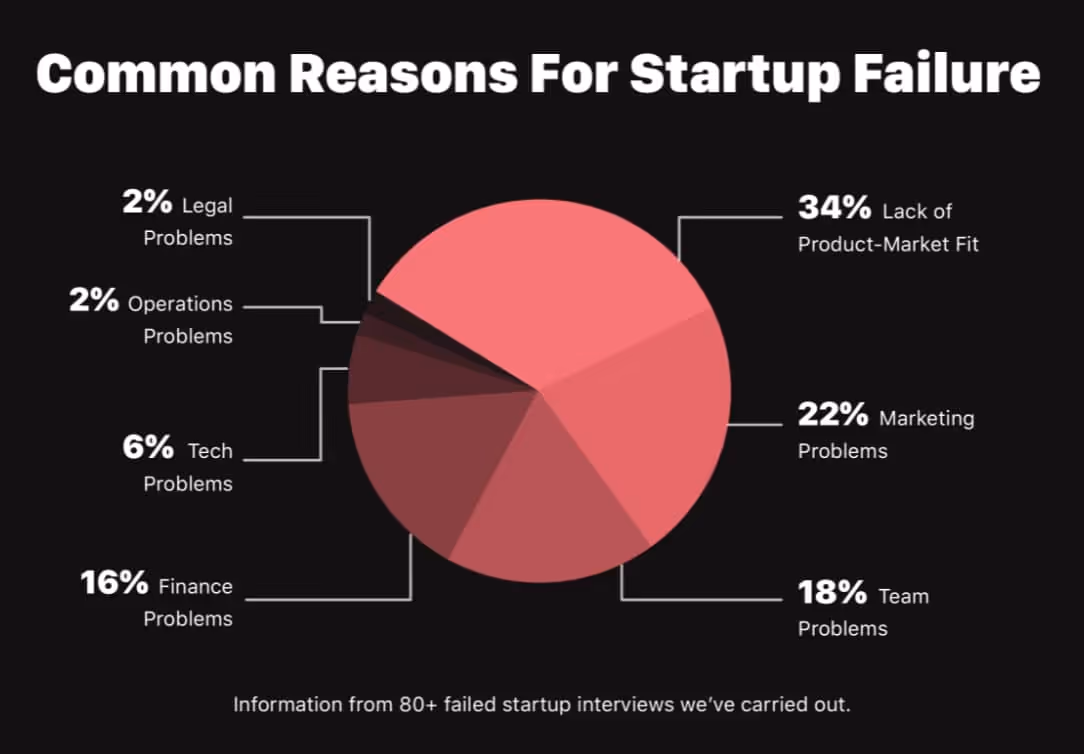
Let’s dive into some specifics around how Slate’s positioning delivered on real consumer needs.
Extreme Affordability, Despite a Regulatory Rug-Pull
When Slate launched with an EV priced below $20k (after tax credits were applied), it suddenly made EVs feel accessible and within reach for so many more Americans.
"There's a massive population of people out there that when it comes to safe, reliable, affordable transportation; there just really aren't many alternatives for them," — Chris Barman, CEO, Slate
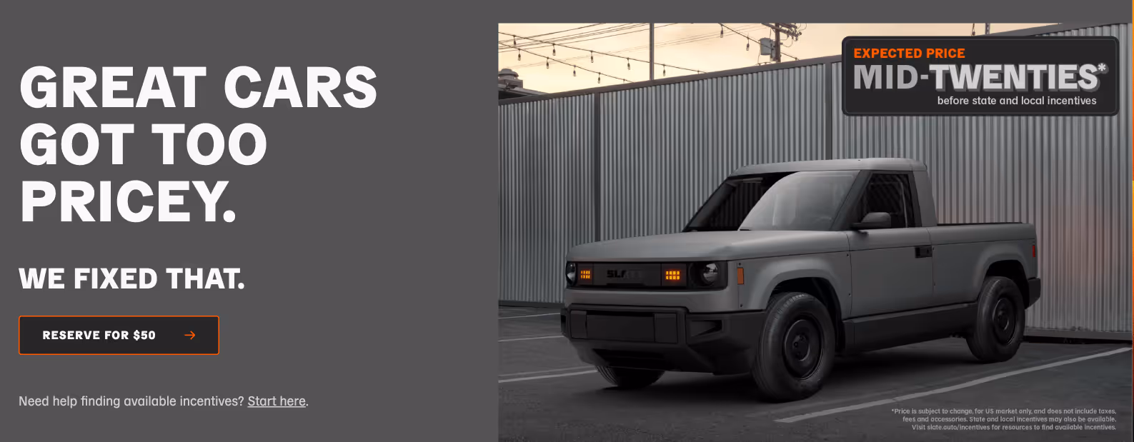
In a time when the average new car is nearing $50k, and the average new EV is north of $55k Slate launched with an EV that cost less less than half of those averages. At the original stated price of “under $20k” (after tax incentives), there was only one car on the American market that could say the same: the Mitsubishi Mirage. Woof.
“We are building the affordable vehicle that has long been promised but never been delivered.” — Chris Barman, CEO, Slate
Slate was making a clear value play, except their discerning, no-nonsense approach made “cheap” feel smart instead of like something you settle for.
But then came the “Big Beautiful Bill” which slashed EV tax credits and thus raised the price of a new Slate by $7,500. But even after losing $7,500 in tax credit benefits, Slate’s pricing is still competitive (albeit to a lesser degree), now in the “mid-twenties” according to their homepage. This shows they’ve built a model that could absorb regulatory shocks. And their made-in-America production might also help them sidestep potential tariff troubles.
There are about 20 car models on the American market priced below $30k, most of which are far less exciting than the Slate truck, and the only EV in this range is the Nissan Leaf, starting at $29,280. Meaning despite significant regulatory changes, Slate is still plenty differentiated.
For founders and startups, the lesson is: don’t be shades different from your competitors, be undeniably different. Even with vanishing tax credits nipping at their heels, Slate still has room to stay out in front as a value EV. They built something strong (and affordable) enough to weather this unforeseen storm.
If you’re building in a highly regulated space (or one that’s subject to change at a moment’s notice) make sure your value isn’t merely propped up by policy or a clever loophole. Ideally, it should hold up on its own merits regardless.
Marketing Hype With Wild Prototypes
You only get one chance to make a first impression, and Slate’s teaser campaign was a lesson in classic guerrilla marketing.
By partnering with the always-interesting ad agency Mischief, they unleashed a series of fake-business prototype vehicles, each more absurd than the last, strategically parked around LA to spark coverage and curiosity.
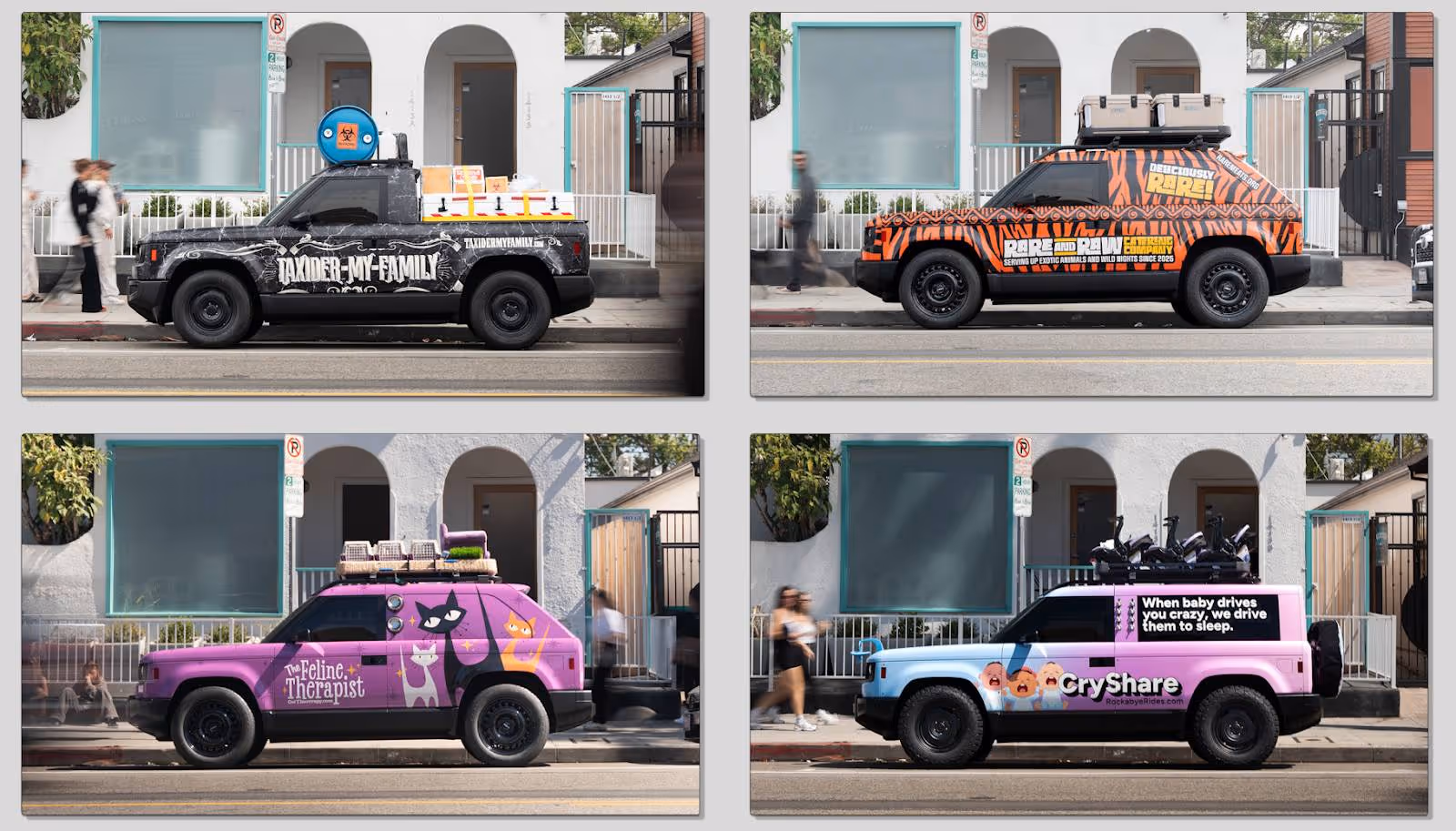
In an industry where humorous marketing is lacking, and banal taglines like “Experience Amazing” or “Innovation That Excites” come standard, this actually felt like fun. TAXIDER-MY-FAMILY, with an entire backstory? Come ON.
This sharp left turn sparked articles titled “The New Slate SUV Reportedly Funded By Jeff Bezos Was Just Revealed In The Most Insane Way” and popped up in Subreddits like r/whatisthiscar creating genuine intrigue for such a novel concept.
Not only did the playful and hilarious stunt signal Slate’s unique marketing stance, but it also put their modular and highly customizable nature at the forefront.
The lesson? If you’re going to pay for marketing, don’t pay for ignorable wallpaper. Stunts like Slate’s prove that entertainment can earn headlines and attention in a way that expected, descriptive messaging never will. (More on how to change that here.)
As a startup or challenger brand, you have to hold every idea to the standard of, “Is this working as hard as it possibly can?” And crucially, it has to reflect who you are. While Slate’s marketing made people laugh, it worked because it clearly served up their promise of modularity, play, and difference.
Customization as a Future Growth Engine
“It’s a blank Slate. You call the shots.” Says the copy a few modules down on Slate’s homepage.
It continues, “It's a blank canvas for personalization, so you can get exactly the Slate you want, with the stuff you want, at the price you want.”
With this, Slate is offering a platform with a low barrier to entry, endless DIY upgrades, and continuous personalization. Sure, it’s about individuality in a market largely devoid of it, but it’s also setting up a community-driven engine for growth. It’s a product that can scale 1:1 with each user’s exact intentions and desires, while starting at an inviting price point.
Speaking of inviting price points, their refundable $50 reservation fee acted as its own psychological “starter kit” that spawned 100,000+ signups within a month. This tripwire funnel invited people to join the Slate tribe without any real risk, while mirroring Slate’s product philosophy: start small, and add as you go.
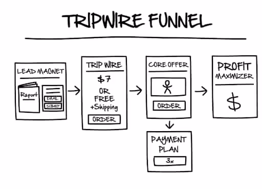
The site features a carousel module with 32 wildly unique configurations, each with its own fun name, often hinting at different vignettes and use cases. It shows just how modular these things can be, and it lightens the cognitive load by showing creative thought-starters (most of which require plenty of add-ons, naturally).
Slate’s design leverages mass customization, the concept of delivering tailored products at near mass-production efficiency through modular design and delayed differentiation. Their “Blank Slate” base model is not intended to be finalized. It’s begging to be customized.
Like a budget airline or à la carte menu, Slate unbundles the extras to let customers build exactly what they want. And whereas traditional trim packages bundle their features into pre-set tiers, Slate takes it a step further by letting buyers essentially create their very own trim package from scratch.
Want a nice set of speakers but the basic wheels? Great. Want to turn your truck into a doorless SUV? Bam. Want black seats and gunmetal HVAC knobs? Not a problem. Congrats, you just created your own bespoke trim package, and you didn't pay for a single "extra" you didn't want.
Your business can borrow this play by starting with an accessible hook, then building a roadmap of upsells that feel like added value or self-expression instead of nickel-and-diming.
The Takeaway: Push Perception Past Parity
It’s so easy to forget cars are parity products. Yes, Ferraris and Priuses seem like they’re worlds apart. But at the end of the day, cars are just four-wheeled vehicles built to take you from point A to point B.
That’s why positioning matters a lot more than fender flares or hand-gesture controls. Instead of trying to merely sell a more affordable EV, Slate positioned its product as the ultimate utilitarian vehicle. While middle-of-the-road car brands tout “innovation,” Slate proved it through an actual blank canvas for customization.
Whether they can deliver on building a quality vehicle or a great user experience remains to be seen (they’re likely hitting the streets in 2027). Even if two doors are a dealbreaker for me personally, I’ll be cheering them on from the sidelines.
If you’re in a crowded category, don’t aim for incremental differences and nuances. Tie your entire brand around one obvious wedge (Volvo has safety, Porsche has performance, Prius has stewardship, etc.) and drive that wedge like you stole it.
Gil Templeton
Demand Curve Staff Writer
Become a better marketer, in minutes.
Join 90,000 founders and marketers getting actionable, no-BS startup growth marketing advice each week.
From Discord Discourse to Dominance
Insight from Kevin DePopas, Demand Curve Chief Growth Officer + Gil Templeton, Staff Writer

RC and Matt were traders (and strangers) obsessed with the same thing, finding an automatable trading strategy that would make them millions.
The key to cracking this code hinged on “backtesting” which is basically a way to take a trading strategy like "buy when the price drops 10%" and testing it against years of historical market data to see if it would have made money. No real cash at risk, just practice runs on old data.
The problem was the existing backtesting software was complete garbage. And because of this, traders were either stuck using clunky programs, working in Excel spreadsheets, or gambling with real money to test their strategies.
Matt’s trading-themed YouTube videos caught the attention of RC, a software engineer and part-time trader. RC loved the videos, so he reached out through Discord, and the kindred spirits hit it off.
One night in their Discord chat, RC sent a message saying, "I think I know how I can build a backtesting platform."
Three months later, without warning, RC sent Matt a screen recording of him clicking through candlestick charts, demonstrating successful backtesting on a web interface.
"I was like, what the hell? How'd you do this?" Matt recalled.
RC had been building proof of concept while working full-time, but that was just the start of the slog.
The Year of No Weekends
Building the actual product was brutal.
For a year, RC would work his demanding full-time job, then come home to work on FX Replay until 2 AM, not to mention the marathon weekends. He was also on a work visa in the US that could be revoked at any moment, adding to the stress and uncertainty.
As RC built, Matt gathered feedback. In the spirit of co-creation, they created a Discord server where traders could test early versions and give feedback.
After over a year of iterating, it was time to make it real.
"It's now or never," RC told Matt two weeks before their launch in October 2022. "It's been going on for too long. We need to know if this is going to work or not."
RC pushed himself to his limits during those last two weeks. Even though the platform was missing dozens of features users desperately wanted, they shipped anyway.
Finally, RC sent Matt a message telling him to record the launch announcement. Right before collapsing into bed for two days, he checked Stripe.
"I saw somebody had already bought the trial and put their credit card down. That moment made everything seem worth it. I literally went to bed crying.”
The Growth Engine Nobody Teaches
By the end of month one: 100 paying users
Ten weeks in: 1,000 users
After eight months: 5,000 users
This was all without paid ads or a growth team. But how?
A key piece of their initial traction was Matt's existing audience. At the time, Matt had personally built a modest yet engaged following on Telegram, YouTube, and Instagram.
When most teams might see early community traction and conclude they need to double down on growing their own community organically, Matt decided to try replicating their community success with other existing trading communities.
Matt's strategy was deceptively simple: Turn community outreach into a systematic growth channel.
He went to other community leaders with this pitch:
"We'll give you a free account and a discount for your community. Just try it out, and share with them if you think they’d find it useful."
Even though there was no affiliate program at the time, many community leaders shared FX Replay with their audience freely and didn’t ask for a cut, because it was so valuable to their followers.
Matt was essentially running an outbound sales motion, but for community partnerships instead of customers. He emailed hundreds of trading influencers with personal, thoughtful messages after actually watching their content.
"I would always watch some of their stuff, so I could actually tailor a message to them," Matt explained. "If it's like, 'Hey, I watched this video and I really got a lot of value out of it. And I think your following can actually get value out of what we're making here too,' it hits a little harder."
While RC built features based on Discord feedback, Matt built relationships with community leaders. Because one community with 10,000 engaged traders beats cold-emailing 10,000 individuals.

Now is where most startup stories end with "and then we scaled." But not this one.
Leveling Up the Growth Engine
As they scaled past 5,000 users, Matt knew he needed to level up. They had traction, but he wanted more structure to test new channels and optimize conversion.
"I had little to no experience on the marketing side of things. I was trying to look and see, 'how can I be better at my job?'" Matt admitted.
He had a natural knack for growth but didn’t have the structure to scale systematically. That's when he found our Growth Program.
"It's different when there's a structured sequence showing you every step, from step one to step ten," Matt explained.
The program didn't transform them overnight, but it gave them a framework to understand and optimize what they were already doing right, and a method of testing new channels to see if they could unlock more growth.
"It helped assess our product, market, customers, and channels," Matt explained. "We were in a fortunate position with a lot of users and data, and we needed to do something with that to understand what they want, what they need."
Most importantly, it gave them the discipline to test methodically while staying grounded in what was working.

They launched a podcast, ran bi-weekly webinars, experimented with influencer partnerships, tried Snapchat ads (which flopped), and most recently began testing paid media. But here's the key, the program taught them to treat each channel as a hypothesis to test, rather than a shiny object to chase.
"It helped me focus on one channel and dial that in... because you spread yourself so thin when you try to do so many different things at once,” said Matt.
The program helped Matt understand why their community strategy worked (high-intent audiences and strong product-market fit), when to expand beyond it (after exhausting the channel and reaching a plateau), and how to build repeatable processes around what felt like lucky breaks.
Through this experimentation, the data kept pointing back to the same thing, community and word of mouth are the core of FX Replay's growth engine. RC estimates 90% of their users still come from word-of-mouth and community channels.
The Playbook You Can Actually Use
After dissecting their journey, here are the lessons you can take from FX Replay’s growth:
1. Solve a Problem You Live
Both RC and Matt were traders first and founders second. They didn’t have to study traders’ frustrations, because they felt them every day.
"Because we knew the problem so intimately, we knew what we needed to do to create an actual solution,” said Matt.
Today, FX Replay takes this concept even further by encouraging all their employees (devs included) to trade. Because when your team feels the same pain as your users, everyone is on the same page.
2. Ship the Core (But Make It Sharp)
We all know about MVPs. Eric Ries wrote The Lean Startup over a decade ago. Silicon Valley has been preaching "ship fast" ever since.
But user expectations have changed significantly over the last ten years. We've been spoiled by beautiful, intuitive apps. This means your MVP still needs to feel modern, even if it's not fully fleshed-out with features.
FX Replay launched with only two key features: Backtesting trades and seeing analytics. But those features ran smoothly behind a clean interface and didn’t require a download.
"People couldn't go back if they skipped forward too fast, and they were complaining about that for a long time," RC admitted.
So while some users complained about missing features, they still paid to support the vision, because the core experience was so solid.
3. Leverage Other Communities While Building Your Own
When founders hear "community-led growth," they usually think it means building their own communities from scratch (which can be a daunting undertaking). But Matt proved community-led growth doesn’t have to start and end with a community you own.
Instead of choosing between building their own community or partnering with others, Matt did both. While FX Replay invested in their own channels (Discord, webinars, podcasts, YouTube) they simultaneously turned existing trading communities into a distribution engine.
Give community leaders free accounts and member discounts. Ask them to try the product and share if they found value.
These external communities drove new user acquisition while FX Replay's own channels kept users engaged (and feeding the product roadmap).
Matt essentially systematized word-of-mouth growth through strategic community outreach, and you can too.
4. Discord as Your Product Development Lab
A lot of companies use Discord for support, but FX Replay turned Discord into their product team.
They let users suggest features, vote on priorities, and watch updates happen. This created a tight feedback loop where users felt like their fingerprints were all over the experience.
On top of getting great feedback, this created emotional investment. When users saw suggestions turn into updates and features, they became loyal. Plenty of users paid for a work-in-progress product just to help support its development.
5. Focus Wins Out (Even When You Test Everything)
FX Replay has tested a lot of growth channels, but they never turned their backs on what worked best.
Community outreach and word-of-mouth drove an estimated 90% of their growth from day one. Nearly three years later, those same key channels still drive roughly 90% of new users.
This mirrors a theme we've written about before, the best companies don't necessarily do one thing forever, but they tend to master one thing completely before adding more to the mix.
Bottom Line: Fundamentals Always Win
The most interesting part about FX Replay's story was that after a couple years and 100,000+ users, they're largely doing the same things that got them their initial traction.
Community outreach. Discord engagement. Building alongside users. Creating valuable content that teaches instead of promotes.
"More than the quantity is the quality," RC emphasized about their community relationships.
They didn't pivot to paid ads when they hit 1,000 users. They didn't raise venture capital at 50,000. They kept executing the fundamentals with a little more sophistication.
Matt and RC transformed from accidental marketers to intentional growth leaders through systematic learning and discipline. The Growth Program gave them the structure to understand why their organic success worked, and how to magnify it without muddying it.
No matter what kind of business or industry you’re in, you should follow their lead. Choose systems over hunches, and depth over breadth.
Kevin DePopas
Demand Curve Chief Growth Officer
Gil Templeton
Demand Curve Staff Writer
P.S. Want to build your own systematic growth engine? The Growth Program 2.0 teaches the same frameworks that helped RC and Matt scale FX Replay.
Learn more →
Become a better marketer, in minutes.
Join 90,000 founders and marketers getting actionable, no-BS startup growth marketing advice each week.
From Discord Discourse to Dominance
Insight from Kevin DePopas, Demand Curve Chief Growth Officer + Gil Templeton, Staff Writer
“Nothing Beats a Jet2 Holiday…”
From the desk of Gil Templeton – Staff Writer
While it seems there’s no singular “song of the summer” this year, there’s certainly been a sound of the summer. That sound is the certified-viral “Nothing beats a Jet2 holiday” audio clipped from the ads and in-flight videos of the budget British airline/travel company Jet2.
The hashtag #Jet2holidays has been used on 456,000 TikToks, and the audio has been used in 2.8M videos, most of which show vacation fails: pulling open hotel curtains to reveal the world’s smallest window, watersports disasters, wipeouts in the bowling lane, etc.
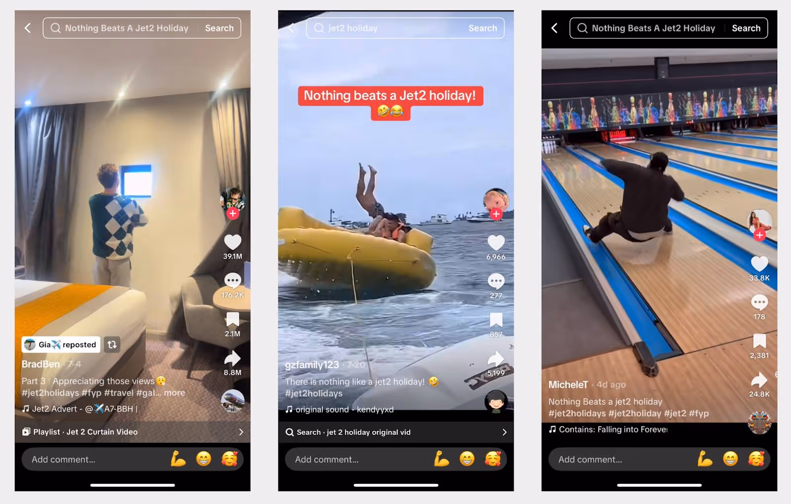
The “joke” is that Jet2’s relentlessly sunny earworm, Hold My Hand by Jess Glynne, creates a lighthearted mismatch when paired with epic vacation fails. As a budget-friendly airline and travel package provider, Jet2 experiences aren’t always known for being high-end or picture-perfect.
Instead of trying to swim upstream and “fix” the narrative around this onslaught of negative yet hilarious videos, Jet2 leaned in. They created a lipsyncing contest for the audio, offering £1,000 for the winning submission. Their video has 34M+ views and comments like “This is actually so iconic” and “Jet2 has entered the chat.”
The Lesson: If you can’t beat ‘em, join ‘em.
You can’t fight a wildfire with a press release or cold corporate messaging. When a good-natured social media trend has taken on a life of its own, you have no choice but to cheekily hitch your wagon to it and play along.
By winking at the joke, Jet2 showed they were in on the fun without directly admitting they sell lackluster experiences. It was a smart way to ride the wave without sinking brand equity.
Domino’s Pizza Turnaround
Back in 2009, Domino’s had a mess on their hands. In addition to viral videos of real employees doing heinous things to customers’ pizza, their product quality was slipping amidst franchise expansion. The fallout made Domino’s a lightning rod for criticism, and they needed to gain control of the narrative.
Enter Domino’s Pizza Turnaround, featuring one of my favorite off-kilter taglines ever: “Oh Yes We Did.” Domino’s tapped red-hot ad agency Crispin Porter + Bogusky for a come-to-Jesus ad campaign, featuring cutdowns from their wonderful four-minute marquee video where they faced the harsh truth.
The ads showed focus groups calling out their cardboard-like crust and their ketchup-esque sauce. It showed the corporate team cringing and shaking their heads in shame. Then it showed the team rallying wholeheartedly to make better pizza.
“You can either use negative comments to get you down, or you can use them to excite you and energize your process and make a better pizza. We did the latter.” – Patrick Doyle, President, Domino’s Pizza
The numbers following the refreshingly candid campaign didn’t lie. By the end of the next quarter (Q1 2010) Domino’s posted a 14.3% sales increase QOQ, one of the highest-ever revenue jumps for a fast food chain. (Source: UCLA Economics). By the end of 2010, the company’s stock had soared 130% from where it was at the end of 2009.
Domino’s stock continued to go on a remarkable run for the next twelve years, with gains dwarfing the S&P 500, Invesco QQQ, and Papa John’s for good measure.
Their stock went from $8.38 a share at the end of 2009 to $564.33 by the end of 2021. An absolutely legendary run. I, for one, don’t believe this would have happened with cardboard crust and ad campaigns acting like everything was hunky-dory.

The Lesson: Honesty is the fastest way to reset trust.
Instead of slightly tweaking the recipe, Domino’s tore everything down to the studs. That radical transparency showed customers the company was serious about fixing the problem, thus creating a clean break from the old baggage and opening the door to growth.
The Anti-Luxury Amsterdam Hostel
Back in 2013, my two friends and I needed a cheap hostel for a one-night stay in Amsterdam. After poking around online, one option stood out like a sore thumb: The Hans Brinker.
In some of the boldest pieces of advertising I’ve ever seen, their site featured atypical “Before” and “After” photos of guests looking nice at check-in and awful at check-out, implying the Hans Brinker was a wild, chaotic, sleepless adventure.
So we did what 21-year-old guys do and immediately booked a night there. After being paired up in a room with a group of six Aussie guys on a bachelor party (who didn’t really sleep, and snored like locomotives for the hour or two they did) we got the full Hans Brinker Budget Hostel experience, as advertised.
Checking back in on the Hans Brinker today, they’re still living into their promise, albeit in a more tasteful way. Absolutely hilarious, daring lines like “Just don’t say we didn’t warn you” and “You probably won’t sleep much anyway” are paired with photos of llamas in dorm-style rooms.
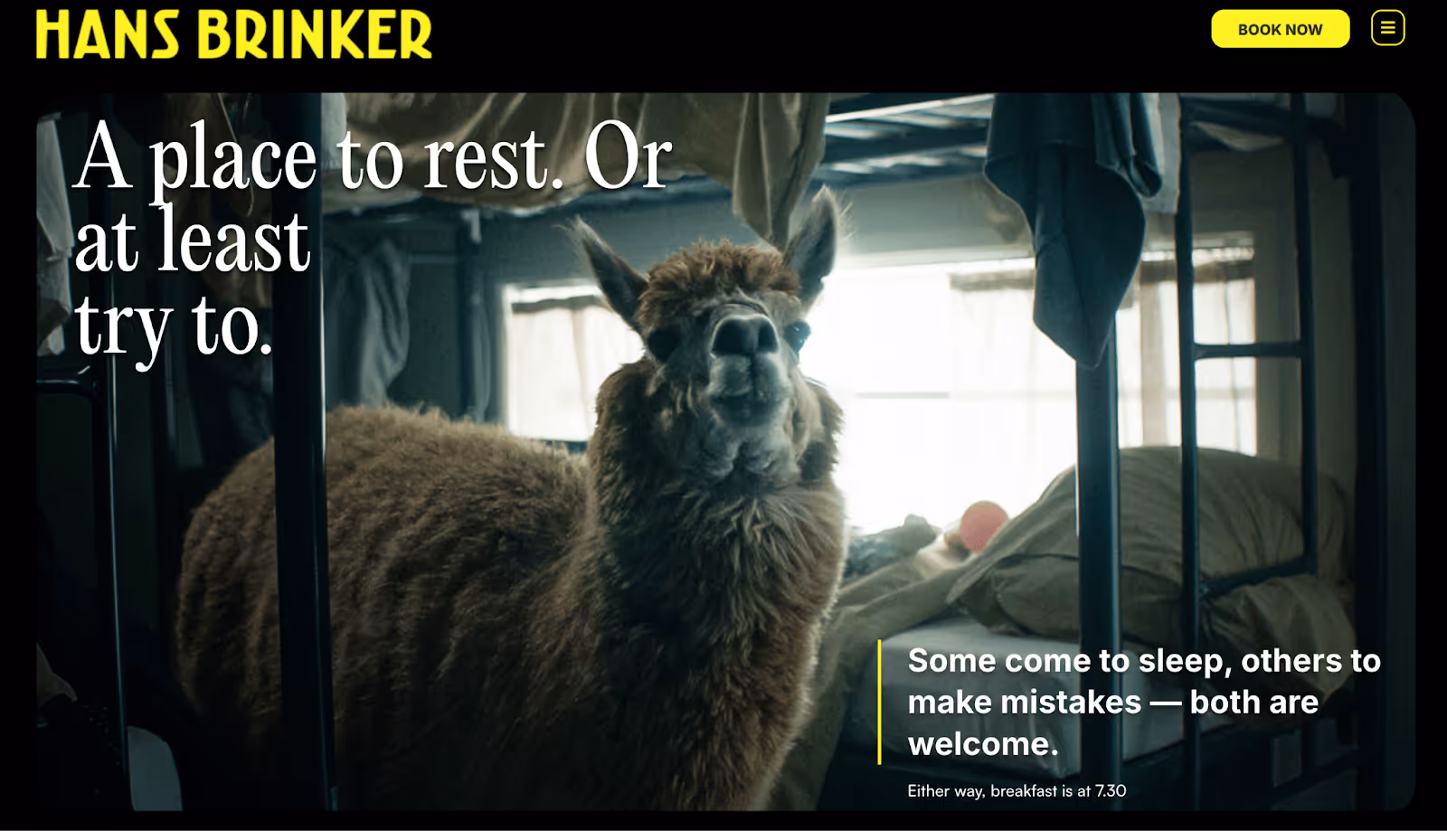
This is a classic case of knowing what you are and what you aren’t. It’s also proof you don’t need a viral trend or a multimillion dollar ad campaign to own your “thing.” You just need to be intentional about your brand differentiation, especially above-the-fold, then put your shoulder behind it across your marketing efforts.
If the Hans Brinker website had featured their central location, history, team, or their (admittedly scant) amenities in 2013, we would have glossed over it and booked a place with better reviews. But they played (and still play) to the adventurous, younger crowd who’s looking for a story, not sleepy time.
The Lesson: Specificity beats general appeal every time.
Instead of getting lost in the noise with other listings, the Hans Brinker plays up their truth (cheap rates and unbridled chaos) in a way that speaks to a specific slice of customers. In a huge tourist destination, they don’t need to be everything to everyone.
In other words, nobody craves buffet food. So choose the food you serve best (steak, tacos, or in this case late-night pizza) and make it even more specific (dry-aged steak, al pastor tacos, or the biggest slice in town).
The Takeaway: Truth Is Your Trojan Horse
The truth, especially when it’s wrapped up in wit or self-awareness, is disarming. It can sneak past natural skepticism like a Trojan horse rolling through the gates.
Whether it makes people laugh, feel seen, or nod along, leaning into your brand’s truth shows your audience you’re willing to meet them where they are.
Specificity and honesty are also self-filtering. They pull in the right customers and build loyalty in a way that “We’ve got something for everybody” never will.
Gil Templeton
Demand Curve Staff Writer
Become a better marketer, in minutes.
Join 90,000 founders and marketers getting actionable, no-BS startup growth marketing advice each week.
MidJourney’s UX Journey
From the desk of Gil Templeton – Staff Writer
When MidJourney launched via Discord 2+ years ago, the UX was tricky, at least for me. For those not intimately familiar with Discord (and a little intimidated by their first foray into image-gen) the experience left plenty to be desired.
You had to create and link a couple accounts, you were directed to use public channels filled with other users’ images, it wasn’t clear where your saves went (or how your credits worked), and you started every prompt by manually typing “/imagine”.
It constantly had me wondering, “Am I even using this right?” and the murky UX almost made me walk away.
Fast-forward to Midjourney today, and it’s as user-friendly as anything: a familiar “search bar” at the top for your prompt, upvoted eye-candy, a simple side panel for navigation, and no two-stepping through another platform (i.e., Discord).
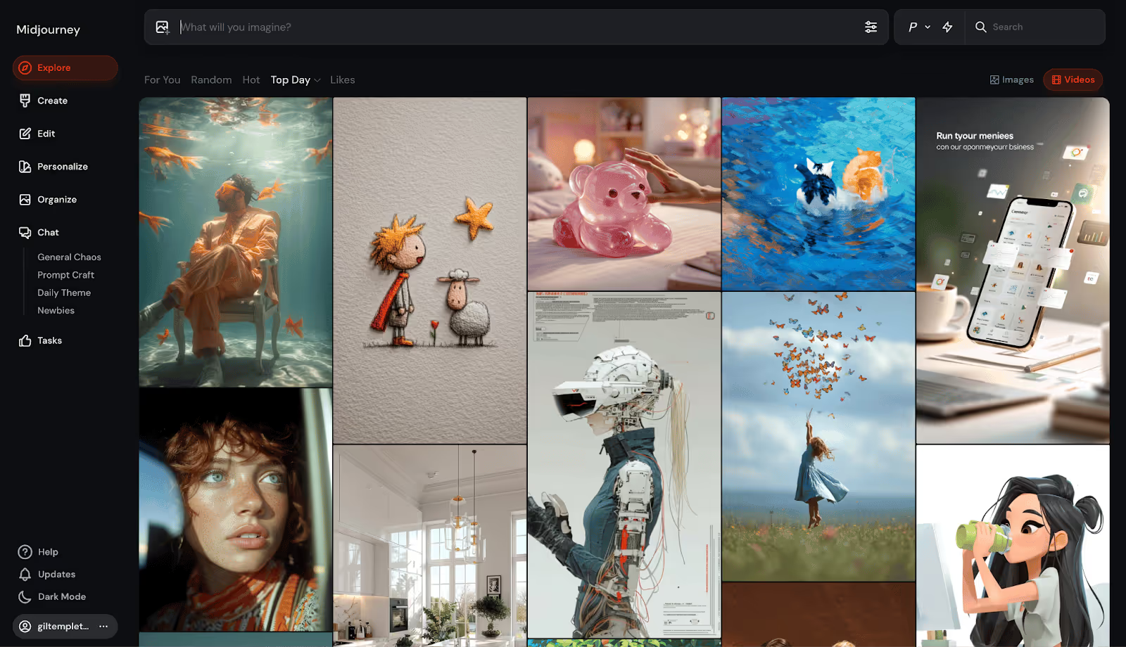
This transformation epitomizes the stupid-simple standard that’s become the template for today’s AI platforms, where the inner-workings are increasingly mind-bending, but the outward-facing wrapper is instantly enticing.
Let’s take a closer look at this standard that’s coalescing around today’s AI darlings.
A New Standard for Chatbots and Visual Tools
The main interfaces of platforms like Lovable, ChatGPT, Gemini, Veo, etc. are shockingly stark, stripped-down, and simple. Even if you have no idea what you’re doing or if you really need this thing, you immediately know how you’re supposed to use it. Then your quick and easy outputs prove why you need it.

They throw you straight into the experience with virtually zero friction. “Just type something here and have your mind blown, we’ll figure out the details later,” seems to be the new norm. When they do ask you to sign up, it’s free and takes a click or two.
They strip out any potential rub and make the first interaction feel like a win, hooking you with your “Aha!” moment before you can even think about leaving.
My dear grandmother doesn’t know what “vibe” or “coding” mean, but could she vibe code on Lovable in a minute or two? Yeah, she could. It would probably be very bad (sorry, Nana) but she could type a few sentences and get something for her troubles.
Here are some themes and tactics helping these sites turn viewers into users:
- Frictionless or deferred sign-ups: These platforms tend to hook you with output before asking for a credit card. By the time you’re prompted to pay, the platform already has its hooks in you.
- Zero-education interfaces: They remove intimidation for first-timers by skipping the jargon and onboarding tours. There’s usually a single input field in a familiar search bar format, accompanied by easy-to-digest, human-sounding copy.
- Guided “first wins”: These platforms lower the cognitive load by showing suggestions, templates, or sample outputs from others, so users don’t have to think about how to take that first big step.
- Instant feedback: Rapid output delivers an instant dopamine hit that we’re well-documented suckers for. And with highly visual platforms like Sora, Midjourney, or Veo, the outputs are eye-catching and shareworthy.
- Dead-simple CTAs: “Type here” or “Upload a file” or “Paste your text” puts an easy-to-follow breadcrumb right in front of users without overwhelming them.
- Freemium plans: They’ll give you a taste of the real thing without making you pay a dime. Only when you want to cross a certain threshold of credits, time, or quality do they put a price tag on it.
- Lightning-fast Time To First Value (TTFV): By providing value (or the “Aha moment” below) so rapidly, these sites create instant momentum, making it far more likely you’ll engage and convert.

Some Other Interesting Examples
Plenty of other AI-forward or AI-enabled businesses are leaning into instant interactivity and quick wins to remove roadblocks and boost retention. Below are two creative examples:
Replit uses a Mad Libs-esque approach for app creation, where the homepage asks first-timers to fill in the blanks on three input fields: type of project, who it’s for, and what it does. This works because it collapses the intimidating “Where do I start?” moment into a playful, low-effort interaction that personalizes the output and gets users involved before asking for an email.
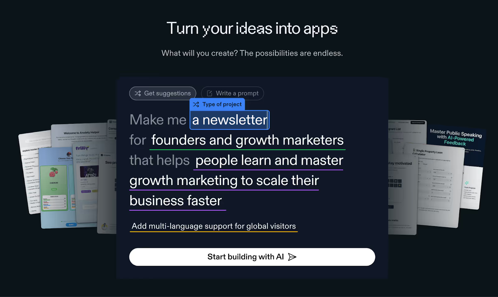
Creati conveys their value in a modular, highly interactive flowchart that begs for you to click on it. You can choose your model, featured object/product, and scene. Within seconds, the output updates to reflect your choices, showing you the exact value they bring.
Psychology of the Free Sample
The more I thought about this approach, the more I realized it’s essentially the digital cousin of the Costco free sample, on steroids. Free samples are a notoriously effective tactic at retail, as one industry study of grocery stores showed samples driving product purchases by 2000%.
The chart below shows just how effective free samples can prove to be across product categories (in real life, at least). Even a “laggard” like beer still sees a staggering 71% sales increase after engaging in free sampling.
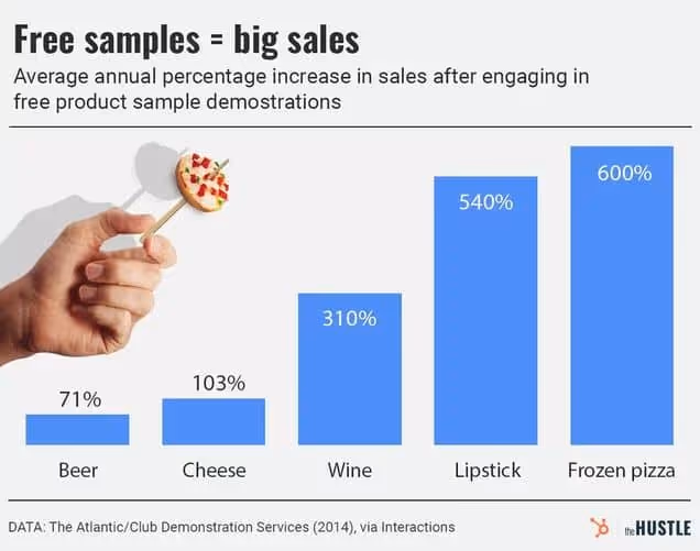
Free samples work in supermarkets for similar reasons why they work on homepages:
- Instant gratification: Quick, rewarding outputs deliver that same hit of “I got something” like you get from a sugary chocolate chip cookie quadrant.
- Lowered sense of risk: Once you taste it, you know whether you like it or not. So when a site/experience gives you something you like, it’s easier to justify further engagement or payment.
- Reciprocity drives action: While this is likely stronger in an in-person situation, a no-questions-asked free trial/freemium subscription comes across to me as more endearing than the pay-first option.
- Higher awareness: Once you’re exposed to a brand or business, they’re more likely, on average, to be in your consideration set. Of course a positive, hands-on experience can make it even more familiar and memorable.
When I said “...on steroids.” earlier, I was hinting at the attribute that makes this “sampling” even more powerful: bespoke outputs. Because a free sample of baklava is great. No complaints.
But a free sample of exactly what you’re craving (a Philly cheesesteak for me right now) cooked in seconds and served hot? One nibble of that, and I’m 100% reaching for my wallet to buy the footlong. Being able to generate these unique, personal outputs at scale is now possible through AI.
Takeaway: Be Interactive and Instant
Today’s best homepages and landing pages grease users up, so they can glide through progress and achieve gratification (or “first value”) before they can blink.
Sure, yours might not be as simple as a prompt field, but when you aim to make a user’s first steps just as inviting, obvious, and rewarding as these masterful AI juggernauts, your conversion rate will act accordingly. (P.S. if you want deeper guidance on your CRO and landing page optimization, the Growth Program 2.0 will cover that in spades).
If your site’s first impression doesn’t have an interesting “hook” above the fold (more on that here), or it asks people to work too hard (decoding jargon, stumbling through sign-up, guessing the action they should take, etc.) you’re turning people off. And this gap is only getting more pronounced with frictionless AI tools becoming so ubiquitous.
While user behavior has always echoed the sentiment of “Don’t make me think,” it might be heading toward a place of, “Make me something.”
Gil Templeton
Demand Curve Staff Writer
Become a better marketer, in minutes.
Join 90,000 founders and marketers getting actionable, no-BS startup growth marketing advice each week.
What High-Converting Pages Do Differently
We’ll start with three homepage best practices that give your page a rock-solid foundation.
Convert More With Your Homepage
Insight from Demand Curve
Buyer journeys aren’t nearly as clean as we like to imagine. Most people won’t see your ad → visit your landing page → buy immediately.
It’s more likely to go like this:
- They see your ad while doom-scrolling Instagram. They click.
- Something distracts them away from their phone.
- They remember later in the evening (or 3 weeks later) thanks to a Trigger Event.
- They Google your company name.
- They visit your homepage, not the conversion-focused landing page you intended them to hit.
(At least, that’s how I tend to buy things online.)
Is your homepage optimized for conversion? If not, you may be leaving growth on the table.
Yes, your homepage has many jobs (too many). One is to orient people to your brand and everything you do. But don’t forget high-intent visitors often visit your homepage late in the funnel.
Design it with conversion in mind.
Here are some quick ways to make sure your homepage converts:
1. Start by nailing the above-the-fold
Your above-the-fold (ATF) is the portion of your website that’s immediately visible to visitors: your hero header, subheaders, imagery, and calls to action (CTA).
Header and subheaders: Keep your copy short. Concisely convey what your product is and why they should care. Visitors shouldn’t have to scroll to understand what you offer and how they’ll get value from you.
Imagery: Whether static images, slides or video, keep your product(s) at the forefront. Photos with people are optional, but they have a proven track record of increasing conversion.
Call to action (CTA): Your ATF is the most important part of your most important page, and your CTA here might be the most important part of your entire site. This is what drives action. CTAs for ecommerce tend to be “shop now.” For services, “get started” and “try now” work well. Make sure your CTA is high-contrast and unignorable.
Here’s an example of an above-the-fold done well.
- Concise, punchy header and subheader explaining what Mosaic is and why you should care
- Attractive visuals of the product
- Clear, high-contrast call to action (although they should depart from their monochrome design and make the CTA a contrasting color to make it pop)
We wrote an entire playbook on ATF alone. When you’re ready to create your ATF, you can follow our step-by-step process.
2. Handle objections in your below-the-fold.
Below the fold, you briefly address any objections visitors might have.
Some elements you might include here:
Social proof: Share reviews, press, user-generated content, testimonials, endorsements, ratings, customer logos, and customer stats.
- Include social proof near your CTAs to handle their objections at the key moment where they’re deciding to click or not. Trust leads to action.
- There’s basically no such thing as too much social proof.
Product features: Highlight unique product features that address common concerns.
- Worried about quality? Here’s why we’re the best you can get.
- Worried it’ll take too long? We’ll have you onboarded in five minutes or less.
- Worried about not liking the product? If you don’t like it, we’ll give you a full refund.
FAQ: Take it a step further and add an FAQ section.
- Start with the most common or highest-friction questions.
- Assume they didn’t read the whole page and repeat all the key points.
Bestsellers: If you have several products, highlight your flagship and most popular items. Or highlight a “starter pack” or samples.
Footer: Include pages in the footer that you want to give visitors access to but aren’t critical to the conversion journey, like your exchanges and returns policy.
See how MUD\WTR uses their FAQ section to address common questions (objections):
Include CTAs throughout your homepage so visitors don’t have to scroll back to the ATF to take the next step in their buyer journey: the product, pricing, or sign-up pages. CTAs in a sticky nav work well, too.
3. Run an A/B test.
It’s easy to make changes and assume they’re better. Time to test that:
Filter for people who have already visited your ad landing pages. These are the warm visitors we’re experimenting with. Send half to your current homepage and the other half to your new, conversion-focused homepage. See which performs better.
Put a little love into your homepage, you might see a big bump in conversion.
For more, dive into our Above the Fold playbook and Landing Page guide.
Now it’s time to dig a little deeper into the layout of the “perfect” landing page. While homepages and landing pages share a lot of the same DNA, let’s expand on landing page-specific nuances below.
The Perfect Landing Page Checklist
Insight from Tuff Growth and Demand Curve.
Your marketing efforts are wasted if the landing page sucks.
That’s why it's a good idea to use a proven template rather than get too creative.
Wait, don’t we constantly tell you to be creative?
Yes, 100%, your marketing needs to be creative to stand out.
But creative layouts confuse people.
So, be creative with marketing (ads/content/email) and practical with conversion.
Here's a checklist for nailing the perfect landing page (high-res version):

Thanks to our friends at Tuff Growth for creating this A+ infographic, particularly Sean Tremaine, the genius writer and designer behind it. Let’s dive into each of these sections some more.
Hero Section:
The hook is everything:
- Header: Clearly state what you do and why it matters.
- Subheader: Expand your headline. How do you do it?
- Image/Video: Visually communicate your product.
- Call-to-Action (CTA): Place an OBVIOUS button that guides the user to the next step.
- Navbar: Key conversion pages/sections only (Pricing, FAQ, Features) and make it sticky.
Social Proof #1
Social proof is one of the biggest motivators:
- Display usage numbers or logos of well-known customers to build credibility and trust.
Benefits/Features Sections:
Features = talking about yourself. Benefits = talking about your customer.
- Benefit Headers: Clearly state your product or service's main benefits.
- Feature Subheaders: Explain how they get that benefit with your product’s features.
- Image: Use visuals to reinforce the benefits and show your product in action.
- Use bullet points and icons for easy reading.
- Repeat your CTA button for each section.
Social Proof #2
There’s no such thing as too much social proof.
Go deeper with testimonials/case studies/reviews.
- Testimonials: Include quotes from satisfied customers, ideally with names and photos, to add authenticity.
- Case Studies: Highlight the results your customers have had.
You can see a deeper dive into the science of using reviews here.
FAQ Section:
- Don’t assume they read the page. Repeat key details.
- Handle the most common objections.
- Don't lay on the marketing speak, just give the facts.
Tip: Ask support and sales for common customer questions and objections.
Final CTA Section:
Make it glaringly obvious how you can help and how they can take action:
- Hammer in the top value prop.
- Make the CTA clear and persuasive.
- If it’s a form, use as few form fields as possible.
Footer Section:
- Only link to key conversion pages.
- Make it painfully obvious how to contact you.
- Privacy and Cookies Policies and Terms are mandatory.
Note: Of course, you can layer additional sections as appropriate for your startup. You can add pricing sections. Problem agitation. How it works. Product gallery. Your mission. And so on. This is a purely skeleton to build on top of.
Quick Tips
- 90% of the work is done by the hero. Make it hooky.
- Your CTA Button should be the most glaringly obvious thing on the page.
- Be short and clear. Optimize for scannability.
- Mobile-friendly is mandatory.
- If you have the traffic volume, A/B test regularly to find the copy and images that convert best. If not, get a lot of feedback from people.
Check this off next time you build a landing page, and you'll be ahead of 90+% of folks.
Want to get ahead of the rest?
Get our extremely detailed guide walking you through how to perfect each section. And if you want more detailed guides on every aspect of growth, sign up for the Demand Curve Growth Program 2.0 waitlist. Launching soon!
— The Demand Curve Team
Become a better marketer, in minutes.
Join 90,000 founders and marketers getting actionable, no-BS startup growth marketing advice each week.
What High-Converting Pages Do Differently
The High Cost of Low-Effort Outputs
From the desk of Gil Templeton – Staff Writer
A friend and I were dissecting a LinkedIn post from someone we both know, and it reeked of pure, unadulterated AI slop.
She asked a simple but important question: “Do you keep reading once you know it’s just pasted from AI?”
My response was a hard “No.” And I’ll be less likely to read another post from that person in the future, just because they’ve shown their hand. Their six-fingered hand, that is.
This anecdote speaks to the ways people (and platforms) have quickly learned to spot what’s genuine versus generated (what a CUNY professor describes as an “incredibly banal, realistic style.”) It also encapsulates how these types of posts and people are being categorically dismissed.
Since LLMs are so accessible and widespread, let’s start there, so you can be sure your brand’s associated text outputs (captions, ad copy, scripts, post on LinkedIn or X, web copy, emails, etc.) are boosting your credibility and reach.
Eight Ways To Nuke Your Copy Cred
To prove just how predictable AI writing can be, we threw a simple prompt into ChatGPT 4o to see how many instances of AI tells show up. While there are always exceptions, let’s look at some of the common (and lesser-known) AI text transgressions that can register as robot authorship:
- “It’s not just _____. It’s ______.” Similar formulaic, context-based comparisons such as these have been a darling of LLMs. While these can make a strong point or pivot in just a couple words, strive to find another format or approach to convey the idea.
- The much-maligned em dash: This well-documented “tell” has been a major blow to the infinitely versatile punctuation mark that writers notoriously overuse (guilty). In a strange reversal, real human writers are ditching it altogether to signal “Hey, I really put time and attention into this,” as much as it might pain them to do so.

- Excessive hedging or overly formal transitions: Spotting phrases like, “It may be prudent…” or “It might appear that…” show the lack of a clear and compelling human POV. Also formal transitions like "As a result" , "In parallel" , "Ultimately" feel mechanical and overused.
- Tripping over triplets: Using a sequence of threes is a historically strong tactic for storytelling. The number three scratches some itch in our human brains, and AI knows that. So if you see a “build, launch, and scale” or a “simple, smart, seamless” you’re likely staring down the barrel of a bot.
- Grandiose descriptors and verbs: These sensationalist adjectives, adverbs, and verbs try to drum up the emotion and persuasive flair, but they usually feel like a reach. I’m talking adjectives like revolutionary, groundbreaking, jaw-dropping, next-level etc. Adverbs like radically, seamlessly, shockingly, infinitely, etc. And verbs like delve, harness, illuminate, unleash, underscore, facilitate, streamline, bolster, embark, leverage, unlock, elevate, foster, map out, etc.
- Rhetorical Questions: These faux-conversational devices pop up when AI tries to sound engaging and interactive. Instead of naturally transitioning between ideas, AI drops in questions like "What's changed?" or "Sound familiar?" to create artificial dialogue.
- Nebulous quotes & sources: If you’re using a quote from someone, triple check that it exists in a credible source outside of your LLM. Sometimes you’ll get quotes that never existed, along with cloudy takes like “Studies show…” or “Experts agree…” when there’s not hard evidence backing it up. A real study showed AI failed to produce accurate citations about 60% of the time, so proceed with extreme caution.
✅ 0 instances ✅
- “Tapestry.” Just the word “Tapestry.” From personal experience (and the experiences of those on a Reddit thread and Grammarly blog too), it seems like AI can’t get enough of this one. Try to resist the urge to use it, unless your content relates to an actual tapestry (not a metaphorical one).
✅ 0 instances ✅
The examples above will be hard to avoid completely in all of your writing. Lots of the callouts are fairly common, and some are particularly effective (especially before they became a little suspicious). If you list a series of three things or use an em dash, nobody is going to write you off. But if you copy and paste a first-draft 300-word output from your LLM, you’ll probably sound some alarm bells.
Our Recommendation: If you're going to use AI to help draft content, use Claude over ChatGPT. In our experience, it's better at writing human-sounding prose. Use a reasoning model (like Opus 4 or Sonnet 4). These models can loop through instructions to avoid AI tells and make sure they don't show up. Create a "Claude Project" with plenty of examples of your actual writing, in your tone. Use this Project to draft your content. Finally, dictate your perspective (and loads of context) into the LLM before you simply prompt it to "write me a blog post." Your unique POV is a huge component of what makes your content human.
Worth Thousands of Words, Audiovisual No-No’s
When you’re going for realism, the same sloppy shortcuts that give your AI-generated copy away can taint your visual and audio assets. If you’re going for something so outlandish, unrealistic, or very clearly made with AI, people don’t judge the same way. As long as they know you’re not trying to fake them out.
But the moment you try to pass AI content off as an actual photograph, something human-made, or a real interview, it can be interpreted as deceptive and unethical. The backlash can be even stronger in certain industries like fashion, where models and photography are sacred. Last week’s public response to the AI model featured in a Guess ad in Vogue Magazine had people upset to say the least.
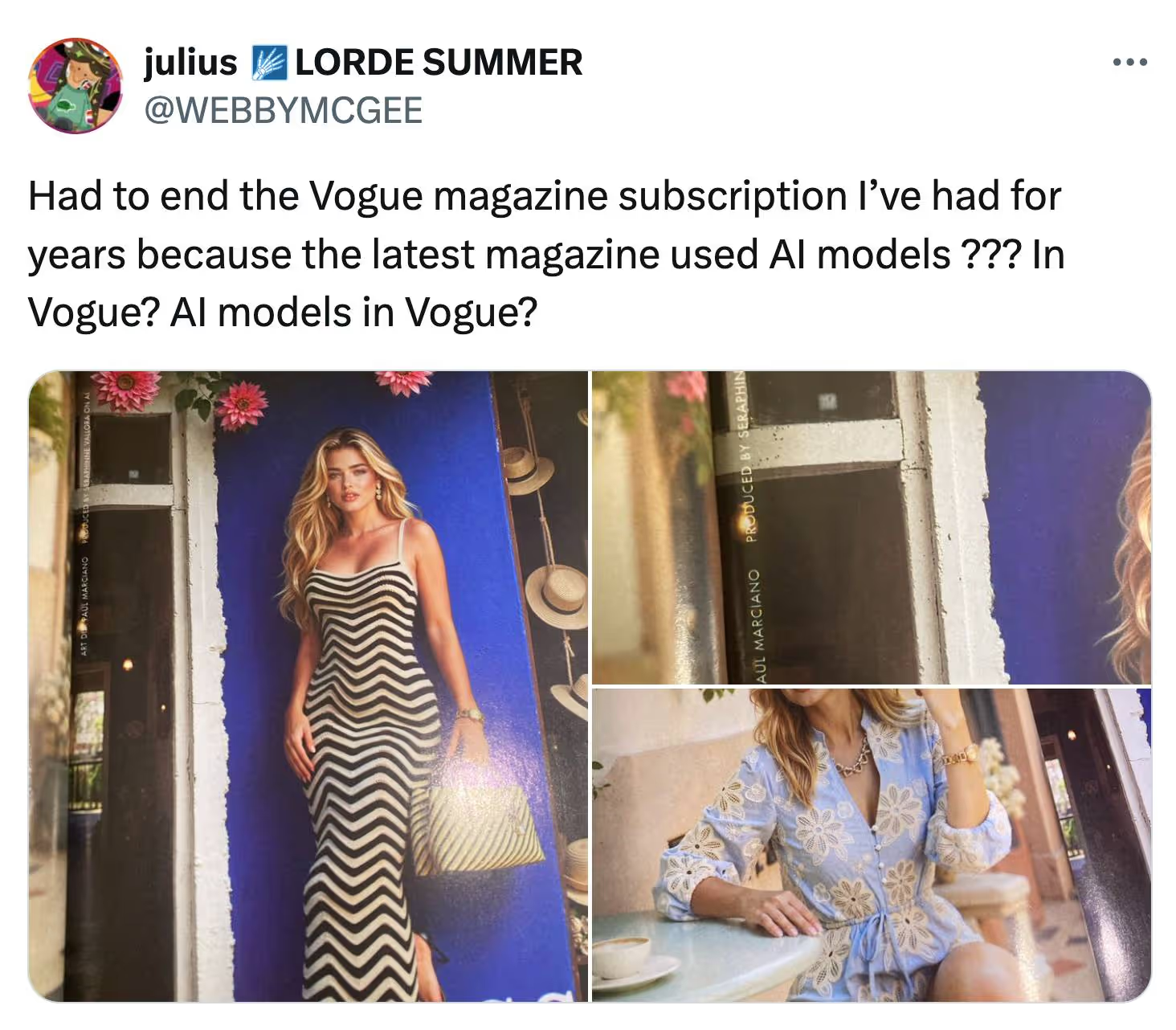
Product photography affected by AI can also pose an ethical dilemma. Let’s say you include a reference image of your brand’s purse in your Midjourney or Sora prompt, but the output looks more upscale.
The image looks glossy, immaculate, velvety, detailed, even though it doesn’t quite look like that in real life. Is it still honest to use that image in your ad, knowing AI dolled it up? Or have you crossed the line to misrepresentation?
We're not attorneys, but we'd urge you to research FTC regulations surrounding false advertising and deceptive claims in your industry.
Below are some practices and approaches you should avoid to ensure your audio/visual outputs aren’t seen as deceptive or jarring, especially if you are conveying realism:
- Fake humans pretending to be real ones: Passing off synthetic models or avatars as real people (whether in customer testimonials, interviews, or photoshoots) erodes credibility. Even if you disclose your AI usage or use an outright fake influencer (like the fleeting Mia Zelu of Wimbledon fame), it’s no guarantee people will like it or see it as ethical.
- Uncanny glitches in video: An unnatural movement or jarring facial expression quickly tells viewers they’re looking at AI. If the point of your video hinges on looking real, don’t use AI unless you have total mastery of the output and you disclose your usage of AI. The “Uncanny Valley” theory supports this notion that people can’t stand to look at something almost human. Act accordingly.
- Fake news-style interviews: Creating realistic yet fake footage of someone saying something they never said crosses the line (whether it’s a deepfake of a real person or a made-up character that looks like an everyday person). Unless you’re 100% transparent, or if your account is clearly for comedy/satire purposes only, stay away. This format has proven to be easy to pull off with Google Veo 3.
- Synthetic voiceovers with no context: AI narration with unnatural or flat delivery can stand out as inauthentic to some listeners (or stylistic to others). Use it to prototype or time your edits, but if you want the best shot at a voiceover that conveys human emotion (especially in high-touch, produced pieces) use real voiceover talent. However, ElevenLabs raised $180M in January at a $3B valuation, so the gap might be bridged pretty quickly if progress stays the course. And of course there are cases where AI voiceover works well.
- ChatGPT Sepia Filter: That telltale yellow-beige tint that washes over AI-generated images. It's the visual equivalent of the AI em dash. Yellowish images can still get your point across and might be better than nothing, but make sure the visual message is worth the potential credibility hit. A quick "temperature" and "tint" adjustment can fix the issue.
Platforms Prioritizing Quality
Tech platforms are making their stance clear, use AI to elevate, not automate. They want creators and users who embrace this new technology to add value. They’ve been fine-tuning their policies and algorithms to sort for quality over sheer quantity.
YouTube made a change to their monetization policy where “faceless,” repetitive, or mass-produced content (often made possible with AI) will now be deemed inauthentic and ineligible for monetization. And while remixes and AI content are still allowed, creators must add clear value or commentary for it to qualify. The bar might not be particularly high, but at least the bar has been re-set.
Google has also clarified their stance of “Rewarding high-quality content, however it is produced.” Pay special attention to that phrase: “high-quality.” They’re much less concerned with how something was made, and much more concerned with the actual merits of the site or blog. In other words, you can definitely use AI to help write your SEO-boosting blogs, but the final draft better not read like unoriginal, regurgitated goop.
And if you’re like me, you’re probably scrolling through LinkedIn like you’re walking through a minefield, cautiously approaching each post to inspect for clear and present traces of AI before devoting time to reading it.
Bottom Line: Recalibrating Our Filter
Sure, the tools are faster than ever. The slop is sloppier than ever. But we humans are already doing what we’ve always done during these eras of newfound media overload, recalibrating our filters and redefining our threshold for what’s worthy of our time and attention.
So while you can now “write” a blog post by dictating a few sentences into AI and hitting a couple buttons, remember, so can everyone else. The barriers to entry are lower, and because of that, the bar for quality has never been higher.
Gil Templeton
Demand Curve Staff Writer
Become a better marketer, in minutes.
Join 90,000 founders and marketers getting actionable, no-BS startup growth marketing advice each week.
A Lovable Story
Insights from Gil Templeton and Kevin DePopas
Stockholm-based Lovable turned a simple, powerful idea into a rocket ship: use AI to let anyone build apps or sites just by describing what they want. The approach, vibe coding, became popular this year as a tool for rapid prototyping, paired with software.
Within eight months of launching in late 2023, Lovable attracted 2.3M active users, saw over 10M projects built, and raised a $200M Series A, valuing the company at ≈ $1.8B. They minted a European AI unicorn at unprecedented speed.
By letting you speak your app into existence with vibes only, it basically turns moodboarding into shipping. A founder described it as holding a “magic key” that opens the door to software without developers.
This level of product-market alignment makes customers’ obsession with the product a natural growth lever. Every output becomes a showcase people want to show off. And each user becomes a signal-boosting evangelist.
It’s one of those rare cases where an innovation has so many use cases and so much visual intrigue, the product itself is the growth engine no matter what channel it’s on or who’s looking at it.
The 12-Channel Illusion
On the contrary, some growth gurus were quick to claim Lovable architected their growth through a complex omni-channel strategy:
- GitHub - Launched as GPT Engineer, got 54K stars
- Product Hunt - Multiple launches, starting January 2024
- X/Twitter - Daily posts from CEO Anton Osika
- LinkedIn - Professional spin on the same X/Twitter content
- Discord - 34K+ member community
- YouTube - 20K+ subscribers, product demos
- Google Ads - Paid search campaigns
- Partnerships - Agency deals with commission structures
- Podcasts - Hit every major tech show (20VC, Lenny's, etc.)
- Events - Presented at Slush and other startup conferences
- Reddit - Strategic threads showcasing the product
- SEO - Blogged about their own growth to attract more growth
Impressive list, but this is more correlation than causation. It's what happens when your viral coefficient (the average number of new users that an existing user generates) is insanely high. Because starting a fire is a littleee easier when your product is a 50-gallon drum of jet fuel.
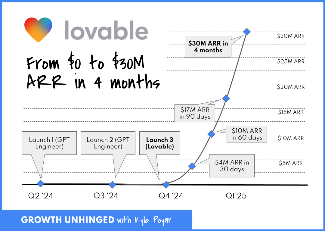
The Viral Coefficient Driving It All
During Lovable's early hypergrowth from over 20,000 users in late January 2025 to over 500,000 in February, they achieved ~25x user expansion in about a month, implying a peak weekly viral coefficient K ≈ 1.24.
When your viral coefficient is that high, channel selection becomes irrelevant. Post on Product Hunt? Viral. Tweet about it? Viral. Show up at an event? The crowd goes wild.
It's not that Lovable mastered these 12 channels in order to grow. It's that their product is so shareable, user-friendly, visually stunning, and so "holy sh*t look what I made in minutes" that any exposure becomes a growth loop.
Mo’ Money. No Problems.
And if you're still tempted to mimic their strategy, gut check whether you have as much cash on-hand to fuel your growth.
Unlike most startups, Lovable never had to worry about scraping together cash, due to a sizable $7.5M pre-seed followed by an explosion of early revenue traction. Lovable launched on November 21st 2024. By February 2025 (3 months after launch), they had:
- Acquired 30,000 paying customers
- Hit $17M ARR
- Raised a $15M pre-Series A
- Spent $2M to get there (mentioned in an X post from the CEO, Anton Osika)
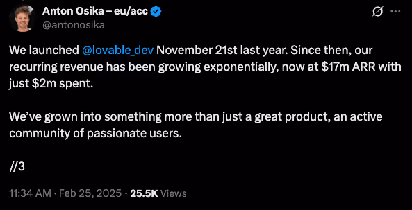
While Osika doesn’t mention exactly how they spent the $2M, even if only 20% of that $2M went to marketing, that's still $133,000/mo in marketing spend out of the gate. Most startups are trying to stretch out $10k over three months of Meta ads. 🥲
When you have that kind of capital, you can afford to have a presence everywhere at once. You can hire Discord community managers, video content editors, SEO writers, and still have budget left for paid ads.
Why Your Bicycle Can't Handle a Jet Engine
Lovable rides a jet engine fueled by three things:
- Insane product-market fit that creates outputs people compulsively share
- Early revenue and venture funding that enables simultaneous channel execution
- Perfect timing in the AI gold rush where "I built this with AI" still grabs eyeballs
There’s a good chance your startup doesn’t have all of these to the degree Lovable does. Which means copying their channel playbook isn’t particularly useful.
The Actual Takeaways Here
Strip away the hype and oversimplification, and here's what matters:
- Build virality into your product: To the extent your product/service supports it, ask yourself, "Is my product something people actually want to show others? Can we build in network effect dynamics?"
- Be realistic about resources: If you can’t spend $100K+/month on growth, you probably can’t fund a breakneck 12-channel growth strategy.
- Recognize survivorship bias: Remember, for every Lovable, there are 1,000 startups that tried to "be everywhere" and burned out.
- Learn from Lovables individual channel strategies: None of this is meant to knock Lovable. They are clearly very talented marketers and you can still learn from them. Building in public on X might be a great strategy for you.
The Channel Focus Reality Check
In the incredibly likely event your product doesn't have Lovable's inherent virality, here's your channel playbook:
- Test 3-5 channels with small budgets ($3-5K each)
- Identify the one with the best unit economics
- Scale that channel until you hit diminishing returns
- Only then consider adding channel #2
It’s not as sexy, but a steady, sustainable, scalable growth engine is how the majority of successful startups actually grow (it's also the key focus of the Demand Curve Growth Program).
Bottom Line: Product Over Everything
Lovable's story is seductive (and potentially dangerous) because it suggests you can brute force your way to product-market fit. “Just be everywhere all the time! Master ALL the channels! Growth will surely follow!”
That's bass-ackwards. Lovable earned the right to be everywhere, because their product was everywhere-worthy. They mastered all channels because every channel bowed down to it.
Your job isn't to copy Lovable's channel tactics. It's to build something users love and share as much as Lovable. Until then, a focused channel strategy likely beats cosplaying as a hypergrowth startup.
Gil Templeton
Demand Curve Staff Writer
Kevin DePopas
Demand Curve Chief Growth Officer
Become a better marketer, in minutes.
Join 90,000 founders and marketers getting actionable, no-BS startup growth marketing advice each week.
The Worst Rebrands of All Time
Insight from Gil Templeton — Staff Writer
Quiznos (2004): The Scary Sub Spongmonkeys
The Situation: Quiznos was getting their lunch eaten by Subway, which had a huge marketing budget and was building momentum through brand recognition, value messaging, and healthy offerings (yes, the Jared Fogle ads). Quiznos needed a breakout campaign to make them relevant and top-of-mind, especially with the younger crowd.
The Goal: Stand out in a crowded fast food market by being weird and irreverent, targeting younger, internet-savvy customers in the early viral video era.
The Rebrand: Quiznos launched the infamous national ad campaign featuring the “Spongmonkeys,” aka the bizarre, rodents with floating heads and screeching voices.
The Reception: The ads were plenty memorable, but deeply off-putting. The original Spongmonkeys were born from a viral Flash animation video, but their jump to mainstream TV was jarring for most Americans. Many were grossed out and/or creeped out, but most importantly, the campaign didn’t communicate anything meaningful.
Despite high ad spend, Quiznos lost market share and momentum as Subway doubled down on clear messaging around value and freshness. They emerged from Chapter 11 bankruptcy restructuring in 2014. Today, there are fewer than 200 Quiznos locations, compared to about 4,700 at their peak. Compare that to Subway’s 37,000 global locations. Of course, you can’t pin it all on one bad brand move, but the campaign might’ve taken Quiznos from “toasty” to “toast.”
The Takeaway: It’s okay to be weird, as long as you have a good reason for it. Being memorable doesn’t matter if people don’t remember what you’re selling (or when your food becomes associated with something kinda repulsive). Wackiness and silliness can’t carry your positioning if your core value prop isn’t clear.
Jaguar (2024): The Eclectic Electric U-Turn
The Situation: Jaguar had seen seven straight years of declining sales and was lagging behind luxury competitors in the EV arms race. With growing regulatory pressure on gas-guzzlers in Europe and a change in preference toward tech-forward EVs, Jaguar desperately hit the hardest of resets.
The Goal: Boldly recast Jaguar as a premium EV player and reposition the brand against Tesla and Porsche instead of leaning on heritage.
The Rebrand: A shocking repositioning of Jaguar into a minimalist EV-only brand with all-new type and colors, flattened logos, and a nebulous high-art ad that went viral for the wrong reasons.
The Reception: Like a bad car wreck, this gave people major whiplash. Fans (and pretty much everyone else on the planet) reacted viscerally, noting how the classic allure of the heritage brand was completely gone. People were confused by the vague “Copy Nothing” slam-poetry and enraged that the ad didn’t even show a car.
While sales had been declining for years, only 49 Jaguars were purchased across Europe in April 2025 (yes, 49 cars across continental Europe). Compare that to 1,961 cars in April 2024, and that’s a 97.5% drop in YOY sales. Mind-boggling for a storied hundred-year-old company.
The Takeaway: Jaguar absolutely needed to make a bold change. But instead of ushering the brand into the EV age, they came across as confusing, vacant, and weird for weird’s sake. They’d likely be better off if they made a more focused shift that combined their glorious heritage with today’s EV tech (and still offered a fuel-burner or two as a safety net for now).
Tropicana (2009): Grasping at Straws
The Situation: Minimalism and clean design were becoming the dominant aesthetic in CPG, as brands like Honest Tea and Naked Juice gained market share. Classic orange juice was facing hipper, healthier competition, and the legacy brand felt like they needed to make a shift.
The Goal: Tropicana wanted to modernize its image to signal purity and healthiness, appealing to a younger group of health-conscious shoppers.
The Rebrand: A total packaging overhaul that replaced the iconic orange-with-a-straw for a minimalist glass of juice and sterile sans-serif type.
The Reception: Customers couldn’t find it. The new look removed about every distinctive brand asset that made Tropicana recognizable and iconic. Within 60 days, sales had dropped by 20% (a loss of over $30 million). Needless to say, the old packaging made a quick comeback.
Tropicana sales saw a sharp rebound after reverting to the previous look, but it still didn’t reach previous highs. It’s likely that sixty days was enough time for consumer habits to shift permanently, and the reversion could have also signaled a somewhat-stale step backward, when Tropicana had a chance to evolve more intentionally from the failed effort.
The Takeaway: Sometimes recognition is better than reinvention. Mega-distinctive assets (like the red and white spiral straw in the orange) are strong visual cues for consumers to quickly identify at-shelf. So sometimes it’s best to gently update them, not ditch them altogether. When a premium, legacy brand looks more like the everyday store brand, consumers will either have trouble finding it, or they’ll default to the cheaper option and move on.
HBO Max → Max (2023): Rewinding Brand Equity
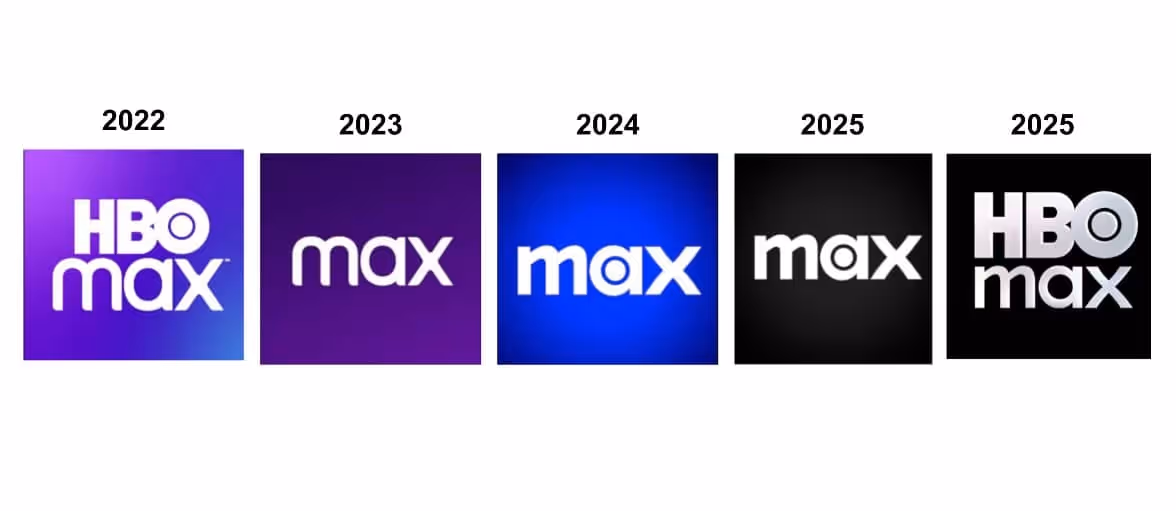
The Situation: Warner Bros. and Discovery had just merged, and they wanted to consolidate media assets under one roof to compete with Netflix and Disney+. There was internal pressure to streamline the brand and create a name that could stand for more than prestige TV.
The Goal: Create a platform that housed all content under one neutral umbrella. “Max” was supposed to be simple and expansive, allowing it to flex to select, new Discovery offerings.
The Rebrand: HBO Max (originally HBO GO) rebranded to “Max,” as part of the consolidation strategy.
The Reception: The name lost the strongest asset HBO had: its name. “HBO” stood for premium TV, while “Max” sounded like a budget broadband provider. Because of consumer confusion, the app tanked in App Store rankings, and HBO’s reputation got watered down by association with reality TV and clutter.
The Takeaway: Play to your strengths. If one part of your brand holds more equity than the rest of your offerings combined, build on that. HBO was the standard-bearer in award-winning, premium entertainment for decades, and they should have put their valuable name on a pedestal. After the confusion, HBO wised up and reverted back to HBO Max after several iterations of Max. A “full-circle” moment for the ages.
JCPenney (2011): The Anti-Sale Strategy
The Situation: JCPenney was struggling for relevance after the recession. Big-box and specialty retailers like Target, Kohl’s, and fast fashion brands were stealing market share, and JCPenny’s coupon-driven model suddenly felt outdated. Fresh off his success as the retail chief at Apple, the board brought in Ron Johnson as the new CEO to lead the reinvention.
The Goal: Reposition JCPenney as a modern, stylish department store that didn’t rely on gimmicky sales. The idea was to attract younger, higher-income shoppers and compete with trendy retailers.
The Rebrand: Ron Johnson led a full-scale rebrand from the top down. In addition to overhauling the brand’s look (including a square in the logo to match the new “fair and square” pricing approach, get it?) he eliminated sales, coupons, and markdowns in favor of an everyday pricing model.
The Reception: It turns out the traditional JCPenney shopper was a deal-hunter who loved coupons and doorbuster sales more than pricing transparency. The rebrand was seen as unearned and untrue to their crowd’s sensibilities.
In one year, JCPenney lost over $4 billion in revenue as foot traffic plummeted. Johnson was fired in 2013, and the brand walked back most of the changes. But they still experienced a slow, decade-long slide until filing for bankruptcy in 2020. Where’s JCPenny today? It looks like they just offloaded about 20% of their locations to a PE firm.
The Takeaway: Don’t rebrand for the customer you wish you had. Rebrand for the one you’ve earned, and reap the halo-effect along the way. Drastically changing your business strategy without accurate insights is a gamble to say the least. A rebrand should evolve your positioning without erasing what people were actually showing up for.
So When Should You Rebrand?
If your business is in one of the situations below, it might be time to consider making one. If not, you should probably fight the urge for now.
- Your positioning has shifted: You’ve evolved beyond your original product or audience, and your current brand doesn’t accurately reflect what you do best.
- You’re being mistaken for someone else: If customers confuse you with a competitor or unrelated brand, you need to stand out more clearly.
- You’re targeting a new audience segment: A new prospective target may require a fresh voice, look, or story to resonate. But make sure it doesn’t turn your loyalists off, RE: JCPenney.
- You’ve outgrown your humble beginnings: Maybe you didn’t have the time or budget to invest in quality branding when you started your business. If you’ve received a new round of funding or can otherwise afford a needed brand update, a fresh coat of paint might be the professional sheen you need.
- You’re entering a new stage of growth: Important opportunities like expanding to new markets or launching a flagship product can be the right moment to level up.
Find Clarity, Then Use Creativity
I hope these cautionary tales haven’t scared you away from making an important brand update if you need to.
The takeaway here isn’t “Rebrands are dangerous.”
The takeaway is: Rebrands can be multipliers, but they need to be executed thoughtfully.
There’s a reason just about every company undergoes a rebrand or two throughout the years. Offerings, audiences, opportunities…they can all change, and a brand needs to make strategic updates in order to keep its footing and keep climbing.
Have any good stories or lessons from your company’s rebrand? Reply with a message, we’d love to hear about it.
Gil Templeton
Demand Curve Staff Writer
Become a better marketer, in minutes.
Join 90,000 founders and marketers getting actionable, no-BS startup growth marketing advice each week.
No results found. Clear Search.


