

Conversation


Growth Newsletter #266
A rebrand is a fact of life for most successful businesses.
A strong rebrand can give your business a much-needed tune-up. But an ill-informed one can be the death knell for your sales. And it can take years to recover from (if you’re lucky enough to fully recover).
Today, we’re breaking down five of the most infamous rebrands of all time. Not just to point and laugh (okay, maybe a little), but also to see what happens when you turn your back on what makes your brand special, ignore your audience, or mistake aesthetics for strategy.
At the end of the movie MacGruber, Piper tells the incompetent MacGruber (played by Will Forte) “I learned a lot from you. A lot of it was what NOT to do, but that’s an important part of the process.”
In that same spirit, let’s take a look at five troublesome rebrands, so you can learn what to avoid when considering one for your business.
— Gil
This week's tactics
The Worst Rebrands of All Time
Insight from Gil Templeton — Staff Writer
Quiznos (2004): The Scary Sub Spongmonkeys
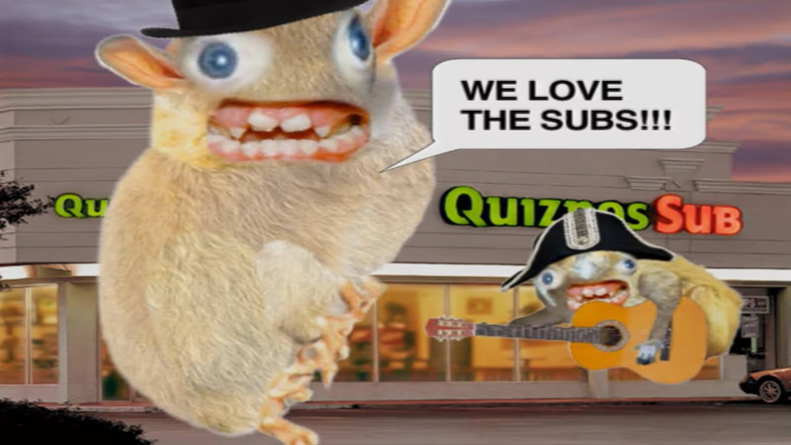
The Situation: Quiznos was getting their lunch eaten by Subway, which had a huge marketing budget and was building momentum through brand recognition, value messaging, and healthy offerings (yes, the Jared Fogle ads). Quiznos needed a breakout campaign to make them relevant and top-of-mind, especially with the younger crowd.
The Goal: Stand out in a crowded fast food market by being weird and irreverent, targeting younger, internet-savvy customers in the early viral video era.
The Rebrand: Quiznos launched the infamous national ad campaign featuring the “Spongmonkeys,” aka the bizarre, rodents with floating heads and screeching voices.
The Reception: The ads were plenty memorable, but deeply off-putting. The original Spongmonkeys were born from a viral Flash animation video, but their jump to mainstream TV was jarring for most Americans. Many were grossed out and/or creeped out, but most importantly, the campaign didn’t communicate anything meaningful.
Despite high ad spend, Quiznos lost market share and momentum as Subway doubled down on clear messaging around value and freshness. They emerged from Chapter 11 bankruptcy restructuring in 2014. Today, there are fewer than 200 Quiznos locations, compared to about 4,700 at their peak. Compare that to Subway’s 37,000 global locations. Of course, you can’t pin it all on one bad brand move, but the campaign might’ve taken Quiznos from “toasty” to “toast.”
The Takeaway: It’s okay to be weird, as long as you have a good reason for it. Being memorable doesn’t matter if people don’t remember what you’re selling (or when your food becomes associated with something kinda repulsive). Wackiness and silliness can’t carry your positioning if your core value prop isn’t clear.
Jaguar (2024): The Eclectic Electric U-Turn
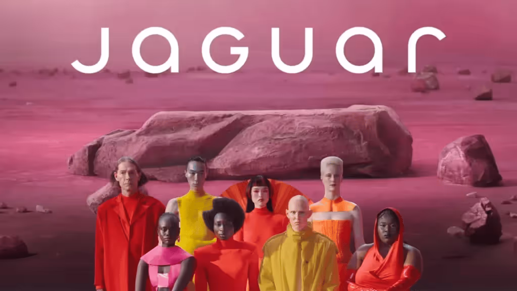
The Situation: Jaguar had seen seven straight years of declining sales and was lagging behind luxury competitors in the EV arms race. With growing regulatory pressure on gas-guzzlers in Europe and a change in preference toward tech-forward EVs, Jaguar desperately hit the hardest of resets.
The Goal: Boldly recast Jaguar as a premium EV player and reposition the brand against Tesla and Porsche instead of leaning on heritage.
The Rebrand: A shocking repositioning of Jaguar into a minimalist EV-only brand with all-new type and colors, flattened logos, and a nebulous high-art ad that went viral for the wrong reasons.
The Reception: Like a bad car wreck, this gave people major whiplash. Fans (and pretty much everyone else on the planet) reacted viscerally, noting how the classic allure of the heritage brand was completely gone. People were confused by the vague “Copy Nothing” slam-poetry and enraged that the ad didn’t even show a car.
While sales had been declining for years, only 49 Jaguars were purchased across Europe in April 2025 (yes, 49 cars across continental Europe). Compare that to 1,961 cars in April 2024, and that’s a 97.5% drop in YOY sales. Mind-boggling for a storied hundred-year-old company.
The Takeaway: Jaguar absolutely needed to make a bold change. But instead of ushering the brand into the EV age, they came across as confusing, vacant, and weird for weird’s sake. They’d likely be better off if they made a more focused shift that combined their glorious heritage with today’s EV tech (and still offered a fuel-burner or two as a safety net for now).
Tropicana (2009): Grasping at Straws
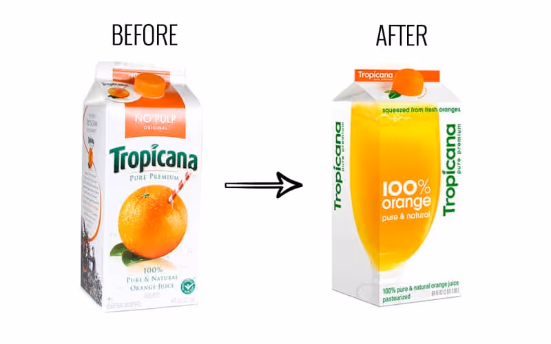
The Situation: Minimalism and clean design were becoming the dominant aesthetic in CPG, as brands like Honest Tea and Naked Juice gained market share. Classic orange juice was facing hipper, healthier competition, and the legacy brand felt like they needed to make a shift.
The Goal: Tropicana wanted to modernize its image to signal purity and healthiness, appealing to a younger group of health-conscious shoppers.
The Rebrand: A total packaging overhaul that replaced the iconic orange-with-a-straw for a minimalist glass of juice and sterile sans-serif type.
The Reception: Customers couldn’t find it. The new look removed about every distinctive brand asset that made Tropicana recognizable and iconic. Within 60 days, sales had dropped by 20% (a loss of over $30 million). Needless to say, the old packaging made a quick comeback.
Tropicana sales saw a sharp rebound after reverting to the previous look, but it still didn’t reach previous highs. It’s likely that sixty days was enough time for consumer habits to shift permanently, and the reversion could have also signaled a somewhat-stale step backward, when Tropicana had a chance to evolve more intentionally from the failed effort.
The Takeaway: Sometimes recognition is better than reinvention. Mega-distinctive assets (like the red and white spiral straw in the orange) are strong visual cues for consumers to quickly identify at-shelf. So sometimes it’s best to gently update them, not ditch them altogether. When a premium, legacy brand looks more like the everyday store brand, consumers will either have trouble finding it, or they’ll default to the cheaper option and move on.
HBO Max → Max (2023): Rewinding Brand Equity
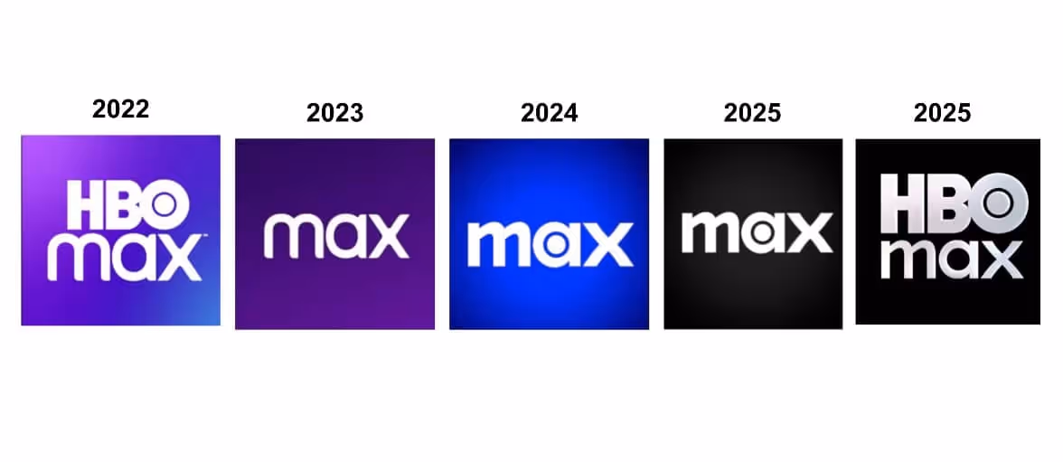
The Situation: Warner Bros. and Discovery had just merged, and they wanted to consolidate media assets under one roof to compete with Netflix and Disney+. There was internal pressure to streamline the brand and create a name that could stand for more than prestige TV.
The Goal: Create a platform that housed all content under one neutral umbrella. “Max” was supposed to be simple and expansive, allowing it to flex to select, new Discovery offerings.
The Rebrand: HBO Max (originally HBO GO) rebranded to “Max,” as part of the consolidation strategy.
The Reception: The name lost the strongest asset HBO had: its name. “HBO” stood for premium TV, while “Max” sounded like a budget broadband provider. Because of consumer confusion, the app tanked in App Store rankings, and HBO’s reputation got watered down by association with reality TV and clutter.
The Takeaway: Play to your strengths. If one part of your brand holds more equity than the rest of your offerings combined, build on that. HBO was the standard-bearer in award-winning, premium entertainment for decades, and they should have put their valuable name on a pedestal. After the confusion, HBO wised up and reverted back to HBO Max after several iterations of Max. A “full-circle” moment for the ages.
JCPenney (2011): The Anti-Sale Strategy
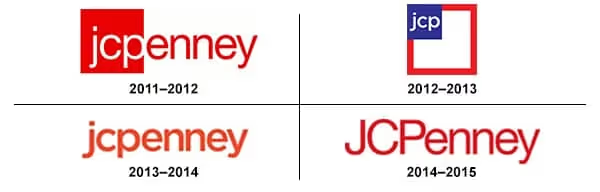
The Situation: JCPenney was struggling for relevance after the recession. Big-box and specialty retailers like Target, Kohl’s, and fast fashion brands were stealing market share, and JCPenny’s coupon-driven model suddenly felt outdated. Fresh off his success as the retail chief at Apple, the board brought in Ron Johnson as the new CEO to lead the reinvention.
The Goal: Reposition JCPenney as a modern, stylish department store that didn’t rely on gimmicky sales. The idea was to attract younger, higher-income shoppers and compete with trendy retailers.
The Rebrand: Ron Johnson led a full-scale rebrand from the top down. In addition to overhauling the brand’s look (including a square in the logo to match the new “fair and square” pricing approach, get it?) he eliminated sales, coupons, and markdowns in favor of an everyday pricing model.
The Reception: It turns out the traditional JCPenney shopper was a deal-hunter who loved coupons and doorbuster sales more than pricing transparency. The rebrand was seen as unearned and untrue to their crowd’s sensibilities.
In one year, JCPenney lost over $4 billion in revenue as foot traffic plummeted. Johnson was fired in 2013, and the brand walked back most of the changes. But they still experienced a slow, decade-long slide until filing for bankruptcy in 2020. Where’s JCPenny today? It looks like they just offloaded about 20% of their locations to a PE firm.
The Takeaway: Don’t rebrand for the customer you wish you had. Rebrand for the one you’ve earned, and reap the halo-effect along the way. Drastically changing your business strategy without accurate insights is a gamble to say the least. A rebrand should evolve your positioning without erasing what people were actually showing up for.
So When Should You Rebrand?
If your business is in one of the situations below, it might be time to consider making one. If not, you should probably fight the urge for now.
- Your positioning has shifted: You’ve evolved beyond your original product or audience, and your current brand doesn’t accurately reflect what you do best.
- You’re being mistaken for someone else: If customers confuse you with a competitor or unrelated brand, you need to stand out more clearly.
- You’re targeting a new audience segment: A new prospective target may require a fresh voice, look, or story to resonate. But make sure it doesn’t turn your loyalists off, RE: JCPenney.
- You’ve outgrown your humble beginnings: Maybe you didn’t have the time or budget to invest in quality branding when you started your business. If you’ve received a new round of funding or can otherwise afford a needed brand update, a fresh coat of paint might be the professional sheen you need.
- You’re entering a new stage of growth: Important opportunities like expanding to new markets or launching a flagship product can be the right moment to level up.
Find Clarity, Then Use Creativity
I hope these cautionary tales haven’t scared you away from making an important brand update if you need to.
The takeaway here isn’t “Rebrands are dangerous.”
The takeaway is: Rebrands can be multipliers, but they need to be executed thoughtfully.
There’s a reason just about every company undergoes a rebrand or two throughout the years. Offerings, audiences, opportunities…they can all change, and a brand needs to make strategic updates in order to keep its footing and keep climbing.
Have any good stories or lessons from your company’s rebrand? Reply with a message, we’d love to hear about it.
Gil Templeton
Demand Curve Staff Writer
Community Spotlight
News and Links
Something fun
Something fun
The power of satire. 3 days, 272k impressions, 175k members reached. Half thought it was real. Full case study coming soon. Check it out ➡️

If you enjoyed this, please consider sharing with a friend. If a friend sent you this, get the next newsletter by signing up here.
Who's Demand Curve?
We’re on a mission to make starting, building, and growing startups easier.
We share high-quality, vetted, and actionable growth content as we learn it from the top 1% of marketers. We democratize senior growth knowledge.
How we can help you grow:
- 📖 Read our free playbooks, articles, growth guide, and teardowns—we break down the strategies & tactics used by fast-growing startups.
- 🚀 Running growth yourself? Use our updated Growth Program to get traction and build your growth engine.
- 📈 Need help with ads? We’ve built the ads agency for startups.
- 🌏 Looking to hire overseas growth talent? Our partner, GrowthPair, will find you an expert for 40-80% lower costs.
- 📣 Get in front of 90,000+ founders by sponsoring this newsletter.
— Thanks y'all!


The Newsletter Vault
Only available to Members. Enroll now to get access to the full catalogue of Demand Curve's newsletters.
More newsletter editions
Join 91,000 founders and marketers getting actionable startup growth tactics in their inbox each week.


