Conversation


🥳 Feedback Received!
Thanks for taking a moment to share your thoughts — it genuinely helps us make each chapter sharper.
What happens next:
- Your feedback goes straight to our product team.
- We’ll use it to refine lessons, clarify examples, and make the program even more useful.
Appreciate you helping make this program better for everyone.
Ready for your next challenge? 👇
Anatomy of a High-Converting Landing Page
There are all kinds of landing pages, which we'll cover in future lessons.
But instead of just giving you a laundry list of ideas, we want to give you the 80/20 landing page structure. You can always experiment with radically different ideas later (calculators, quizzes, advertorials, etc), but in most cases, especially early on, we recommend the following structure.
Generally, the more you deviate from the following template, the more confused the average visitor becomes.
Creativity in conversion-focused funnels is generally a bad thing. A confused person bounces.
Here's a cheat sheet of this landing page structure:
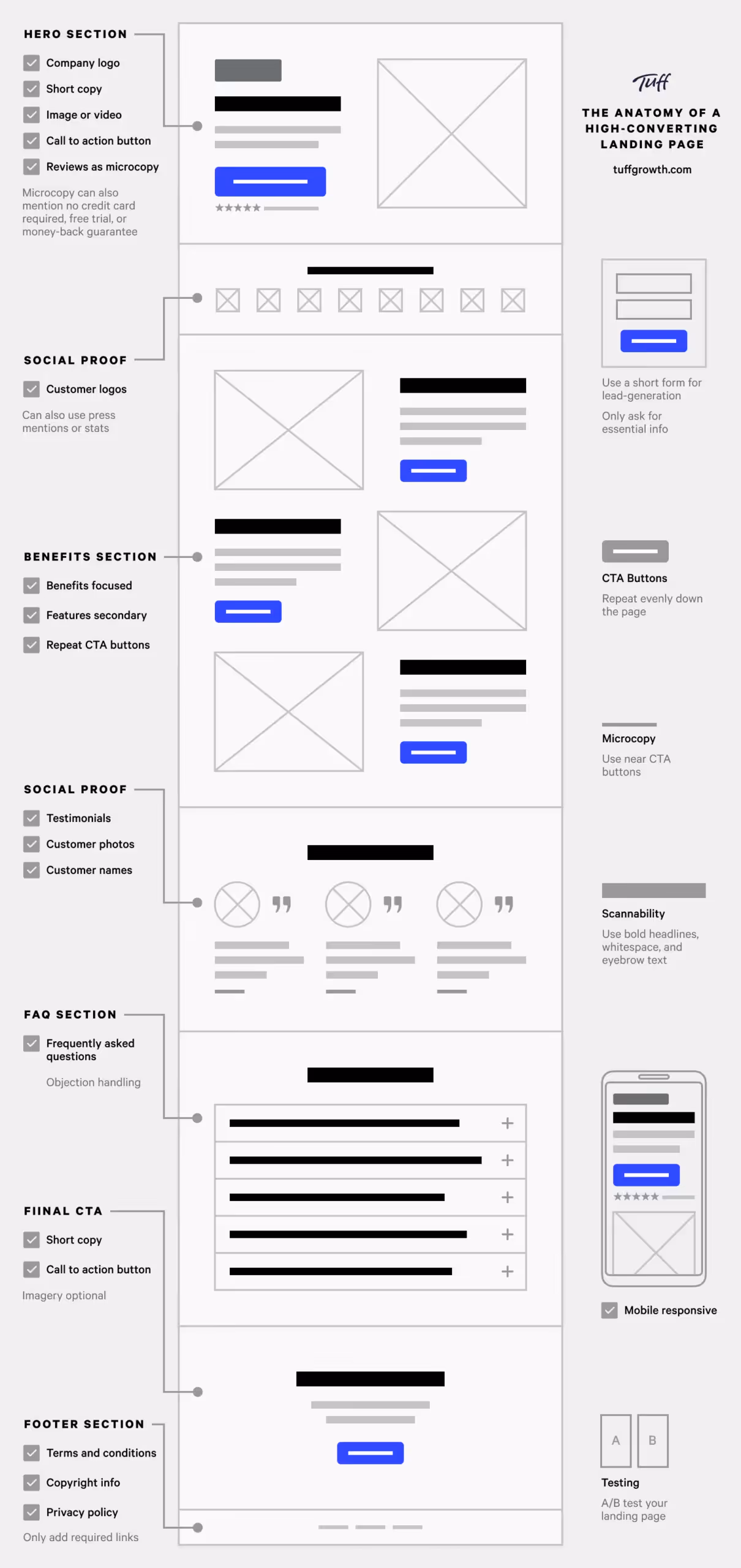
Thanks to Tuff Growth for this great graphic. Instead of inventing our own cheatsheet, we're leveraging theirs throughout this lesson.
We'll dive into our recommendations for each of these sections. It is a lot of content so we'll break it up into separate lessons.
For now, let's talk about some core landing page principles.
Think of your landing page from the perspective of a visitor's likelihood to purchase:
💡 Purchase Rate = (Desire + Confidence) / (Effort + Confusion)
To increase a visitor's purchase rate, increase the visitor's desire and confidence while decreasing their effort and confusion:
- Increase desire: Entice visitors with the transformative value your product will provide.
- Increase confidence: Make them confident they’ll successfully get that value.
- Decrease labor: Reduce your visitors' effort so they don't get tired or annoyed. Be concise and ensure every word and element is valuable.
- Decrease confusion: Don't confuse visitors with obscure or verbose messaging. Ensure every sentence can be easily understood. And make it self-evident which action they should take next (e.g. sign up or purchase). And ensure your action elements (e.g. buttons) are unignorable.
Don’t do something avant-garde with your homepage structure unless you have a good reason.
Here’s the typical landing page structure we'll be using:
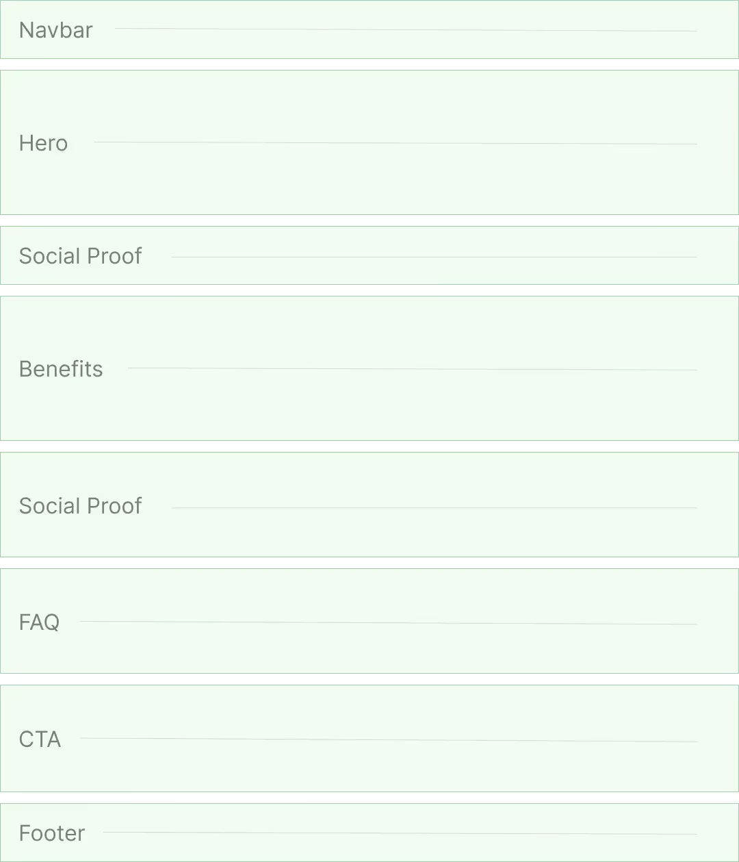
- Navbar: The top of the page — where your logo and navigation links are. Ideally sticky.
- Side or bottom navigation is cool and all, but confuses more than is helpful.
- Hero: The main section at the top of the page, which includes your header text, subheader text, and captivating imagery.
- Social proof: Logos of press coverage or your well-known customers.
- Benefits and objections: Your key value propositions fully written out.
- Social proof #2: Testimonials or results from past customers.
- FAQ Section: Methodically answer all the major questions and objections someone might have.
- CTA (call to action):A dedicated section to entice them to take action.
- Note: Each section should have a CTA to take them to the next step.
- Footer: Miscellaneous links.
We'll walk through each of these elements in detail in the following lessons.
You can re-use this structure for a variety of LPs
For example, you can use this same structure for:
- Persona-specific landing pages
- Ad-specific landing pages
- Keyword-specific landing pages
- Funnel/product specific landing pages
- Problem-specific landing pages
You'd just change the words and images (and perhaps sections) used in the landing page. But the structure can be relatively the same.
Let's dive into the different sections