Conversation

Thank you! Your submission has been received!
Oops! Something went wrong while submitting the form.

💬 Ask Copilot

🥳 Feedback Received!
Thanks for taking a moment to share your thoughts — it genuinely helps us make each chapter sharper.
What happens next:
- Your feedback goes straight to our product team.
- We’ll use it to refine lessons, clarify examples, and make the program even more useful.
Appreciate you helping make this program better for everyone.
Ready for your next challenge? 👇
Oops! Something went wrong while submitting the form.
Lesson
⌛
minute read
General suggestions for conversion
Here are some rapid-fire ideas to ensure your page converts:
- Optimized for all devices. Make sure your site is legible and functional for large monitors, laptops, tablets, and smartphones.
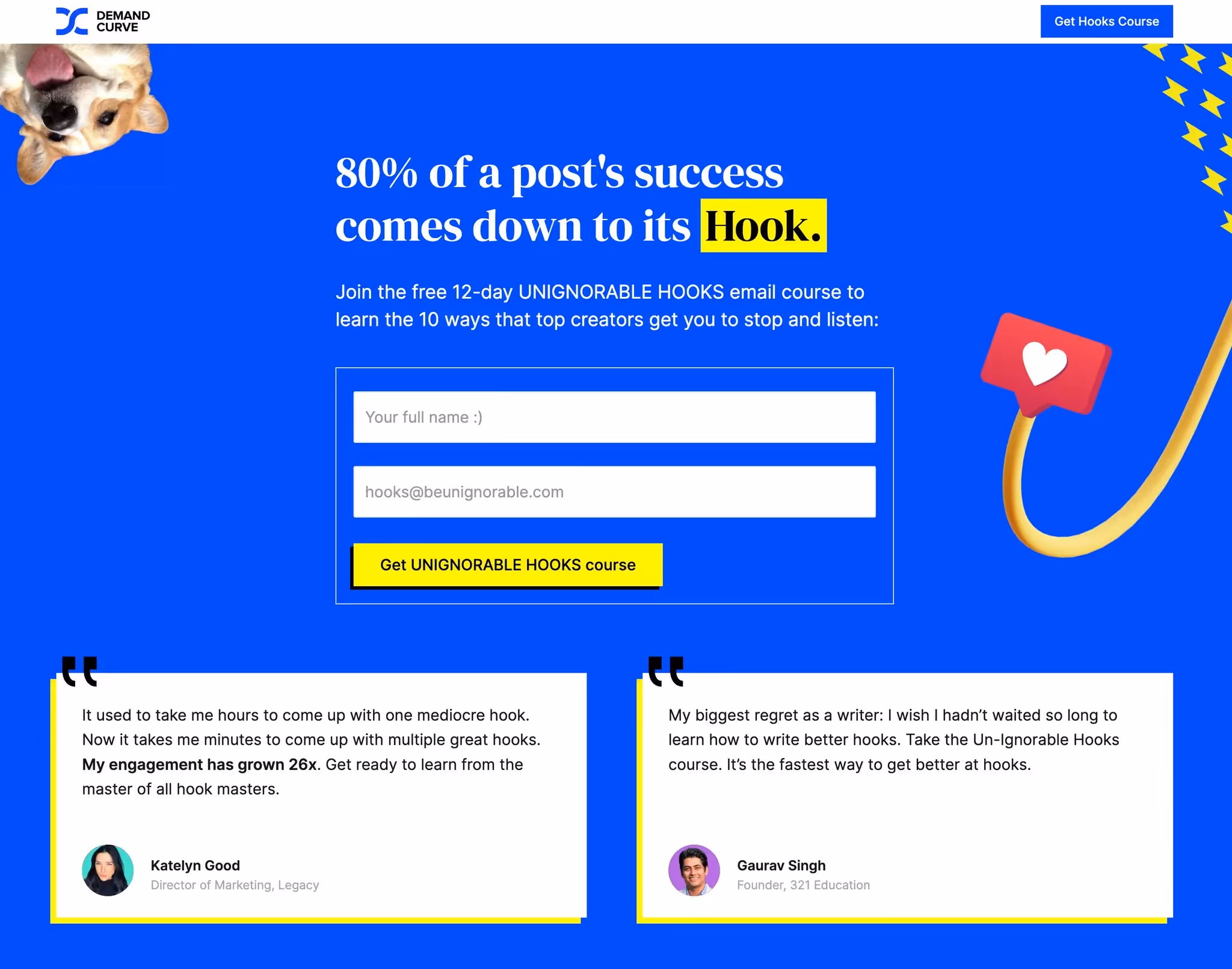
- If the next step is subscribe to something, make the CTA the form. Instead of making them go to a new page or click a button to open a modal, you can just put the form right in the hero. We do that here:
- Never assume anything. Don’t assume they understand terms and acronyms. Don’t assume they know who you are or what you do. Don’t assume they care.
- Always have CTAs handy. Put CTAs in basically every section and/or make sure the navbar is sticky and has a CTA button.
- Use images to aid understanding. People understand images far better and faster than words. Use images whenever you
- Skimmable. People don’t read. Make it so someone can quickly skim your website and know who it’s for, what you do and why that matters to them.
- There’s no such thing as too much social proof. Seriously. The more the better.
- Don’t assume you’ve nailed it perfectly. If you get lots of traffic, do an A/B test. If you don’t get lots of traffic, get feedback (below) or use a service like Wynter.