Conversation


🥳 Feedback Received!
Thanks for taking a moment to share your thoughts — it genuinely helps us make each chapter sharper.
What happens next:
- Your feedback goes straight to our product team.
- We’ll use it to refine lessons, clarify examples, and make the program even more useful.
Appreciate you helping make this program better for everyone.
Ready for your next challenge? 👇
LP Section – Features (benefits) and objections
If needed, to put this back into context of the page, see "Benefits" below.
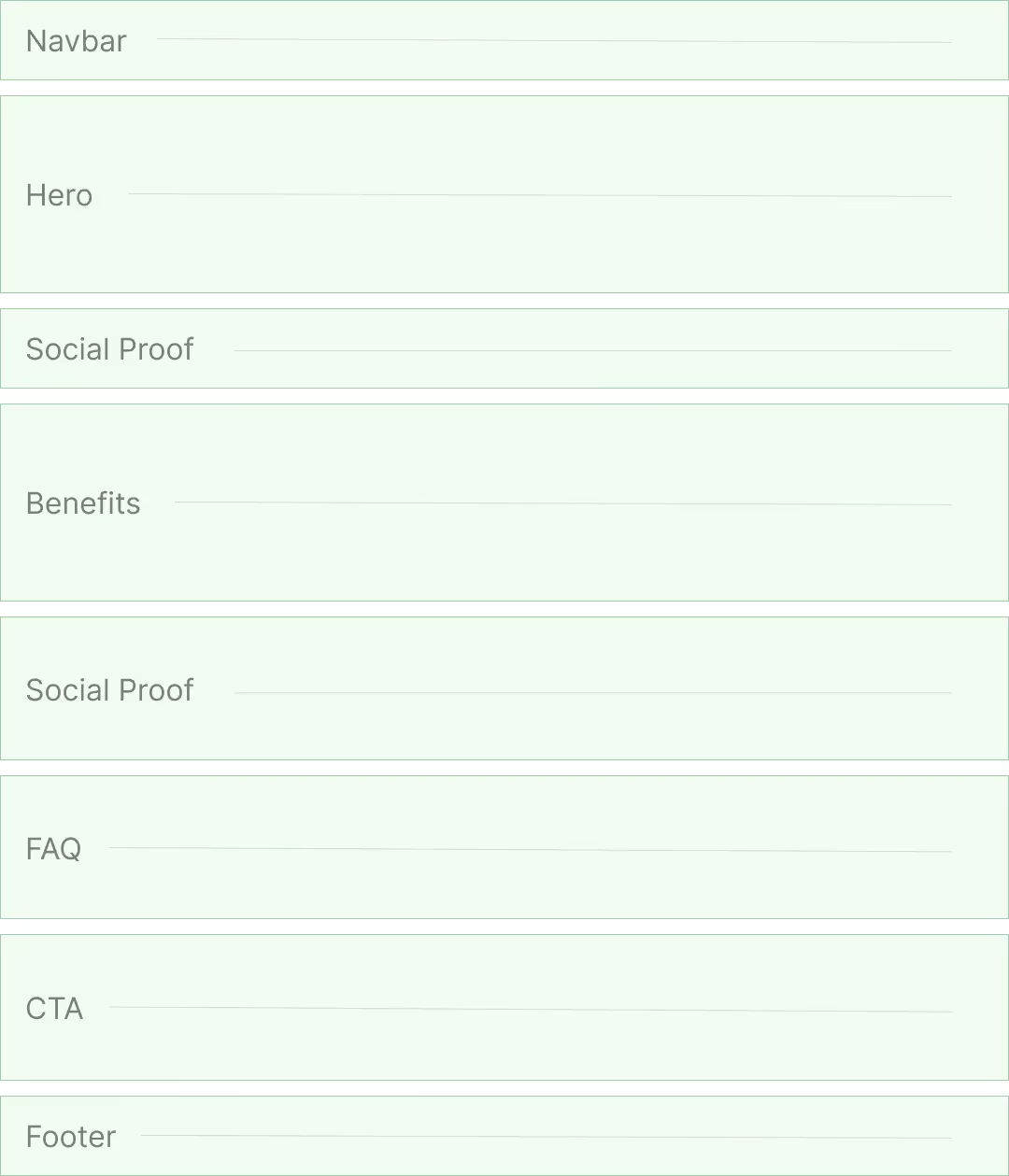
This section contains multiple features/benefits—often 3 to 6. Each is a value prop paired with copy addressing objections that arise upon hearing that value prop:
- The header that states the value prop
- A paragraph explains the value prop and handles objections
- An image reinforces the value prop
- A CTA button for them to take action
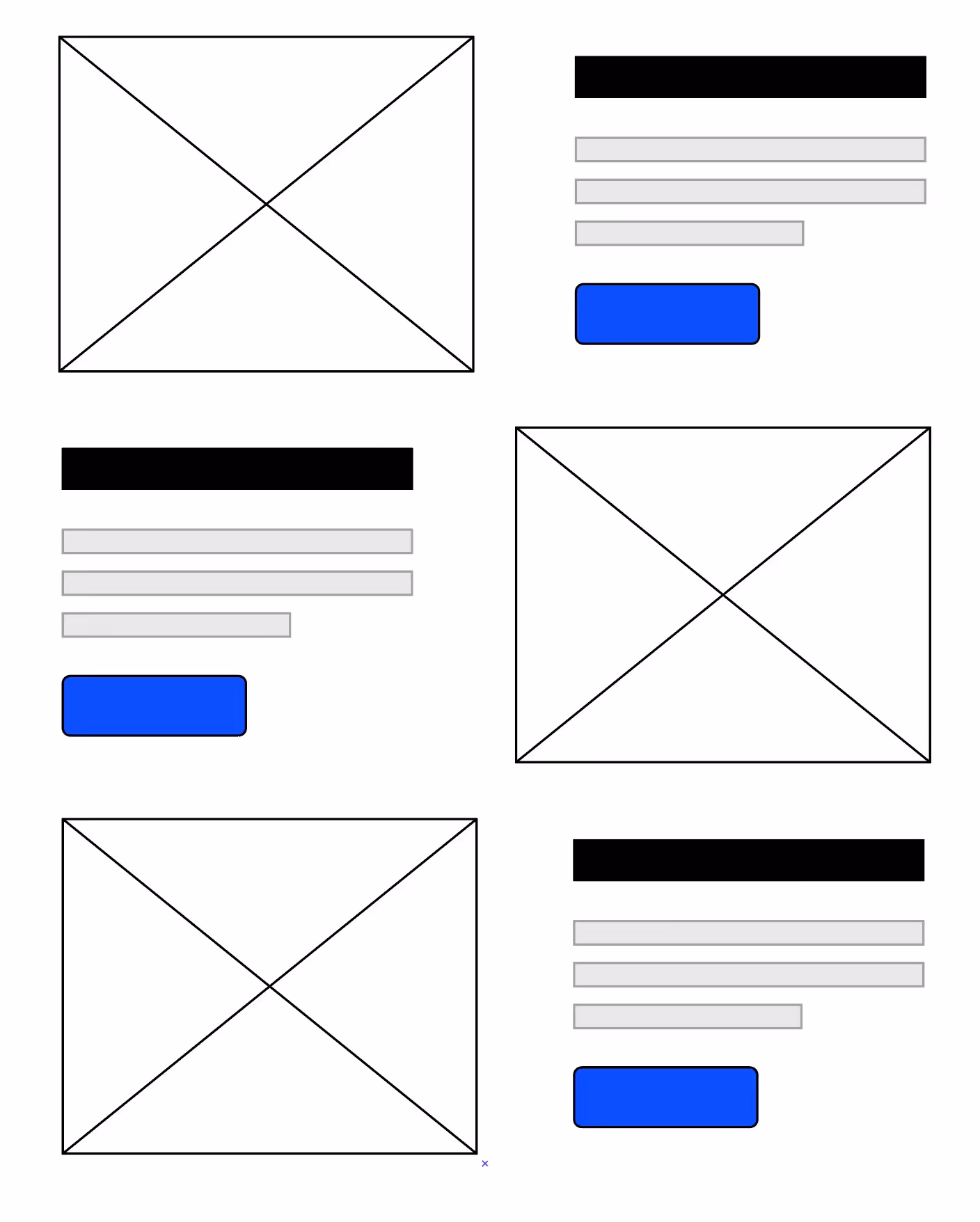
Here’s how this looks in practice:
As you can imagine, the Features section spans the bulk of your page. Its job is to deliver your product's complete sales pitch.
Benefits vs features
Most companies mess this section up by just listing out their features and talking about how great they are.
The problem is when you talk about features you’re inherently focusing on you. You’re like that guy at the party who just yammers on about how great he is.
Instead, focus on your customers*.* Your customers are the protagonist in this story and your product is the supporting character in their transformative journey. **So we’re going to focus on the benefits of each feature while handling any objections they may have in the process.
Got that? Okay, here’s a great example from Apple:
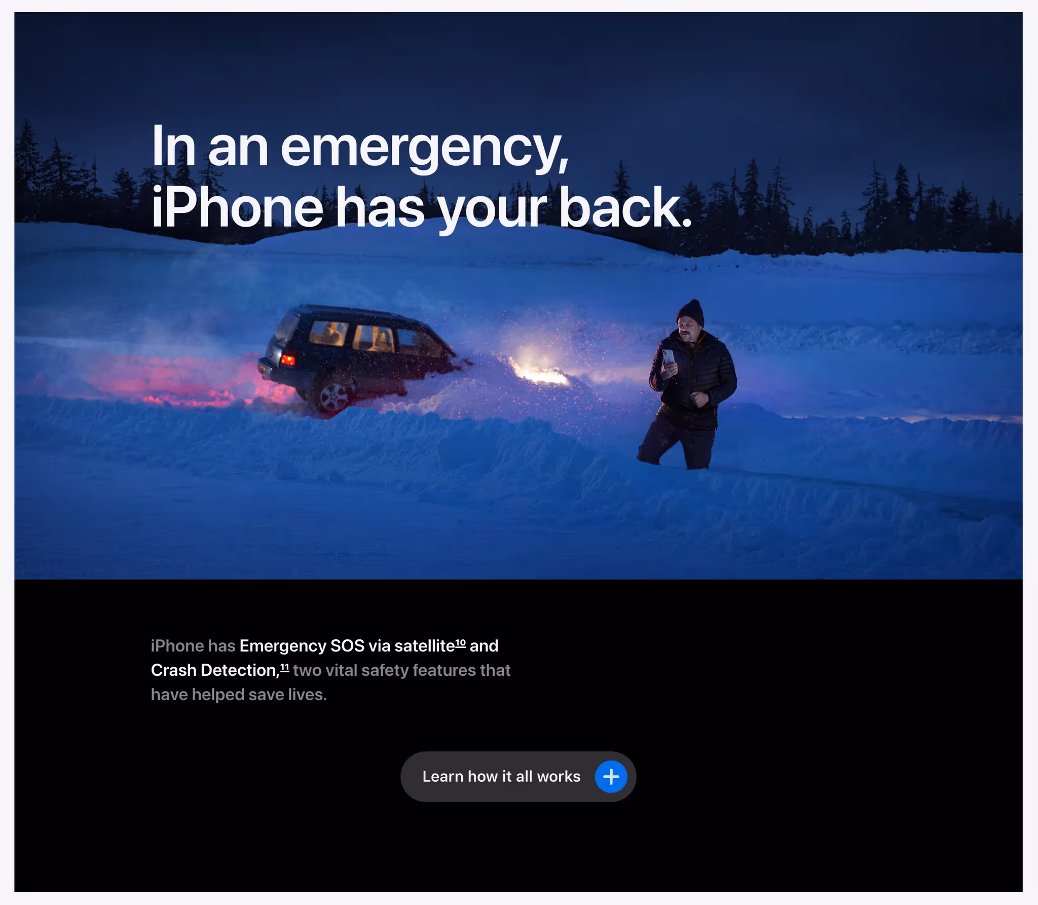
Apple here focuses on the benefit of their SOS and Crash detection features in the headline, and then explain how the product achieves that benefit (the features).
Bonus tip: Carry the narrative
The best benefits sections carry a running narrative: Each benefits ties back to the dominant value prop pitched in the hero section.
For example, if your hero value prop is “We help you put down your phone so you can focus on the rest of your life,” a description of your Push Notification Blocking feature could include a callback to the header such as this: “… so that you put an end to the habit of constantly looking at your phone for updates.”
If you’re having a hard time deciding which value props and objections to highlight, study your competitors' sites to learn how to differentiate yourself from what people already know about your space.
Let’s dive into specific advice for each part of the Feature section.
Feature — Header
For a feature header, write a short value prop. Don't use vague language like "Empower your sales" or "Revolutionize your workflow." Just bluntly describe the value prop so visitors can quickly decide whether the value prop is relevant to them and whether they should read the feature paragraph.
For example, here are feature headers for a portable grill:
- Cooks and sears
- No clean up
- Cooks more than just meat
💡 Again, people will skim and not read unless the headers effectively hook them. Read our free email course on creating Unignorable Hooks.
Feature — Paragraph
In your feature's paragraph, concisely describe the feature and address important objections that might prevent people from purchasing.
If it’s a complex or unintuitive feature, either link to a separate page where visitors can learn more or have a button they can click or tooltip to reveal additional details.
The latter is preferable because it keeps users in the flow of your current page.
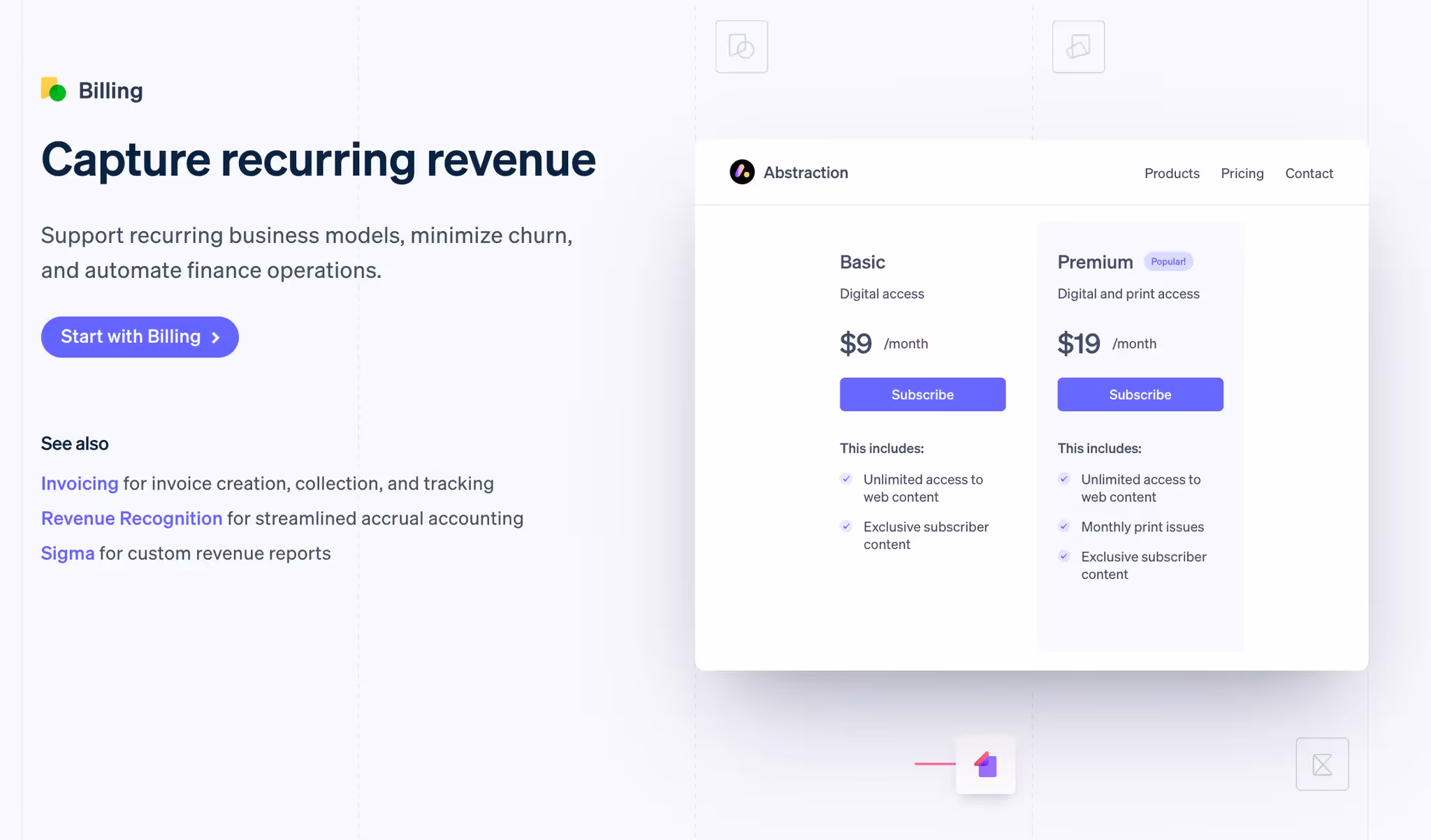
Feature — Image
Features are paired with an image so that your landing page isn't a giant wall of text and to reinforce what you're describing.
For your feature image, consider two goals:
- Visually appealing: Modern, clear, and pretty. Pay a designer if you aren't one.
- Demonstrate the value of your product: Show the product in action. For software, avoid useless abstract imagery.
HelloSign includes a GIF of their product in action in the example below. It shows us what we're about to sign up for. It de-risks our time investment and removes uncertainty.
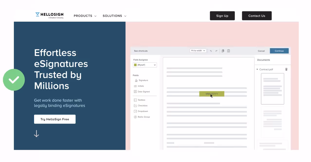
Further, instead of making the visitor read tiny text, they blur it out so you can focus on what matters: how the product works.
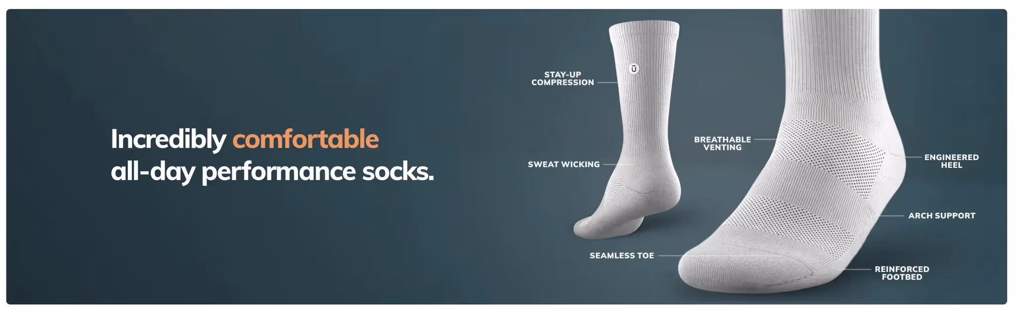
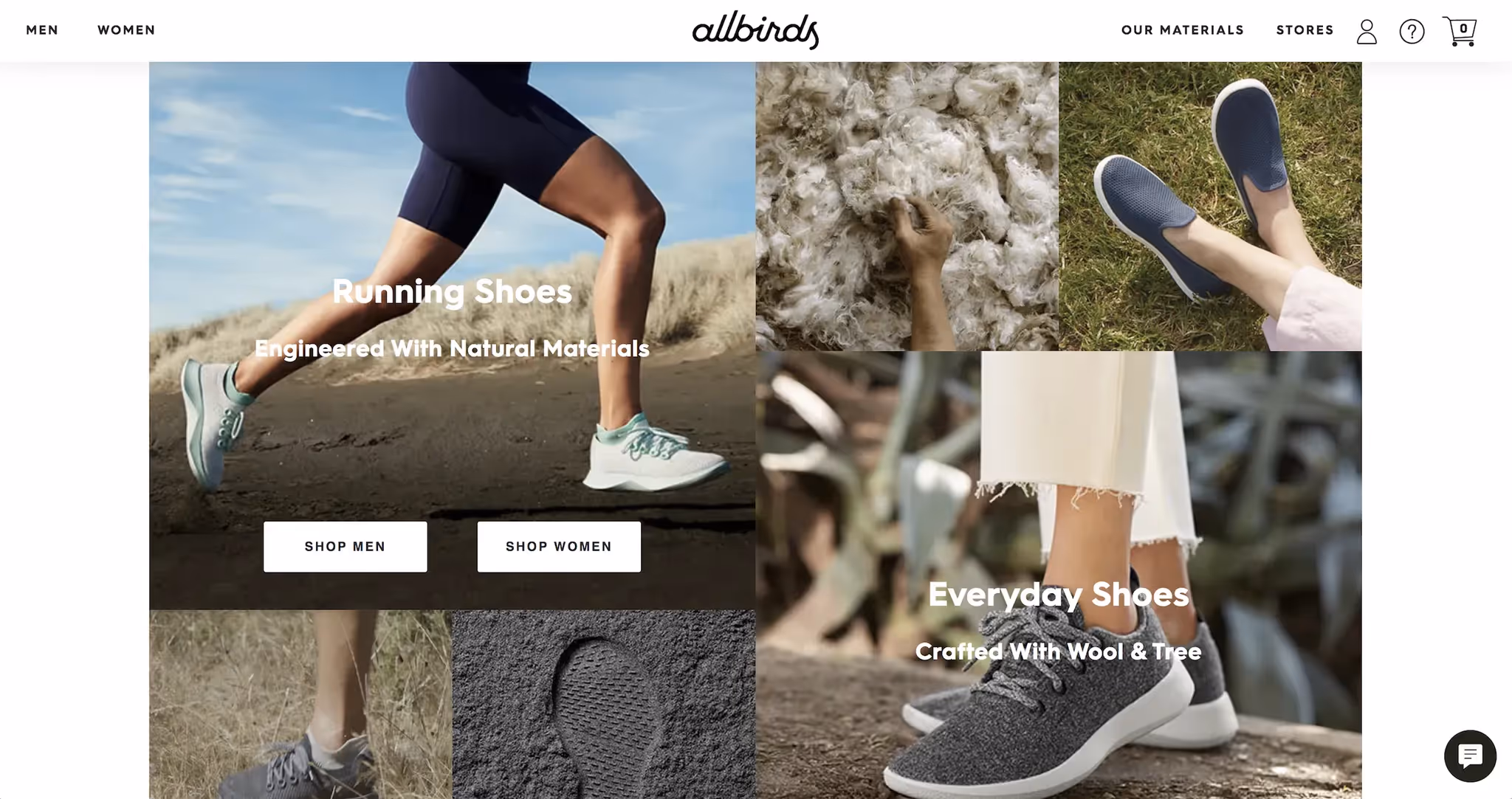
Another example: If you're selling physical goods, consider doing two things:
- Show off the various use cases or features
- Show close-ups of the build quality. This gives visitors a fuller appreciation of the product's magic. Here’s an example from Outway and Allbirds:
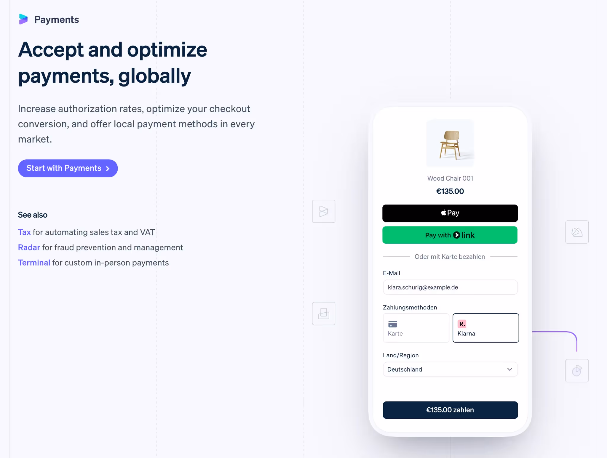
Feature – CTAs
You don’t know which feature/benefit will finally push someone over the edge to want to take action. Therefore, don’t bury the call to action (CTA) buttons somewhere else on the page.
Let them take action immediately:
- Add a CTA to every feature section.
- When relevant, tailor the CTA text to the specific feature.
- Consider adding relevant social proof as well to overcome objections.
Here’s how Stripe does it:
Now onto Social Proof #2!