Conversation


🥳 Feedback Received!
Thanks for taking a moment to share your thoughts — it genuinely helps us make each chapter sharper.
What happens next:
- Your feedback goes straight to our product team.
- We’ll use it to refine lessons, clarify examples, and make the program even more useful.
Appreciate you helping make this program better for everyone.
Ready for your next challenge? 👇
LP Section – Hero
The hero is the most important part of the page because everyone will see it. And the most likely time that someone leaves your site is in the first few seconds.
The hero is 100% what determines if they keep reading or hit the back button.
Here’s the typical structure of your landing page “hero.”
"Hero" is jargon for the big section at the top of your page—what visitors first see before they scroll down. It's also called your above-the-fold.
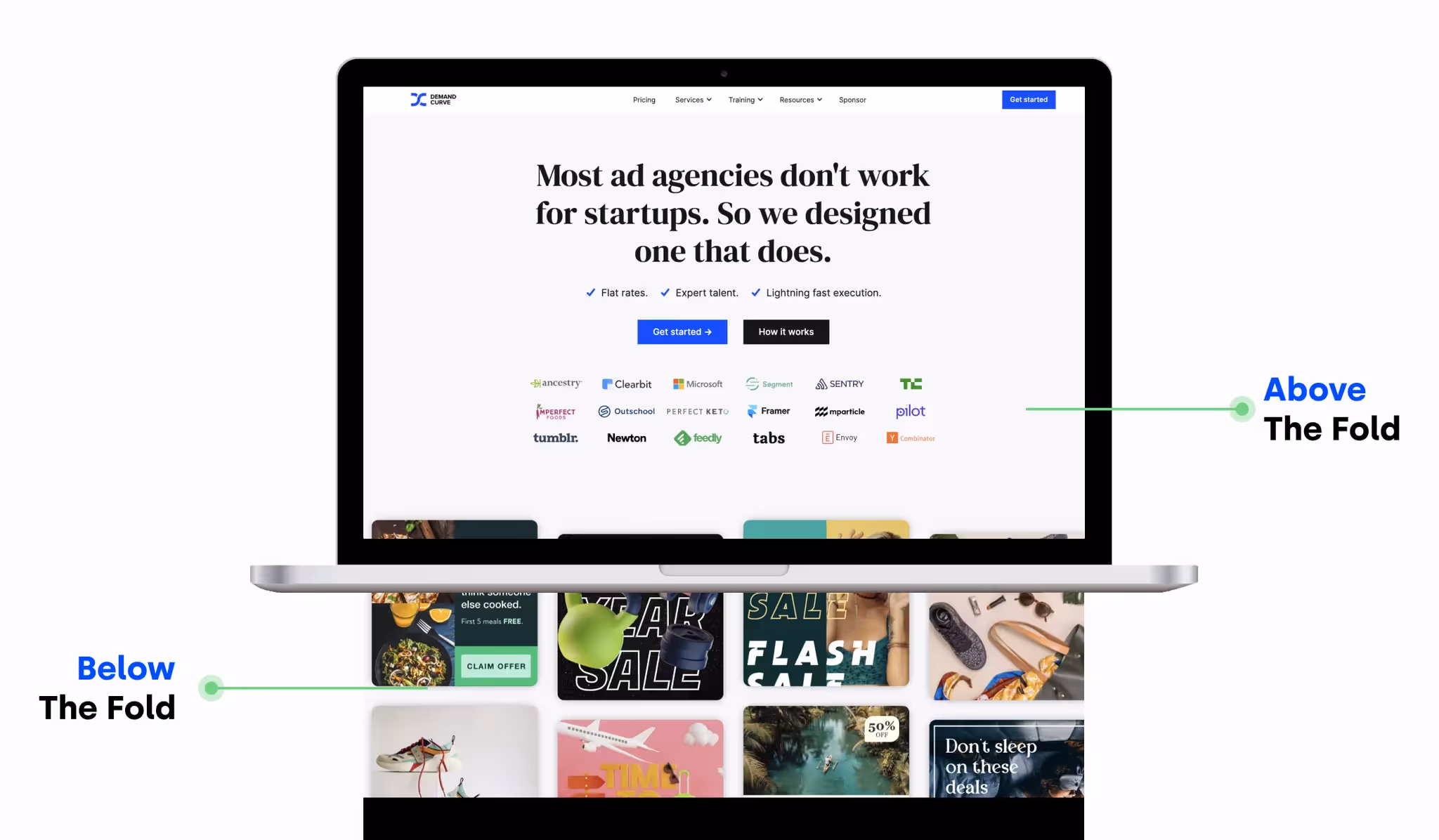
Your hero consists of header text, subheader text, CTA, and often an image. You must put a lot of thought into each of these. Nailing header copy has the highest impact on whether people continue scrolling and reading.
Consider how people don't actually have short attention spans:
- They finish 3 hour Joe Rogan episodes.
- They binge 14 hour shows.
Instead, they have short consideration spans: they must be hooked quickly. So, don't fear writing a long homepage.
But, ensure your hero is incredible.
💡 I cannot stress the importance of hooks enough. Even the best landing page won’t be read if it fails to hook them in the first few seconds. It needs to be clear, compelling, and intriguing. Read our free email course on creating Unignorable Hooks.
Hero — Header
The header must be fully descriptive of what you're selling and who it’s for.
If the visitor doesn't understand precisely what you do immediately upon landing, they'll bounce out of laziness or skim-read the rest of the page and risk getting the wrong impression.
Here's the litmus test for whether your header is sufficiently descriptive: If the visitor reads only this text on your page, will they know exactly what you sell?
Bad headers—found all over the web—are those that read like slogans instead of descriptions. For example:
- "Improve your workflow!"
- "Supercharge your collaboration!"
- “Software for humans.”
These are all useless.
If that's all we read on your page, we'd have no idea what the product actually is. And we'll probably leave.
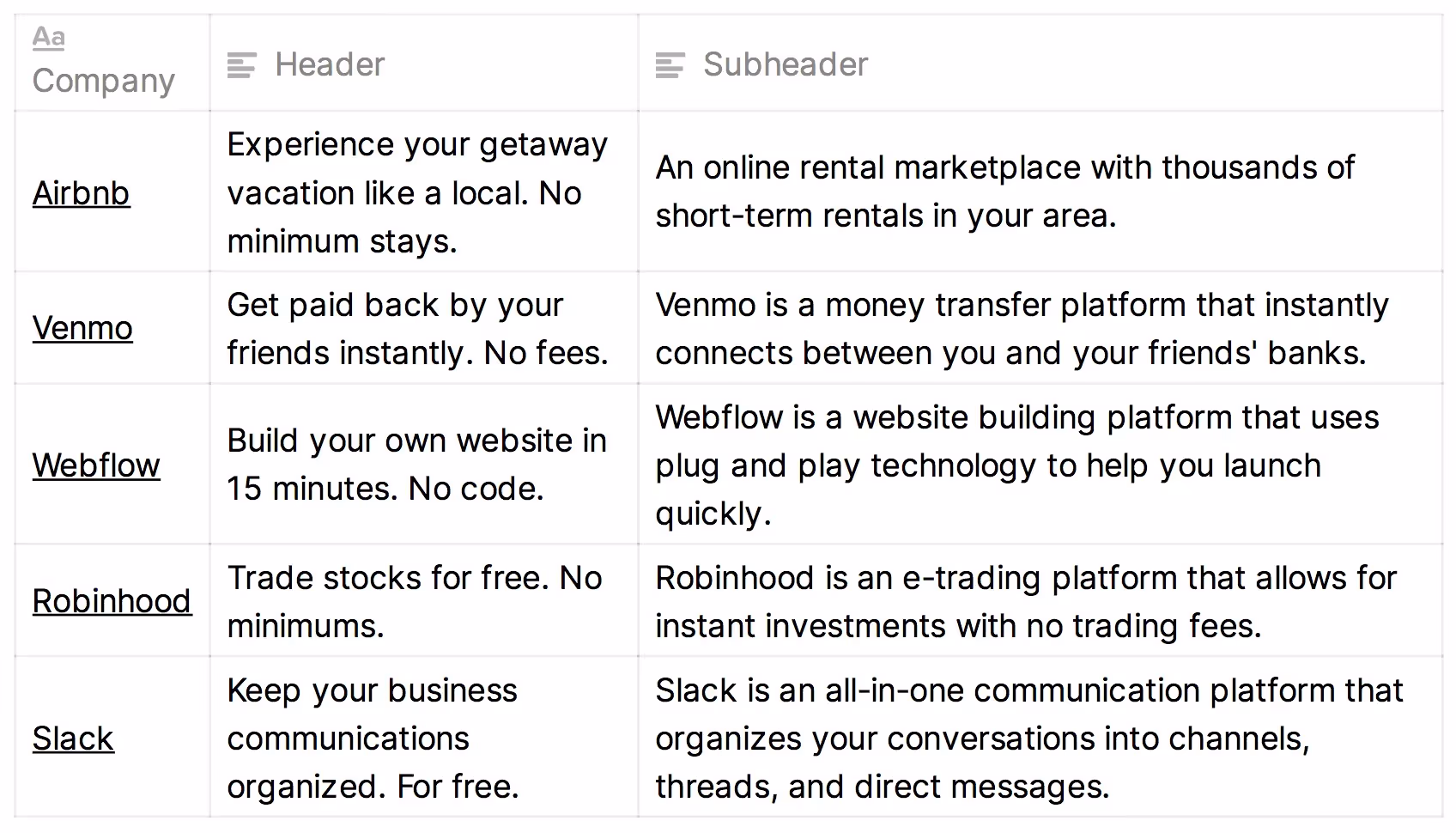
What does a good, descriptive header look like? Like this:
- For a website design tool — "Visually design and develop sites from scratch. No coding."
- For a grocery delivery service — "Groceries delivered in 1 hour. Say goodbye to traffic, parking, and long lines."
- For a home rental service — "Rent people's homes. Experience a city like a local."
Those help us understand what you're selling. And we can immediately self-identify as someone who does in fact want what you're pitching, which means we'll have patience to read through the rest of your site to get the details.
Let’s look at more examples.
On the left, we have a bad header. Pay attention to what makes the right example better.
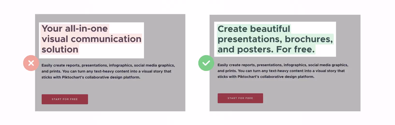
The right one is better because:
- It no longer sounds like corporate speak.
- It describes the specific benefit of the product.
Another example:
Again, the right one is better because:
- It no longer uses vague phrasing.
- It describes the specific benefit of your product.
Another:
The right one is better because:
- It doesn't talk in self-congratulatory terms. It talks in terms of benefits to the visitor.
- It clarifies the specific outcome of using the product.
What these improved examples have in common is increased specificity.
Specificity is step one to strong header writing.
Header writing process
To write our header and subheader text, we'll follow two steps:
- Identify how users get value from your product
- Add a hook—to get them to keep reading
1. Identify how users get value
Value props are the ways people "get value" from your product.
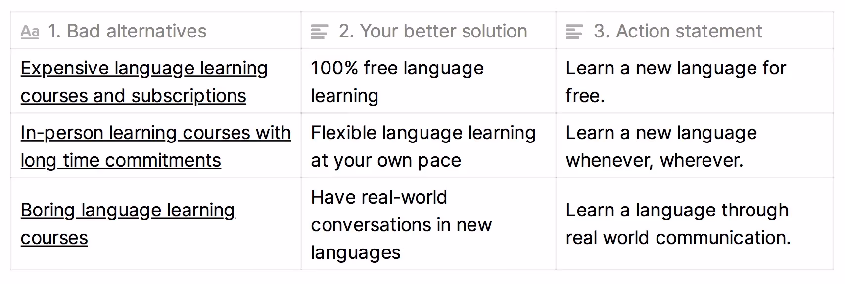
Here's an exercise for finding your product's value props:
- What bad alternative do people resort to when they lack your product?
- How is your product better than that bad alternative?
- Now turn the last step into an action statement—that's your value prop.
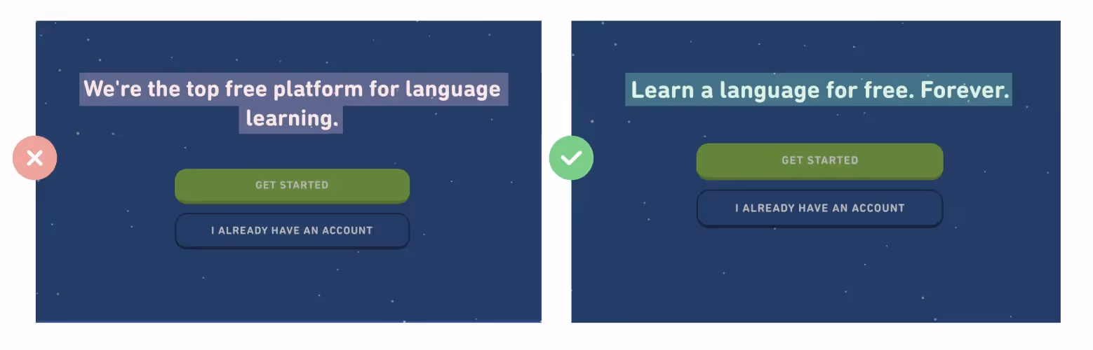
As an example, let's use the free language learning app Duolingo. It offers short-form, interactive lessons.
A few more examples:
2. Add a hook
Adding a hook to your header can take two forms:
- A bold claim
- A response to likely skepticism
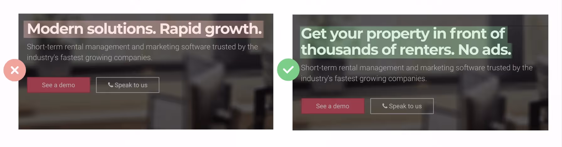
Hook option #1: Add a bold, specific claim
On the left, we have a vague statement. On the right, we have a specific, bold claim about the benefit users will receive.
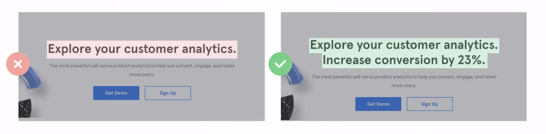
Now that's more enticing. Readers want to know how that's possible. So they keep reading.
Another example:
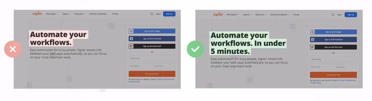
In short, a bold claim is:
- Highly specific
- Triggers a dopamine hit of "wow, I didn't know that was possible."
Hook option #2: Address objections
As an alternative to including a bold claim, another way to create a hook is by addressing a key objection in your header.
Let's use the website design tool, Webflow, as an example. Below is their header copy, which hasn't yet been paired with a hook:
"Build your own website."
Upon seeing this, objections readers have could include:
- But, I don't know how to code. Don't websites require coding skills?
- This will take too long. I don't have the time. I'm not a trained designer.
- This will be low functionality and constraining like other site design tools.
Your job is to identify which of these is a major buying objection—and to proactively address it. Don't let visitors retain their unaddressed concerns that cause them to bounce before scrolling. See below:
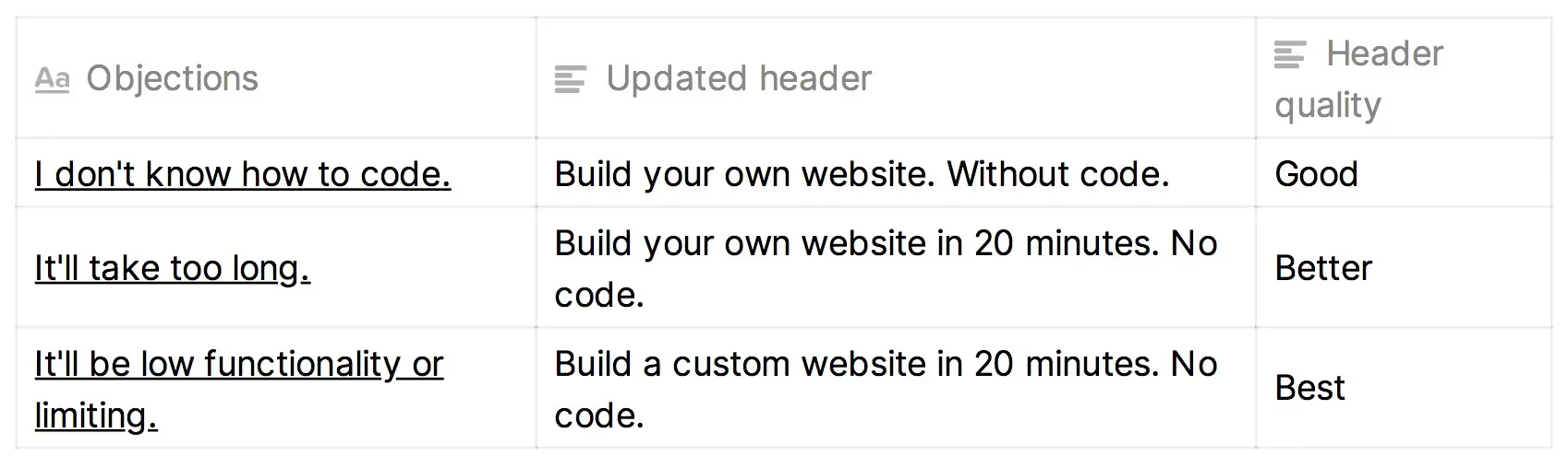
In the examples above, we're expanding our header's first sentence plus adding a second—in pursuit of our handling a key objection.
This requires balance. If you bloat your header with extraneous details, it becomes hard to read. Don't try to address every objection—you can do that with the rest of your page.
Backing up, how do you go about identifying your customers' biggest objections? Survey them:
- "What almost stopped you from buying?" That's an objection.
- "Why do you think non-customers haven't bought from us yet?" That's an objection.
Let's revisit our earlier examples—this time with objection handling:
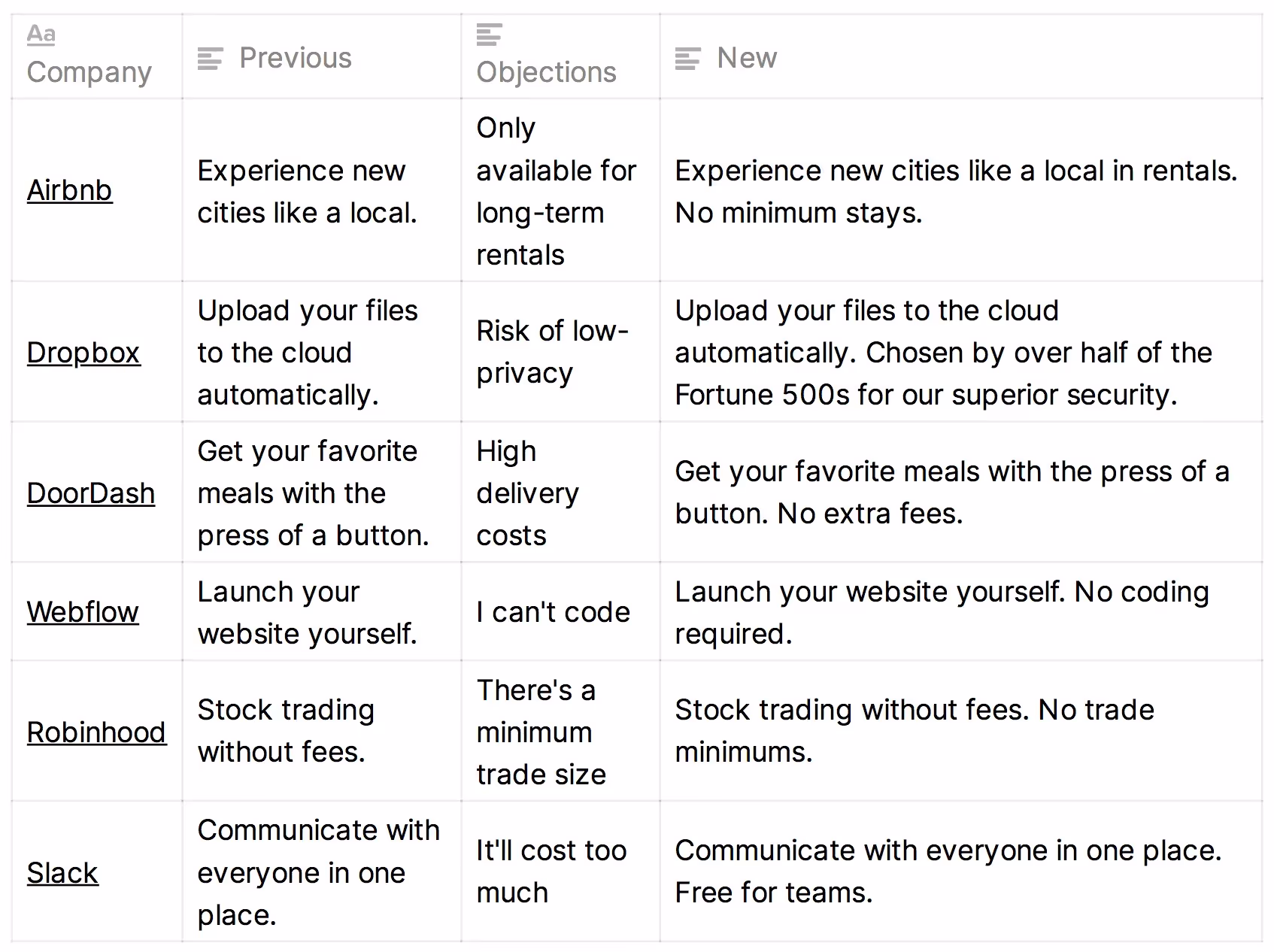
To recap, once you've identified your value prop, add a hook: either inject a bold claim or proactively address an objection.
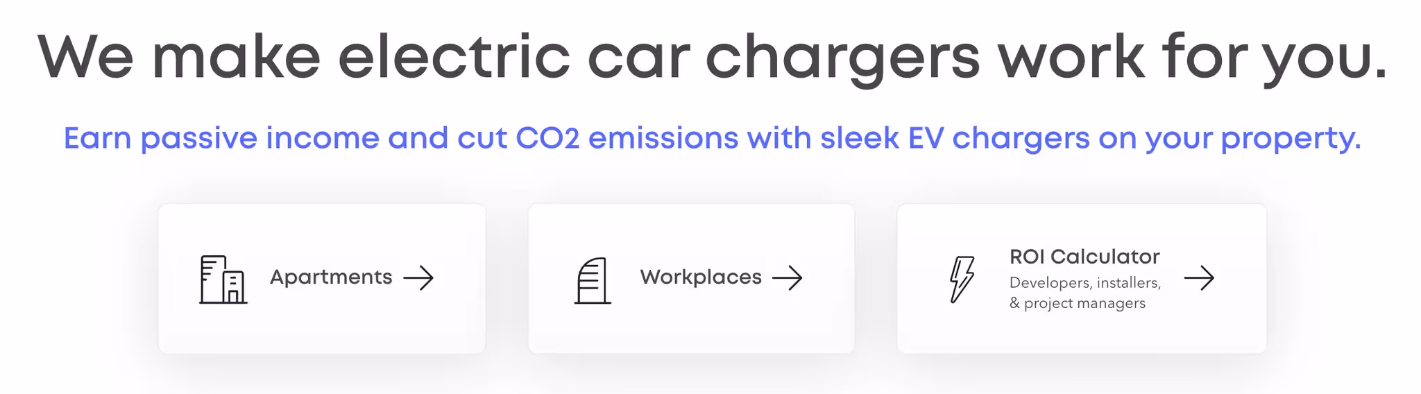
If your product targets multiple major personas, you can prompt visitors to choose which persona they fit into at the top of your page. Then route them to the appropriate section of your site. We call this "choose your own adventure." In the example below, Xeal Energy creates different paths for apartment and workplace owners:
💡 Read our free email course on creating Unignorable Hooks.
Hero — Subheader
It's time to complement our header with a subheader, which will expand on what makes our product special.
The subheader is commonly used for expanding on two thoughts:
- How does our product work exactly?
- Which of our features make our header's bold claim believable?
For example:
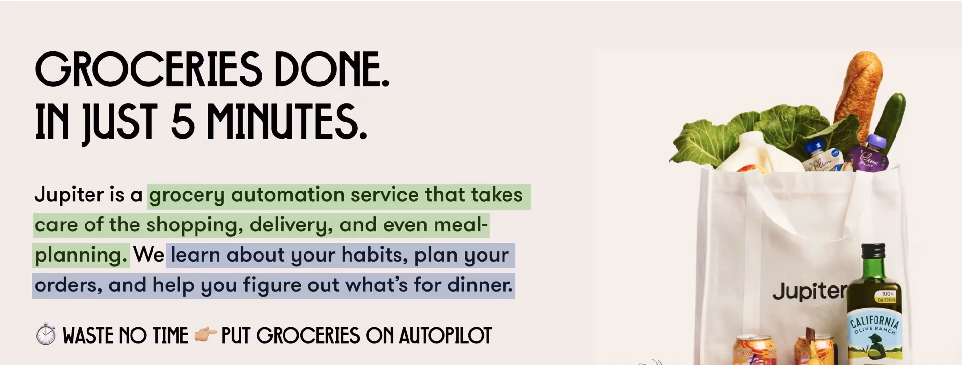
Similarly, Jupiter's first sentence explains their product (green). Then it explains how its claim ("In just 5 minutes") is possible (blue).
As a rule of thumb, your subheader should only be one or two sentences. Don't make this an essay. Keep reading breezy so visitors sustain their momentum.
Let's look at more examples:
Hero — Image
This will depend greatly on what your product is. But in general, you want to:
- Show the product in action (if physical) or visually represent the value they get from it (intangibles like software).
- Research shows that adding people is a plus.
Don’t just add some crazy illustration of an astronaut or something.
Instead, use a visual to make it more obvious what you sell and why it’s valuable.
Use AI to create an image if you don't have the design resources!
Now onto Social Proof #1