
In last week’s Growth Newsletter #282, we took a deep dive into above-the-fold (ATF) messaging.
We talked about the importance of a first impression, and we walked through a methodical, step-by-step process to nail your introductory ATF message (namely a header and subheader).
Today, we’ll flip to the other side of the ATF coin: design. Because, while your message gives customers the language they need to feel confident about choosing you, strong design helps you present an ironclad case.
After these two newsletters, you should have everything you need to dial in your messaging and design above the fold, which is a critical piece of your website.
That being said, it’s just one small slice of your site. For more guidance on how to create an entire website that converts, our Growth Program 2.0 has everything you need.
Now let’s make sure the design of your ATF isn’t making people say “WTF?”
— Gil

Brought to you by Insense - UGC & influencer marketing for Q4 made easy for growth-focused teams
Save 40+ hours/month with Insense; both a platform + agency solution for scaling high-performing UGC and influencer campaigns, without the manual grind.
Get end-to-end influencer management, ready-to-use UGC video ads, tons of raw UGC footage for Q4 creative testing, ideation and creative concepts, and more!
Demand Curve readers get up to 10% off their agency services until October 10th.
Brought to you by Playbookz. "My marketing team is begging me to post on LinkedIn."
If you're a B2B founder, you know LinkedIn could be one of your best channels.
But it’s hard to do right. Creating posts that actually feel genuine and valuable takes more time than most founders care to spare.
That’s why Playbookz gives you the upside of being a thought leader on LinkedIn, without the grind of posting every day or the risk of sounding cringe.
In the last 12 months, they’ve generated 3M+ views and 1,500 MQLs for clients.
If you don’t get 20k+ views in 28 days, you don’t pay a dime.
Demand Curve readers, try now to get $1k off your first month.
Perfecting Your Above-The-Fold Design
Insight from Gil Templeton — Demand Curve Staff Writer
There are times when unbridled creativity and “reinventing the wheel” can give your company a major leg up. However, your ATF is not usually one of these instances.
*Insert sad trombone*
Because your product should be the most interesting part of your website, not the site design itself.
So don’t be overly audacious or aggressive with avant-garde design unless you have a real reason to be (ex. you’re a web dev company, a high-end architecture firm, a fashion brand, or a creative agency that trades in taste, aesthetics, or digital craft).
People have been trained on how to navigate typical websites, and there’s a certain set of expectations users already have.
So don’t ask them to swim upstream and work against what’s been ingrained in their heads; create a site that helps them swim with the current instead. And give them nudges along the way to keep guiding them toward the action(s) you want them to take.
Messaging Takeaways From The Last Newsletter
Just to reground us (and to prevent you from rummaging through your inbox and inevitably getting distracted) let’s revisit the key takeaways from last week’s Growth Newsletter #282:
- Your header should use specificity to convey your value and show a customer what they stand to gain, often in an actionable/imperative way.
- You should augment your header with a “hook” that either makes a bold claim or directly handles at least one major objection viewers might have.
- Your subheader should work hard to answer “What, exactly, is our product?” and/or "What features make our header bolder or more believable?" in a sentence or two.
Remember, your ATF is where viewers’ skepticism is highest and their attention span is shortest, so nailing the message is critical to lowering your bounce rate and boosting your conversion rate.
Do not fall into the trap of merely describing your company like a dictionary definition or using abstract language that lacks clarity.
Now that we’ve run through the tenets of good ATF messaging, let’s get to the design side of things.
Incorporating Images
When adding imagery to your ATF section, there are two goals to keep in mind:
- Make sure the images are visually appealing: modern, crisp, pretty, positive. If you aren’t a designer, it’s probably worth outsourcing this part to a professional.
- Ensure the images demonstrate your product’s value. This can often be done by showing the product in action.
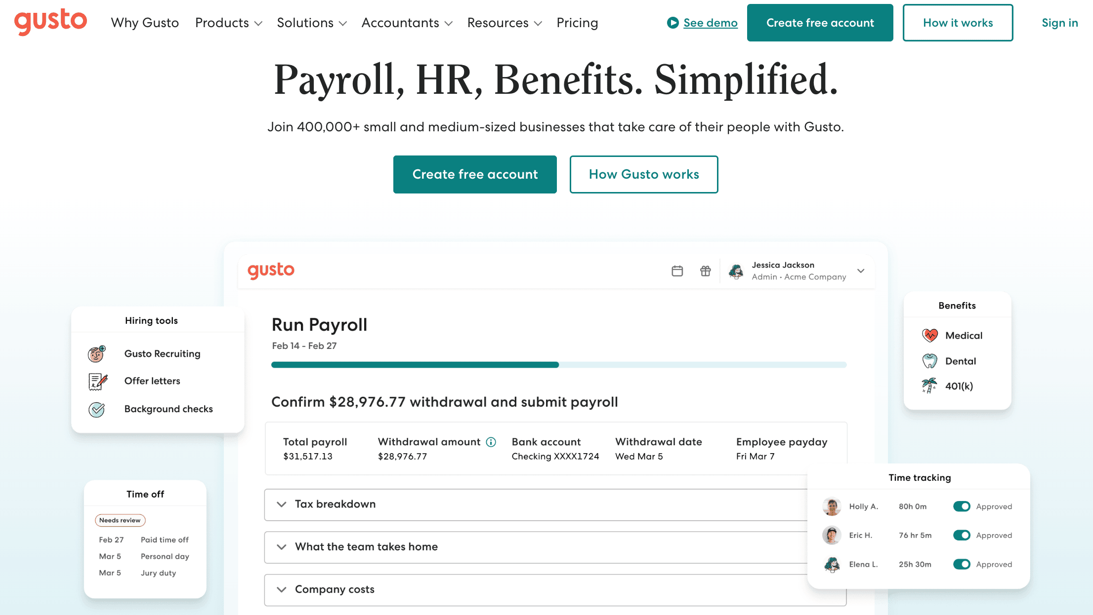
In the example below, Gusto includes an attractive dashboard view of their product in action, which begins above the fold and invites users to scroll to see the rest. It quickly shows users how they can simplify payroll, HR, and benefits on one cohesive platform.
This “peek under the hood” helps to de-risk and remove uncertainty for viewers.
If you’re selling physical goods, consider doing two things:
- Show off various use cases
- Show close-ups that convey quality, giving users a fuller appreciation of the product.

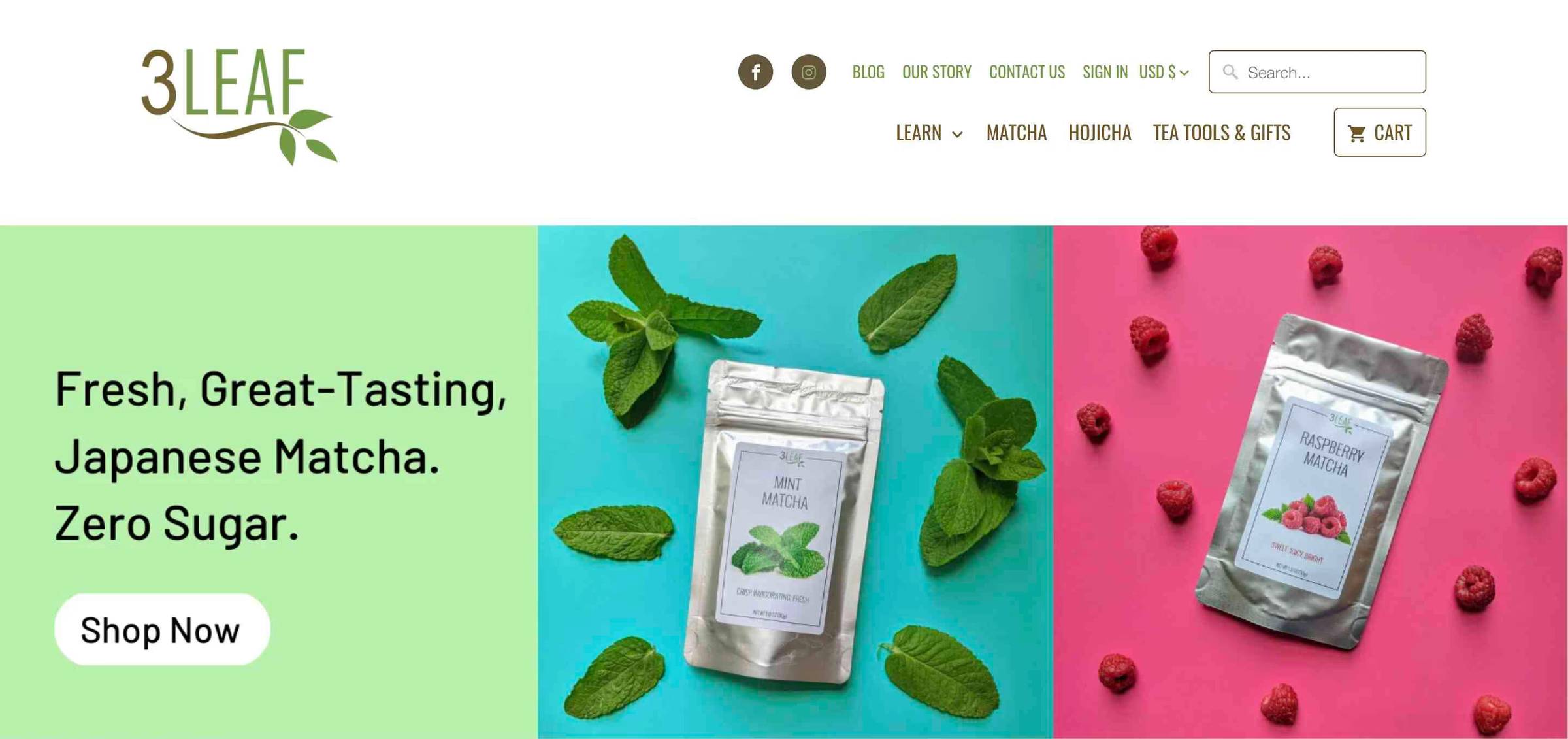
Another consideration for e-commerce companies: If your product’s packaging is aesthetically pleasing, consider displaying your product in its actual packaging.
You might persuade more shoppers to click in hopes of “unboxing” the product and seeing more. You might also help shoppers recognize you at shelf if you have a retail presence.
Here’s how 3 Leaf, a matcha company, does just that:
Using Negative Space
While it’s not a hard-and-fast rule, keeping plenty of empty space between elements in your ATF will help your copy and visuals pop. It also adds a certain understated sophistication that can convey confidence and quality.

Below is an archived counter-example that takes a visual approach we don’t recommend. The visual here doesn’t add any value by educating or lowering perceived risk. It also competes for hierarchy with the message. Not to mention the subhead clashes with the image, which looks unintentional and unpolished.

Navigation Bar
As a general rule of thumb, the fewer links you have in your navbar, the better. Try to minimize analysis paralysis and not overwhelm viewers.
Especially if you’re a traction-stage startup, you should be guiding users toward the single key action you want them to take, whether that's to request a demo, start a free trial, or book a call with your sales team.
Below, Slack probably has too many things going on in the nav bar. Whereas Trello is possibly too minimal with their approach; Having a few more options would likely help them build confidence with buyers.

A good rule of thumb for your nav bar is to use 2–4 links plus a standout CTA if it’s your homepage or landing page.
CTA Buttons
Let’s talk about those little rectangles that can make a big difference: “Call-To-Action” buttons.
Below, you’ll see two strong examples. Directives like “See what’s nearby” and “Start Learning” are continuations of the magic that’s been teased in the header copy.
It feels natural to click on these CTAs, because they help the visitor continue the narrative these companies have begun.


You can think of your CTA as the actionable next step to fulfilling the claim in your header. Being specific, action-oriented, and positive is good here; Do what you can to entice users to click, then take them somewhere that delivers on your promise.
Below, you’ll see a weak example of a CTA button above the fold.

First of all, the copy is vague throughout, so it never really establishes what a viewer stands to gain. From there, it pushes you to “Request meeting” which seems like an incredibly tall order at this stage on the website, especially when the takeaway is nebulous at best.
It’s like proposing to someone on a first date that’s not even going particularly well. Perhaps if they were more specific about what their software enables or alleviates, a “See demo” or "Learn more" CTA would be more appropriate.
Look at some (archived) examples below from companies that understand how to use specific, actionable copy in their CTA buttons.

Sometimes The Best CTA is to Keep Scrolling
Some products are inherently more difficult to “pitch” in a few seconds than others. If your product falls into this category, you might benefit from providing more context/education on your homepage or landing page before asking users to click and sign up.
That said, you should consider having your CTA button simply lead further down the page. Then have a CTA that’s more conversion-focused once a user is down there. A simple “Learn more” button below drives users to more info below without muddying up the ATF.

Or instead of adding a CTA to keep scrolling, you might also consider cutting your ATF short, so visitors must scroll to see the rest of what you’re teasing. We saw this approach earlier in the Gusto homepage example as well.

To Recap
Your ATF starts your brand’s narrative in viewers’ minds. Strong ATFs give visitors the specificity, the “what’s in it for me?”, and clarity they need to take the next action in your funnel.
Like we said last week, you only get one chance to make a first impression, so this area warrants a lot of time and attention to ensure it’s working as hard as possible for you.
Your ATF design says just as much about your brand as your ATF message. A clean, modern look communicates you’re probably worth trusting, just like a compelling and focused message does.
And while viewers might not consciously pore over every word of copy, the instant, visual nature of your design will quickly make a strong impression with them, where they either sense you’re buttoned-up and put-together or sloppy and not worth their time.
You should always A/B test new design updates to ensure they’re improving your key metrics. It’s not always the case that more artful or beautiful design moves the conversion needle, so practice good fundamentals and keep iterating.
Gil Templeton
Demand Curve Staff Writer
Something fun
A one-in-a-million photo taken at the U.S. Open a few weeks back. Courtesy of Getty Images and photographer Ray Giubilo.
