
Top Growth Tactics
We continuously interview our community of 60k founders and marketers to figure out what’s working. We share the insights through our newsletter. We update this page every time we send our newsletter.
You can use the filters, and search, to narrow your focus.
Is It Time To Revisit Your Tagline?
Insight from Gil Templeton — Demand Curve Staff Writer
For all the changes in marketing and branding over the last several decades, the merits and tenets of a strong tagline remain largely unchanged in my book.
Your tagline should convey the greatest value you offer in a way that’s clear, differentiated, and emotionally resonant with your target…which can be a tall order to pack into five-ish words or fewer. That’s why it usually takes careful consideration and lots of iteration to get to a winner.
A good tagline is becoming more valuable as a way to differentiate in the increasingly competitive small business space. It can help you be a consistent, focused signal among the growing noise in your category.
For startups and smaller businesses, I’d urge you to lock down on one consistent tagline across messaging efforts. Some household brand names (who pay for lots of TV ads) might use short-lived campaign lines or wrap lines for a campaign or quarter. But for lesser-known companies with smaller marketing budgets, diverting focus tends to dilute your message.
There aren’t exactly hard-and-fast “rules” for when to use a tagline, but think of it like your company’s shortest boilerplate message. In those instances where you’re making a first impression or leaving people with one key takeaway, you can default to your tagline.
You can use your tagline in your:
- Hero logo lockup
- Ad campaigns
- Web headers and meta descriptions
- Signage at a trade show or conference
- Email signatures
- Social bios
- Product packaging
- Branded swag
- Loading screens or video intros
- Pitch decks
- Business cards or letterhead
How to Assess Your Current Tagline
If you already have a tagline, check yours against this basic criteria to see if you have a winner, or if you need to reconsider. This is an admittedly subjective topic, and there are outliers that might work well, but these three questions are here to serve as your sounding board and keep you honest.
1. Is your tagline clear?
This doesn’t mean it has to describe your company or call out your industry, but it should convey what you make possible, what you can make go away, or the shift someone feels after using you.
It should be focused and specific. Ask yourself (or better yet, ask someone else) “Does this convey the general gist of the value we provide?”
Taglines for a meal kit service:
Clear example: Solve dinner in 15 minutes.
Unclear example: Redefining how people eat at home.
Takeaway: The clear example conveys the benefit (saving time) and lets readers gather that it’s a meal kit/prep service. The unclear example is a grandiose nothing-burger that requires more context for any clear takeaway outside of “food.”
2. Does it differentiate the company?
This doesn’t have to be (and usually isn’t) an explicit claim, but it should either convey your unique POV or hint at what makes you unique inside the competitive set.
Ask if your closest competitor could credibly use your same line. If so, it’s probably not defensible. Differentiated taglines highlight a well-defined stance, benefit, or use case.
Taglines for a plant-based snack brand:
Differentiated example: Crave junk. Eat plants.
Undifferentiated example: Snacks you can feel good about
Takeaway: Differentiation in a tagline does not need to mirror your UVP or be a competitive message. The first example here is differentiated, simply because it takes a stance that feels unique, bold, and conveys their value for a specific use case. The bad tagline could live (and probably does live) across hundreds of brands.
3. Does it stir up an emotion?
The best taglines hit you in the gut. The easiest way to test it is by asking whether it makes a reader feel something beyond sheer understanding or comprehension.
It doesn’t have to make someone “emotional.” But ask yourself: Does it excite? Spark curiosity? Make them feel seen? Create a sense of connection? Provide a sense of relief? Make them proud? If your tagline does something like this, it’s pulling the emotional lever.
Taglines for a farmers’ market collective:
Emotional example: Know the folks feeding you.
Emotionally empty example: Farm-fresh food every week.
Takeaway: The strong example evokes a sense of deeper connection and delivers on that natural human desire. The weak example reduces the product(s) to a commodity with descriptive, emotionally empty copy.
(For more on avoiding descriptive copy and instead answering “What’s in it for me?” to your audience, see a fan-favorite Demand Curve resource here.)
Now, to evaluate your tagline:
Most good taglines can only deliver on one or two of these in spades. So instead of asking, “Does my tagline totally nail all three of these?” ask yourself, “Does it nail at least one of these really well? And do I avoid the common pitfalls of being unclear, undifferentiated, or emotionally flat?”
So if your tagline is clearly violating one of these no-nos (lacking clarity, sounding like anyone else, or being devoid of emotion), you should consider updating it.
In that same spirit, if your tagline doesn’t pull at least one of these three levers in a major way, you might want to try for a new one that does.
Tips for Writing a New Tagline
I’ll caveat things again by saying: there are many iconic and enduring taglines that violate a tip or two below, so think of these like general best practices to help you get to solid ground.
For your starting point, ask yourself what feeling, promise, or change you most want to embed in someone’s head. A tagline’s job is to convey your value in a few memorable words, so begin by exploring the core benefit, belief, or transformation your brand makes possible.
A lot of startups don’t have the luxury of mass brand awareness, so the rules here are slightly different than those for household names. For startups and smaller businesses in need of a hardworking, helpful tagline, follow these general tips when writing yours:
Tip 1: Make it as punchy as possible
As a copywriter who’s written lots of taglines over the last decade, I’ve noticed there’s a natural ceiling at about five words. A tag longer than five words is harder for people to repeat or remember, and it will likely pose issues down the road (your logo lockup, fitting into small spaces, lower recall, etc.).
But this doesn’t necessarily mean, “See what you can do in five words.” Try to get it down to three or four if possible, and judge every word as “guilty until proven innocent” to ensure it’s working hard for you. Your word count and character count are precious here. Make every one count.
To make your tagline as short as possible:
- Remove any qualifier words (really, truly, more, better, innovative, modern, etc.) that aren’t mission-critical.
- Ditch the throat-clearing setup words (“Helping you…”, “Designed to…”, “Making it easier to…”).
- Swap phrases for single words where possible (“Get rid of” → remove; “Move faster with” → accelerate.)
Example A: Payroll Software Company
Too verbose: Simplifying the way you pay employees.
Punchy: Make payroll stupid-simple.
Example B: E-Commerce SaaS
Too verbose: Sell your products across every channel.
Punchy: Sell everywhere.
Tip 2: Be singular
Your tagline should only make one point. You might be tempted to load it with multiple benefits, audiences, or ideas, but that will likely dilute your message.
A great tagline shines a bright spotlight on just one promise or benefit. Be so sharp and focused, the reader instantly knows what to take away.
Example A: Healthcare payment platform
Too scattered: Easier payments for doctors and patients
Singular: Simplify every care payment.
Example B: Fitness App
Too scattered: Track workouts. Count calories. Build confidence.
Singular: Get healthier every day.
Tip 3: Be actionable
There are plenty of great taglines that don’t do this, but using the imperative case and instructing people to do something is generally a strong approach; It’s certainly not THE only way to write a tagline, but it tends to keep you on the right track.
Some all-time classic taglines like “Think Different,” “Open Happiness,” and “Just Do It” embrace this angle to make their point.
You’ll notice I’ve naturally been doing this in my examples (taglines that begin with words like solve, crave, know, make, sell, simplify, get.)
Being actionable can do you several favors:
- It makes your tagline a call-to-action in itself, giving readers something to do or become instead of just giving them an idea to process.
- It puts the customer at the forefront, and shows them what they stand to gain as opposed to a self-important description of your company.
- It forces you to be clear. If you can tell someone what to do in a couple of words, it’s a good sign you’ve boiled down your value to a very focused form.
Example A: Travel-booking platform
Inactionable: Your fastest travel booking solution.
Actionable: Book travel faster.
Example B: Cloud storage SaaS
Inactionable: Better cloud-based file storage.
Actionable: Access files anywhere.
Tip 4: Play the numbers game
Much like naming a brand or writing a killer headline, the process for writing a tagline is largely a numbers game. You should really get a couple hundred options on the page before you whittle the list down to a few favorites to stress-test and consider.
First, go wide. Come at it from every possible angle and get as many types of ideas on the page as possible (aim for 200+). Riff with a partner or coworker for a few marathon sessions. Use LLMs to return tons of options. Keep going and going.
Then, go back through the list and choose 5 to 10 favorites. Rewrite them and rewrite them to ensure the idea is as short, clear, and compelling as possible.
Once you’ve got your final contenders, stress test them across various contexts (logo lockup, ad creative, etc.) to help you pick “the one.”
Then, ask a few trusted customers (or other trusted opinions outside of your company) if they “get it” and if they can repeat it easily.
If so, bag it and tag it. You've got your tagline.
Gil Templeton
Demand Curve Staff Writer
First, Some Background: How AI Rewrote the Rules of Search
Insight from Kevin DePopas, Demand Curve Chief Growth Officer + Gil Templeton, Demand Curve Staff Writer
Before we break down the Loop framework, let's get on the same page about why a new playbook is even necessary.
The core problem is that the traditional inbound marketing funnel (largely built on attracting organic traffic from search) isn't quite flowing like it used to. The evidence is mounting…
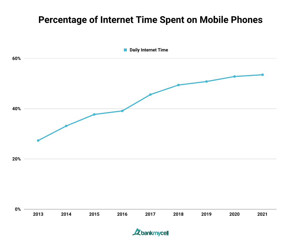
- The Rise of Zero-Click Search: Nearly 60% of Google searches now end without a click. Instead of browsing links, people are getting answers directly from generative AI.
- Scattered Customer Attention: Your audience’s attention is now fragmented across a dozen different channels like YouTube, TikTok, Reddit, and podcasts.
- The Declining Power of the Blog: Even HubSpot is now seeing 90% of their leads coming from non-blog sources, with YouTube leads up 100% and newsletter leads up 90%.
This is where the distinction between SEO and AEO becomes critical. Traditional SEO is largely determined by how well your site indexes on a single platform (mostly Google), driven by content quality, technical on-site SEO, and backlinks. AEO is different. LLMs don't merely pull from your website; they synthesize answers from data across multiple surfaces where your brand is mentioned and described.
Here's an example to make this concrete. In the pre-LLM era, getting your product mentioned in a Reddit comment or a YouTube video was great for awareness, but it wouldn't help your "SEO juice" without a direct backlink. In the LLM era, that's no longer true. Since AI models are trained on full video transcripts and entire comment threads, simple brand mentions now impact how you show up in AI answers. As HubSpot puts it, brand mentions are the new backlinks, and things like Reddit posts, YouTube videos, and reviews matter more than ever.
So like it or not, it appears we’re no longer just optimizing for Google's crawlers. We're also optimizing for a swarm of AI models that learn from the entire internet.
The top sources LLMs cite:

Decoding the Loop: A Founder's Translation
Seeing that list of sources can be overwhelming. The idea of managing your brand's presence across Reddit, YouTube, and a dozen other platforms feels like a tall order for most lean startup teams.
This is where HubSpot's Loop Marketing comes into play. It's a framework designed to bring order to this chaos by helping you tell a consistent, compelling story across all the surfaces AI models learn from.

HubSpot's framework is a cycle with four stages. Here's the official definition, and our translation of what it means for your AEO strategy.
1. Express
- HubSpot’s Definition: Define your brand’s unique taste, tone, and point of view before you bring in AI.
- Translation: Nail Down A Unified Message. Before you even think about creating content, it’s smart to decide on the single, consistent message you want AI crawlers to find everywhere. This is because LLMs appear to get more confident when the same story is repeated across multiple trusted surfaces. If your message is fragmented, so is their understanding of your value.
For example, let's say your company is a new AI note-taking app (like Fathom or Fireflies). If your website claims your key differentiator is "seamless integration with project management tools," a YouTube review you sponsored highlights its "superior transcription accuracy," and a Reddit thread praises its "unbeatable price," an LLM sees three different, conflicting signals. AEO experts are urging marketers to pick one core message and stick to it.
2. Tailor
- HubSpot’s Definition: Use AI to make your interactions with customers personal, contextual, and relevant at scale.
- Translation: Plan Your Content for Specific Audiences. This is the strategy phase. Once you have your core message (from the Express stage), “Tailor” is about using AI to identify your key customer segments and plan content that speaks directly to their pain points. The power of AI here is making this level of personalization feasible for a small team, where it might have previously been cost-prohibitive.
Continuing the AI note-taker example...Let's say you've decided your most strategic differentiator is "seamless integration." You analyze your user base and find three main archetypes: startup founders, enterprise sales execs, and growth marketers. The Tailor phase is where you can use AI to help brainstorm, outline, and create laser-focused landing pages, blog posts, Reddit threads, etc. for each of those segments, all reinforcing your chosen core differentiator.
3. Amplify
- HubSpot’s Definition: Diversify your content and distribute it across the channels and surfaces where both humans and bots will find it.
- Translation: Execute Your Plan on the Right Surfaces. If “Tailor” was the strategy, “Amplify” is the execution. This is where you take the content plans you created and deploy them on the high-value surfaces that LLMs are crawling. You’re strategically placing your tailored content where it will have the most impact for AEO.
4. Evolve
- HubSpot’s Definition: Use AI to iterate on your strategy quickly and effectively in real time.
- Translation: Measure and Adapt. This is the crucial feedback loop. Once you’ve amplified your content, you need to track what’s working. For example, if you launched a Reddit AEO strategy, the Evolve stage is where you check back in. Are you seeing an increase in brand mentions? Is your AEO score improving in tools like HubSpot’s AEO grader? This is where you analyze the data and decide whether to double down, pivot to a new surface, or refine your messaging.
This framework is general enough to be executed with any toolset. However, it's clear that HubSpot has intentionally built its product suite to power each stage of this loop, making it worth a look if you're searching for an integrated solution to manage the whole process.
So, What Now? Four AEO Topics We're Thinking About at Demand Curve
Look, we could attempt to give you a 7-step playbook on how to execute an AEO strategy. But frankly, we're learning AEO for the first time too, and it's top of mind considering the recent launch of Growth Program 2.0. So after digging into HubSpot's Loop framework and the broader conversation around AEO, here are the four big takeaways our team is discussing at Demand Curve.
1. Establish A Baseline
Before diving into a new strategy, it’s always smart to know your starting point. You can't improve what you don't measure, and AEO is no different. Since this is new territory for most of us, getting a clear baseline can feel a bit abstract.
To establish a baseline, we started with HubSpot’s free AEO Grader. The tool generates an AEO score out of 100 by scanning a URL, and provides an actionable checklist of recommendations. The score is based on factors that AI models prioritize, like content readability, author authority, and trustworthiness. It provides a quick snapshot of where a site stands before you make any changes.

2. Good AEO Starts with Good SEO
The idea of optimizing for a dozen new platforms is daunting, so our next question was, "Do we have to throw out our entire SEO playbook?"
The answer, thankfully, is no. As SEO expert Matt Kenyon explains, ranking in AI search largely boils down to "doing good SEO with a few important nuances." The established fundamentals are more important than ever.
AI models still need to find and understand your content. This means:
- Crawlability is key: AI crawlers like OpenAI’s GPTBot and Google’s crawlers need to be able to access your site. Your robots.txt file must allow them in. If you’re non-technical, it might be worth hiring someone to make sure your site can be crawled.
- Structure matters: A clear hierarchy of headings, bullet points, and tables makes your content easy for both humans and AI to parse. Groundbreaking, right?
- Schema is your friend: Using schema markup to explicitly label your content (e.g., as an article, organization, or product) is critical for helping AI understand exactly what it’s looking at.
The takeaway for us is that strong SEO practices are the foundation for any AEO strategy. So, if you're already doing that, you're in a great starting position.
3. We're Auditing Our Brand's Digital Footprint
HubSpot's framework points out that LLMs synthesize answers from data across multiple surfaces. While a backlink from an aggregator site like G2 or Crunchbase might not carry the same weight as an editorial link in traditional SEO, its role in AEO seems to be different.
LLMs build confidence by seeing the same story repeated across multiple, trusted platforms. This has us thinking about the importance of brand consistency everywhere. We're planning a sprint to audit and align our messaging on platforms like:
- Wikidata (the structured database behind Wikipedia)
- Business directories like G2, Crunchbase, and Google My Business
- Niche industry databases
If an AI model sees Demand Curve described consistently across our website, LinkedIn, G2, and YouTube transcripts, it's more likely to trust that narrative and repeat it in an answer. This makes auditing our "digital footprint" for consistency a new priority.
4. We're Systematizing Outreach for Brand Mentions
The idea that "brand mentions are the new backlinks" is probably the single biggest shift for us. While Demand Curve already has a decent SEO presence from nearly a decade of consistent content creation, our social presence outside of LinkedIn is, well…lacking. An unlinked mention in a Reddit comment or a mention in a creator's YouTube video now appears to be a powerful AEO signal.
With that in mind, our next step is to get more high-quality mentions on the surfaces that AI is trained on. This effort looks a lot like a traditional link-building or digital PR campaign, but the goal is different. We're planning to target creators on YouTube, Reddit, and high-signal newsletters to generate authentic conversation and mentions, whether linked or not.
A key part of this effort is making it easy for creators to talk about us (and make content about us). To that end, we're taking a page from our favorite creator marketing expert and building out media drop kits that give creators everything they need in one place: our core message, stats, unreleased brand assets & videos, curiosity-inducing storylines, etc.
The Bottom Line
Ultimately, HubSpot's Loop framework provides a solid mental model for organizing these efforts. Define your story (Express), tailor it (Tailor), seed it where it matters (Amplify), and measure the impact (Evolve). The inbound traffic playbook is no longer about winning a single algorithm on a single platform (we're looking at you Google). It's about shaping the entire conversation around your brand across the open internet.
The beauty of this approach is that you can execute it with any toolset, making it accessible to most teams. And while you can certainly run this play using your own stack, it’s worth noting HubSpot has built its entire marketing suite around the concept of Loop Marketing. So whether you patch together your own process or give Hubspot’s AI Marketing Suite a shot, it’s probably time to start thinking about your AEO strategy. Because the brands that move quickly will become the default answer in their niche.
Kevin DePopas
Demand Curve Chief Growth Officer
Gil Templeton
Demand Curve Staff Writer
The Direct Sales Trap
Insight from Gil Templeton — Staff Writer, Demand Curve
Let's start with some math that might look appetizing on paper, but was actually limiting doopoll’s growth.
Right before they joined the Growth Program, enterprise contracts made up 75% of doopoll's revenue. These were great deals for the Welsh startup (multi-year commitments, low churn, high value) but each one required one of the co-founders, Marc or Steve, to personally close it. This meant non-stop meeting prep, flights, and handshakes to make sales.
The other 25% of their revenue came from SMEs paying between £9 and £100 per month. This segment had potential for systematic growth, but the founders had been too busy flying around to meetings to stop and figure it out.
That’s when Marc had the realization they could either keep grinding on big enterprise sales, or they could build a system that sold to the masses while they slept.
They chose the system.
Step 1: Getting Outside Help
In early 2019, Marc did something smart. He admitted he didn't know how to build a growth engine.
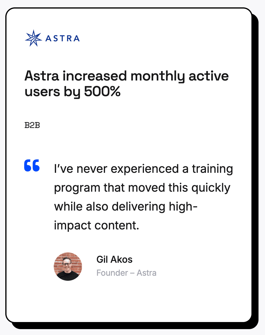
He’d read about Gil Akos at Astra going through the Demand Curve Growth Program and spoke with him after reading our guides.
The entire program cost about the same as four days of consultant time, so he joined.
"We were fairly green to this model," Marc wrote.
They set three goals:
1. Find a channel that reliably brings in paying customers.
2. Keep customer acquisition cost below lifetime value.
3. Increase conversion from website visitor to paying customer.
This made sense, but they didn’t know how to do it without wasting months on avoidable mistakes. Enter the Growth Program.
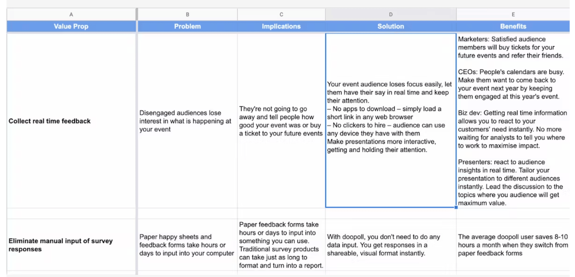
Step 2: The Value Prop Reality Check
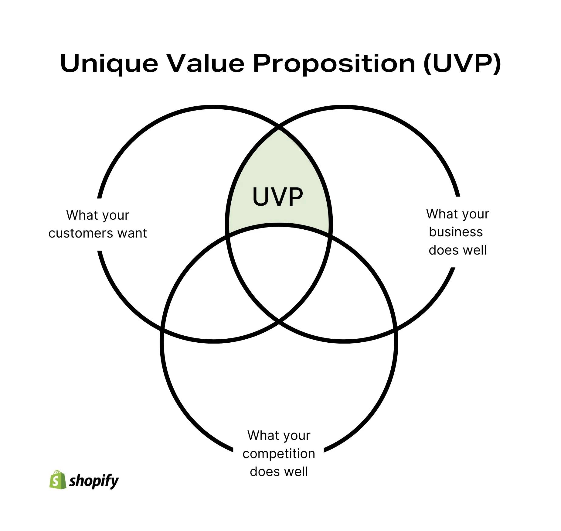
So many startups struggle to develop clear, compelling value propositions. This is one of the fundamental building blocks for growth, and it’s why we help founders build the systems to convey value in an effective way.
Strong value propositions can be the difference between stumbling out of the gate and having people beat down your door to buy what you’re selling.
And like so many founders, Marc thought he knew why customers bought doopoll. He’d pitched hundreds of them personally. But when he reviewed his work with his Demand Curve coach (a resource available for VIP Plan subscribers), the feedback was harsh but enlightening.
The final version of the value prop worksheet was “almost unrecognizable from draft 1.”
It became the foundation for the rest of the work. The copy changes, funnel fixes, and pricing decisions later in this story all stemmed from these clarified value propositions.
Step 3: Competitor Intel
Marc spent two full days going deep on analyzing competitors.
He signed up for each one of them, captured full onboarding flows, analyzed ad copy, documented their pricing psychology, and more.
"There were things that were bad and things that I loved about each of them," he wrote.
He said SurveyMonkey's Genius tool was "genuinely something I’m jealous of."
Founders often skip this part because it’s time-consuming, and they think they already know the space. But Marc’s teardown of the competition revealed real gaps and opportunities for growth.
Step 4: Finding What’s Broken
This is where Marc discovered how broken their funnel actually was.
He installed Hotjar to watch user behavior. Then he did a first-time user test on himself.
His painful observation was that users were confused. "It's not obvious that I can create surveys. Our buttons say 'poll' but our marketing says 'survey.'"
Super basic stuff, but it was killing their conversions.
Then he watched Fullstory sessions from people who didn't convert. It was rough. Users clicked around, got lost, and left.
"You have no idea how hard your 'simple' product is to use…until you’ve watched users (who didn't make it) try to use it."
Step 5: Rewriting Everything
Marc started his career as a journalist. He could certainly write, but at the time, he didn’t know how to write copy for an effective landing page.
He drafted a new landing page and sent it to his Demand Curve coach for review. It came back covered in edits.
"It stung," Marc admitted. But the rewrite pulled directly from the refined value props. It might not have won any points for creativity, but it was extremely clear and compelling.
The results were immediate, and they saw conversions jump.
Step 6: The Failed Tattoo Campaign
Before joining the Growth Program, Marc tried cold outreach. It involved sending emails with the subject line:
"I want to work with you so bad I got a {firstName} tattoo on my arm."
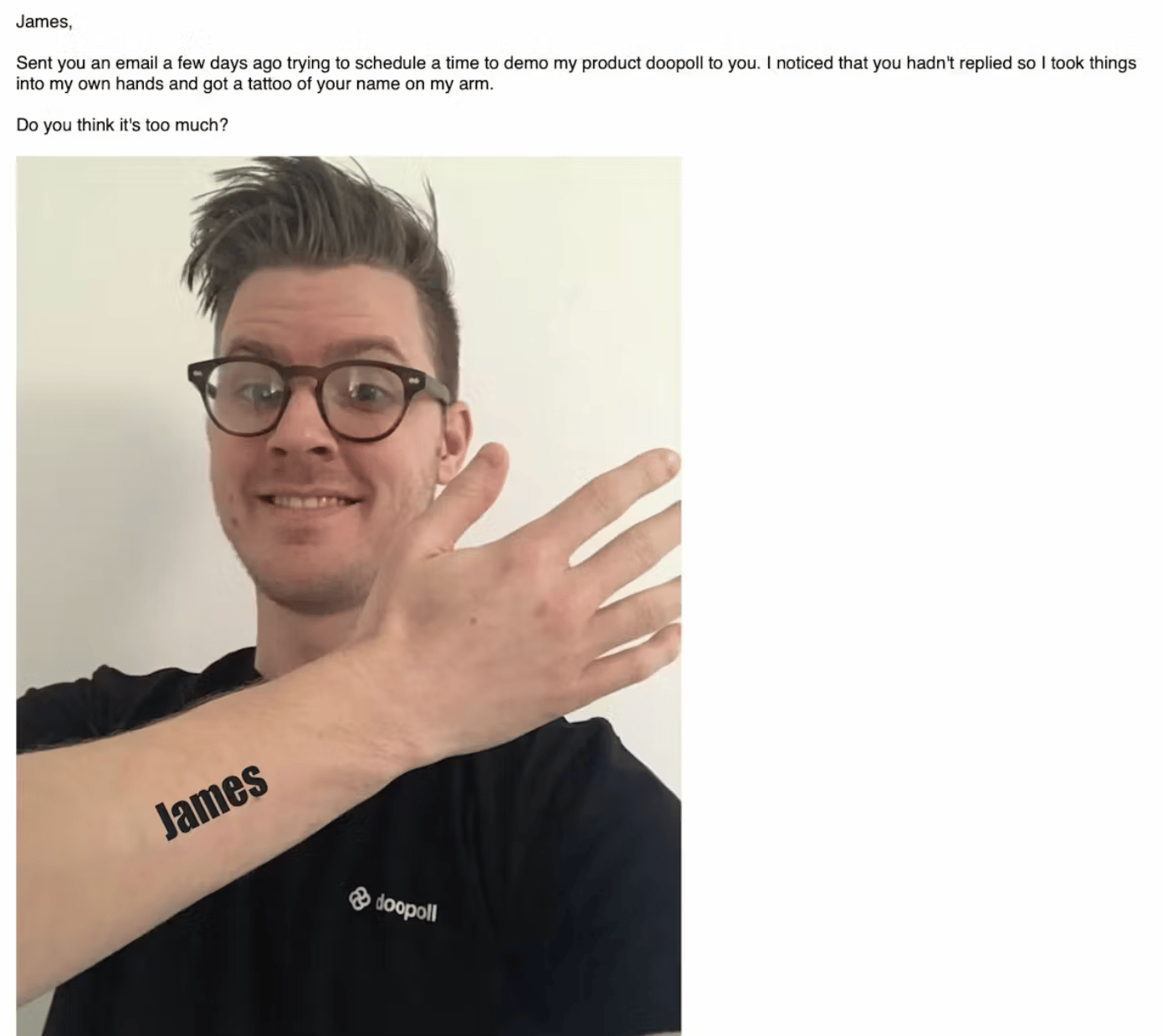
The responses were...mixed.
A few loved it. Most ignored it. Others were actively hostile toward it.
When his coach suggested trying cold outreach again, Marc was skeptical. But their approach was going to be different: short, plain-text emails to well-targeted segments.
Results improved. People replied without the backlash, but it still didn’t clear the bar. They didn’t have a repeatable growth engine yet.
Step 7: Turning the Ad Faucet On
Setting up Google Ads and Facebook Ads took 21 days. Then Marc hit "go."
"The rush of seeing a huge stream of people from all over the world was hypnotic and addictive," he wrote.
For 14 days, traffic poured in. They doubled their ad spend to get meaningful data.
Then reality hit: very few actually converted to paying customers.
Marc described it perfectly, "The come-down is a killer."
Step 8: The Power of the Pause
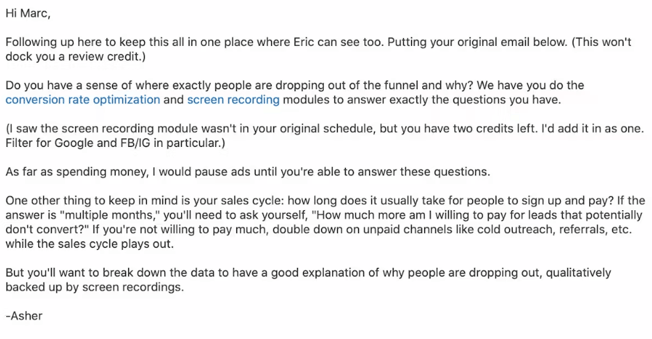
Marc was panicking and burning cash with just a few sales. He asked his Demand Curve coach for help.
His coach’s advice was to turn off the ads. Fix the funnel. Then turn the ads back on.
"Taking that advice was one of the smartest things I've ever done," Marc wrote.
With ads off, he could turn his focus to why people weren't converting.
See the actual email from their Demand Curve coach below.
Step 9: The Freemium Model Breakthrough
Their data revealed the core problem: the 14-day trial didn't match the way people actually used doopoll.
For example, event organizers set up surveys weeks ahead of time, but the 14-day trial ended before they saw any value come to fruition.
Marc switched to freemium:
- Create unlimited surveys: Free
- First 10 responses: Free
- Pay when you see value: £39/month
Within 30 minutes of launching, they got their first conversion. Then another. Then another.
"We used to have a Slack bot that pinged us 'Tuscan Leather' by Drake when someone paid through Stripe," Marc wrote. "We had to turn it off. We were getting too many notifications."

Step 10: The Testing Cycle
Marc developed a systematic approach:
- Form a hypothesis and ship a change
- Run ads for 1–2 weeks to bring in ~200–300 users
- Pause ads
- Measure behavior and conversion
- Plan the next test
He was starting to practice what the Growth Program teaches: sustainable growth comes from stacking small, repeatable improvements, not going all-in on one silver bullet.
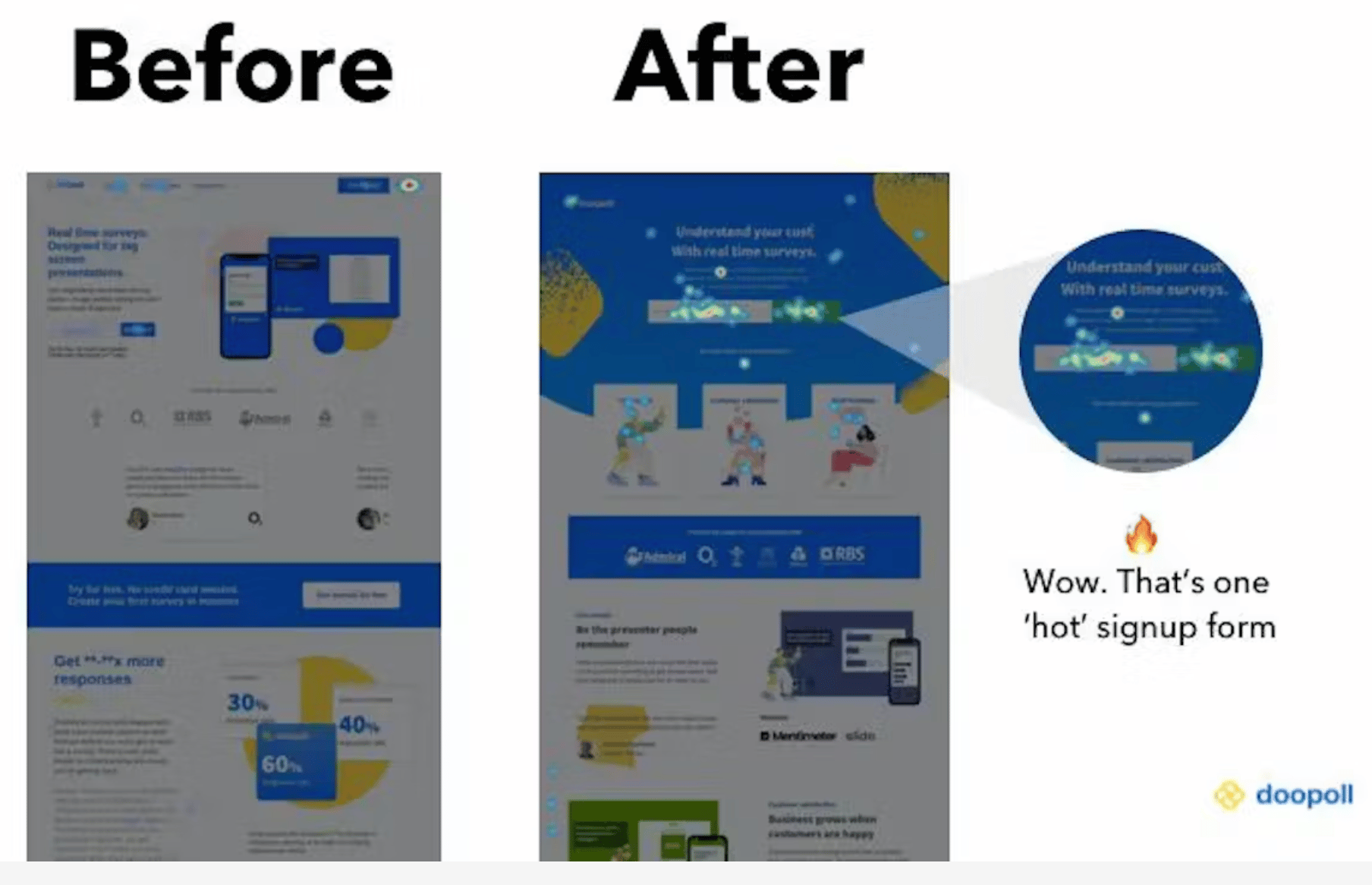
Step 11: The Big Swing
For one of their first major A/B tests, they didn't test something minor like CTA button colors. They completely rebuilt the landing page.
Marc stole inspiration from Notion's template gallery approach. "Hands up: we took heavy inspiration from what they did," he admitted.
The test ran for one week. The new page converted at 14%, up from 4%.
That's a 250% improvement from one test.
The Numbers That Matter
After six months (September 2019 to March 2020):
- MRR growth: 800%
- Monthly customer growth: 75% average
- Conversion rate: 4% → 14%
- CAC:LTV ratio: Around 1:1.5-2 (target was 1:3)
- Founder involvement in sales: Zero
But what matters most is this growth came from low-touch acquisition. The founders only talked to customers after they'd already paid. They no longer had to be in the room, selling to large clients only.
Three Lessons from Marc's Journey
Marc shared these three key takeaways from his transformation:
1. Growth is about systems rather than hacks
"A lot of people end up with poor results because they focus on tactics that worked for people they know. Strategy is more important, and a systematic approach to strategy is best of all."
2. Most people don't grow astronomically overnight
"It's usually the accumulation of small gains over time that makes an impact. If you take a systematic approach to growth, you don't need to get hung up on rapid growth figures."
3. Growth for a SaaS project is a whole business project
"Opportunities get missed when growth work isn't driven across teams, including product, marketing, sales, and customer success."
The Lesson For You
A lot of founders will read Marc’s story and go back to grinding out the wins. But grinding harder in a broken model doesn’t fix growth issues.
What worked for Marc (and what works for basically every founder we’ve met) is building a system that compounds. Not a huge heroic pivot or a lucky hack, but rather a steady run of the right changes, stacked week after week.
And that’s exactly what we teach in the Growth Program 2.0: many of those same frameworks Marc used to turn doopoll into a sustainable growth engine.
Gil Templeton
Staff Writer, Demand Curve
Tips & Use Cases for AI Imagery
Insight from Gil Templeton — Demand Curve Staff Writer
Before we get down to the nitty-gritty, let’s cover our bases with three big-picture pieces of advice on AI image generation. FYI, most of today’s lesson will draw from my personal experience with Midjourney, ChatGPT’s Sora, and just a little time with Google’s all-new Nano Banana.
Tip 1: Iterate. Iterate. Iterate.
If you’re new to this world, it’s easy to be impressed by your first shiny output, and it’s tempting to assume it’s good enough. But try to think of AI as an iterative tool that can help you work toward a desired outcome, not a magic “make it” button.
For example, I’ll often run the same exact starter prompt three times in Midjourney, which gives me twelve unique outputs. Seeing twelve potential paths all next to each other helps me weigh my options and choose the best starting point.
Sometimes you might see an outlier or a “happy accident” that wasn’t what you originally intended, but it ends up being your preferred output.
Other times, the majority of your outputs might fall flat or have something “lost in translation” like the example below. Only two of the twelve images (barely) understood my prompt of the front tires bouncing in the air, even though I explicitly stated that note in the prompt.

Of course iterating doesn’t stop there. As you keep refining, honing, coaching, and editing, you’ll need to keep weighing your options as you work toward a quality outcome.
Another important note: free trials are great for a quick test drive, but the credit limits can make you feel hesitant to experiment. I recommend starting with the lowest-tier paid plan to initially remove that gate, so you can feel free to iterate and get better instead of being precious about each output. It made a big difference for me.
Tip 2: Inconsistency kills
It’s not too hard to get an awesome one-off image. What’s harder is building a collection of visuals that all feel like they belong to the same brand or campaign. If someone visits your site or socials and sees a range of disparate, inconsistent visuals, you risk looking like an amateur operation.
One of the best ways to combat inconsistency is to create (and continually update) a library of reference images for certain projects or clients. Feeding these platforms strong references (whether it’s your past campaign shots, product imagery, or a specific artist’s style) provides important guidelines.
I’ll often take a “hero” image that nails the look and use it as a visual anchor, referencing it across multiple generations. For example, here’s an image I captured on a shoot (with the help of talented photographer Dan Escobar). Let’s say I wanted to re-use this image’s style for some new executions.

By uploading the reference image above to Midjourney as a "style reference," I can create a consistent, complementary image like the one below (after a little finessing, of course).

It might not be quite as amazing as the actual shot from a world-class photographer. But let’s compare that to the inconsistent output below, where I used the exact same prompt, without a reference image. This one would certainly clash with the first image(s) if you used it in the same campaign or webpage.

Midjourney also supports SREF codes, which allow you to create or choose an existing “Style REFerence” so every output has a similar vibe. This can save you hours.
Without these kinds of guardrails, you’ll get varying results: one output that looks on-brand, another that looks like weird AI stock imagery, and another that looks like it belongs to a different brand.
But a strong reference library and consistent style inputs will help you string together dozens of outputs that look cohesive and intentional.
Tip 3. Ask yourself the hard question
AI image & video generation is incredibly powerful and increasingly useful. However, it’s not the answer for every visual need out there.
People might rush to assume they never have to pay for a photoshoot again, or that users won't care if something is slightly unsettling/off-kilter in an AI-generated visual.
But before using AI-generated images (and videos) for your business, ask the hard question: Is this elevating how my brand is seen? Or cheapening it?
Big companies have made this mistake and seen the backlash. Vogue caused an uproar by allowing GUESS to run a magazine ad featuring an AI model. A24’s AI-generated promo materials for Civil War were replete with obvious AI “tells.” Coke’s AI 2024 holiday ad was a little unsettling, just look at the top comments on the YouTube video.
Sure, big companies are under more scrutiny to hit a higher standard, because they’re more visible and have more money (presumably to pay artists, talent, production houses, etc.). Smaller startups and tech-forward brands probably have more leeway, but without holding your outputs to a high standard of quality and consistency, it can erode trust and make you look cheap.
Context is everything here. If you’re an AI gaming startup and you generate a hyper-real dreamscape visual to use in a paid ad, you’re gravy. But other industries like healthcare, fashion, finance, and even food & bev can carry higher stakes.
I’m not saying you shouldn’t use AI-generated assets in these industries, but hold yourself to a high standard, and make sure you don't mislead. Missteps can damage trust and even invite regulatory heat.
Now let’s get into some relevant, simple use cases for how you can use AI to elevate your brand.
Use Case 1: Eye-Catching Product Photography
AI excels at transforming a flat, forgettable product shot into something entirely more beautiful or interesting. If you have a clear image of your product on a plain background (or maybe you already have a great image you’re looking to augment), you can take that “seed” and reimagine it across lifestyle scenes, hyper-stylized backdrops, and more.
In my experience, ChatGPT’s Sora does a great job of respecting the details and integrity of the product while inserting it into new contexts, so that’s what I’ll be using in these first two examples. There are other great options as well.
When you’re doing this, I would describe the scene you want to ChatGPT (or another chatbot of choice), and ask it to return a Sora prompt for you to use. Just as important as the prompt is the negative prompt (where you tell it not to distort the label, warp the text, etc.) so make sure you ask for a negative prompt to preserve your product’s integrity. And iterate, as always.
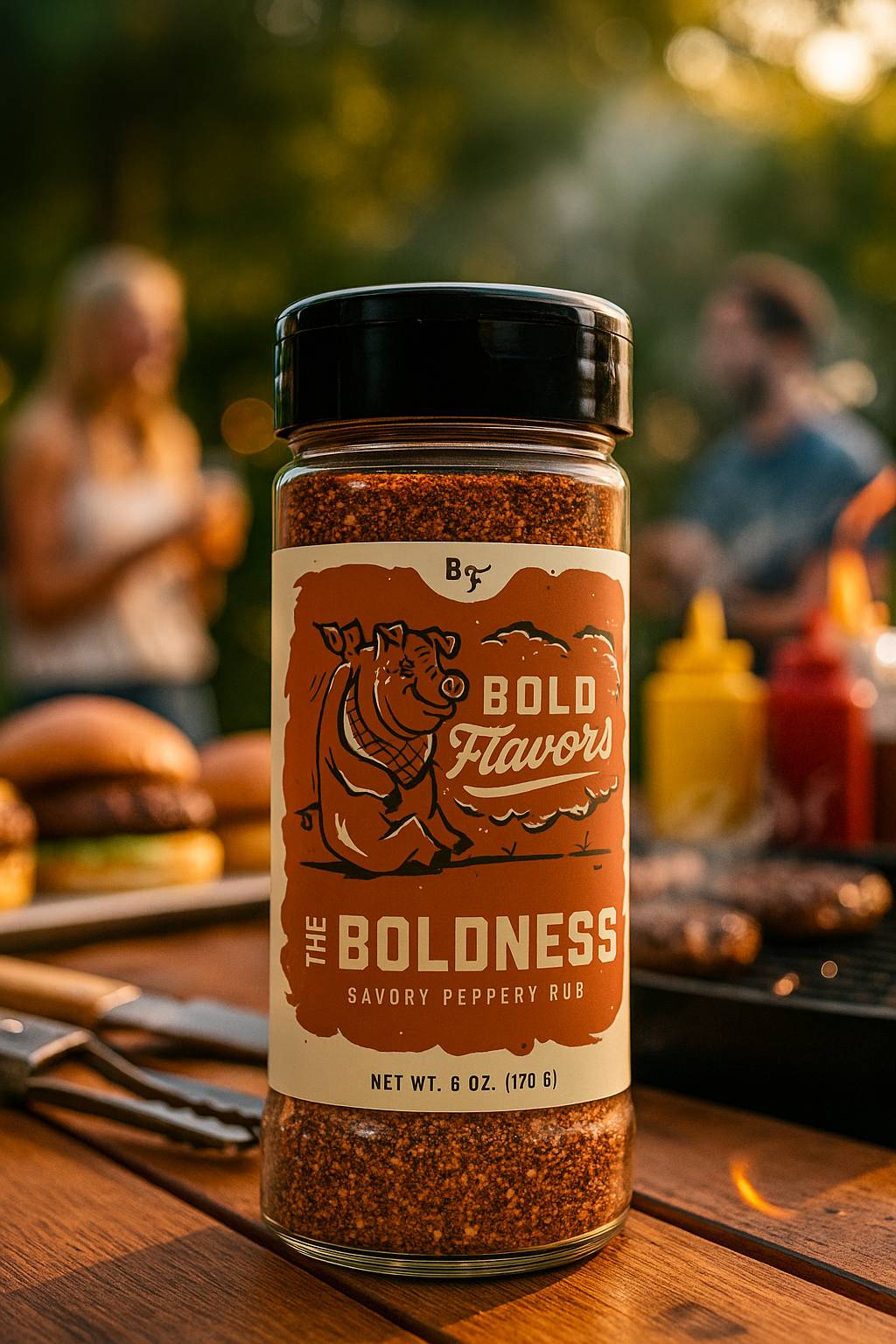
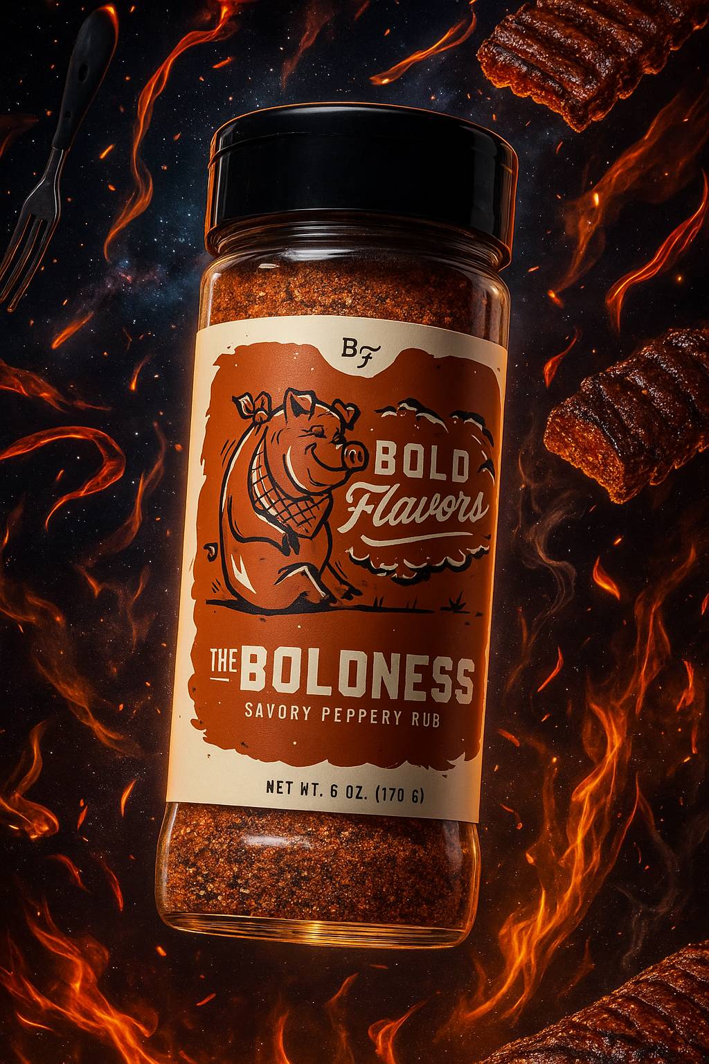
For these two product examples, I’ll be using this one mockup of my BBQ seasoning jar as my reference image (label made by a designer, but mocked up with AI). The label contains tons of small, hand-drawn details which is a challenge Sora still gets 99% right.
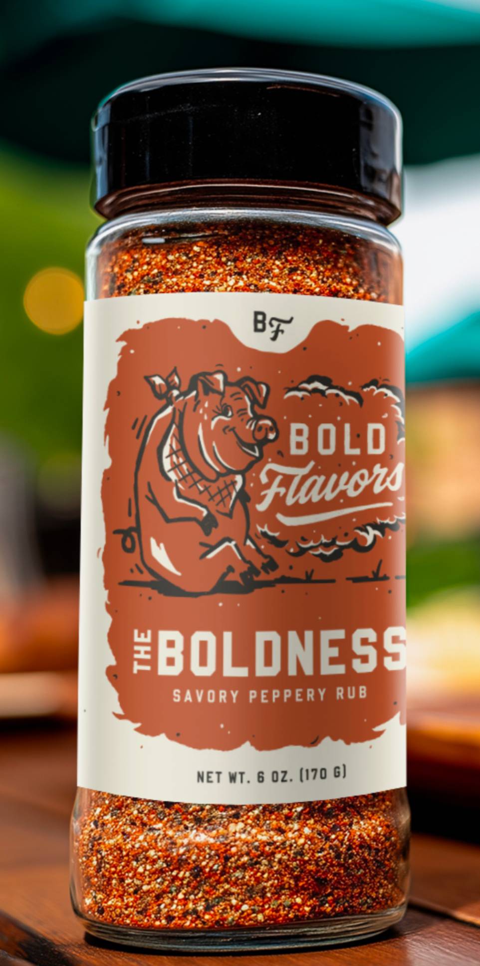
Example 1: Lifestyle Drop-In
Example 2: Surreal Brand World
Use Case 2: Professional Portraits & Headshots
This one is increasingly practical for remote teams (or individuals) who want to come across consistently and professionally.
On your “Meet the Team” pitch deck slide or your “About Us” page on your site, inconsistent headshots with different lighting, backdrops, and angles don’t exactly look polished or convey professionalism.
Even if you’re a solo freelancer, it helps to have a professional-looking headshot to represent yourself wherever people might see your avatar online: your LinkedIn page, portfolio, Gmail profile picture, featured image in press coverage, etc.
Below are two varying examples (an artistic portrait and a more typical corporate headshot) that can turn a regular old photo into something more impressive.
For these two examples, I’ll be using this photo of me below as the reference image. I used Sora to generate my examples here as well.

Example 1: High-Contrast Portrait

Example 2: Corporate Headshot

Use Case 3: Un-Stocking Photos
Whether it’s key visuals to complement text in a pitch deck, website imagery, a background on a headline-driven ad, or whatever else, sometimes you need images to do stock image-ish things.
Using AI instead of stock helps you circumvent typical stock licensing expenses while letting you build equity in a look that’s yours to own.
This is a case where a consistent style is absolutely key. The more you can own a defined, unique art direction lane, the more artful and high-end your assets will feel.
In this example, we’ll be looking at more abstract images, not ones featuring real products or humanity like prior examples. Think of this use case as a way to avoid and/or plus-up images like the one below.
Now let’s take this expected example above and make it into something a little more visually interesting and ownable with Midjourney (which I think does great with abstract/surreal prompts). I’ll take this reference image and cast it through a dimensional, textured, zany Memphis Design Revival style.
I fed my starter image into ChatGPT, asked it to cook up some prompts that translate this image through a bold Memphis Design Revival Style, ran several prompts several times, and ended up with this one I’m digging. I really went for it:

Now let’s try that same money tree stock image with more of a retro-futurist comic book illustration style. Ideally, you'd choose something as distinct as one of these looks and continue to sharpen your outputs as your needs grow.
The point is, you can “filter” about any image or concept through any style of art direction, photography, illustration, etc. you like. So don’t settle for boring. Choose a lane that feels right for your brand or project, and keep living into it.
The Takeaway
If you’re an AI image-generating beginner or novice, I hope you found this useful or at least thought-provoking. If you’re already an expert, you know this barely scratches the surface. It’s meant to be a quick, practical spark for curious readers. The truth is, the more you share ideas and experiments with others, the faster you learn, especially with AI tools.
Gil Templeton
Demand Curve Staff Writer
Running the Garmin Gamut
Insight from Gil Templeton — Staff Writer
To ground us, let’s go back to the beginning. Garmin (originally ProNav) was founded in 1989 in Kansas by two engineers, Gary Burrell and Min Kao. “Gar” and “Min” joined forces because they saw ripe opportunities in the emerging U.S. satellite nav market.
Their first product was a bulky boat GPS that retailed for $2,500, but throughout the next decade, they diversified their offerings across several markets.
1991: The ProNav GPS 100 takes off in marine markets.
1994: Garmin launches the GPS 155 which sets the standard for aviation nav.
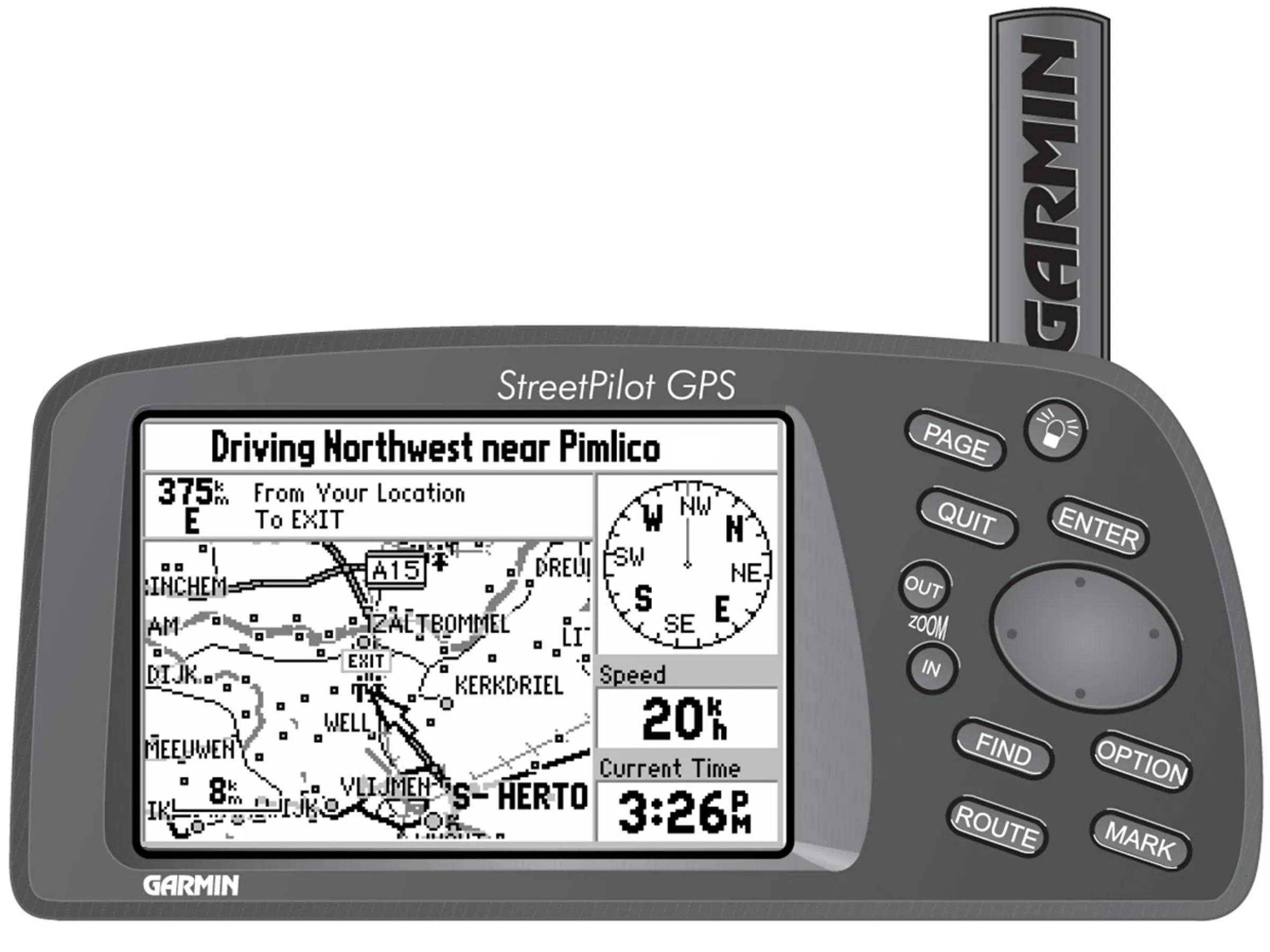
1998: Garmin introduces the StreetPilot, their first portable device for car navigation.
2005: Garmin launches the nüvi line. Its practical, user-friendly design helps it become the go-to driver GPS in the U.S.
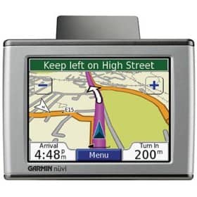
With mass adoption of the nüvi, Garmin saw explosive growth in the period following the product's launch. In 2006, their total annual revenue was $1.77B, which was up 73% from their revenue just one year prior.
By this point, Garmin had officially made the leap from niche gadget company to mainstream tech staple, and they hit paydirt with a product that materially improved the driving experience for so many.
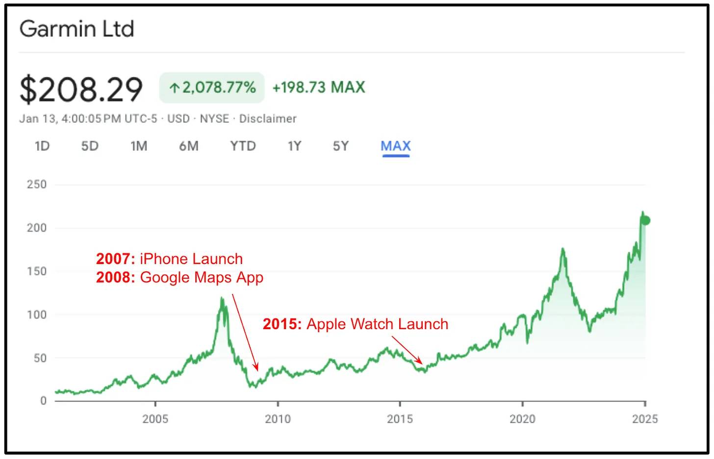
In 2007, about 70% of their sales were car GPS devices. And then their world got turned upside down…

The iPhone Blindside
In mid-2007, Apple launched the iPhone and poured gas on the smartphone revolution. Within a year, 6 million iPhones were sold. By 2009, Apple had moved 20 million units thanks to the iPhone 3GS. Of course each of these was capable of running the rapidly-improving Google Maps app.
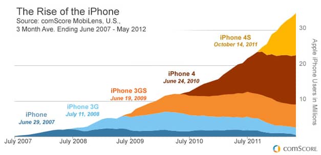
To smartphone owners, the main value prop of a standalone GPS disappeared into thin air. Who would fork over $300–$500 for a Garmin nüvi, when your smartphone did the exact same thing with real-time updates and was already in your pocket?
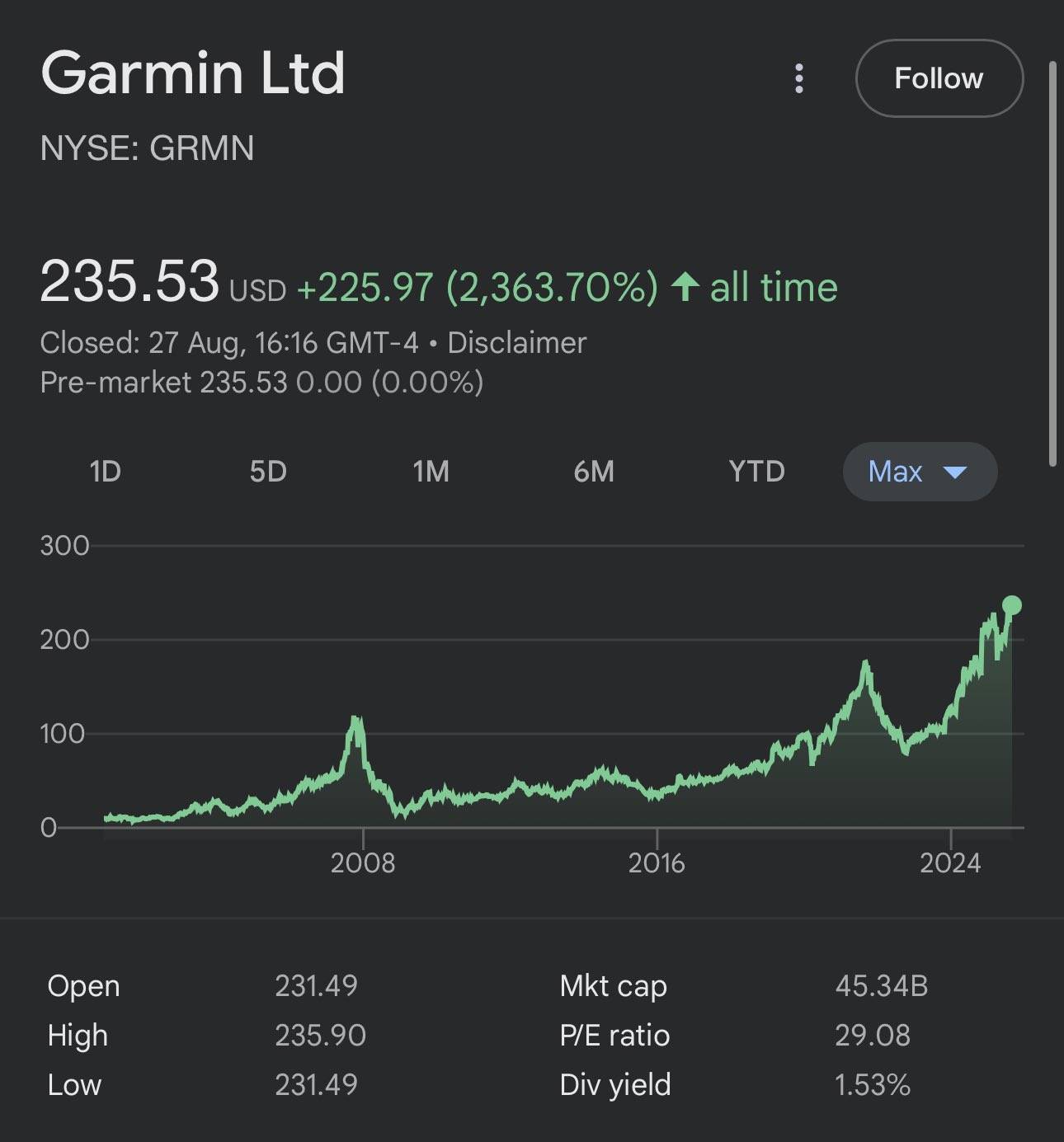
Garmin’s stock, which saw a huge pop after the success of the nüvi, plummeted in 2008. The combination of smartphones eroding its market share and the 2008 financial crisis combined to form the perfect storm. The car GPS had basically become a relic as quickly as it had risen to prominence.
So many other companies in Garmin’s position then would have dug their heels in. They might have added traffic alerts, a sleek iPhone-esque UX, or a subscription billing model. But instead, Garmin read the writing on the wall, made a hard left turn, and hit the gas.
GPS: Global Pivoting System
In 2008, Garmin’s leadership team smartly acknowledged they were fighting a losing battle with their flagship car GPSs. Instead of trying to “build a better mousetrap” they looked to repurpose some of their core strengths and efficiencies to make the ultimate pivot.
They tapped into their engineering talent, general GPS prowess, and vertically-integrated model to make decisive, defining moves:
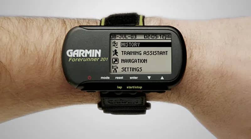
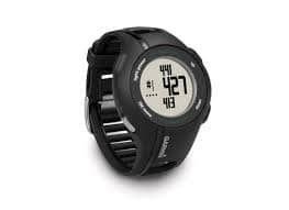
Focus on fitness & outdoors
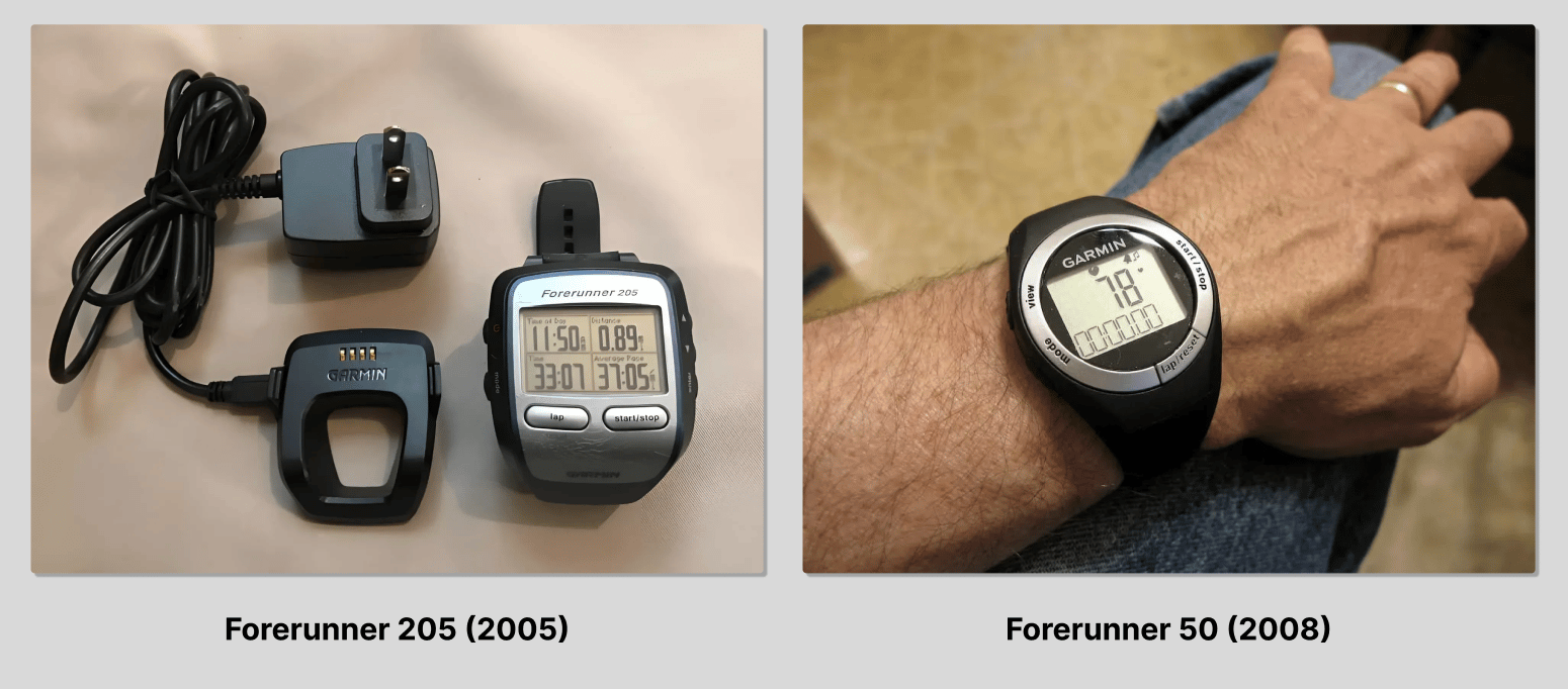
Garmin had already launched the Forerunner five years prior in 2003, which was a wrist-worn GPS primarily for runners. It was a little clunky (and niche) but it had a strong cult following and continued to evolve through several iterations.
By 2008, the design of the Forerunner had taken the form of a more typical watch and no longer looked like a wrist-computer, perhaps signaling a coming-of-age for the product line.
Garmin doubled down on their fitness and outdoor efforts. In 2011, they launched the Approach S1 at the PGA Merchandise show. The watch came pre-loaded with 14,000+ courses and helped golfers track their performance in a more accurate way.
“With the Approach S1 golf GPS watch, Garmin has once again created an entirely new category for fitness and outdoor recreation. Golfers who want their data and their device as streamlined as possible will find Approach S1 to be a sleek and simple hands-free solution to taking the guesswork out of their game.” — Dan Bartel, VP of Worldwide Sales, Garmin
In 2012, they launched the fēnix line, a smartwatch aimed at outdoorsy folks: mountaineers, hikers, hunters, cyclists, etc. Its rugged build and ABC sensors (altimeter, barometer, compass) made it an ideal backcountry companion.

In a weird way, the smartphone revolution enabled the success of Garmin’s new fitness and outdoor watches, because Garmin's new products required tech that had been downsized and commoditized for smartphone application.
The Apple Watch wouldn’t launch until 2015, which posed yet another existential threat to Garmin’s outdoor and fitness-related options. But Garmin smartly continued to invest in performance and very specific use cases, whereas the Apple Watch was (and is) more of a generalist tech wearable.
In other words, Garmin hasn’t tried to be a smarter smartwatch for the masses. Instead, they’ve made each offering supremely useful for its niche, whether that’s insanely rich running data or more accurate backcountry coordinates or helping your uncle line up his approach shot.
Their wearables are fitness-first. Period. And they’ve never lost sight of that. Today, the lion’s share of Garmin’s annual revenue is fueled by their “outdoor and fitness” segment, which can be further divided into crystal-clear sub-categories (golf, running, mountaineering, even equestrian, etc.). This is a testament to Garmin’s focus and their ability to find product-market fit across several markets.
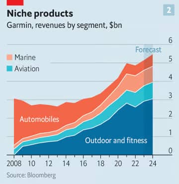
This chart shows another interesting takeaway: the growing presence of marine and aviation products in their revenue mix. Again, these serve well-defined, unique audiences (primarily boat owners and plane captains) and Garmin continues to reap rewards from fundamentally-sound seeds they planted long ago in these categories.
“Just as they had found a way to take GPS from the ocean to the air to the street, Garmin’s R&D team identified fitness as a niche market. They didn’t cling to the past. They invented a new future.” —Trung Phan
In last week’s Demand Curve Growth Newsletter about elevator pitches, we focused on proven ways to differentiate your brand in the “how” portion of your pitch. One of these paths was “You serve a specific niche better than anyone.”
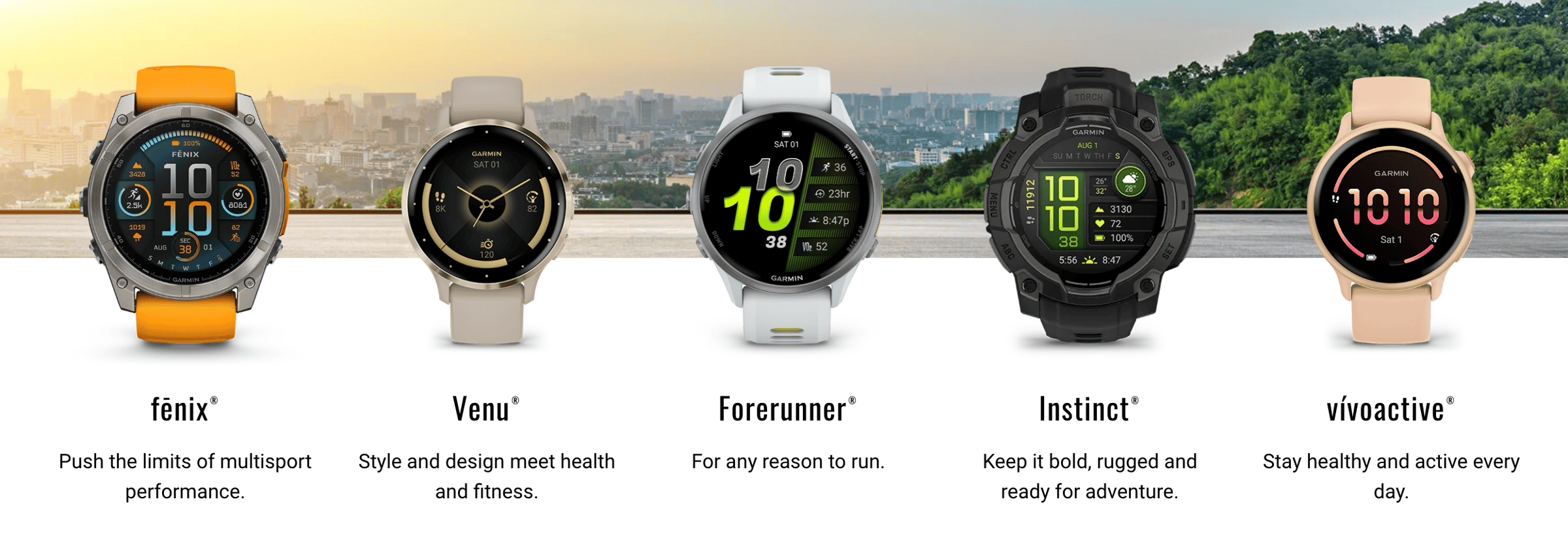
Garmin is living proof that you don’t have to serve just one niche. They serve several at the same time, because each product stays laser-focused on a unique market. While they do appear to have more “generalist” fitness wearables offerings now, it’s clear what each line specializes in, and fitness (not tech) is still at the forefront.
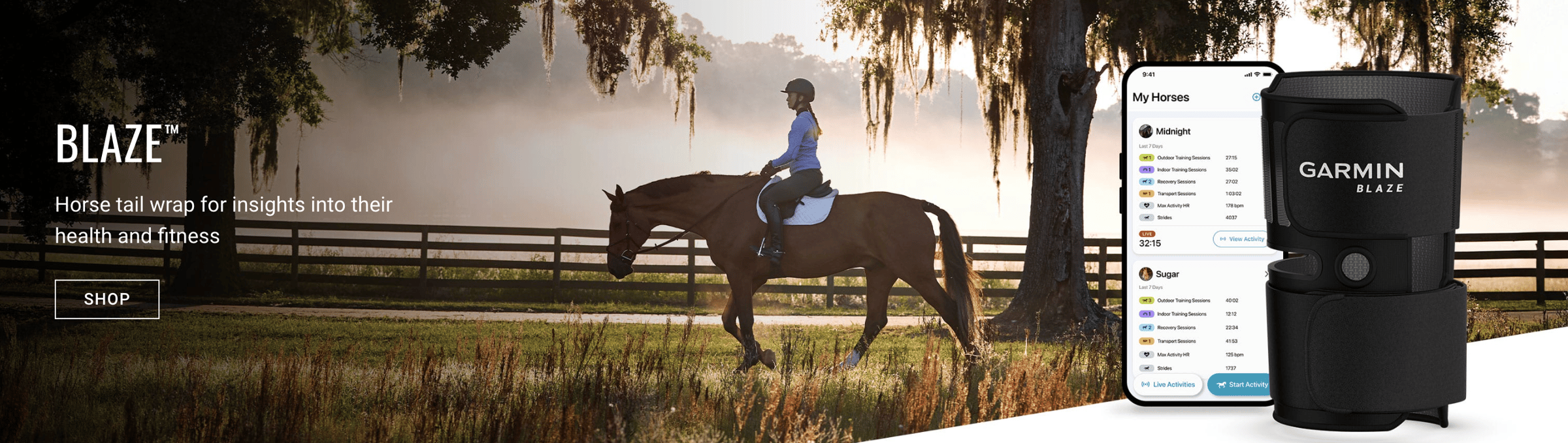
And if you want proof they’re still finding extremely well-defined opportunities, check out the Blaze horse tail wrap. Certainly not something they’ll be competing with Apple on.
Hitting the gas on R&D
Another bold choice that paid off was Garmin’s decision to go all-in on R&D when they realized their standalone car nav systems were passé. Other companies might have cut costs and retreated to survival mode, but Garmin went on the front foot.
As you can see in the chart below, Garmin decided to spend big bucks on R&D initiatives and hire more R&D-related staff after their 2008 gut-punch. They ramped up spending despite the fact their sales and stock had taken a tumble, signaling a calculated risk and “betting on themselves” to bounce back.
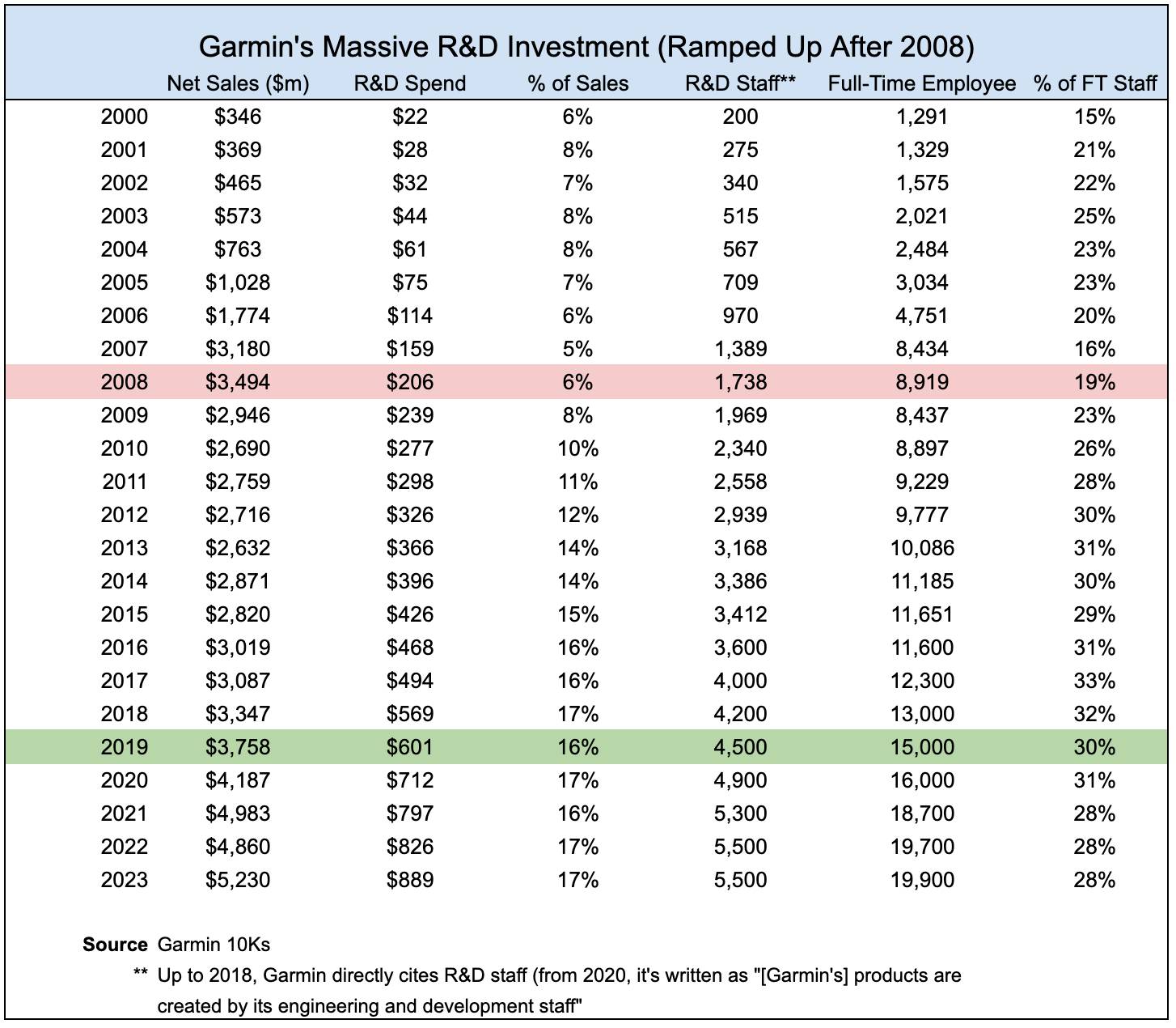
Even after the current CEO Clifton Pemble took over in 2013 (following Min Kao’s retirement), the focus on R&D spending remained strong and even increased further under Pemble’s guidance.
Garmin was in a strong position to make this big bet on R&D, largely due to their fiscally conservative ethos and good financial standing. Take a look at this excerpt from an interview with Min Kao back in 2012.
“Gary and I both are fiscally conservative by nature, and we managed our company accordingly. Our early success bred more success. We reinvested in the company and established disciplines like having cash in the bank, maintaining sufficient inventory levels, and staying debt-free. Those practices helped avoid a lot of hurdles.” — Min Kao, Founder & Former CEO, Garmin
On top of being financially set up to weather the storm, Garmin’s famed vertical integration helped them stay resilient. They make their own chips, software, and hardware. Not to mention their marketing, sales, and support teams are also in-house.
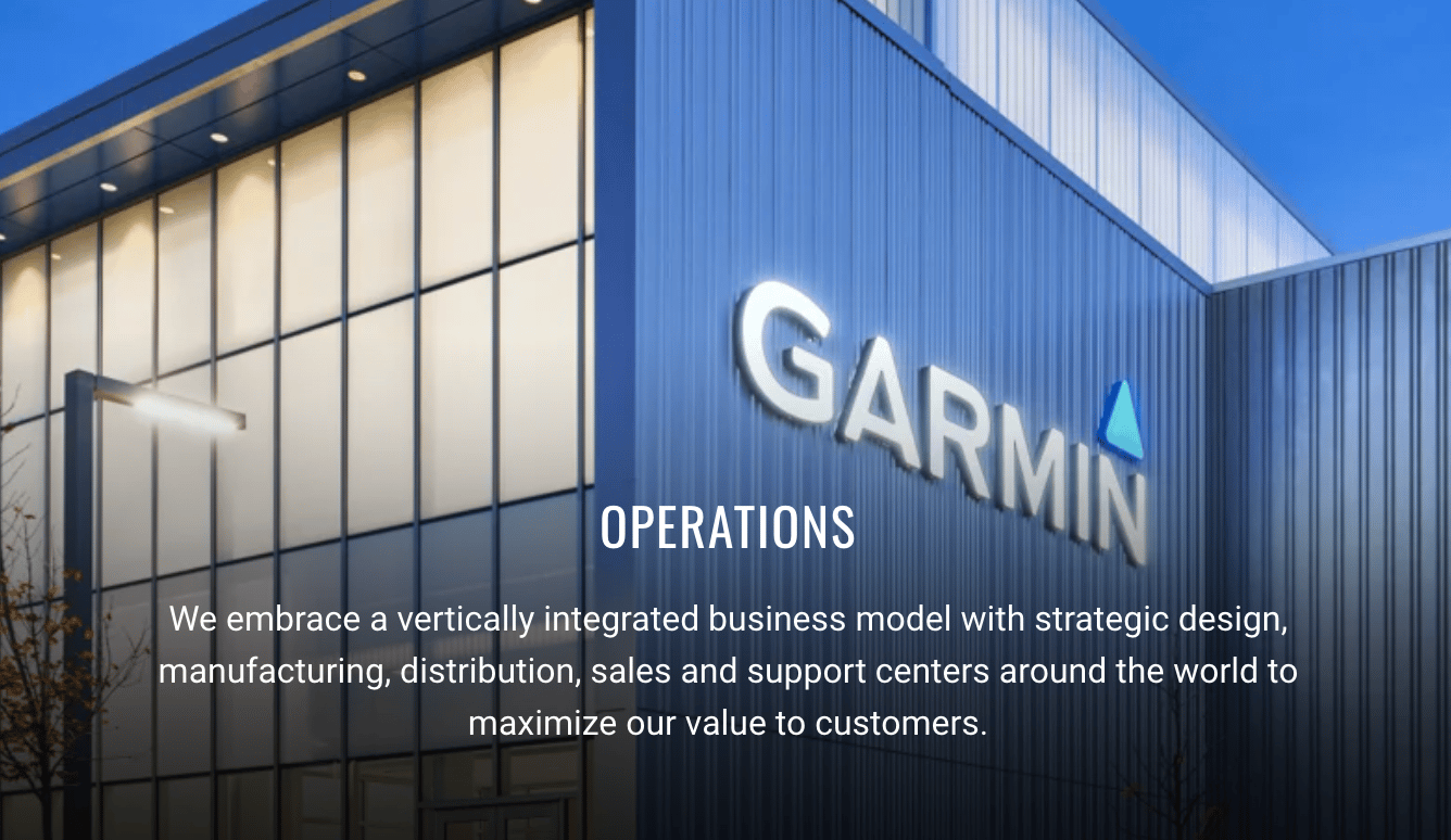
This philosophy of overarching alignment (and dare I say synergy) allowed them to create a focused, controlled pivot, where they could create efficiencies while insulating themselves from third-party delays and pricing volatility.
“Gary and I believed in our business model of vertical integration. By doing so, we have been able to have greater control over timelines, quality and service. It might have been easier in the short term to offload many of these functions, but in the long run, we've learned that by controlling the entire process, we’ve had higher levels of innovation, reduced risks, lower costs, and greater scalability.” — Min Kao, Founder & Former CEO, Garmin
Owning the stack meant Garmin could reuse their core GPS, mapping, and battery-management tech in entirely new product lines (like the Forerunner, Approach, fēnix) without reinventing the wheel.
It also meant they weren’t waiting around for third-party component makers to supply their parts, and they also weren’t on the hook to pay marked-up prices to these suppliers.
Three Main Takeaways
Garmin, a company built to simplify navigation, ironically proved it could navigate its own way through major disruption. Let’s take a look at three big lessons we can learn from Garmin’s pivot masterclass.
1. Don’t Fight the Tsunami
When the iPhone caught on, Garmin didn’t try to out-feature Apple on their GPS. Other hardware incumbents (think BlackBerry or TomTom) clung to their legacy and lost. Garmin rightfully realized that was a losing game, so they pivoted to new markets while they still had cash flow and credibility.
If you see a cultural or technological tidal wave coming, don’t hurry to build a taller sandcastle. Do what you can to build somewhere else, and quickly. For example, if AI threatens your specific SaaS edge, reframe your offering around plays that are harder for AI to encroach on.
2. Niche Is the Moat
Garmin didn’t pivot to make products for “everyone who needs a watch.” They built the Forerunner for runners, the Approach for golfers, the fēnix for outdoorsy folks, etc. Whereas the iPhone and Apple Watch won by going wide, Garmin’s fitness and outdoor products won loyalty because they solved very specific problems in depth.
So double down on specificity and depth in your positioning, especially if your business isn’t a mass-market product or service.
Don’t just say “all-rubber watchbands,” say “all-rubber watchbands that don’t scratch or scrape your laptop keyboard.” That tweak creates much more defensibility. (Free business idea for any takers. I’d buy a few.)
3. Bet on What You Do Best
Instead of slashing costs when sales collapsed, Garmin increased R&D spend. They treated the downturn as the right time to reinvest. It might have been risky on paper, but their vertical integration and healthy balance sheet gave them a fighting chance.
Nearly twenty years after the iPhone launched, Garmin's diversified product portfolio and strong stock performance suggest the big bet has paid off.
In hard times, invest in experiments that align with your DNA. Instead of cutting and burning, reallocate it to new bets that overlap with existing core strengths or capabilities.
Gil Templeton
Demand Curve Staff Writer
Best Practices for Better Pitches
Insight from Gil Templeton — Staff Writer
If you asked each person on your team to give your company’s elevator pitch, how similar would their answers be? (Please try it and reply to this email with your results).
I’d bet you’d get a mash-up of different features, founder stories, and scattershot narratives. But everyone should really be reading from the same “sheet music” no matter what.
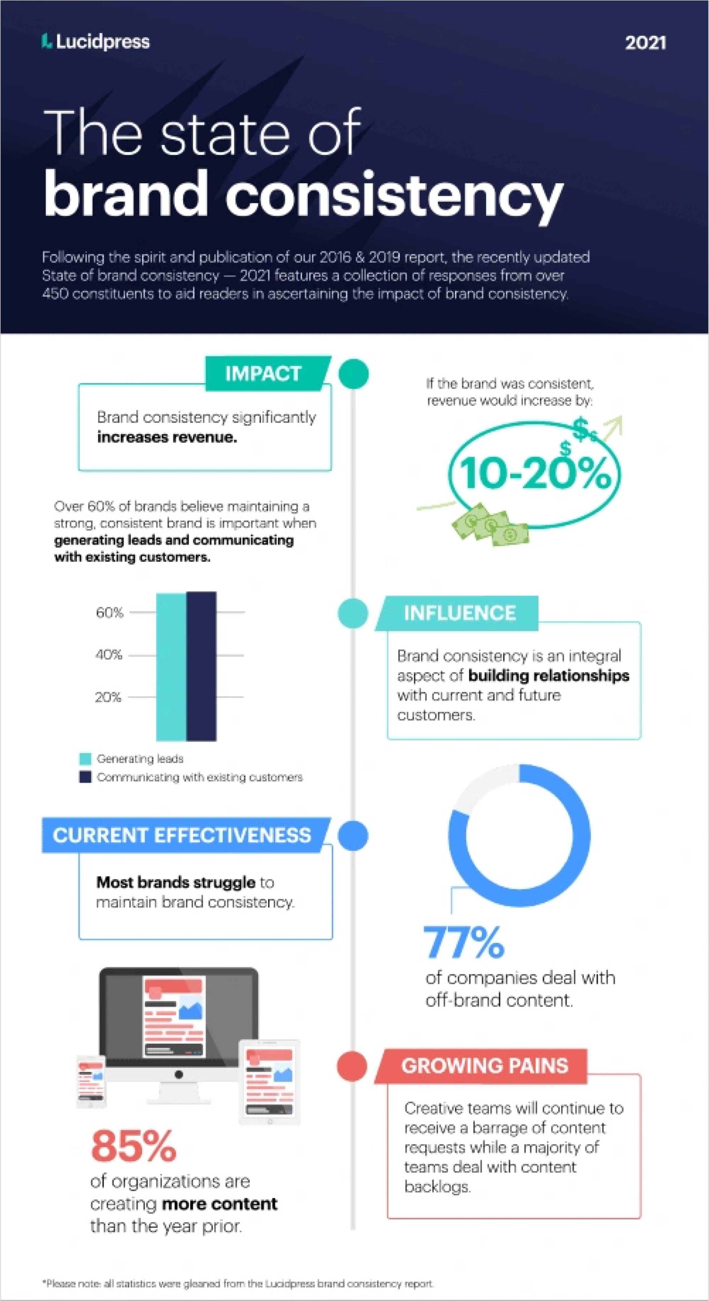
The more your team tells a similar story, the more you can create compounding momentum instead of pulling in different directions. A study showed that the average revenue increase attributed to high brand consistency is 10–20%, so the more consistently you can convey your narrative, the better.
Let’s look at a few evergreen tips that provide guidance on creating a consistent, compelling elevator pitch.
Tip 1: Aim for about 30 seconds and don’t go too far over that. That’s enough time to tell a story, but short enough to keep it laser-focused.
Tip 2: You (and your team) don’t need to memorize the pitch verbatim. It’s okay to put it in your own words, as long as the content and takeaways are the same.
Tip 3: Show, don’t tell. Use real numbers and irrefutable facts to make your points more credible and tangible.
Tip 4: Your pitch should answer three key questions, usually in this order:
- What is your company?
- What problem do you solve?
- What makes you different?
Now let’s expand on how to answer each of these three questions.
Pitch Part 1: What Is [Your Company]?
This is the simplest part, but because of its simplicity, it can be easy to fumble.
Your job at this juncture is to introduce the company in a matter-of-fact way. Set the table with literally one sentence about what your company is.
One way I like to think about this is: what would (or does) your Wikipedia page’s first sentence say?
Looking at Apple’s Wiki page, the first sentence reads, “Apple Inc. is an American multinational corporation and technology company headquartered in Cupertino, California.”
Just the facts, ma’am. Short, sweet, and straight.
Below are some examples, using made-up businesses across three industries that we’ll use throughout today’s newsletter.
- AI Marketing Startup Example: “We’re an AI platform that helps mid-sized e-commerce brands generate ads.”
- Workforce Training SaaS Tool Example: “We’re a B2B software company that improves the onboarding process.”
- CPG Drink Brand Example: “We’re a beverage company making clean energy drinks with mushrooms and adaptogens.”
That’s it. Check the box and move on.
Pitch Part 2: What Problem Do You Solve?
Now we move into your “why.” In this section, we explain the lock that your company holds the key to. This part is very similar to your problem statement.
It provides the context and stakes for what you do, and if you can define the problem clearly, it sets your solution up to look like the obvious choice.
Without this tension, there’s no story. So this is precisely where we introduce the “villain” your company helps people overcome.
This is important for founders and small startup teams who often get caught up in their own underwear, defaulting to features and nuances instead of telling the bigger story.
It’s easy to forget that no one wakes up thinking, “I want a new SaaS platform today.” What they think is: “Ughhhh, I can’t keep wasting all my time training these new hires.” So speak to that frustration or friction.
Clearly articulating the problem is an attention-grabbing “hook” that signals focus; it shows you aren’t trying to solve too many problems at once, and it means you have a good understanding of your target.
Let’s look at some examples, building on the fictional companies from part one.
Note: Including language like, “We exist to…” or “We solve this problem by…” can help you make the turn from illustrating the problem to showing your solution. Don’t get into claims or your UVP yet, though.
- AI Marketing Startup Example: “Creative teams are drowning in asset production all day, every day. We exist to help them automate iteration, so they can create assets faster and test more ideas without hiring up or burning out.”
- Workforce Training SaaS Tool Example: “Studies show most remote employees feel underwhelmed by the onboarding process. Our platform solves this problem by giving teams an interactive way to onboard without the faceless, boring modules and decks.”
- CPG Drink Brand Example: “Most energy drinks dump in synthetic caffeine, sucralose, and artificial ingredients that spike your system and make you crash. That’s why we built ours around lion’s mane mushrooms and adaptogens, providing a natural, gradual lift.”
Aim for 2 or 3 sentences here. Again, don’t overdo it, just explain that gap you fill.
Pitch Part 3: What Makes You Different?
Now it’s time to land this bad boy. If part two addressed your “why,” think of this section as your “how.”
This part should lean heavily into your unique value proposition (UVP) to show why you’re uniquely positioned to solve the problem better than anyone else.
This is your moment to make a sharp, specific claim only you can make. To do that, point to exactly how you deliver a better outcome.
Some strong examples of common differentiators are:
- You deliver faster, cheaper, or more reliably.
- “We give you a bespoke AI brand strategy in 60 seconds.”
- You provide access to something others don’t or won’t.
- “Our tool gives you real-time access to competitors’ pricing, not just historical data.”
- You solve the problem in a fundamentally different way.
- “Our wearable tracks focus instead of fitness.”
- You’ve made a deliberate tradeoff your audience values.
- “We only serve Series A startups, so you’re not competing with enterprise clients for support.”
- You serve a specific niche better than anyone.
- “We design seamless, slipless socks exclusively for marathon runners.”
Don’t fall into the trap of using vague phrases like “our team works hard,” “our customer service is amazing,” or “we’re building community.” These aren’t defensible positions, especially to a skeptical prospect or investor.
Let’s finish out our examples using the same companies from earlier:
- AI Marketing Startup Example: “Unlike other AI marketing tools that generate generic ad outputs and require tons of manual cleanup, our platform integrates directly with your brand guidelines and ad account, so every asset created is on-brand and optimized to perform.”
- Workforce Training SaaS Tool Example: “Instead of dumping content on new hires and hoping it sticks, we tailor bespoke onboarding paths to each employee with real job KPIs in mind, helping new hires actually ramp up and hit targets 23% sooner, on average."
- CPG Drink Brand Example: “Most functional beverages that contain mushrooms require refrigeration and go bad after a few weeks. So we created a shelf-stable product that stays fresh for two months at room temperature, cutting refrigeration costs, opening new retail doors, and making the product travel-friendly.”
Part 3.5: Your Call To Action
At the very end of your pitch, make sure to include a call to action (CTA) instead of giving a blank stare and expecting your audience to know what you want them to do.
This should be an actionable request for a next step. It might be to schedule a meeting, exchange contact information, sign up for a free trial, ask if they’d like a demo, open the floor for further questions, or whatever step you’d like them to take next.
After you do that, pause and listen. The strength of an elevator pitch is not necessarily in “closing the deal” like it might seem on Shark Tank. It’s in opening the dialogue, getting your audience talking and asking questions, and ultimately deciding if you might be a good fit for each other.
The Takeaway: Your Pitch Is Your Growth Engine
Your elevator pitch is a conversion tool that scales with every interaction your team has with the outside world.
Your sales team is pitching prospects. Your marketing team is conveying value props creatively. Your recruiters are selling candidates on why they should join. Your CEO is pitching investors. Your engineers are explaining what you build to potential partners.
When everyone's telling the same focused story, you create a multiplier effect where every touchpoint reinforces your positioning.
But if your pitch is inconsistent, you're essentially running constant A/B tests (and C/D/E/etc. tests) across every conversation, diluting the message and confusing your audience.
Here's what a tight, aligned pitch can do:
- Faster sales cycles: Prospects quickly “get it” and immediately understand your value. No need for lengthy descriptions or follow-up calls to paint the big picture.
- Sales & marketing consistency: Your marketing team can hit the same notes as your sales team, creating congruency and momentum across the two.
- Rock-solid fundraising narrative: Investors will hear the same compelling story no matter if they’re talking to your CEO or intern.
- Better team alignment: New hires can confidently represent your company from day one, and tenured employees can stop inadvertently telling different versions of your story.
On the other hand, a weak (or inconsistent) pitch doesn’t only confuse your audience. It can tell investors that you might have trouble selling and recruiting in the future. In an article about elevator pitches from best-selling author and VC Sean Wise (who claims to have heard 20,000+ pitches), Sean makes a good point:
“How well you communicate [your pitch] to investors is a proxy for how well you’ll be able to sell to early adopters, and how likely you are to recruit top talent. Failing to deliver may signal to investors that you don’t have the business acumen to succeed.” — Sean Wise
Knowing how crucial this 30-second “script” is, it’s worth your time to ask three people on your team to explain what, why and how your company does what it does, in about 30 seconds. Time them and make note of the variations between responses.
Then use the exercise above to craft your Rosetta Stone of an elevator pitch, and turn every team member into a force multiplier.
Gil Templeton
Demand Curve Staff Writer
The Cracker Barrel-Roll
Insight from Gil Templeton — Staff Writer
It’s getting a little too predictable.
A company updates their logo and branding with a stripped-down, “simplified” version.
The public reacts negatively and gets worked up.
Then the news cycle changes, people move on with their lives, and everyone gets used to the new brand identity over time.
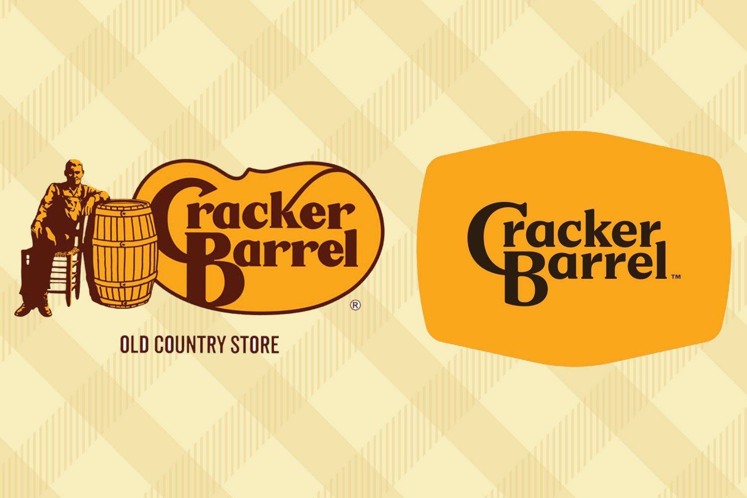
Last week’s unlucky headliner was Cracker Barrel, the southern roadside staple known for its nostalgic appeal, rustic country store, beloved peg game, and healthy portions of unhealthy food.
Their rebrand went viral with a few key visuals making the rounds: namely before-and-after comparisons of the logo and interior.
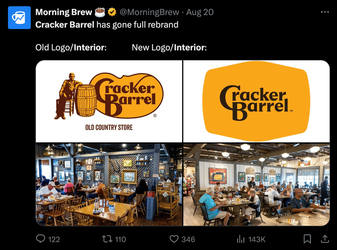
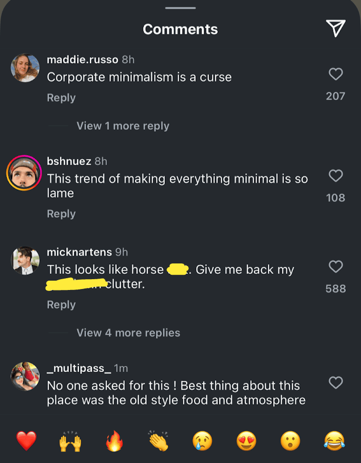
The memes poured in. Their already-weak stock took a tumble. And the comments sections were flooded with rip-roaring rage, like these comments screenshotted from Food52’s post.
Obviously, this sweeping rebrand includes interior updates, new menus, a new tagline of “All The More” and plenty more, but the logo has been the lightning rod at the center of the PR storm.
On the contrary, there were also some well-argued takes from people explaining why the update made sense to them.
Medium published a short-and-sweet article titled, “Why Cracker Barrel’s New Logo Actually Hit The Mark.”
“The old logo…does not work well on anything other than a big sign. It doesn’t shrink down well, it doesn’t look good on the web, and it doesn’t look good on a phone. It has no real brandable elements to it except the wordmark.” — Brad Thomas, Medium
Graphic Design publication The Dieline ran an article titled, ”Cracker Barrel’s Perfectly Fine Brand Refresh Courts Controversy," and you can practically hear the exhausted “here we go again” eyeroll in the headline.
Another take from digital designer Peter Laudermilch on LinkedIn made a fair point about the runaway narrative:
“When a new identity gets flattened into a static screenshot for social commentary, of course it looks bland. You’re seeing it stripped of motion, context, and personality—the visual equivalent of an out-of-context soundbite.”
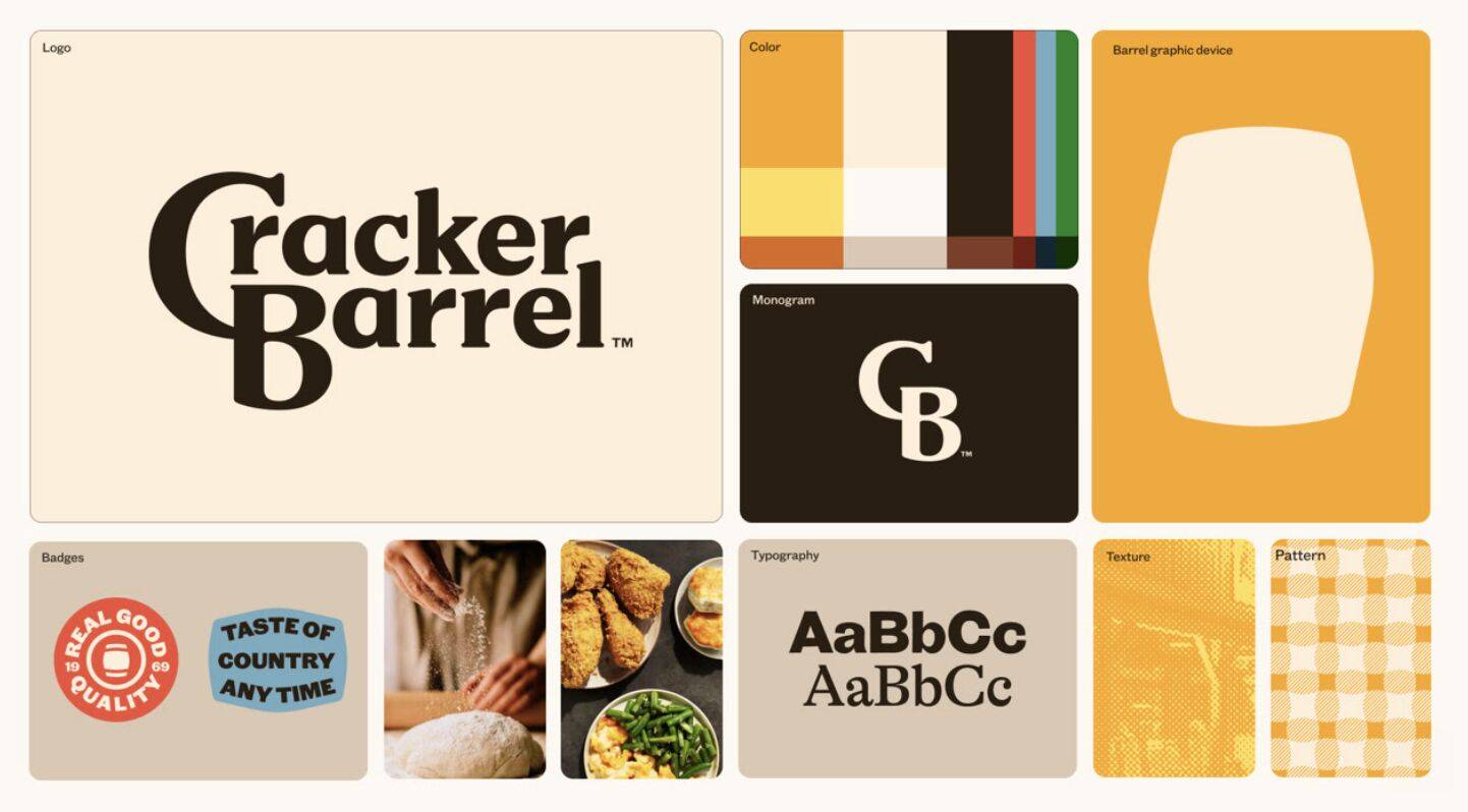
To that point, when you look at more of these new brand elements together below (even without motion), the new Cracker Barrel brand ecosystem starts to come to life.
Cracker Barrel clearly felt it was time to signal a big change with their rebrand, even if they stood to catch some initial heat for it. Let’s look at what might have forced their hand.
Even Nostalgia Needs Modernizing Sometimes
For all the people commenting various versions of, “They didn’t need to change anything!” Let's look at some numbers that suggest otherwise.
I’m not saying this exact execution was the exact right answer to their problems, but we all know the definition of insanity. And when business is down for a few years, you can’t keep doing the same thing, expecting different results.
For one, their stock has generally been on the slide since 2021. And a topical Forbes article from Monday suggests Cracker Barrel exhibits weak growth, very weak profitability, and very weak downturn resilience.
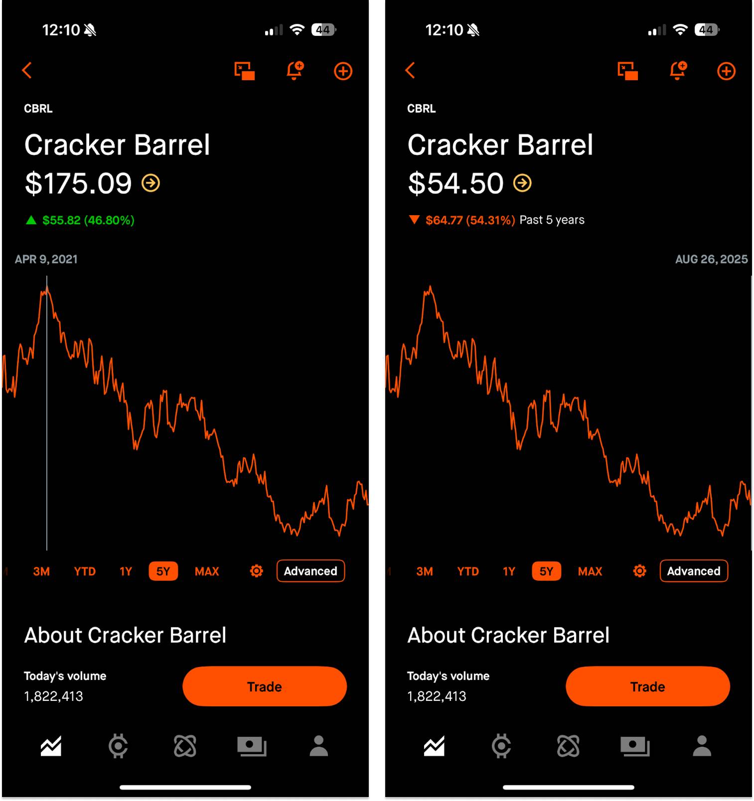
To add insult to injury, transactions across the foodservice sector declined 7% year-over-year during the first quarter of 2025, signaling a tough time for the industry in general.
In the least surprising news ever, Cracker Barrel has trouble attracting younger customers. They cater to an older crowd who is aging out and dining out less. 2023 company data showed 43% of guests are at least 55 years old. For reference, around 80% of Applebee's customers in 2023 were under the age of 60.
The Cracker Barrel CEO, Julie Felss Masino, added a little more context when she was interviewed on Good Morning America, citing tariff costs and managers pleading for remodels as additional reasons to reexamine the brand at this time.
"Cracker Barrel needs to feel like the Cracker Barrel for today and for tomorrow.” — Julie Felss Masino, CEO, Cracker Barrel
Their rationale for a major change likely stemmed from a convergence of harsh Cracker Barrel business realities, mounting restaurant industry headwinds, an aging customer base, and a brand that visually harkens back to the pre-smartphone era.
“Phone Eats First”
This trend of visual simplification largely stems from brands needing to flex across a thousand dynamic use cases, because logos don’t just hang on creaky signs above front porches anymore.
In addition to high-touch dynamic pieces, think about favicons, YouTube thumbnails, App Store icons, and other pixel-pinching needs that require maximum clarity.
This simplification is more about survival than a pure stylistic choice. What I’m saying is: minimalism is becoming more necessary, because you’re increasingly likely to meet brands through a small screen than through a fully-fledged physical experience.
Without ever seeing firsthand proof of Cracker Barrel’s existence, you might:
- See a paid social ad for Cracker Barrel
- Search for a nearby location
- Check the hours
- Browse the menu
- Order online
- Get your food delivered
…all through your phone.
If it feels like logos are looking more and more similar, it’s probably because we’re looking at our phones more (and consequently driving more traffic through phones than desktops as of 2018).
These clear-at-a-glance logos are the answer to a seismic societal shift where the default digital spaces are getting smaller.
A brand is bigger than a logo, but a logo is an important visual anchor and symbol. If your logo is chock-full of tiny details and elements that are nightmarish at small sizes or quick glances (like Cracker Barrel’s old logo) you might need to rip the proverbial Band-Aid off, absorb a little expected backlash, and lean into other things that can breathe more life into a modern brand: UX, product, content, community, etc.
Traits of a Modernized Logo
While not present in every single example, below are five common attributes of simplified, modern logos designed to withstand digital pressures. Logos are notoriously subjective, but these characteristics generally ensure more appropriate digital applications.
- Colors reduced: From complex palettes to a hue or two
- Flat design: 3D bevels and shadows stripped away
- Wordmark: Brand names/abbreviations prioritized over symbols
- Serifs removed: Cleaner, more legible, more neutral
- Increased spacing: For breathability on small screens
And it’s not just companies with a strong physical presence (restaurants, cars, CPG, etc.) that have needed some digital honing over time. Take a look at some of these digital-first companies whose old logos look zany and unrefined compared to their restrained appearance today.
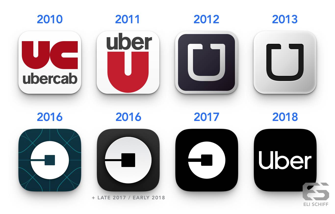
Take a peek at Uber’s journey. Throughout the years, they’ve simplified their name, embraced a max-contrast color scheme, and eventually re-embraced their wordmark. They’ve been a phone-first company since their founding, and they’ve still seen plenty of sweeping visual changes throughout 15 years.
And now, Cracker Barrel. Whose evolution doesn’t seem quite as crazy, given the context of these previous examples. Even though I do feel like the wordmark could be about 20% bigger inside the barrel.
The Takeaway: Today’s Great Logos Do No Harm.
While founders and marketers love a genius, gorgeous, eye-catching logo, that’s not necessarily what users need, even if they think they do. Instead of going for the single prettiest mark, look for a resilient one that stays strong across platforms and is easy to remember.
A strong logo can’t carry a business like an amazing user experience or product, but a weak logo can chip away at it, especially on small screens and fast-moving videos. In that sense, your logo’s job isn’t to impress (like it might have been in the past). Its job is to anchor your brand without tripping anyone up.
Right now, everyone’s got something to say about Cracker Barrel’s logo. And there’s certainly a chance this runaway narrative harms the brand long-term. But if this new mark eventually blends in, helps elevate the brand’s everyday experience, and never distracts customers (at least for a second time), it will be a win.
Gil Templeton
Demand Curve Staff Writer
Product-Market Fit For a King
Insight from Gil Templeton — Staff Writer
As someone who drives a base model 2011 4Runner (or “2Runner” since it has no 4-wheel drive), I don’t need a lot in a car. I want something reliable, with enough room to access two car seats, and Bluetooth capabilities to play music from my phone.
As I waded into the car market earlier this year to probe for an upgrade, I was disheartened by my experience (and yes, I’m still rocking my 2Runner today).
For one, the prices were prohibitive for many models. Period.
Second, there were too many over-tech’d features solving non-existent problems. I don’t want to drag a tiny area on a huge screen to adjust my air vents. I don’t need to make wild hand gestures to turn the volume down. (Hot take alert) I don’t think automatic lift gates solve more problems than they cause. And I definitely don’t want to pay extra for all that stuff.
Third, the new car designs felt generally unexciting and indistinct from one another. Looking for a reasonable SUV to accommodate my family of four felt like playing an expert-level game of “Spot the Difference.”

These forces I felt are the exact gaps in the market Slate exploited. They saw these unmet needs hiding in plain sight: drivers feeling priced out, fed up with frilly features, and craving something more “their own.”
The Slate truck is a textbook case of product-market fit (PMF) covered in depth in the Five Fits Framework. It addresses what a large portion of the market was asking for (especially EVs under $40,000), while the rest of the category did tone-deaf things like charge drivers to use their own heated seats. Within one month of launching, 100,000+ buyers had reserved their Slate, showing signs of strong PMF.
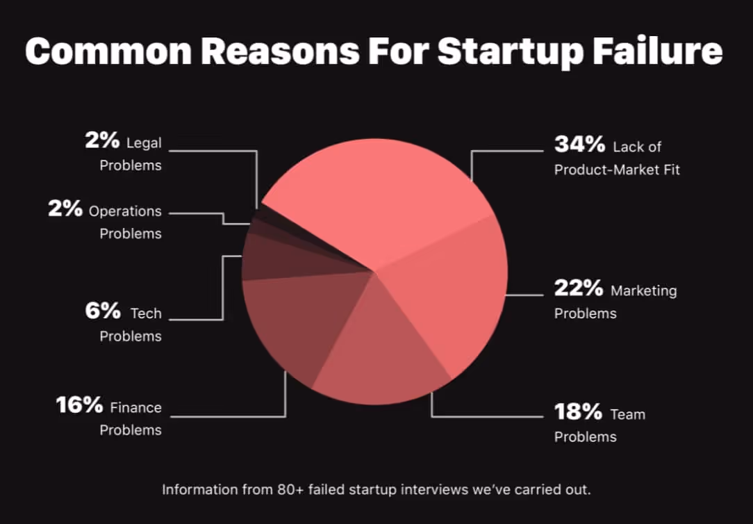
It’s a reminder that PMF doesn’t need to come from “more.” So much of the time, it comes from sharpening your focus and pouncing on the spaces competitors leave open. Having a strong PMF is so important, a study showed startups are twice as likely to fail from lacking it (34%) than from financial problems (16%).
Let’s dive into some specifics around how Slate’s positioning delivered on real consumer needs.
Extreme Affordability, Despite a Regulatory Rug-Pull
When Slate launched with an EV priced below $20k (after tax credits were applied), it suddenly made EVs feel accessible and within reach for so many more Americans.
"There's a massive population of people out there that when it comes to safe, reliable, affordable transportation; there just really aren't many alternatives for them," — Chris Barman, CEO, Slate
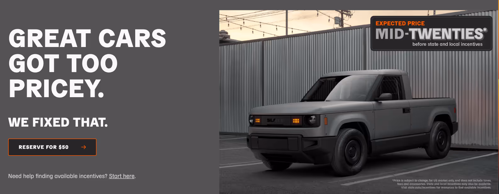
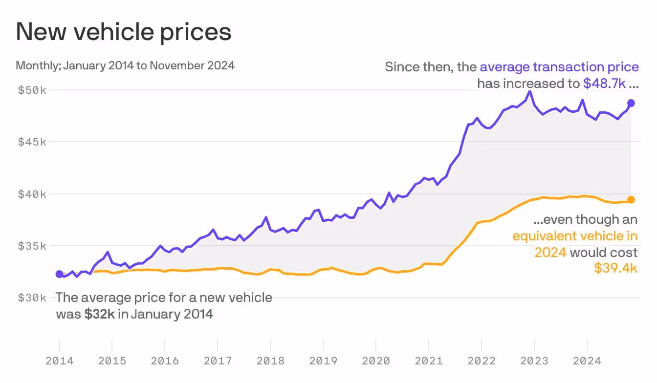
In a time when the average new car is nearing $50k, and the average new EV is north of $55k Slate launched with an EV that cost less less than half of those averages. At the original stated price of “under $20k” (after tax incentives), there was only one car on the American market that could say the same: the Mitsubishi Mirage. Woof.
“We are building the affordable vehicle that has long been promised but never been delivered.” — Chris Barman, CEO, Slate
Slate was making a clear value play, except their discerning, no-nonsense approach made “cheap” feel smart instead of like something you settle for.
But then came the “Big Beautiful Bill” which slashed EV tax credits and thus raised the price of a new Slate by $7,500. But even after losing $7,500 in tax credit benefits, Slate’s pricing is still competitive (albeit to a lesser degree), now in the “mid-twenties” according to their homepage. This shows they’ve built a model that could absorb regulatory shocks. And their made-in-America production might also help them sidestep potential tariff troubles.
There are about 20 car models on the American market priced below $30k, most of which are far less exciting than the Slate truck, and the only EV in this range is the Nissan Leaf, starting at $29,280. Meaning despite significant regulatory changes, Slate is still plenty differentiated.
For founders and startups, the lesson is: don’t be shades different from your competitors, be undeniably different. Even with vanishing tax credits nipping at their heels, Slate still has room to stay out in front as a value EV. They built something strong (and affordable) enough to weather this unforeseen storm.
If you’re building in a highly regulated space (or one that’s subject to change at a moment’s notice) make sure your value isn’t merely propped up by policy or a clever loophole. Ideally, it should hold up on its own merits regardless.
Marketing Hype With Wild Prototypes
You only get one chance to make a first impression, and Slate’s teaser campaign was a lesson in classic guerrilla marketing.
By partnering with the always-interesting ad agency Mischief, they unleashed a series of fake-business prototype vehicles, each more absurd than the last, strategically parked around LA to spark coverage and curiosity.
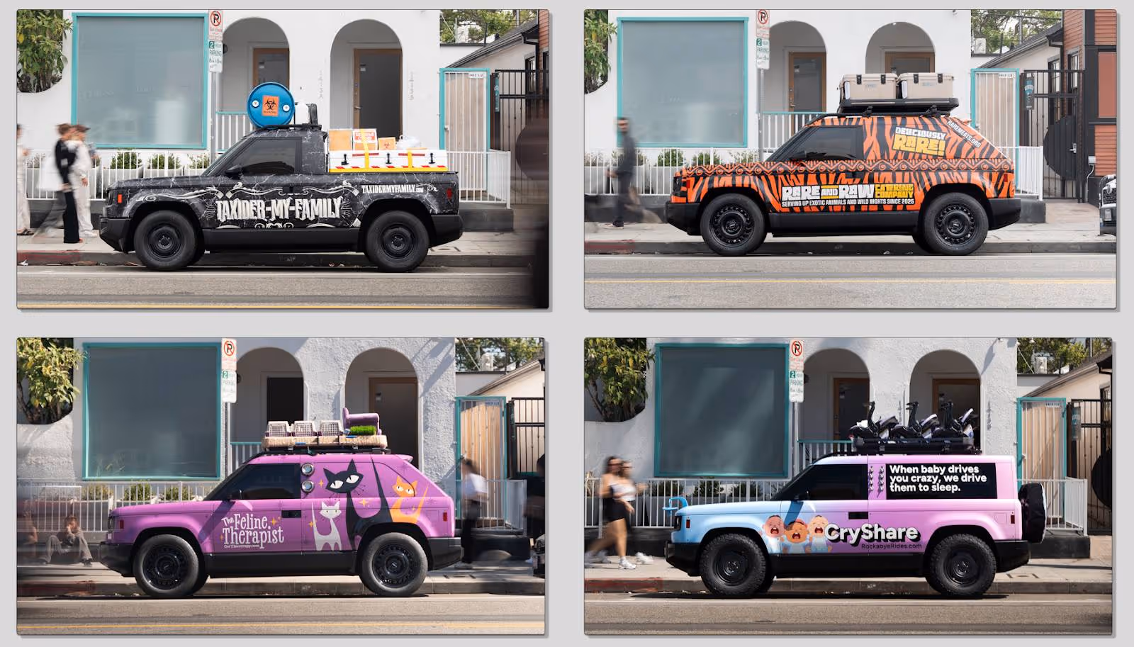
In an industry where humorous marketing is lacking, and banal taglines like “Experience Amazing” or “Innovation That Excites” come standard, this actually felt like fun. TAXIDER-MY-FAMILY, with an entire backstory? Come ON.
This sharp left turn sparked articles titled “The New Slate SUV Reportedly Funded By Jeff Bezos Was Just Revealed In The Most Insane Way” and popped up in Subreddits like r/whatisthiscar creating genuine intrigue for such a novel concept.
Not only did the playful and hilarious stunt signal Slate’s unique marketing stance, but it also put their modular and highly customizable nature at the forefront.
The lesson? If you’re going to pay for marketing, don’t pay for ignorable wallpaper. Stunts like Slate’s prove that entertainment can earn headlines and attention in a way that expected, descriptive messaging never will. (More on how to change that here.)
As a startup or challenger brand, you have to hold every idea to the standard of, “Is this working as hard as it possibly can?” And crucially, it has to reflect who you are. While Slate’s marketing made people laugh, it worked because it clearly served up their promise of modularity, play, and difference.
Customization as a Future Growth Engine
“It’s a blank Slate. You call the shots.” Says the copy a few modules down on Slate’s homepage.
It continues, “It's a blank canvas for personalization, so you can get exactly the Slate you want, with the stuff you want, at the price you want.”
With this, Slate is offering a platform with a low barrier to entry, endless DIY upgrades, and continuous personalization. Sure, it’s about individuality in a market largely devoid of it, but it’s also setting up a community-driven engine for growth. It’s a product that can scale 1:1 with each user’s exact intentions and desires, while starting at an inviting price point.
Speaking of inviting price points, their refundable $50 reservation fee acted as its own psychological “starter kit” that spawned 100,000+ signups within a month. This tripwire funnel invited people to join the Slate tribe without any real risk, while mirroring Slate’s product philosophy: start small, and add as you go.
The site features a carousel module with 32 wildly unique configurations, each with its own fun name, often hinting at different vignettes and use cases. It shows just how modular these things can be, and it lightens the cognitive load by showing creative thought-starters (most of which require plenty of add-ons, naturally).
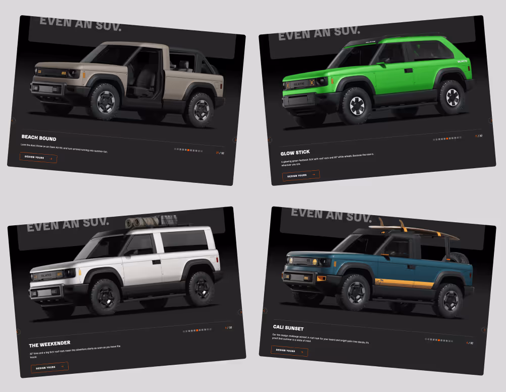
Slate’s design leverages mass customization, the concept of delivering tailored products at near mass-production efficiency through modular design and delayed differentiation. Their “Blank Slate” base model is not intended to be finalized. It’s begging to be customized.
Like a budget airline or à la carte menu, Slate unbundles the extras to let customers build exactly what they want. And whereas traditional trim packages bundle their features into pre-set tiers, Slate takes it a step further by letting buyers essentially create their very own trim package from scratch.
Want a nice set of speakers but the basic wheels? Great. Want to turn your truck into a doorless SUV? Bam. Want black seats and gunmetal HVAC knobs? Not a problem. Congrats, you just created your own bespoke trim package, and you didn't pay for a single "extra" you didn't want.
Your business can borrow this play by starting with an accessible hook, then building a roadmap of upsells that feel like added value or self-expression instead of nickel-and-diming.
The Takeaway: Push Perception Past Parity
It’s so easy to forget cars are parity products. Yes, Ferraris and Priuses seem like they’re worlds apart. But at the end of the day, cars are just four-wheeled vehicles built to take you from point A to point B.
That’s why positioning matters a lot more than fender flares or hand-gesture controls. Instead of trying to merely sell a more affordable EV, Slate positioned its product as the ultimate utilitarian vehicle. While middle-of-the-road car brands tout “innovation,” Slate proved it through an actual blank canvas for customization.
Whether they can deliver on building a quality vehicle or a great user experience remains to be seen (they’re likely hitting the streets in 2027). Even if two doors are a dealbreaker for me personally, I’ll be cheering them on from the sidelines.
If you’re in a crowded category, don’t aim for incremental differences and nuances. Tie your entire brand around one obvious wedge (Volvo has safety, Porsche has performance, Prius has stewardship, etc.) and drive that wedge like you stole it.
Gil Templeton
Demand Curve Staff Writer
From Discord Discourse to Dominance
Insight from Kevin DePopas, Demand Curve Chief Growth Officer + Gil Templeton, Staff Writer

RC and Matt were traders (and strangers) obsessed with the same thing, finding an automatable trading strategy that would make them millions.
The key to cracking this code hinged on “backtesting” which is basically a way to take a trading strategy like "buy when the price drops 10%" and testing it against years of historical market data to see if it would have made money. No real cash at risk, just practice runs on old data.
The problem was the existing backtesting software was complete garbage. And because of this, traders were either stuck using clunky programs, working in Excel spreadsheets, or gambling with real money to test their strategies.
Matt’s trading-themed YouTube videos caught the attention of RC, a software engineer and part-time trader. RC loved the videos, so he reached out through Discord, and the kindred spirits hit it off.
One night in their Discord chat, RC sent a message saying, "I think I know how I can build a backtesting platform."
Three months later, without warning, RC sent Matt a screen recording of him clicking through candlestick charts, demonstrating successful backtesting on a web interface.
"I was like, what the hell? How'd you do this?" Matt recalled.
RC had been building proof of concept while working full-time, but that was just the start of the slog.
The Year of No Weekends
Building the actual product was brutal.
For a year, RC would work his demanding full-time job, then come home to work on FX Replay until 2 AM, not to mention the marathon weekends. He was also on a work visa in the US that could be revoked at any moment, adding to the stress and uncertainty.
As RC built, Matt gathered feedback. In the spirit of co-creation, they created a Discord server where traders could test early versions and give feedback.
After over a year of iterating, it was time to make it real.
"It's now or never," RC told Matt two weeks before their launch in October 2022. "It's been going on for too long. We need to know if this is going to work or not."
RC pushed himself to his limits during those last two weeks. Even though the platform was missing dozens of features users desperately wanted, they shipped anyway.
Finally, RC sent Matt a message telling him to record the launch announcement. Right before collapsing into bed for two days, he checked Stripe.
"I saw somebody had already bought the trial and put their credit card down. That moment made everything seem worth it. I literally went to bed crying.”
The Growth Engine Nobody Teaches
By the end of month one: 100 paying users
Ten weeks in: 1,000 users
After eight months: 5,000 users
This was all without paid ads or a growth team. But how?
A key piece of their initial traction was Matt's existing audience. At the time, Matt had personally built a modest yet engaged following on Telegram, YouTube, and Instagram.
When most teams might see early community traction and conclude they need to double down on growing their own community organically, Matt decided to try replicating their community success with other existing trading communities.
Matt's strategy was deceptively simple: Turn community outreach into a systematic growth channel.
He went to other community leaders with this pitch:
"We'll give you a free account and a discount for your community. Just try it out, and share with them if you think they’d find it useful."
Even though there was no affiliate program at the time, many community leaders shared FX Replay with their audience freely and didn’t ask for a cut, because it was so valuable to their followers.
Matt was essentially running an outbound sales motion, but for community partnerships instead of customers. He emailed hundreds of trading influencers with personal, thoughtful messages after actually watching their content.
"I would always watch some of their stuff, so I could actually tailor a message to them," Matt explained. "If it's like, 'Hey, I watched this video and I really got a lot of value out of it. And I think your following can actually get value out of what we're making here too,' it hits a little harder."
While RC built features based on Discord feedback, Matt built relationships with community leaders. Because one community with 10,000 engaged traders beats cold-emailing 10,000 individuals.

Now is where most startup stories end with "and then we scaled." But not this one.
Leveling Up the Growth Engine
As they scaled past 5,000 users, Matt knew he needed to level up. They had traction, but he wanted more structure to test new channels and optimize conversion.
"I had little to no experience on the marketing side of things. I was trying to look and see, 'how can I be better at my job?'" Matt admitted.
He had a natural knack for growth but didn’t have the structure to scale systematically. That's when he found our Growth Program.
"It's different when there's a structured sequence showing you every step, from step one to step ten," Matt explained.
The program didn't transform them overnight, but it gave them a framework to understand and optimize what they were already doing right, and a method of testing new channels to see if they could unlock more growth.
"It helped assess our product, market, customers, and channels," Matt explained. "We were in a fortunate position with a lot of users and data, and we needed to do something with that to understand what they want, what they need."
Most importantly, it gave them the discipline to test methodically while staying grounded in what was working.

They launched a podcast, ran bi-weekly webinars, experimented with influencer partnerships, tried Snapchat ads (which flopped), and most recently began testing paid media. But here's the key, the program taught them to treat each channel as a hypothesis to test, rather than a shiny object to chase.
"It helped me focus on one channel and dial that in... because you spread yourself so thin when you try to do so many different things at once,” said Matt.
The program helped Matt understand why their community strategy worked (high-intent audiences and strong product-market fit), when to expand beyond it (after exhausting the channel and reaching a plateau), and how to build repeatable processes around what felt like lucky breaks.
Through this experimentation, the data kept pointing back to the same thing, community and word of mouth are the core of FX Replay's growth engine. RC estimates 90% of their users still come from word-of-mouth and community channels.
The Playbook You Can Actually Use
After dissecting their journey, here are the lessons you can take from FX Replay’s growth:
1. Solve a Problem You Live
Both RC and Matt were traders first and founders second. They didn’t have to study traders’ frustrations, because they felt them every day.
"Because we knew the problem so intimately, we knew what we needed to do to create an actual solution,” said Matt.
Today, FX Replay takes this concept even further by encouraging all their employees (devs included) to trade. Because when your team feels the same pain as your users, everyone is on the same page.
2. Ship the Core (But Make It Sharp)
We all know about MVPs. Eric Ries wrote The Lean Startup over a decade ago. Silicon Valley has been preaching "ship fast" ever since.
But user expectations have changed significantly over the last ten years. We've been spoiled by beautiful, intuitive apps. This means your MVP still needs to feel modern, even if it's not fully fleshed-out with features.
FX Replay launched with only two key features: Backtesting trades and seeing analytics. But those features ran smoothly behind a clean interface and didn’t require a download.
"People couldn't go back if they skipped forward too fast, and they were complaining about that for a long time," RC admitted.
So while some users complained about missing features, they still paid to support the vision, because the core experience was so solid.
3. Leverage Other Communities While Building Your Own
When founders hear "community-led growth," they usually think it means building their own communities from scratch (which can be a daunting undertaking). But Matt proved community-led growth doesn’t have to start and end with a community you own.
Instead of choosing between building their own community or partnering with others, Matt did both. While FX Replay invested in their own channels (Discord, webinars, podcasts, YouTube) they simultaneously turned existing trading communities into a distribution engine.
Give community leaders free accounts and member discounts. Ask them to try the product and share if they found value.
These external communities drove new user acquisition while FX Replay's own channels kept users engaged (and feeding the product roadmap).
Matt essentially systematized word-of-mouth growth through strategic community outreach, and you can too.
4. Discord as Your Product Development Lab
A lot of companies use Discord for support, but FX Replay turned Discord into their product team.
They let users suggest features, vote on priorities, and watch updates happen. This created a tight feedback loop where users felt like their fingerprints were all over the experience.
On top of getting great feedback, this created emotional investment. When users saw suggestions turn into updates and features, they became loyal. Plenty of users paid for a work-in-progress product just to help support its development.
5. Focus Wins Out (Even When You Test Everything)
FX Replay has tested a lot of growth channels, but they never turned their backs on what worked best.
Community outreach and word-of-mouth drove an estimated 90% of their growth from day one. Nearly three years later, those same key channels still drive roughly 90% of new users.
This mirrors a theme we've written about before, the best companies don't necessarily do one thing forever, but they tend to master one thing completely before adding more to the mix.
Bottom Line: Fundamentals Always Win
The most interesting part about FX Replay's story was that after a couple years and 100,000+ users, they're largely doing the same things that got them their initial traction.
Community outreach. Discord engagement. Building alongside users. Creating valuable content that teaches instead of promotes.
"More than the quantity is the quality," RC emphasized about their community relationships.
They didn't pivot to paid ads when they hit 1,000 users. They didn't raise venture capital at 50,000. They kept executing the fundamentals with a little more sophistication.
Matt and RC transformed from accidental marketers to intentional growth leaders through systematic learning and discipline. The Growth Program gave them the structure to understand why their organic success worked, and how to magnify it without muddying it.
No matter what kind of business or industry you’re in, you should follow their lead. Choose systems over hunches, and depth over breadth.
Kevin DePopas
Demand Curve Chief Growth Officer
Gil Templeton
Demand Curve Staff Writer
P.S. Want to build your own systematic growth engine? The Growth Program 2.0 teaches the same frameworks that helped RC and Matt scale FX Replay.
Learn more →
“Nothing Beats a Jet2 Holiday…”
From the desk of Gil Templeton – Staff Writer
While it seems there’s no singular “song of the summer” this year, there’s certainly been a sound of the summer. That sound is the certified-viral “Nothing beats a Jet2 holiday” audio clipped from the ads and in-flight videos of the budget British airline/travel company Jet2.
The hashtag #Jet2holidays has been used on 456,000 TikToks, and the audio has been used in 2.8M videos, most of which show vacation fails: pulling open hotel curtains to reveal the world’s smallest window, watersports disasters, wipeouts in the bowling lane, etc.
The “joke” is that Jet2’s relentlessly sunny earworm, Hold My Hand by Jess Glynne, creates a lighthearted mismatch when paired with epic vacation fails. As a budget-friendly airline and travel package provider, Jet2 experiences aren’t always known for being high-end or picture-perfect.
Instead of trying to swim upstream and “fix” the narrative around this onslaught of negative yet hilarious videos, Jet2 leaned in. They created a lipsyncing contest for the audio, offering £1,000 for the winning submission. Their video has 34M+ views and comments like “This is actually so iconic” and “Jet2 has entered the chat.”
The Lesson: If you can’t beat ‘em, join ‘em.
You can’t fight a wildfire with a press release or cold corporate messaging. When a good-natured social media trend has taken on a life of its own, you have no choice but to cheekily hitch your wagon to it and play along.
By winking at the joke, Jet2 showed they were in on the fun without directly admitting they sell lackluster experiences. It was a smart way to ride the wave without sinking brand equity.
Domino’s Pizza Turnaround
Back in 2009, Domino’s had a mess on their hands. In addition to viral videos of real employees doing heinous things to customers’ pizza, their product quality was slipping amidst franchise expansion. The fallout made Domino’s a lightning rod for criticism, and they needed to gain control of the narrative.
Enter Domino’s Pizza Turnaround, featuring one of my favorite off-kilter taglines ever: “Oh Yes We Did.” Domino’s tapped red-hot ad agency Crispin Porter + Bogusky for a come-to-Jesus ad campaign, featuring cutdowns from their wonderful four-minute marquee video where they faced the harsh truth.
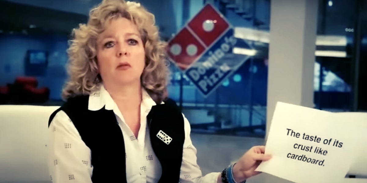
The ads showed focus groups calling out their cardboard-like crust and their ketchup-esque sauce. It showed the corporate team cringing and shaking their heads in shame. Then it showed the team rallying wholeheartedly to make better pizza.
“You can either use negative comments to get you down, or you can use them to excite you and energize your process and make a better pizza. We did the latter.” – Patrick Doyle, President, Domino’s Pizza
The numbers following the refreshingly candid campaign didn’t lie. By the end of the next quarter (Q1 2010) Domino’s posted a 14.3% sales increase QOQ, one of the highest-ever revenue jumps for a fast food chain. (Source: UCLA Economics). By the end of 2010, the company’s stock had soared 130% from where it was at the end of 2009.
Domino’s stock continued to go on a remarkable run for the next twelve years, with gains dwarfing the S&P 500, Invesco QQQ, and Papa John’s for good measure.
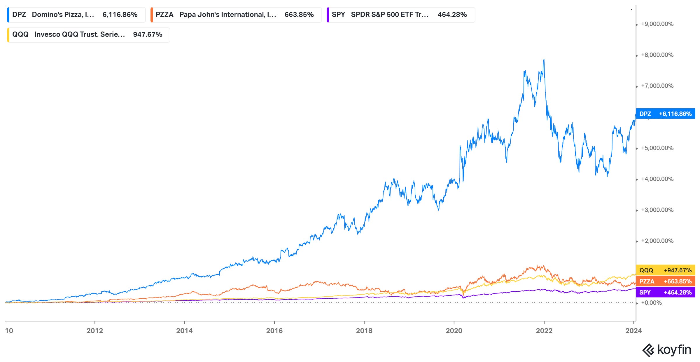
Their stock went from $8.38 a share at the end of 2009 to $564.33 by the end of 2021. An absolutely legendary run. I, for one, don’t believe this would have happened with cardboard crust and ad campaigns acting like everything was hunky-dory.

The Lesson: Honesty is the fastest way to reset trust.
Instead of slightly tweaking the recipe, Domino’s tore everything down to the studs. That radical transparency showed customers the company was serious about fixing the problem, thus creating a clean break from the old baggage and opening the door to growth.
The Anti-Luxury Amsterdam Hostel
Back in 2013, my two friends and I needed a cheap hostel for a one-night stay in Amsterdam. After poking around online, one option stood out like a sore thumb: The Hans Brinker.
In some of the boldest pieces of advertising I’ve ever seen, their site featured atypical “Before” and “After” photos of guests looking nice at check-in and awful at check-out, implying the Hans Brinker was a wild, chaotic, sleepless adventure.
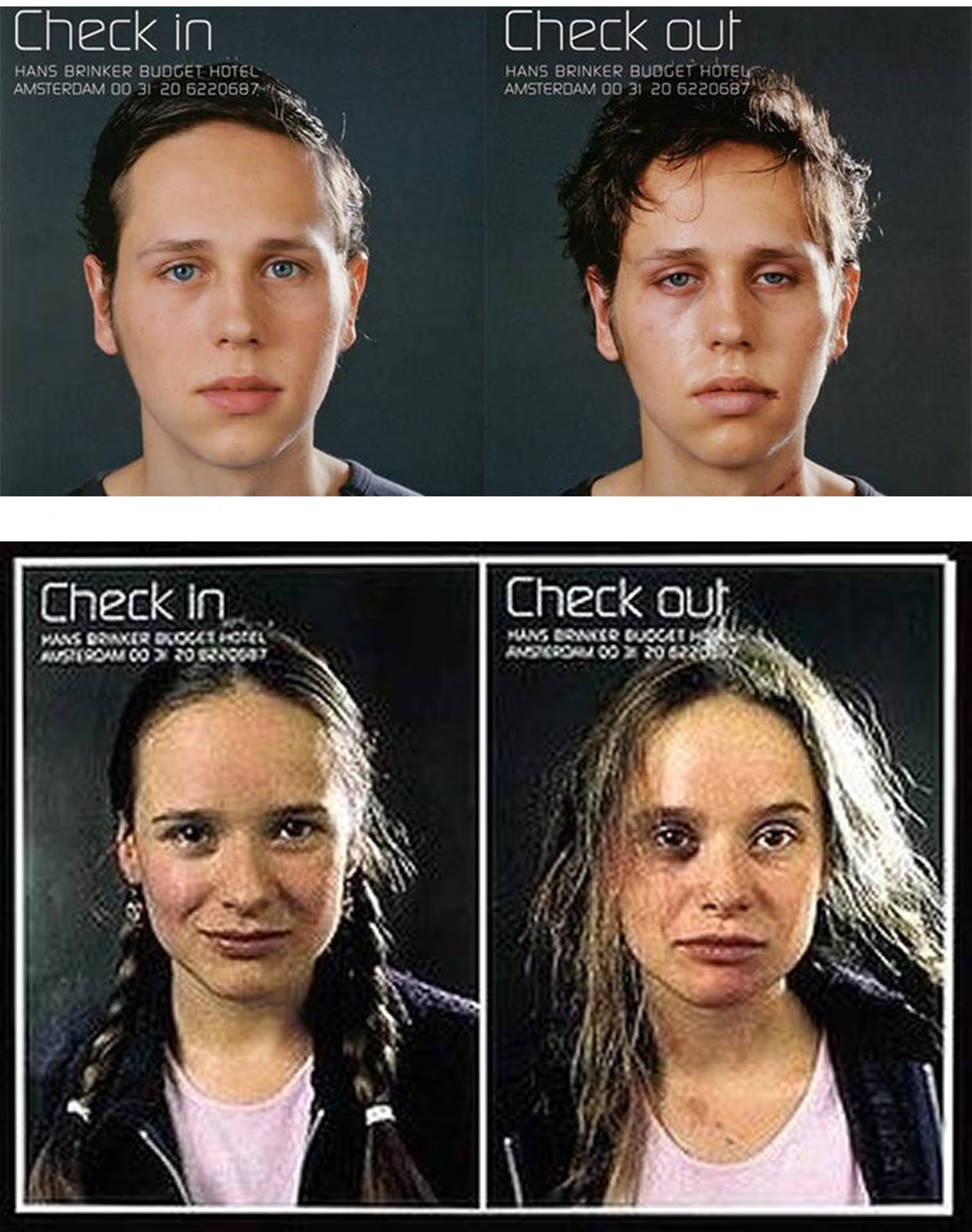
So we did what 21-year-old guys do and immediately booked a night there. After being paired up in a room with a group of six Aussie guys on a bachelor party (who didn’t really sleep, and snored like locomotives for the hour or two they did) we got the full Hans Brinker Budget Hostel experience, as advertised.
Checking back in on the Hans Brinker today, they’re still living into their promise, albeit in a more tasteful way. Absolutely hilarious, daring lines like “Just don’t say we didn’t warn you” and “You probably won’t sleep much anyway” are paired with photos of llamas in dorm-style rooms.

This is a classic case of knowing what you are and what you aren’t. It’s also proof you don’t need a viral trend or a multimillion dollar ad campaign to own your “thing.” You just need to be intentional about your brand differentiation, especially above-the-fold, then put your shoulder behind it across your marketing efforts.
If the Hans Brinker website had featured their central location, history, team, or their (admittedly scant) amenities in 2013, we would have glossed over it and booked a place with better reviews. But they played (and still play) to the adventurous, younger crowd who’s looking for a story, not sleepy time.
The Lesson: Specificity beats general appeal every time.
Instead of getting lost in the noise with other listings, the Hans Brinker plays up their truth (cheap rates and unbridled chaos) in a way that speaks to a specific slice of customers. In a huge tourist destination, they don’t need to be everything to everyone.
In other words, nobody craves buffet food. So choose the food you serve best (steak, tacos, or in this case late-night pizza) and make it even more specific (dry-aged steak, al pastor tacos, or the biggest slice in town).
The Takeaway: Truth Is Your Trojan Horse
The truth, especially when it’s wrapped up in wit or self-awareness, is disarming. It can sneak past natural skepticism like a Trojan horse rolling through the gates.
Whether it makes people laugh, feel seen, or nod along, leaning into your brand’s truth shows your audience you’re willing to meet them where they are.
Specificity and honesty are also self-filtering. They pull in the right customers and build loyalty in a way that “We’ve got something for everybody” never will.
Gil Templeton
Demand Curve Staff Writer
MidJourney’s UX Journey
From the desk of Gil Templeton – Staff Writer
When MidJourney launched via Discord 2+ years ago, the UX was tricky, at least for me. For those not intimately familiar with Discord (and a little intimidated by their first foray into image-gen) the experience left plenty to be desired.
You had to create and link a couple accounts, you were directed to use public channels filled with other users’ images, it wasn’t clear where your saves went (or how your credits worked), and you started every prompt by manually typing “/imagine”.
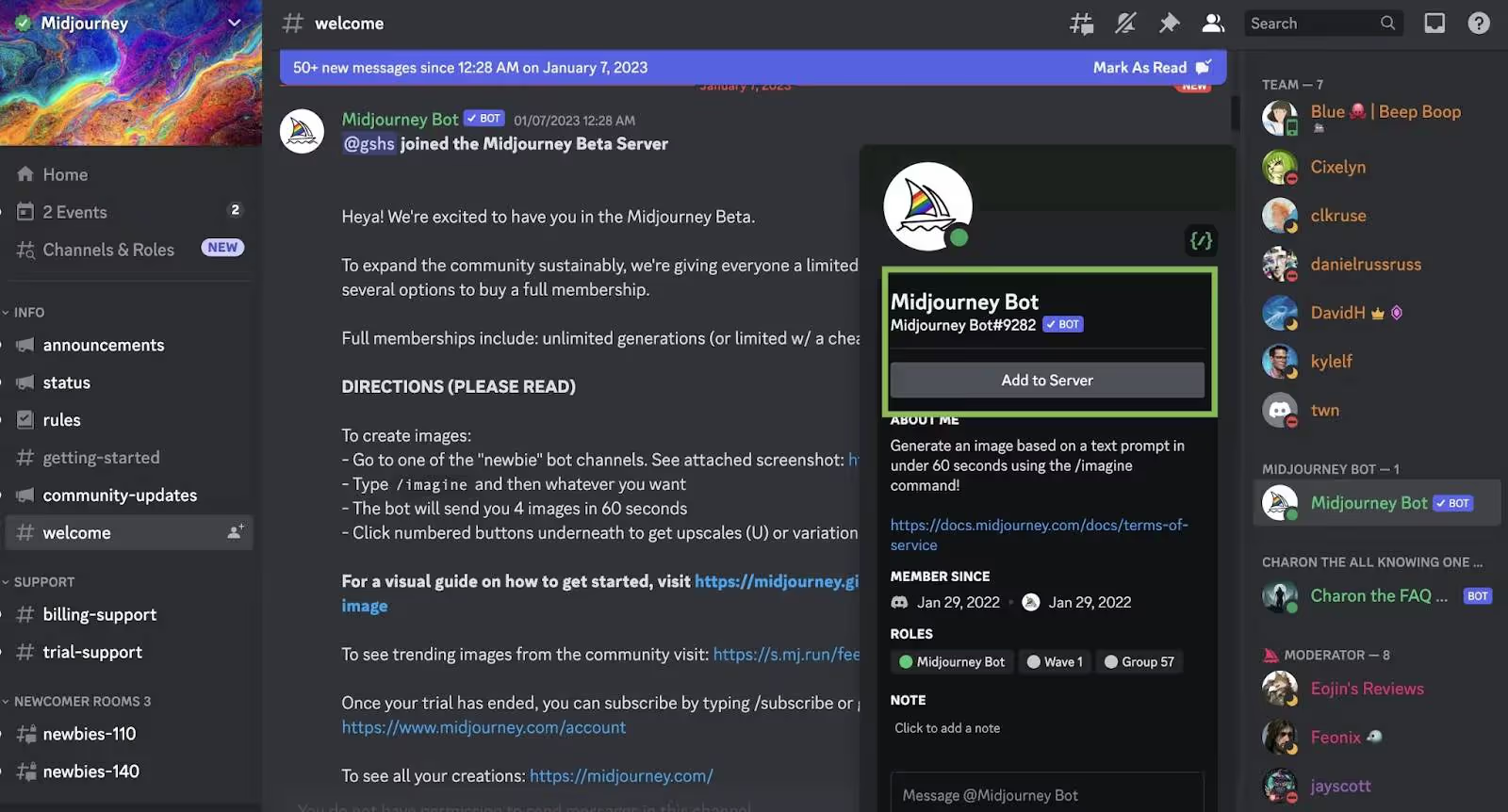
It constantly had me wondering, “Am I even using this right?” and the murky UX almost made me walk away.
Fast-forward to Midjourney today, and it’s as user-friendly as anything: a familiar “search bar” at the top for your prompt, upvoted eye-candy, a simple side panel for navigation, and no two-stepping through another platform (i.e., Discord).
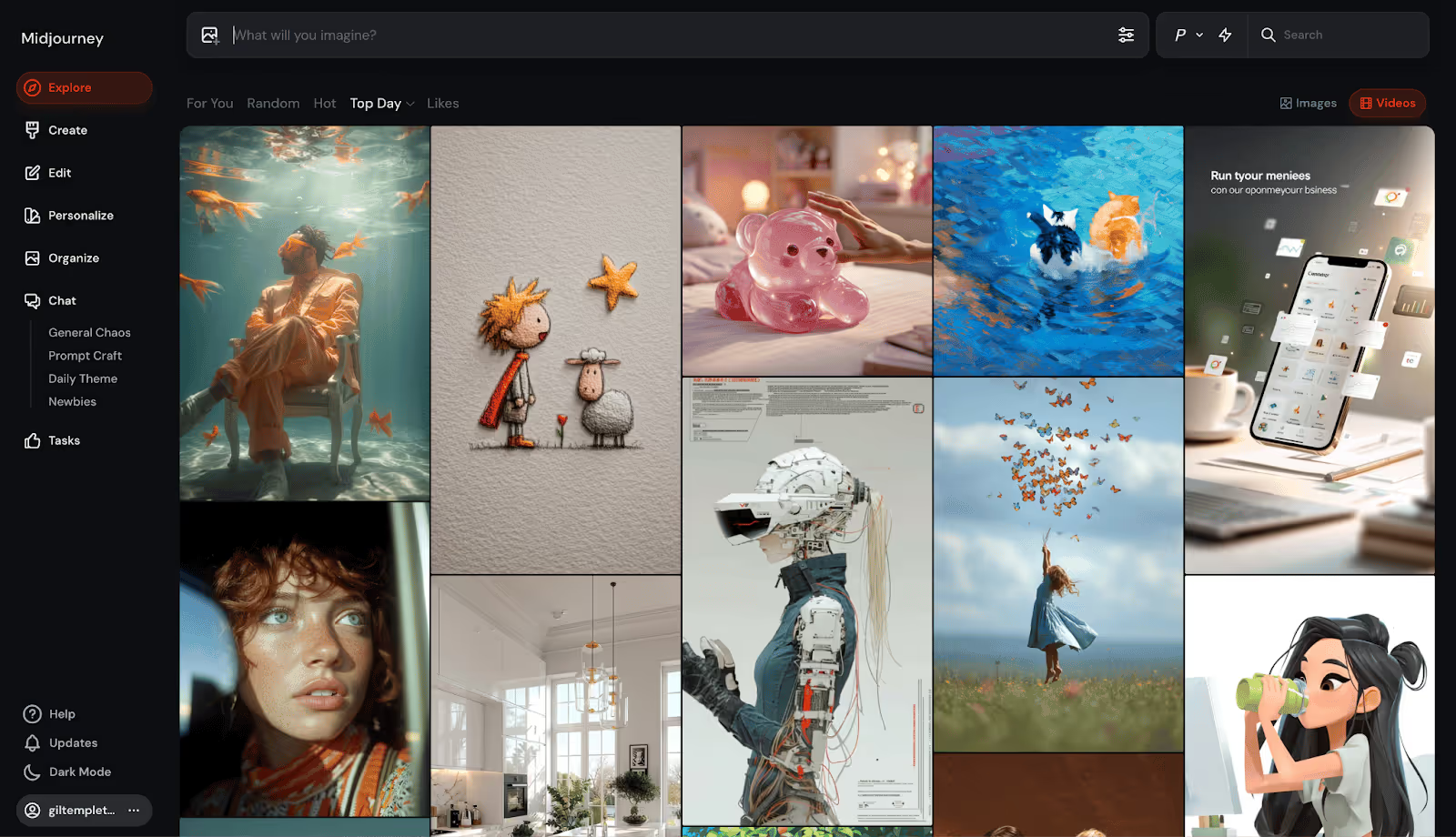
This transformation epitomizes the stupid-simple standard that’s become the template for today’s AI platforms, where the inner-workings are increasingly mind-bending, but the outward-facing wrapper is instantly enticing.
Let’s take a closer look at this standard that’s coalescing around today’s AI darlings.
A New Standard for Chatbots and Visual Tools
The main interfaces of platforms like Lovable, ChatGPT, Gemini, Veo, etc. are shockingly stark, stripped-down, and simple. Even if you have no idea what you’re doing or if you really need this thing, you immediately know how you’re supposed to use it. Then your quick and easy outputs prove why you need it.
They throw you straight into the experience with virtually zero friction. “Just type something here and have your mind blown, we’ll figure out the details later,” seems to be the new norm. When they do ask you to sign up, it’s free and takes a click or two.
They strip out any potential rub and make the first interaction feel like a win, hooking you with your “Aha!” moment before you can even think about leaving.
My dear grandmother doesn’t know what “vibe” or “coding” mean, but could she vibe code on Lovable in a minute or two? Yeah, she could. It would probably be very bad (sorry, Nana) but she could type a few sentences and get something for her troubles.
Here are some themes and tactics helping these sites turn viewers into users:
- Frictionless or deferred sign-ups: These platforms tend to hook you with output before asking for a credit card. By the time you’re prompted to pay, the platform already has its hooks in you.
- Zero-education interfaces: They remove intimidation for first-timers by skipping the jargon and onboarding tours. There’s usually a single input field in a familiar search bar format, accompanied by easy-to-digest, human-sounding copy.
- Guided “first wins”: These platforms lower the cognitive load by showing suggestions, templates, or sample outputs from others, so users don’t have to think about how to take that first big step.
- Instant feedback: Rapid output delivers an instant dopamine hit that we’re well-documented suckers for. And with highly visual platforms like Sora, Midjourney, or Veo, the outputs are eye-catching and shareworthy.
- Dead-simple CTAs: “Type here” or “Upload a file” or “Paste your text” puts an easy-to-follow breadcrumb right in front of users without overwhelming them.
- Freemium plans: They’ll give you a taste of the real thing without making you pay a dime. Only when you want to cross a certain threshold of credits, time, or quality do they put a price tag on it.
- Lightning-fast Time To First Value (TTFV): By providing value (or the “Aha moment” below) so rapidly, these sites create instant momentum, making it far more likely you’ll engage and convert.

Some Other Interesting Examples
Plenty of other AI-forward or AI-enabled businesses are leaning into instant interactivity and quick wins to remove roadblocks and boost retention. Below are two creative examples:
Replit uses a Mad Libs-esque approach for app creation, where the homepage asks first-timers to fill in the blanks on three input fields: type of project, who it’s for, and what it does. This works because it collapses the intimidating “Where do I start?” moment into a playful, low-effort interaction that personalizes the output and gets users involved before asking for an email.
Creati conveys their value in a modular, highly interactive flowchart that begs for you to click on it. You can choose your model, featured object/product, and scene. Within seconds, the output updates to reflect your choices, showing you the exact value they bring.
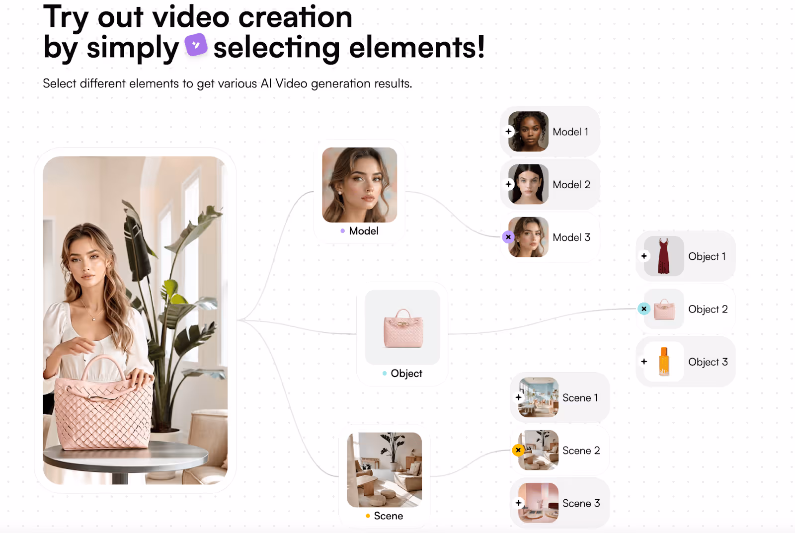
Psychology of the Free Sample
The more I thought about this approach, the more I realized it’s essentially the digital cousin of the Costco free sample, on steroids. Free samples are a notoriously effective tactic at retail, as one industry study of grocery stores showed samples driving product purchases by 2000%.
The chart below shows just how effective free samples can prove to be across product categories (in real life, at least). Even a “laggard” like beer still sees a staggering 71% sales increase after engaging in free sampling.
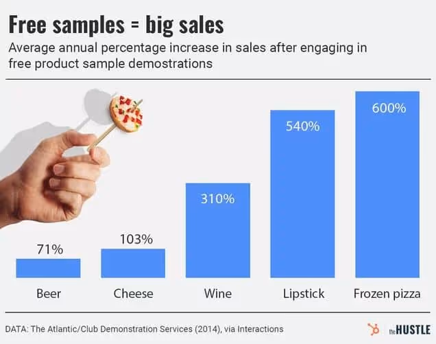
Free samples work in supermarkets for similar reasons why they work on homepages:
- Instant gratification: Quick, rewarding outputs deliver that same hit of “I got something” like you get from a sugary chocolate chip cookie quadrant.
- Lowered sense of risk: Once you taste it, you know whether you like it or not. So when a site/experience gives you something you like, it’s easier to justify further engagement or payment.
- Reciprocity drives action: While this is likely stronger in an in-person situation, a no-questions-asked free trial/freemium subscription comes across to me as more endearing than the pay-first option.
- Higher awareness: Once you’re exposed to a brand or business, they’re more likely, on average, to be in your consideration set. Of course a positive, hands-on experience can make it even more familiar and memorable.
When I said “...on steroids.” earlier, I was hinting at the attribute that makes this “sampling” even more powerful: bespoke outputs. Because a free sample of baklava is great. No complaints.
But a free sample of exactly what you’re craving (a Philly cheesesteak for me right now) cooked in seconds and served hot? One nibble of that, and I’m 100% reaching for my wallet to buy the footlong. Being able to generate these unique, personal outputs at scale is now possible through AI.
Takeaway: Be Interactive and Instant
Today’s best homepages and landing pages grease users up, so they can glide through progress and achieve gratification (or “first value”) before they can blink.
Sure, yours might not be as simple as a prompt field, but when you aim to make a user’s first steps just as inviting, obvious, and rewarding as these masterful AI juggernauts, your conversion rate will act accordingly. (P.S. if you want deeper guidance on your CRO and landing page optimization, the Growth Program 2.0 will cover that in spades).
If your site’s first impression doesn’t have an interesting “hook” above the fold (more on that here), or it asks people to work too hard (decoding jargon, stumbling through sign-up, guessing the action they should take, etc.) you’re turning people off. And this gap is only getting more pronounced with frictionless AI tools becoming so ubiquitous.
While user behavior has always echoed the sentiment of “Don’t make me think,” it might be heading toward a place of, “Make me something.”
Gil Templeton
Demand Curve Staff Writer
What High-Converting Pages Do Differently
We’ll start with three homepage best practices that give your page a rock-solid foundation.
Convert More With Your Homepage
Insight from Demand Curve
Buyer journeys aren’t nearly as clean as we like to imagine. Most people won’t see your ad → visit your landing page → buy immediately.
It’s more likely to go like this:
- They see your ad while doom-scrolling Instagram. They click.
- Something distracts them away from their phone.
- They remember later in the evening (or 3 weeks later) thanks to a Trigger Event.
- They Google your company name.
- They visit your homepage, not the conversion-focused landing page you intended them to hit.
(At least, that’s how I tend to buy things online.)
Is your homepage optimized for conversion? If not, you may be leaving growth on the table.
Yes, your homepage has many jobs (too many). One is to orient people to your brand and everything you do. But don’t forget high-intent visitors often visit your homepage late in the funnel.
Design it with conversion in mind.
Here are some quick ways to make sure your homepage converts:
1. Start by nailing the above-the-fold
Your above-the-fold (ATF) is the portion of your website that’s immediately visible to visitors: your hero header, subheaders, imagery, and calls to action (CTA).
Header and subheaders: Keep your copy short. Concisely convey what your product is and why they should care. Visitors shouldn’t have to scroll to understand what you offer and how they’ll get value from you.
Imagery: Whether static images, slides or video, keep your product(s) at the forefront. Photos with people are optional, but they have a proven track record of increasing conversion.
Call to action (CTA): Your ATF is the most important part of your most important page, and your CTA here might be the most important part of your entire site. This is what drives action. CTAs for ecommerce tend to be “shop now.” For services, “get started” and “try now” work well. Make sure your CTA is high-contrast and unignorable.
Here’s an example of an above-the-fold done well.
- Concise, punchy header and subheader explaining what Mosaic is and why you should care
- Attractive visuals of the product
- Clear, high-contrast call to action (although they should depart from their monochrome design and make the CTA a contrasting color to make it pop)
We wrote an entire playbook on ATF alone. When you’re ready to create your ATF, you can follow our step-by-step process.
2. Handle objections in your below-the-fold.
Below the fold, you briefly address any objections visitors might have.
Some elements you might include here:
Social proof: Share reviews, press, user-generated content, testimonials, endorsements, ratings, customer logos, and customer stats.
- Include social proof near your CTAs to handle their objections at the key moment where they’re deciding to click or not. Trust leads to action.
- There’s basically no such thing as too much social proof.
Product features: Highlight unique product features that address common concerns.
- Worried about quality? Here’s why we’re the best you can get.
- Worried it’ll take too long? We’ll have you onboarded in five minutes or less.
- Worried about not liking the product? If you don’t like it, we’ll give you a full refund.
FAQ: Take it a step further and add an FAQ section.
- Start with the most common or highest-friction questions.
- Assume they didn’t read the whole page and repeat all the key points.
Bestsellers: If you have several products, highlight your flagship and most popular items. Or highlight a “starter pack” or samples.
Footer: Include pages in the footer that you want to give visitors access to but aren’t critical to the conversion journey, like your exchanges and returns policy.
See how MUD\WTR uses their FAQ section to address common questions (objections):
Include CTAs throughout your homepage so visitors don’t have to scroll back to the ATF to take the next step in their buyer journey: the product, pricing, or sign-up pages. CTAs in a sticky nav work well, too.
3. Run an A/B test.
It’s easy to make changes and assume they’re better. Time to test that:
Filter for people who have already visited your ad landing pages. These are the warm visitors we’re experimenting with. Send half to your current homepage and the other half to your new, conversion-focused homepage. See which performs better.
Put a little love into your homepage, you might see a big bump in conversion.
For more, dive into our Above the Fold playbook and Landing Page guide.
Now it’s time to dig a little deeper into the layout of the “perfect” landing page. While homepages and landing pages share a lot of the same DNA, let’s expand on landing page-specific nuances below.
The Perfect Landing Page Checklist
Insight from Tuff Growth and Demand Curve.
Your marketing efforts are wasted if the landing page sucks.
That’s why it's a good idea to use a proven template rather than get too creative.
Wait, don’t we constantly tell you to be creative?
Yes, 100%, your marketing needs to be creative to stand out.
But creative layouts confuse people.
So, be creative with marketing (ads/content/email) and practical with conversion.
Here's a checklist for nailing the perfect landing page (high-res version):

Thanks to our friends at Tuff Growth for creating this A+ infographic, particularly Sean Tremaine, the genius writer and designer behind it. Let’s dive into each of these sections some more.
Hero Section:
The hook is everything:
- Header: Clearly state what you do and why it matters.
- Subheader: Expand your headline. How do you do it?
- Image/Video: Visually communicate your product.
- Call-to-Action (CTA): Place an OBVIOUS button that guides the user to the next step.
- Navbar: Key conversion pages/sections only (Pricing, FAQ, Features) and make it sticky.
Social Proof #1
Social proof is one of the biggest motivators:
- Display usage numbers or logos of well-known customers to build credibility and trust.
Benefits/Features Sections:
Features = talking about yourself. Benefits = talking about your customer.
- Benefit Headers: Clearly state your product or service's main benefits.
- Feature Subheaders: Explain how they get that benefit with your product’s features.
- Image: Use visuals to reinforce the benefits and show your product in action.
- Use bullet points and icons for easy reading.
- Repeat your CTA button for each section.
Social Proof #2
There’s no such thing as too much social proof.
Go deeper with testimonials/case studies/reviews.
- Testimonials: Include quotes from satisfied customers, ideally with names and photos, to add authenticity.
- Case Studies: Highlight the results your customers have had.
You can see a deeper dive into the science of using reviews here.
FAQ Section:
- Don’t assume they read the page. Repeat key details.
- Handle the most common objections.
- Don't lay on the marketing speak, just give the facts.
Tip: Ask support and sales for common customer questions and objections.
Final CTA Section:
Make it glaringly obvious how you can help and how they can take action:
- Hammer in the top value prop.
- Make the CTA clear and persuasive.
- If it’s a form, use as few form fields as possible.
Footer Section:
- Only link to key conversion pages.
- Make it painfully obvious how to contact you.
- Privacy and Cookies Policies and Terms are mandatory.
Note: Of course, you can layer additional sections as appropriate for your startup. You can add pricing sections. Problem agitation. How it works. Product gallery. Your mission. And so on. This is a purely skeleton to build on top of.
Quick Tips
- 90% of the work is done by the hero. Make it hooky.
- Your CTA Button should be the most glaringly obvious thing on the page.
- Be short and clear. Optimize for scannability.
- Mobile-friendly is mandatory.
- If you have the traffic volume, A/B test regularly to find the copy and images that convert best. If not, get a lot of feedback from people.
Check this off next time you build a landing page, and you'll be ahead of 90+% of folks.
Want to get ahead of the rest?
Get our extremely detailed guide walking you through how to perfect each section. And if you want more detailed guides on every aspect of growth, sign up for the Demand Curve Growth Program 2.0 waitlist. Launching soon!
— The Demand Curve Team
The High Cost of Low-Effort Outputs
From the desk of Gil Templeton – Staff Writer
A friend and I were dissecting a LinkedIn post from someone we both know, and it reeked of pure, unadulterated AI slop.
She asked a simple but important question: “Do you keep reading once you know it’s just pasted from AI?”
My response was a hard “No.” And I’ll be less likely to read another post from that person in the future, just because they’ve shown their hand. Their six-fingered hand, that is.
This anecdote speaks to the ways people (and platforms) have quickly learned to spot what’s genuine versus generated (what a CUNY professor describes as an “incredibly banal, realistic style.”) It also encapsulates how these types of posts and people are being categorically dismissed.
Since LLMs are so accessible and widespread, let’s start there, so you can be sure your brand’s associated text outputs (captions, ad copy, scripts, post on LinkedIn or X, web copy, emails, etc.) are boosting your credibility and reach.
Eight Ways To Nuke Your Copy Cred
To prove just how predictable AI writing can be, we threw a simple prompt into ChatGPT 4o to see how many instances of AI tells show up. While there are always exceptions, let’s look at some of the common (and lesser-known) AI text transgressions that can register as robot authorship:
- “It’s not just _____. It’s ______.” Similar formulaic, context-based comparisons such as these have been a darling of LLMs. While these can make a strong point or pivot in just a couple words, strive to find another format or approach to convey the idea.
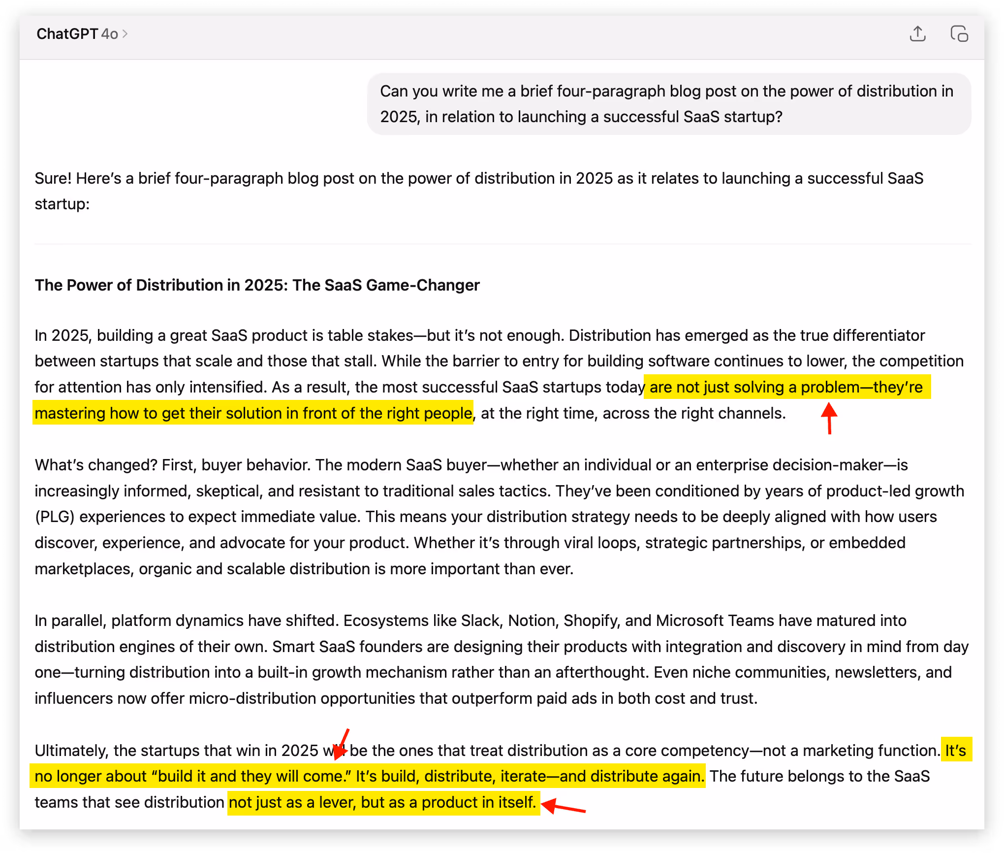
- The much-maligned em dash: This well-documented “tell” has been a major blow to the infinitely versatile punctuation mark that writers notoriously overuse (guilty). In a strange reversal, real human writers are ditching it altogether to signal “Hey, I really put time and attention into this,” as much as it might pain them to do so.

- Excessive hedging or overly formal transitions: Spotting phrases like, “It may be prudent…” or “It might appear that…” show the lack of a clear and compelling human POV. Also formal transitions like "As a result" , "In parallel" , "Ultimately" feel mechanical and overused.
- Tripping over triplets: Using a sequence of threes is a historically strong tactic for storytelling. The number three scratches some itch in our human brains, and AI knows that. So if you see a “build, launch, and scale” or a “simple, smart, seamless” you’re likely staring down the barrel of a bot.
- Grandiose descriptors and verbs: These sensationalist adjectives, adverbs, and verbs try to drum up the emotion and persuasive flair, but they usually feel like a reach. I’m talking adjectives like revolutionary, groundbreaking, jaw-dropping, next-level etc. Adverbs like radically, seamlessly, shockingly, infinitely, etc. And verbs like delve, harness, illuminate, unleash, underscore, facilitate, streamline, bolster, embark, leverage, unlock, elevate, foster, map out, etc.
- Rhetorical Questions: These faux-conversational devices pop up when AI tries to sound engaging and interactive. Instead of naturally transitioning between ideas, AI drops in questions like "What's changed?" or "Sound familiar?" to create artificial dialogue.
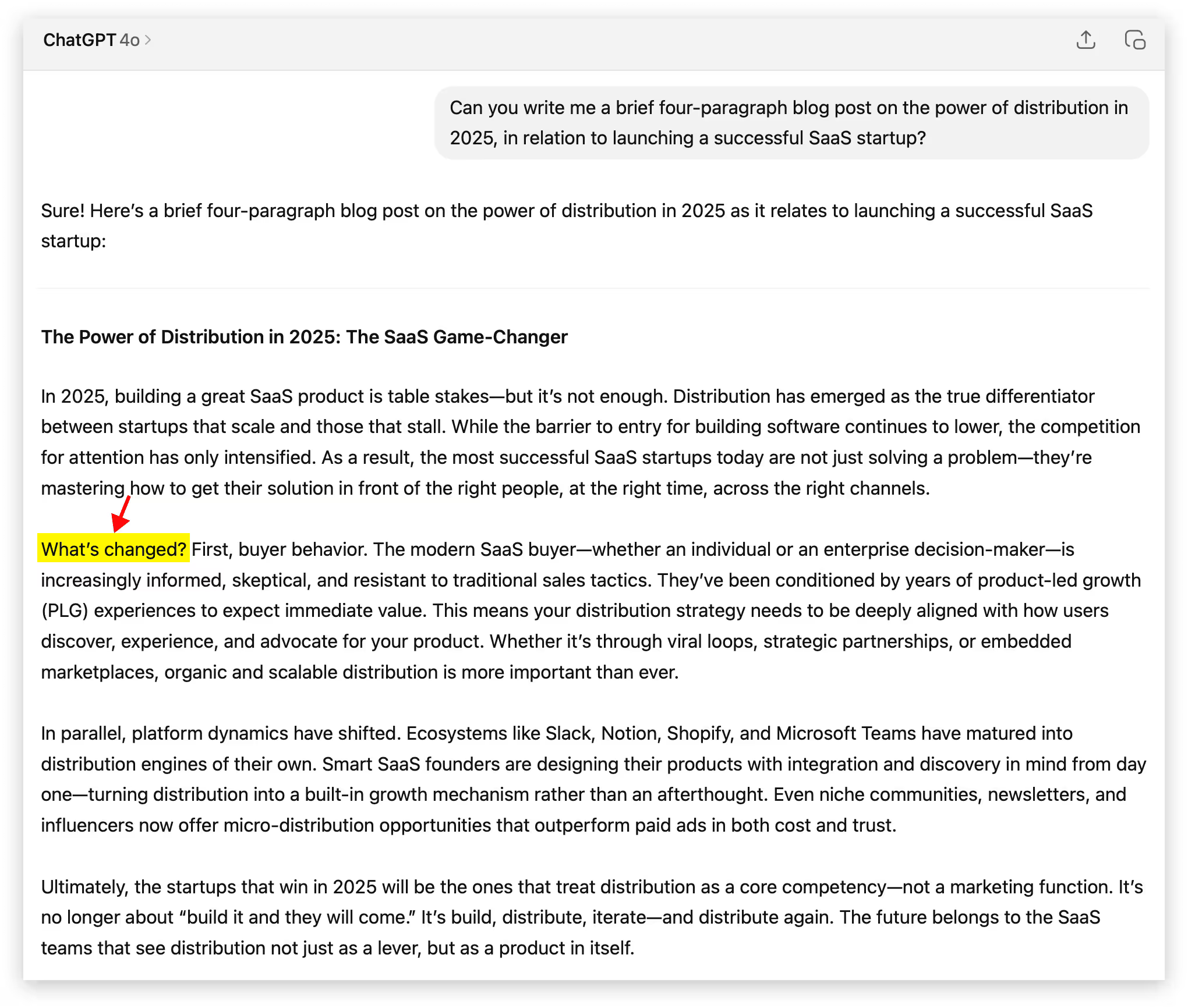
- Nebulous quotes & sources: If you’re using a quote from someone, triple check that it exists in a credible source outside of your LLM. Sometimes you’ll get quotes that never existed, along with cloudy takes like “Studies show…” or “Experts agree…” when there’s not hard evidence backing it up. A real study showed AI failed to produce accurate citations about 60% of the time, so proceed with extreme caution.
✅ 0 instances ✅
- “Tapestry.” Just the word “Tapestry.” From personal experience (and the experiences of those on a Reddit thread and Grammarly blog too), it seems like AI can’t get enough of this one. Try to resist the urge to use it, unless your content relates to an actual tapestry (not a metaphorical one).
✅ 0 instances ✅
The examples above will be hard to avoid completely in all of your writing. Lots of the callouts are fairly common, and some are particularly effective (especially before they became a little suspicious). If you list a series of three things or use an em dash, nobody is going to write you off. But if you copy and paste a first-draft 300-word output from your LLM, you’ll probably sound some alarm bells.
Our Recommendation: If you're going to use AI to help draft content, use Claude over ChatGPT. In our experience, it's better at writing human-sounding prose. Use a reasoning model (like Opus 4 or Sonnet 4). These models can loop through instructions to avoid AI tells and make sure they don't show up. Create a "Claude Project" with plenty of examples of your actual writing, in your tone. Use this Project to draft your content. Finally, dictate your perspective (and loads of context) into the LLM before you simply prompt it to "write me a blog post." Your unique POV is a huge component of what makes your content human.
Worth Thousands of Words, Audiovisual No-No’s
When you’re going for realism, the same sloppy shortcuts that give your AI-generated copy away can taint your visual and audio assets. If you’re going for something so outlandish, unrealistic, or very clearly made with AI, people don’t judge the same way. As long as they know you’re not trying to fake them out.
But the moment you try to pass AI content off as an actual photograph, something human-made, or a real interview, it can be interpreted as deceptive and unethical. The backlash can be even stronger in certain industries like fashion, where models and photography are sacred. Last week’s public response to the AI model featured in a Guess ad in Vogue Magazine had people upset to say the least.
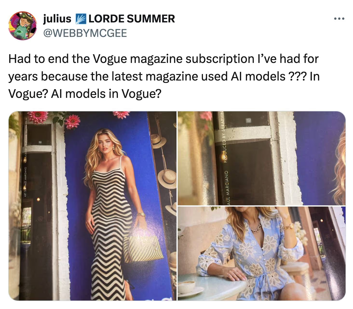
Product photography affected by AI can also pose an ethical dilemma. Let’s say you include a reference image of your brand’s purse in your Midjourney or Sora prompt, but the output looks more upscale.
The image looks glossy, immaculate, velvety, detailed, even though it doesn’t quite look like that in real life. Is it still honest to use that image in your ad, knowing AI dolled it up? Or have you crossed the line to misrepresentation?
We're not attorneys, but we'd urge you to research FTC regulations surrounding false advertising and deceptive claims in your industry.
Below are some practices and approaches you should avoid to ensure your audio/visual outputs aren’t seen as deceptive or jarring, especially if you are conveying realism:
- Fake humans pretending to be real ones: Passing off synthetic models or avatars as real people (whether in customer testimonials, interviews, or photoshoots) erodes credibility. Even if you disclose your AI usage or use an outright fake influencer (like the fleeting Mia Zelu of Wimbledon fame), it’s no guarantee people will like it or see it as ethical.
- Uncanny glitches in video: An unnatural movement or jarring facial expression quickly tells viewers they’re looking at AI. If the point of your video hinges on looking real, don’t use AI unless you have total mastery of the output and you disclose your usage of AI. The “Uncanny Valley” theory supports this notion that people can’t stand to look at something almost human. Act accordingly.
- Fake news-style interviews: Creating realistic yet fake footage of someone saying something they never said crosses the line (whether it’s a deepfake of a real person or a made-up character that looks like an everyday person). Unless you’re 100% transparent, or if your account is clearly for comedy/satire purposes only, stay away. This format has proven to be easy to pull off with Google Veo 3.
- Synthetic voiceovers with no context: AI narration with unnatural or flat delivery can stand out as inauthentic to some listeners (or stylistic to others). Use it to prototype or time your edits, but if you want the best shot at a voiceover that conveys human emotion (especially in high-touch, produced pieces) use real voiceover talent. However, ElevenLabs raised $180M in January at a $3B valuation, so the gap might be bridged pretty quickly if progress stays the course. And of course there are cases where AI voiceover works well.
- ChatGPT Sepia Filter: That telltale yellow-beige tint that washes over AI-generated images. It's the visual equivalent of the AI em dash. Yellowish images can still get your point across and might be better than nothing, but make sure the visual message is worth the potential credibility hit. A quick "temperature" and "tint" adjustment can fix the issue.
Platforms Prioritizing Quality
Tech platforms are making their stance clear, use AI to elevate, not automate. They want creators and users who embrace this new technology to add value. They’ve been fine-tuning their policies and algorithms to sort for quality over sheer quantity.
YouTube made a change to their monetization policy where “faceless,” repetitive, or mass-produced content (often made possible with AI) will now be deemed inauthentic and ineligible for monetization. And while remixes and AI content are still allowed, creators must add clear value or commentary for it to qualify. The bar might not be particularly high, but at least the bar has been re-set.
Google has also clarified their stance of “Rewarding high-quality content, however it is produced.” Pay special attention to that phrase: “high-quality.” They’re much less concerned with how something was made, and much more concerned with the actual merits of the site or blog. In other words, you can definitely use AI to help write your SEO-boosting blogs, but the final draft better not read like unoriginal, regurgitated goop.
And if you’re like me, you’re probably scrolling through LinkedIn like you’re walking through a minefield, cautiously approaching each post to inspect for clear and present traces of AI before devoting time to reading it.
Bottom Line: Recalibrating Our Filter
Sure, the tools are faster than ever. The slop is sloppier than ever. But we humans are already doing what we’ve always done during these eras of newfound media overload, recalibrating our filters and redefining our threshold for what’s worthy of our time and attention.
So while you can now “write” a blog post by dictating a few sentences into AI and hitting a couple buttons, remember, so can everyone else. The barriers to entry are lower, and because of that, the bar for quality has never been higher.
Gil Templeton
Demand Curve Staff Writer
A Lovable Story
Insights from Gil Templeton and Kevin DePopas
Stockholm-based Lovable turned a simple, powerful idea into a rocket ship: use AI to let anyone build apps or sites just by describing what they want. The approach, vibe coding, became popular this year as a tool for rapid prototyping, paired with software.
Within eight months of launching in late 2023, Lovable attracted 2.3M active users, saw over 10M projects built, and raised a $200M Series A, valuing the company at ≈ $1.8B. They minted a European AI unicorn at unprecedented speed.
By letting you speak your app into existence with vibes only, it basically turns moodboarding into shipping. A founder described it as holding a “magic key” that opens the door to software without developers.
This level of product-market alignment makes customers’ obsession with the product a natural growth lever. Every output becomes a showcase people want to show off. And each user becomes a signal-boosting evangelist.
It’s one of those rare cases where an innovation has so many use cases and so much visual intrigue, the product itself is the growth engine no matter what channel it’s on or who’s looking at it.
The 12-Channel Illusion
On the contrary, some growth gurus were quick to claim Lovable architected their growth through a complex omni-channel strategy:
- GitHub - Launched as GPT Engineer, got 54K stars
- Product Hunt - Multiple launches, starting January 2024
- X/Twitter - Daily posts from CEO Anton Osika
- LinkedIn - Professional spin on the same X/Twitter content
- Discord - 34K+ member community
- YouTube - 20K+ subscribers, product demos
- Google Ads - Paid search campaigns
- Partnerships - Agency deals with commission structures
- Podcasts - Hit every major tech show (20VC, Lenny's, etc.)
- Events - Presented at Slush and other startup conferences
- Reddit - Strategic threads showcasing the product
- SEO - Blogged about their own growth to attract more growth
Impressive list, but this is more correlation than causation. It's what happens when your viral coefficient (the average number of new users that an existing user generates) is insanely high. Because starting a fire is a littleee easier when your product is a 50-gallon drum of jet fuel.
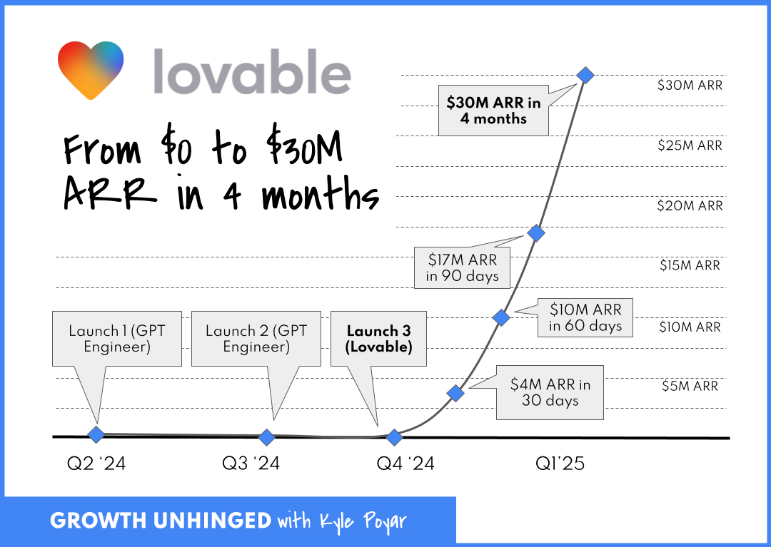
The Viral Coefficient Driving It All
During Lovable's early hypergrowth from over 20,000 users in late January 2025 to over 500,000 in February, they achieved ~25x user expansion in about a month, implying a peak weekly viral coefficient K ≈ 1.24.
When your viral coefficient is that high, channel selection becomes irrelevant. Post on Product Hunt? Viral. Tweet about it? Viral. Show up at an event? The crowd goes wild.
It's not that Lovable mastered these 12 channels in order to grow. It's that their product is so shareable, user-friendly, visually stunning, and so "holy sh*t look what I made in minutes" that any exposure becomes a growth loop.
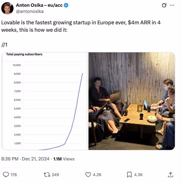
Mo’ Money. No Problems.
And if you're still tempted to mimic their strategy, gut check whether you have as much cash on-hand to fuel your growth.
Unlike most startups, Lovable never had to worry about scraping together cash, due to a sizable $7.5M pre-seed followed by an explosion of early revenue traction. Lovable launched on November 21st 2024. By February 2025 (3 months after launch), they had:
- Acquired 30,000 paying customers
- Hit $17M ARR
- Raised a $15M pre-Series A
- Spent $2M to get there (mentioned in an X post from the CEO, Anton Osika)
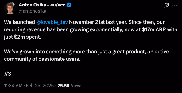
While Osika doesn’t mention exactly how they spent the $2M, even if only 20% of that $2M went to marketing, that's still $133,000/mo in marketing spend out of the gate. Most startups are trying to stretch out $10k over three months of Meta ads. 🥲
When you have that kind of capital, you can afford to have a presence everywhere at once. You can hire Discord community managers, video content editors, SEO writers, and still have budget left for paid ads.
Why Your Bicycle Can't Handle a Jet Engine
Lovable rides a jet engine fueled by three things:
- Insane product-market fit that creates outputs people compulsively share
- Early revenue and venture funding that enables simultaneous channel execution
- Perfect timing in the AI gold rush where "I built this with AI" still grabs eyeballs
There’s a good chance your startup doesn’t have all of these to the degree Lovable does. Which means copying their channel playbook isn’t particularly useful.
The Actual Takeaways Here
Strip away the hype and oversimplification, and here's what matters:
- Build virality into your product: To the extent your product/service supports it, ask yourself, "Is my product something people actually want to show others? Can we build in network effect dynamics?"
- Be realistic about resources: If you can’t spend $100K+/month on growth, you probably can’t fund a breakneck 12-channel growth strategy.
- Recognize survivorship bias: Remember, for every Lovable, there are 1,000 startups that tried to "be everywhere" and burned out.
- Learn from Lovables individual channel strategies: None of this is meant to knock Lovable. They are clearly very talented marketers and you can still learn from them. Building in public on X might be a great strategy for you.
The Channel Focus Reality Check
In the incredibly likely event your product doesn't have Lovable's inherent virality, here's your channel playbook:
- Test 3-5 channels with small budgets ($3-5K each)
- Identify the one with the best unit economics
- Scale that channel until you hit diminishing returns
- Only then consider adding channel #2
It’s not as sexy, but a steady, sustainable, scalable growth engine is how the majority of successful startups actually grow (it's also the key focus of the Demand Curve Growth Program).
Bottom Line: Product Over Everything
Lovable's story is seductive (and potentially dangerous) because it suggests you can brute force your way to product-market fit. “Just be everywhere all the time! Master ALL the channels! Growth will surely follow!”
That's bass-ackwards. Lovable earned the right to be everywhere, because their product was everywhere-worthy. They mastered all channels because every channel bowed down to it.
Your job isn't to copy Lovable's channel tactics. It's to build something users love and share as much as Lovable. Until then, a focused channel strategy likely beats cosplaying as a hypergrowth startup.
Gil Templeton
Demand Curve Staff Writer
Kevin DePopas
Demand Curve Chief Growth Officer
The Worst Rebrands of All Time
Insight from Gil Templeton — Staff Writer
Quiznos (2004): The Scary Sub Spongmonkeys

The Situation: Quiznos was getting their lunch eaten by Subway, which had a huge marketing budget and was building momentum through brand recognition, value messaging, and healthy offerings (yes, the Jared Fogle ads). Quiznos needed a breakout campaign to make them relevant and top-of-mind, especially with the younger crowd.
The Goal: Stand out in a crowded fast food market by being weird and irreverent, targeting younger, internet-savvy customers in the early viral video era.
The Rebrand: Quiznos launched the infamous national ad campaign featuring the “Spongmonkeys,” aka the bizarre, rodents with floating heads and screeching voices.
The Reception: The ads were plenty memorable, but deeply off-putting. The original Spongmonkeys were born from a viral Flash animation video, but their jump to mainstream TV was jarring for most Americans. Many were grossed out and/or creeped out, but most importantly, the campaign didn’t communicate anything meaningful.
Despite high ad spend, Quiznos lost market share and momentum as Subway doubled down on clear messaging around value and freshness. They emerged from Chapter 11 bankruptcy restructuring in 2014. Today, there are fewer than 200 Quiznos locations, compared to about 4,700 at their peak. Compare that to Subway’s 37,000 global locations. Of course, you can’t pin it all on one bad brand move, but the campaign might’ve taken Quiznos from “toasty” to “toast.”
The Takeaway: It’s okay to be weird, as long as you have a good reason for it. Being memorable doesn’t matter if people don’t remember what you’re selling (or when your food becomes associated with something kinda repulsive). Wackiness and silliness can’t carry your positioning if your core value prop isn’t clear.
Jaguar (2024): The Eclectic Electric U-Turn
The Situation: Jaguar had seen seven straight years of declining sales and was lagging behind luxury competitors in the EV arms race. With growing regulatory pressure on gas-guzzlers in Europe and a change in preference toward tech-forward EVs, Jaguar desperately hit the hardest of resets.
The Goal: Boldly recast Jaguar as a premium EV player and reposition the brand against Tesla and Porsche instead of leaning on heritage.
The Rebrand: A shocking repositioning of Jaguar into a minimalist EV-only brand with all-new type and colors, flattened logos, and a nebulous high-art ad that went viral for the wrong reasons.
The Reception: Like a bad car wreck, this gave people major whiplash. Fans (and pretty much everyone else on the planet) reacted viscerally, noting how the classic allure of the heritage brand was completely gone. People were confused by the vague “Copy Nothing” slam-poetry and enraged that the ad didn’t even show a car.
While sales had been declining for years, only 49 Jaguars were purchased across Europe in April 2025 (yes, 49 cars across continental Europe). Compare that to 1,961 cars in April 2024, and that’s a 97.5% drop in YOY sales. Mind-boggling for a storied hundred-year-old company.
The Takeaway: Jaguar absolutely needed to make a bold change. But instead of ushering the brand into the EV age, they came across as confusing, vacant, and weird for weird’s sake. They’d likely be better off if they made a more focused shift that combined their glorious heritage with today’s EV tech (and still offered a fuel-burner or two as a safety net for now).
Tropicana (2009): Grasping at Straws
The Situation: Minimalism and clean design were becoming the dominant aesthetic in CPG, as brands like Honest Tea and Naked Juice gained market share. Classic orange juice was facing hipper, healthier competition, and the legacy brand felt like they needed to make a shift.
The Goal: Tropicana wanted to modernize its image to signal purity and healthiness, appealing to a younger group of health-conscious shoppers.
The Rebrand: A total packaging overhaul that replaced the iconic orange-with-a-straw for a minimalist glass of juice and sterile sans-serif type.
The Reception: Customers couldn’t find it. The new look removed about every distinctive brand asset that made Tropicana recognizable and iconic. Within 60 days, sales had dropped by 20% (a loss of over $30 million). Needless to say, the old packaging made a quick comeback.
Tropicana sales saw a sharp rebound after reverting to the previous look, but it still didn’t reach previous highs. It’s likely that sixty days was enough time for consumer habits to shift permanently, and the reversion could have also signaled a somewhat-stale step backward, when Tropicana had a chance to evolve more intentionally from the failed effort.
The Takeaway: Sometimes recognition is better than reinvention. Mega-distinctive assets (like the red and white spiral straw in the orange) are strong visual cues for consumers to quickly identify at-shelf. So sometimes it’s best to gently update them, not ditch them altogether. When a premium, legacy brand looks more like the everyday store brand, consumers will either have trouble finding it, or they’ll default to the cheaper option and move on.
HBO Max → Max (2023): Rewinding Brand Equity
The Situation: Warner Bros. and Discovery had just merged, and they wanted to consolidate media assets under one roof to compete with Netflix and Disney+. There was internal pressure to streamline the brand and create a name that could stand for more than prestige TV.
The Goal: Create a platform that housed all content under one neutral umbrella. “Max” was supposed to be simple and expansive, allowing it to flex to select, new Discovery offerings.
The Rebrand: HBO Max (originally HBO GO) rebranded to “Max,” as part of the consolidation strategy.
The Reception: The name lost the strongest asset HBO had: its name. “HBO” stood for premium TV, while “Max” sounded like a budget broadband provider. Because of consumer confusion, the app tanked in App Store rankings, and HBO’s reputation got watered down by association with reality TV and clutter.
The Takeaway: Play to your strengths. If one part of your brand holds more equity than the rest of your offerings combined, build on that. HBO was the standard-bearer in award-winning, premium entertainment for decades, and they should have put their valuable name on a pedestal. After the confusion, HBO wised up and reverted back to HBO Max after several iterations of Max. A “full-circle” moment for the ages.
JCPenney (2011): The Anti-Sale Strategy
The Situation: JCPenney was struggling for relevance after the recession. Big-box and specialty retailers like Target, Kohl’s, and fast fashion brands were stealing market share, and JCPenny’s coupon-driven model suddenly felt outdated. Fresh off his success as the retail chief at Apple, the board brought in Ron Johnson as the new CEO to lead the reinvention.
The Goal: Reposition JCPenney as a modern, stylish department store that didn’t rely on gimmicky sales. The idea was to attract younger, higher-income shoppers and compete with trendy retailers.
The Rebrand: Ron Johnson led a full-scale rebrand from the top down. In addition to overhauling the brand’s look (including a square in the logo to match the new “fair and square” pricing approach, get it?) he eliminated sales, coupons, and markdowns in favor of an everyday pricing model.
The Reception: It turns out the traditional JCPenney shopper was a deal-hunter who loved coupons and doorbuster sales more than pricing transparency. The rebrand was seen as unearned and untrue to their crowd’s sensibilities.
In one year, JCPenney lost over $4 billion in revenue as foot traffic plummeted. Johnson was fired in 2013, and the brand walked back most of the changes. But they still experienced a slow, decade-long slide until filing for bankruptcy in 2020. Where’s JCPenny today? It looks like they just offloaded about 20% of their locations to a PE firm.
The Takeaway: Don’t rebrand for the customer you wish you had. Rebrand for the one you’ve earned, and reap the halo-effect along the way. Drastically changing your business strategy without accurate insights is a gamble to say the least. A rebrand should evolve your positioning without erasing what people were actually showing up for.
So When Should You Rebrand?
If your business is in one of the situations below, it might be time to consider making one. If not, you should probably fight the urge for now.
- Your positioning has shifted: You’ve evolved beyond your original product or audience, and your current brand doesn’t accurately reflect what you do best.
- You’re being mistaken for someone else: If customers confuse you with a competitor or unrelated brand, you need to stand out more clearly.
- You’re targeting a new audience segment: A new prospective target may require a fresh voice, look, or story to resonate. But make sure it doesn’t turn your loyalists off, RE: JCPenney.
- You’ve outgrown your humble beginnings: Maybe you didn’t have the time or budget to invest in quality branding when you started your business. If you’ve received a new round of funding or can otherwise afford a needed brand update, a fresh coat of paint might be the professional sheen you need.
- You’re entering a new stage of growth: Important opportunities like expanding to new markets or launching a flagship product can be the right moment to level up.
Find Clarity, Then Use Creativity
I hope these cautionary tales haven’t scared you away from making an important brand update if you need to.
The takeaway here isn’t “Rebrands are dangerous.”
The takeaway is: Rebrands can be multipliers, but they need to be executed thoughtfully.
There’s a reason just about every company undergoes a rebrand or two throughout the years. Offerings, audiences, opportunities…they can all change, and a brand needs to make strategic updates in order to keep its footing and keep climbing.
Have any good stories or lessons from your company’s rebrand? Reply with a message, we’d love to hear about it.
Gil Templeton
Demand Curve Staff Writer
How AI is making your growth problems worse (and how to get back on track)
Insight from Kevin DePopas - Demand Curve Chief Growth Officer
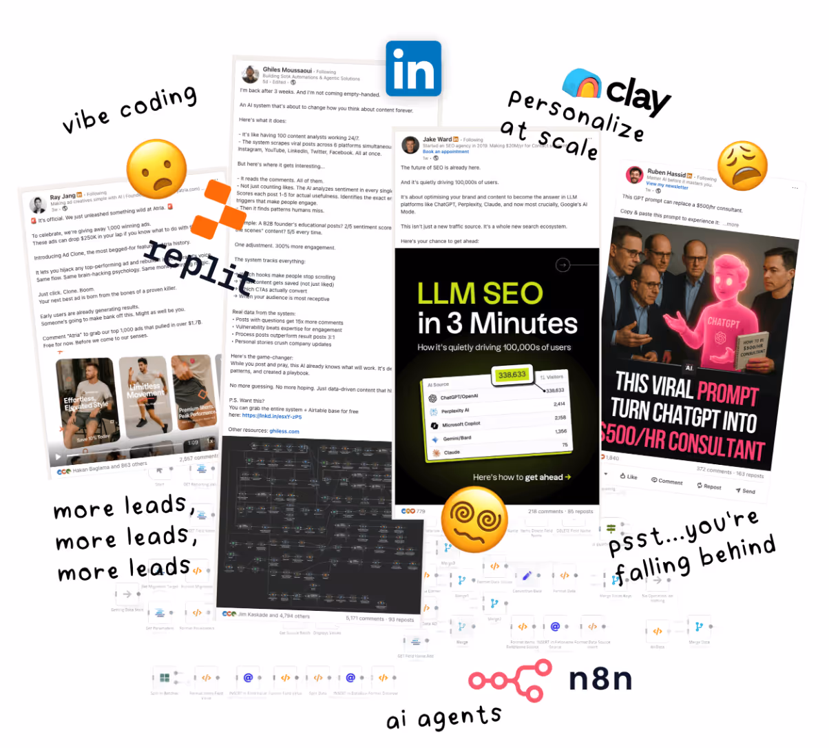
The AI Productivity Paradox
This week, I analyzed feedback from 800+ companies explaining why they joined our Growth Program. One founder wrote:
"All our growth has come magically and almost nothing we did seems to work."
Another said they were running:
"Organic, App Store Search Ads, Google Ads, Facebook Ads, Affiliate Marketing, YouTube, Snapchat..." but still struggling to scale.
This is the pattern I see everywhere now, amplified by AI tools.
Look, I've been there. When you're just starting a company, you inherently don't know what works. To find out, you need to test. And generally speaking, testing more gives you more chances to unlock a winner.
But there's a difference between systematic experimentation and spraying and praying at 10x speed.
Companies using AI to run 20 tests per month when they used to run 3 end up with a lot of shallow data but very few real deep learnings that inform how they can adapt their strategy and double down on what's working.
Not to mention, even if you can run 20 tests per month:
- Are you adequately budgeting those tests?
- Are you letting them run long enough?
- Are you documenting what you learned?
- Are you building on previous insights?
The answer is almost always no.
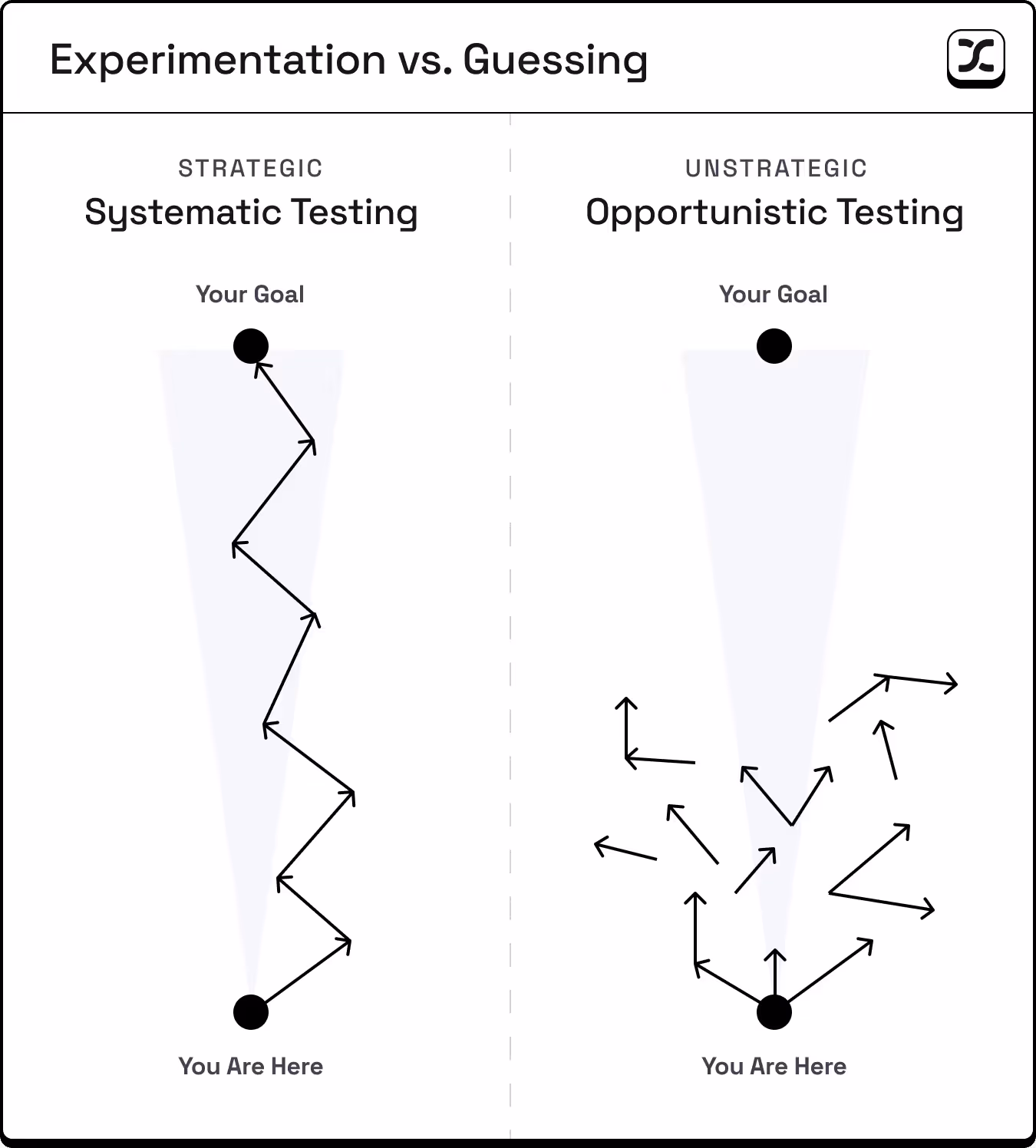
Your Foundation Is Your Multiplier
Think about it this way, if you just got your driver's license, getting a Ferrari won't make you a good driver. It'll just make you more dangerous on the road. And if you're heading in the wrong direction, you're going to end up 100 miles off course, when if you rode a bike, you'd only end up a mile off course.
How I think about it:
- Strong fundamentals × AI = Compound growth
- Weak fundamentals × AI = Compound confusion
Here's what strong fundamentals actually look like. Make sure to have these in place before amplifying your growth efforts with AI.
1. Know Your 5 Fits (Not Just Product-Market Fit)
After working with hundreds of startups at our agency and thousands of startups through our Growth Program, we've identified 5 critical fits. We wrote a whole newsletter about this in May, but it's worth revisiting.
- Market-Product Fit: Your product actually works. People are pulling it out of your hands. They use it and tell friends.
- Market-Model Fit: Your pricing aligns with how your market buys. (One company we worked with was trying to sell $50K enterprise contracts through self-serve.)
- Market-Brand Fit: Your brand resonates with your specific audience (e.g., Stripe's technical excellence appeals to developers).
- Market-Channel Fit: You're where your customers actually make purchasing decisions (e.g., B2B SaaS on LinkedIn, not TikTok).
- Model-Channel Fit: Your unit economics work in your chosen channels (e.g., $10/month products can't afford $100+ CACs).
Miss any of these, and AI will enable you to spin your wheels faster than ever, until you run out of cash.

2. Implement a Minimally Viable Experimentation Framework
One Growth Program student told us their biggest challenge was...
"Knowing what's working/not working...and consequently, knowing where to focus."
When you're running a startup, it seems so appealing to have all your tests cleanly organized and meticulously tracked.
But like wasting time on worthless AI-fueled tests, overbuilding your experimentation framework can pull valuable time from running the actual experiments.
I can't tell you how much time I've wasted in Notion, Clickup, Asana, etc...
Even a minimum level of organization helps. What matters is learning intentionally to inform your strategy.
This is the difference between testing loops and learning loops:
- Testing loops ask: "Which version won?"
- Learning loops ask: "What did this teach us about our customer?"
You don't need a complex system. Create a simple Google Doc with these questions:
Ideating tests:
- What metric are we trying to improve?
- What are all our hypotheses for improving it? (List them all, even wild ones)
- What evidence or customer insight supports each hypothesis?
Prioritizing tests:
- Which test has the highest conviction based on customer data?
- Do we have enough traffic/users for a meaningful result?
- What's the effort vs. potential impact?
Planning tests:
- What exactly are we changing?
- What does success look like? (Define win criteria upfront)
- What's our budget/time limit?
Learning from tests:
- What happened? (Just the facts)
- Why did it happen? (Your best explanation)
- What's our next test based on this learning?
Not that you need it, but I'm giving you permission to literally do this in a Google Doc. The best system is the one you'll actually use.
Three well-designed experiments that you track beat 20 random (un-tracked) tests, every time.
3. Max Out What Works
Most early-stage startups abandon their channels too early.
I worked with a DTC company spending $6,000/month on ads. They had barely scratched the surface of their serviceable addressable market.
Their CAC was $40, and their unit economics could support up to $80 CAC before they would be unprofitable on every sale.
As they pushed spend above $6,000, their CAC crept up to $50, then $60. They panicked and pulled back.
But here's what they missed. Even at $60 CAC, they were still profitable on each sale. The real questions they should have asked:
- What's our payback period at the higher CAC?
This is how long it takes to recoup your customer acquisition cost. If you spend $60 to acquire a customer, when do you get that $60 back? For subscription businesses, it might be 3-6 months. For this DTC company, it was immediate on first purchase.
- Can our cash position handle the float?
"Float" is the money you need upfront before customers pay you back. Even if you're profitable long-term, you need enough cash to cover acquisition costs while waiting for revenue. A startup with $50K can't float thousands in ad spend if payback takes months.
- Is our contribution margin still healthy?
This is what's left after subtracting all variable costs (product, shipping, transaction fees) from revenue. As long as this margin exceeds your CAC, you're adding profit with every sale.
For this company, all three answers were favorable. In other words, they were leaving cash on the table by pulling back ad spend.
Rising CAC isn't always bad. Only start testing new channels when your marginal CAC in the current channel exceeds what you could realistically achieve elsewhere.
Most startups never get there. They see CAC increase 20% and immediately jump to the next shiny channel, spreading themselves thin instead of maximizing what's already working.
Have you actually pushed your best channel to its limits? Or did you just get scared when the numbers changed?
The Bottom Line
Before you add another AI tool to your stack, test another channel, or pull the plug on an existing test, ask yourself:
- When's the last time you went through the 5 Fits framework with your co-founder or a trusted advisor?
- Do you have a simple, systematic way to document learnings from tests?
- Have you maxed out your best-performing channel?
Depending on your answers above, AI may actually be delaying your success.
Focus on your fundamentals first. Build real learning systems. Max out what's working.
Then, and only then, let AI amplify your efforts.
Kevin

Kevin DePopas
Chief Growth Officer
Identifying The “What” Trap
Insight from Gil Templeton - Staff Writer
This lesson focuses on lead marketing messages (your homepage, ad copy, pitch deck headlines, social content, etc.) Of course there are places where customers are seeking more technical or detailed info, but let’s focus on high-level copy today.
The “What” Trap shows up when your messaging answers questions such as:
- “What do we make?”
- “What industry are we disrupting?”
- “What features are we proud of?”
- “What’s our origin story?”
All fair questions internally. But externally, they produce messaging like:
- “We use clean, ethical ingredients.”
- “Scalable cloud infrastructure solutions”
- “Innovation is in our DNA.”
- “Meeting the highest industry standards.”
None of this is wrong per se, but it’s answering the wrong question. Because your customer isn’t asking “What do you do?” They’re asking “What’s in it for me?”
While this messaging might be technically accurate, it’s emotionally vacant.
Why Do So Many Make This Mistake?
Most founders and marketers don’t set out to write ineffective, self-centered copy. But when you’re so deep inside the business, it’s like trying to read your label from inside the jar. And it’s easy to default to what you know best: What you made. How you made it. Why it’s better.
That’s all valid stuff. But it’s not what gets strangers to stop scrolling or lean in.
You don’t win with more description or explanation. You win with more relevance.
The B.A.D. to B.E.S.T. Pivot
When messaging falls into The “What” Trap, it tends to be an ineffective mix of boastful, abstract, and dry. In other words, it’s just plain B.A.D.
In order to pivot to a more appealing message, we need to shift our point of view to create the B.E.S.T. message:
- Benefit-Led: Lead with what your customer gets, not what you made.
- Empathetic: Show how you understand their problem or aspiration.
- Story-Driven: Anchor the message in a moment or feeling they can relate to.
- Transformational: Focus on how their life can improve because of you.
As you can see, all of the B.E.S.T. lines on the right have flipped the focus to the customer. They use specificity, and they imply a transformation for the better.
For other useful exercises, check out the Copywriting Frameworks Cheatsheet featured in the Growth Program.

Tips for Making the Pivot
Speak to one person: You’re not shouting at a crowd through a megaphone, you’re showing one person what they stand to gain.
- Ex. “We provide 24/7 tech support.” → “You’ll never have to troubleshoot alone again.”
Speak like a real person: Use contractions, cut any fluff, and avoid incomplete sentences.
- Ex. “Innovating smarter workplace software solutions for you since 2005” → “You run the business. We’ll handle the boring stuff.”
Embrace directives/imperatives: The examples in the chart above use words like “feel,” “get,” and “wake up” to be actionable and paint a picture of what life could look like with the product or service.
- Ex. “A platform designed for fast-growing startups” → “Scale smarter. Sleep better.”
Start with your customer’s “after” state: Stop selling features and start selling transformation. What does your customer want to achieve or get rid of?
- Ex. “Designed with posture-correcting lumbar support” → “Work a twelve-hour day without a sore back.”
Give it the “So what?” test: Don’t expect a stranger to care unless it’s immediately clear what your product/service can do to improve their emotional state.
- Ex. “Delivered in 2–3 business days” → “Order today. Get it by the weekend.”
Putting It All Together: Three Unique Examples
Let's transform real messaging from B.A.D. to B.E.S.T. by working with three examples representing different businesses: a B2B software tool, a service marketplace, and a consumer product.
Example 1: B2B Software (Analytics Platform)
Step 1: Start with the bad example "Advanced AI-powered analytics with real-time dashboard capabilities"
Step 2: Identify the core benefit Marketers can finally understand which campaigns actually drive revenue.
Step 3: Try a version for each B.E.S.T. tenet
- Benefit: See which campaigns make money (not just clicks)
- Empathy: "I'm tired of explaining why our CTR is high but sales are flat"
- Story: Your CEO can finally stop questioning your ad spend
- Transformation: From guessing what works to knowing what pays
Step 4: Draft new lines from the above insights
- Stop guessing which ads actually make money.
- See your real ROI, minus all the WTF.
- Turn marketing data into a narrative your CEO actually understands.
- Go from ‘CTR is high’ to ‘Revenue is higher.’
Example 2: Service (Freelance Marketplace)
Step 1: Start with the bad example "Vetted network of 10,000+ professional freelancers"
Step 2: Identify the core benefit Hiring help doesn't have to eat up your whole week.
Step 3: Try a version for each B.E.S.T. tenet
- Benefit: Get help without the hiring time suck
- Empathy: "I need help NOW but don't have 3 weeks to find someone"
- Story: You posted at 9am and had three great options by lunch
- Transformation: From drowning in work to actually moving forward
Step 4: Draft new lines from the above insights
- Get unstuck without the 47-step hiring process.
- Find help faster than writing another job post.
- Post your project at breakfast. Review candidates by lunch.
- Leave the hiring circus behind for good.
Example 3: Consumer Product (Sleep App)
Step 1: Start with the bad example "Science-based sleep optimization technology"
Step 2: Identify the core benefit Selling the feeling of waking up well-rested.
Step 3: Try a version for each B.E.S.T. tenet
- Benefit: Wake up feeling like a functional human
- Empathy: "I'm so tired of being tired all the time"
- Story: You didn't need three alarms for the first time in weeks
- Transformation: From zombie mode to morning person
Step 4: Draft new lines from the above insights
- Wake up feeling human, not hungover.
- Sleep through the night without the 3am spiral.
- Stop pretending coffee is a personality trait.
- How to become an annoyingly cheerful morning person
Now it’s time to try this exercise for your business. Start with any lead marketing messages that don’t clearly answer “What’s in it for me?” for your customers, and walk through the steps above. After you’ve got a worthy replacement line, go live and test it to see how it improves your key metrics.
Keep Your Eye on the Ball
Now more than ever, it’s hard to stay focused. With so many channels to manage, AI outputs to choose from, content to create, and thought leaders zinging hot takes, it’s easy to lose the plot when it comes to creating consistent, compelling messaging.
But messaging clarity is still one of the biggest levers you can pull, especially if you can zoom out far enough to see your business through the eyes of your target audience.
If you run your copy through the “What’s in it for me?” lens, and resist the urge to simply describe what you do, you’ll be ahead of most competitors stuck in “me” mode.
The more you get into this habit, the more you’ll turn marketing goop into messaging that works hard.
Gil Templeton
Demand Curve Staff Writer
How to Name Anything, A Blueprint
Insight from Gil Templeton - Staff Writer
Step 1: Warm Up With Name Archetypes
To begin your naming project, let’s start by establishing some common categories of names. You’ll naturally gravitate toward some buckets over others, but keep your ideation broad at first. Buckets you don't initially gravitate towards might end up leading you somewhere.
- Descriptive: These names tell you exactly what the company does. Clear, literal, and SEO-friendly, but not too unique or aspirational. Ex. General Motors, The Weather Channel
- Abstract: Made-up words that have virtually no meaning or connotation, but can come to mean something over time. Often catchy and distinct. Ex. Xerox, Hulu, Dasani
- Evocative: Names that hint at a larger story, emotion, or cultural idea, inviting interpretation and storytelling. Ex. Robinhood, Patagonia
- Functional-Fresh: Names that reference what the product does, with a playful or metaphorical twist. Fun and somewhat intuitive. Ex. Swiffer, Pinterest
- Founder’s Name: Using the founder’s name or a variation to signal legacy, craft, or prestige. Common for food & bev, DTC, and fashion. Ex. Ben & Jerry’s, Chanel
- Compound: Portmanteaus formed by two words smashed together to create something new and memorable, great at signaling multiple ideas. Ex. Facebook, YouTube
Keep in mind, this list of categories isn't exhaustive, and there’s certainly no right or wrong place to begin. This is just a good way to ground ourselves and get the ideas flowing.
Exercise: Look at 8–10 brands you love, and see if you can put each of their names into one of the categories above. Some might fit into a couple categories, and some might fall into less common categories not listed here.
Step 2: Play the Numbers Game
Like most creative exercises, naming is a numbers game, where a higher quantity naturally leads to higher quality. Remember, Da Vinci had hundreds of projects that were unsuccessful, and only a couple that endured.
For example, a famed study (retold in Art & Fear) split a pottery class into two groups: one graded solely on sheer quantity of their pottery output, the other on creating a single perfect pot. Each time, the quantity group “accidentally” produced the best pots, simply by throwing more clay and learning from each attempt.
In this spirit, try to riff with a partner or two in this early phase. Create a fun and open space where there are no bad ideas (even though 95+% of them will certainly be bad ideas). Like improv comedy, it’s all about “Yes, and…” at this stage.
Write down anything that comes to mind and don’t linger. Keep going. And going. And going.
And if you don’t have a partner, keep your keyboard clicking, your pen moving (or your voice dictating into AI). Inertia is your friend. You should be aiming for a couple hundred names.
Exercise: Generate 50+ names for each archetype category, for a total of 300-500 names. Store these in a Google Sheet to review later. This process can go faster than you think, especially with AI.
Routes and Resources to Riff With
While you’re in the “quantity” phase, here are some tools or prompts that can help you iterate.
- Embrace Latin roots: Dig into relevant root words (e.g. port, aqua, vis, dict) then combine or augment them in different ways. These can be somewhat of a cheat code, clueing people in on what your product might do or solve (even if it’s a 100% made up word).
- Translate key words in other languages: Sometimes hearing a boring English word in another language can add some flair or help you unlock a new word altogether.
- Use word finder tools: I always have a Litscape tab open during a naming project. The “words containing sequence” tool helps you find all words that contain your chosen sequence of letters.
- Common idioms and sayings: Let’s say you’re naming a home improvement business. Look up any and all idioms having to do with houses, and you might find part of a phrase or saying that brings it all home.
- Portmanteaus via AI: ChatGPT is pretty good at understanding the assignment when it comes to two-part word mashups. Keep your prompt simple, instructing it to combine two relevant themes or motifs into non-existent words that retain typical phonetic structures.
- Tap into the senses: Think about what your product or service looks, feels, sounds, or even tastes like, then brainstorm around those qualities. Sensory words often carry implicit emotion, which helps your name do more with less.
- Map out your metaphors: Build a mind map of symbolic themes associated with your brand (e.g. growth = gardens, rocket ships, compounding interest). These detours can lead to surprising but resonant name ideas.
Step 3: Thin the Word Herd
Once you’ve spent enough time amassing a huge batch of names in your Google Sheet (hopefully a couple hundred), it’s time to trim the list down to the cream of the crop.
First, go back through your master list and highlight the names that feel like they have the most potential.
Maybe there were a couple you fell in love with when you wrote them down, or maybe fresh eyes give you a newfound appreciation for names that didn’t trip your trigger initially.
There’s no hard and fast rule here — or anywhere in this meandering process for that matter — but I’d aim for a batch of your best 30+ names at this point.
Exercise: Narrow down to your top 30 or so names. Look for ones that: (1) made you smile when you wrote them, (2) feel fresh with new eyes, (3) could work across multiple products, (4) you'd feel proud to tell your mom about.
Step 4: The Heartbreaker, Check Availability
Up until now, we’ve been living in a naming fantasy land, but it’s time to face reality. Get ready to say goodbye to the majority of the selected names you’ve fallen in love with, because most of them will be unavailable for you to use IRL (in real life). Here’s how you can check for viability.
- Give it a Google: The quickest way to see if a brand with a name like yours exists (especially within your category) is to Google it. If there’s a brand with the same name in an unrelated industry, you’re usually safe, as long as it wouldn’t be confusing to a consumer. This is why Delta Airlines and Delta Faucets can coexist peacefully.
- Do a trademark search: Ah, good ol’ government websites. Use the US Patent & Trademark Office TESS tool to check whether your name is trademarked by someone else already. You can often see who owns the trademark in case you wanted to do further research or reach out directly.
- Check for URL availability: I use GoDaddy.com to see if my name’s “.com” version is available, and if not, I see which other options might fit the bill. The closer you can get to “brandname.com” the better, usually. This is more of a consideration than a black-and-white decision — but if an established company is already using your name, owns the best URL, and has a high SEO ranking for your name, is that an uphill battle worth fighting?
If the .com URL is already taken for a name you love, try these prefixes: get-, hey-, try-, use-. Or try -app, -co, -hq as suffixes. The D2C healthcare brand Hims launched in 2017 under the domain Forhims.com before they could acquire the cleaner Hims.com domain in 2020.
- Salvaging favorites: You might have already listed some existing names with funky or off-kilter spelling (e.g. Lyft or Tumblr), but now can be a time to push words into more unique territory to make them distinct from competitors or established brands in other industries, especially if there may be some confusion.
- Try dropping a letter (“Quick” becomes “Quik”)
- Try swapping letters with similar sounds (“Light” becomes “Lyte”)
- Try adding extra letters (“Drop” becomes “Dropp”)
Misspellings may have worked for Flickr in 2004, but proceed with caution. Every dropped vowel or swapped consonant adds friction, at least at first. People will generally type the 'correct' spelling first, potentially sending traffic to competitors. Only do this if your name is worth the education tax (and the obligatory investor eyeroll).
- Check Your Domain's History: Even if a domain is available, that doesn’t guarantee a clean history. A close friend of mine picked what seemed like the perfect URL with his his ideal ".com" address for a cheap price. Months later, he learned his emails were going to spam folders because the domain was an adult site years prior. It was still blacklisted, and he had to rebrand the whole company. Sigh.
While it's great to sound relevant and current, leaning into the major trends can sometimes leave you lost in the noise. Take a look below at the exponential boom of names ending in "-ify" and how they start to blend together after a while.
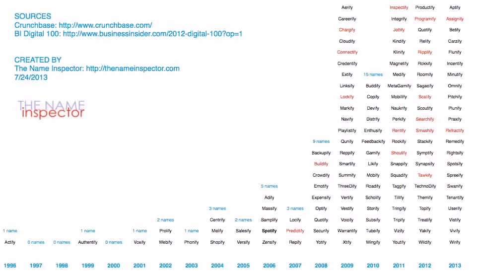
Step 5: End With the Gut-Checklist
After checking the availability of 30ish favorite names, you’ll likely end up with 5ish viable options that are legally safe and pass your initial vibe test.
If there’s a clear, legally viable winner in the group, great. Test that option against the following criteria below. If you have a couple contenders you feel good about, do the same to see if one rises above the rest.
If you need a sounding board or another set of eyes, ask a trusted partner or an expert in the space to test the name against the following questions. However, be cautious about opening this up to a group. It can be hard to achieve consensus or useful feedback through a larger audience.
Your Gut-Checklist:
- Can someone pronounce it correctly after reading it once?
- Can someone spell it correctly after hearing it once?
- Is it easy to remember?
- Does it feel like the future of your brand?
- Could it stretch to your future products or offerings?
- Would you be proud to wear it on a shirt?
The Bottom Line
Once you have the name that passes the test, sleep on it, say it out loud, imagine it in a headline or on packaging. A great brand name should make a strong first impression and leave a lasting one, too. So if yours can make customers smile, spark curiosity, or solve a problem for your business, don’t overthink it too hard.
Sleep on it, and if it still holds up tomorrow, congratulations. You might have just found a name that opens doors for your brand.
Gil Templeton
Demand Curve Staff Writer
Doubling Our Sponsorship Revenue in 30 Days
Insight from Kevin DePopas - our Chief Growth Officer
Over the years, our newsletter sponsorship business has essentially run itself. Inbound inquiries flow through our website, occasional leads come from marketplace aggregators like Passionfroot and Paved, and revenue remains stable without much intervention.
With our heads down relaunching Growth Program 2.0, sponsorship revenue hadn't gotten much love from a growth standpoint.
During the second week of June, Justin (our CEO) and I mapped out Q3 priorities. We decided it was time for a quick 80/20 sprint to improve newsletter revenue and operations.
The goal: Double sponsorship revenue in 30 days (doing as little work as possible).
The challenge: We had contacts scattered across email threads, a basic Notion database acting as our "CRM," Sponsy (where we host our newsletter storefront), and no systematic approach to nurturing leads.
Here’s how we began to tackle the opportunity.
Understanding Our Options, Shrinking the Problem
I needed to understand what we were working with, so I mapped out the top ways to grow newsletter revenue:
After some thinking, we agreed that our fastest path to near-term revenue (without incurring too much operational overhead) was reconnecting with people who already know us…
- Previous Sponsors
- Warm Inquiries
The two categories comprised hundreds of potential deals just waiting for follow-up. Now that we had our priorities, we moved on to the next challenge, getting organized.
Getting Organized, Finding the Right Infrastructure
Before reaching out to these two buckets of prospects, I needed somewhere to house the data and manage the process.
After researching options, I landed on Attio. They'd sponsored our newsletter months back, and their AI-native CRM positioning and Notion-esque UI/UX intrigued me.
I reached out to see if they'd be comfortable with me documenting my experience using their tool.
They agreed and are sponsoring this issue, but everything you're about to read is my genuine experience using their tool. Attio has since become our main CRM.
The Implementation, Multiple Tools, One Workflow
Here's the workflow I built. It involves several tools working together, with Attio as the central hub.
Step 1: Data Extraction & Import
First, I pulled two lists:
- Previous sponsors from Sponsy (our sponsorship management tool).
- Inbound inquiries from Tally forms that pipe into Notion.
I uploaded these as CSVs into Attio, creating a unified deals “list”. While the CSVs only contained basic company info fields (company name, domain, and main contact email), Attio automatically enriched all the other data I needed (company descriptions, revenue estimates, employee counts, LinkedIn profile URLs, previous email conversations, etc.).
Step 2: Intelligent Filtering with AI Fields
Next, I didn't want to waste time nurturing prospects if they weren't a good fit to sponsor our newsletter. I decided all previous sponsors were worth reaching out to, but I needed to filter the larger list of inbound inquiries that never converted.
Attio lets you create “AI Attribute” fields that analyze structured and unstructured data using LLMs. I figured I could use a Research Agent attribute field to help me analyze and categorize inbound prospects based on fit.
So I created a "Sponsor Fit" field that evaluates each company based on two criteria:
- Whether they target startups/marketers
- Whether they have budget to support sponsorships
This cut my outreach list by 60%, focusing only on high-probability opportunities.
Note for builders: I was considering using a tool like Clay for filtering and data enrichment, but Attio handles similar enrichments internally without buying another tool or learning a new system. If Attio doesn't have an enrichment capability you need, you can fire workflows that integrate with Clay, n8n, or other tools. Simple enough for lightweight systems, but can scale if needed.
Step 3: Research for Personalization
Now that I had organized lists of previous sponsors and good-fit potential sponsors, it was time to plan the campaigns.
Data shows personalized emails can 2X+ response rates, so I wanted to tastefully incorporate personalization that proved we understand each company's product and how it relates to the Demand Curve audience.
To do this, I built another AI Research Agent Attribute field in Attio that:
- Visits each company's website
- Extracts their main product offering
- Summarizes key value props
- Formats it for email personalization
We’ll use this field later in our personalized email outreach, stick with me!

Step 4: Building Smart Campaigns
Time to put it all together. I built two campaigns in Attio:
- Campaign A (Previous Sponsors): Companies that have already sponsored our newsletter one or multiple times.
- Campaign B (Warm Inquiries): People who filled out our inbound form but didn't move forward AND met our “sponsor fit” threshold.
Step 5: Creating the Email Copy
Rather than crafting campaign copy from scratch, I wanted our emails to reflect how we actually talk about Demand Curve sponsorships.
I used ChatGPT o3 to build a scraper (via Google Apps Script) that pulled all my sales-related email conversations from the past two weeks into a Google Sheet. This captured how I handle objections, explain service offerings, answer questions, all the nuances of real conversations.
Vibe Coding Shoutout: I’m not a developer, so I had to vibe code this whole scraper. It took about 20 minutes.

I then exported the CSV of my sponsor sales conversations and fed it into a Claude 4.0 Opus Project, asking it to create simple 3-4 touch campaigns for each audience.
Pro tip: To improve your cold email quality, create a Claude Project and load it with training data from cold email experts. I loaded all of Lavender AI's cold emailing blog content into my project before feeding it my sales conversations.
Step 6: Personalizing with AI Content
Research from Lavender AI shows that including a personalized "P.S." at the end of emails can increase reply rates by 35%.
So I used Attio's AI Variable functionality within my email sequence to reference the “Product/Value Prop” field I created earlier, and use it to create personalized P.S. lines for each prospect:
"P.S. I think {Company Name}’s {AI Field: Product/Value Prop} would resonate with our audience."
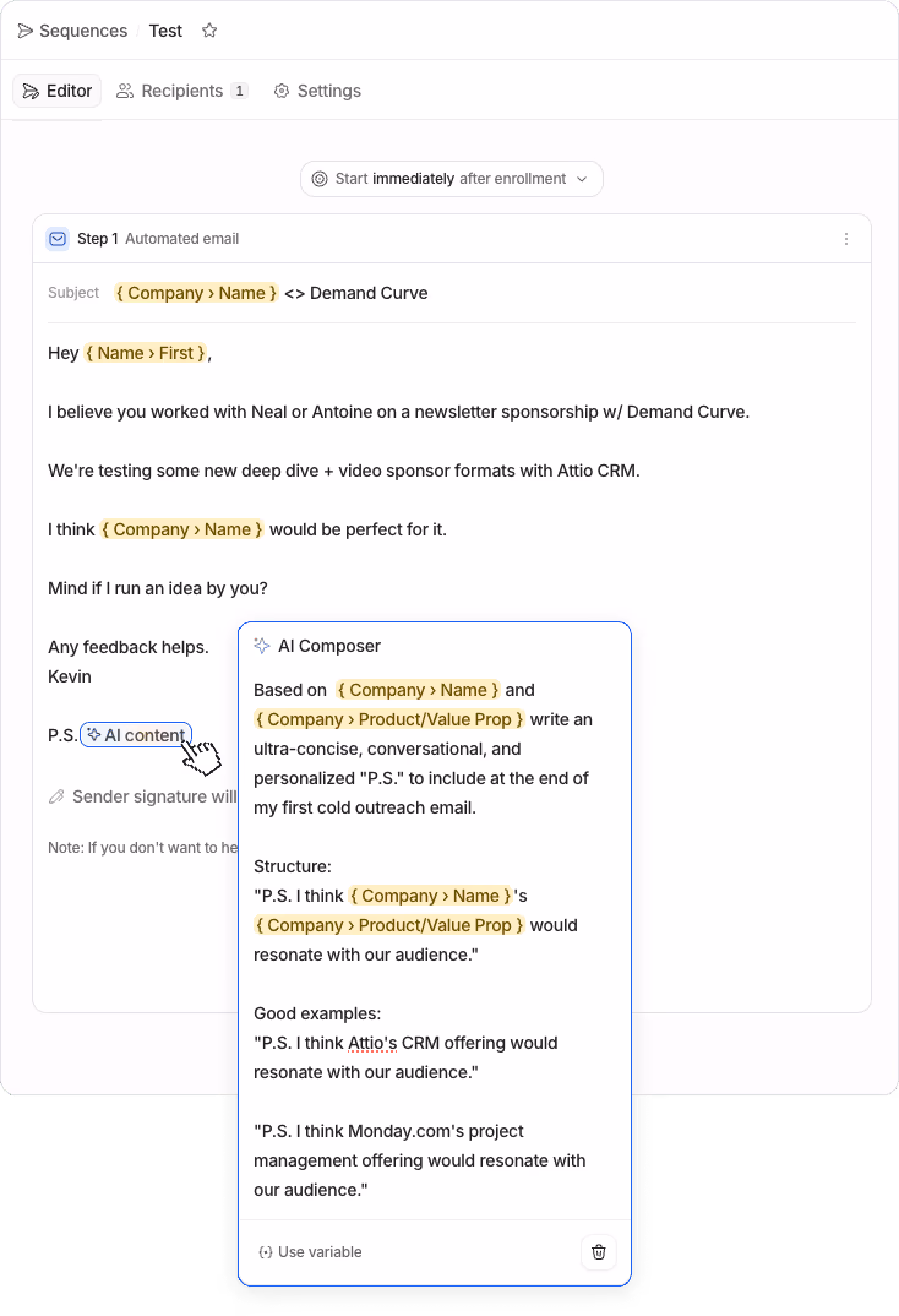
Notice how I'm able to reference the AI Research Agent field I created earlier (Product/Value Prop) as a prompt input within Attio's AI email variable.
Results So Far
I ran the campaigns for 14 days and have continued any active sales conversations since. Here are the preliminary results (as of 7/15):
- 32% campaign reply rate (industry average is 8-10%)
- 24 active deals initiated from initial campaigns
- 4 package deals closed so far
- 9 deals active (still in conversation)
Want to join the mix for Q3/Q4 sponsorships? Email me. 😉
What's working well:
- AI enrichment saved hours of manual research.
- The AI variable within email templates (and it's ability to reference other AI fields as prompt inputs) is a powerful feature I haven’t seen in many other email tools.
- Everything lives in one place, Attio acts as my hub, consolidates sheets and Notion into a single source of truth.
- Attio’s Call Intelligence meeting assistant joins my calls and captures notes/follow-up items (I didn’t even realize this was a feature when I signed up, but I’m liking it).
- As an avid Notion user (and a sucker for good design), I appreciate the thoughtfulness of Attio's UI/UX.
Looking ahead: I'm excited to see how Attio continues developing agentic capabilities. Similar to how Attio removes the need for Clay for lightweight enrichment, with further development, it could eliminate the need for n8n for AI automation use cases.
I'd also love if Attio's AI fields allowed connecting custom LLMs for more flexibility in what models run on the backend, getting closer to Clay's customization options.
The Consolidation Potential
As I built the workflow above, it was hard to ignore that Attio could potentially replace multiple tools in our stack.
- CRM: If you're using Notion as a makeshift CRM (like we were), Attio can obviously replace that.
- Data Enrichment: If you're contemplating Clay for enrichment, I’d test out Attio first to save yourself another subscription.
- Meeting Recordings: Paying for meeting recording tools? Attio can likely replace these.
- Email Sequences: Attio's built-in email automation can potentially save you yet another SaaS subscription. (Attio also has a pretty seamless integration with Mixmax that I’m playing with).
We haven't consolidated everything yet, but the potential is there. And for smaller teams, this could mean significant simplification and cost savings.
If You're Thinking About Modernizing Your Sales Stack
Attio genuinely surprised me. The AI features aren't an afterthought, they're front and center throughout the application. The interface is clean enough that our team actually uses it. And the potential for tool consolidation is real.
If you're like I was (cobbling together spreadsheets, losing track of conversations, missing follow-ups) it's worth exploring.
Try Attio free for 14 days →
No credit card required.
How AI video impacts founders, growth marketers, and startup execs
Insight from Gil Templeton—Creative Director @ BrandBossHQ
High-production video is no longer just for giants with million-dollar media budgets. AI has collapsed the cost, time, and overall hassle of video creation, giving lean teams the power to punch way above their weight. What used to take a quarter can now happen over a weekend, and the results can be just as effective when done right.
- You can now iterate and test video ad creative (not just static) without waiting on agencies, shoots, or post-production delays.
- Brand storytelling is back on the table for teams who couldn’t previously afford the polish required to make it feel legit.
- It’s easier than ever to stand out in noisy channels like TikTok and YouTube with content that looks like it came from a studio, not an iPhone.
What does traditional video production (sans AI) look like?
Obviously video production can be done at any budget, from person-talking-to-iPhone all the way up to a feature film. But let’s look at what a brand might need for a somewhat-polished 30-second pre-roll video ad with human talent:
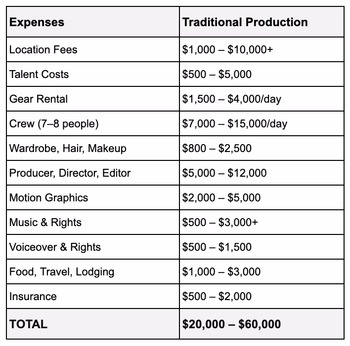
There’s a crazy amount of expense and effort that goes into this process — especially when results may vary. And while having a high-production brand video can perform well, it might not “outperform” assets produced on way scrappier budgets.
The new economics of AI video production
Case Study: How the Kalshi video was made

Let’s take a look at what went into making the Kalshi ad referenced earlier. Again, this aired during the 2025 NBA finals. Here’s a great quote from PJ Accetturo, the self-proclaimed “AI filmmaker” who was hired to make the ad:
“It was aired on TV, alongside $400K+ 2-month-long productions, and this took me 2 days, costing a lot less. But most importantly, I got to stay in my underwear for the entire shoot.”
In PJ’s blog post about making the ad, he casually reveals his process. Basically, he:
- Writes a rough script
- Uses Gemini to convert it into a shot list
- Runs the prompt through Google Veo 3 on Flow
- Selects the outputs that meet his standard/vision
- Then edits the sequence using a common video-editing software.
A couple days. About $2,000 in AI video credits. One talented dude working from home. Compare that to the headaches of typical video production, and the case becomes compelling quickly. In the same blog, Accetturo makes a prediction about where things might be headed:
“The future is small teams making viral, brand-adjacent content weekly, getting 80 to 90 percent of the results for way less.”
While the ad is chaotic and imperfect, it’s proof that companies can make broadcast ads (and lower-stakes videos) with AI tools instead of traditional production studios. This is a massive opportunity for emerging and challenger brands looking to steal attention from more established category players.
You can debate the quality of the ad (and point out that it clearly looks AI-generated), but you can’t debate the earned media coverage and economic efficiency of the spot. Just search “Kalshi Ad” on Google and you’ll see the splash of earned media attention the ad generated.
AI Video Showdown: Sora vs. Midjourney vs. Veo
Let’s break down three common video-generation platforms so you can understand which might be best for your style of video. Depending on your subject matter (ex. beautiful light-motion product shot vs. introducing a talking mascot) your choice of platform can make all the difference.
OpenAI Sora

Strengths: Sora excels at generating realistic, physics-aware scenes with cinematic lighting and fluid motion, all inside longer-form (up to 60 seconds) clips. Its deep integration with ChatGPT makes it perfect for prompt-driven storytelling.
Best for:
- Captivating product shots in vivid settings
- Mood pieces for lifestyle or mission-driven brands
- Explainers using metaphor-heavy visuals
- Preserving real details of a product throughout shots
- Creating environmental stills that you can later add motion to
Midjourney Video (V6.0+)
Strengths: Midjourney’s video output leans hyper-stylized, with dreamlike textures, bold motion, and painterly effects. It’s lightweight and faster than the rest, ideal for bold creative that doesn’t rely on realism.
Best for:
- Social-first, scroll-stopping visuals
- Brand identity loops for video intros, banners, and reels
- Abstract, dreamy, or hyperreal visuals
- Product mood reels (ex. luxury perfume ad in abstract fog)
Google Veo 3
Strengths: Veo 3 delivers polished, photorealistic footage with cinematic camera moves, sharp details, and high resolution, making it the most production-ready tool of the bunch. Best for realistic shots with people, and its frame-to-frame capability adds a useful layer of control.
Best for:
- Polished ad spots that mimic agency-level work
- B-roll libraries to elevate decks, ads, or site content
- Quick-cut trailers or brand intros
- Funny or absurd character-based scenes
Note: We know, there are other video generation platforms out there…Kling, Runway ML, Higgsfield, (and countless AI UGC tools). Each has their benefits and tradeoffs. Here’s a more comprehensive list.
Where do things go from here?
For brands and businesses looking to embrace AI-generated video, here are some informed predictions about the trends and changes we’ll see in the near future.
“Close enough” becomes enough
While AI video opens up tons of possibilities that aren’t feasible on traditional production budgets, it’s still hard to get it just right. For companies who can handle their product looking a little distorted at times or an unnatural gesture from a character, AI will scratch the video itch. For those seeking perfection or complete control, traditional production has the upper hand, for now.
Not a believer yet? Don’t forget how far video AI can progress in a single year.

Niche comedy social accounts
Whether it’s an Instagram account like @alexlexobx1 that leans into the shared experiences and inside jokes of a community like the NC Outer Banks, or a slew of political-leaning TikTok handles spoofing the other party’s apparent hypocrisy, absurd comedy is an easily repeatable, occasionally viral formula for AI video (and AI image) generation.

A numbers game
It’s becoming less about creating perfect pieces of art and more about creating as many assets as possible with the chance one or two in the batch will gain traction. Entrepreneurs and Vtubers like Bloo (who has 2.5M Youtube subscribers) are leveraging AI to create low-effort clips, sometimes up to 80 per day. While critics will call it classic “AI slop,” view counts and occasional virality are showing the potential of a volume-based video approach.
The bottom line
AI video still has its quirks, but you'd be wise to start testing because six months from now (let alone a year from now) your control over consistency and realism in AI video will likely be 10x what it is now.
The tools are ready. The gap between big budgets and bootstrapped teams just disappeared. So what are you waiting for?
Time to start shipping.
Gil Templeton
Creative Director @ BrandBossHQ
Demand Curve Guest Writer
P.S. Check out my portfolio if you're interested.
Algorithms Changed. A Lot of Creators Didn't.
Insight from Kevin DePopas—our Chief Growth Officer
Since TikTok exploded in 2020, every major platform has shifted from follower-based to interest-based algorithms. Instagram, YouTube Shorts, and even LinkedIn have all adopted similar mechanics for content distribution.
The algorithm shows your content to a small test group. If the test group engages (quantified via watch time, shares, saves, etc.), the algorithm keeps expanding reach. If not, reach slows, then stops.
This means your follower count matters much less than it used to. Your first post can literally reach millions of users if it captures attention.
Having a solid follower count can certainly help. It's why my favorite Youtube channel, Veritasium, seems to pull 5M+ views in 24 hours, every time. The algo knows their content is top-notch, so it pushes it hard.
Enter the "Generalist Principle"
I first heard of this concept from author, Brendan Kane, in his podcast interview with Chris Do on The Futur. Brendan and his team have built content strategies for everyone from Taylor Swift to small, hyper-niche craftspeople. After analyzing thousands of viral posts, he noticed something counterintuitive.
The most successful "niche" creators don't actually create niche content. They take their expertise and package it so anyone can understand and enjoy it, while still delivering value to their core audience.
Think of it like this. A tax accountant could post the same piece of content, framed two different ways:
- "New IRS Rule 462.B Affects S-Corp Distributions."
- "The IRS Just Changed A Single Rule That Could Save You $10,000."
Same topic, but one version has a chance of attracting viewers who would never follow a tax accountant.
Let's Look at the Numbers
Say you're a B2B SaaS consultant creating content about enterprise software implementation.
Niche approach:
The primary goal of your content is to educate people on the nuances of enterprise software implementation.
- Total addressable audience: 100,000 people
- Viral reach: 10% see your content
- Views: 10,000
- Viewers who are potential clients: 50%
- Potential clients reached: 5,000
Generalist approach:
The primary goal of your content is humor, entertainment, or novelty, while subtlety educating on enterprise software implementation.
- Total addressable audience: 1,000,000 people
- Viral reach: 10% see your content
- Views: 100,000
- Viewers who are potential clients: 10%
- Potential clients reached: 10,000
Despite an 80% drop in the proportion of viewers who are potential clients (50% → 10%) with general content, your potential customer base still doubles thanks to the broader audience.
Three Examples Worth Studying
In his free e-book, The Guide To Going Viral, Brendan uses the following examples to highlight the generalist principle.
Tanner Leatherstein makes handmade leather goods. Instead of turning his Instagram grid into a wall of undifferentiated product shots targeted at affluent buyers, he buys $500+ designer bags and tears them apart on camera.
His 'Is It Worth It?' series taps into a question a lot of people have wondered, are luxury goods worth the price? While dissecting each bag, he not only entertains the masses, he also builds trust with a large number of people who may consider buying a bag from him instead of Hermès.
Dr. Julie Smith is a clinical psychologist. Instead of posting academic lectures about cognitive behavioral therapy techniques that only fellow therapists would understand, she uses everyday objects to visualize complex mental health concepts.
In one video, she fills a trash can with crumpled papers to represent emotional overwhelm, then slowly removes and folds each paper to show what therapy feels like. Through this format, she entertains millions who will probably never book a session, while demonstrating her expertise to a select few who might.

Graham Stephan teaches personal finance. His biggest video (8.6M views) isn't titled "Understanding Compound Interest." It's "How I Bought a Tesla for $78/Month." Far more people are curious to know his trick vs. learning about a subject they already think they understand. The finance principles he teaches along the way feel like a bonus, not the main point of the video.
Our Own Mixed Results
I've been testing this myself on the Demand Curve LinkedIn. Most of our videos get between 1,000 and 5,000 views. Decent for B2B content (Right guys? We're doing great, right? 😅)
But one video hit 390,000 views. The topic? Celsius energy drinks.
The hook was simple:
"In 2017, Celsius was essentially nonexistent, but now they have 11% market share and they're worth $9B. So I found myself asking, how did they get so big so quickly?"
Here are some of the generalist principles that may have come into play on the Celsius video.
- Celsius is a brand regular people recognize and have opinions about.
- The visual showed Celsius cans immediately (first 2 seconds), confirming this was about something familiar.
- The question "how did they grow so quickly?" interests marketers, CPG founders, and Celsius fans alike, not just energy drink operators.
Compared to a hook like "How energy drink companies can grow through retail partnerships," the hook I chose had a shot at appealing to a much broader audience.
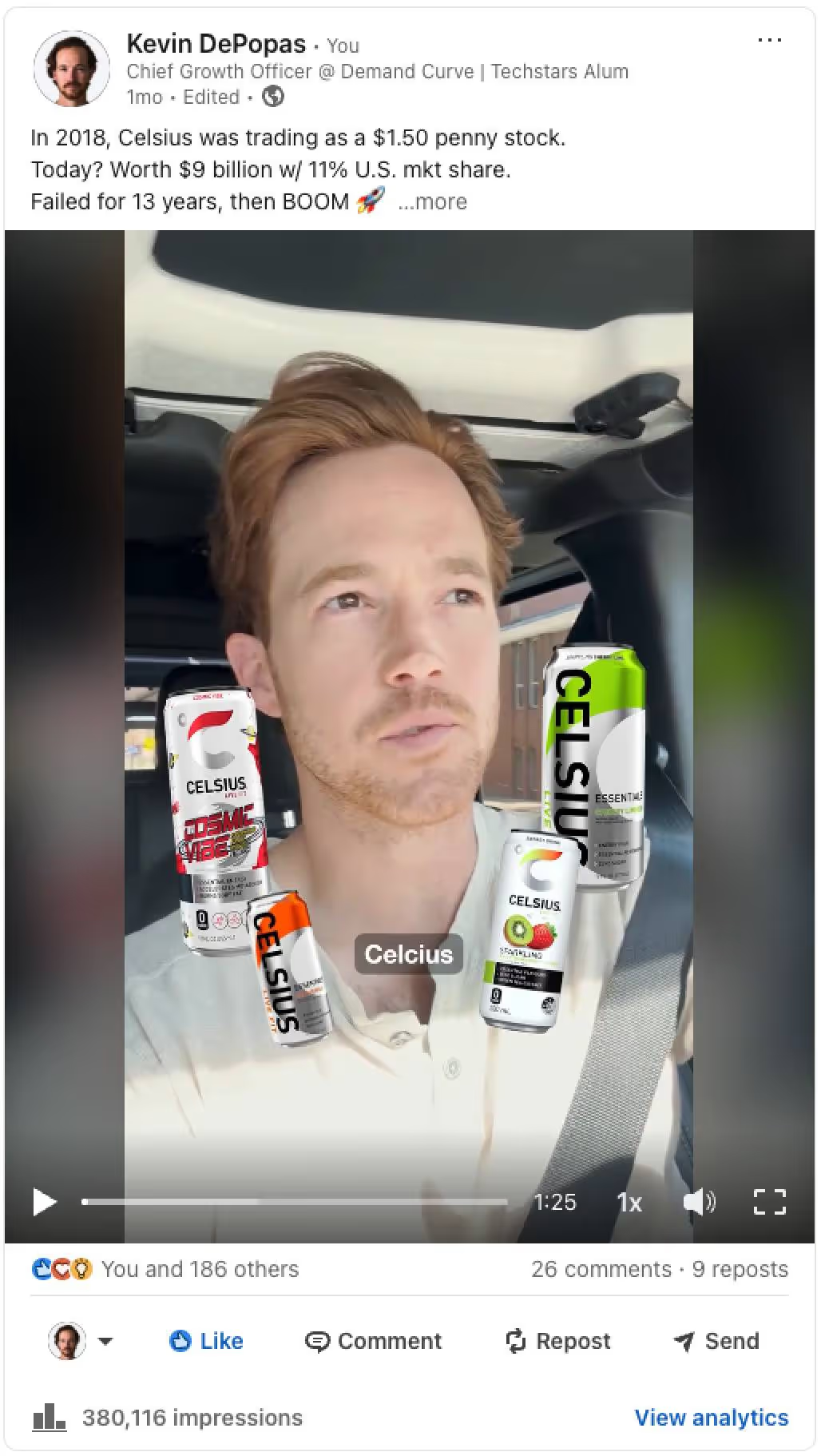
A Brute Force Approach
One brute force way to test the generalist principle is starting with a hook that has nothing to do with your business, then bridging to your actual topic.
This concept is similar to the idea of basing your content on "validated outlier" formats and hooks. We cover this topic in-depth in Growth Program 2.0. Hop on the waitlist here.
Here's an example. This creator's videos regularly saw 1,200 to 10,000 views until he posted the video below (which reached 1.3M views & 68k likes).
The video starts with a viral meme hook, then transitions to showing the creator's AI workflow for optimizing landing page messaging. Yes, this technique is a bit cheeky, but his account reached 45k followers within 10 weeks of launching. Can't knock the results.
Note: The brute force approach still needs to be executed thoughtfully. The video above worked because the viral meme humorously bridges into a much drier (but still intriguing and valuable) AI workflow. If the juxtaposition wasn't funny, or if the workflow wasn't valuable, the video probably would have flopped.
We'll Be The Guinea Pig
We're running our own experiment next Tuesday (July 8th), testing the generalist hook format from above. The formula:
- Start with a validated generalist viral hook (similar to the one above)
- Build a bridge to a curiosity-inducing workflow (that adds value)
- Demonstrate expertise on our actual topic throughout the video
I'll report back on whether it works or whether I look like an idiot for trying. Seriously though, check our LinkedIn on Tuesday to see this technique in a business context.
How to Use This Today
First, look at your last 10 posts. Count how many require insider knowledge to understand. If it's more than two, you're probably being too niche. Also, consistently low (and not improving) view counts are a red flag.
Second, take your next planned post and rewrite the first 1-3 lines a couple times (or a couple hundred using AI). Each version should pique the interest of someone outside your industry. Then pick the one that would even make your mom curious.
Third, remember that broader reach doesn't mean dumbing down your content. It means being smarter about how you package it.
The goal isn't to trick people into watching your content. We're simply trying to earn the attention of a wider audience, which allows us to deliver value to more of the people who matter to your business.
Have fun testing!
Kevin
P.S. The video we're testing on Tuesday opens with a sweaty, shirtless tech-bro surrounded by liquor bottles. Professional reputation on the line. Wish us luck.
Greatest Hits Series
Let's start with the math that changed how we think about growth.
Growth Loops, not Growth Hacks
Insight from Reforge.
Which would you choose:
- Initiative A: Gives you 500 new users this week but nothing afterward.
- Initiative B: Gives you 20 new users in week one, 22 in week two, etc (growing 10% WoW) for every week going forward.
Initiative B will take 14 weeks to reach 500 new users.
But after 1 year, you’ll have 28,208 new users and grow by ~2600 per week. By the end of year 2, you have 4,035,039 new users (assuming a constant 10% growth rate).
This is the general principle behind compounding Growth Loops:

In short, the output of a marketing initiative feeds back into the input. Examples:


Another classic example is ads:
- You spend money to run ads
- You profitably acquire new customers
- You use said profit to acquire more customers. If you need help running ads, we’ve built an ad agency specifically designed for startups.
In short, your primary marketing efforts should not be one-off tactics. Instead, they should be initiatives that can compound. Here are examples that do not compound:
- Launching on Product Hunt: You get an influx of users. You… can’t launch on Product Hunt again.
- Timed-limited Promos: You get a big influx of customers and revenue. You can’t just run another promo.
- Press coverage: You get featured in Forbes. You get a big spike in traffic. It disappears a couple of days later. You can’t be featured all the time.
Compound growth sounds great. But how do you know which loops to build? This is where strategy comes in.
Create a real strategy, not just a list of goals & tactics
Insight from Mark Pollard.
Most companies' "strategies" are either purely:
Goals:
- Become relevant with Gen Z
- Increase sales by 30%
Tactics:
- Post on LinkedIn 5 times per week
- Create lead magnets
Mark (aka Strategy Friend) defines a strategy as "an informed opinion about how to win."
Your strategy is supposed to tell you exactly what your team needs to do to grow. Yet, according to Mark, most strategies look like this:
_01HKDX748DHCD7G8QF6XKJXY59.avif)
They're missing the key insight to the real cause of the problem and a strategy to help solve the problem. Instead, they just jump straight into tactics with no clear vision.
"Tactics are simply the activities that make a strategy happen."
Here are two examples of what a good strategy looks like:
_01HKDX74P3K81JDEZEXSP0E3RS.avif)
_01HKDX752P9MGE96D7WGRGS07T.avif)
We've covered the power of compounding growth. We understand how strategy drives tactics. Now let's simplify growth to its essence.
This mental model will help you shrink the big wide world of growth opportunities into four logical buckets.
The 4 high-level ways to drive growth
Insight from a great article from MKT1.
Fundamentally, there are only four high-level ways to drive growth.
This image from MKT1 summarizes it perfectly:
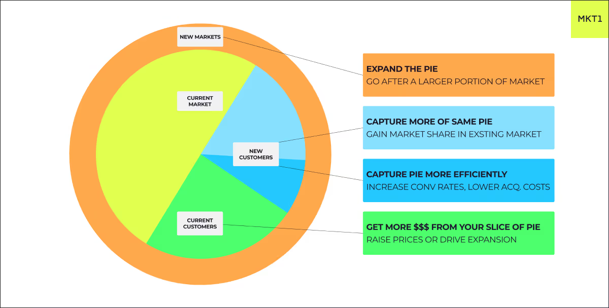
A startup can do a million things to grow (we’ve covered over 455 of them here), but given extremely limited resources, you should find the highest leverage place to apply pressure to grow now.
Understanding these four primary levers helps you prioritize. Let’s dive into each:
1. Get more $$$ from your current slice of pie
- Charge more money from existing customers (make sure to increase perceived value too).
- Sell more products to existing customers (upsell/cross-sell)
- For SaaS, increase revenue per customer by adding new features and tiers, increase the number of seats they use, or increase product usage.
- Reduce churn so revenue can grow over time. The SaaS Quick Ratio is a handy metric for determining whether your growth and churn are healthy.
2. Capture the same pie more efficiently
You’re always getting new customers, but you can do it better. You can generate more revenue with the same or less cost and effort.
There are really only two fundamental ways to do this:
- Increase conversion rates with better funnels (copy, landing pages, lead magnets, sales, etc).
- Lower acquisition costs with better creatives, targeting, lead quality, (and conversion rates ;0)
Note: Check our Growth Vault for 84+ tactics to increase conversions
3. Capture more of the same pie
You’re growing within the same market segment but can get MORE leads:
- Double down on what’s working, but always experiment with creative ideas.
- Watch out for diminishing returns (increasing acquisition costs), especially on ads, if you’ve been going after the same market for a while and keep increasing budgets. That’s especially true if it’s a niche market.
- If you’re steadily growing, don’t wait until you cap out before expanding the pie because it takes longer than you think.
- Set up a different growth engine (content or sales instead of ads)
Note: No matter how good you are, you will never get the whole pie, sorry!
4. Expand the pie (or test new pies entirely)
- Go after new markets/segments (industries, company sizes, geos, verticals).
- If you’re very early stage, this is just trying to find product-market fit.
- Depending on the new segment, you can either use the same growth engine (ads) or you need to set up another one (i.e., outbound or content).
- Create new content, messaging, and funnels tailored to the new “pie”.
- Always run small tests before going all in. Make sure to prioritize your tests using the RICE/DRICE frameworks.
- Double down if you have similar or higher conversion rates with this new market or segment.
How to use it
Every few months, pick one of these to prioritize and go hard on it. What matters most will depend on your current circumstances (and likely stage). For example:
- A very early-stage company is either focusing hard on one market/segment or testing several to find product-market fit.
- A startup with PMF will likely want to improve conversion rates with well-optimized funnels, great onboarding, and strong retention.
- Then they'll want to focus on capturing more of the same pie by ramping up their current growth engine (ads) or setting up a second (outbound).
- Then they might want to get more from their current customers by charging more and upselling and cross-selling.
- Then, they might want to expand markets/segments as they reach saturation in their current ones.
If you want some support...
Growth Program 2.0 takes these frameworks deeper with personalized growth paths, AI-powered feedback, and human coaching to help you implement and iterate.
Knowing frameworks is step one. Executing and adapting is where the real work lives. We’re here to support you along the way.
Join Growth Program 2.0 Waitlist →
— Kevin and the Demand Curve Team
The Creativity Paradox: Why "Creative" Ads Fail For Unknown Brands
Insight from Joey Noble, Creative Strategist at Demand Curve
A lot of marketers get distracted trying to impress other marketers, but what they should really be doing is converting strangers into customers.
When Nike runs an abstract, artistic campaign, it works because everyone already knows what Nike does.

And Apple can show artistic lifestyle shots because their products are already familiar. These brands have earned the right to be creative through decades of clear messaging. They’ve already established what they do and why it matters.
When you're an unknown startup trying the same approach, you're essentially asking people to solve a puzzle while doom scrolling. No thank you.
Your job here is to educate and excite your prospects, not confuse them with fancy, abstract messaging.
You have about 0.5 seconds to communicate value before they scroll past, and you can only afford to be creative once you've built clear brand association with your specific outcome.
But why is this so hard for unknown startups to accept? The answer lies in basic psychology.
The Cognitive Load Problem
Psychologist George Miller discovered that humans can only process 5-7 pieces of information at the same time. And in low-consideration span environments, like social media, that number drops even lower.

This means that every "creative" element like clever wordplay, abstract imagery, multiple messages all add cognitive load.
So the formula is simple: more mental effort = less conversions.
Example of High Cognitive Load (Low Converting):
- Headline: "Connect With Prospects In Powerful New Ways"
- Subtext: "Revolutionary AI-powered sales ecosystem"
- Visual: Abstract geometric shapes
- Mental effort required: What does this do? Who is it for? How does it help me?
Here’s how you should rewrite it:
Example of Low Cognitive Load (High Converting):
- Headline: "Get 2x More Sales Calls Booked"
- Subtext: "AI writes your cold emails in 30 seconds"
- Visual: Simple email screenshot
- Mental effort required: None. The value instantly clicks in your mind.
Now the value is super clear. You save time writing emails, and get 2 times the amount of calls booked.
But cognitive load is step one, now let’s talk about step two: context. We’ll figure out exactly what headspace your audience is in when your ad pops up.
Context Is Everything: Matching Creative to Mindset
Before writing a single word, visualize where your prospect is when they see your ad. The more descriptive, the better.
Instagram/TikTok: Entertainment Mode
- Mindset: Mindlessly scrolling, chilling on the couch, TV on, baby is crying, and your cat is trying to scale the screen door again. Distractions are everywhere.
- Consideration span: 0.5-3 seconds for initial hook
- Creative approach: Bold, simple, outcome-focused
- What could work: "47 calls booked in 30 days" with calendar screenshot and numbers in a big font.
LinkedIn: Professional Break Mode
- Mindset: Quick break between meetings, stress-eating a protein bar, while looking to learn something to improve at your job.
- Consideration span: 2-5 seconds, but higher intent
- Creative approach: Professional but direct, focus on business outcomes and tutorials
- What could work: "Here's exactly how I booked 47 calls this last month" with a loom video attached explaining your process.
Facebook: Social Connection Mode
- Mindset: Checking on high school friends you haven't talked to in 10 years, getting distracted by your uncle's political rants, seeing that your mom shared a video of a guy making tiny pancakes. Your ad should feel like content a friend would actually share.
- Consideration span: 1-2 seconds, very low tolerance for promotion
- Creative approach: Native, conversational, problem-first
- What could work: "Anyone else struggling to get clients on calls? Found this approach that actually works" with casual selfie-style video, feels like a friend sharing a genuine discovery.
YouTube: Content Consumption Mode
- Mindset: You’re trying to figure out how to “Fix a Squeaky Door in 2 Minutes” and now you’re getting an ad about tax software. You’re annoyed, about to click on the skip button, but you might give it 5 seconds if it’s actually interesting.
- Consideration span: 5 seconds before skip option, slightly more patient than Instagram/TikTok.
- Creative approach: Story-driven, can be longer, but hook still critical
- What works: "This changed how I book clients" with personal story
Now that we understand how context shapes attention, let's get tactical. Here are the four pillars that separate high-converting creative from expensive failures.
The 4 Pillars of Anti-Creative Creative
Pillar 1: Outcome-First Messaging
Stop talking about your company. Start talking about their results.
The Transformation:
- Before: "We're the world's leading email marketing platform"
- After: "Send emails that actually get opened"
Lead with the outcome they want, not the process you provide.
More Examples:
- Before: "Advanced CRM with AI-powered analytics"
- After: "Never lose a lead again"
- Before: "Revolutionary fitness technology"
- After: "Lose 10 pounds in 30 days"
- Before: "Comprehensive project management solution"
- After: "Finish projects 2 weeks faster"
Pillar 2: Ruthless Simplicity
Every word in your creative should earn its place. If it doesn't directly contribute to the value proposition, cut it.
Meaningless Phrases to Eliminate:
- "World-class" (says nothing specific)
- "Revolutionary" (overused, meaningless)
- "Cutting-edge" (what does this actually mean?)
- "Industry-leading" (according to who?)
The Edit Test: Read your headline out loud. If you can remove a word without losing meaning, remove it.
Example Edit Process:
- Original: "Our revolutionary AI-powered platform helps busy startups streamline their daily workflow processes"
- Edit 1: "AI-powered platform that helps startups streamline workflows"
- Edit 2: "AI platform that streamlines startup workflows"
- Final: "Automate your daily tasks with AI"
Pillar 3: Problem-Solution Clarity
Your prospect should instantly understand three things:
- What problem you solve
- How you solve it
- What they get as a result
Here’s a high-converting formula: "Get [Specific Outcome] with [Simple Method] in [Time Frame]"
Examples:
- "Get 100 qualified leads with AI-powered prospecting in 7 days"
- "Build a profitable newsletter with our content templates in 30 minutes"
- "Book 5x more sales calls with personalized video outreach in 10 minutes"
Pillar 4: Context Optimization
Like we talked about before, design your creative for the specific platform and mindset, not your brand guidelines.
- Instagram Version: Bold text overlay, clear benefit, swipe-friendly format
- LinkedIn Version: Professional screenshot, business outcome, comment-worthy angles
- Facebook Version: Conversational tone, problem-first approach, native feel
- YouTube Version: Story setup, clear payoff, skip-resistant hook
Your Anti-Creative Audit Cheatsheet
Run every ad creative through these questions:
Clarity Check:
- Can a 12-year-old understand what I'm offering?
- Is the main benefit in the first 5 words?
- Does the visual support or distract from the message?
Simplicity Test:
- Can I remove any words without losing meaning?
- Am I using industry jargon or clear language?
- Is there only one main message?
Context Alignment:
- Does this work for someone scrolling mindlessly?
- Am I respecting their current mindset on this platform?
- Is the cognitive load minimal?
Outcome Focus:
- Do I lead with customer outcome, not company features?
- Is the benefit specific and measurable?
- Would my ideal customer instantly see the value?
The Bottom Line
The most effective creative isn't creative at all, it's clear, direct, and outcome-focused.
Save the artistic expression for when you're Nike. Until then, master the art of boring clarity that converts strangers into customers.
— Joey and the Demand Curve Team
The Five Fits That Matter (And One Bonus)
Insight from Demand Curve Growth Program
Think of your startup as a puzzle with five interlocking pieces. Miss one, and growth becomes much more difficult:

- Market-Product Fit: Do people desperately want what you’re building?
- Market-Model Fit: Can your market actually afford what you’re selling?
- Market-Brand Fit: Does your brand resonate with your target audience?
- Market-Channel Fit: Can you reach your market where they hang out?
- Model-Channel Fit: Does your pricing align with your acquisition costs?
*Bonus* Product-Channel Fit: Can someone understand your product's value in the time/format your channel provides?
Each fit is a potential failure point. But get all five (ideally, six) right, and you can unlock scalable, sustainable growth.
Market-Product Fit
Most people call this "product-market fit" or PMF.
Definition: People want your product so badly they’d be upset if you took it away.
The test: When Brian Chesky asked early Airbnb users how they’d feel if Airbnb disappeared, they said “devastated.” That’s market-product fit.
Signs you have it:
- Customers pull your product from you (vs. you pushing it)
- Word-of-mouth becomes your biggest growth channel
- People use your product despite bugs and missing features
- Retention curves flatten (people stick around)
Red flags you don’t:
- You’re constantly convincing people why they need your product
- High churn after trials or POCs
- “It’s nice, but…” is the most common feedback
What founders miss: “Nice to have” and “must have” are very different. If your market can easily live without you, you might not have market-product fit (or you’re just in a crowded space with lots of alternatives).
For early-stage founders, market-product fit is your north star. Without this fit, optimizing anything else is premature. Check out our growth program if you need helping nailing market-product fit.
Market-Model Fit
Definition: Your pricing matches both your market’s ability/willingness to pay and your growth ambitions.
The math:
- 1,000 customers × $100/year = $100K business (lifestyle).
- 1,000 customers × $100K/year = $100M business (venture-scale).
It's hard to build a billion-dollar business selling $10/month to SMBs, the math simply doesn’t work at scale.
If you have a small market size AND low average annual revenue per customer, that's a market-model fit issue (especially if your goal is to build a large company).
This seems like an obvious concept, but it's something startups often get wrong. That's likely because they think their market is bigger than it really is, and/or they think they'll be able to charge more than they really can.

This diagram from founder and investor Christoph Janz demonstrates our point. There's a tradeoff between the number of customers you need to acquire and the price you're able to charge.
Market-Brand Fit
Definition: Your brand instantly connects with your market’s identity and aspirations.
Here’s an example:
Stripe, the payments infrastructure company, had to build trust to scale. Businesses are understandably cautious about who handles their money and customer payment data.
They crafted a brand that emphasizes security, reliability, and technical excellence. Their documentation, website design, and even their API are all highly crafted, communicating trustworthiness without saying a word.
If their brand was cluttered, overly casual, or inconsistent, they’d likely struggle to win trust from developers and finance teams.

Most founders treat branding as an afterthought, but your brand is often your first (and sometimes only) chance to connect with your market.
Like Stripe, your brand should immediately communicate fit with your market.
Market-Channel Fit
Definition: Your ideal customers naturally congregate where you’re trying to reach them.
The test: Ask 10 ideal customers: “Where do you spend your time online or in-person?" Their answers will point towards potential channels.
Combinations that work:
- B2B SaaS → LinkedIn (decision-makers discussing business)
- Gen Z fashion → TikTok (young people seeking trends)
- Developer tools → GitHub/X/Reddit (engineers sharing solutions)
- Enterprise software → Outbound sales (complex deals need human touch)
Combinations that fail:
- Senior healthcare → Snapchat (wrong demographic)
- DevTools → FM radio ads (engineers don’t discover tools there)
- Luxury goods → Groupon (destroys premium positioning)
Choosing channels based on cost or comfort rather than where customers actually hang out can be a costly mistake.
Model-Channel Fit
Definition: Your business model's unit economics align with your customer acquisition channel costs.
This determines which channels you can actually afford to use profitably. The more you charge, the more you can spend to acquire each customer.
A few rules of thumb:

Your model-channel fit can also determine fundraising needs.
For example, if you're bringing an enterprise SaaS tool to market with $100K ACV, expect to spend 15-30% of ACV to acquire customers ($15K-$30K CAC).
If you only raise a $100K friends-and-family round, you'll run out of capital after acquiring 3-7 customers. This might signal you need to raise significantly more to effectively bring the product to market.
Product-Channel Fit: The Bonus Consideration
Definition: Your product's complexity matches your channel's ability to communicate value.
Some products are too complex to explain in low-attention channels. Others are too simple to justify high-touch channels.
The communication test: Can someone understand your product's value in the time/format your channel provides?
Examples that work:
- Simple meditation app + TikTok ads = ✓ (15-second video can show the entire value prop)
- Enterprise security software + direct sales = ✓ (complex product gets dedicated explanation time)
Examples that fail:
- Enterprise security software + Instagram ads (only) = ✗ (impossible to explain compliance features while users scroll)
- Simple task app + 3-hour sales calls = ✗ (wastes everyone's time explaining obvious features)
Smart teams choose an appropriate set of channels that allow them to naturally convey the value of their product (and address objections) rather than forcing complex products through low-touch channels.
Your Next Steps
Audit Your Fits: This doesn’t have to be an academic exercise. Just talk with your co-founders, your team, or yourself, and rate each fit from 1-10. Be intellectually honest, and brainstorm the changes you need to make to improve your score.
Your growth potential is bottlenecked by your weakest score, not your strongest.
The testing hierarchy:
- Validate Market-Product Fit first (nothing else matters without this)
- Confirm Market-Model Fit second (can they afford it?)
- Develop the others in parallel (they’re interdependent)
You can fake fits temporarily with capital. Discounts simulate market-model fit. Ads mask poor channel fit. But eventually, reality wins.
If you could only fix one fit in the next 90 days, which would create the biggest breakthrough?
That’s where you start. Not with your strongest fit, with your weakest.
If you liked this content, check out our growth program. It contains hundreds of in-depth modules just like this.
Why You Need a Content System
Insight from Neal O’ Grady—Co-Founder at Demand Curve
Struggling to consistently create content that resonates with your audience?
You’re not alone. Many creators face the same challenge: they sit down to create but waste precious time staring at a blank page, wondering what to post.
The solution isn’t more creativity. It’s better systems.
You don’t need a rigid framework, but clear structure is essential. Many top creators, like Seth Godin, have repositories of ideas and research to pull from when writing.
Without the foundation, they’d often be stuck too, starting each day from zero.
The Complete Content Creation Framework
The template consists of five key components:
1. Strategic Foundation (Top Section)
At the very top of your template, you’ll fill out a few key details to ground your content strategy. This gives future-you (and tools like ChatGPT) the clarity needed to generate content that actually resonates. These inputs help guide your creative thinking and ensure that everything you create speaks directly to your ideal audience.
Think of this section as your always-visible north star: a quick reference to keep your content focused, aligned, and audience-driven:
- High-level Topic: Your primary subject area
- Audience: Who specifically you're creating for
- Their Selfish Desires: What they secretly want
- Their Goals: What they're trying to achieve
2. Content Management (Left Section)
The left sidebar contains a navigation menu that helps you track posts through your creation pipeline. This is where you'll move content from ideation to publication, with dedicated views that filter your posts automatically based on their current status.
Track posts through your creation pipeline:
- Ideas: Initial concepts waiting to be developed
- In Progress: Content currently being created
- Ready: Completed content ready to be scheduled
- Calendar View: Visual scheduling interface
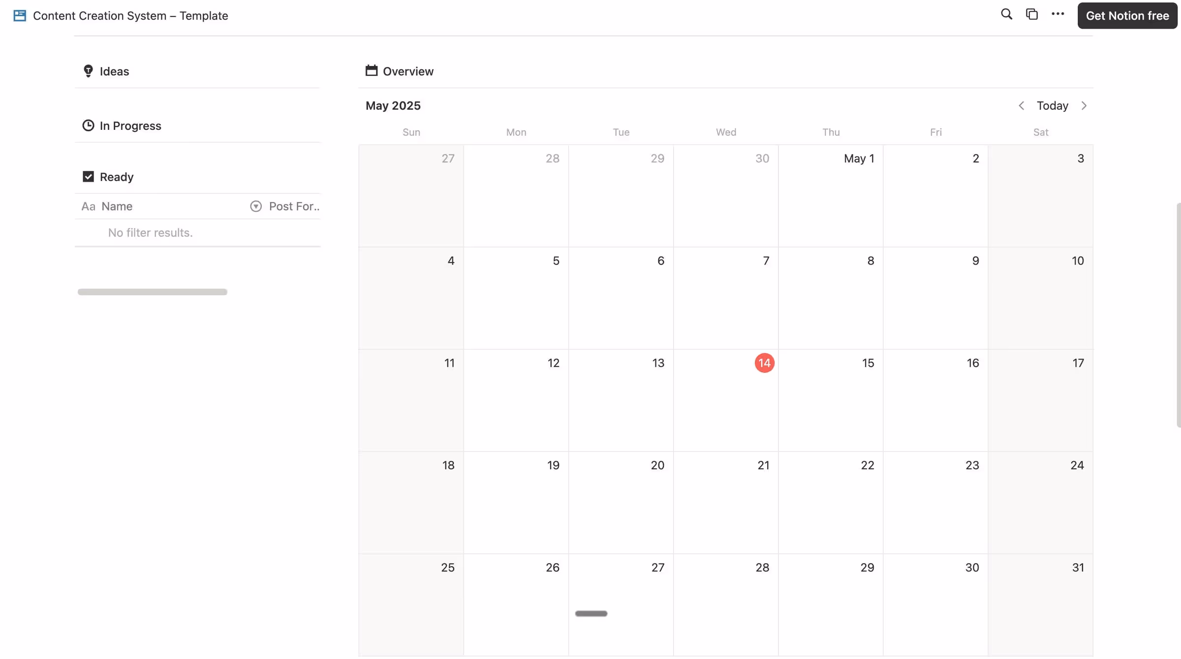
3. Inspiration Repository
Below your post management area, you'll find a dedicated database for capturing interesting content from around the web, your personal swipe file. Instead of saving content across different platforms, use this section to store everything in one place.
Capture inspiration efficiently:
- Save content from platforms like Instagram, X, YouTube, and Reddit
- Use tools like the Save to Notion browser extension
- Review these saved items when brainstorming new content
4. Subtopics List
While the Strategic Foundation helps you define your high-level topic and audience, this Subtopics List is where you start mapping out your actual content lanes. The Subtopics table appears in the main body of the template and serves as a bridge between your high-level topic and specific post ideas.
Break down your high-level topic into 5-10 broader categories:
- Think of each subtopic as a lane in your content strategy
- Use these categories to tag and organize future post ideas
- This structure helps maintain balance and variety in your content
5. Post Topics & Content Types
The Post Topics table is where everything comes together. Each entry connects to a specific subtopic and includes multiple fields for planning your approach. As you create entries in this table, they'll automatically appear in your Posts view, ready for scheduling and creation.
This is where your ideas start to crystalize into actual posts.
Each post can be framed using one of several proven content types, as outlined in this guide:
- Actionable: Step-by-step breakdown of how to do something
- Observation: What you've observed about the topic
- X vs Y: Compare two situations with an interesting takeaway
- Present/Future: How things work today vs. how they'll work in the future
- Contrarian: Your spicy point of view that differs from the mainstream
- Analytical: Breakdown of a topic, company, person, or content style
- Motivational: Inspire your audience to achieve their goals
- Listicle: A list of things, people, books, tools, podcasts, etc.
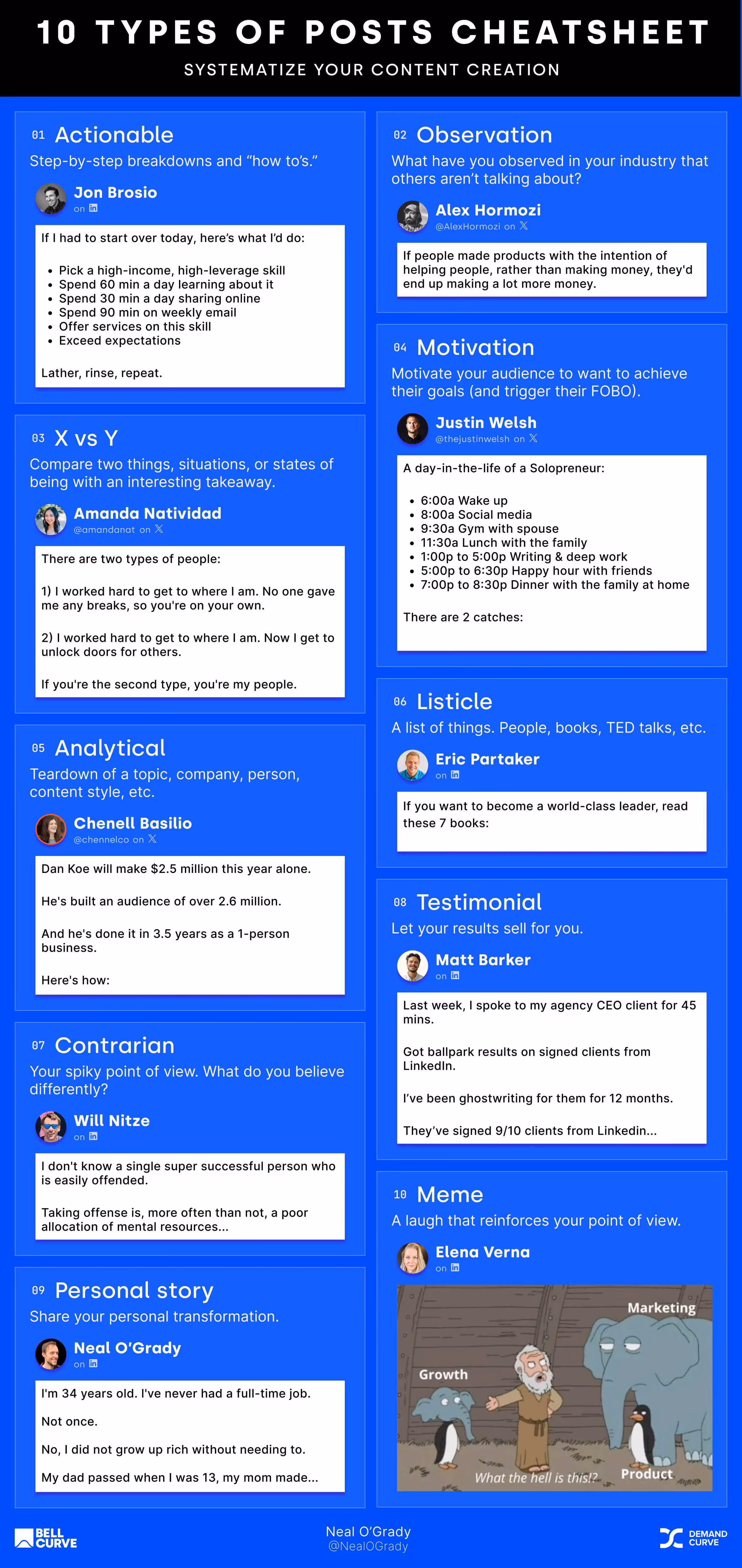
How to Use the Content Creation System (In Just 6 Steps)
Step 1: Make a copy of the template
You can find the Notion template here.
- Click the three dots in the top-right corner of the original template
- Select "Duplicate" from the dropdown menu
- The template will be copied to your own Notion workspace with all the structure intact but none of your personal content
Step 2: Fill in your strategic foundation
At the top of your newly duplicated template, add your:
- High-level topic that you'll be creating content about
- Target audience description, being as specific as possible
- Their selfish desires (what they want but might not admit publicly)
- Their specific goals (what they're actively trying to achieve)
Here’s an example of Podcasting for beginners:
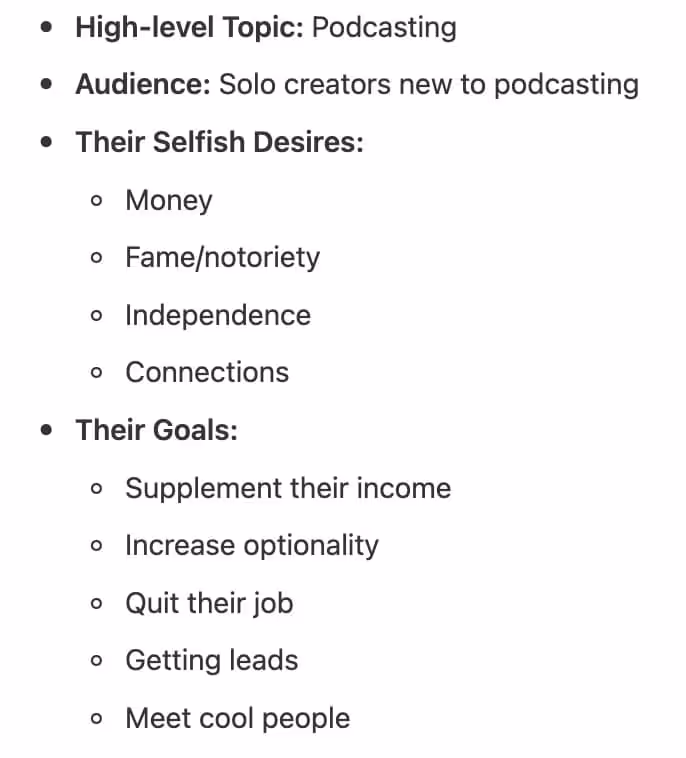
Step 3: Generate 5-10 subtopics
- Scroll down to the Subtopics table in the main section of the template
- Click into the table and add new rows for each broad category within your high-level topic
- These should be fairly broad concepts that can each contain multiple post ideas
- For a podcasting niche, you might include categories like Equipment, Tools, and Sponsorships
Step 4: Generate post topics within each subtopic
- For each subtopic you've created, brainstorm specific angles or implementations
- These should be focused enough to cover in a single post but broad enough to approach from multiple angles
- Add these as new entries in the Post Topics section, making sure to link each to its parent subtopic
Example of post topics for Tools, Equipment and Sponsorships subtopics:
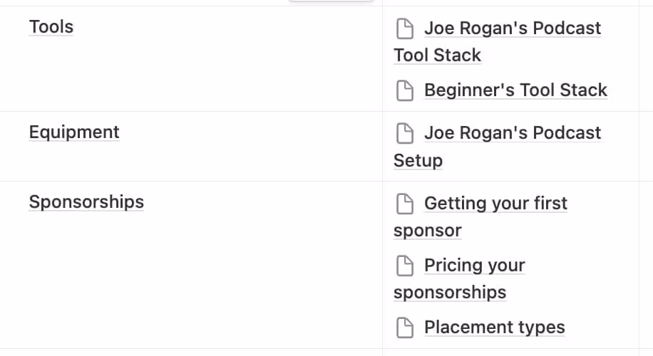
Bonus: Leverage AI to accelerate this process
ChatGPT is excellent at generating a ton of ideas for you to filter through
- Try prompts like: "Generate 10 specific post topics about podcast equipment for beginners"
- Use AI to brainstorm different angles for approaching the same topic
- Filter through the suggestions and add the ones that resonate with your brand voice
- Remember that AI is your assistant, not your replacement, so always review and refine suggestions
Here’s the Video Walkthrough:
Step 5: Create 10 specific posts by assigning a post type
- Within the Post Topics table, each idea can be approached from multiple angles
- For each post topic, click into the entry and select which approach would be most effective:
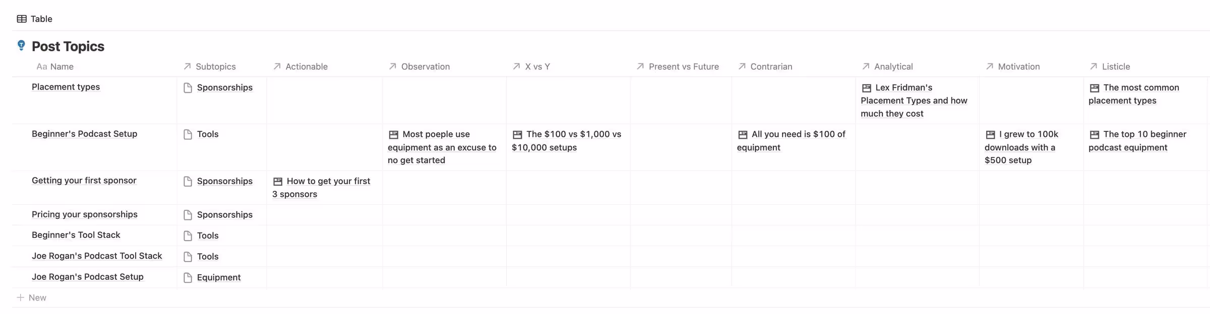
Step 6: Schedule and create
- Return to the Calendar view in the left sidebar
- Drag posts from your idea pool onto specific dates in the calendar
- Click into each scheduled post to add details like platform, format (carousel, video, etc.)
- As you publish content, track metrics like engagement and reach to see what performs best
Keep this cycle going—your calendar becomes your content engine, and your ideas stay organized, fresh, and ready to publish.
The Bottom Line
Remember, the goal isn't perfection. The system is designed to reduce friction in your creative process and ensure you're creating content that strategically serves your audience.
Feel free to adapt however works for you:
- Some people enjoy using the whole system to generate ideas
- Others just use the Posts table and nothing else
- It's whatever system works for you and keeps you writing
The key is consistency. Even the most brilliant content strategy fails without execution.
Why most GPT ads look like garbage and how to fix it
Insight from Joey Noble, Creative Strategist at Demand Curve.
Most GPT-generated image ads are mediocre at best.
Yet on social media, everyone says, “I whipped up these high-converting ads with ChatGPT in half a minute.”
What they’re hiding is all the 12+ iterations they had to make, the edits they did in Photoshop, and that they very thoroughly prompted GPT to get a decent output.
Meanwhile, on LinkedIn:
“Just tell GPT to clone this ad with your branding—and boom—a high-quality ad.”
So I tried that. I said, “Recreate this ad but with my product and branding.”
The results were disappointing to say the least:
- Layouts that didn’t make sense
- Copy that reads like it was written by my grandpa on hallucinogens
- Warped product renders
- Fonts and colors that didn’t match my brand
- And zero grasp of why the ad worked in the first place
Here’s the ad I asked it to clone:

I like this feature point-out ad from Oats Overnight. It tells me the cost, calories, protein amount, and that others love it. Perfect.
Since it’s an Ecomm ad, I selected one of my recent favorite Ecomm brands, IM8, to make an ad for (I'm not affiliated; I just like their packaging).
I asked GPT to clone the ad but with my branding and product. I gave it a list of some value props and let it rip.
Recreate this ad but with im8health.com’s branding. Attached is the image of my product, and here are some value props to use:
- 95% felt a noticeable boost in daily energy levels.- 85% experienced less bloating and improved digestion.- Only $2 per serving- One scoop. Once a day.- All-in-one wellness.- Superfoods, Greens, Fruits, Herbs.- Heart Health Support.- Joint and Muscle Health Support.- Hydra Electrolytes.
Here’s what I got:

That’s not what I was expecting.
The visual hierarchy isn’t great. The padding is atrocious.
It changed the product image and decided that “technology” is actually spelled “technotogy.”
It also got rid of the elements that I felt made the reference a great ad.
Here’s what I’ve observed: GPT isn't your creative director (yet). It's your caffeinated but clueless intern.
It needs constraints, structure, and direction. Without them, you get, well.. this.
I spent the last few weeks building a repeatable system that turns GPT into a rough-draft engine, one that gets you 95% of the way to a usable ad in a fraction of the time and cost of starting from scratch.
Here’s how it works:
Step 1: Create a JSON file of your brand
Most people give vague instructions in GPT, such as “Use our brand colors and fonts.” But GPT works exponentially better with structured data.
Instead, feed it a JSON file like this:
json
{
"brandName": "IM-8",
"colors": ["#A40000", "#E3D8CD", "#FFFFFF"],
"fonts": ["Playfair Display", "Inter"],
"valueProps": [
"Supports gut health",
"All-in-one daily greens",
"Backed by nutrition science"
],
"tone": "Scientific but approachable",
"targetAudience": "Health-conscious professionals, 30-45",
"callToAction": "Try risk-free for 30 days"
}
This gives GPT constraints and direction, which leads to better creative output.
But the neat part is you don’t need to be technical or know how to create a JSON file. Just tell ChatGPT everything you want included in the file and it’ll create for you.
What I do is feed it everything I want it to know, like brand guidelines, tone of voice, font style, look and feel, etc. I also take a full-page screenshot of my landing page for ChatGPT to extract things I didn’t think of. (Link to the screenshot tool: gofullpage.com)
Here’s the exact prompt I used:
You’re going to create a master JSON file of my brand. You will structure the file in such a way that I can easily feed it to you to reference when making image ads – so that you can apply my branding to the ad references I give you. I want you to take my fonts, branding, colors, value props etc and turn it into the ultimate JSON file.
Here’s what the JSON must include:
- brand_name: e.g., “IM-8 Daily Essentials”
- tagline: One-line brand positioning or hero line
- fonts:
- headline_font: name or description
- body_font: name or fallback option
- colors:
- primary: hex code
- secondary: hex code
- background: hex code
- accent: hex code
- value_props: High-impact claims or stats (e.g., “95% felt more energy”)
- functional_benefits: Tangible outcomes of using the product
- trust_signals: Endorsements, social proof, certifications
- key_ingredients or core_features: If the product is ingredient- or feature-driven
- tone_voice: A few adjectives that describe how the brand speaks (e.g., “confident, clinical, warm”)
- visual_branding_notes: Description of packaging aesthetics, logo placement, typical imagery (but not ad layouts)
[Insert any other specific brand guidelines that ChatGPT might not be able to extract from the landing page screenshot alone]
Attached is a full-page screenshot of my product landing page. Analyze it thoroughly and extract all relevant branding cues, layout patterns, and copywriting angles — including testimonials, claims, imagery style, and benefits.
Now that I have a structured JSON file, I can go to the next step.
Step 2: Ask GPT how it would prompt itself
I don’t see enough people doing this.
Instead of trying to write the perfect prompt yourself, give GPT your brand JSON + a reference ad and ask:
“With this JSON and ad reference, how would you prompt yourself to recreate this ad, step-by-step, using your own best practices?”
GPT will return a specific, structured prompt. And it’s usually better than what I’d come up with anyways. Once I get the prompt I’ll read through it and modify it a bit to get exactly what I want.
You’ll get something like this:

Step 3: Feed it the right imagery
GPT image generation works best when you’re clear about what kind of image you want.
Use a reference ad and match its structure. For example:
- If the ad uses a product photo on a clean background, upload your product photo.
- If it uses lifestyle imagery, pull something from Unsplash or your own shoots.
The more visually aligned your input is, the better the output.
I used these images for my ad:


Step 4: Feed everything into ChatGPT to get a solid rough draft creative
Now I’ll give ChatGPT the prompt that it generated itself, my brand JSON file again, and the product images.
With a much better prompt and structured data for ChatGPT to use, I get a much better result:

Much better, but not perfect yet.
- There are still some misspellings.
- The fonts aren’t accurate.
- And some of the spacing could be improved.
- It also randomly decided to add “Total wellness. Simplified” to the bottle.
At this point you can continue to tweak it within GPT, but I wouldn’t recommend this. You tell it, “Change the headline to ‘Elite Daily Nutrition’” and it changes that but then also morphs your product or changes other copy.
Here’s what I would do instead:
Step 5: Polish the result with a junior designer
GPT gets you most of the way there. But the fine details still break as I pointed out above.
So I take the GPT draft and hand it off to a junior designer (Fiverr, GetAds, etc.) with a simple brief:
“Use this layout. Replace the fonts and imagery with the real assets. Keep everything else the same.”
By limiting the designer’s scope to just “make this look exactly like this, but with our real assets,” you avoid lengthy creative discussions, long briefs and feedback loops.
Here’s what the final output looks like:

Bonus step: Turn this into a project within ChatGPT
Create a ChatGPT project and give it the JSON file, your brand guidelines, and anything else you’d want it to know so you don’t have to do this every time. Then any time you want to create a new ad you can just do so within the project and it will already have all your brand details saved.
Final thoughts
AI isn’t replacing designers anytime soon. But it is changing the creative workflow from expensive exploration with long feedback loops to rapid iteration with focused human polish.
The teams winning with AI aren’t replacing their designers. They’re creating human-AI workflows that leverage the strengths of both.
The Strategy Behind Notion Mail: New Entry Points, Not Just New Features
Insight from Kevin DePopas—our Chief Growth Officer
If you're Notion users like we are at Demand Curve, you have good reason to be excited about Notion Mail's April 2025 launch. It's a sleek email client that works with your existing email accounts, and it has some pretty powerful native AI features.
But what makes this launch interesting isn't just the product itself — we know Notion creates good products — but how it fits into Notion's broader growth strategy: creating multiple entry points into their ecosystem to expand their addressable market.
This approach directly addresses a challenge that successful software companies eventually face: market saturation. While competitors battle for the same users in the project management space, Notion is opening new doors.

Market Signals Point to Saturation
Growth in the project management and personal productivity category appears to be cooling. IDC’s latest Collaboration Applications sizing shows YoY spend expanding 32.9% in 2020, 28.4% in 2021, and just 14.6% in 2022, with a preliminary 13.7% clip for 2023, according to Computerworld’s analysis.
On the ground, public filings tell the same story:
The land-grab days are ending; the hand-to-hand fight for share has begun. Additional market signals reinforce this shift:
- Traffic plateau: Google Trends, App-Store chart logs, and Similarweb ranks point the same way: interest in “Notion” hasn’t cratered—but it also hasn’t broken out since mid-2023. The growth curve is bending horizontal.
- Competitive intensity: ClickUp, Asana, Monday.com, and Microsoft Loop are all battling for the same enterprise customers with increasingly similar feature sets.
Acquisitions Signal Notion's Expansion Strategy
Rather than simply fighting harder in this competitive landscape, Notion has methodically expanded with strategic acquisitions and product launches:
Each acquisition follows the same playbook: acquire a best-in-class tool, sunset the original service, and relaunch it as a free, independent app that complements but doesn’t require the core workspace.
This pattern reveals a deliberate strategy to create multiple on-ramps into the Notion ecosystem rather than simply enhancing their core product.
The Potential Revenue Opportunity
While Notion Mail is currently free, looking at comparable email clients reveals significant monetization potential:
Notion has already established a precedent for feature-specific pricing with Notion AI, which costs an additional $8/month per user. This suggests an emerging monetization strategy: instead of simply raising core workspace prices, Notion could charge separately for each specialized tool.
If Notion eventually charges just $5 monthly for Mail, $5 for Calendar, and maintains the $8 for AI features—all as optional add-ons to their base workspace—they could potentially 2X their average revenue per user (ARPU) through an à la carte model.
I’ve personally experienced the value proposition. Before Notion Mail, I paid $50/month for Fyxer (month-to-month Professional plan). I’ve since switched to Notion Mail—making their ecosystem stickier while saving monthly costs.
This approach opens up opportunities for Notion and strengthens their ecosystem:
- Direct revenue potential: Standalone tools can be monetized independently at premium price points
- Higher ARPU opportunity: Specialized tools justify higher per-user pricing than general platforms
- Increased switching costs: Each additional tool raises the barrier to leaving the ecosystem
- Competitive displacement: Replacing point solutions reduces competition without direct confrontation
Creating Multiple On-Ramps for Different User Segments
Notion’s strategy aligns with Geoffrey Moore’s “Crossing the Chasm” framework—but with a twist. Rather than trying to push one product across the chasm, they’re building multiple bridges tailored to different user segments.
While many tech professionals have already adopted project management tools, adoption remains significantly lower outside tech hubs. Nearly a quarter of micro-SMBs still run projects on email and spreadsheets, according to Capterra’s 2021 Project-Management User Survey.
By offering free, standalone tools with immediate utility, Notion reduces the psychological barriers that typically prevent later-stage adopters from trying new productivity tools:
- Email is familiar: Even the most change-resistant users understand email
- Zero switching costs: Works with existing email addresses
- Minimal learning curve: Email UI patterns are broadly understood
- Mission-critical but contained risk: Email is essential but a client swap is relatively low-risk
The Enterprise Trojan Horse
Beyond targeting individual late adopters, Notion’s standalone tools create another growth vector: grassroots adoption within organizations already using competing project management tools.
According to Torri's SaaS Visibility and Impact Report, 69% of tech leaders cite unauthorized tools as a top security concern—indirectly confirming that employees regularly adopt helpful tools regardless of official IT policy.

This shadow IT pattern creates two advantages for Notion:
- Foothold without displacement: Companies can use ClickUp, Asana, or Microsoft Project for project management while individual teams adopt Notion’s free tools for personal workflows.
- Internal champions: As more employees use Notion’s tools, the company builds advocates who can eventually influence broader adoption decisions.

The Macro Context: Changing Work Patterns
Two broader trends likely factor into Notion’s strategy too:
- The lean-team era: Companies are producing more with fewer employees. Meta cut 21,000 positions in 2023 during its “Year of Efficiency,” yet grew revenue by 16% compared to 2022, according to CNBC.
- Growth in independent workers: The freelance economy continues expanding, with over 64 million Americans freelancing in 2023, up from 60 million in 2022 according to Upwork’s Freelance Forward study.

These shifts create demand for lightweight, integrated tools rather than enterprise-heavy solutions—precisely the niche Notion’s standalone apps fill.
What’s Next for Notion?
Given the pattern established, I predict Notion’s next likely move is a video conferencing or screen recording tool with AI integration.
The evidence points in this direction:
- Skiff’s technology already included encrypted video calling capabilities
- Notion’s Special Projects engineering listings mentioned “real-time collaboration and rich media” (since been removed)
- AI email tools like Fyxer already include seamless video meeting assistants that draft follow-up emails based on the meeting notes.
- Calendar (time) → Mail (communication) → Video/Meetings (presence) forms a logical progression
This would move closer to completing Notion’s daily workflow coverage, adding the synchronous layer to their growing stack and feeding Notion AI with valuable meeting transcript data.
For users, the integration would create a compelling workflow: schedule a meeting in Calendar, join via Notion’s video tool, capture AI notes, and link everything to your workspace—all within one ecosystem.
I'd love a Loom-esque asynchronous video recording tool within Notion too. 😉
Takeaways for Companies in Maturing Markets
Notion’s strategy offers valuable lessons for any company facing growth plateaus:
- Add doors, not just features: When direct competition intensifies, create new entry points that target adjacent, untapped audiences rather than just adding features to your core product.
- Build standalone value first, integration second: Ensure each new tool delivers immediate value independently before pushing ecosystem benefits. This lowers acquisition barriers while creating multiple monetization opportunities.
- Price like a specialist when possible: Specialized tools can often command higher per-seat prices than general platforms. Consider pricing standalone tools separately to increase overall ARPU.
- Recognize where your market sits on the adoption curve: Products designed for early adopters don’t always resonate with the late majority. Different segments require different entry points and value propositions.
The Bottom Line
For founders and growth leaders, the key takeaway is that sometimes the most effective strategy isn’t competing harder for the same customers—it’s finding creative ways to expand your addressable market while creating new monetization opportunities.
What do you think of Notion’s strategy? Would your business benefit from a similar approach? Reply to this email with your thoughts—I read every response.
How Vail Resorts Collects 75% of Revenue Before Winter Even Starts
Insight from Kevin DePopas—our Chief Growth Officer
The largest ski company in the world has completely flipped its business model over the past 15 years.
In 2008, 65% of skiers at Vail Resorts bought single-day lift tickets. Today, 75% of their customers purchase season passes, committing thousands of dollars months before the first snowfall.
This transformation didn't happen by accident. It was a deliberate strategy to address a serious threat to their business: climate change.
.avif)
Analysis of 652 sites across the Western U.S. reveals a troubling trend: 81% of ski areas have experienced decreased snowfall since 1955, with almost half seeing drops of 20% or more. Unpredictable snowfall creates unpredictable revenue—a nightmare for any seasonal business.
Hat tip to @sportsball on Instagram for their fantastic data visualization on this topic that inspired our analysis. Check these guys out.
Vail’s solution? Use pricing psychology to drive non-refundable annual season pass purchases.
Since 2010, the company has steadily increased the price of single-day lift tickets to an astonishing $329 per day—nearly triple what they cost just a decade ago. Meanwhile, they’ve kept their unlimited Epic Pass around $1,000 for the entire season.
.avif)
The brilliance of this strategy is in the mental calculation it triggers:
“If I ski just 3-4 days this season, the annual pass pays for itself!”
This pricing approach presents several advantages:
- Hedge against uncertain weather: Vail collects payment upfront, regardless of future weather.
- Cash flow improvement: The company receives a substantial capital boost before their high-cost operating season begins.
- Perceived value: Customers feel like they’re getting a deal, even as they commit more money upfront.
But this isn’t just a ski industry phenomenon. Companies across sectors are applying this same psychological trigger—and we recently spotted a particularly good example.
The "Anchor Shock" Strategy in Action: Screen.Studio’s Clever Pricing
While researching screen recording tools, we stumbled across an example of anchor pricing in action, Screen Studio. Their pricing triggered the same result as Vail's, more annual signups.
Screen Studio's pricing page initially shows a very affordable $9 per month. It looks like a great deal until you notice it's for annual billing. Switch to monthly pricing, and you'll experience the "anchor shock" as the price jumps to $29 per month.

$348 for a year of monthly payments versus just $108 for the annual plan. The math feels obvious—you break even after just four months of use, making the annual plan feel like the only rational choice. (And yes, we became annual subscribers.)
While most SaaS companies offer a modest 15-20% discount on annual plans, Screen Studio's dramatic 3X difference creates a much stronger pull toward annual commitments.
This example prompted us to investigate: How effective is this pricing strategy? To find out, we ran the numbers.
The “Anchor Shock” Math: Why Dramatically Lower Annual Prices Can Generate More Revenue
To understand why companies are embracing this strategy, we created a simple model comparing two hypothetical pricing approaches for a SaaS product:

What happens when 100 potential customers visit each pricing page and we track the revenue from this "month 0" cohort for two years? Let’s examine the assumptions for our model:

Key differences between our two scenarios:
- Conversion Rate (2% vs. 6%): The Anchor model converts three times more visitors. When a $50/month product is suddenly available for the equivalent of $12.50/month (annual plan), it becomes accessible to a much wider audience. What was previously a considered purchase becomes closer to an impulse buy.
- Plan Mix (50/50 vs. 83/17): In the Standard model, we assume a 50/50 split between annual and monthly subscribers (1 annual, 1 monthly). This is conservatively high, and favorable for the Standard model. In the Anchor model, we see a dramatic shift toward annual plans (5 annual, 1 monthly). This shift occurs because the annual discount is so compelling that it’s hard to justify the monthly option.
- Annual Renewal Rate (50% vs. 80%): The Anchor model’s annual price ($150) creates much less “renewal friction” than the Standard model’s $500 renewal. At $150, it’s more likely to be approved without scrutiny, while $500 often triggers a “do we still need this?” evaluation.
Now let’s see how these models perform at key stages:
Month 0: Initial Conversion

Right from the start, the Anchor model generates 45% more revenue ($800 vs. $550) due to higher conversion rates and more annual plans.
End of Year 1

By the end of the first year (including renewals), the Anchor model has generated $1,950 compared to the Standard model’s $1,350—a 44% advantage.
End of Year 2

After two years, the gap widens. The Anchor model produces a cumulative $2,530 versus $1,575 for the Standard model.

That’s $955 more revenue from the same 100 visitors—a 61% increase—despite charging 70% less for annual plans ($150 vs. $500).
It’s important to note that our model only follows the initial cohort from Month 0. In reality, these effects would compound month over month, year over year, as each new cohort follows the same pattern.
Want to play with the numbers for your business? Reply to this email and we'll send you the full editable model.
Why The Anchor Shock Strategy Works
The Psychological Principles at Work
This strategy leverages several cognitive biases:
- Price anchoring: The high monthly price makes the annual price seem like a bargain by comparison.
- Loss aversion: Once customers do the math, choosing the monthly option feels like “losing money.”
- Future discounting: Most people overestimate how long they’ll use a product, making the annual commitment seem like an even better deal.
How to Implement the Anchor Shock Strategy in Your Business
There are two primary ways to implement the anchor shock pricing strategy:
- Increase your monthly price while keeping your annual price stable (if your monthly plan is currently underpriced).
- Decrease your annual price while keeping your monthly price stable (if your monthly price is already appropriate and you have margin to spare on your annual plan).
Either approach can work—the key is creating a ~3X differential between the 12 month total cost of your annual and monthly plans.
Beyond that core principle, here are specific implementation tips:
1. Set your monthly price point strategically
This becomes your anchor—the reference point against which everything else is judged. Don’t be afraid to set it higher than you might normally think.
2. Create a large gap to your annual plan
Instead of the typical 15-20% annual discount, aim for a 65-75% difference when calculated on a monthly basis.
3. Lead with the annual price (shown monthly)
This is critical: On your pricing page, show the monthly equivalent of your annual plan FIRST. Seeing the lower monthly price first is what sets the psychological hook.

4. Test different gaps
While 3X appears to be a sweet spot, every business is different. This is something you can A/B test relatively quickly to see how the math works for your specific audience and business model.
5. Consider adding a premium tier
This further enhances the perceived value of your annual plan through comparison, making it look like the reasonable middle option. Screen Studio also has a $229 "Pay Once" option, which also makes $108 feel like a great deal.
Industry Examples Beyond SaaS
Online Courses:
- Monthly access: $49/month
- Annual access: $199/year ($16.58/month equivalent)
- The pitch: “Access all courses for less than 5 months’ worth of the monthly plan!”
Coaching Business:
- Pay-per-session: $299/session
- 12-session package: $1,199 ($99.92/session)
- The pitch: “Book a 12-session package and save 67% per session!”
When It Might Not Work
While the Anchor Shock strategy has proven effective across many businesses, it may not be right for every situation:
- Low retention products: If your product has inherently low retention regardless of price, the annual renewal advantage may not materialize.
- Premium positioning: For luxury or high-end products, dramatic discounts might undermine perceived value.
- Complex pricing structures: Products with multiple tiers, add-ons, or platform pricing (like HubSpot...sheesh) may find it difficult to implement consistently across their pricing matrix.
- Long sales cycles: Enterprise products with lengthy approval processes may not see the same impulse buying effect.
Final Thoughts
The Anchor Shock strategy challenges conventional wisdom about maximizing revenue per customer. By optimizing for conversion and retention rather than unit economics, companies can achieve significantly higher overall revenue.
Whether you’re running a ski resort facing climate uncertainty or a SaaS startup looking to improve cash flow, consider experimenting with this approach. Your customers might thank you for the perceived deal, while your business benefits from higher conversion rates and predictable revenue.
Steal creative ideas from others
Insight from DC's Growth Program.
AI increasingly dominates the performance of ad channels.
These days, the optimal targeting strategies mostly let AI do the heavy lifting.
You feed Meta the copy and creatives, and it figures out who to show it to.
Which makes creatives by far the most important variable to test.
But you also don't want to waste money testing subpar creatives either.
So you might as well steal the creative ideas from others.
There are a few ways to gather inspiration:
- Creative inspiration tools: Tools like Foreplay and Atria let you browse a big library of ads.
- Ad channels themselves: The Meta Ad Library and LinkedIn Ad Library let you peak at ads that any company is running.
- Social media: Sometimes, the best inspiration organically pops into your social feed.
- Databases and galleries: Random sites have created databases of ads.
Let's dive into each of those now:
Creative inspiration tools
We'll start with creative inspiration tools because they help you:
- Discover great ads either organically or by searching
- See their accompanying ad copy, landing page, and whether they're still running that ad or not (a good signal it's working)
- Save great ads you stumble upon into collections (aka "boards").
You can then use those to inspire yourself, your team, or your clients.
Here are the two tools we recommend:
- Foreplay: The tool we use internally with our agency to gather inspiration to use internally and to share with clients.
- Atria: A competitor to Foreplay with some analytics tooling (for more $).
Here's a walkthrough of Foreplay from our in-house creative, Joey Noble:
Meta and LinkedIn Ad Libraries
Here are the links to the ad libraries:
These tools let you search for the ads being run by specific companies.
Here's a walkthrough from Joey of how to do just that:
And, of course, if you decide to use Foreplay or Atria, save any great ads you find to your boards. If not, you can also save them to a swipe file, notion, google drive, or whatever else you may use.
Social media
How to tell you're a real marketer:
You stop to watch the ads as you browse social media. AND you save the ones you find interesting.
Whenever you're scrolling through Instagram, TikTok, LinkedIn, YouTube, or wherever, take note of an ad that:
- Catches your attention
- Makes you stop scrolling
- Keeps you watching until the end
- Has you questioning whether you should click or not
- Or, is just creative or interesting
Then, you can save the ads to Foreplay for future reference. You do that by forwarding the ad to the Foreplay Instagram account (assuming you linked your Instagram to your Foreplay account).
Note: I apologize in advance for the search results that come up when you search "foreplay" on Instagram 🙄.
Databases and galleries
Various websites or influencers out there have curated ads:
- Adfolio: Database of great b2b ads.
- Ads of the World: Ads from big brands.
- Commarts: Ads from big brands.
- The Ad Professor: An influencer who shares a lot of ad inspo.
- Copywriting Examples: Great repo from Harry Dry!
I also have some curated ads you can see here:
Some quick ad creative takeaways
Here's some rapid-fire advice:
- Hooks are the most important. People hate ads in general. So you better intrigue them as fast as possible.
- Don't make people think. People have zero patience for confusing ads.
- Don't be fancy. Simple, clean, & straightforward is almost always best.
- Try not to be a “creative copywriter.” You're not trying to win an award. You're trying to sell a product.
- Be novel/quirky. Peculiarity often stops the scroll.
- Leverage culture. Familiarity, topicality, and relevance help.
- Get in the mindset of the audience. The best ads often come from noob ad makers with an iPhone and an intimate understanding of:
- Who they are
- What problems they're struggling with
- What they're worried about
- What their selfish desires are
- What they care about
- Don't talk about you, talk about them. Make them the hero of the story. Your product is the lead supporting character.
- Kill your darlings. Ruthlessly cut meaningless words or elements that don't add to the value of what you're saying—even if you like it.
Let others make your ads more efficient
Don't create in a vacuum.
Finding inspiration should always be a part of your creative process.
Need help from a growth strategist?
As part of the natural rhythm of work life, some of our incredible team members eventually move on to new adventures.
Antoine is doing just that—going out on his own to pursue freelance growth strategy and advisory work.
If you're in need of early-stage growth support, Antoine is your guy:
- He’s a rockstar strategist with over 10 years of experience growing both bootstrapped and venture-backed companies.
- He’s already helped take 2 SaaS startups from early-stage to acquisition, and now he’s looking to bring that same magic to new projects.
- He’s currently taking on just 2 new clients.
He typically offers this for $7,000, but is offering a giant 50% discount for the DC audience. Work with him for only $3.5k.
How to make your product more viral
Insight inspired by Kyle Poyar.
Churn kills a lot of products.
Acquiring new customers or leads is often linear (you gain X customers per month because you spend $YYYY on ads).
Churn, however, is often exponential (you lose Y% per month).
You completely stall out when your churn = your new acquisition.
For example, if you:
- Add ~100 customers per month, and
- Lose ~3% of your customers each month due to churn
You'll completely stall out once you have ~3,333 customers.
Here's a chart visualizing this "Growth Ceiling."

Ways to prevent stalling out and keep growing?
- Reduce churn (better product, better onboarding, etc)
- Crank up acquisition (more content, more ads)
- Make your product more viral
Let's focus on how to make your product more viral
A truly viral product grows itself—each new customer refers one or more other customers.
If you can achieve that, you have a completely self-sustaining growth engine where each user leads to another user which leads to another user (and so on).
This growth is typically measured by the "viral coefficient"—the average number of new users each current user brings in. If this coefficient is greater than 1, you're experiencing viral growth.
Here's a nice graph showing growth over time based on viral coefficients of 0.8, 1, and 1.2. As you can see, it goes wild once you go over 1.

(You probably heard a lot about the R factor during COVID, this is the same thing, except for product growth, we usually call it the K factor)
Virality makes your acquisition efforts easier
It drastically reduces your customer acquisition costs and accelerates your growth, creating sustainable momentum that ads alone can't achieve.
Imagine two scenarios where it costs you $50 to acquire each new customer:
- Each new customer refers 0 new customers. To scale you need to keep spending $50 per customer—which will break because as you scale your CAC will generally increase as you target colder and colder audiences.
- Each new customer refers 2 new customers. Therefore, it costs you ~$16.67 per customer because of the 2 free referrals. You can push ads much harder and have room to scale (particularly if those referred customers also refer customers).
Cracking virality is huge.
The two types of virality
One last stop before the actionable tips. There are two types of product virality:
#1. Internal virality: The product spreads from person to person in a company.
Design products that naturally spread within an organization—tools like Slack, Notion, or Figma achieved massive internal virality through seamless user adoption as one user in an org invites other users in the org.
#2. External virality: The product spreads from person to person across different companies.
Tools like Calendly or Typeform spread externally because users naturally send their branded links to new, external audiences.
We'll talk about ways to achieve both.
Viral products aren't built by accident—they're engineered.
Here’s how to give your product the best shot at organic growth.
1. Embed social features directly into your product
The best viral products are inherently social, and the user cannot get value from the product unless shared with someone else. Examples include:
- Calendly: People can't book unless you share your Calendly.
- Figma: You can't share a design or collaborate without sharing your Figma.
- Loom: You can't easily share your video without sending the Loom link (I mean, you could download it and send it, but the easy sharing is the real value prop of Loom)
- Dropbox: To get the most value, you need to be able to share the files.
When you design your product, consider ways to make it so the user can only really get full value by sharing it—even if it's not the core use case.
For example, Foreplay made a secondary product use viral.
Foreplay lets you browse ads that other advertisers run and save them to boards. It's super handy just for gathering inspiration.
To make it more viral, they also make it easy to share the boards you create and share individual ads you find and live on Foreplay-hosted and branded domains.
Here's an example of a board we made with AG1 ads:

2. Remove friction from sharing
Every extra step it takes to share kills virality. Aim for one-click sharing.
Some quick ideas:
- Ever-present obvious CTAs to share.
- Give options for sharing (links, emails, text, social)
- Auto-populate sharing messages to reduce cognitive load (e.g., pre-written referral messages).
- Make it free or really cheap to share
On that last point, Kyle Poyar gives some great ways to make it seamless to get new users in without it immediately costing the sharer money:

3. Remove friction from joining
Every extra step it takes for the referred user to get in and get value kills virality.
Some quick ideas:
- Have generous free tiers or free trials so people can instantly use it.
- Make it so they can get value without needing to create an account, but if they want to take action, they have to create one (like Figma lets you view a file, but if you want to comment or edit it, you need an account)
- Google/Facebook/Apple/LinkedIn account creation so it's quick and easy.
- Have templates and opinionated defaults to make onboarding easy.
4. Brand your product's outputs
When someone shares something from your product, make sure to take the opportunity to make yourself known:

- Add a "Created/Made with" badge. Note: a premium tier could involve removing that branding (like Tally, Typeform, Webflow, etc)
- Host the output on your domain. Examples: Notion, Webflow, Calendly, Foreplay, Typeform.
- Add your watermark when they export it. For example, when you download a video from TikTok it automatically adds TikTok branding:

5. Incentivize referrals
Sure, the best is when people share your product just by using it or because they can't shut up about it.
But with the right incentives, you can:
- Push people over the hump who wouldn't otherwise share
- Turbocharge the rate at which people share
Here are a few ways to incentivize referrals:
- Increase usage limits (more storage, more time, more whatever)
- Free product
- Free bonus incentives (swag)
- Contests
- Free credits (ex: supercharger credit
- Amazon gift cards or straight-up cash
This can either be with the typical referral or affiliate links, or you can build it into the product.
For example, testimonial.to shows its branding on free tiers.
On paid tiers, you can decide to remove the branding, OR you can keep it, but by doing so, you get 30% of the referred revenue from people who click it.

6. Give fun reasons to share
Rather than sharing the product, give users a compelling reason to share something about your product.
- Create badges, leaderboards, streaks, or awards users can share on social media or their LinkedIn profile. (Duolingo’s streaks, HubSpot’s certifications)

- People love to learn about themselves and share things that are core to their identity. Use data you have about the users to create shareable content. Think Spotify Wrapped:

7. Strategically prompt happy users to share
YouTube annoys the hell out of me.
It asks me to upgrade whenever I'm going through the Google 2FA flow—which is exactly when I have zero patience to consider upgrading and just want to log into to finish the task I'm focused on.
Asking for referrals is similar.
Don't ask whenever a user is in the middle of something.
Instead, do it after they've completed a big milestone where they're probably stoked.
8. Surprise and delight users
If you surprise and delight a customer, they will likely share their excitement.
Chewy, the pet food brand, did this best.
Here are insights shared in Marketing Examples:
"Every customer is welcomed with a handwritten card reminding them to call anytime:

They employ 100 artists whose sole job is to paint customers' pets. The portraits are then mailed to unsuspecting customers:

If they hear about a pet passing away, they'll send a bouquet of flowers and a condolence note:

And if you buy the wrong dog food, customer service will tell you:
Don’t worry about returning it, we’ll refund you, just donate the item to a pet shelter"
Not only does this build insane brand loyalty (in a commoditized market), it is also very likely someone will share these stories with friends and on social.
Quick takeaways for virality
- Try to make your product inherently viral.
- Remove friction for people to share and use it
- Brand your product's outputs
- Incentivize referrals
- Give fun reasons to share
- Prompt happy users at the right time
- Surprise and delight customers
How not to write a terrible cold email
Insight from us.
Cold emails and DMs are getting damn near constant.
Our brains are INCREDIBLY good at quickly identifying it as spam and:
- Ignoring
- Archiving
- Reporting
So here’s a bunch of tactical ways to not be ignored (and at the end, I’ll share some of the most over-used tactics that people still recommend):
Trick #1: Make it warm
If you got a personalized message from your favorite founder, author, influencer, or celebrity, you would welcome it, read it, and happily respond.
And you’d be extremely forgiving.
Here’s how to make it warm:
- Produce a lot of free content on LinkedIn, Twitter, newsletter, YouTube, podcast, etc.
- Then engage with people who engage with you. Engage with others, writing and commenting on relevant posts in your niche.
- Eventually, DM them a personalized message to get to know them, give them a free resource, or pitch an offer (that you know they’ve likely had some exposure to).
Your response and success rates will be WAY higher, and you’ll be burning far fewer bridges.
Trick #2: Short and simple
I can immediately tell it’s a cold email when I see 100+ words, and it's all perfectly formatted.
The cold emails I’ve actually responded to?
- Short
- Simple
- Casual
- To the point
Here’s a cold email we received from Sponsy that led to us (and several other newsletter operator friends I know) becoming a customer:

Here’s what it does well:
- It’s three short sentences and gets to the point quickly.
- It doesn’t try so damn hard to fake a connection.
- It’s focused on my problems and how they can solve them—not about how great they are.
- It’s well-targeted. They knew we had newsletter sponsors, and I likely had those problems before sending it.
Trick #3: Put in the work
Our top-performing cold outreach campaign for a client was directly a result of putting in the work before emailing people.
Our client allowed WordPress sites to create "members only" content (like Substack does now).
The most likely person to want this? Someone already using a competitor to run a membership program on their WordPress site.
What we did:
- Paid for scrapers and VAs to go through lists of WordPress sites that sold memberships and label them based on the competitor they were using.
- Researched people's top objections about each competitor.
- In our emails, we highlighted those headaches and how our client's tool would relieve them.
- We offered a free migration (because no creator wants to deal with the headache of migrating tools).
Our response rate was nearly 80%. And we booked tons of sales demos.
Trick #4: No links
Here’s an email I just got that has several problems:
- It doesn’t know my name, so it just put it blank. So the opener of “Hi ,” makes it very clear it’s templated.
- It’s from outreach@ and is from the Outreach Team… talk about personal
- It’s all about them them them them—it provides zero value
- It’s sent from their actual domain—meaning if I mark it as spam it can ruin the reputation of their entire domain.
- Lastly, it has not one but two links

Why are the links an issue?
Well, for three reasons:
- The first link is not something we use for anything—so it's a red flag.
- Email providers (Google, Microsoft, Yahoo) are savvy that cold emailers add links. Adding links can ding your email reputation—especially when you’re sending a ton of them
- It’s immediately obvious that it’s cold outreach spam.
Quick tips
- Write like you would to your friend or partner.
- Make it about them and their problem.
- Personalize with variables that matter—like the tools they use or the problems they're experiencing.
- Don't just spray and pray. Fewer, better-targeted emails.
- Show it to a friend, partner, or family member for their honest feedback on whether it "smells" like a cold email.
- Send using a different domain—so you don't accidentally destroy the reputation of your real domain.
Tired cold outreach tactics
Here are some of the top cold outreach tactics I see constantly that will make people ignore you or mark you as spam.
#1. The cringe/forced personalization
The opener to Kevin about his new role at DC is so forced, given the subject:

Another classic is the fake restaurant recommendation in the recipient's town, which is just one of the top restaurants on TripAdvisor.
It's very strange to get someone in Ann Arbor, Michigan, recommending a restaurant to visit in Victoria, BC.
#2. The "reply" or "forward" subject line
You've probably seen someone recommend writing a subject line with a "Re: " or "Fwd: "
I imagine this greatly increases the odds you open the email.
But at what cost?
Having them realize your first interaction with them was a lie?
#3. The horribly targeted
This email was quite frustrating:

Here are two reasons it's terrible:
- Its subject line is horribly clickbaity and deceiving.
- We very clearly have a website, yet he's claiming we don't. It would not take much effort to realize we have a Webflow website.
#4. The fake personalized loom video
Here, the person records one Loom video pitching their product.
But to make it look personalized, they cut it so that they're looking at the homepage of your website—maybe even fake scrolling through it.
The best was when I got a video like this from someone I've met before.
He could have just sent me a WhatsApp message, but instead, I got a cold email from him that was clearly fake, which made me instantly lose respect for them.
Be useful and real.
Most of this advice comes down to this:
- Don't deceive people. Be real with them.
- Don't do forced personalization. Only do it if it makes sense.
- Don't spam people. Try only to contact people who need your product.
- Don't just talk about how great you are. Focus on their problem.
- Don't spray and pray. Be more targeted and build relationships.
- Don't write an essay. Short, simple, to the point.
Get F*cking Going
Insight from Neal's Newsletter.
Most people who want to build an audience won’t try.
Most who try won’t for long.
What’s holding them back: Being scared to start and sticking with it.
The fear comes from a variety of sources:
1. Imposter Syndrome
70% of people feel like they’re not good enough or that they’re just pretending to be competent, according to a study published in 2021.

They’re worried about sharing their ideas and having someone expose them for the incompetent fool that they are.
Competent experts are more likely to experience imposter syndrome partly due to the…
2. The Dunning Kruger Effect
The less you know, the more confident you are:

An expert knows there’s a lot that they don’t know and can think of various people who are better at those things, so they become less confident in their abilities than the complete amateur who doesn’t know enough to realize they know very little.
It’s a dangerous combo when it’s combined with…
3. The Curse of Knowledge
“Yes, but I don’t have anything interesting to say.”
When you’re an expert who’s been doing something for years, and you’re surrounded by people who have also done that thing for years, it becomes incredibly hard to recognize how much valuable knowledge you have that others wish they had.
For example, one of my friends has worked with Dr. Andrew Huberman, Sam Harris, Dr. Rhonda Patrick, Dr. Peter Attia, and Shane Parrish to grow their audiences and increase the revenue they earn from their businesses.
The above quote was what he said to me when I encouraged him to start posting online.
A marketer with 10+ years of experience working with some of the biggest creators in the entire world, and he thinks he has nothing to teach people.
We need more people like him sharing their knowledge, not 20-year-old influencer wannabes sharing lists of free AI tools.
Lastly, we’re all scared to put ourselves out there because of…
4. The Spotlight Effect
We all feel that everyone is paying attention to us. If we mess something up, everyone will notice and care.

The reality is that everyone is too busy worried that you will judge them.
Because of these, people get stuck in the research and prep phase
Here are the reservations people typically have at first
- “I don’t have anything valuable to say”
- “I don’t want people to judge me”
- “I don’t know what tools to use”
- “I don’t know what to write about” (← the major focus of the rest of this article)
You need to muscle through the first two by reminding yourself of the 4 psychological biases above. They’re ingrained into us. Even when you’ve been doing it for years, you’ll still have to fight them off occasionally.
The others we’ll dive into separately:
“I don’t know what tools to use”
Researching tools feels productive. And it’s a lot easier and less scary than actually doing the work.
This is why people love nerding about productivity tools and systems because it's a way to procrastinate in a way that feels productive.
In reality, the only tools you need to get started as a creator are:
- A social media account
- An internet connection
- A smartphone or computer
You don’t need the ultimate productivity system. You can write directly in the app and record video and audio using your smartphone.
That being said, here’s the Audience Building Tool Stack I recommend.
“I don’t know what to write about”
A content creator rarely starts with the perfect idea.
It’s very similar to startups. Most successful startups are not:
- Selling the same product they started with
- Targeting the same market they started with
For example, Slack started as a video game. After years of development, they scrapped the game and turned the in-game messaging system into a product.
Airbnb was a marketplace for finding places to crash during conferences where you’d sleep on an air mattress on the floor (hence Airbnb). Hell, Airbnb even sold presidential breakfast cereal:

As for content creators:
- Justin Welsh started with software sales advice and now sells the dream of solopreneurship.
- Ali Abdaal helped people get into medical school, then did MacBook reviews, then did investment advice, and has settled on being a productivity expert after researching how to create content efficiently.
- Sahil Bloom started with nuanced finance discussions and now talks about family and living a “high-performing, healthy, and wealthy life.”
- Katelyn Bourgoin was sharing general marketing advice when she realized she was really interested in the psychology behind why people buy. So, that became her entire focus.
Just like I somehow became obsessed with How to Write Hooks while creating startup growth content on LinkedIn.
So, in short:
Get f*ckin’ going, you’ll find it on the way
Imagine you were 18 years old and refused to work until you knew what you wanted to do for the rest of your life.
You’d likely be homeless (or a pain in your parents' ass) and never work.
Instead, follow your interests until you find something you want to explore deeply—the same applies to startups.
You don’t need to be an expert in it; you can become one by obsessing over the topic for months and months.
That being said, I have an article on choosing a topic you can monetize.
You’ll get better with consistent practice
In 2007, a struggling digital artist from South Carolina named Mike Winkelmann was frustrated with his poor drawing skills. So, he issued himself a challenge:
→ Post 1 new piece of unique art online by 11:59 PM Eastern Time.
No excuses:
- He did it on his wedding day.
- He did it when he was deathly ill and could barely move.
- He did it even on the days his two children were born.
For years, this challenge was purely a means to improve his skills as an artist and to get attention to his work so he could do commissioned art pieces for people.
His first pieces are objectively… terrible:

But after consistent practice…

The result?
On March 11th, 2021, Mike Winkelmann, aka Beeple, made history. He sold an NFT of the first 5,000 pieces of art he made this way for $69,346,250. It was the second most expensive piece of art from a living artist ever sold.

His 6,000+ pieces of art are documented proof of his development as an artist over 17 years.
His strategy worked well for a few reasons:
- It forced him to create art every day. The hardest part of being a creator is getting your ass into the seat. This forced him to do it.
- It forced him to keep expanding his skill set to stave off boredom. He went from pencil drawings to 3d renderings.
- Posting every day gives him the opportunity to create culturally relevant and timely art—art that can strike a chord immediately as it enters the Zeitgeist.
- He could be known for something. He’s the guy who creates weird, culturally relevant art each day.
- It gets easier every day. With every piece of art, he’s adding to his catalog of assets that he can use in future pieces. If he creates Elon Musk or Sam Bankman Fried one day, he can re-use them in the future. He has systems, presets, and templates that make creating complex art way faster and easier.
Frameworks to get started
Sure, it’s easy for me to tell you to get started, but here are some frameworks to make it easier to figure out what to write about:
- Explain something you’ve explained 3 times or more recently
- Tell stories from your life
- Write down whatever interests you lately. Your latest rabbit hole.
- Something you just learned.
- A problem you just dealt with at work
- An analysis of one of your favorite books, companies, styles, etc.
- Create lists of your favorite books, podcasts, tools, and resources
- Actionable step-by-step on how to do parts of your job
- Share a meme that made you laugh out loud
- Issue yourself some sort of challenge. For example, Beeple’s daily art or Soren Iverson’s daily parody UI:

Make sure to work on your copywriting
You must be a sharp copywriter for your content to perform.
Here are a few resources I’ve created to help:
- 10 Ways to Write Hooks. I’ve studied hundreds of viral hooks and found 10 fundamental ways to hook people.
- The 10 types of posts and how to use them. Use these to systematize your content creation process.
- 10 Copywriting Tips. One of my top articles and LinkedIn posts.
- 7 Copywriting Frameworks (with cheatsheet). So you don’t have to start from scratch; these frameworks make “fill in the blanks.”
- An analysis of 12 ways to hook with Thumbnails. A hook can be an image, too.
Just don't use reading these resources as an excuse to not Get F*cking Going right now ;0
This Simple Design Principle Will Increase Your Website Conversion Rate
Insight from Kevin DePopas—our Chief Growth Officer
First, a confession: I'm not a designer by trade. I've picked up these principles over years tinkering in Figma, Webflow, and countless marketing automation tools, testing what works and what doesn't.
The high-stakes reality of cold outreach
When you're doing outbound sales as an early-stage startup, here's what typically happens:
- You spend hours crafting the perfect cold email
- If it resonates, the prospect clicks through to your website
- In under 10 seconds, they decide whether your company is worth their time
This critical 10-second window is where many startups unknowingly lose potential customers—not because of their product or offering, but because of poor visual hierarchy.
What is visual hierarchy?

Visual hierarchy is how all the pieces of your website are arranged and styled to guide visitors' eyes in a specific order. It uses size, color, contrast, spacing, font choices, weight, and even movement to tell people what to look at first, second, and third—like creating a roadmap for their attention.
When done well, your visitors seamlessly absorb your value proposition and know exactly what action to take. When done poorly, they feel confused and bounce.
Real-world examples: A respectful analysis

I recently received cold emails from two companies that successfully got me to click through. Both are likely doing great work (kudos for getting the cold email opened in the first place!), but their websites could benefit from some visual hierarchy adjustments.
Note: This analysis isn't meant to reflect negatively on these companies whatsoever—I'm merely pointing out potential areas for improvement that could boost their already successful outreach efforts.
Company #1

While the headline is really clear and outcome-focused, there are a few hierarchy issues worth addressing:
- The second line is hard to read against the gradient backdrop
- The embedded video creates a second hero message that pulls attention away from the main header
- The high-contrast white cards below compete for attention with the primary CTA
The result: I feel visually confused about what I'm looking at and where to focus during those critical first seconds.
Company #2

While this site looks cleaner at a glance, the visual hierarchy can be improved:
- Social proof logos placed under the hero header disrupt the typical flow
- Testimonial section is placed before I understand what the product is
- No UI shots to help the viewer glean what the company does
- Long-form paragraph text is hard to scan
The result: I find my eyes bouncing around this page, comprehending very little about the problem they solve and how they solve it.
The fix:
Here's how I would fix this landing page in 5-10 mins, without changing the copy and messaging.

Here's a full video of me editing the new landing page, step by step.

Four principles any non-designer can implement today
1. Size = Importance
The largest text should be your most important message. Your headline should be the largest, followed by subheadlines, then body copy.
2. Contrast creates focus
Elements that stand out visually get noticed first. This applies to color (bright vs. muted), size (large vs. small), and even spacing (isolated vs. grouped). Use contrast to highlight what you want visitors to see first.
3. One primary message per section
Each section should direct users toward a single key takeaway. Multiple competing messages decrease comprehension.
4. Put your product or UI front and center
Visitors want to see what they're getting ASAP. A well-placed product or UI shot can communicate more than paragraphs of text.
For SaaS founders, if you don't show your UI, I assume you're hiding it because it's bad. I'll bounce 99% of the time if there's no UI on your landing page.
The 10-second test anyone can run
- Show someone your homepage for exactly 10 seconds.
- Close it and ask:
- What does this company do?
- Who is it for?
- What action were they supposed to take?
If they can't answer clearly, your visual hierarchy likely needs work. Lack of clear value prop messaging may also be the problem. If you need help with copy and positioning, check out the Demand Curve Growth Program.
BONUS TIPS:
Use Templates (the shortcut to good design)
Imagine going to your first guitar lesson and your teacher tells you to compose an original song. You'd be lost – you don't even know the basic chords yet! That's what it's like trying to build a website from scratch without being a designer. Start by using templates (like beginners play other people's songs). Master fundamental design principles before you consider breaking them.
- Find a template on Figma, Webflow, or Framer that's directionally aligned with your brand
- Use it as the base for how you lay out content on your site
- Change as little as possible (seriously)
Why not change it? Here's another analogy. If I took "Game of Thrones" and started adding random characters or changing major plot points without being a seasoned writer, I'd likely ruin what made it great in the first place.
The same applies to website templates. Professional designers have already solved visual hierarchy problems—trust their expertise. Slot your story into their framework.
Another way to do this is to find a company that has great visual hierarchy and model after them. Take Attio, today's sponsor, their website demonstrates all of the design principles discussed above.
Pro Resource

Check out Relume (relume.io). They have a massive Figma library with hundreds of website components. The components offer a starting point that you can apply your brand colors, font, and copy to.
Remember, the goal isn't to reinvent design—it's to communicate clearly so your potential customers understand your value proposition.
These principles apply beyond websites
If you were wondering, yes, visual hierarchy applies to all your content—emails, pitch decks, ads, resumes, and social posts. Clear visual hierarchy helps people understand your message faster, regardless of the medium.
Before you blame your cold email copy or offer, run a critical eye over your website's visual hierarchy. This simple check could dramatically improve your conversion rates.
For more tactical content like this, follow me on LinkedIn.
—Kevin
The "Rice Ball Test": How to Turn Obvious Problems into Million-Dollar Businesses
Last week, we spoke with Ash, founder of Auggie, for what was supposed to be a quick interview about her growth strategy. Instead, we discovered something far more valuable: a case study in how to spot and capitalize on obvious-but-overlooked problems.
In less than a year, she built a $20K/mo business that's already profitable—all by solving a problem so obvious that when she explains it, the most common reaction is: "Wait, that didn’t exist?"
The insight that sparked her business? Women were filling pantyhose with rice to simulate breast implants before committing to a $10,000 surgery.
When DIY Hacks Signal Business Opportunities

Back in 2022, Ashleigh (a chemical engineer, ex-Deloitte consultant, and former tech CEO) was getting ready for a wedding with a friend who had recently gotten breast implants. When she asked how her friend had chosen her implant size, the answer shocked her.
“I used the ‘rice sizer’ method.” Meaning, she filled pantyhose with RICE, converting cups to CCs to create DIY implant sizers at home."
While this method is fairly common, and even recommended by some surgeons, Ash with her chemical engineering background, promptly went home, did an experiment, and confirmed that the packable density of rice is 18-20% different from medical-grade silicone. So women who are using the rice method for sizing, are getting a false sense of feel.
Ash discovered that breast implant manufacturers already make professional sizers, but they're only available to surgeons. Women reported feeling rushed using the in-office sizers during a 15-30 minute try-on during consultations.
That's when it clicked: women need "Warby Parker at-home glasses try-on for boobs!"
Ashleigh launched Auggie—a rental service letting women try different implant sizes at home for 7-14 days with their own clothes. Within 10 months, Auggie hit profitability, sold over 1,000 units, and collected over one hundred 5-star reviews.

The most surprising outcome? Some women try Auggie sizers and realize they love their natural breasts—saving them from a surgery they might have regretted.
Three Types of Innovation Opportunities
Auggie's story illustrates that profitable businesses don't require groundbreaking inventions. Founders find white-space in dozens of ways—new tech, fresh distribution channels, quirky brand twists, and everything in between. I’m going to spotlight three high-leverage plays to turn scrappy ideas into real businesses.
- Product Innovation
Creating something truly new that solves an existing problem in a novel way.
- Business Model Innovation
Taking existing products and reimagining how they’re sold, distributed, or monetized.
- Branding Innovation
Taking commodity products and injecting personality, purpose, and premium positioning.
Think of these as “lenses,” not firm boxes. A single startup can, and often does, use more than one at the same time.
Auggie is fascinating because it's a great example of a business model innovation with slight product innovations.
Ashleigh’s innovation wasn’t being the first one to create implant sizers, she worked with a medical device manufacturing company to improve an existing technology, and then created a novel rental service that made them accessible directly to consumers. By improving and productizing an existing technology, she accelerated her time-to-market (and profitability).
Innovation Examples
Let's explore three high-leverage approaches to turn scrappy ideas into real businesses:
You'll notice that many of the examples below don't use just one innovation type exclusively. For example, Allbirds combines product innovation (sustainable materials), business model innovation (direct-to-consumer), and branding innovation (eco-friendly lifestyle positioning) to create their competitive advantage.
Product Innovations
Product innovation means creating something truly new that solves an existing problem in a novel way.
Technological Breakthroughs: Creating something that wasn't possible before.
- Example: ChatGPT enabled natural language conversations with a large language model, creating an entirely new way for humans to learn, create, and do work.
Significant Improvements: Making existing products dramatically better.
- Example: Love em or hate em, Tesla transformed electric vehicles from limited-range novelties into high-performance cars with superior range and performance.
New Combinations: Combining existing technologies in novel ways.
- Example: Peloton combined stationary bikes (which had existed for decades) with streaming technology and social features to create a new home fitness experience.
Business Model Innovations
Business model innovation takes existing products and reimagines how they're sold, distributed, or monetized.
Subscription Transformation: Converting one-time purchases into recurring revenue models.
- Example: Spotify transformed music consumption from purchasing individual albums or songs to a monthly subscription for unlimited access, changing how people consume music.
Rental Transformation: Taking products traditionally purchased outright and offering them as rentals.
- Example: Rent the Runway turned designer clothing from an expensive purchase into an affordable rental, making luxury fashion accessible to a much wider audience.
Professional-to-Consumer Bridge: Making tools or services only available to professionals accessible to consumers.
- Example: Canva made professional-level graphic design accessible to everyday users without the steep learning curve of Adobe software or the need to hire a designer.
Marketplace Creation: Connecting buyers and sellers in ways they couldn't connect before.
- Example: Airbnb created a marketplace that allowed homeowners to rent spare rooms or entire homes directly to travelers, bypassing traditional hospitality gatekeepers.
Direct-to-Consumer: Removing middlemen to offer better products at lower prices.
- Example: Hims & Hers took prescription healthcare products directly to consumers through telemedicine, cutting out traditional doctor visits for routine treatments like hair loss and erectile dysfunction.
Branding Innovations
Branding innovation takes commodity products and injects personality, purpose, and premium positioning.
Design-Led Transformation: Taking an existing product and making it beautiful while changing little else.
- Example: Welly transformed boring bandages and first aid supplies into colorful, distinctive products with premium packaging, creating a design-forward brand in a traditionally clinical category.
Purpose-Driven Positioning: Aligning existing products with social causes or values.
- Example: TOMS Shoes built their entire brand around the "One for One" model, donating a pair of shoes for each pair purchased, transforming commodity footwear into a vehicle for social impact.
Lifestyle Integration: Turning utilitarian products into lifestyle statements.
- Example: Allbirds took basic sneakers and repositioned them as sustainable, comfortable lifestyle products for environmentally conscious consumers, creating a brand identity far beyond the functional benefits.
Demographic Repositioning: Taking products traditionally marketed to one group and repositioning them for another.
- Example: Pattern Beauty created hair care products specifically formulated for curly and textured hair (particularly positioned towards people of color), serving an underrepresented demographic that mainstream brands had largely ignored.
Premium Positioning: Elevating commodity products through design, packaging, and storytelling.
- Example: Yeti turned basic coolers and drinkware into premium lifestyle products commanding 3-5x the price of conventional alternatives through rugged design, brand storytelling around outdoor adventure, and strategic partnerships with outdoor influencers.
6 Ways to Spot "Rice Ball Problems" in Your Daily Life
Based on conversations with dozens of successful founders, here are six practical methods to identify obvious-but-overlooked problems:
1. The "Pain Point Journal" Method
Keep a notes file on your phone and record moments of frustration throughout your day. What made you say "that's ridiculous" or "there must be a better way"?
The key is immediacy—capture the pain point while you're feeling it, not retrospectively when you might rationalize it away.
Review this journal monthly, looking for patterns. The problems that repeatedly frustrate you will likely frustrate millions of others.
2. The "Painful Payment" Technique
Noah Kagan, founder of AppSumo, recommends reviewing your credit card statement and identifying the payments that physically hurt to make. For each one, ask:
- Why is this so expensive?
- Is there a technological reason for the high cost, or just market entrenchment?
- Could this service be provided at 50% of the cost while maintaining quality?
This technique led Kagan to identify numerous business opportunities, including a cheaper alternative to expensive e-sign services.
3. The "Jobs To Be Done" Framework
Clayton Christensen's famous framework from the book, "The Innovator's Dilemma" focuses not on products but on the "jobs" consumers are trying to accomplish.
When applying this to find business ideas, ask:
- What "job" are people trying to get done?
- What are they currently "hiring" to accomplish this job?
- Is there a gap between what they want to accomplish and the current solutions?
For Auggie, the "job to be done" wasn't "try on implants"—it was "make a confident decision about a body-changing surgery with minimal regret risk." The rice balls were what women were "hiring" to do this job, but the rice balls themselves were woefully under-qualified.
4. The "Business Model Scan"
Look at existing products and ask:
- Could this be turned into a subscription?
- Could this be rented instead of purchased?
- Could this be unbundled or rebundled with other services?
- Could this be made available direct-to-consumer?
For Auggie, the question was: "Could professional sizing tools be rented directly to consumers?" The answer was yes.
5. The "Professional-to-Consumer" Bridge
Identify tools, products, or access that professionals have but consumers don't. This is exactly what Ashleigh did with Auggie.
Other examples:
- Canva made professional design tools accessible to non-designers
- Robinhood brought commission-free trading to everyday investors
- MasterClass brought world-class teaching to the living room
Ask yourself: "What exclusive tools do professionals use that everyday consumers might benefit from having access to?"
6. The "Category Scan" Method
Next time you're at a supermarket, pharmacy, or browsing Amazon categories, scan for:
- Products where most items look outdated or nearly identical
- Categories with clinical or utilitarian packaging lacking emotional appeal
- Products that haven't meaningfully changed their look in 10+ years
- Categories where the target market has evolved but the branding hasn't
These are prime opportunities for branding innovation, as demonstrated by companies like Welly (bandages), Native (deodorant), and Judy (emergency kits).
Why Do Obvious Problems Remain Unsolved?
You might be thinking: "If these solutions are so obvious, why doesn't someone else solve them first?"
Ashleigh asked herself the same question before launching Auggie. Here's the thing...
Established players often deliberately ignore obvious solutions that would cannibalize their existing business models.

In Auggie's case, breast implant manufacturers make billions selling to surgeons. They have no incentive to create a direct-to-consumer model that might give women more power in the decision process or potentially reduce surgery rates. Device manufacturers are also subject to much more regulatory scrutiny, which increases the complexity of execution for them, but not for a new entrant.
This pattern repeats across industries:
- Eyewear manufacturers had no incentive to disrupt the high-margin business model they'd created with opticians (Warby Parker)
- Hotel chains had no reason to unlock the value of spare bedrooms in residential homes (Airbnb)
- Taxi medallion owners had no desire to make private drivers more accessible (Uber)
Where industry giants see threats to their business model, entrepreneurs see opportunity.
The Bottom Line: Finding Success in Plain Sight
Most successful businesses aren't built on revolutionary breakthroughs—they're built on making obvious solutions accessible to the people who need them most.
As Ashleigh's experience shows, sometimes the best business opportunity is simply spotting a problem people are already trying to solve with improvised solutions, and turning their makeshift fix into a proper product.
The next time you see someone using a creative workaround, don't just admire their ingenuity—ask yourself if there's a business opportunity hiding in plain sight.
Why Building Distribution Before Product Is Today's Unfair Advantage
In August 2022, tech YouTuber Linus Sebastian (Linus Tech Tips) launched a premium ratcheting screwdriver priced at $69.99, generating approximately $5 million in first-batch pre-sales with essentially no marketing spend.
While impressive, it took Linus 3 years to develop the screwdriver and nearly a decade to build his 16m subscriber base. Nonetheless, he leveraged years of audience trust to validate his product along the way and fund production through pre-sales.
This is a good segue into our first big concept.

The Era of the Audience-First Company
Here's our take: In today's market, building an audience first—before developing products—might be the safest startup strategy available (for most founders).
Let's consider a concrete example: imagine you want to build an AI marketing agency platform. Essentially, a single software that replaces the need to work with an ad agency. This hypothetical SaaS tool would solve the following problems.

Let's consider two paths to bring this product to market:
Traditional Path:
- Develop MVP (3-6 months)
- Test with beta users
- Raise funding
- Build out full feature set (6-12 months)
- Launch and scramble to find customers
Risk: By launch, market conditions have changed, competitors have emerged, and your feature set may already be outdated
Audience-First Path:
- Build content/community around marketing automation expertise
- Grow to 1,000-10,000 engaged followers
- Launch a micro-SaaS product, small feature-set, 10x improvement in UX, quality, price
- Generate revenue while learning exactly what your audience needs
- Continually sell new products/features into your steadily growing audience
Advantage: Rapid market feedback, built-in distribution, revenue while building
The economics have fundamentally changed. What used to be a negative—"That's not a company, it's a feature"—is now potentially a strength.

A Real Example: Consider content creator Kane Kallaway, who:
- Built a following of 290K+ on Instagram and 300K+ on TikTok talking about tech and AI
- Launched a YouTube channel teaching people how to create viral short-form content, reaching 100K subscribers in under five months
- Is now building an AI software (sandcastles.ai) that helps people implement the viral content strategies he teaches on YouTube
With each step, he's generating revenue while simultaneously building distribution channels for his next product. In a world where AI makes building easier, distribution becomes increasingly valuable.
To be clear: This doesn't work for every business. Deep tech, regulated industries, and complex B2B platforms still require substantial upfront investment & development.
Why Pre-Selling Beats Feedback Every Time
The second insight from our Linus case study is the power of pre-selling as validation.
Conventional startup wisdom says to get feedback before building. But there's a problem with this approach: feedback is free, and people are generous with positive reactions that don't require commitment.
Pre-selling is the antidote. When someone puts down money—even a small deposit—they're demonstrating actual demand, not hypothetical interest.
The difference between "that sounds interesting" and "here's my credit card" can’t be understated.
Pre-selling works particularly well when you've built an audience, but it's effective even if you haven't. Here's how to approach it:
When You Have an Audience (Even a Small One):
Direct pre-selling can work beautifully with just 1,000 engaged followers. You can:
- Email your list to notify them of the product you’ve built
- Drive them to a landing page (built with best-practices e.g. strong value prop messaging, social proof, product UI imagery, etc.)
- Offer early-bird pricing or founder's discounts
The key is ensuring there's enough skin in the game—a deposit or full payment—to confirm genuine interest.
When You Don't Have an Audience Yet:
This is where the "service-first" approach comes in—something we call "manual before mechanical."
Case Study: DesignJoy founder, Brett Williams, built a productized design service where he personally handles all design work. Solopreneur design services might sound like small potatoes, but Brett claims to rake in nearly $1.2M/yr. While he hasn't chosen to build a product yet, he could fund development of a SaaS product through his service revenue if he wanted to.
Potential Pitfall Alert: The service-first approach comes with a major challenge—you can get trapped in service delivery. When you're spending 110% of your time fulfilling client work, when do you actually build the product? If you choose this path, be prepared to either:
1. Cap client intake at a manageable level
2. Hire help to run the service side while you build
3. Use profits to bring on a technical co-founder
Without this planning, many founders get stuck in "service purgatory"—too successful to quit, but unable to evolve into a scalable product. I know from personal experience. 🤦♂️
Addressing the Skeptics: Real-World Constraints
Let's address some valid considerations regarding the audience-first approach:
"Building an audience takes too long" Fair point—not everyone can wait 1-2 years to build a following. The answer? Start small and focused. You don't need millions of followers—you need 100-1,000 of the right people. Niche down aggressively. A newsletter with 500 enterprise CIOs is more valuable than 10,000 mixed followers.
"The audience-first approach doesn't work for deep tech" True—some technical innovations require significant upfront R&D. In these cases, consider a hybrid: develop your core technology while simultaneously building thought leadership in your space through technical content that attracts your ideal audience. Check out Nothing Tech. They've built a ~1M subscriber following on Youtube while developing an iPhone competitor.
"Pre-selling doesn't work for enterprise products" Enterprise sales cycles are indeed longer and more complex. However, we've seen founders successfully use "paid pilots" and “design partnerships” as a form of pre-selling—where a company pays a reduced fee to participate in early development, essentially funding your build while providing real-world feedback.
"Service businesses are fundamentally different from software" Yes—and that's exactly why you need a clear exit strategy if you're using the service-first approach. Define specific metrics that will trigger your transition to product development (e.g., "$300K ARR" or "50 active clients"). Otherwise, you risk building a service business that consumes all your bandwidth.
Actionable Steps to Implement These Strategies
For the Audience-First Approach:
- Identify your zone of expertise and the audience you can uniquely serve
- Commit to consistent content that demonstrates your knowledge
- Focus on one platform where your audience already exists
- Set a modest initial goal (1,000 newsletter subscribers, 5,000 followers)
- Start building micro-products or services while growing your audience
We developed the Demand Curve UNIGNORABLE course to help founders solve this problem. Keep an eye out, we may just open it back up. 😉
For the Pre-Selling Approach:
- Create a landing page that clearly articulates your value proposition
- Use AI tools to mock up a realistic UI/design of your product
- Offer limited early-access pricing (with meaningful deposits)
- Set a specific validation target (e.g., "We'll build if 50 people pre-order")
- Consider starting with a service version that you can deliver manually
👆If you’d a clear step-by-step guide on how to validate your product, check out the Demand Curve Growth Program. 25% off through April 30th.
P.S. Shoutout to Soren Iverson for last week’s “Just for Fun.” Sorry for leaving out your much deserved attribution buddy!
When Everyone Looks the Same, Do the Opposite
Have you ever walked down a grocery aisle and felt your eyes glaze over at the wall of nearly identical products? That's exactly the problem Brooklyn-based ice cream brand, Van Leeuwen, was facing.
What do you notice about the ice cream brands below?

Van Leeuwen couldn't stand out in this crowded landscape. Their packaging blended in with competitors, making them practically invisible to consumers despite their premium product.
The Solution That Transformed Their Business
In 2017, Van Leeuwen worked with vaunted design agency, Pentagram, to redesign their brand identity and packaging. Sales jumped 50% within months after introducing their new look.

Van Leeuwen stripped away:
- Cluttered visuals fighting for attention
- Maximalist "word-art" style fonts
- Ice cream, cow, and ingredient imagery
Insight: Before the redesign, Van Leeuwen's packaging had another critical flaw – the colors of their cartons didn't signify the flavors inside. Their chocolate ice cream came in a yellow carton, while other flavors had completely different looks with little brand consistency. The redesign not only simplified, it also created a cohesive system where colors related to flavors.
The Pattern-Breaking Formula
To be clear, the takeaway isn't just to "go minimal." It's about studying what everyone in your category is doing—and deliberately doing the opposite. If everyone in your niche is already going minimal, you might need to go maximalist to stand out. The key is spotting the pattern and doing something different. As Marty Neumeier puts it in his book ZAG: The #1 Strategy of High-Performance Brands: "When everybody zigs, zag."
When to go maximalist: When Hims and Hers hit the scene in 2017, their distinctive pastel color palette and clean design was unique. Today, countless brands have emulated their identity. So if you're launching a direct-to-consumer healthcare, skincare, or haircare product in 2025, the pattern-breaking move might be to go bold and maximalist rather than following the minimal trend.
Case Study: Graza Olive Oil

Full video on Linkedin
Traditional olive oil brands come in glass bottles with earth-toned labels, gold accents, and imagery of Mediterranean landscapes.
Graza took one look at this pattern and broke it:
- Bright neon squeeze bottles that look more like condiments
- Playful, simple typography
- Practical design that improved the user experience
The result? Heads turned, sales took off, and they've achieved a $240M valuation.
Functional Innovation: Graza's squeeze bottles weren't just about looking different—they solved a real problem. Professional chefs have long used squeeze bottles for olive oil because they offer precision and control. Graza brought this practical solution to home cooks while creating a distinctive brand identity.
Case Study: Liquid Death

When you think of packaged water, you picture clear plastic bottles with blue labels and images of mountains or springs, right?
Liquid Death said f**k that 🤘:
- Aluminum cans typically reserved for beer or energy drinks
- Heavy metal-inspired branding
- Edgy messaging that speaks to a completely different audience
This departure from category norms is, in large part, responsible for their $1.4B valuation.
Social Context: Like Graza, Liquid Death's success isn't purely attributed to design. For non-drinkers at concerts, bars, and social events, holding a Liquid Death can feels similar to holding a beer, allowing people to blend in while staying hydrated—solving a problem other water brands never considered.
Case Study: Notion

While other productivity tools like Asana and Trello embraced rainbow-colored interfaces, notifications, and feature-packed dashboards, Notion went in the opposite direction:
- Black and white color scheme
- Clean, minimal interface
- Playful illustrations for brand textures
- Focus on customization rather than out-of-the-box features
The result? An instantly recognizable product that defined a category and has subsequently amassed a $10B valuation.
Category Creator: Notion's minimal black-and-white approach has become so influential that numerous tools now emulate its aesthetic. Products like Capacities and Coda have emerged with interfaces that look like close replicas of Notion's clean design, showing how successful pattern-breakers often create new standards others follow.
When Your "Zag" becomes everyone else's "Zig"
When brands successfully break a pattern and scale, they create a new standard that others will inevitably follow. The innovators pave the way, and followers pile on. We've seen this with Graza's squeeze bottles now being copied by established brands, and with Notion's aesthetic influencing countless productivity tools.

Your Pattern-Breaking Action Plan
The formula is remarkably simple: Look at what everyone else is doing, do something different.
To implement this in your business:
- Audit your category: Collect examples of competitors' branding, packaging, or interfaces. Look at your cateogory's product page on Amazon. Walk the shelves at your local grocery store.
- Identify the pattern: What specific design choices, colors, form factors, messaging approaches, or features are universal in your space? These are your opportunities to differentiate.
- Deliberately break the pattern: Choose at least one significant element to invert or reimagine. Remember, sometimes less is more—but if everyone's going minimal, you might need to go bold.
- Make it distinctive enough: You don't need to overhaul everything. Clay.com differentiated itself with unique brand textures layered throughout an otherwise standard SaaS website. Find your signature element and execute it well.
- Stay ahead of copycats: Once others start emulating your approach, look for fresh ways to differentiate again.
The Bottom Line
Pattern-breaking isn't just about aesthetics—you have to have a good product, distribution, messaging, etc. too. But all things being equal, when consumers face overwhelming choice, the brand that stands apart often has the advantage.
What category patterns could you break in your business? I'd love to hear your thoughts.
- Kevin
P.S. If you need help with your brand positioning, check out the 2025 Demand Curve Growth Program. 25% off through April 30th.
How a "Fail" Turned Viral—and 2 Ways to Borrow Big-Brand Buzz (Without Betting It All)
Insight from
Real talk on Poppi's vending machine stunt, Olipop's clever piggyback, and how early-stage founders can replicate—or steer clear of—both strategies.
⸻
Poppi's $800K Vending Machine Fiasco (…Or Was It?)
Back in February, prebiotic soda brand Poppi allegedly spent up to $800K sending 30+ custom pink vending machines to top influencers. They wanted something splashy during Super Bowl season, but the internet accused them of wasting money on already-wealthy creators.

Yet what looked like a bust had a silver lining: Poppi became the talk of social media, major news outlets, and angry fans everywhere. Meanwhile, rival Olipop jumped in for free exposure. It's a fascinating case study with nuance for early-stage founders wondering if "viral" stunts or cheeky hijacks can help them grow.
Let's break down:
- The "Earned Media Multiplier" Why even negative buzz can catapult brand awareness.
- The "Hijack" Strategy How Olipop rode Poppi's wave—and why it worked for them, but might be trickier for newcomers.
Lesson 1: Big, Controversial Stunts Multiply Reach—But Not Always as Planned
Poppi shipped 32 bright-pink vending machines—rumored at $25K each—to major creators. But they didn't anticipate the backlash over "wasting money on rich influencers."
Here's why that fiasco still gave Poppi a visibility boost:
- Earned Media MultiplierThe moment a stunt becomes "drama," every reaction multiplies visibility. People with zero interest in Poppi jumped in to criticize or defend the brand, blanketing social feeds for free.
- Emotional Hooks Trigger SharingOutrage is a powerful driver. Even unplanned negativity can spark massive reach—the question is whether that translates into long-term sales or drives folks away.
ROI Calculation
If we assume a typical CPM for beverage ads is ~$8–$10, Poppi would need 80M–100M impressions to justify their $800K spend. Given that multiple influencer TikToks hit millions of views, plus mainstream media coverage, they likely reached that scale—intentionally or not.
Important: Poppi reportedly didn't aim to spark negativity. They wanted a "cool factor," not a fiasco. That's the caution: once your PR gambit is live, you lose control of the reaction.

Poppi (@drinkpoppi) • Instagram photos and videos
Why Founders Should Care—Even if You're Not Dropping $25K Machines
- Bold Hooks Can Work at Any Budget: Surreal Cereal took a more approachable path with their fake “celebrity” campaign—they found everyday people who share names with celebrities ("Dwayne Johnson," "Serena Williams") and had them endorse their cereal on billboards and social. It was cheaper, borderline edgy, and generated strong buzz. (We'll do a full newsletter on Surreal in a couple weeks—stay tuned.)
- But Bold Risks Can Backfire: Poppi's brand took hits from consumers who thought the stunt was tone-deaf. Your reputation is at stake, especially if you're smaller and less established.
- Not a Reliable Growth Engine: PR stunts are a crapshoot. Founders will almost always be better served by investing in a more predictable growth engine through proven channels (paid media, consistent organic content, direct outreach, etc.).
Lesson 2: Hijacking a Competitor's Spotlight—Why Olipop Succeeded
While Poppi battled critics, Olipop popped up in the comments, joking about the rumored $25K price tag. By engaging in that moment—and offering itself as a cooler, more down-to-earth alternative—they attracted significant attention.

But here's the nuance most miss:
- Olipop Is Already Established
- If you're truly unknown, commenting on Poppi's drama likely won't move the needle. People only noticed Olipop because they recognized it as Poppi's established competitor.
- Content Remixing Is The Real Strategy
- Simply commenting may not work for newcomers. Instead, consider what creator Kane Kallaway calls "cult hopping"—creating derivative content that remixes or responds to a trending moment.

Relatively small creator, Joefromyoutube (94.6k followers on Tiktok) reached 16.4M people with his morning routine parody.
Different Space, Example Opportunity
- Remember the Jaguar rebrand everyone hated in early 2025? Small car brands could have gained traction not just by commenting, but by creating comedic content analyzing the rebrand fail—or even suggesting their own alternatives.
- This works because algorithms prioritize content related to trending topics, giving newer accounts a chance at visibility despite having fewer followers.
Keep It Realistic
- Not Your Main Growth Lever: Piggybacking builds awareness but won't be your breakout engine. You still need an ongoing content strategy that solves real problems for your audience.
- Build The Always-On Muscle: Part of your strategy can be: "In addition to our core helpful content, we'll try to hop on at least one trend per month." Having a baseline content operation puts you in position to capitalize when opportunities arise.
- Mix With Other Tactics: Think of trend-hopping as a fun add-on to paid ads, direct outreach, or methodical brand building. The real foundation is consistent, high-value content that builds trust.
Final Thought: Balancing Hype with Substance
In the pop-soda wars, Poppi gambled big on a one-shot moment. Olipop piggybacked nimbly, scoring an easy PR win. But for most founders, the real magic is in consistent, strategic growth habits.
A splashy moment might give you a short burst of buzz—but sustaining those new leads, fans, or followers takes an always-on plan. So go ahead and brainstorm your creative PR stunts, but make sure you have a backstop: an actual product people love, systems for turning attention into customers, and baseline content to keep them engaged after the hype dies down.
The truth is, while big stunts make for great case studies, steady, predictable growth almost always beats viral breakout attempts. The companies that last are rarely one-hit wonders.
⸻
–– Team Demand Curve
(We help early-stage founders build repeatable, scalable growth. If you're looking for proven playbooks—plus hands-on support—check out our Growth Program or schedule a quick call. Let's get your traction engine running.)
Professional motion ads using Keynote
Insight from Kevin DePopas—our Chief Growth Officer.
Startups are all about rapid learning and iterating.
Ad creative is one of the highest-leverage things you can test and iterate on.
They help you quickly iterate and discover the value props, imagery, angles, and messages that resonate with your audience.
Hiring a designer or agency sounds appealing, but outsourcing too early can slow you down and eat into your budget—without guaranteeing better results.
And as we learned last week, video ads can make a huge difference.
So here's how to make motion ads yourself using Keynote
Most people think great animated ads require years of experience and hours of fiddling with excessively complicated tools like After Effects.
Even seemingly simple things can be a ton of work:

I’ve been using Keynote and PowerPoint for years to create polished, professional ads—without spending a dime on motion design.
In this quick breakdown, I show you exactly how to make an animated ad in under an hour, using nothing but Keynote (psst…you can do this in PPT too).

Inside, I cover:
- How to create smooth motion effects using Magic Move in Keynote.
- A parallax-style depth effect that makes ads look more dynamic
- How this method can make your brand look more premium—without a big budget
This is an easy way to level up your ad creative without hiring anyone or learning complex tools.
Try this tactic or send it to your marketing team or ad designer—it’ll save hours.
If you want the full, unedited tutorial where I walk through every step in detail, reply to this email, and I’ll send it to you.
For more tactical content like this, follow me on LinkedIn.
– Kevin
P.S. If you’d rather outsource motion graphic ad creation, we can do it for you. We have 3 slots left for new clients in February. Reply here or head to DemandCurve.com to book a call.
Don't be so f*cking boring.
Insight inspired by Dara Denney and David Ogilvy.
We hate "the same old shit."
Our brains evolved to detect the abnormal because it had a significantly higher chance of leading to either death or thriving.
As a result, we adapt to anything incredibly quickly—even something that initially shocked or terrified us— and it becomes part of the mundaen.
That's the whole idea behind the Law of Shitty Clickthroughs:
Over time, all marketing strategies result in shitty clickthrough rates.
— Andrew Chen, partner at a16z
For example, the first banner ad ever on HotWired had a CTR of 78%. Today, the average CTR on a Google Display ad is about 0.60%.
This, of course, happens to every channel and tactic eventually:

This rise and fall happens for two compounding reasons:
- Marketers ruin everything. Anything that works gets overused.
- We crave novelty. Something is only interesting the first few times.
So the truly fundamental rule of marketing is:
Don't be so f*cking boring.
The Man in the Hathaway Shirt
Nobody knew this better than advertising legend David Ogilvy.
Ogilvy first became famous due to his legendary ad campaign for his upstart fashion client, Hathaway:

Ogilvy randomly decided to pick up some eyepatches on his way to the photoshoot and got the photographer to humor him and take a few photos.
The ad caused Hathaway to quickly sell every shirt in the city. Hathaway and Ogilvy both became instantly famous from this ad.
All because of a stupid eye patch that cost 50 cents.
Other great examples of silly ideas
Is that a house arrest device?
Here's Dara Denney's YouTube video that inspired this newsletter:

Shoe brand Labucq cleverly slapped some sort of electronic device on the model's ankle in an ad—and gave absolutely zero context on what it is.
Guaranteed, nearly anyone who looks at the end will stare at that device and wonder what it is. They're also likely to click into the comments to see if anyone says what it is. They may even click to the website.
That's significantly more time and attention on the ad than for a boring old ad featuring someone's feet.
The incredibly slow build

This ad breaks all the rules:
- It starts completely silent.
- It takes 16 seconds for the first word.
- The scene doesn't change for 23 seconds.
- The sound cuts off again halfway through.
- You finally know what the ad is for 83 seconds into the ad.
- Then it hangs there for another 17 seconds before it ends.
But it's perfectly on brand for Guinness's slogan:
Good things come to those who wait.
This ad took a lot of guts to make and release, but it is often considered one of the best of all time.
Honorable mention
Cadbury's famous Gorilla ad used the exact same format:

I don't like it as much because it's a bit too random. At least with Guinness, the core idea of the ad matched the brand.
Comically cringe and terrible ads
These two ads are legendary.
First, Chuck Testa's taxidermy in bizarre, uncomfortable scenarios:

And then The Red House's extremely uncomfortable and confusing ad for its "Black and White People Furniture:"

What on earth is going on?
I'll let the video/visuals do the talking for these first:


They're so bizarre. They're impossible not to watch and share.
You would not believe the motherload I just dropped—and that's how I like it
This ad has one of the greatest hooks of all time (written above):

The writing is impeccable.
The overly posh English accent and dress combined with the vulgarity of her descriptive prose truly make it delightful.
Boring is the default—fight it
You can pretty much guarantee that the first idea you have is likely the same idea that nearly everyone else would have.
The best ideas are:
- Those goofy random thoughts (like Ogilvy's eyepatch)
- Wrung out of your head with a lot of creative brainstorming—ideally with other goofy and creative people.
- Ones that scare you to do. You should be worried about creating and releasing it, either because you think it'll bomb or you're worried about people's reactions.
As Rory Sutherland likes to say:
You'll never be fired for being logical.
But doing the logical thing means you'll be doing the same old boring stuff that everyone else is doing.
So, take risks.
Because not taking risks is actually far riskier in the long run.
How to choose a topic that makes money
Insight from Neal's Newsletter and UNIGNORABLE.
As I said, content that gets a lot of likes often doesn’t generate purchase intent.
Let’s use a somewhat extreme case to illustrate this.
There are a lot of really popular Instagram accounts that share things like:
- Funny animal videos
- Victorian Era homes
- Hilarious fake products/signs
- History facts or videos
Yet they make basically no money.
It turns out that just because you have 1M followers who love funny cat videos doesn’t mean they’ll ever buy anything you recommend or sell.
Even if they’re cat-related.
They trust you to make them laugh. They don’t trust you for financial/life decisions.
Whereas creators like Linus Tech Tips and MKBHD can make or break products with the power of their recommendations.
Choosing the right topic and angle is one of the most critical steps in the process. With the same effort, you can achieve significantly different business results.
Let’s dive into how to identify the right topic for your (or your startup’s) content:
Characteristics of monetizable content
There are a few variables here that all need to mingle in just the right way:
- Audience
- Topic
- Content
Four characteristics of a monetizable AUDIENCE:
#1. Pain
They must desperately want what you’re offering. Your content must help them relieve the pain (or at least, make them feel like it’s relieving that pain).
#2. Purchasing power
They have money to pay to relieve the pain.
- No purchasing power: Students hate spending money.
- Lots of purchasing power:
- Venture capitalists will pay a lot if you can make them more.
- Rich audiophiles will buy expensive hifi audio equipment you recommend.
This can be overcome if the audience is very large, much like MrBeast makes a lot of money from a lot of eyeballs despite most of them being broke teenagers.
#3. Social presence
They exist on the channels you plan to target, and it’s normal to talk about that thing on that channel.
For example, LinkedIn isn’t the right place if you talk about gardening even if there were a lot of gardeners on it. But it is the right place to talk about startups and leadership.
#4. It’s growing (and large ofc)
In the past several years, the fastest-growing content creators have written about crypto and AI, two booming industries on an uptrend.
Another example is someone scaling a pickleball newsletter to 150,000 subscribers in record time thanks to the sudden and rising popularity of the sport:
.avif)
Find the next trend, or at least one going in the right direction.
#5. Underserved
Ideally, the audience doesn’t have a lot of options already. AI newsletters grew the fastest right as the world started to wake up to AI. Now, there’s a lot more competition for AI newsletters, so it’s harder to grow.
Three characteristics of a monetizable TOPIC:
#1. Specific/niche
Leadership is a broadly appealing topic. It’s a problem for many, and it means a lot of different things. Don’t just talk about “leadership;” instead, focus on being a better startup CEO.
Help a specific buyer solve their specific problems.
Here are three ways you can niche down:
- Subtopic: Not general copywriting, but writing ad copy.
- Audience: Not “leaders” but CEOs of 100+ person companies.
- Outcome: Not “build an audience” but “make 5-figures a month from LinkedIn."
Here are some examples of each.
.avif)
#2. Matches what you sell
If you sell or want to sell SEO services or software, the buyers are anything from local stores, dentists, tiny startups, and massive companies.
You need content that gets in front of your target buyer, like simple “how to” guides. If you talk about nitty gritty, nerdy SEO details, you’ll attract your peers, not buyers.
But if you sell advanced SEO training or software, or are looking for a job as the Head of SEO, then nerdy talking about SEO details is perfect.
How you approach the topic changes whose trust you’ll build.
#3. Infinite game
Your content cannot solve a finite discrete task.
For example, fundraising for a startup. It’s a painful problem for someone who can pay a lot. But, once that person finishes raising money, they never want to think about it again. Your content will be interesting to them for that brief moment.
Instead, you need a game that never ends. People never stop striving to be better CEOs, parents, creators, marketers, programmers, designers, storytellers, or product managers.
Nor do people stop being interested in cars, tech, fashion, etc.
Two characteristics of monetizable CONTENT:
#1. It builds trust
Sharing memes, funny videos, and lists of hot AI tools is great and all, but in no ways does it make people trust you.
Linus Tech Tips and MKBHD have done a great job making engaging content that gives you informed and honest recommendations of tech products, and haven’t lost people’s trust by doing anything shady like take on Apple as a sponsor and then talk about how perfect their new products are.
They’re taken conflicts of interest seriously by not accepting a sponsor from a product category they review, not taking compensation to do a review, and trying to always give honest, critical and (hopefully) unbiased recommendations.
To build and keep trust:
- Have morals and stick to them
- Do right by people
- Create content that demonstrates your knowledge and expertise
- Avoid cringe things like clickbaity hooks or thumbnails of you crying that may help in the short term but make people lose respect for you
#2. Different
The exact method you use to address a topic needs to be different. You can’t just copy how another creator or company does it.
If you started posting videos identical to MKBHDs why would anyone care?
They’re going to go with the more established folks already doing it. So you need to approach it in your own unique way that’s true to you or your company.
For example, Hot Ones is just an interview podcast, but they made it completely different by forcing guests to eat spicy food.
.avif)
Once you nail the fundamentals, the rest is easier
Take some serious time to pause and reflect on:
- Who you’re creating content for
- What you’re talking about
- And how you’re talking about it
Because if you nail that, growth will come—even if the content isn't perfect.
If you want to go deeper into my advice for choosing a topic, read my full article.
And if you want a ton of help building your audience, consider joining the final cohort of our popular audience building course UNIGNORABLE. Enrollment closes next Tuesday.
Start with getting slapped by a baguette
Insight inspired by Storyworthy by Matt Dicks.
“The waiter slapped me across the face with a baguette, and I didn’t know why.”
This opening line to a story is significantly better than the more commonly used, “my vacation to Paris was a disaster.”
But why?
They both induce curiosity and beg a follow-up question.
The problem with the second, more general one is that only someone who cares about the person speaking would bother to ask a follow up.
It’s simply too risky.
You might be about to receive a banal story about waiting in lines at the Eiffel Tower or a French person being rude to you for speaking English.
The first, however, puts you right into the action of a specific moment
Your brain instantly paints the scene:
- You see the cute French café
- You see the waiter’s outfit
- You see his funny mustache.
- You see him swing a baguette across the person’s face
It’s tangible. It’s hilarious.
And then it leaves you with a mystery.
“What do you mean you didn’t know why he slapped you with a baguette? What happened?”
You’re hooked. You’re invested.
Better yet, you’ll be miserable if you don’t hear the conclusion.
This is what Matt Dick calls “Anchor in a specific moment” in his book Storyworthy.
And it’s precisely what you need to get people invested in your stories.
Why anchoring in a specific moment works
#1. Clarity for the listener/reader:
A specific moment helps your audience visualize what’s happening immediately. It gives them something tangible to latch onto rather than vague descriptions.
It also removes the risk of asking a follow-up question to a generic opener. They’re already hearing the story and know that they’re interested.
#2. Eliminates rambling
When you anchor your story in a moment, you avoid rambling on about random details that matter to you but don’t matter to the story—starting with a clear "where and when" lets you get to the interesting bits faster.
This is what Wes Kao calls finding the “Minimum Viable Backstory” when she recommends, “Start right before you get eaten by the bear.

#3. Creates a sense of time and place:
Anchoring helps orient the audience. They immediately know where they are, when this is happening, and often what’s at stake—pulling them into the story.
How to anchor effectively
- Start in the middle of the action: Open your story by describing something happening right now rather than explaining what led up to it.
- Example (weak): "When I was in college, I used to do a lot of embarrassing things."
- Example (strong): "I was standing on a cafeteria table, pantsless, holding a loaf of bread over my head like a trophy."
- Use the five senses: Use sensory details to help the audience see, hear, or feel what’s happening.
- "The cold metal of the handcuffs clicked shut around my wrists."
- Avoid broad generalizations: Sentences like “It was a normal day, until....” or “Life was good” are too abstract (and cliché). Be specific and drop us into the moment that matters.
- Don't make me wait: Every story is about a transformation. The opening anchors us as close to that moment of change as possible so we can follow the journey.
Let’s dissect a famous example
“Not for the first time, an argument had broken out over breakfast at number four, Privet Drive.”
Here's what's powerful about this opener to the Chamber of Secrets:
- Economical and direct: One sentence sets the scene, introduces conflict, hints about who’s involved and perhaps what it’s about, and establishes a pattern (this happens often).
- Immediacy: We’re thrown straight into the argument, bypassing unnecessary description.
- Colorful writing: Starting with “not for the first time” makes the sentence stand out and frames it in a negative (leaning into the Negativity Bias)
- Specificity: “Number four, Privet Drive” anchors the story in a precise location—that’s well known to fans, so they instantly know who might be wondering and start wondering what they’re arguing back this time.
It’s a powerful opener that’s doing a lot of work in a short amount of time.
“But I’m a startup founder. What do I care about telling stories!??”
Because humans are obsessed with stories and narratives:
- Christmas is a story.
- The concept of what “The United States” is is a story.
- The rising popularity of personal branding is a story.
- Bitcoin, gold, and money are shared narratives and concepts that have value because we believe that story.
- The US dollar goes up because people start believing a story that people start spreading because of Trump getting elected who got elected because of stories he and others told about him and the future that would unfold if he was elected.
- Tesla’s stock shoots up because Elon tells a story of a future where people don’t need to own cars because there’s a fleet of autonomous cars driving everyone around for super cheap.
- He first told this story back when the tech wasn't remotely close to doing that, but he sold the dream, which helped keep the company afloat long enough to the moment when we were getting close.
Stories are powerful.
Use stories to your advantage to:
- Sell your product
- Get investors
- Convinces people to invest years of their career at your startup
Microwave Headlines
Insight from A Self-Help Guide for Copywriters.
Linus Pauling, a two-time Nobel Prize winner, famously said
“The way to get good ideas is to get lots of ideas, and throw the bad ones away.”
Creativity is a process.
You generally need dedicated time to sit down and focus on generating a lot of ideas. Generally the first stuff you make will be kinda “meh.” Then you’ll have an idea. You’ll build on it. You’ll find ideas related to it. You find something else and build on that.
This continues until you’ve found various interesting ideas.
At least that’s what happens whenever we’re making ad creatives for clients, or whenever I’m making carousels for LinkedIn.
But what if you don’t have that luxury of time. What if someone on the team comes to you and says:
“Hey, you’re a good copywriter, what’s a clever way of saying X?”
Because with time, you can make a gourmet meal. But what if you only have 15 minutes? Well, in that case you need to use a microwave.
And that’s what Dan calls a “Microwave Headline.”
Let’s dive into 6 techniques to get a decent headline in 15 minutes or less:
1. Ask them to write the bad “facts” version
Or as Dan says it, get them to “Say it straight, say it great.”
Ask the person (or yourself) to just state the facts.
This is useful for a few reasons:
- It forces the requester to be more clear with the request by summarizing it in a sentence.
- It gives you a backup. If you can’t find a more clever way to do it, then give it an edit and send it back with your approval.
- As Harry Dry says it, all good writing and communication starts with a fact. Instead of saying: “Tiger Woods wasn’t very strong today,” say: “Tiger Woods normally averages X, and instead he’s Y today.”
- This forces the reader to think and completely removes subjectivity.
Sometimes the factual statement is actually pretty good.
2. Smile headlines
This is a concept that Dan also calls The Mullet.
- Business in front: Put the factual business message upfront.
- “Follow me on LinkedIn.”
- “People swear by it.”
- “Please enjoy responsibly.”
- Party in the back: Make them smile with a joke on the business message.
- “Or I’ll keep following you in person.”
- “And at it.”
- “The Internet never forgets”

Try that and see if you make something better than “just the facts.”
3. Common quotes/phrases
Here you want to dive into pop culture, common phrases, or quotes.
Try to think of anything remotely related to your product or market (or words that rhyme with things kind of sorta related).
The examples that Dan gives for a sporty deodorant are:
- “Don’t sweat the small stuff.” → “Don’t sweat the sweaty stuff.”
- “To be or not to be” → “To stink or not to stink.”
- “Be the change you want to see in the world” → “Be the scent you wish to smell in the world.”
I asked ChatGPT to write some ideas to pitch itself… a lot were terrible but after some prompting and editing, here’s what we came up with:
- "The pen is mightier than the sword." → "The prompt is mightier than the pen."
- "Houston, we have a problem." → "Houston, we have a solution—ChatGPT."
- Alternatively it could be “Houston, we had a problem.”
- "Think outside the box." → "Think outside the brain."
- "Ask and you shall receive." → "Prompt and you shall receive."
4. Find some opposites
I’ll do exactly what Dan did here and share a quote from Thomas Kemeny’s book Junior, Writing Your Way Ahead in Advertising.
“Clients love this shit. It’s cheap, but it works. Find some parallel you cna make in the language between opposites. You can this with just about any brief, any client, any boffer. For exdample, a bank wants you to talk about their low interest rates on their platinum cards. You can be “Small rates. Big dela.” Or “Pay a little, get a lot.” If you’re working on a car you could say, “Roars like a lion, priced lime a lamb.” Or “Giant horsepower. Tiny price.”
Here’s some examples for major tech companies I just came up with (with help of ChatGPT):
- Apple: "Powerful inside. Beautiful outside."
- Tesla: "Fast as lightning. Quiet as a whisper."
- Airbnb: "Unique stays. Familiar comfort."
- Google: "Search less. Find more."
- Amazon: "Big variety. Small wait."
- Netflix: "Big binge. Tiny cost."
5. 100 MPH Writing
That’s 160kph for the non Americans and Brits in the audience.
Here you just set a timer for 15 minutes and just write down as many ideas as you possibly can.
Just let it flow. You can judge them at the end and hopefully you vomited something halfway decent out.
6. Fill a few buckets
This is a shortened version of the meat of Dan’s creative process that I outlined in newsletter #205.
Here’s the high-level overview (this uses an example directly from A Self Help Guide for Copywriters by Dan Nelken.
Step 1: Jot down a few very high-level value props/ideas. For example, for sporty deodorant:
- You won’t stink
- You’ll smell nice
- It’s good for you skin.
Yes they’re very dumb and high-level.
Step 2: Fill 3 buckets with more flesh out ideas
For example for “you won’t stink”
- You can go from the gym to a date
- YOu can go from the gym to the bar
- You can go from the gym back to work
- You can go into an elevator without offending people
- You won’t smell like you just had a workout.
Step 3: Spend 5 minutes turning those into headlines
- “From working out to working it.”
- “From sweaty to ready.”
- “From weight room to board room.”
- “Do burpees. Don’t smell like burpees.”
Remember, writing is hard
Writing clearly is hard enough.
Writing cleverly is even harder.
Writing clearly and cleverly in a way that also increases someone’s desire to purchase your product is insanely difficult.
But use these techniques above to slam out some solid headlines in a short timeframe.
Why you buy sh*t you don't need
Insight from Neal's Newsletter.
We’ve all bought something we shouldn’t have.
Especially during Black Friday & Cyber Monday 👀
Whether it was from an Instagram ad, a late-night infomercial, a BFCM promo email, a knee-jerk purchase at a store (possibly due to some sales pressure), or a major purchase we’ve spent weeks thinking about.
We’ve all dropped our hard-earned cash on dumb sh*t.
Here I analyze 6 ways that companies get you to buy sh*t you don't need.
(Or... 6 ways you can get people to buy legitimately good products.)
Painkillers and Vitamins
First, let's go over the two fundamental types of products:
- Painkillers
- Vitamins
If you have a splitting headache, and you're in the desert, and someone has a painkiller—you'd be willing to pay an irrational amount for it.
And you won't need convincing. You'll understand the benefits immediately. Because you’re actively feeling the pain it relieves.
“Get rid of my f*cking headache!”
You'll buy a painkiller when the time comes.
And you’ll curse the fact that you didn’t have any on hand for this moment.
The important thing for Advil and Tylenol is making sure they're the brand you reach for at the drug store. They do that through branding and lots of ads.
And through clever positioning.
"Back painkillers” have the same ingredients as "headache painkillers," but if your back hurts, guess which one you’re reaching for.
I wrote about this phenomenon back in Newsletter #133.
On the other hand, you don't NEED a vitamin.
You also can't feel the benefits (if there are any).
Instead, people have been convinced of a narrative that taking a vitamin will make them live a longer and healthier life. It may be true, but it’s still a narrative that needed to be sold to them—and needs to keep being sold to them.
Most products are vitamins.
You don’t NEED them to solve a horrible and debilitating pain right this second.
These 6 tactics apply mostly to vitamins.
Read my breakdown of the clever ways AG1 has convinced people to spend ungodly amounts on their vitamin.
1. Time pressure
This is one of the most effective and easiest to use.
It’s simple. If someone feels rushed, they'll more easily part with their money.
Hence the effectiveness of Black Friday and Cyber Monday deals.
There are plenty of products that people might need, but just not right now. Or they don’t need them, but they think they might.
Time pressure helps push them over the hump to buy.
This is why sales are for a "limited time only." This is why Ticketmaster adds a countdown clock and says how many other people are looking at the event.

You feel pressured into making the decision faster.
And generally, a fast decision is in their favor, not yours.
2. FOMO or "Fear Of Missing Out"
Here they convince you to take action because doing so will cause you to miss something exciting or important.
Or at least they make it seem exciting or important.
"Be at the event, or you'll miss Bill Gates leaping over a chair. We won't be recording."
Who would want to miss that?
And yes, Bill Gates was knowing for jumping over desk chairs:
3. Social proof
If you love and respect someone, and you found out they use a product you're considering, you're a lot more likely to buy it.
Especially if you see them say how much they love it.
This works whether they
- Actually love the product.
- Are friends of the owners.
- Were paid for the endorsement.

Note: The risk for brands like Tim Horton’s is that when you do celebrity deals, you better make sure that celebrity is a saint. Otherwise, it may come out that they loved frequently P Diddy’s parties.
4. It’s been engineered to be a habit
In Nir Eyal's Hooked, he talks about how companies turn vitamins into painkillers by making their product a habit.
For example, nobody NEEDS to check TikTok or Instagram. But try taking a teenager's phone away for a weekend and see how they handle it.
Or remove a crypto trader’s ability to check the price of Bitcoin for a few hours (especially as it skirts with $100k).
They'll likely have a mental breakdown.

The companies have engineered their product to be the solution to a need. Often the need to relieve negative feelings of boredom or anxiety.
That’s how they turn a vitamin (entertainment) into a painkiller (make the anxiety go away).
5. Fear
If you don't take your daily vitamin, you will die earlier.
Or at least that's what the vitamin industry is getting at.
Another example:
Diamonds are not as rare as the price indicates. De Beers controlled the supply and pulled off the best marketing campaign in history.
"Diamonds are forever." Just like your marriage should be.
And the larger the diamond, the more you love them.
If the size and purity of your diamond are a reflection of the size and purity of your love, you better pay up, or you'll lose them forever.
This is how they created the convention of spending 2 months’ salary on a diamond ring that cost them a fraction to produce.
6. You’ve been sold a dream
A Rolex isn't 1,000x better at telling time than a Casio. But it costs that much more.
Rolex has positioned itself as the watch people wear when they've "made it." So when people earn a lot of money and want to signal it, they drop 5 figures on a Rolex.
Google "rolex famous people" and you'll see some of the top male celebrities.

Rolex has worked for decades to make sure the biggest (male) names are wearing Rolex to make people dream of one day owning one.
They want to make you feel like you can join an exclusive club with members like Tom Hanks, Brad Pitt, James Bond, and Jay-Z.
It’s not just manipulations
Yes, these tactics are used every day to get people like you to buy sh*t they do not need at either inflated or deflated prices (depending if it’s BFCM sale or not).
But they also work to convince people to buy or use legitimately useful products at fair prices.
Products that are good for humanity also need marketing.
In fact, they generally need better marketing, because good is hard, and bad is easy.
So use these tactics for good.
And try to resist when someone is using them on you.
Note: I originally wrote this piece on my personal Substack.
Company brand or personal brand?
Insight from us.
You’ve all been shouted at that you must have a personal brand.
If not AI will replace you, and your business will fail.
But do you really though?
Or is that just something ghostwriters and personal branding experts say?
I want to give you my honest perspective after creating and growing both a company and a personal brand, and having helped over 1,000 people grow their audiences with UNIGNORABLE.
First, what am I talking about exactly?
Essentially, this all falls under the bucket of “content marketing.”
Whether for a newsletter, podcast, YouTube channel, or posting on channels like Instagram, LinkedIn, X, and TikTok.
It’s just creating content to grow a business.
The core question we’re tackling here is whether you post it personally or with your company.
Company brand content marketing was the standard for years. In the last few years, however, personal branding has exploded across all channels.
People now love to cherry pick examples like:
- Elon Musk: more people follow him than follow X, Tesla, SpaceX, and Neuralink combined.
- Donald Trump: used his notoriety as a businessman & TV host to become president twice.
- The Rock & George Clooney: both created billion-dollar Tequila brands.
- Ryan Reynolds: bought a Mint Mobile and used his fame to promote it.
People love to claim that company brands are dead and personal brands are the way of the future.
Of course, nothing is ever one-sided, and there is a lot of nuance.
Let’s dive into the pros and cons to help you decide which is right for you.
Personal brands
The pros of personal-branded content
- Increases your personal optionality
- If one day you’d like to do something other than what you’re doing, you have a platform to assist you with what’s next. You can promote whatever you launch next.
- Increases your ability to network and meet people you want to meet
- You’ll attract cool people to you, and people will be more likely to reply to your DMs
- Increases your “market value”
- This could be for the job market (easier to get a job and increase your compensation for it)
- This could be your ability to raise money
- Your opportunities increase
- Since posting on LinkedIn I’ve had significantly more requests for consulting, advisory, and even podcast appearances and speaking engagements.
- You can increase your personal revenue
- Speaking engagements, sponsorships, premium subs, and consulting
- Increases your company's visibility and hopefully attracts leads
The cons of personal-branded content:
- Exiting the business can be hard
- If you want to sell your business, and its lead flow depends on you and your personal accounts, then:
- You might not be able to sell,
- It might be at a bad valuation, or
- You gotta remain working there after you sell
- If you want to sell your business, and its lead flow depends on you and your personal accounts, then:
- You have to worry about your personal image and any haters
- It’s hard to outsource given 👆. And it’s a lot of work.
- It can be challenging for the company to justify paying for something that benefits you.
- If you stop, then generally it stops. It’s hard to pass it off.
- The company has a risk if you ever leave
I love many of the benefits of growing my LinkedIn following to ~75k followers. It’s allowed me to meet some incredible entrepreneurs. And it’s helped generate more attention and customers for Demand Curve.
Company brands
The pros of company-branded content:
- The content more directly generates awareness and desire for the product/service.
- The content engine and notoriety can make it attractive in an acquisition.
- You can hire a team and outsource all aspects of it.
- You’re distanced from it, so you don’t take hate personally.
- If your company gets well known, you can still benefit in ways when you tell people you founded it or you worked there.
The cons of company-branded content:
- You don’t get the personal life benefits—unless your company gets really big and well known.
- Engagement rates can be lower since people generally prefer engaging with and following other people.
- If you leave the business, you lose the audience
I’m very thankful we built up the content and newsletter under DC. It's allowed for the brand to have its own reputation and get its own organic leads. And it's allowed for other people to work on the content.
How to decide which one to do
Ultimately it could pay off to do both. Then you get the benefits of both. And you can also use both accounts to amplify each other:
- You grow as the company grows.
- The company grows as you grow.
But if you have to choose just one, it really depends on a few things:
- Are you planning to sell the business?
- Then you probably want to build up the company’s own marketing engine since you don’t want to be tangled up in.
- Do you want the personal benefits above like the optionality, networkability, opportunities, and market value? Are you highly motivated to do it for those benefits alone?
- Then you should build up your personal accounts—and you can post about stuff related to your company to get leads in the door.
- Are you the type of person who would be anxious about what people think of you and get upset if people said things mean in comments?
- Then you should probably do it on company accounts.
- Do you want to be doing and overseeing the content yourself for an extended period? Or would you rather someone else do it?
- If you want others to do it, it’s probably better to do it via company.
There’s no real right answer. It’s very personal.
I’m glad I’ve done both since I get the best of both worlds.
But I spent years building the company one before I started with the personal one—and I had a leg up due to both the notoriety of DC and the bank of content I could repurpose on my personal account. For example:

It’s easier to do one at a time than to boot both up simultaneously.
And if you need help building up your audience
Then join the best (and last) cohort of UNIGNORABLE starting on January 20th.
We’re doing a Cyber FUNday deal on December 2nd at 9 AM Pacific.
Be there if you want $300 off and access to a free masterclass on starting and growing newsletters. Join the waitlist.
Choosing a monetizable topic
It’s official. Everyone is telling you that you must be creating content—either as a company or as an individual in the company.
- Pain: They must desperately want what you’re offering.
- Purchasing power: They have money to pay to solve the pain. Students hate spending money. Venture capitalists will pay a lot if you can make them more.
- Social presence: They exist on the channels you plan to target. For example, LinkedIn isn’t the right place if you talk about gardening.
- Specific/niche: Leadership is a broadly appealing topic. It’s a problem for many, and it means a lot of different things. Don’t just talk about “leadership;” instead, focus on being a better startup CEO. It’s a specific buyer with specific problems.
- It’s growing: The fastest-growing content creators in the past several years wrote about crypto and AI—two booming industries on an uptrend. Another example is someone scaling a pickleball newsletter to 150,000 subscribers in record time. Find the next trend, or at least one going in the right direction.
- Matches what you sell: If you sell or want to sell SEO services, the buyers are anything from local stores, dentists, tiny startups, and massive companies. You need content that gets in front of your target buyer, like simple “how to” guides. If you talk about nitty gritty, nerdy SEO details, you’ll attract your peers, not buyers.
- But if you sell advanced SEO training or are looking for a job as the Head of SEO, then nerdy talking about SEO details is perfect.
- Infinite game: Your content cannot solve a finite discrete task. For example, fundraising for a startup. It’s a painful problem for someone who can pay a lot. But, once that person finishes raising money, they never want to think about it again. Your content will be interesting to them for that brief moment. Instead, you need a game that never ends. People never stop striving to be better CEOs, parents, creators, marketers, programmers, designers, storytellers, or product managers.
How to ruin your brand with 1 tweet
Insight from us.
When is the last time you ever talked or thought about Jaguar?
Unless you’re an old car nerd, maybe never.
And if you are a car nerd, you maybe talked about the 1960’s E-Type that Enzo Ferrari called “the most beautiful car ever made.”

Or the 90s XJ220, which was (briefly) the fastest production car in the world.
Since then?
Their sales have declined by about 70% in the last 3 years, primarily due to competition releasing much cooler and more modern electric SUVs.
Why get a $100k+ Jaguar SUV when you can get modern electric options like the Model Y (number 1 car in many markets), Model X, Rivian R1S, or Porsche Macan?
It’s generally accepted that their strategy to revive themselves is to go all in on being an electric luxury brand—like all the other luxury car brands currently are.
And then they released this tweet:

In conjunction with this, they:
- Deleted all previous tweets.
- Changed their website to remove all links or references to cars.
- To be fair, they only did this for a day.
This meme summarizes the most common reaction to this move:

The other common reactions are… not appropriate for this newsletter. But let’s just say people are saying it doesn’t quite match the current culture moment with the clean sweep of Republicans.
I can only speculate the thought process behind this rebrand:
#1. “A new generation of Jaguar owners”
Jaguar mainly appealed to older generations.
So they ask themselves, how can we engage a younger audience?
But here’s the problem:
Is some crazy avant-garde fashionista video featuring meaningless combinations of words going to appeal to young, affluent people? Is that where we are at this cultural moment even?
Releasing this makes Jaguar seem tone-deaf to the current climate.
I think Tesla and Rivian have proven what that audience cares about is:
- Advanced new tech (FSD, auto-everything)
- Goofiness (whoopie cushions, light shows)
- Removal of things people thought were required (gear shifters, knobs, etc)
- Making it a “smart” vehicle (no keys, controllable remotely)
- It being “cool”
Nothing about this rebrand says any of this.
And in the process of desperately trying to appeal to a younger audience, they’ve entirely abandoned and humiliated their core audience of older white dudes who like British things.
Talk about lose-lose.
2. “We need to get people talking about us again”
And boy, have they.
At the time of writing, that tweet has been seen 50M+ times, with ~420k tweets about it in the first 24 hours:

Not to mention countless press mentions or internet creators like me writing newsletters to weigh in on it.
Perhaps they’re leaning into the adage: “No news is bad news.”
This is probably more views and mind share than they’ve ever had. Ever.
But it’s all negative. They’ve become a laughingstock.
Is that what you want when you sell $100k vehicles? For anyone who buys them in the future to be ridiculed by their friends?
And I feel like all the attention is a waste, considering there’s no product. Why not do this in conjunction with a release of a new car? Would that not make the whole thing make sense?
How long are we going to have to wait for an EV that looks sorta like every other luxury EV and in no way matches the weird promise they’ve made?
3. “Copy nothing.”
The saying is ironic.
If their future is to go all-electric, isn’t that what every other car company is scrambling to do right now?
This graph perfectly illustrates what’s going on:

Volvo and Genesis are the only luxury brands currently surviving the rapid shift. Every other brand’s market share is evaporating.
So Jaguar’s solution is to copy Tesla, which every other brand is already doing.
There’s no way they can release anything and not get ridiculed for joining the bandwagon—unless it’s so insane that it’s ridiculed for other reasons.
As Naval points out, this is likely just the beginning:

“Naval you’re crazy! Google? They aren’t even an automaker!”
What Naval is alluding to is the approaching revolution in the vehicle market. Where cars drive themselves better than the fallible human is able to.
Tesla is planning to release cars with no steering wheel in just a few years. And release an Uber-competitor where nearly every current and future Tesla is able to operate autonomously and earn the owner income when they’re not using it.
Google, which owns Waymo, already has a fleet of cars driving around like Ubers.
Why would you buy a Jaguar when you can buy a Model X or Y that can pay itself off by driving people around?
In the long run, why even spend $100k on a car if there’s a fleet of autonomous vehicles driving around that costs a fraction of an Uber to use?
What should they have done?
What Jaguar probably should have done is copy themselves, as Kevin Dahlstrom says here:

The old 60’s E-Type was a beautiful car.
If Jaguar had remade the old E-Type, it would have been “cool” based on its appearance and legacy alone.
And nostalgia is in more than ever.
Would this save them in the long run, given the impending future? Probably not.
But it would likely give them a spike in sales and make them “cool” again rather than being a bizarre and tone-deaf last attempt before filing for bankruptcy.
What’s the takeaway
If you’re going to rebrand:
- Do it without alienating your core audience.
- Make sure your product is at the heart of the story—not completely absent.
- Make sure it’s relevant to the current cultural climate.
- Make sure the slogan isn’t ironic and doesn’t set you up for failure.
- Find a way to make it interesting to people—which they did!
Use Tipping Points to convert more
Insight derived from Bangaly Kaba's article.
Last week, we discussed Adjacent User Theory—a powerful growth framework for identifying opportunities to expand into tangential markets.
As a quick recap:
- Core Users: People your product was built for and who “get it.”
- Adjacent Users: People who could use it, but it needs to be modified or communicated differently to them. The goal of Adjacent User Theory is to identify the right adjacent users to expand into.
One of the powerful parts of this theory (that I didn’t cover last week because I think it muddied the conversation) is what I like to call “tipping points.”
Think of them as moments or conditions when a user is on the cusp of becoming more engaged or converting into a paid customer.
Products (ecomm and software) have tipping points at various stages.
Let’s dive into some examples.
Slack example of tipping points
The primary thresholds that a Slack user has to cross through are:
- Not Signed Up → Signed Up
- Ex: A friend invites them to Slack
- Signed Up → Casual (occasional free user)
- Ex: They open Slack whenever they’re pinged
- Casual Free → Core Free (active free user)
- Ex: They open Slack to speak regularly
- Ex: Maybe they even start their own Slack channel
- Core Free → Monetized (active paid user)
- Ex: They upgrade to a paid user on someone else’s or their own Slack.
A tipping point is when they’re on the line between one stage and the next.
For example, Slack determined that the tipping point between a “Casual Free” and a “Core Free” was their weekly active use. If they used Slack 3 out of the last 7 days, there was a 50/50 shot they’d either churn entirely or become an active user.

Armed with this information, they knew they had to do everything they could to push people to be active more than 3 days per week. Things like:
- Encouraging them to download the mobile app
- Encourage them to enable notifications (of any kind)
- If they don’t enable push notifications, send them emails
- Seamless onboarding that lets them discover the value of Slack quickly
They knew where to focus their efforts.
Instagram example of tipping points
Here are the thresholds for Instagram:
- Not Signed Up → Signed Up
- Signed Up → Activated
- Casual → Core Usage
They discovered that if a “Signed Up” user had more than 10 followers in the first 7 days, there was a >65% chance they became “Activated.”

This is the counterpoint to the famous Twitter example where if someone followed a certain number of people, they’d be more likely to stick. Here, Instagram users were more likely to be engaged the more followers they had.
If you’re an Instagram user, you’ve definitely received these notifications before:

These trigger in various scenarios, but a common one is when someone creates an account on Instagram. It can fire them out to:
- Facebook friends
- Contacts in your phone (or if you’re a contact on their phone)
- Mutual friends
- Shared educational background on Facebook
These were created so that new users would quickly gather followers so that people became activated users.
How to find and act upon tipping points
I’ll leave you with some tactical tips on how to take action here:
#1. Make sure you’re tracking everything.
You can’t make decisions if you don’t know what users/customers are doing. Every click should be recorded and associated with the user. Do that in GA4 and/or Mixpanel/Amplitude and/or your ESP.
#2. Identify the various stages that a user goes through from discovery to full converted.
A stage can be defined by either them taking action (signing up, subscribing, purchasing) or by a more complicated set of variables (daily active, does X things per month).
See the next step for examples of different variables.
#3. Analyze the behavior of people who blew through thresholds and those who did not.
Try to identify the variables of “things they did/didn’t do” that lead to someone significantly more likely progressing through the threshold.
For example, this could be things like:
- Purchased the consumable product X times
- Have used the product on X of the last days
- Have used X and Y features (either at all or a threshold amount)
- Have opened (or clicked) X of the last Y newsletters/product emails
- Have at least X team members
- Follow your account on social media
- Have downloaded the mobile/desktop app
There are a lot of variables to consider!
Since this comes from Adjacent User Theory, you’ll also want to try to learn who these people are. Are specific personas getting stuck while others are not? If so, that could be an opportunity to change the flow/messaging to convert them better.
#4. List strategies for how to get people to reach and exceed the tipping points.
For example, if you identify that customers who buy at least 6 of your consumable DTC products are X% more likely to become paid subscribers (or loyal repeat purchasers), then list strategies to increase the likelihood they order at least 6 of the product (either all at once or in separate orders):
- Bulk discounts (shipping or discount)
- Sell a starter bundle
- Send reminder emails or texts to stock up
- Inserts into product deliveries that encourage repeat purchases
- Surprise gift (like a sample of a new flavor)
Now, go put this into action!
There are infinite ways to adjust your marketing or product to increase conversions.
Identifying tipping points helps you learn exactly where to apply force to get the maximum leverage. They provide clarity and significantly increase the odds of success for a test.
It’s not “what” but “where”
Insight derived from A Self-Help Guide for Copywriters by Dan Nelken.
Creating a headline for an ad is incredibly difficult. It has to:
- Hook them
- Highlight the problem
- Communicate the value
- Hint at who it’s for
- Be unique/novel
- Do it all as quickly and in as few words as possible
Luckily, the visual is there to help.
The text often sits on top of or adjacent to the visual. Something like this:

This tactic all about getting creative with where the headline is placed.
Ask yourself
“Where’s the most perfect or powerful or ironic place for your headline to appear?”
(Note the headline above is from A Self-Help Guide for Copywriters.)
For example, the perfect place for a NYC taxi ad is:

And if you run a chain of restaurants in Austria at highway rest stops:

And no, before you roll your eyes and go: “I run a startup, I can’t afford to start building 100 foot tall billboards!”
I agree.
You probably shouldn’t do that unless you’ve got a massive budget. But remember that with a combination of Photoshop and AI you can easily make anything look real.
Some more examples
Speaking of tunnels
This ad is extremely unignorable:

3M Security Glass
This ad has gone viral numerous times:

What better way to make a point about your product than to than to put “$3M” in a public bus stop. Note: it was there for a day, and it was only $500 of real money and it was protected by security.
Interactive ads
This is a clever two part ad:
.jpeg)
Perfect for a non-profit that helps find housing for those who need it.
For some reason benches are popular props for this:

Transforming the everyday
Use the environment to create an absurd scene your product can help with:

Using people as props

Build up to it
These two ads show that you can build up to the punchline:
.jpeg)

Remember, it doesn’t need to be in the real world
Many of these ads have gone viral one or more times since they’ve been captured and thrown online.
I think that’s proof that you could them as real or photoshopped images and run them digitally.
Here’s an example of a clever ad that was intended as an image from the start:

So get creative and figure out ways to place integrate the headline with the visual—whether it’s real or digital.
And I recommend A Self-Help Guide for Copywriters by Dan Nelken for more great ad-making ideas.
The best "political" ad I've seen
Insight from us. Ad by Progress Action Fund.
We’ve never analyzed a “political” ad before—for many reasons.
But this one is just completely different than any other I’ve seen.
As a fair warning, the first 2 seconds are NSFW, as you can tell from the thumbnail below.
Click here to start after that point.
tl;dr is that a man tries to use the contraceptive drug Plan B, and a grumpy Republican senator appears and tells him it has been banned.Here’s what this ad does incredibly well:
#1. The Hook
The average person scrolls ~43.25 feet of content daily on their phone.
If you fail to hook someone in the first few seconds, they’re gone.
This ad’s opener is very hard to ignore, both visually and aurally.
#2. It cuts to the chase
Most stories are terrible because they meander endlessly with useless context.
The stories that captivate give you only what’s critical.
This is what Wes Kao calls the Minimum Viable Backstory:

It didn’t waste precious time showing how the couple got into this scenario.
Instead, it cuts to the critical moment where the main character’s problem begins with just enough context for you to understand what’s going on and be invested.
#3. It’s laden with suspense
They hook you.They introduce the problem.
They get you invested.
Suddenly, an old man in a suit appears in the man’s bathroom.

(And the scream the man emits is delightful 😂)
You have no idea what you’re really watching or why.
It’s only 2/3 into the video do they finally introduce the “why.” By then, you’re really invested, and the surprise is hilarious.
#4. It engages an audience that is otherwise checked out
Most men ignore topics related to women’s reproductive rights. Although it’s a problem that affects all of us, it doesn’t directly affect men.
This ad does an excellent job making it their issue too.
It made the guy the main character of the ad:
- He’s the one trying to grab the Plan B.
- He’s the one being confronted by the grumpy man in the suit.
- He’s the one who will have to break the news to her.
- He’s the one being called “daddy.”
This ad does a perfect job of making the target audience acutely feel the problem.
#5. It’s relatable
The minimal viable backstory doesn’t explain the status of these two people. They could have just met. They could have been dating for a year. They could be married.
It leaves you to fill in that blank.
On top of that, according to studies, condoms break 2-5% of the time. And at least 45% of women have had pregnancy scares in their lifetime with 25% of women having used Plan B at least once.
It’s a relatable problem the target audience has experienced first- or second-hand.
#6. Most importantly, it shows, not tells
Most ads of this type are just someone talking at the camera trying to either:
- Shame you
- Educate you
- Convince you
This ad isn’t a man staring you down and bashing you over the head with their opinions about how the other side is evil/wrong.
Instead, it tells a relatable story designed to empathize with the problem.
A far more effective way to convince someone.
#7. It attempts to simplify the decision
Politics is extremely complicated. There are infinite possible combinations of opinions that someone can have about how a country should be run.
Unfortunately, in a lot of countries, we're given two options.
Given that, it can be extremely difficult for someone to weigh all the pros and cons of stuffing a round or a square peg into the amorphous blob of a hole that is your political opinion.
This ad attempts to simplify the problem by making you care first and foremost about a single issue.
And our brains love simplicity.A study showed that a single thing can heavily influence people's voting in the final days to hours before an election.
Politics aside, I hope you found this inspiring
I leave it up to you to decide whether you agree or disagree with the ad’s message.
Regardless, this ad is a masterclass in making someone care about something they might not be paying attention to.
Takeaway:
Make them painfully aware of a problem or danger through creative storytelling.
It’s about the work on your desk
Insight from Charlie Munger.
Charlie Munger died nearly one year ago at the age of 99.
His net worth was $2.6B then, thanks to his uncanny ability to identify companies to invest in and not get spooked by short-term volatility.
One of his mottos often rings through my head.
I think it does because it’s at odds with what we generally talk about here at DC.
The motto is:
It's not about the big picture.
It’s about the work on your desk.
Do the work in front of you and do it well.
And because this newsletter is all about growing startups, I feel it’d be a disservice to all of you if I didn’t occasionally pause from talking about the nitty-gritty marketing and growth tactics to truly focus on what matters:
Your product is by far the most important thing.
Let’s analyze the situation where you do lousy work/your product isn’t very good:
- People stop using you (churn is high)
- People talk about it
- You never get referrals
- You never have good reviews, testimonials, and case studies to use as social proof to close people
- Your reputation proceeds you, reducing the odds someone becomes a lead, signs up, or buys
- Your cost of acquisition increases across the board
- You have to invest more and more into marketing to make up for the poor organic growth
And in contrast, let’s say you have an exceptional product:
- People keep using you (churn is low)
- People talk about it
- Referrals drive a significant portion of your revenue
- You’re able to collect great social proof
- Your reputation proceeds you, making anything you launch convert better
- Your cost of acquisition decreases across the board
- You can invest in marketing to make things grow even faster rather than try to fight the tides. And when you do, it’s more effective.
Marketing should be about getting the word out about an amazing product—not making up for a bad one.
This is why our agency is selective with who we work with. It doesn’t matter how good our ads are if the product isn’t good. It’s setting ourselves up for failure, and our clients up for disappointment—ruining our own product in the process.
So really, the best growth tactic I can and will ever give is:
It’s about the work on your desk.
Do the work in front of you and do it well.
Consider this your primary mission as a founder
So please please please, if you’re a founder, get deeply involved in your product/service. Know it better than anybody else. Be brutally honest about how good it is and where it falls short. Obsess over making it better.
Most people are terrified to look too closely and start asking hard questions. Be one of the brave few who do.
And remember, no one will ever care as much as you, the founder. You have to be the one to go the extra mile to make it exceptional.
So, in short, do everything you can to consistently increase the average satisfaction of your customers.
Do that, and you’ll see more organic growth.
Do that, and all of these growth tactics we have covered and will cover will work significantly better.
Thanks for reading, and back to the regularly scheduled growth tactics next week.
Opinionated defaults loosely held
Insight from Adam Fishman.
The Airbnb host onboarding experience is a bit magical.
You click the CTA in the top navbar that says “Airbnb your home,” and instantly, you see this:

Whoa, I could make an extra $2k per month?
To give me this estimate, they had to make a lot of assumptions:
- That my home is where I’m accessing their site from (safe assumption)
- That I can charge $289/night for my place (average based on their data)
- That is has two bedrooms (median number of bedrooms)
- That I’d get 7 booked nights per month (average based on their data?)
- That my home is somewhat “average” and not crazy good or crazy bad (little do they know!)
- That I wanted to rent out my entire place and not just a private room
- That I’m even eligible to Airbnb my home
Some of those things could be horribly horribly wrong.
But they committed to reasonable assumptions that allowed me to immediately experience the “magic moment” of seeing how much money I could make.
A bad experience would be making me do a long onboarding form, selecting all of these before seeing my estimate. It would be terrible if I had to enter my email to see my results or, worse yet, book a call with someone to discuss them.
This is the power of opinionated defaults.
Opinionated defaults loosely held
Opinionated defaults are pre-selected choices within your product that nudge users toward desired actions—or that simply make the experience that much easier or more delightful. For example, Airbnb made several opionated defaults to show me my estimated monthly income.
Defaults are powerful for two reason:
- They anchor you. If $20 is the default on a donation field, that will be the most common donation.
- They make it smoother for the most common use cases. If chosen properly it can make the experience more seamless for the average user.
“Loosely held” meaning the user can easily change them. For example, I could easily change my location, number of bedrooms, stay type, and number of booked nights to get a more accurate estimate.
You can assume a bunch of different variables:
- Location
- Pricing
- of users
- Preferred login method
- Preffered payment method
- Template
- Pricing/tier
- More nuanced, product specific things (ex: # of bedrooms)
Let’s dive into some more real-world examples:
Uber/Lyft example
Both Uber, Lyft, and Google assume that you’re booking a ride or getting directions from your current location:

You can, of course, change this, but it defaults to your current location because 99%+ of rides/navigating likely start there. They’ve made it more annoying to use 1% of the time to make it easier to use 99% of the time—great trade off.
Patreon example
According to Adam Fishman, Patreon had the problem of all their creators choosing $1 as their support membership price—it just became culturally normal to do it after the default was set to $1—which shows the impact a default can have.
To combat this, they changed the default text to say $1 to $5, which they eventually changed to:

This change significantly increased the average monthly price of tiers—increasing revenue for both them and their users.
Figma example
One thing we’ve covered previously is Figma’s invite and billing mechanism.
Most SaaS tools work like this:
- A team member wants to invite someone to the tool so they can collaborate on a project
- But they can’t, they need an admin to approve it
- They get delayed waiting for the admin to approve it
- The admin responds 2 days later, saying, “No, we don’t want to pay for them!"
- The team member gets annoyed waiting and needs to find a workaround
Here’s what Figma does:
- Anyone can invite someone to a Figma file
- New people get added to the team but get the first month for free
- The admin gets an email reminding them of next monthly payment and tells them to check the users
- They go in (maybe) and see their team has added various people
- They either leave them or remove them
Figma made inviting someone to the paid membership the opinionated default.
And I imagine that change alone has contributed a lot to their MRR over the years because it’s significantly harder for the admin to revoke someone’s existing access than denying it in the first place.
Canva example

Templates are a common thing these days.
Pushing templates onto people is Canva saying, “Hey, you’re probably trying to do something that most other users have already done before; why not use this thing and save hours of work?”
In many cases, it works wonderfully—assuming you make templates for the most common use cases and legitimately solve the problem for most people.
Framework for Opinionated Defaults
Adam Fishman made an actionable framework for you. I could reword it for you but this image has all the necessary info.

Just remember, by thoughtfully choosing opinionated defaults, you can guide user behavior to benefit both your customers and your startup, leading to sustainable growth and a more intuitive product.
But always, ALWAYS, make sure to let people adapt things how they actually want it in case the default is wrong.
Get going, folks!
Grow by stacking S-Curves
Insight from Casey Winters.
Most startups fail because of bad ideas.
The rest?
Well, in startups, growth solves all problems.
- Low cash reserves? Growth means you get more revenue and can raise money easier.
- Hate your cofounder? Growth makes it easier to ignore. The real fights happen during the hard times.
- No systems or processes? Growth lets you throw more resources at it
- Struggling to hire top talent? Growth makes you more attractive to top-tier candidates
So, the rest fail because they either never crack a consistent growth channel or they run out of room to grow because they failed to adapt before they hit the ceiling on their current channel, market, or product.
That’s what happens when companies ride one growth curve too long:
- Markets get saturated
- The competition heats up and copies what their doing well
- Customer acquisition gets harder
- Momentum dies
Smart companies prevent this by mastering S-curve growth—a structured way to expand into new products, new growth channels, and new markets before hitting a ceiling.
Here’s how to do it.
First, what's an S-Curve
Most famously, the adoption of new technologies follows the S-Curve:

Notice that they all follow a similar S-shape (with some momentary dips). And how they're generally accelerating.
What's missing from that graph is AI, which was around for decades and was slowly, slowly getting increased adoption. Then ChatGPT came out, and suddenly, everyone was talking about and using AI.
So AI had a decades long ramp up, and then an extremely violent adoption.
How S-Curves work
Every product, channel, or market follows an S-curve:
- Slow Start: Early traction is hard. You’re figuring out positioning, messaging, features, form factor, UX, etc.
- Hypergrowth: You find a repeatable customer acquisition loop, and growth accelerates. In products, typically, it happens with some "killer app" moment like when ChatGPT was released.
- Saturation: Channels become expensive, competitors catch up, there's fewer and fewer remaining "potential users," and growth slows.
The mistake many startups make?
Waiting until Stage 3 (Saturation) to launch a new growth curve.
At that point, it’s often too late.
How to sequence growth
The best startups layer new S-curves before the first one flattens.
Again there are three types of S-Curves a company is fighting with:
- Product
- Market
- Acquisition channel
The slightly confusing part is that Product and Market are a little muddied.
A new product can enter a new market (Mac vs iPhone), or it can be the same market just with a much better form factor (Netflix DVDs vs Streaming).
Let's dive into each.
In terms of products, think:
- Uber: UberX → Uber Pool → UberEats → Freight
- Amazon: Books → ecommerce → AWS/Prime Video/Music/Medical
- Telsa: Luxury (S and X) → Mid-range (3 and Y) → Solar → Trucks (Cybertruck) → Economy (upcoming) → Semis → Autonomous (Cybercab) → Home Robots (Optimus)
- Apple: Macs → Macbook → iPhone → iPad → Watch → Airpods → Airtags → Vision
- Airbnb: Homes → Experiences → ???
Note: Many of these expansions were larger (or more profitable) opportunities than their earlier products (iPhone, Macbook, AWS, Model Y), but some of them were expansions were smaller opportunities (Watch, Airpods, Experiences).
Sometimes it's obvious that it's a bigger or smaller opportunity, and other times it's a gamble. For example, things like Apple Vision, Uber Freight, and Tesla's upcoming products like Semi, Cybercab, and Optimus are either going to be big winners or not—time will tell.
Also note: Unless Airbnb can find its next S-Curve, it may lose its dominance and stop growing due to saturation, competition, and regulation. Experiences is a small portion of their revenue currently.
In terms of markets, think:
Expanding into new markets can be done by opening the same product to more people or creating a new product that targets a different market (for example, Amazon AWS was a totally different market than those buying books)
- Slack: Developers → Startups → Enterprises
- PayPal: eBay payments → Peer-to-peer payments → B2B → Crypto
- Shopify: Small businesses → Enterprise → Retail POS (new product)
- Square: Small business payments → Enterprise solutions → Consumer banking (Cash App) → Crypto
In terms of growth channels, think:
- Dropbox: Paid ads → Referral program → B2B partnerships
- HubSpot: Content → Sales-led growth → Community-driven growth
- TikTok: Organic viral loops → Influencer partnerships → Paid advertising
For primary growth channels, reference Lenny's Racecar Growth Framework's "Growth Engine" section:

Everything else (Kickstarts, Fuel, Lubricants, Turbo boosts) help with conversions or to kickstart growth, but only the Growth Engines are likely to produce these S-Curves.
Note: For each new product and market a company creates, they also create separate S-Curves for growth channels.
For example, Square could saturate the market on Meta Ads for small business payments, then launch the Cash App, and massively open up Meta Ads again with the consumer market.
Here’s how to sequence your growth properly:
#1. Find your next S-Curve early
- Identify adjacent customer needs. What else do your existing users struggle with? Ex: Canva started with social media graphics, then expanded into presentations and video.
- Alternatively, look for new growth channels. Ex: Dropbox shifted from paid ads to referral-based growth to sales.
- Or explore new markets. Ex: Stripe expanded from startups to enterprise payments to government integrations to crypto payments.
#2. Expand through existing distribution
- Ideally, your new product, channel, or market can leverage your existing user base. Either through product-led growth or through broadcast marketing (email + social).
- Slack grew through developers, to internal teams, then expanded into enterprise sales.
- You can also layer in new marketing channels—e.g., Facebook ads → influencer partnerships → outbound sales.
#3. Test without disrupting core growth
- Avoid derailing your primary revenue stream in case the expansion is unsuccessful.
- Start with small tests or pre-sales (MVPs, beta launches, new ad channels) to validate before scaling.
#4. Time it before growth slows
- If you wait until CAC rises or retention drops, you’re already behind.
- Launch your next S-curve during your peak growth period.
Takeaway
If your startup is still finding traction, again, use the Kickstarts, Turbo boosts, etc to help get your first Growth Engine going. Here they are again:
If your startup is growing fast, now is the time to plan your next move.
Spot your next S-curve—whether it’s a new product, growth channel, or market—validate it early, and launch before your current curve stalls.
Not sure what your next growth curve should be?
Ask: "What’s the biggest pain our current customers still have?"
Their answers might define your next expansion.
— If this was helpful, forward it to a founder who needs to hear it.
Read Casey Winter's full article to learn more.
Identify growth opportunities with the Adjacent User Theory
The vast majority of homepages are incomprehensible—especially for SaaS.
Seriously, it can take a ton of brain power to figure out what they sell and to whom.
There’s a reason for this:
- Everyone on the team knows what the product is.
- They know what the internal jargon means.
- They don’t understand what it’s like to have zero context on the brand, the company, the competitive landscape, the industry, and the market as a whole.
Everyone on the team has intimate knowledge of 👆 those things.
Unfortunately, complicated jargon is often the most succinct way to describe a complex product.
“It’s the all-in-one AI hyper-personalization platform.”
I’m sure that perfectly describes it, but… HUH?
This same problem also exists for product decisions
You are a power user of your own product.
When you and your product team use your app (or product/service), you’re viewing it from a highly informed viewpoint:
- You’re very technically savvy.
- You know the product intimately.
- You know where everything is.
- You know everything it can and cannot do.
The vast majority of your current and potential users?
They don’t know any of that.
They’re fumbling around in the dark, trying to figure out what the tool does and how it can help them.
It’s not until they’ve reached some tipping point that they finally stick.
The Adjacent User Theory by Bangaly Kaba
What is an Adjacent User, you say?
Honestly, a lot of the explanations out there are confusing, so I’ll try to make it clear:
- Core Users are those for whom the product is initially built and who understand and engage with its core value without much modification or onboarding friction. These users align directly with the product's initial design and purpose.
- Adjacent Users are people interested in or could benefit from the product but don’t align perfectly with its current form or messaging. They may need a slight change in positioning, feature tweaks, or lower barriers to engage fully.
I’ll dive into examples next to help illustrate this.
Adjacent users are often accidentally ignored by teams that are too knowledgeable to understand their unique needs.
Instead, product teams focus on improving the experience for the already active and engaged core users—because they are core users.
If you want to unlock growth to a broader set of users (rather than just obsessed power users), you need to identify:
- Who these adjacent users are (user attributes and behavior)
- What exactly they’re getting hung up on
- What they are actively using and enjoying that you might not be prioritizing
- The thresholds/tipping points between inactive users and active users
- We’ll cover tipping points in a future newsletter.
Examples of identifying adjacent user behavior
Here are some examples of companies identifying adjacent user behavior and expanding to make it more appealing to them:
- LinkedIn: LinkedIn started as a site for getting a job and hiring. Then, they noticed that a cohort of entrepreneurs and freelancers used it to build a personal brand. So, they added various features like Creator mode.
- Instagram: It started as a “check-in” app like Foursquare. They noticed people were more engaged with sharing photos of their outing—and using filters to make up for their terrible phone picture quality. So, they expanded that functionality.
- Slack: Initially marketed itself as a communication tool for developers. Then, they noticed people who worked tangentially with developers (designers, marketers, etc) were being invited in. So, they broadened the appeal.
- Airbnb: Started as a platform for renting air mattresses in people’s living rooms. People looking for affordable and unique accommodations beyond hotels were interested but hesitant about staying on air mattresses. So Airbnb expanded it to staying in people’s homes… regardless of mattress type.
- Dropbox: Dropbox initially focused on cloud storage for tech-savvy users who understood file synchronization. They found that people without technical expertise needed a simpler way to store and access files across devices. So they made it super simple.
If these companies had stuck with their initial set of core users and ignored all the adjacent users, they’d all be much smaller than they are today.
How Instacart identified potential adjacent users
To understand expansion opportunities, you first need to know exactly who your core users are.
Early on, Instagram knew that 75% of its core users were:
- Women
- Urban
- Located In Certain Cities
- Head of Household
- Had one or more kids
- Were more affluent and less price-sensitive
- Willing to spend an hour filling up their Instacart Order
Each one of these attributes has an opposite (or tangential) user attribute:
- Women → Men
- Urban → Suburban
- Cities → Other Cities
- Head of Household → Members of households
- >1 kid → Smaller Families, Couples, Singles
- More Affluent + Less Price Sensitive → More Price Sensitive
- Willingness to put effort into the cart → Less willingness to spend that time
Each of those is a potential adjacent user to your core user. Here is an excellent image from Reforge for the common attributes:

Actionable takeaways
Okay, so we know who adjacent users are and the importance of engaging them.
I'll leave you with some actionable takeaways on how to do something about it:
- Identify core attributes of core users and look at opposites/tangential: This will help you find potential adjacent user attributes.
- Look for use cases you didn’t initially design for: Are there users finding value in your product in unexpected ways or segments?
- Identify small barriers for similar users: What minor adjustments would allow these “near” users to engage fully? Is it messaging, ease of use, or feature tweaks?
- Talk to adjacent users: Identify and talk to people who are using the product in unexpected ways or who are outside the core audience.
- Expand incrementally: Experiment with language and features that address those near-miss users without alienating core users.
- Simplify onboarding: If the adjacent users are less savvy and engaged, simplify onboarding as much as possible.
- Speak clearly: Instead of your copy speaking just to tech-savvy nerds, make sure it speaks to less knowledgeable people.
Remember, your core user base is only so big. Ignoring the adjacent user could prevent you from unlocking the next stage of growth.
If you want to dive a lot deeper into the full nerdiness of Adjacent User Theory, check out Andrew Chen’s full article.
PS: Ads are also a great way to experiment with these new cohorts, as you can create lookalikes from your adjacent users or target people with attributes of the adjacent user.
The art of competitor bashing
This tactic is all about illustrating your value by picking a fight with a well-known competitor on a metric that you’re superior at.
Some quick warnings:
- Make sure it’s a fight you can win
- Don’t get sued. Get clever with how you mention them.
Here are the clever ways people do it:
Secret Wink
“You know what I’m talking about.”


Surreal did a great job using the notoriety of incumbent brands to get attention and call out how they’re better.
The not-so-secret slap to the face
There’s also the other strategy where instead of doing a wink, wink, nudge, you instead just come out and say it:

First, yes, that is true. Ask your AI of choice to verify.
Second, this is a classic X vs. Y ad, but it’s done through text instead of the typical visual format.
Start with a fact and build on it
Start with a fact:
- McDonald’s has way more drive-thrus than Burger King
- People put other brands of ketchup in Heinz bottles
- There are a lot of songs about Corvettes
Then build on it:


Use them against themselves
Here, you use a unique aspect of their branding or product to your advantage. For example, this classic Pepsi Max ad:

Note: This Pepsi ad is risky. We’ll cover why below.
Or how Huel takes a shot at Athletic Greens (their most hyped competitor) by removing the label from their distinctive package:

Make fun of the stereotype of your competitor
There’s no better example of an ad campaign where a brand made fun of who uses their competitor than the Mac vs PC campaign:

This ad was extremely successful in making Macs seem like the “cool” choice, a trend that has continued nearly twenty years later.
Just be careful
Remember, when you mention a competitor, you draw attention to them. Therefore, you run the risk of that competitor winning that fight.
So, as I said before, make sure it’s a fight you can win.
But also remember that this strategy works better if you are a challenger startup going after incumbents.
Surreal doesn’t need to worry about giving cornflakes a platform that it doesn’t already have. And they’re so differentiated that they don’t need to worry.
But McDonald’s needs to be incredibly careful mentioning Burger King. Pepsi when it mentions Coke. Or Audi when it mentions BMW or Mercedes.
There’s been a few misses:
Kahlua ran ads that looked way too similar to classic Guinness ads during their prime time of year—St Patrick’s Day—when everyone is thinking about Guinness and seeing Guinness ads.

Or Pepsi reacting to Coke’s sales being 4x more than theirs:
Is this ad creative? Definitely.
But, why draw attention to the fact that your competitor is more popular? That’s social proof working against you.
And if they hadn’t made an ad about it, maybe people wouldn’t have known that Coke sold 4 times more than them.
But, if you’re a startup, think of ways to you can take shots at the big guys.
Creative Fatigue and First Time Impression
Use conflict to make people care
Insight inspired by Harry Dry's interview on How I Write.
Most people either focus on themselves:
- Their story
- Their product’s features, benefits, etc
Or they focus purely on delivering their opinion or facts:
- This thing is good
- This thing is bad
But here’s the problem:
Everybody loves conflict
Anything without conflict is typically extremely boring.
Think about the stuff that people binge-watch:
- Dating shows like Love Is Blind and Too Hot to Handle
- Reality TV shows like Selling Sunset
- Dramas like Game of Thrones
Conflict. Conflict. Conflict.
When’s the last time someone binged a textbook with its cold, hard facts and total lack of narrative or conflict?
Conflict is inherently interesting.
As a result, it’s one of the most powerful hooks.
How to make people care to take their vitamin
Educational content is an absolute vitamin.
None of you need to be reading this right now. But you are because you know it’s good for you, and I’ve made it interesting enough to keep you engaged.
Most people fail to do that.
As Harry Dry of Marketing Examples says, many people would say something like:
“Loom’s positioning is good because they do X, Y, and Z”
Whereas Harry does it by using storytelling and conflict:

If you’re paying attention, you noticed something
This is effectively what I’ve done with this very newsletter you’re reading.
I didn’t just say:
“Conflict makes for interesting content. Here’s how to do it.”
Instead, I:
- Started with what most people do wrong
- Moved on to why it’s wrong
- Then gave an example of a better way to do it
- Pointed out that’s what I’m doing and why
- Then finished with pointers on how to do it
In short:
You have to make people care enough to do the “hard” thing that’s good for them.
Often, the hard thing is just spending time to consider your product.
People are busy, and they don’t care.
You need to make them care.
Conflict can help.
Pointers on how to use conflict
As Harry says in this great interview:
“You want pickle juice and orange juice.
The pickle juice makes the orange juice taste sweeter.
The orange juice makes the pickle juice sourer.”
The contrast of the two extremes makes both more intense.
The problem seems worse.
The solution seems better
Simple ways to introduce conflict:
- X vs Y (including before and after)
- Here’s the problem, here’s why it sucks, here’s the solution
- This is the classic PAS copywriting framework.
- Here’s how they do it. Here’s how we do it
- Tell a story of someone experiencing a problem
The next time you write copy, ensure there’s an element of conflict.
It’s the only way to make people care.
And if you liked this, you’ll love Harry Dry’s Marketing Examples.
It’s not all about the CPM and CPC
Insight inspired by Barry Hott's old tweet.
There’s a common mistake that new advertisers make.
They unknowingly assume that all traffic is equal.
They focus too much on CPMs (cost per 1,000 views) and CPCs (cost per click) and not enough on how much they make from their ads.
For example, say you have two ad campaigns:
- Campaign 1: $10 CPM, $1 CPC.
- Campaign 2: $30 CPM, $5 CPC.
In other words, Campaign 2 costs 3x more for impressions and 5x more for clicks!
Campaign 1 will surely make you five times as much money, right?
After all, if your conversion rate is 2%, shouldn’t a conversion cost $50 for one and $250 for the other?
Nope.
In many cases, the $5 clicks perform better.
Here’s why:
1. The ad channels know a lot about people.
.jpeg)
They know a lot about the apps you use, the sites you visit, and the ads/posts you read, click on, and share. They know what you find interesting. And they know when you’re on the cusp of a buying decision.
Imagine you’re Meta—a public company trying to maximize shareholder value and let Zuck buy more of Hawaii and custom Porsches—and you determine that a user:
- Is a high-income earner or represents a business,
- Is prone to buying products after seeing an ad,
- Is on the cusp of purchasing an expensive product, or
- Has a behavior and interests profile of a typical customer.
Wouldn’t you also charge as much as you possible can for their click?
The more confident they are that a click will lead to a conversion, the more confident they are to charge proportionally more for it.
2. Not all placements are created equal.
Meta has a ton of different places it can show ads.
Some placements are known to be the best:
- FB/IG feed
- Reels
- Stories
- Explore
- Marketplace (when appropriate)
And some are known to be lower quality:
- Audience Network
- Right Column
- Messenger
- Instant Articles
Meta will charge you a lot less for 1,000 views of a Right Column Ad then it will for an Instagram Reel or Story.
But I bet conversion performance will be a lot worse.
In short, focus on CPAs and ROAS
If the CPMs or CPCs are cheap, there’s probably a good reason why.
Ad channels use an auction system to sell people’s attention to relevant advertisers. If their attention was worth a lot, they’d charge a lot.
Cheap traffic is likely:
- Not paying attention
- Not likely to click
- Not likely to buy
- Not actually interested
That being said, if you’re one of those rare founders who has something truly novel, exciting, and enticing to a broad range of people.
One of those rare products that immediately intrigues basically anyone.
Then you can probably go for bargain-bin traffic.
For the rest of us, the more expensive traffic is often the better option, sadly.
Just make sure you have great creatives, landing pages, and funnels to take advantage of the expensive traffic, or it’ll get very expensive, very quickly. Check out our free Growth Guide as a tactical overview of all things Growth.
7 tactics AG1 uses to justify its price tag
Insight by us.
Multivitamins have been on the market since 1916.
Greens powders the early 90s.
They are the definition of vitamin pain.
So they require a ton of fancy marketing to get you to buy them.
Athletic Greens is easily one of the top players in the market, with $112M in funding and a unicorn status valuation.
And it just so happens to be extraordinarily expensive compared to all its direct and indirect competitors—$80 per month.
In comparison, I got a greens powder from Costco for $40 with 100 days' worth of servings. This calculates out to be 6.67 times cheaper than AG1. A multivitamin from Centrum would be even cheaper still.
Athletic Greens is expensive—no doubt about it.
Therefore, their entire job as a marketing department is to convince you that their premium-priced product is worth paying for.
Consider this an analysis of how AG1 attempts to justify its price tag.
First, the vast majority of companies pitch multivitamins and greens power with (honestly, I just checked like ten brands):
- 40+ vitamins & minerals that are essential for health & normal bodily function
- Provide a safeguard to your diet.
- Great way to ensure you get enough of the right vitamins and minerals daily.
- Specially formulated for various niche groups (women, men, over 50, kids, etc)
- High-quality ingredients.
Or, to put it shortly:
- SNORE
- SNORE
- SNORE
- Okay, I’m interested. Niche targeting is powerful.
- SNORE
If you read our newsletter earlier this week, you'll notice they all appeal to reason, not interest—read the previous edition to find out why that's a bad idea.
Let's dive into eight clever tactics AG1 uses to justify its price:
High price justification #1: We replace a bunch of stuff

Here’s why this is smart:
- It leverages a famous saying from the movie jaws (”You're going to need a bigger boat”)
- It tells you what Athletic Greens replaces—an entire cupboard full of vitamins.
They aim to make people confident they can replace all the other vitamins they’re slamming back each day with one healthier and tasty drink.
The claim is: "You'll save money, and it works better than what you currently use."
Hence, this prominent part of their homepage:

High-price justification #2: It's totally different. We swear.
If you go to their website, you'll notice they do not call themselves a greenspowder or a multivitamin.
Of course not.
That'd put them in direct competition with cheaper alternatives.
Instead, they're a Foundational Nutrition supplement.

What is that you ask? Well, no one quite knows
But it sounds fancy.
Maybe AG1 is worth over six times more than a regular old greenspowder.
Right?
This is a concept from the field of category design.
Where you come up with some fancy new term for your product to help allow it to operate in a "category of its own."
High-price justification #3: Specific outcomes
As I said initially, their competitors almost all say the same boring things about general health and wellness.
Instead, AG1 focuses on specific outcomes that people care about most (even if the statements are not evaluated by the FDA):

Better yet when they're backed up with scientific research:

High-price justification #4: The highest quality possible
This is an age-old tactic. Particularly for something attached to someone's:
- Health
- Wealth
- Status
How can you make sure that yours appears like it's the best?
For health, make it appear like no one else is remotely close in terms of quality:

High-price justification #5: Trusted influencers
Their number one key to success is their influencer marketing.
The hashtag #athleticgreens has over 86.8 million views on TikTok.
Athletic Greens has recruited nearly all the top tech and health influencers to promote and recommend their product.
Not only do they pay for placements, but they also give them a cut of sales.
If you hang on to Huberman's every word, would you not be convinced that AG1 is worth the money?

High-price justification #6: Good ol' social proof
We're herd animals. We do what others do.
Therefore, they can build tons of trust simply by highlighting the nearly 50,000 verified 5-star reviews that they've done a great job collecting.
If you're putting something in your body every single day, are you going to trust the greens powder on the shelf at Walmart, or the one with 50,000 glowing reviews?

High-price justification #7: Pricing + quality hacks
Our brains are easily tricked.
If something is in a premium package, we value it more.
And if we get a bundle of things for free upfront with your monthly subscription, we feel we got a deal.
That's why their Welcome Kit is genius.
You get a premium, branded glass bottle, and tin to use with your Foundational Nutrition supplement—and to signal to everyone else that you're an AG1 user.

Is AG1 worth the money?
I have no idea.
I'm not a doctor or nutritionist, nor do I make greens powders.
It could be. But I suspect it's all just clever marketing designed to turn a commodity product into a luxury good worthy of the elevated price tag.
Coincidentally, Bryan Johnson posted this AG1 hit piece as I wrote this newsletter. If you're interested, I suggest you check it out
A cautionary advertising tale (with lessons)
Insight inspired by Yuriy Zaremba.
This is a funny cautionary tale.
In most of the US, you’re likely to see accident lawyers, churches, McDonald’s, and realtors plastered on the countless billboards that fill major cities and highways.
In San Francisco, however, it’s almost all startups selling to other startups.
This is a funny, cautionary tale of one of those campaigns, with a few actionable nuggets—including an example of how they could have done it so much better.
Here’s the billboard in question:

Say you drove past and saw this.
(Although tbh I don’t think it’s particularly noticeable)
What would you likely remember to google when you get to your destination?
For many, it’s likely “ai sdr.”
Which funny enough, is actually the name of one of the advertiser’s competitors.
The advertiser is called Qualified. And Piper, is the product.
AiSDR got an uptick in traffic and closed at least 2 deals from their competitor’s ad.
Here are some actionable takeaways
#1. Considering being clever with naming:
Choosing a name and/or domain that matches the keyword the majority of people will search can pay dividends.
This reminds me of this famous Thai restaurant in New York:
.jpeg)
#2. Use Google Ads to target essential keywords
If you are running ads where it’s likely people won’t act on it immediately (billboards, radio, podcasts, TV, or print), make sure you use Google Ads to bid on the keywords they’ll likely use to find it later.
For example, they probably won’t google “Qualified Piper AI SDR.”
Instead, they’re likely to google “ai sdr.”
People are remarkably good at forgetting everything but essential details.
And you don’t want a competitor with better SEO to get it instead.
#3. Make an ad that people can act on immediately
This ad is a FAR better version:

Here's why it's so good:
- It communicates so much in just six words
- People can immediately act (call the number)
- It’s incredibly intriguing to try out
- It leverages a familiar interface (iOS call notification) to shortcut understanding
- The phone number is simple to type in
- People can try the product within seconds of seeing the ad
- It’s absurdly simple and noticeable, with a ton of whitespace.
Here’s a snippet from Lenny’s Newsletter where he compiled a quote about this billboard:

I bet that’s infinitely more benefit than Qualified got from theirs.
Particularly since Qualified’s version increased the visibility of their competitor.
Stay creative folks.
Break the Fourth Wall
Insight from us :).
In film, stage, and TV, there’s a concept of the “fourth wall”—the unseen wall that separates the audience and the performers.
The separation between actor and audience makes for a more believable story.
“Breaking the fourth wall” is the intentional act of either:
- Speaking directly to the audience: The performer makes eye contact with the audience and talks to them as co-conspirators in the action. If you’ve seen House of Cards, Frank’s monologues to the camera are a perfect example.
- Breaking character: The performer talks about the performance—making reference to it being a movie, show, etc.
Breaking the fourth wall is a way to connect with the audience and build trust.
This is also a tactic used in a bunch of ads.
Let’s talk about both styles:
Speaking to the audience
Traditional video ads create a scene where people are experiencing a problem and the product is presented as the solution to that problem.
It’s a performance.
Other video ads are just showing the product in action and talking about its features.
Static ads try to do both with punchy copy or intriguing images.
Dollar Shave’s Club famous ad has the actor stare at the camera the entire time:
Old Spice’s famous ad takes it up a level by talking directly to the women watching and references their male partners:
Bonus points for the complicated production to make it absurd.
Lastly, this is basically every UGC ad out there
A creator or user speaks directly to the camera and talks about their experience.
Breaking character
Here instead of just speaking directly to the audience, you call out the fact that you’re trying to sell something to them.
L’Oréal’s ad is one of my favorites

This ad is genius because the hook is intriguing when contrasted with the traditional feminine image of lipstick.
Surreal and Oatly do this a lot and weave in humor


RxBar does it to lean into their “No B.S. ingredients” mantra
The core idea behind it is that even their ads are “no B.S.”

Lastly, this amazing ad from Lewis Capaldi

I love this ad because it:
- Hooks you first with an insane visual
- Rehooks you with the credibility hook style
- He leverages that credibility & social proof while also making fun of himself so it doesn’t come off as bragging
- It’s subtly breaking the fourth wall by saying “you” and “I” and is acknowledging that he’s created an ad begging for your attention.
It’s unignorable. It’s funny. And it’s quirky enough to go viral on social.
Go try it yourself
The next time you’re creating content or ads, try breaking the fourth wall:
- When creating videos, try speaking directly to the audience.
- When creating static or video content, try explicitly or subtly calling out the fact that it’s an ad.
Have fun with it!
Extra-dimensional advertisements
Insight by us. Specifically, Neal, because he stares at ads all day.
Creativity is by far the number one way to impact the success of your marketing.
Particularly for a boring product. For example, dietary fiber powder:

Unless you have a unicorn product that is so unique, compelling, and well timed that you can basically do anything (or even nothing) to sell it…
You’re going to have to get creative.
This tactic mostly relies on physical advertisements (billboards, signs, buses, cars, etc), but I find the creativity incredibly inspiring.
Let’s break down some examples.
Materials and elements
Tyrolit could just show a beautiful knife cutting some shoes or tin cans and say their slogan “Flawless forever.”
That’s what almost all knife companies do.
Or they could show rather than tell like they do in this creative billboard that lets the materials and the elements make the point for them:

Incorporating people into the ad
The Economist could just say, “Our content sparks ideas.”
But instead, this ad incorporates people into the ad to make the point for them.
And the giant light bulb turning on and off also helps attract people’s attention.

Using materials to show the problem
Most breakfast cereals, like most companies, focus on the “features” or the “lifestyle.” Examples:
- Features: Magic Spoon has Xg protein and Yg of sugar per serving.
- Lifestyle: Vector is for athletes.
This ad from Surreal, however, focuses on the largest objection people have about “healthy cereals,” and they do it in a delightful and creative way that shows the problem.

Transforming the everyday
Again, most companies focus on the obvious uses of their product.
For LEGO, that would be distracting your kid for a few hours with building the Millenium Falcon.
This ad, however, leans into the idea that LEGO fuels your child's imagination.
What better way to illustrate that, than to use LEGO to completely reimagine the mundane everyday scene of a bus stop and an overpass:

Show the problem vividly
Think of the last time you saw an ad for a glasses company.
It’s probably a bunch of attractive people’s faces wearing attractive pairs of glasses doing attractive people things, and the ad really doesn’t say anything at all.
Instead, Specsavers delightfully highlights the problem of not wearing glasses with the right prescription:

- It’s funny.
- It’s noticeable.
- And it takes a second to realize it’s not a mistake.
I’ll say it again:
Creativity is by far the number one way to impact the success of your marketing.
The next time you create a new campaign, email, post, or ad, take some extra time to think outside the (two-dimensional) box.
- How can you show rather than tell?
- How can you make it fun?
- What are my competitors not doing?
Don’t appeal to reason. Appeal to interest.
Insight from Poor Charlie's Almanack.
People are profoundly illogical.
Our actions are predominately driven by emotion.
Then, we tell ourselves logical stories to rationalize our irrational behavior.
Savvy marketers and founders recognize this and leverage it.
Here’s an example from Poor Charlie’s Almanack:

In short, to convince, don’t appeal to reason.
Instead, appeal to their selfish interests.
Let’s dive into tangible examples:
1. High-end electric car (ex: Tesla)
- Reason:
- Environmental benefits.
- Savings on gasoline.
- Low maintenance costs compared to traditional gasoline vehicles.
- Interest:
- Prestige from owning the newest Tesla.
- Break-neck acceleration.
- Quirky and novel features (whoopie cusions).
- Futuristic Full-Self Driving that your friends will be wowed by.
2. Fitness mobile app
- Reason:
- Cost-effectiveness compared to a gym membership.
- Convenience of working out at home.
- Variety of workouts that can cater to different fitness goals.
- Interest:
- Desirable outcomes, such as getting into shape quickly for a wedding.
- Ability to workout at home and not feel like you’re being judged or creeped on.
- Personalized training plans that make the user feel special and catered to.
3. Luxury skincare products
- Reason:
- The scientific research behind the products.
- High-quality ingredients.
- Benefits of using a scientifically formulated skincare regimen.
- Interest:
- Sell the dream of flawless skin.
- The allure of using products loved by celebrities.
- The exclusivity of having a luxurious skincare routine that not everyone can afford.
4. Educational children’s toys
- Reason:
- Explain how the toys enhance learning and development.
- Discuss the safety of materials used.
- Made from durable, high-quality materials.
- Interest:
- Promote how these toys can make their child smarter.
- The free time parents will have because the child will be distracted.
- How the toys will help their children succeed in the future.
5. Organic food products
- Reason:
- Detail the health benefits of organic eating.
- Absence of harmful pesticides.
- Positive environmental impact of organic farming.
- Interest:
- Emphasize the taste superiority of organic products
- The lifestyle connotation of health and wellness that comes with organic eating,
- The social status associated with making environmentally-conscious decisions.
We all know that we shouldn’t eat sweets and fried foods.
They’re bad for our health after all.
Yet almost every single one of us does.
So clearly the logical argument is not compelling.
The next time you’re writing copy, stop to notice whether you’re appealing to reason, or their selfish interests.
Twisted visual. Straight line.
Insight by Dan Nelken and Bob Gill.
This tactic is about the juxtaposition of the absurd and the normal.
As Dan Nelken calls them:
- Twisted visual. Straight line.
- Twisted line. Straight visual.
When creating ads or promos, maximize the absurdity of either one or the other.
Making both the visual and text absurd makes the ad overwhelming and less powerful. It also ruins your ability to control how they experience the ad.
Let’s illustrate this with examples of both:
Twisted visual. Straight line.
Hook with an absurd visual. One that takes your core idea and takes it to 1,000.
Then, state the core idea plainly with unassuming text.
For example:

The unique leaf catches your eye. You focus on it to discern what it is. You then scan for the text to explain it. You then have the “aha” moment.
Or this eye-catching ad from Sirius:

The basketball-playing punk nun catches your eye. The headline contextualizes it. The footnotes explain it.
Or this hilarious ad for Nicotinell

The old woman lighting a cigarette with a candle is shocking. Your eye then goes to the 42. You’re momentarily confused. You scan the ad, looking for an explanation. The text snaps it all into clarity and makes you laugh.
This tactic is powerful:
- The visual grabs their attention and piques their curiosity.
- They scan the rest of the ad for an explanation.
- The text then contextualizes the image, causing them to close the curiosity loop.
- Ideally, it makes them feel something, like a laugh.
Now, let’s explore the inverse.
Twisted line. Straight visual.
These ads let the absurdity of the words do the work.
For example, this viral ad from fiverr:

This ad was perfectly timed in 2023, when everyone feared AI replacing jobs.
The gigantic text makes you think it's a warning about the horrors of AI... but the juxtaposition with the smile on her face confuses you.
You then read the smaller text, and it makes you chuckle.
Then there’s this hilarious and beautiful storytelling ad from Mount Sinai Hospital:

This is one of my favorite ads. It again makes you think it’s going one way, and leaves you with a laugh. The simple image of a child on a beach enhances the emotion of the mini-story.
Then there’s this classic ad from Porsche:

I love that this ad starts with a fact that makes you say, “Okay, so what?” and then leaves you with a funny twist. You then notice that the car has a tire lifted.
Remember: It’s key for these ads to have fairly simple images because you want the words to be the star of the show. The image contextualizes them.
Okay, so what?
The next time you’re creating an ad, a social post, or even a section of a landing page, try both:
- Twisted visual. Straight line.
- Twisted line. Straight visual.
Set a timer and create a few variations for #1. Then do it again for #2.
Play with the design, fonts, and placements to control how the person experiences the ad.
For more ad inspo, check out our ever-growing Ad Vault. And for more creative advice on writing great headlines, check out A Self-Help Guide for Copywriting by Dan Nelken.
Reframe your flaws as benefits
Insight by us. Specifically, Neal, because he stares at ads all day.
Ironically, I won't waste time jumping into an example.
Guinness needs to be poured slower than every other beer (here’s why). Instead of figuring out a way to pour it faster, they’ve leaned into this slogan:

My personal favorite is how Stella Artois leans into a powerful psychological bias:
The more something costs, the more people value it.
This is why I love their slogan, “Reassuringly expensive,” and the clever ads that go along with it:
.jpeg)
.jpeg)
We all know Buckley’s famous line: “It tastes awful, but it works.”

This is clever because people are more likely to believe its claims of potency. After all, it tastes so weird and medicinal. (I’ve written previously about how Red Bull uses both the price and taste to its advantage.)
And lastly, Avis was famous for reframing their “number 2” position as a positive with “We try harder.”

They know people default to the market leader, so they decided to address that head-on and turn it into a benefit.
Here’s a swipe file of a bunch of their ads leaning into that concept.
To do this, you need to decide what you’re not
- Stella decided they’re not a budget beer for the everyman.
- Buckley’s decided to keep their product tasting terrible.
- Nintendo decided to make the Switch portable (and slower), instead of competing directly with Xbox and Playstation on performance.
- Tesla decided only to make electric vehicles. No hybrids. No gas cars. No fuel cell vehicles.
The framework here is:
- Decide/figure out what you aren’t.
- Use that to figure out what you are (it’s easier to invert).
- What are the downsides of that?
- How do you flip that on its head?
We all suck at something.
You might as well make it work for you.
Be candid with your flaws
Insight from us.
It’s human nature.
Very few people (and companies) are willing to:
- Admit their flaws
- Turn people away
- Upset people
It’s part of why being extremely candid with your flaws can be so powerful.
Because others aren’t.
Be willing to insult yourself
It’s incredibly bold to insult your product on a quality many consider important.
Like this classic VW ad calling their cars ugly:
.jpeg)
Or this one calling their cars slow:
.jpeg)
I love the old VW because they were brave enough to draw a line in the sand:
“We focus on reliability and practicality. We’ll let all the other brands fight over the fastest, the prettiest, and the most advanced.”
Side note: Today, nearly all car companies sell all kinds of cars. Lamborghini sells an SUV. Volkswagen sells luxury models. Hyundai sells trucks. I suspect this is why their advertisements are all so boring and similar now.
Being candid with your flaws works for a few reasons:
- It builds trust. If you’re willing to be candid about your product’s flaws, people trust you’re telling them the truth about its strengths.
- It tells you who it’s for. We all want a product that’s tailored to our specific needs. Yet most companies try to be all things to all people.
- A flaw is also a strength. There are always trade offs. When you make something better at one thing, it gets worse at others. If your car is pretty, it’s probably expensive. If your car is fast, it probably uses a lot of gas. If you car has room for 7, it probably will be filled with kids.
This Atoms’ ad tackles these trade offs head on:
.jpeg)
Be willing to alienate people
This old SAAB ad takes #2 (telling you who it’s for) to the next level:
.jpeg)
Instead of insulting the product, they insulted people who buy their competitor’s product—which candidly, is a small pool of people that can afford to buy a sports car.
The beauty of this ad copy is that it implicitly admits that the SAAB is nobody’s dream car.
That’s a brave thing to admit.
SAAB didn’t even trying to compete with the Ferraris and Corvettes of the world.
Instead, they put their car in its own category: A practical and affordable car that’s also sporty.
Be willing to turn people away
Do what nearly all other brands are not willing to do:
- Admit your flaws.
- Turn people away
- Upset people who aren’t your target customer
It'll attract the right people to you.
By the way, I’ve been curating and analyzing some of the world’s best ads on my LinkedIn. I’m now starting to use that to fill up our Ad Vault.
The goal is to make it a comprehensive, searchable, filterable resource for the best ads in the world—with quick explanations of the tactics they’re using.
It’s a work in progress, so keep checking back as we fill it up.
Be a little unclear and cryptic
Insight from me, collected from a few sources.
Every copywriter will tell you to be as clear as possible.
Today, I’m telling you to be the opposite.
Being cryptic can be powerful.
For example:

The beauty and hilarity of this ad/public service announcement is in its lack of clarity.
It’s not saying: “Don’t drink and drive or else you’ll be arrested, go to the hospital, or maybe even die.”
If it did, it would have elicited an eyeroll.
Instead, the unusual sight of the 4 cars and 4 people hooks and intrigues you.
You read the line.
You look at them again.
A light bulb goes off.
You get it.
Dopamine surges through your brain.
You chuckle.
All because they didn’t tell you everything you needed to know. Instead, they presented all the information, left some key things unsaid, and let you bridge the gap.
Some examples of this done well
This is one of my favorite ads from The Economist:

This ad cleverly nods to the horrors of smartphones/watches:

This ad leverages the familiar image of the Hulk’s hand to shortcut understanding:

And lastly, this ad makes you put two and two together to explain the weird scene:

Don’t always be crystal clear
As Charlie Munger said in his 1996 Stanford commencement speech about a lesson his father taught him:
Instead of just pounding it in, he told it to me in a way that required a slight mental reach. I had to make the reach myself in order to get the idea that I should behave like Grant McFayden. And because I had to reach for it, he figured I’d hold it better. And, indeed, I’ve held it all the way through until today, through all of these decades.
These types of ads are intriguing, memorable, and funny.
Which is hard to say about 99+% of ads.
But hopefully, now, I'll be able to say it about yours 😉
Taking advantage of a familiar interface
Insight from us.
Let’s play a game.
I’ll share 3 ads, and you tell me why I think they're clever.
Okay, here they are (click for high-res):
.jpeg)
Figure it out?
That’s right. They each reuse an absurdly common interface: Texts, Calendar, and right-click tooltip.
These ads are clever and effective for a few reasons:
- Familiarity Bias: We gravitate to familiar things.
- Peculiarity: They’re completely unignorable. They stand out, demand closer inspection, and are shareworthy:
- You don't expect to see a message thread on a sign. You’d walk up to it.
- You don’t expect to see a calendar at a bus stop. You’d stop to read it.
- You don’t expect to see a tooltip on a photo of a woman’s face. You’d assume it was a mistake, pause to take a closer look, or take a picture of their mistake, and then you’d notice it’s intentional.
- Memorable: Most people don’t need the product when they see an advertisement. It’s critical that your ads are so memorable that they think of you when they do need it.
- They’re funny: Each leaves you with a smile.
Why does that all matter?
Consumer neuroscience research has found that highly successful ads score well on three key dimensions:
- Attention (familiarity + peculiarity),
- Conversion to long-term memory (peculiarity + humor),
- Emotional engagement (humor)
These ads hit the mark for all 3.
Here are a few more examples of ads that leverage this tactic
These ads all mimic apps that every Apple user knows:
.jpeg)
And these two mimic Instagram DMs and stories:
.jpeg)
Here’s McDonald’s using their classic format of replicating their BigMac with color symbols, but doing it in a calendar interface that tells a story:

There are infinite ways you can do this.
The key is to find interfaces or environments that your ideal customer is intimately familiar with then to use them in a completely unexpected context:
- For accountants: Quickbooks, Xero, or Excel.
- For salespeople: Salesforce, HubSpot, Gmail, Spam, or Zoom.
- For gamers: Twitch, Discord, Steam, or Fortnite.
- For lawyers: a golf course.
Or you can leverage the classics that everyone knows: texts, calendars, calls, Windows, email, excel, and PowerPoint.
PS: I couldn't resist an opportunity for a Rick Roll.
What are you really selling?
It’s a hot day. Your kids bounce off the walls, and you scroll Instagram to de-stress.
You’re hit with an ad for a Springfree trampoline. The ad shows kids double bouncing each other into the air and off the enclosed walls.
Your eyes gloss over, and you start to scroll past.
And then the ad says:
“They’ll be distracted for hours while you lounge peacefully inside.”
You perk up. Now you’re interested.
Finally a way to get some peace and quiet.
When someone buys a trampoline, what they're really buying is peace.
Find the benefit of the benefit
When you write copy to sell your product, sometimes it’s helpful to look at the “benefit of a benefit.”
Note: this is more obvious when the buyer is different than the user, but that's not a requirement. Use this exercise to uncover clever ways to pitch your product.
Step 1:
Write a list of your product’s benefits AND its downsides.
You’ll see why in a second.
Step 2:
Analyze each and ask, “what’s a unexpected / obvious / helpful / interesting / funny / convenient / comforting / amazing / wild / beautiful / exciting / weird… benefit of this benefit/downside?”
In other words, what’s a second-order benefit of that benefit/downside?
It can either be directly for the user (kids on a trampoline) or for the real buyer/user (relaxed parent).
A bunch of examples:
Trampoline → fun for multiple kids → parents get some time off
Sports car → no back seats (drawback) → no room for kids (there's a theme here)

Dog bed → dog will have a place to sleep → he won’t sleep in your bed
Electric car → no visiting gas stations → not caring when gas prices go up
Durex → no unexpected pregnancies → no kids stuff (Durex = cheaper than baby)
.jpeg)
Jeep → amazing off road vehicle → can park anywhere

McDonald’s → open 24/7 → only food available on a late party night → good at interpreting drunk people (note this is a benefit of a benefit of a benefit).
.jpeg)
You get the point.
Do this simple exercise the next time you write copy for your site, an ad, an email, or a piece of content. List all the benefits and downsides of your product. Then find the second (or third) order benefit of each.
A lot will be rubbish. But you might strike gold.
Shoutout to Dan Nelken’s great book, A Self-Help Guide for Copywriters, for this insight. I highly recommend its process for generating a bunch of great copy ideas.
Harry’s three fundamental rules for good copy
Insight from Harry Dry’s interview.
Harry Dry is my favorite copywriter.
He obsesses over brevity and clarity.
And leverages visuals to enhance both.
Here are Harry’s three fundamental rules to good copy:
- Can you visualize it?
- Can you falsify it?
- Can nodody else say this?
As Harry says:
“If you have three no’s, you’ve probably written a lot of rubbish. If you have three yes’s, you’re on to something”
Let’s dive into each.
But first, here’s an ad that does all three:
.jpeg)
Rule #1: Can you visualize it?
If you can’t visualize it, you won’t remember it.
The more concrete and specific the visual, the better.
For example, most companies write copy like this:
- Worn by everybody
- Get fit again
- 32GB storage capacity
You can’t visualize the first. The second is ambiguous. The third is too broad.
Here are better examples of each:
- Worn by supermodels in London and dads in Ohio
- Couch to 5K
- 1,000 songs in your pocket
.jpeg)
Rule #2: Can you falsify it?
Can your words be proven to be true or false?
This weeds out meaningless copy like this:
- Revolutionize an industry
- Quality you can trust
- Next-generation technology
- World-class service
To do this, point at concrete facts and examples. Don’t just describe.
Let’s illustrate with an example:
You’re setting up a date for your best guy friend. Most people say things like:
- Smart
- Funny
- Good values
- Tall and attractive
Those are all subjective descriptions that don’t tell you anything about him. But instead if you say:
- Reads every day
- Has made me pee myself laughing
- Volunteers with seniors
- 6’2” and looks like Ryan Gosling
Now they have a real idea of who this person is, what they’d be like to be around, and whether they might be someone they’d be interested in.
And Heinz can prove that people put competitor’s ketchups in Heinz bottles:
.jpeg)
Rule #3: Can nobody else say it?
Draw a line in the sand and say something unique to you
That makes someone buy your product instead of your competitors.
For example, Volvo points out that their odometers have more numbers than everyone else:
.jpeg)
Note: Volvo used “speedometer” because at the time “odometer” was an uncommon word. They define it in the body copy.
Chevrolet points out that Corvettes are the fuel for countless songs:
_(1).jpeg)
Next time you’re writing copy, pass it through this test
- Can you visualize it?
- Can you falsify it?
- Can nodody else say this?
Keep re-writing until you get three yes’s.
I highly recommend watching the entire interview with Harry Dry on How I Write.
And if you want to get more of Harry’s copywriting tips directly from the man himself, subscribe to his newsletter, Marketing Examples. It’s one of my faves.
What are you really selling?
Insight from A Self-Help Guide for Copywriters by Dan Nelken.
It’s a hot day. Your kids bounce off the walls, and you scroll Instagram to de-stress.
You’re hit with an ad for a Springfree trampoline. The ad shows kids double bouncing each other into the air and off the enclosed walls.
Your eyes gloss over, and you start to scroll past.
And then the ad says:
“They’ll be distracted for hours while you lounge peacefully inside.”
You perk up. Now you’re interested.
Finally a way to get some peace and quiet.
When someone buys a trampoline, what they're really buying is peace.
Find the benefit of the benefit
When you write copy to sell your product, sometimes it’s helpful to look at the “benefit of a benefit.”
Note: this is more obvious when the buyer is different than the user, but that's not a requirement. Use this exercise to uncover clever ways to pitch your product.
Step 1:
Write a list of your product’s benefits AND its downsides.
You’ll see why in a second.
Step 2:
Analyze each and ask, “what’s a unexpected / obvious / helpful / interesting / funny / convenient / comforting / amazing / wild / beautiful / exciting / weird… benefit of this benefit/downside?”
In other words, what’s a second-order benefit of that benefit/downside?
It can either be directly for the user (kids on a trampoline) or for the real buyer/user (relaxed parent).
A bunch of examples:
Trampoline → fun for multiple kids → parents get some time off
Sports car → no back seats (drawback) → no room for kids (there's a theme here)

Dog bed → dog will have a place to sleep → he won’t sleep in your bed

Electric car → no visiting gas stations → not caring when gas prices go up
Durex → no unexpected pregnancies → no kids stuff (Durex = cheaper than baby)

Jeep → amazing off road vehicle → can park anywhere

McDonald’s → open 24/7 → only food available on a late party night → good at interpreting drunk people (note this is a benefit of a benefit of a benefit).

You get the point.
Do this simple exercise the next time you write copy for your site, an ad, an email, or a piece of content. List all the benefits and downsides of your product. Then find the second (or third) order benefit of each.
A lot will be rubbish. But you might strike gold.
Shoutout to Dan Nelken’s great book, A Self-Help Guide for Copywriters, for this insight. I highly recommend its process for generating a bunch of great copy ideas.
Tap into relatable truths
This is one of my favorite tweets about startups:
.jpeg)
Clearly, it resonated with quite a lot of other people, too.
Why?
It summarizes a truth that I immediately got but failed to articulate previously:
Every successful person got lucky, and their success is near impossible to replicate.
Note: Paul Graham says that a founder’s best way to replicate this is to increase their luck surface area by meeting people, writing online, building an audience, living in a major city, etc.
This tweet taps into one of the most powerful ideas behind impactful marketing: relatable truths.
Tapping into relatable truths makes your message more powerful and memorable.
In the book A Self-Help Guide for Copywriters, Dan gives examples of relatable truths you can tap into during Christmas holidays:

Notice how you felt after each of them. Did you find yourself nodding along?
I know I did.
Let’s dive into the different types of relatable truths.
Here are a few ways to categorize relatable truths:
- Context: Truths related to where the message is seen. For example, an ad in LA:

- Holidays/events: Truths related to the current or recurring events such as advertising your product during Valentine’s Day, Christmas, a US election, a recession, or a global pandemic.
- Industry: Truths related to the specific industry you operate in. For example, startups/business (like Andrew’s tweet), kids toys, dating, clothing, and for marketers:

- Cultural: Truths related to social, societal, or cultural trends. Ranging from:
- Hype trends: AI, crypto, Clubhouse, BeReal, and Squid Game.
- Culture shifts: Sustainability, remote work, DEI, personal brands, creator economy, urban diaspora, video > books, anon accounts, and mental health awareness.
- Technological shifts: Internet, mobile, AI, blockchain, virtual reality/metaverse, 3d printing, quantum computing, and nuclear fusion.
- Memes: rick rolling, ok boomer… too many to list.
_(1).jpeg)
- Human: Truths related to core human behavior and psychology. This is the most broad-reaching and hardest to categorize. For example, how people act in an embarrassing moment:
.jpeg)
Spend time brainstorming relatable truths for your product, industry, culture, and context. And add to this list whenever you come across one.
They’ll help your marketing resonate.
The perfect landing page checklist
Insight from Tuff Growth and Demand Curve.
Your marketing efforts are wasted if the landing page sucks.
Luckily, it's a good idea to use a proven template rather than get too creative.
Wait, don’t I constantly tell you to be creative?
Yes, 100%, your marketing needs to be creative to stand out.
But creative layouts confuse people.
So, be creative with marketing (ads/content/email) and practical with conversion.
Here's a checklist for nailing the perfect landing page (high-res version):

Thanks to our friends at Tuff Growth for creating this A+ infographic—particularly Sean Tremaine, the genius writer and designer behind it.Let’s dive into each of these sections some more.
✔️ Hero Section:
The hook is everything:
- Header: Clearly state what you do and why it matters.
- Subheader: Expand your headline. How do you do it?
- Image/Video: Visually communicate your product.
- Call-to-Action (CTA): Place an OBVIOUS button that guides the user to the next step.
- Navbar: Key conversion pages/sections only (Pricing, FAQ, Features)—and make it sticky.
✔️ Social Proof #1
Social proof is one of the biggest motivators:
- Display usage numbers or logos of well-known customers to build credibility and trust.
✔️ Benefits/Features Sections:
Features = talking about yourself.Benefits = talking about them.
- Benefit Headers: Clearly state your product or service's main benefits.
- Feature Subheaders: Explain how they get that benefit with your product’s features.
- Image: Use visuals to reinforce the benefits and show your product in action.
- Use bullet points & icons for easy reading.
- Repeat your CTA button for each section.
✔️ Social Proof #2
There’s no such thing as too much social proof.
Go deeper with testimonials/case studies/reviews.
- Testimonials: Include quotes from satisfied customers, ideally with names and photos, to add authenticity.
- Case Studies: Highlight the results your customers have had.
I dove deep into the science of using reviews here.
✔️ FAQ Section:
- Don’t assume they read the page. Repeat key details.
- Handle the most common objection.
- Don't lay on the marketing speak, just give the facts.
Tip: Ask support and sales for common customer questions and objections.
✔️ Final CTA Section:
Make it glaringly obvious how you can help and how they can take action:
- Hammer in the top value prop.
- Make the CTA clear and persuasive.
- If a form, use as few form fields as possible.
✔️ Footer Section:
- Only link to key conversion pages.
- Make it painfully obvious how to contact you.
- Privacy and Cookies Policies and Terms are mandatory.
Note: Of course, you can layer additional sections as appropriate for your startup. You can add pricing sections. Problem agitation. How it works. Product gallery. Your mission. And so on.This is a purely skeleton to build on top of.
Quick Tips
- 90% of the work is done by the hero. Make it hooky.
- Your CTA Button should be the most glaringly obvious thing on the page.
- Be short and clear. Optimize for scannability.
- Mobile friendly is mandatory.
- If you have the traffic volume, A/B test regularly to find the copy and images that convert best. If not, get a lot of feedback from people.
Check this off next time you build an LP, and you'll be ahead of 90+% of folks.
Want to get ahead of the rest?
Get our extremely detailed guide walking you through how to perfect each section.
FaaS: Friction as a Service
Insight written by Enzo Avigo from June.so. Edited by Neal.
Deleting a Digital Ocean instance is an exercise in patience.
You have to:
- Open Digital Ocean’s dashboard,
- Click a “Destroy” menu item,
- Then a “Destroy this instance” button,
- Then manually type in the droplet’s full name,
- And finally, click a red glowing “Destroy” action.
It takes 30 seconds, at least.
Yet perhaps that’s the correct level of gravity for something that can take your entire business offline forever—the software equivalent of requiring that two people turn two keys to launch a missile.
A bit of friction makes it nearly impossible to destroy a server… or city accidentally.
Friction is not such a bad guy
We’ve been trained to believe that seamless, frictionless experiences are the ultimate goal in product design.
This is true in many cases, particularly for established businesses or categories.
People know what they want and what you offer, so get out of their way.
But it’s not true in all cases—especially new businesses in emerging categories/markets.
Wait, wasn’t it earlier this week that I talked about removing friction through the power of opinionated defaults? Am I now contradicting that today??
Not entirely.
Nothing is all good, and nothing is all bad.
Adding the right kind of friction—positive friction—could be the key to driving engagement, learning from your users, and achieving product-market fit.
Here’s why everything memorable (and valuable) is often hard—and how you can apply this insight to your early-stage startup.
The case for positive friction
Think about Gmail.
When it launched, it was invite-only, creating buzz and a sense of exclusivity. Here's an example of these invite emails from Hash Milan's blog:

Compare that to signing up for most tools today, where the process is so effortless it’s forgettable (ironically partly due to the ease and ubiquitousness of Google login).
The Gmail invite hunt and getting it before your friends made it memorable.
Superhuman took it further.
Its onboarding process involved:
- A survey,
- A 30-minute call with a rep, and
- Deep customization for users
The friction wasn’t a barrier—it was a feature. It helped users feel valued, understand the product, and justify the $30/month price tag for something that’s always been free.
It worked so well that the playbook is frequently run by new startups.
Positive friction can make your product stand out.
It can create anticipation, teach users its value, and build long-term loyalty.
Good friction vs. bad friction
Bad friction is frustrating and pointless—think of the hoops Adobe makes you jump through to cancel a subscription.
Or when you’re signing up for yet another ebook and you’re asked:

When really, all they need is your email address. The rest was likely added to fulfill various requirements for sales and marketing departments.
Positive friction, on the other hand, helps you learn more about your users and makes your product memorable.
Here’s a guide to the types of positive friction and how to implement it, starting from day one.
Pre-Product Positive Friction
1. Early Access Programs
Rather than opening the floodgates, use an early access program to build desire and learn about your customers.
Your job here is to manufacture desire and turn that into action. So invest in design at this stage, and make your landing page look as nice as possible.
Start with a landing page, collect signups, and filter through surveys and calls to identify the most engaged users. This builds FOMO and lets you focus on feedback from your most promising audience.
Speaking of collecting signups for something upcoming...
Due to the success of our paid media agency's first pod, we're at capacity and taking a waitlist for our next pod. We're assembling the next team of rockstar media buyers and creative strategists to scale startups.
We're only accepting 5 startups to start. Join the waitlist now.
2. Strategic Pricing
Skip the free tier—at least for now.
Charge enough to attract serious users who see value in your product.
Pricing acts as a filter—people willing to pay are far better users than the random free trial tire kicker.
Take this up a level, and don’t disclose pricing initially.
Is it annoying? Yes.
But it allows you to dynamically experiment with pricing and see their non-verbal feedback as you disclose pricing.
3. High-Touch Onboarding
Resist automating everything early on.
Manual processes like one-on-one walkthroughs or even handling customer imports by hand help you deeply understand what your users want. You’ll learn which features matter and build lasting relationships.
Example: Airbnb started to see success after they did their own professional photographs of the properties on their platform. Check out these examples from Snappr’s article.

Post-Product Positive Friction
1. Usage-Driven Features
Like gaming’s level-up mechanics, unlock features based on usage. Hacker News requires participation before you can downvote. MidJourney’s web app was rolled out first to its power users (more than 10,000 images generated)
This approach encourages engagement and mastery of your product.
2. Viral Invite Mechanics
Take inspiration from Dropbox’s referral program, where users earned extra storage by inviting friends.
And it’s a perfect viral loop because the more people you collaborate with in Dropbox, the more files you’ll store, the more storage you need, and the more likely you—and each of your collaborators—are to pay and upgrade.
You amplify your reach by tying rewards to engagement and collaboration while reinforcing your product’s value.
3. Intentional Support Friction
Instead of making support effortless, add small steps to ensure high-quality interactions. For example, Arc browser requires users to include a screenshot when reporting bugs.
This reduces frivolous requests and speeds up resolution times, creating better user experiences.
But don’t go this far:
.avif)
Friction drives traction
The goal isn’t to frustrate—it’s to focus.
Add friction where it helps you learn, where it aligns with your values, and where it turns casual users into loyal advocates. Because sometimes, a little effort makes all the difference.
Thanks again to Enzo Avigo from June.so for this.
Follow Enzo on LinkedIn for his insights, memes, and cheatsheets on product management and PMF.
Check out June.so if you're a B2B SaaS tool wanting better analytics.
Play the long game with soft-sell ads and content
Insight from Nice Ads and DC.
Hold up, what’s the difference between hard and soft sell ads?
A hard sell is classic direct-response advertising. Think:
- Bold claims
- Coupon codes, offers, trackable links
- Sometimes (though not always) a focus on product features (not benefits)
- The goal is an immediate sale or at least get you into a funnel
For example, this static ad from Vessi:

Can’t get more hard sell than that really.
With soft sells, the goal is to connect with the viewer by showing them you understand their lifestyle, values, and pain points. It’s not about an immediate sale but rather forming trust that you can trade for a sale (or referral) later.
A soft sell looks like this:
- No pushing for clicks
- No discount codes
- Highlighting your product’s benefit to the viewer (not the features)
- Solving a problem the viewer is experiencing
- Gently positioning your product in the context of something the viewer already finds valuable
- Tapping into the user’s identity
Let’s look at three examples: a B2B one curated by me and two B2C ads curated by Nice Ads.
This first one is from Thermacell

What I love:
- Feels like an organic post. The creator walks through a solution to a familiar audience problem: mosquitos. This is the type of content most folks follow this creator for.
- The creator highlights the product's benefit (rather than a feature). We don’t care how the Thermacell works. But we care a lot about a fun evening outdoors without mosquitos.
- It’s a soft sell. There’s no link. No discount code. They’re earning trust and playing the long game (and hopefully increasing branded searches).
This second one’s from Jack Links:

What works?
- It’s goofy and entertaining.
- The entire video is raw. You can’t tell it’s an ad until the creator specifically highlights Jack Links halfway through. Even then, it’s about 2% of the video.
- This is the type of content people follow this creator for. Simple, but that’s what makes the ad engaging.
- Again, it’s a soft sell. The mention of Jack Links is concise and positions the product as a solution to this audience’s known problem. Hungry while out adventuring? Jack Links is for you.
Last one, B2B this time, and an ad for Instantly
Check out the full post here, but here's the opening:

Why I like it:
- It's legitimately useful content for people trying to set up a modern cold outreach practice. It gives free value.
- It shows how Instantly fits into a workflow, removing the confusing guesswork for them.
- In no way does it feel like it's promoting Instantly. They aren't mentioned until tool #4, and there are 4 other tools mentioned.
This organic post is now being promoted by Instantly as an ad to drive leads to their product (using the Thought Leadership ad type on LinkedIn).
Often the best ads are great organic social posts.
Just so we're clear, we don’t hate hard sell ads. Far from it.
They’re valuable and have a place in most solid ad strategies.
The ideal playbook is a combination of hard and soft sell ads, for example:
- Hard-sell ads targeting folks who watched or engaged with soft sell ads.
- Soft-sell when using influencers (as they’ll be concerned about enraging their audience, and a more organic plug will likely perform better).
- Or even soft-sell organic content and promote it if it does well.
- Hard sell for retargeting campaigns.
Use both in your ad strategy to grow fast and far 🙂
Generate hundreds of copy ideas
Most people jump straight into writing a bunch of headlines.
Worse yet?
A lot of them just roll with the first idea that comes to mind.
Here’s Dan Nelken’s process for generating hundreds of ideas for your next copywriting project.
Step 1: Create your idea buckets
Instead of jumping into finished headlines, start extremely high level. Create at least 20 idea buckets. As Dan says, you’re on the right track if they're too obvious.
List benefits, attributes, insights, and general truths for whatever you’re selling.
Here’s what this might look like for Udemy:
- You can learn from home
- You can learn from the comfort of home (slight word change)
- You don’t have to go to school
- You don’t have to commute
- Classes start whenever you want them to
- Add new skills to your resume
- They offer free courses
- Countless 5-star reviews
- Students can rate teachers.
- Over 40,000 courses to choose from.
And so on.
Notice how high-level and obvious these are. They are just simple truths about the product and the company.
Some tips:
- Just jot them down.
- Make slight wording changes to previous ideas.
- Get more specific with ideas.
- Look at the opposites. "Not slow" may give interesting ideas versus "fast."
- Research product pages, competition, FAQs, socials, and reviews.
Step 2: Fill your buckets with ideas
Let’s dive a little deeper. We’ll jot down ten first-thought ideas for each bucket.
For example, for the bucket “You can learn from home:”

Some tips:
- This is a painful process. You’re flushing all the bad ideas out to find gems.
- Resist the urge to write headlines. Just jot down the ideas.
- Look out for relatable truths. Ones that make you say, “That’s so damn true!”
- What’s the benefit of the benefit? Or phrased differently, what are you really selling? Trampolines are fun for kids but also give parents a break.
Step 3: Craft the ideas into headlines/ads
This is the trickiest step. This gets into the entire field of copywriting, which I can’t teach in a 100-ish word section of a newsletter.
You want to take your collection of ideas and turn them into clear (or clever) and compelling headlines.
Here is a collection of copywriting/ad creation techniques I’ve either created or collected in my time:
- The 10 ways to hook people: Our free 12-day email course on the different ways to write hooks.
- 3 fundamental rules of good copy: Brilliant advice from one of the best copywriters, Harry Dry.
- Twisted visual. Straight line: A simple framework to create compelling ads.
- Be candid with your flaws: How to win their loyalty with candor.
- X vs. Y: Control the narrative with clever framing.
- Re-using a familiar interface: Leverage the familiar to your advantage.
- “Ugly ads”: Purposely ugly. Delightfully charming.
- The Mullet: A simple way to write a headline that leaves them smiling.
I’ll keep sharing various frameworks in the future, ultimately culminating into a big resource for all the various ways to do it.
Stay tuned ✌️
It’s ugly, but it works.
Insight from Barry Hott and Neal’s carousel.
The Internet used to be extremely ugly:
- Flashing banner ads
- Under construction signs
- Horrible font and color choices.
To compete, stand out, and build trust, people started making websites look prettier, more trustworthy, and higher production value.
With each new competitor and campaign, we all kept raising the quality bar.
The problem now?
Everything is incredibly manicured and over-engineered.
YouTube is all $50k camera and lighting setups. Instagram photos are heavily edited and filtered. Some websites look like pieces of art.
How do you stand out now? By reverting back to the ugly days.
“Ugly ads” and low production value content is on the rise. We talked previously about Sam Sulek’s massive success on YouTube despite (because of?) ugly thumbnails, terrible titles, horrible lighting, and zero production value.
When taken to an extreme, ugly ads stand out, make you double take, and make you share them.
But they can also masquerade as regular, organic content.
Here are some amazing “ugly,” yet effective, ads
Brand: Surreal

- Screenshot of interface on a billboard, lolwut?
- Hilariously bad graphic design
- Purposely lazy, fourth-wall breaking ad copy
Brand: Wandering Bear

- “In the wild” shot of the product in action
- Looks like your dad took a photo of his fridge and posted it
Brand: Nuts.com

- Excessive close-up with odd cropping
- A+ pun work
- Scribbled ad copy on a box and post-it
Brand: birddogs

- X vs. Y comparison making alternative look bad
- Instagram story aesthetic
- Emojis for familiarity and casualness
Brand: Harry’s
.jpeg)
You can find the full video in this collection.
- Low budget phone video of their competitor in store
- Looks completely organic
- Makes you immediately curious
Ugly Ads work for a few reasons:
If they’re over-the-top hideous:
- They look completely different than everything else in our feeds.
- It's incomprehensible someone would make an ad that simple or ugly, so it's surprising and delightful.
- Like when Surreal creates an entire billboard of a screenshot of a horrible, fourth-wall-breaking ad made in PowerPoint.
If they’re just low production value:
- They look and feel like organic posts.
- We crave authenticity, simplicity, and rawness.
Next steps
Next time you’re creating ads and content, try taking the opposite approach to what you’re used to. Specifically make an ad that looks low production value.
And shout out to the king of ugly ads, Barry Hott for making a lot of these. Follow him for inspiration.
To learn more:
- Check out a repository of Barry Hott’s ugly ads
- Check my carousel with 6 more examples of ugly ads and why they work—my top LinkedIn post of all time.
Three of Oatly’s insane campaigns
Insight from Oatly and Neal’s carousel.
Oatly asked a kind of dumb question.
“How can we sell oat milk to people who don’t drink it or want to drink it?”
Aren’t we supposed to sell to people who actually want your product?
But by doing so, instead of going after the small market of not-milk drinkers, they went after the gigantic market of cow milk drinkers. And they did that with bold branding, going after baristas, and some insane marketing campaigns.
Last week we talked about how companies in boring categories (like oat milk) need to either keep it super simple (puppies on a toilet paper package) or need to make it interesting by being over the top fun/ridiculous. Oatly has taken the over the top route.
Let’s highlight 3 of their most clever campaigns:
It’s like milk but for humans + F*CK OATLY
This is one of Oatly’s primary marketing messages—subtly reminding people how odd it is that we drink milk intended for baby cows:

These ads got Oatly banned or sued in countries like Ireland and Spain with influential dairy unions.
In response, they created fckoatly.com, pretending to be anti-Oatly:

They didn’t stop there; they made various satirical sites pretending to hate the anti-Oatly or anti-anti-Oatly sites. Here’s fckfckoatly.com:

They go all the way to fckfckfckfckfckoatly.com until they ask you to call a number.
The Dairy Deal
Next, they went after the dairy industry’s climate impact by buying billboards and print ads like this all over the place:

They’re challenging the dairy industry
And if you go to the URL in the corner (oatly.com/DairyDeal), it takes you to a full site pitching the deal to dairy reps (actual deal with up to 140k GBP value):

Note: I think it would have benefitted them if they published the number somewhere in the marketing since otherwise people wouldn’t really know these stats:

Paris cleverness
Paris has some funny laws.
A mural advertisement can’t contain both text and an image of the product. So they painted a bunch of bold, text-only murals, and then cleverly positioned objects in front of the walls to complete the picture:

To dive more into some of Oatly’s top ads, I’ve compiled them into a carousel.
The Toilet Paper Rule
Insight from Alex M H Smith.
We want to be the Patagonia of dishwasher tablets.
We want to be the Apple of accounting software.
We want to be the Lululemon of toilet paper.
We want to be the Tesla of bathroom grout.
Being the something of something is attractive because it’s shorthand for a lot of hard to describe elements that make up a brand.
But obviously these above statements are all a bit ridiculous.
What makes them ridiculous is the total mismatch between the brand's sexiness and the product category's utter lack of sexiness.
In short, as Alex puts it, “the inherent interest level of a category determines how nuanced and complicated the strategy can be.”
- Interesting = nuanced, sophisticated and rich brand strategy
- Boring = simple and to the point strategy
Here’s Alex’s complex graph to illustrate the concept:

Let’s dive into examples to illustrate this.
Examples of inherently interesting categories:
- Cars
- Health
- Beauty
- Fashion
- Investing
- Furniture
- Travelling
- Technology
With all of the above you can think of various examples of interesting brands that spend countless dollars building a rich brand identity. Tesla, Nike, Athletic Greens, Apple, Airbnb, Lululemon, Patagonia, IKEA, LVMH, L’Oréal.
People spend countless hours researching these categories. They’re hobbies. They’re down-right obsessions for some people.
Examples of inherently boring categories:
- Cleaning supplies
- Office supplies
- Toilet paper
- Accounting
- Appliances
- Insurance
- Oat milk
- Taxes
- Paint
- Law
Most people want to spend as little time thinking about these categories as possible—get in, buy something, and get out. Please never mention it again.
If you sell toilet paper, a legitimate strategy is to slap some puppies or kittens on the package to indicate it’s soft. People already know why soft is good. Try to sell people on your brand values and people will roll their eyes.
Here are some examples of brands who have managed to make their boring product more interesting by keeping their strategy simple:
Oatly
Non-dairy milk alternatives is a boring category. So Oatly differentiated with absurd branding, advertisements, and marketing schemes:

Liquid Death
Is there anything more boring than water?
Liquid Death opted to be the opposite of all other boring water brands by leaning into absurd death metal vibes and wacky advertisements like this:

Who Gives A Crap and Dude Wipes
Toilet paper is one of the most boring and uninteresting categories.
Both Who Gives A Crap and Dude Wipes didn’t try to win you over with complicated brand values, instead they went for “let’s be a fun toilet paper brand”
Who Gives A Crap relies on its funny name and fun packaging:

Dude Wipes leans in harder with puns (and a more specific audience):

How to determine if your category is interesting
A great test to measure a category's inherent interest level is to look up how many big YouTubers exist in the category and its subcategories.
There are countless YouTubers who just talk about cars. There are even a ton who just talk about Teslas. Therefore, cars are clearly interesting, so you must have an interesting and nuanced strategy to compete.
None exclusively talk about toilet paper.
Therefore, it’s clearly not interesting, so you must keep it simple.
Check out Alex’s full article for more, or read his book. And otherwise, check out our Growth Vault for more lessons on strategy.
Control the narrative with X vs. Y ads and posts
Insight from Neal O'Grady's carousel.
“What you see is all there is.”
– Psychological bias coined by Nobel Prize-winning psychologist Daniel Kahneman.
Brains are lazy. We tend to only evaluate the information that’s currently presented rather than tapping into all our knowledge about the world.
Smart marketers use X vs. Y content to leverage this psychological bias.
For example, this ad for Loop earplugs:

Now, you’re only comparing Loop earplugs to the old foam ones—not the much better custom-molded earplugs.
This comparison causes you to tunnel vision on how they present the options, allowing them to control how you perceive them.
Take note of all the clever things the ad does to make the alternative look unappealing in comparison.
This is called the X vs. Y content type, where you compare two things, situations, or states of being, usually one “good” and one “bad,” with an interesting takeaway.
Usually, the “good” represents the thing you sell, either directly or indirectly.
This is easiest to understand with more examples:
X vs. Y examples
You can use X vs. Y in ads or in organic posts.
And you can either directly compare your product to competitors or indirectly compare two things related to your product.
Let’s dive into what this looks like:
Direct product comparisons:
This healthycell product is a bit odd. People expect to take a pill to help sleep, not use a tube of gel. This ad quickly demonstrates what it’s for and shows the entire pharmacy you’d have to swallow to replace it.

And this Huel ad positions the product and controls the narrative effectively by comparing a Huel meal to just instant noodles (not a home-cooked meal) on metrics it can easily crush it on:

Here I launched our ads agency for startups by comparing how most ads agencies work versus how ours works:

Indirect comparisons:
These examples don’t compare two products. Instead, they compare more complex things, but the goal is still to build intention for their product.
The most famous of course, is Apple’s “Get a Mac” campaign, where instead of comparing a Mac directly with a PC, it compares the type of people who use them:
.png)
This optometry company shows how the world view you with and without glasses:

Nikolas Konstantin is a CEO Coach with a focus on mindfulness. He uses this graphic to illustrate people’s errors in how they approach health. His mindfulness coaching services are more attractive when you share that world view:

Rob’s carousel doesn’t directly compare his SEO agency to others. Instead, it sneakily highlights his values and expertise in SEO:

Ways to frame X vs Y ads/posts
- Using your product vs Not using it
- Competitor vs You
- When you do X vs Y (or don’t do X)
- Before vs. After
- Past vs. Present or Present vs. Future
- What people want vs. What they get
- What people think vs. Reality
- Group A vs. Group B
- Perspective X vs Y
There are endless ways to do this. Use the above examples to get started.
Dive into my carousel for 17 examples and their timeless marketing lessons.
Use power words in the right order to trigger the right emotion
Insight from SmartBlogger, Contagious, and Demand Curve.
Read this ad (forwards and backwards):

Source: @dailyadcoffee
Copywriter Jon Morrow defines power words as “persuasive, descriptive words that trigger a positive or negative emotional response. They can make us feel scared, encouraged, aroused, angry, greedy, safe, amused, or curious.”
These emotions drive action.
What’s remarkable about this ad from Patagonia isn’t that it uses power words. All great copywriting does.
But it taps into different emotions depending on the order you read it.
- Reading from the top down, they cause anger and anxiety: screwed, it’s too late, we don’t trust anyone, we don’t have a choice.
- From the bottom up, the emphasis changes entirely to hope and encouragement: choice, livable, imagine, healthy future.
Brilliant. Read it again to notice how this affects you.
(tbh I also love the hook of "we're all screwed.")
The poem is followed by the tagline, “Buy Less, Demand More.” That’s shocking from a retailer and extremely affecting.
The takeaway? Appeal to your readers’ emotions.
We justify with logic, but emotions drive our actions. Emotions are why we:
- Share things that go viral
- Donate to causes
- Buy what we buy (or don’t buy what we don’t need, in the case of Patagonia).
Let's dive into the data of the viral power of emotions:
The viral power of emotion
Jonah Berger's (author of Contagious and Wharton professor) research shows that activating emotions like anger, excitement, amusement, and awe drive action more than happiness, sadness, and contentment.
Here are the stats from analyzing thousands of New York Times articles:
- Awe inspiring = 30% more likely to share
- Anger = 34% more
- Anxiety = 21% more
- Amusement = 29% more
- Sadness = 16% less
And positive emotions are 13% more likely to lead to being shared. So much for the classic adage, "If it bleeds, it reads."
Consider how your copywriting instills awe, fear, amusement, anxiety, arousal, anger, greed, safety, or curiosity. If, instead of triggering a high-arousal emotion, it makes you feel merely content, a little bit sad, or just kind of bored—rewrite.
Thanks for reading.
Dive into 50+ copywriting tactics in our Growth Vault.
6 tips to improve your copywriting
Insight from Neal O’Grady.
Copywriting is one of the most important skills.
Particularly for founders and marketers.
Here are 6 simple and effective tips to improve your copywriting.
Use them to rewrite your ads, landing pages, and that email in your drafts asking your boss (or cofounder) for a raise.
1. Make it about them—not you (your product)
People don’t care about your product. They care what your product can do for them.
What problem are you solving for them? And how does their life improve as a result?

Here are some company examples:


2. Make it relatable
Selling something novel or complex?
People don’t buy things they don’t understand.
Relate your product to something they already understand perfectly. They’ll get it immediately.
Metaphor example:
- Bad: Portable MP3 player with 8GB of storage
- Good: 1,000 songs in your pocket
Analogy example:

Note: The “no fees” is an example of “objection handling”—preemptlively addressing the most likely objection.
Ask current customers how they explain your product to a friend. Find the analogies and metaphors they use.
3. Cut the fluff
Do free flow writing. Then ruthlessly cut words that don’t add value:
- Adverbs
- Adjectives
- Filler
Fluff weighs down copy and makes it harder to read.

4. Use simple words
Even someone with an IQ of 160 enjoys reading at a 5th grade level:
- Avoid industry jargon.
- Pretend you’re explaining it to your grandma or nephew.
It doesn’t matter how educated your audience is:
Harder to read → less engagement → less growth

Tip: Use the Hemingway Editor to check the readability.
5. Be specific
Don’t make people think—be specific and concise.
Specificity helps people quickly understand your value.
Numbers and descriptive details work great. But only if they show the value customers get from you.
Remember: Only you think your value is obvious.


x6. Use active voice (not passive)
Active voice results in shorter, sharper sentences that are easier to follow.
But what does that mean exactly? Here’s an example:

The active voice makes your customer the hero of the story, and your product is the supporting character—not the other way around. This makes it far more compelling and easier to imagine.
Copywriting cheatsheet

Which is your favorite? Hit reply and let me know.
The Bullseye Exercise Framework
Insight from Traction by Gabriel Weinberg and Justin Mares.
The Bullseye Exercise Framework helps you narrow in on the most effective marketing channels for your startup—rather than spreading yourself thin over all 19 growth channels.
It’s not perfect as presented and leaves some things to interpretation
But I’ll help fill in some blanks with other frameworks/data.
Let’s walk through it step-by-step:
Steps to Implement the Bullseye Exercise Framework
- Brainstorm: Generate ideas for each of the 19 traction channels (see below).
- Rank: Prioritize the channels based on their potential impact.
- Test: Conduct cheap tests to validate the highest potential channels.
- Focus: Double down on the most effective channels.
Let’s dive in.
Step 1: Brainstorm
Identify all potential traction channels that could be used to attract customers. The 19 traction channels are:
- Viral Marketing (going viral organically on social platforms)
- Public Relations (PR) (pinging journalists)
- Unconventional PR (going viral with publications)
- Search Engine Marketing (SEM)
- Social and Display Ads
- Offline Ads (billboards, radio, etc)
- Search Engine Optimization (SEO)
- Content Marketing
- Email Marketing
- Engineering as Marketing (product-led)
- Influencers
- Business Development (BD)
- Sales
- Affiliate Programs
- Existing Platforms
- Trade Shows
- Offline Events
- Speaking Engagements
- Community Building
Write down at least one idea for each channel, even if it seems impractical.
Step 2: Rank
Rank the channels based on three criteria:
- Potential: How big is the channel’s audience, and how well does it align with your target market?
- Writing the hilariously large size of the channel’s audience is silly and feels like something you'd do in a business plan. I would focus on how well it aligns with your target audience.
- Cost: How expensive is reaching and converting customers through this channel based on the channel and your resources? For example:
- Ads = $$$
- Outreach = effort
- If you're a skilled writer, you can create content yourself.
- Feasibility: How realistic is it to successfully execute a test in this channel with your current resources and capabilities?
Ex: If you have zero budget, a lot of ads is off the top.
Prioritize the top three to five channels that score highest across these criteria.
I feel like this part is missing a lot of guidance.
Not all of these things work for all kinds of businesses. I recommend using this chart from Right Percent as a guide (I wrote about it previously here):

Step 3: Test
Startups have limited resources. Always best to test first.
Red Bull can commit to the Stratos jump because they can afford to. But you should start small scale.
Design inexpensive tests to validate the potential of your top-ranked channels.
The tests should provide enough data to understand if the channel can be a significant source of growth.
Let’s use Lenny’s Racecar Growth Framework (covered here) to give better guidance on how that might look. Check out the Kickstarts and Turbo boosts:

Other testing methods include:
- Running a small ad campaign. It likely won’t be profitable at first, but as long as it’s generating conversions roughly in the right ballpark.
- Reaching out to a handful of journalists for PR.
- Creating content on LinkedIn for a couple of months.
- Setting up a basic affiliate program and contacting your list.
Measure the results in terms of cost per acquisition (CPA), conversion rates, and overall engagement to determine which channels are worth further investment.
Look for clear winners.
If there are no clear winners, keep testing.
Step 4: Focus
Once you find a winner, go hard.
In the Racecar Growth Framework, that’s the Growth engine. The self-perpetuating engine where growth begets growth (ex: profitable ads → more budget to run ads). Another name for these is Growth Loops.

Allocate more resources to these channels and scale your efforts. Continue to monitor their performance and make adjustments as necessary.
Practical example
Let's say you're launching a new productivity app.
After brainstorming, you decide to rank and test the following channels:
- Sales: Cold outreach campaigns.
- Community Building: Create a community.
- Social and Display Ads: Run Facebook and Google Ads.
- Influencers: You convince or pay influencers to talk about you.
You run small tests for each:
- Sales: Create very targeted lead lists using LinkedIn. Write very personalized messages and offer free value.
- Community: You become active in existing productivity communities—easier than making your own.
- Ads: You run a small-scale ad campaign pushing towards the product/lead magnet.
- Influencers: You recruit a few micro influencers to post about you.
Then based on the results, you’ll decide to lean into one of these and make it more scalable.
The goal is to find a scalable growth engine that’s right for your startup where it is now. Use this framework to help you find it.
How to sustain interest throughout a video
Insight from Jenny Hoyos on Marketing Against the Grain.
Jenny has 1.6B views on 124 YouTube Shorts, averaging ~13M views per video.
Previously, we covered the overall structure she uses for her videos, but she recently shared a teardown line-by-line, second-by-second for one of her videos with 21M+ views, How Many Ice Cream Flavors Can You Get with $1?
Let's dive in!
Note: These tips apply to any short-form video content, including B2B video ads.
The Hook
Here’s the opening Hook:

Hook Takeaways:
- Get right into it. No pre-ample. Just start doing it and explain as you go.
- Don’t waste time saying anything explained visually. She didn’t need to say “of frozen yogurt” because you know that already.
- Use visuals to aid comprehension. The $1 bill on the cup visually reinforces the concept of “she only has $1, and it’s going to be spent on froyo.”
Note: Hook and explain quickly. Check out the 1,3,5+ framework for more.
Foreshadow/Context
Next, she sets the stage with conflict and stakes with the line: “That’s going to be like $20 and it’s only vanilla:”

Takeaways:
- Quickly give context on what they need to watch the video. If a cup with a single flavor costs $20, then it will be hard to get a lot of flavors for $1.
- Her over-the-top facial expressions are to show you how to feel.
Transition
Then, she Transitions into the main action of the video seamlessly: “So I brought a tiny cup to get every flavor without spending more than a dollar.”
Takeaways:
- Transition into the action quickly and seamlessly. Don’t waste time standing in front of the camera intro’ing. Just explain as you’re doing it.
- Recap the concept again. You’re hitting people with a lot of info at once, and you randomly came up in their feed. Keep reminding them and re-hook them.
Body
Then she fills the tiny cup with froyo and does a lot to keep you engaged:

She adds drama to make it interesting:
- The machine spits, and her mom says: “They’re going to kick you out.”
- She introduces the main struggle (with intense music), “I was more concerned that the more flavors I added, the less space I had in my cup.”
- She purposely makes a “mistake” by adding the same flavor twice.
- She eats a bit of the double flavor and asks, “Is this cheating?” and her mom says they’re going to call the cops on her.
She inserts her CTA halfway through the video with a subtle comment from her mom: “All this for one subscriber,” which gets people in the mindset to subscribe.
- Add CTAs in the middle of the video at peak action rather than at the very end. A big virality signal is someone re-watching your video—a boring CTA at the end prevents that.
- But it’s also smart, as many people will bounce right after they get the payoff from watching the video (seeing how many flavors she can fit and if it’ll cost less than a dollar). If you do the CTA first, almost everyone will see it.
She adds a visual reminder of the concept and the progress:
.jpeg)
Conclusion
- As she finishes and walks towards the scale, she says: “14 ice cream flavors, is it going to be less than a dollar? This reminds people of the premise, so they’re more invested in the answer.
- Her mom says: “No, I don’t think so,” to add drama.
- She stands there holding $1 and looking stressed to add drama and continue to reinforce the concept.
- She uses intense, crescendoing music and a series of fast cuts between her face and the cup, like a drum roll, to add drama and intensity again.
- She subtly encourages people to watch her other related video by ending the video with her mom saying, " No ice cream for you again!”
- It ends abruptly, as her mom says that, so the video's retention rates are high throughout (if you linger after the high note, people won’t re-watch).
- Again, don’t put the primary CTA here. Put it earlier in the video when everyone is hooked on watching it, or do it subtly as she did.
Want to learn more? Watch Jenny’s full video, her analysis, our previous breakdown of her Short structure, and her interview on Creator Science.
It doesn't matter if you make organic content or ads; this is key info.
Timeless marketing lessons from print ads
Insight from Demand Curve.
Ever heard of this adage?
New problem, new solution.
Old problem, old solution.
Say you’re setting up a Shopify store or trying to grow on LinkedIn. You should probably go to YouTube and blogs for the most up-to-date resources, not consult classic literature.
But if you’re trying to figure out how to eat healthfully? This is an old problem. Humans have been shoving food in their faces for hundreds of thousands of years. Old solutions have stood the test of time. The latest diet trend has likely been tried dozens of times throughout history.
This also applies to marketing. Capturing attention and convincing others to do something are some of the oldest problems.
Today, we’ll show you three old newspaper print ads, and how you can use the principles in your copywriting today to grow.
Let’s dive in.
Sandtex show don’t tell
These ads from 1984 are smart:
.jpeg)
.jpeg)
What they do well:
- They’re visually interesting and grab attention. Extreme close-ups of two objects. One smooth; the other cracked. The words are huge.
- They succinctly show the benefits. In 8 words and 2 objects, they tell you what it is and why it’s better than competitors.
Cheetos daring below the fold

This one is surprising. Usually, in copy, you want to captivate your reader in the first three seconds. But here, the first 90% of the words have absolutely nothing to do with the product.
It takes a whole 33 words to get to the punch line. Which is literally below the fold—you have to open the folded newspaper just to see what this is all about.
It shouldn’t work. But it does. Here’s why.
- It’s daring. It does the opposite of what we expect: to be sold something right away. It zigs where others would zag.
- It’s sensory. When we finally do get to the punch line, it’s in a high-contrast bright orange—just like the person’s fingertips. And those fingers tap into three senses: sight, taste, and touch.
- It makes you think and chuckle. You have to put two and two together to get it. That gives you a nice hit of dopamine and a chuckle.
- It’s curiosity piquing. Your brain is a categorization machine. It demands to know what connects seemingly unlike things.
To write memorable copy, make it different, make it vivid, and make it curious.
Porsche’s “before vs after”

Here’s a classic car copywriting tactic in action.
BAB: before-after-bridge.
- Before: The problem/pain point your audience is facing. Like driving behind a Porsche in a car that’s not a Porsche.
- After: What life is like when that problem/pain point is resolved. Hands grip a sport steering wheel.
- Bridge: The solution—your product—bridges you from before to after.
I like BAB because it spotlights experience. Try to zero in on and accentuate what it’s like to have or not have your product.
The Sandtex and Porches ads broadly fall under X vs. Y, a very common and powerful format in ads and organic content.
Wrapping up
These ads? Old but gold. In short:
- Lean into striking images, be succinct, and show the benefits.
- Be bold, different, and peek curiosity.
- Use the before-after-bridge copywriting framework to sell the dream.
Want to be inspired by old print ads? Find more here and here.
How to write marketing emails that convert
Insight from Demand Curve.
- Ads get attention and pique interest.
- Landing pages convert interest into intention.
- Emails convert people over time when they're ready.
Remember: It’s rare to see something for the first time and buy it immediately.
Use these steps to write email sequences that sell for you and make your acquisition efforts more profitable.
We need folks to open, engage, read, and take action. Let’s dive in:
1. Get people to open
Only three things dictate whether someone opens an email in their inbox:
- Your reputation (the “from”)
- The subject line
- The pre-header (shown in most email tools)
Here’s what those look like:

A reputation is earned slowly. The subject line and pre-header are more immediately controllable. They need to hook people to get them to open.
Three triggers that cause people to click:
- Self-interest: Offer email subscribers something that's going to help them.
- Example from Spotify: “Playlists made just for you”—save them time and effort.
- Emotional interest: Spark positive emotion.
- Example from Typeform: “You're invited to the premiere”—make them feel special.
- Relational interest: Get them to like you, trust you, and want to hear what you have to say.
- Example from Allbirds: “Leave a lighter footprint”—build connections to the brand and mission.
Write subjects and pre-headers that spark one of these three interests, and they’re more likely to open.
There are many more ways to hook. Subscribe to our free email course on Unignorable Hooks.
2. Get people to read it
Email copy needs to check these boxes:
- Aggressively concise. Don’t waste time with fluff.
- Not clickbait. Fulfill the expectations you set in your subject line.
- Keeps hooking them. Your subject line gets them to open, your opener gets them to keep reading. Continue to build interest and keep them engaged.
- Make the email valuable itself, but promise even more value that’s only delivered when subscribers click your CTA.
Help your readers. And do it succinctly. Frameworks like PAS and AIDA can help:

3. Design it for engagement
Words aren’t everything. Once people open your email, they reflexively decide if they’re going to read it, skim it, or bounce based on their first impression.
Here are a few tips for designing attractive, engaging emails:
- Make it easy to read and skim. Use a standard, large-ish font (12px to 16px).
- Design for mobile, then adapt that design to desktop. Most people will read your email on mobile.
- Hi-fi or lo-fi. If you’re going hi-fi, make it look great and on brand. If lo-fi, make it look like a regular old email sent by a person. Either can work well.
A job well done from Starbucks:

It’s simple, attractive, and easy to read on mobile.
4. Get people to take action
Why are you sending this email?
Optimize the email to achieve that goal. If your goal is:
- To increase webinar signups, a possible CTA would be “book your spot” (which we think is a bit more motivating than the standard “register now”).
- To get feedback, your CTA might be “take the 1-minute survey and get 20% off.” Adding a time frame clarifies the commitment level.
- To drive sales, your CTA might be “Get 20% off today only.”
These examples are specific and directly relevant to the page at the other end of the click. We call these calls to value. Instead of generic prompts, they provide clear value to the reader.
Here’s an example of steps 2, 3, and 4 done right:

Why Cameo’s email works:
- It’s personal—timed just before the recipient’s birthday.
- The paragraphs are short and conversational. They use vivid language that paints a picture: You can have socks, or you can celebrate with a celebrity. That’s an appealing either/or.
- The CTA “Celebrate…” is a clear, specific next step to getting value that leaves you curiously wondering: “which celebs?”
5. Measure, then improve
Don’t just create once and call it done. Monitor performance, figure out what needs improvement, and keep experimenting.
Pay close attention to click-through rate (what percentage of folks are clicking your CTAs) and, if your goal is a sale, revenue per email/subscriber.
We cover the most important email KPIs and how to use them in an article here.

There you have it!
Email funnels are the perfect supplement to a strong ad and organic strategy.
Use this process to write good emails and place them in your sequences to convert more of your traffic.
10 Ways to Write Hooks
Insight from Neal's Newsletter and UNIGNORABLE.
A meh post with a strong hook will significantly outperform a strong post with a meh hook.
It’s just a fact of human nature.
We ignore everything that does not appear to satisfy our needs.
We’re constantly assessing each new stimulus (of which there are a near infinite amount these days) to quickly determine if it will fulfill our needs or not.
In developed societies, our needs have become primarily psychological (feel good) rather than physiological (get food).
We want to feel:
- Inspired and in awe
- Superior (the feeling around being outraged at some bonehead’s behavior)
- Like we’ve “learned” something
- Useful
- Entertained while we procrastinate doing work
We make snap judgments. Once that judgment is set, it becomes the anchor.
If you start weak, you have to work hard to get yourself out of the hole.
If you start strong, you have more leeway.
Success and failure compound
Every time someone fails to make it past your content's hook, they're less likely to get past it in the future.
Your reputation will precede you.
Some creators (like Huberman) write huge walls of text. He gets away with it because he’s built a reputation that what he posts is worth reading. To develop that, you must create things that people want to read consistently.
Here are the 10 hook types that get someone to consume your content:

Just remember, this applies to more than just social posts. It applies to ads, posts, sales emails, articles, podcasts, newsletters, and pitch decks
They all need to hook someone in or risk losing them.
Let’s dive into each of the hook types now.
#1. Establish credibility.
Tell them WHY they should trust you.
- Your own accomplishments: “I sold my last company for $600M.”
- Your own efforts: “I spent 100+ hours analyzing the top hooks on LinkedIn.” – Naim Ahmed
- Someone else’s: “The 12 smartest things ever said by Simon Sinek.” – Eric Partaker
#2. Pique curiosity.
Open a loop they want to close with a question:

Or the start of a story:

#3. Celebrate wins.
People like to celebrate, and it gives them an obvious thing to comment.
- “Today is my 35th birthday.”
- “I just hit 250,000 newsletter subscribers.” ← combo of credibility
- “I just sold my company for $10B.” ← combo of credibility
#4. Embody the counter-narrative:
Challenge a commonly held belief.
- “People do not have short attention spans.” – Julian Shapiro
- “Everyone is wrong about the metaverse.” – Shaan Puri
5. Surprise them.
Surprising facts often go viral as they grab your attention, make you feel something, and make you want to share it.
- “75M baby boomers will retire by 2030.” – Codie Sanchez
- “The average age of a successful entrepreneur is 46.”
#6. Promise value
Tell them what they’re going to gain from reading and why that’s important.
It can be as simple as these:


#7. Speak to their identity:
Call out exactly who it’s for and why they should care.
- Use a Barnum-style statement/question:

- Label them directly: “A rare find for my fellow movie nerds.” – Julian Shapiro
#8. Scare them a little:
- Fear of Missing Out: “If you’re not mastering AI, it will master you.” – too many people
- Fear of Being Outdone: “I run a $400k/yr business with 0 employees” – Katelyn Bourgoin
- Fear of Doing it Wrong: “Most companies suck at onboarding new team members.” – Wes Kao
- Fear Itself: “LinkedIn can ban your account. YouTube can delete your account…” – Jake Ward
#9. Speak eloquently:
Label a feeling they’ve had but haven’t know how to articulate. You want them to say either:
- “Finally, someone said it!”
- “That’s so damn true.” **
- “I never thought about it that way.”
- “Your number one job as a parent is to provide unconditional love to your kids, because it’s the one thing that they can’t get anywhere else.” – Naval
#10. Show your face
We’re hard-wired to look at and respond to someone’s face. We look where they’re looking and assign more value to it. We mirror the emotion displayed on the face.
This can be done tastefully (just showing your face), or it can be done less tastefully like you might see on YouTube:

Combine them for max benefit
Treat these as the fundamental building blocks. They hit the core emotions, but you will often hit one or more of these with an opener.
For example:

And that's all folks. If you wanna dive deeper, I go deeper in my article.
Otherwise, here are a few resources I’ve created to help:
- The 10 types of posts and how to use them. Use these to systematize your content creation process.
- 10 Copywriting Tips. 80/20 tips to improve copywriting.
- 7 Copywriting Frameworks (with cheatsheet). So you don’t have to start from scratch; these frameworks make “fill in the blanks.”
- Breakdown of the top 30 hooks on LinkedIn. Each hook is color-coded to show the smart thing each creator did to hook you.
- Breakdown of the top 26 hooks on Twitter.
- An analysis of the top 20 female creator's hook. Due to the total lack of gender diversity of the top 100 creators, I created one for the top 20 women.
- 12 ways to hook with Thumbnails. A hook can be an image, too.
There's one week left to enroll in our last and best cohort of UNIGNORABLE, where we dive deep into how to grow an audience—of which hooks are a small but crucial part of it. Enroll now.
The best marketing channel for your business
Insight from Right Percent.
There are only so many fundamental ways to grow a company. And not all ways work for all businesses.
Place your product on this chart to get a general idea of what will likely work:

Large bubbles = more money spent. But it generally also means that it works at scale for many companies. Smaller bubbles mean it either has a smaller impact, works less often, or people don’t give it enough credit.
Here's the data used for this chart.
If you haven’t seen the Racecar Growth Framework, it breaks down the “growth engines” and the “boosts/accelerants” that drive true growth, and recommends the order of operations.
Let’s dive into the 4 quadrants (and edge cases):
- Top-left – Random people would want it + they’re looking for it:
- Very broadly appealing stuff people actively search out when needed, like kitchen scissors, a plunger, a marketing agency, or a software tool. Usually, that’s done by searching on Amazon or Google.
- You can’t control who searches for what on Google, so the broader the user, the better.
- Top-right – Specific people + looking for it
- You can control which trade shows you go to. And people typically go to them to find things to use/buy.
- You can also do your best to get onto review sites by contacting the creator or incentivizing past customers to post reviews.
- Bottom-left – Random people + not looking for it
- Very broad things people don’t really need or are likely already using, like kids' toys, Tide, Dove, Colgate, etc.
- And dumb new products people didn’t know existed in infomercials like the Slap-Chop, Shamwow, and dumb fitness doo-dad.
- Bottom-right – Specific people + not looking for it
- If they’re not looking for it, you must go to them. You create lists of people that might be interested and contact them via email or mail.
- Or you use LinkedIn’s great but expensive targeting.
- To be honest, you can use social ads to do pretty specific targeting by uploading your lists of prospects to the ad channels.
- One acquisition channel missing here is communities. Whether they’re on Facebook, Circle, Skool, Slack, Mighty, Meetup, or Twitter/X.
Things that fall in the middle generally mean that “it depends.”
For example:
- Reddit: Sure, it has a very broad user base, but the people in subreddits often have niche interests so it could be a viable way to find your audience.
- Facebook: Posting organically is broad. Groups are similar to subreddits, you can find or create niche ones. And for ads, you can get pretty niche if you do clever things like uploading custom audiences of people you’ve prospected.
- Social Channels: All the social channels are broader if you post organically and can be a lot more niche if you run ads.
- Affiliate: This depends because affiliates can have very niche audiences.
- Magazines: Some are industry-specific, but newspapers, not so much.
Find where your product/audience fits on this chart, and focus your efforts on the proven channels. Check out:
- Our Growth Vault for tactics for each of these,
- Our guides on making/running ads and content marketing.
- And the Racecar Growth Framework for more granular recommendations:

Remind customers that the product is helping them
Even if someone uses your product a lot, they'll start to take it for granted. They'll forget what life was like without it.
Reminding them of that value helps make them value you.
Instacart, the grocery delivery app, does this for time and money.
They continuously remind you of the amount you’re saving due to being a premium user (free delivery and reduction in fees), as well as the time you’ve saved so far.

And to celebrate submitting an order, they show you how many hours you’ve saved and how many orders you’ve completed since you’ve started using Instacart:

This is clever because it makes me:
- Feel like my $100 per year Premium subscription is justified
- Appreciate how useful Instacart has been
- Realize just how many times I’ve used it. They use your past behavior as proof.
A few more rapid-fire examples
Opal tells you how much you’ve reduced screen time
.jpeg)
Imperfect Foods tells you the impact you’re making
“Groceries that help you fight food waste.”
So it makes sense to highlight the impact:

Toothpaste and mouthwash famously does this
Does mint make your mouth cleaner? No.
Does mint make your mouth feel cleaner? It sure does.
Just like manufacturers add palm oil to shampoo to make it foamier. Because foam is a cue that shampoo and soap is working, even if it doesn’t do anything.
Lastly, Wealthsimple reminds you how much interest you’re earning on your money:

Some quick tips
- Remind people of your value as they use it and asynchronously with emails, push notifications, and texts. Keep doing it for as long as they're a customer.
- Only focus on what they likely care about most:
- Time
- Money
- Impact
- Efficacy
- Remind people of the:
- Immediate value: what you’re getting now
- Historical value: what you’ve gotten so far
- Future value: what you’ll get if you keep doing it for life
- Make the impact seem larger by increasing the time scale.
- You’ve saved 300 hours since downloading the app.
- You’ll look at your phone 11 years less in your lifetime.
- If your product does things in the background (like Wealthfront’s tax loss harvesting), send push notifications indicating it’s working hard for them.
- Look for ways to make your product feel like it’s working. That could be both from clever psychological tricks (mint in toothpaste) or by leveraging the labor illusion (showing the effort you’re putting in).
Remind them how you’re helping them, and your customers will value you more and for longer.
Convert more with your homepage
Insight from Demand Curve.
Buyer journeys aren’t nearly as clean as we like to imagine. Most people won’t see your ad → visit your landing page → buy immediately.
It’s more likely to go like this:
- They see your ad while doom-scrolling Instagram. They click.
- Something distracts them away from their phone.
- They remember later in the evening (or 3 weeks later) thanks to a Trigger Event.
- They google your company name.
- They visit your homepage—not the conversion-focused landing page you intended them to hit.
(At least, that’s how I tend to buy things online.)
Is your homepage optimized for conversion? If not, you may be leaving growth on the table.
Yes, your homepage has many jobs (too many). One is to orient people to your brand and everything you do. But don’t forget that high-intent visitors often visit your homepage late in the funnel.
Design it with conversion in mind.
Here are some quick ways to make sure your homepage converts:
1. Start by nailing the above-the-fold
Your above-the-fold (ATF) is the portion of your website that’s immediately visible to visitors—your hero header, subheaders, imagery, and calls to action.
Header and subheaders: Keep your copy short. Concisely convey what your product is and why they should care. Visitors shouldn’t have to scroll to understand what you offer and how they’ll get value from you.
Imagery: Static images, slides, video—whatever you choose, keep your products at the forefront. Photos with people are optional, but they have a proven track record of increasing conversion.
Call to action (CTA): Your ATF is the most important part of your most important page, and your CTA here might be the most important part of your entire site. This is what drives action. CTAs for ecommerce tend to be “shop now.” For services, “get started” and “try now” work well. Make sure your CTA is high-contrast and unignorable.
Here’s an example of an above-the-fold done well.

- Concise, punchy header and subheader explaining what Mosaic is and why you should care.
- Attractive visuals of the product
- Clear, high-contrast call to action (although they should depart from their monochrome design and make the CTA a contrasting color to make it pop).
We wrote an entire playbook on ATF alone. When you’re ready to create your ATF, you can follow our step-by-step process.
2. Handle objections in your below-the-fold.
Below the fold, you briefly address any objections visitors might have.
Some elements you might include here:
Social proof: Share reviews, press, user-generated content, testimonials, and endorsements, ratings, customer logos, and customer stats.
- Include social proof near your CTAs to handle their objections at the key moment where they’re deciding to click or not. Trust leads to action.
- There’s basically no such thing as too much social proof.
Product features: Highlight unique product features that address common concerns.
- Worried about quality? Here’s why we’re the best you can get.
- Worried it’ll take too long? We’ll have you onboarded in 5 minutes or less.
- Worried about not liking the product? If you don’t like it we’ll give you a full refund.
FAQ: Take it a step further and add an FAQ section.
- Start with the most common or highest-friction questions.
- Assume they didn’t read the whole page and repeat all the key points.
Bestsellers: If you have several products, highlight your flagship and most popular items. Or highlight a “starter pack” or samples.
Footer: Include pages in the footer that you want to give visitors access to but aren’t critical to the conversion journey, like your exchanges and returns policy.
I like how MUD\WTR uses their FAQ section to address common questions (objections):

Include CTAs throughout your homepage so visitors don’t have to scroll back to the ATF to take the next step in their buyer journey: the product, pricing, or sign-up pages. CTAs in a sticky nav work well, too.
3. Run an A/B test.
But wait, it’s easy to make changes and assume they’re better. Time to test that:
Filter for people who have already visited your ad landing pages—these are the warm visitors we’re experimenting with. Send half to your current homepage and the other half to your new, conversion-focused homepage. See which performs better.
Put a little love into your homepage, you might see a big bump in conversion.
Dive into our Above the Fold playbook and Landing Page guide.
6 lesser-known ad remarketing strategies
Insight from Ladder.
The highest ROI campaigns will always be to warm audiences. Whether they’ve:
- Visited your homepage
- Visited key parts of your site (FAQ, return policy, pricing, checkout)
- Purchased previously
- Filled out a lead magnet
- Jumped on a sales call
Cold audiences need a ton of convincing.
Warm audiences sometimes just need to be reminded that you exist. Or you need to overcome whatever unresolved objection they may have.
Here are some lesser-known remarketing strategies to boost sales & reduce churn.
1. Retarget high-performing audiences on cheaper channels
Use top-tier channels and targeting to find quality people, then use cheaper/lower-quality channels to remarket to them. For example:
- Ensure all your ad sets and ads have unique UTM tags.
- Find your top Google Ads keywords or Facebook/LinkedIn audiences.
- LinkedIn is very expensive but has great targeting.
- Create custom audiences on Twitter or Display Ads targeting people who visited with those unique UTM tags where people’s attention is cheaper.
Find them where it’s expensive, focus where it’s cheaper.
2. Cross-sell, up-sell, and re-engage inactive customers
After a sale most companies just rely on email to do all the engagement and closing. But, the average open rate on emails is 30~40%.
And a lot of people just open and archive without reading. Instead, use remarketing:
- Identify cohorts of people who are:
- Not reading or engaging with your emails.
- Less likely to repurchase or more likely to churn (haven’t been actively using the product)
- Run retargeting ads to these segments on social platforms (Instagram, Twitter, LinkedIn, etc) to re-engage them.
Here’s how Amazon does it:

3. Remarket for months to come
A lot of folks focus on remarketing within the first few days. Abandoned cart emails or ads after the first day or two. After a couple of week or so, they kinda give up.
Remember: Someone will rarely hit your site and be ready to buy at that moment.
Usually, it’s not “no”. It’s “not yet.” For example:
- For shoes, maybe they don’t need a new pair right now, but they might next spring/summer.
- For B2B services or tools, maybe it’ll take the company months to figure out if they actually need you or if the time is right.
It’s still a decent idea to use a higher budget the sooner the interaction because they are hotter. But try remarketing to people months later.
As a rule of thumb, you should get more salesy the longer it’s been. Don’t overwhelm someone while they’re deciding; it might turn them off. But if you wait 6 months and they’ve forgotten details, hit them with a more direct pitch.
4. Don’t just optimize for purchases
Ad platforms can tell when someone is close to purchasing and charge more for their eyeballs or clicks if your ad campaigns are optimized for sales. Instead:
- Identify or create pieces of content that lead to leads/sales.
- Make sure there’s a strong CTA embedded into the content.
- Send people to that content and optimize your ads for “engagement”:
- 50% scroll depth
- 20+ seconds on the page (or longer)
This may lead to more conversions at a lower price. Example:

5. Get creative for sniffing for intent
Focus on more than just the obvious pricing pages, product pages, checkouts, and free trial events. Here are other ideas:
- Return policy page
- Clicked on 3+ FAQ items
- Clicked on numerous product photos
- Spent X time on the pricing page & scrolled through the different comparisons
- Used search or filtered
- Clicked to numerous pages on the site
Get creative with sniffing for intent and combine it with:
6. Be specific
Specific will always outperform general. Customize ads and emails to match users' confirmed interests and interactions. For example:
- If they visited a specific product page, hit them with an ad or email featuring that specific product.
- If they talked to a specific sales rep, include them in an ad for familiarity.
- If they spent a bunch of time on the pricing page, they might need help figuring out which plan is right for them.
- If they visited the return policy, maybe they're worried they won't like it
Example: Chaiirish used a product the user visited and added some urgency:

Remember:
- Warm > cold
- Specific > general
- Creative > same-old
If you want some ad inspiration, check out our Ad Vault. And if you want to dive deeper into ad tactics, check out the 461 tactics in our Growth Vault.
The horrors of horizontal tabs
Insight from The Baymard Institute.
Here’s an example of my hatred:

As I said, it’s super common on ecommerce product pages, but I also see them on SaaS/service landing pages like this:

The thinking behind horizontal tabs is reasonable:
- We don’t want to overwhelm people.
- It’s vertically compact, so it doesn’t require loads of scrolling.
- For product pages, this allows all the info to be above the fold.
- Only people who care to see the info will click it.
But there are a few problems.
Let’s dive into each:
1. 1 in 4 users never find the info hidden in them
27% of users in a study of Sephora’s old product page never even discovered the content in the unopened horizontal tabs.
For REI’s old site, it was a staggering 43% never noticed the horizontal tabs:

Look at what’s contained in those tabs; Specs, Reviews, Shipping & Returns info, and Ingredients—all key pieces of info people use to make purchasing decisions.
18% of Sephora's users and 21% of Crutchfield's users never saw the tabs despite trying to find the information they contained.
That’s 1 in 5 users desperately trying to make an informed buying decision that will likely turn to a competitor.
2. They have an unclear ROI
When you see something listed in a horizontal tab, you don’t know what it contains or whether it’s worth it to click to see it.
Numerous users in the study were disappointed when they clicked the Reviews tab to find that it was completely empty. Or a Specs tab with three dinky bullet points.
Once they fail you once, you’re less likely to keep exploring.
3. They limit your ability to stumble upon info
As Baymard says it:
When content is hidden in “Horizontal Tabs” layouts it’s very difficult for users to “stumble” onto content that could end up being extremely valuable to their purchasing decision — for example, a fuller description of the materials used, or a discussion of production ethics (both of which were observed to be happy “accidental discoveries” some users had when exploring product pages).
Users have to actively choose to see the title of a tab and click it. So it better be clear and enticing
4. They can be confusing to navigate
Tabs like Reviews, Shipping, Specs, and Materials are really clear what they care.
Tabs like the ones below, however, are not immediately obvious what’s contained within them:

For example, where do you go if you want product dimensions? Maybe Details?
Well, they’re actually just in Overview.
5. The title is everything
As you can see, the title of the tab is really doing a ton of the work.
And due to design considerations, you often need to summarize it with a single word, which may not be enough to accurately convey what’s inside.
For example, “Details.” Details about what exactly?
6. It pigeon holes you to the horizontal tabs
Okay, you realize that maybe the horizontal tabs aren’t great for a lot of things.
So you decide to put some some info in the tabs, but other, more important information in separate sections below the fold.
Well this actually performs very poorly. This causes confusion because:
- Some people won’t find the horizontal tab info.
- Those that do might assume that all info is in there.
- Many will be confused due to the complexity of info being in different places.
These little confusions end up mattering a lot when you’re talking about thousands to millions of people navigating a page.
Alternate formats
There are two major formats to use instead:
#1. Vertically collapsed sections
This has become increasingly common on modern sites.
For example, this is what Sephora does today:

Here’s why it’s better:
- It’s far easier to find everything.
- They can auto-expand the critical sections and auto-collapse the rest.
- This decreases the importance of enticing titles.
- Each section can be designed to present the information best.
- There are no limitations on the number of words used in the titles.
#2. Long page, sticky TOC
Present all the info in separate vertical sections, with no collapsing.
Have a sticky nav that lets people bounce between them.
This has nearly the same benefits as above. The primary consideration is whether you want anything to be auto-collapsed or not.
Takeaway
Designers often create something because it:
- Looks good
- Feels efficient
In reality, it confuses and obfuscates essential information.
Confused people don’t convert.
So, the next time you design a page on your site or an app, prioritize usability and clarity above all else.
7 types of landing pages to test
Insight inspired by @oliviercroguy and adapted by us.
It's incredibly easy to waste money on ads (either by losing it or not getting the most out of it).
Sending your ads to a generic landing page is a surefire way to do just that.
The same concept applies to all marketing channels and campaigns, but it's particularly painful when you're paying for the clicks.
Top startups use custom funnels and landing pages for their ads to drive higher conversion rates.

This tactic is saying two things:
- Don’t reuse existing ads with new landing pages. Create custom ad creatives for each funnel type to match the user journey.
- Don't reuse the same landing page for all your ads. Match the landing page to the ad copy and creative.
Example: An ad creative comparing your product to a competitor should send them to a page that compares them to that competitor—not your homepage or a product page.
@oliviercroguy had a great thread about this a few years ago that shared 7 proven landing page types.
I've used it as inspiration and tweaked the list below.
Let's dive in.
#1. Interactive Calculators
Landing pages don't need to just do a hard sell. They can also be useful:

Offer a tool (e.g., ROI calculator, savings estimator) where users input data, see tailored outcomes, and are prompted to buy or sign up while using or after.
This is great for any company where the user has a complex question they're trying to answer that can be solved algorithmically. For example:
- Health/Fitness: Macros, BMI, protein needs, etc.
- Marketing: ad budget calculator, LTV calculator, growth calculator, etc.
- Finance: Rent or buy, mortgage, car loan, compound interest, etc
2. Competitor Comparison
If your ad directly calls out a competitor, send them to a page that directly compares and contrasts.
Webflow directly compares itself to Squarespace on a variety of metrics.

Note: If you're going to do that, make sure that you're honest and make your competitor win where it actually wins. If you win every single category, it becomes less believable.
Shopify does a great job showing all the reasons why people choose them over Woocommerce with this thorough landing page:

Takeaway: Don't just compare in the ad, go deep and compare yourself to your competitor side-by-side. Highlight your product’s superior features, pricing, or benefits, with a CTA to purchase or sign up.
#3. Pre-Sales Landing Page
Normally marketing advice is focused on reducing the number of steps. Here you're doing the opposite and purposefully putting a page in-between the ad and the product page (or the App/Play Store).
For example, Ritual had a page that tells a story about personalize nutrition, and then links to their product page for vitamins:

Takeaway: warm up cold traffic with storytelling and persuasive copy to build trust before redirecting to a product page (or App/Play Stores).
Use a narrative-driven approach (pains, product benefits, “why now”), visuals, and a clear CTA to transition to the product page.
#4. Free Trial/Welcome Offer
There's a reason why brands are constantly running promos—they work.
This landing page type's focus is getting them an exclusive welcome offer. For example, here's AG1:

And here an example of an ad they used to get there:

Takeaway: Test an exclusive welcome offer and make a landing page completely dedicated to it.
#5. Quiz Funnel
People hate risk.
A quiz is a great way to reduce the perceived risk in a purchase decision.
This is why bra brands like Third Love have quiz funnels to help you feel more comfortable committing to a purchase:

And here's an ad that links to this quiz.
Takeaway: A quiz funnel works best for products where personalization, education, or tailored recommendations increase conversions. Here's a comprehensive list of examples.
#6. Advertorial (a.k.a. Blog Post)
Another way to soft sell is to link to a piece of content that educates your audience and introduces your product naturally.
Here's an example from PetLabCo

We actually used to do this using my cofounder's old "Growth Guide" (which he's now turned into a Startup Guide on his site).
This guide was a primary driver of both agency leads and Growth Program students for 2+ years.
Because it had proven itself to generate leads, we sent both cold and retargeting traffic to it—which worked quite well.
Takeaway: Optimize the content for SEO and it can work both organically and for ads.
#7. Listicle
A listicle is one of the 10 primary types of content that is quite similar to an advertorial but it's more directly product focused.
Generally best used for retargeting since it is more of a hard sell.
A listicle, as the name implies, is a list of things (reasons, tools, ways).
Here's an example from baby food brand Yumi:

A classic listicle style is to compare the "best X tools" and then you include your own tool and present it as the best. Here the listicle that Kit/ConvertKit made about the 13 best newsletter tools that conveniently ranks Kit first.
A few other rapidfire ideas:
- Match the copy/imagery to the ad: A super simple hack is to simply tweak the copy and images on the landing page to match the ad copy and creative. Matching landing page copy to the keywords used on Google Ads is a classic tactic.
- Influencer: If you have a famous customer, affiliate, or super fan (and you have their permission), you can highlight them on the page.
- Demo video: Make the page's focus an in-depth demo of your product or service.
- Flash sale/limited promo pages: Make custom landing pages highlighting short-term promos.
- Super minimal: Try a hilariously short and to-the-point page.
- Super long: Try one of those insanely long ClickFunnels-esque landing pages that take 20 minutes to read.
- Social proof: A page where social proof is the star of the show with walls of testimonials, reviews, case studies, and stats.
- Case studies: An advertorial of sorts where it's entirely focused on the results your product/service has achieved for your customers
- No landing page: Lead-gen ads where you collect their contact info directly in the platform can also work wonders.
Start small, expand from there
Don't go out and create all of these right away. Here's how to start:
- Pick one funnel type and create custom ads and landing pages for it.
- Look at your existing top-performing ads and create ads that build off the copy and creative.
Once you see wins, iterate and expand to other funnel types.
12 Pricing Psychology Tips
Insight from Katelyn Bourgoin.
Your price and how you present it are huge.
Here are 12 tips (lovingly acquired from Katelyn Bourgoin) on how to present prices/numbers so they appear either big or small (depending on your goal)
1. Big Font = Big Price
Brains are lazy. When we see a big thing, we associate it with bigness. When we see a small thing, we associate it with smallness.
So a big font = big price. Small font = small price.
.avif)
If you want a price to seem small, make it small.
If you want a number (like social proof) to seem big, make it big.
2. Dollar signs can trigger “pain of paying”
Paying for things hurts.
Paying with a card is less painful than handing over cash.
Leaving off the dollar sign can reduce the association between the pain of paying and the price.
3 & 4 Exact numbers appear larger. Abbreviated numbers appear smaller
Which feels bigger:
- $1,302,859.53 or
- $1.3M
Or even:
- A grand
- One thousand dollars
If you want a number to feel BIG (competitor’s price or social proof), streeeeeeeeeeetch it out with commas and decimals.
If you want a number to feel small (your price), abbreviate it.
5. The first number we see is the point of comparison
If you open a wine list and the first bottle is a Bordeaux that costs $4,800, then the $20 glass of local red wine seems like a steal.
If you first see the $10 glass of red house at the top of the wine list, then the $20 glass seems pricey.

List higher priced items first to encourage people to spend more.
6. Numbers in red feel like a bargain
Over the years, we’ve been conditioned to associate red with bargains and sales.
Show sale prices in red.
7. Numbers that end in 99 appear cheaper
This is a retail classic. It’s not $6.00 but $5.99.
Hell, even car companies do it with financing/leasing costs:
.avif)
That’s because you see the 2 in front and think, “It’s only $200!” This is a mistake I’ve heard my mom make countless times.
This old trick is called “charm pricing.”
Consider using charm pricing to appear low-cost.
Doing $.99 makes it appear cheap, so Tesla removes decimals on leases ($299). On the car price, they distance away from “cheapness” even further by doing $73,490 instead of $73,499 or $73,499.99.

8. Odd numbers appear cheaper than even ones
Here’s an odd one.
For some reason, our brains interpret odd numbers as lower than even ones.
So $120 seems significantly more expensive than $117 or $119.
End prices with an odd number to appear smaller (without looking cheap)
9. Round numbers = more expensive
Charm pricing and exact numbers are classics for budget options—it makes them appear low-cost and that the price is chosen based on margins/costs.
So, what do luxury brands do?
They use round numbers to signify, “Our product is worth what it’s worth.”
.avif)
Use round numbers to sell luxury.
10. Specific numbers anchor expectations
If your agency does projects ranging from $1,000 to $100,000. If you say “starting at $1,000” then a lead will be really shocked if you quote $50,000 for a project.
This is also true for quantities!
Snickers grew sales by 38% simply by changing the anchor from ‘them’ to ‘18.’ Suddenly, buying a handful of Snickers at once became socially acceptable instead of just one.
.avif)
Be careful how you anchor with prices or anchors.
11. Comparisons help us decide
Whenever we see a price, we want to compare it to something else to make sure we’re getting a decent deal.
Which is what was clever about Basecamp’s old pricing that showed the cost of all the software you’d need to use instead:
.avif)
Tesla also loves to include “gas savings” into the price estimate:

Strategically compare your cost against your competitors to make yourself look like a deal.
12. We’ll buy more to get something for $0
If given the choice between “Buy One Get One Free” or “50% off when you buy 2,” the BOGO offer is more compelling even though they’re the same thing.
In other words, we’d rather feel like we’re getting the second pair for free than getting both pairs for half off.
Silly brains.
This is why “free shipping for orders over $100” is so powerful—even though we’re buying more than we intended.

Free bonuses often beats discounts.
Spend some time rethinking your product/service's price and presentation. They can greatly impact how your leads react to it.
Use the AIDA and 1,3,5+ Frameworks to optimize ads
Insight from Bell Curve.
My favorite metric: Thumb stop rate.
A measure of how effectively your ads grab people’s attention (by getting their thumb to stop scrolling). But your ad needs to do far more than just get attention, it needs to build intention.
To make sure our ads do that, let’s use two key frameworks to create and optimize them:
1,3,5+ Framework
People have zero attention span on social media. You have to get your point across within seconds:
- 1-second mark: Grab attention with something visually striking to stop the thumb.
- Note: ~70% of users don’t have sound on. Make sure the visuals are all you need, but add audio to delight the 30%.
- 3-second mark: Get the point across and intrigue them to keep watching. They should know what the product does (and/or problem it solves).
- 5-second mark: Assume they’re gone by now, so leave them with a clear understanding of the product and be motivated to take action.
- Beyond: For those that are still around, build upon the benefits and features and social proof.
This primarily applies for video ads, but the principles apply for text + image as well. Hook with an interesting visual and opener. Get the point across quickly. Assume people are gone within seconds.
AIDA Framework
Next let’s use the classic copywriting framework, AIDA, to create great ads:
#1. Attention: Does your ad grab people’s attention?
Use the thumb stop rate in Meta Ads to tell you if your ad’s hook was enticing enough to get users to stop scrolling.
It’s a custom metric you need to enable. Make sure to use a percentage format and calculate this as 3-second video plays divided by impressions.
Aim for at least 10%; the higher, the better. If <10%, improve the hook.
#2. Interest: Does your ad sustain people’s attention?
Again this is most applicable to video and carousel ads because there’s no good metric for evaluating static image ads. Gauge people’s interest by looking at video average play time or carousel engagement.
Also look at your video ads’ drop-off data to find out at what point users stop watching your video ad and adjust the video where the drop-off is steepest:
.jpeg)
#3. Desire: Does your ad make users want to learn more?
Look at link clicks (or unique link clicks), Meta’s version of clickthrough rate (CTR). If the clicks are low, change the CTA or focus more on building purchase intent.
Note: Meta offers several different CTRs, which include clicks to your FB page and clicks on something other than your CTA. We recommend looking at link clicks specifically because it looks only at clicks on your CTA button.
.jpeg)
#4. Action: Do users convert after seeing your ad?
The cost per result metric, Meta’s version of CPA, measures the amount spent per whatever conversion chosen for your ad objective, like purchase or app install.
Of course, you want this to be lower than the amount made from the conversion. It probably won’t be at first while Meta and you are learning what resonates, but the goal is to optimize it down to be around ⅓ of the lifetime-value of a customer.
Some recommendations:
- If the CPA is too high, it could be the landing page, the targeting, or the ad.
- Continue the same message and “feel” from ad onto the landing page.
- Craft the landing page to speak to the exact people you’re targeting in the ad.
- Tailor the conversion goal to the warmth of the audience and the price of your product. If it’s inexpensive or a warm audience, go straight for sale. If it’s expensive or a cold audience, try a lead magnet and nurture via email.
- Reduce friction by removing extra form fields and steps to convert.
Next steps
Obviously, there’s a lot to the process of spending money to get people to buy things they weren’t intending to buy today. These two frameworks help but there’s tons of nuance and expertise within it. Here are some resources:
- Check out 54 other ad tactics we’ve shared in this newsletter.
- Browse our Ad Vault for inspiration with 164 Meta Ads from top startups.
- Work with us, we’ll run the ads for you :)
- Read our 5-part TikTok Ads Guide.
- Read our popular Growth Guide to learn the full funnel.
How Calm grows on autopilot from YouTube
Insight from Strategy Breakdowns, Foundation, and The Innovator’s Solution.
Calm makes $7.7M per month and has 150M+ downloads for their meditation app.
~50% of Calm’s social traffic comes on autopilot from handfuls of YouTube videos, getting thousands of views per hour on videos that are upwards of 7 years old.
You might suspect they’re all related to meditation, but they’re not. They’re almost all related to sleep:
.jpeg)
Calm realized that their biggest usage time was between 9PM and 11PM.
Clearly, people used their app to help calm their minds and go to sleep. So targeting people who are pulling up videos to help them sleep is a high-intent audience that would be interested in their product.
It turns out related keywords have a ton of search volume on Google and YouTube:
.jpeg)
So they created videos related to sleep: bedtime stories, rain noises, white noise, ocean sounds, and deep sleep meditations.
And then they subtly funnel viewers to their app:
.jpeg)
There’s no other pitch besides the Calm logo as a watermark during the videos.
The beauty of this is that someone will likely pull up the same video every night and see Calm’s logo and CTA every time.
This is not only a great example of using data to find the next growth opportunity, but it’s also a great example of the law of conservation of attractive profits.
Law of conservation of attractive profits
“In the face of technological disruption, profit opportunities shift from the main product to specialized, hard-to-replicate components or services.”
This law was created by Harvard Business professor Clayton Christensen.
Chris Dixon (a16z) summarizes it with an analogy in his book Read Write Own:
“Commoditizing a layer in a tech stack is like squeezing a balloon. The volume of air stays constant but shifts to other areas. The same is true for profits in a tech stack (roughly). The overall profits are conserved but shift from layer to layer.”
For example, Google started as a Search engine and now makes over $50B per year. To maintain their profits from Search, they’ve tried to own more of the stack required to access it: browser (Chrome), device (Google Pixel), operating system (Android and Chromebook), and telecommunication network (Google Fi).
Even still, they pay Apple $12B per year to be the default search engine on Apple devices to maintain their dominance—that price would be much higher if Android didn’t emerge as a massive contender to Apple’s smartphone dominance.
Takeaway: You can steal away land from your competitor by offering what they sell for free. As Bezos said: "Your margin is my opportunity."
Similarly, IBM invests in open-source operating systems (Linux) not to “give back.”
They just don't want to share profits with corporations like Microsoft. Meta is investing in open-source large language models (LLMs), so it doesn’t need to pay to use OpenAIs.
Now, Google’s strategy is to create free and just as powerful versions of ChatGPT. So far, they are not winning that battle.
Calm has done something similar to a smaller degree.
Most people post videos on YouTube to generate ad revenue.
Calm has created a mobile app that generates $8M per month. They don’t need to monetize YouTube videos for sleep, meditation, and relaxation sounds.
Instead, they want it to have as much reach as possible and build as much affinity as possible so they can convert more people to their app.
So, Calm can have the best sleep sound video with zero ads. That matters to people. This is the most popular ad from Calm’s most popular video:

HubSpot can pump out insane amounts of free marketing content because they don’t need to make money from selling education. They make all of their money from their CRM.
Alex Hormozi doesn’t need to charge you for his book or courses because he’ll make way more money by being able to buy into your business for a low valuation because of the affinity he’s built. This gives him a big edge against other creators who have to charge or add sponsors.
Takeaway question: What are people paying competitors for that you can offer to them for free?
For deeper dives into Calm’s YouTube strategy, check out Strategy Breakdowns and Foundation.
The art of naming your startup/product
Insight from Demand Curve and The First 1000.
What's in a name? That which we call a rose by any other name would smell as sweet.
Shakespeare’s famous line from Romeo & Juliet is wrong.
First, our perception is very sensitive. The color and shape of a spoon can make something taste sweeter. The sound of a deep fryer can make food taste crunchier.
So, if a rose were named “trash,” it might not smell quite as nice.
This is called the labeling effect.
Second, the popularity of roses might not have taken off if the word didn’t sound as lovely as it does. Products named with softer sounds are often seen as more luxurious (think Chanel or Moet) compared to products with harsher names, which might come across as lower quality or even unpleasant.
Think how many people are named Rose versus the harsher words Geranium or Orchid. Could that not have something to do with the popularity of roses?
All that is to say, the name of your startup or product is very important.
Metrics to optimize when choosing a name:
- People’s perceptions. As discussed above, the name should evoke the appropriate emotion or set a certain expectation. This is why grocery store names imply lower cost (Costco) or high quality (Whole Foods).
- Memorability. You want a name that is not easily forgotten, or they’ll remember your competitor.
- “Googlability.” They need to be able to find you online.
- For example, the name Demand Curve is not particularly SEO-friendly.
- “Spellability.” They need to know how to spell it when they hear it.
- This is a major sin of many startups trying to be clever.
- “Sayability.” They need to know how to say it when they see it. And it should be nice and easy to say.
- People don’t like to feel or look dumb. If it’s hard to say, they won’t.
- Understandability. When people hear it, can they guess what it is? If not, does it make sense when they know what it is?
- The “bnb” in Airbnb implies accommodation. VRBO is meaningless.
- Distinct. You want something that’s not easily confused with something else.
- .com preferred. Try to find something you can get a good domain for without spending insane amounts of money.
And yes, ChatGPT is an atrocious name on a few metrics:
- It’s quite a mouthful to say.
- GPT is a meaningless acronym to everybody but AI nerds, so it’s taken months for my girlfriend not to say ChatGTP (not memorable, and people don’t like things that make them feel dumb)
At least chat hints at what it is, but GPT means nothing (low understandability).
But it is googleable and distinct. However, it’s a rare product that was so good and revolutionary that the name didn’t matter. 99.9% of products aren’t that lucky.
So, let’s use the 8 naming strategies from Ali’s The First 1000 to name our startup/product. His article gives way more examples, so check it out, as I’ll just be doing a higher-level overview.
8 startup/product naming strategies
Here’s the great image created by Ali as a summary:

Creative names
1. Mashups
Two words become one. There are two main types:
1.1 Compound Names (fusion of 2 complete words):
Slam together two complete words.
- Ticketmaster: Ticket + Master
- YouTube: You + Tube (slang for TV)
- Paypal: Pay + Pal
- Coinbase: Coin + Base
1.2 Portmanteaus (Blending sounds and meanings of 2 words):
Blend parts of words together to create a new one:
- SpaceX: Space + Exploration
- Netflix: Internet + Flicks (movies)
- Duolingo: Duo (meaning two) + Lingo, from "Linguistics" (which comes from “tongues”)
- This can mean “you and your language learning partner”, or
- “Two tongued” which is exactly what “bi-lingual” means.
- Binance: Bitcoin + Finance
2. Play on words
Words that describe the product, service, or value
Here, Ali says they need to be creatively spelled. I’ll break this category into two.
Creatively-spelled words:
- TikTok: Sound of a clock ticking away as you waste hours of your life
- Reddit: “read it”
- Google: googol (the number one followed by 100 zeroes)
- Nvidia: from the Latin word “invidia,” meaning “envy”—as in, you’ll make people envious. And the “vid” implies it’s for video (which GPUs were for).
Real words, creative meaning:
- Stripe: The black strip on the back of a credit card
- Twitter: Birds making tweet, tweet noises.
- Kindle: Suggests warmth and inspiration. Curling up beside a fire reading.
3. Paying tribute
This category includes companies named after someone (or something) significant to the founder.
3.1 Tribute to the past [mythical or historical figure]
- Starbucks: Tribute to Starbuck, a character in "Moby Dick."
- Apple: Sir Isaac Newton’s apple
- Tesla: Nikola Tesla (inventor of DC current)
3.2 Personal tribute
- Walmart: named after founder Sam Walton (combined with Mart)
- X: named after Elon’s old payments company.
- Roku: means 'six' in Japanese. Roku was the founder's sixth startup.
4. Aspiration
Names that reflect the company’s mission or goals.
4.1 Expression
- Uber: from the German word über, meaning "over, above.”
- Target: symbolizing becoming the go-to shopping destination.
- AgelessRx (our client): implies their goal of increasing longevity.
4.2 Personification
- Nike: The Greek goddess of victory.
- Amazon: The South American rainforest, reflecting size and diversity
Practical names
5. Easy to remember, write and pronounce nonsense
Meaningless words that are short and memorable (ideally, they rhyme or have a .com available)
- Temu
- Hulu
- Tubi
- Brex
6. Value/service descriptor.
Words that simply describe the product/service.
- Threads
- Telegram
- Shop
- Messenger
- Bible
- Weather
Apple loves doing this.
7. Domain name
- The company/product name is just the domain:
- Character(dot)ai
- Booking(dot)com
- Customer(dot)io
This is my second least favorite.
It can get annoying to say. And it’s annoying it Slack/messages when the URL always unfurls. People often start writing things likes booking(dot)com or crypto(dot)com—like I did above to prevent your email tool from autolinking.
8. Abbreviation
When all else fails, use an abbreviation.
- VRBO
- CVS
- ADP
Choose an acronym that’s distinct and easy to say and remember. GPT is terrible. CVS is not bad. At least when evaluated for "is this nice to say?"
But tbh, this is one of my least favorite since acronyms don’t have any soul.
So what’s next
Honestly, I’d recommend shoving this article (both what to optimize for and the naming strategies) into ChatGPT (or fave AI). Then, describe your product/startup and ask it to generate a bunch of ideas.
Then, evaluate each one yourself. Base it on the 8 metrics above and how you feel about it. Remember, the perception and feeling is important.
Then, ask some friends and some people in your target audience what they think. What it makes them feel. How they would say it or spell it.
Keep doing this until you find an obvious winner.
Ideally, it should stand out like meeting your long-term partner. It just clicks and makes sense.
Check out Ali’s article, and the rest of his great newsletter!
12 Go-to-Market Strategies (and when to use them)
Insight from Ali Abouelatta’s First1000.
Getting your first batch of customers can be one of the hardest or easiest parts.
It’s really hard if you do it incorrectly for your product type.
How you approach it depends on:
- Purchase intent of the customer (high vs low)
- High: Something people already know they need. A known problem that people know there’s a solution for.
- Low: Something people don’t know they need yet! An unknown problem or an unknown solution.
- The competitiveness and makeup of the market
- How broadly appealing the product is
- If they’re actively looking for a solution
- If the customer has switching costs (aka opportunity costs)
- Complex vs simple product
- Product category (B2B vs B2C)
- Geographic constraints
- Self-serve vs high-touch
Luckily, Ali created two flow charts depending on customer purchase intent.
GTM motions for high-intent customers
Here’s the flow chart, explanations of each channel below:
.jpeg)
#1. Produce discoverable content:
High-intent, no competitors, looking for solution
Create content that people find while searching for a solution. This can be on Quora, Reddit, communities, YouTube, TikTok, or good ol' fashioned Google.
#2. Overservice 1 customer:
High-intent, no competitors, not looking for solution, complex product/solution
For complex, high-ticket products, go above and beyond for a single customer. Create a product/service that absolutely wows them.
Then, get referrals and create a case study.
#3. Hack a distribution channel:
High-intent, no competitors, not looking for solution, simple product/solution
Use clever hacks on existing marketplaces to get visibility:
- Airbnb: Automatic “post to craiglist” feature to increase visibility. [Source]
- “Tiktok: Appended “for Facebook & Instagram” at the end of the app name on the app store to get in front of people looking for FB or IG. [Source]”
- “Paypal: Created bots that reached out to eBay sellers pretending to be real customers and insisting on paying only via PayPal. [Source]”
Note: Quoted examples are from Ali’s article.
#4. Fish on forums/communities
High-intent, competitive space, no switching costs
Similar to #1, except you find existing posts/questions on Quora/Reddit/Forums, answer their question, and link to your product.
Don’t be spammy.
#5. Cold outreach (and reduce the friction)
High-intent, competitive space, high switching costs
If it’s harder for customers to switch from competitors, reach out to your customers directly, offer free value, and be willing to help them migrate. ConvertKit famously did this to get creators off of competitors like Mailchimp.
GTM motions for low-intent customers
.jpeg)
#6. Launch somewhere (+ PR)
Low-intent, enterprise competitors, self-serve product
If your customers are massive, slow, clunky enterprises, get in front of the small guys. Launch on Product Hunt, Techcrunch, Hacker News, Indiehackers, or KickStarter, or do a PR push (see #12).
A great way to have a big launch is to be “building in public” (see #10) for months before launch.
#7. Warm outreach/intro
Low-intent, enterprise competitors, high-touch product
Low-intent, no competitors, B2B
Find people in your network who likely have the problem but haven’t found a solution (in person or via LinkedIn), overdeliver, and ask for a referral.
In general, warm outreach is infinitely better than cold outreach, so putting yourself out there is an excellent way to increase response and close rates.
#8. Embed yourself in a community
Low-intent, modern competitors, niche appeal
If the product is niche, be a key member in communities around this niche. These could be on Reddit, Facebook, Stack Overflow, campuses, community centers, or dedicated sites and forums.
Or create your own community around it on Reddit, Facebook, Meetup, or Circle.
#9. Grab attention [on the streets]
Low-intent, modern competitors, broad appeal, geographically constrained
Place objects and signs where your customers hang out. For example, “the dating app Honeypot (now Thursday) got its first users by placing whiteboards with quirky messages around the streets of London. [Source]”

#10. Build in public
Low-intent, modern competitors, broad appeal, worldwide
If your product is broadly appealing and the market is competitive, then use social platforms to build an audience that likes and believes in you and your product. Attract people to you by being authentic.
#11. Use influencers
Low-intent, no competitors, B2C
If it’s a new product category targeting consumers, strike deals with micro and nano influencers to share your product on TikTok, Instagram, YouTube videos, and blogs.
Or, at the very least, get them using it.
Note B2B influencers are also on the rise ;0
#12. Full blown PR
Low-intent, strong social mission
If you have a strong social mission, like Tom’s “buy 1 give 1” business model where they’d give shoes to those in need, then you’re a strong candidate for a full blown PR cycle. You can manage this by contacting editors/writers at publications or working with a PR agency.
Ali gives examples of companies for each in the full article.
Takeaway: Find yourself in the flow chart, and then focus on that channel.
10 science-backed tips for customer reviews
Insight from Ariyh (Academic Research in Your Hands).
Nothing sells better than a happy customer.
Here are 10 research-backed recommendations for getting and displaying reviews:
Encourage comparisons in reviews
A review that compares your product to another is far better than a regular review:
- Positive reviews that compare your product increase sales by up to 26%. They anchor your product as being better than competitors. For example, “The iPhone 15 has a better camera than my friend’s Google Pixel” is better than “The iPhone 15 camera is really good.”
- Negative reviews that compare are up to 47% less harmful. We attribute their dislike to their personal preferences. Example: “The iPhone’s battery life isn’t as good as the Pixel” is less harmful than “The iPhone battery life sucks.”

Encourage reviews to compare your product by asking: “How was it compared to a similar product you’ve tried?”
Expert recommendations vs customer reviews
Should you display simple customer reviews or expert recommendations?
It depends on how easy it is for people to judge the product's quality by using it:
- If it’s easy to judge the quality, then do customer reviews. Examples: T-shirts, food, hotels.
- If it’s hard to judge and requires expertise, do an expert recommendation. Examples: insurance, dentists, educational institutions, software, agencies.
- Would you trust “Bob Smith” to recommend a heart surgeon? Or would you trust your family doctor more?
How incentives boost reviews
Most happy customers will never bother to leave a review. Even if you ask them.
But incentivizing them with free products, cash, gift cards, or contest entries makes it much more likely that they will leave a review, and it’s more likely to be positive.
Here’s the data:
- Home improvement store product reviews were 83.4% more positive when incentivized via sweepstakes entries.
- Even a modest $0.25 incentive paid immediately for rating and reviewing a video proved effective, leading to a 20.6% increase in positivity
Do not ask for a positive review. That might backfire and is against Amazon TOS.
Don’t ask for reviews too soon

Getting asked to review a product you just got is like a popup modal asking you to subscribe before you even know what the website is.
Recommendation: Wait at least 10 days before asking for a review to increase the chance they review by 40-60%.
Additional recommendations for software reviews:
- Don’t do it based on time after signing up; do it based on milestones of usage (for example, they just hit their "aha" moment with your product.
- Don’t ask them when they’re clearly in the middle of something.
Some negative reviews are good for you
You see a 4.9-star-rated espresso machine and start reading the reviews. They’re all resoundingly positive…, but you start to get a little suspicious that they’re all fake.
You check the 1-star reviews and see: “There is a considerable difference in taste when mineral or filtered water is used rather than tap water”
You laugh and say, “That has nothing to do with the machine, you bozo!! Well, if that’s all people have to complain about, then it must be good.”
Oddly enough, a low, fairly irrelevant review will improve your perception of a highly-rated product by ~15%.
Takeaway: Don’t hide negative irrelevant reviews, or maybe even showcase them!
Show “likes” on the product page
Leverage the engagement your product has received on social media:

Oddly enough, this only increased sales during non-work hours. However, each additional like received increased sales by €0.26, about 0.14% of the product price.
Takeaway: Show a product’s likes and a few profile photos of people who liked it.
The first review sets the tone
We’re the pinnacle of herd animals.
If the first review is negative, you’ll get fewer sales, fewer reviews, and more negative reviews. This effect can last for 3 years or more.
And the opposite happens if the first review is positive.
Here are some recommendations:
- Launch products to a select group of customers mostly likely to rate it highly.
- Launch on new marketplaces (like Amazon or Walmart) the same way.
- Reach out to early customers that you think are happy and incentivize them to write a review about it.
- If you get a negative review early, do everything you can to correct it.
Order matters
Sales are up to 84% higher if the first review is 5-star versus 1-star, and we rarely read more than 10 reviews before deciding.
Takeaway: Display at least one positive review first before displaying others. Never display a negative review first.
4.3 is better than 4.9 (if it’s your own website)
Oddly, sales peak between 4.0 and 4.5 stars and dip down at 4.5 to 5.0. At really high ratings, we become skeptical and assume the results are manipulated (the study focused on specific retail websites and not a marketplace like Amazon).
Takeaway: Don’t delete or hide all reviews lower than 5.
Reply to all reviews
Replying to reviews has various benefits:
- It can make an upset customer change their mind and increase their rating (and maybe even stay a customer).
- It signals to people that you care about customers.
- And a study showed it increased the number of reviews by 12% and increased the average rating by 0.12 stars.
So make sure to reply to all of them!
–––
Use these 10 research-backed ways to get the most out of customer reviews.
Check our Growth Vault for 84 other CRO tactics (and 373 growth tactics).
The 4 high-level ways to drive growth
Insight from a great article from MKT1.
Fundamentally, there are only 4 high-level ways to drive growth.
This image from MKT1 summarizes it perfectly:

A startup can do a million things to grow (we’ve covered over 455 of them here), but given extremely limited resources, you should find the highest leverage place to apply pressure to grow now.
Understanding these 4 primary levers helps you prioritize. Let’s dive into each:
1. Get more $$$ from your current slice of pie
- Charge more money from existing customers (make sure to increase perceived value too).
- Sell more products to existing customers (upsell/cross-sell)
- For SaaS, increase revenue per customer by adding new features and tiers, increase the number of seats they use, or increase product usage.
- Reduce churn so revenue can grow over time. The SaaS Quick Ratio is a handy metric for determining whether your growth and churn are healthy.
2. Capture the same pie more efficiently
You’re always getting new customers, but you can do it better. You can generate more revenue with the same or less cost and effort.
There are really only two fundamental ways to do this:
- Increase conversion rates with better funnels (copy, landing pages, lead magnets, sales, etc).
- Lower acquisition costs with better creatives, targeting, lead quality, (and conversion rates ;0)
Note: Check our Growth Vault for 84+ tactics to increase conversions
3. Capture more of the same pie
You’re growing within the same market segment but can get MORE leads:
- Double down on what’s working, but always experiment with creative ideas.
- Watch out for diminishing returns (increasing acquisition costs), especially on ads, if you’ve been going after the same market for a while and keep increasing budgets. That’s especially true if it’s a niche market.
- If you’re steadily growing, don’t wait until you cap out before expanding the pie because it takes longer than you think.
- Set up a different growth engine (content or sales instead of ads)
Note: No matter how good you are, you will never get the whole pie, sorry!
4. Expand the pie (or test new pies entirely)
- Go after new markets/segments (industries, company sizes, geos, verticals).
- If you’re very early stage, this is just trying to find product-market fit.
- Depending on the new segment, you can either use the same growth engine (ads) or you need to set up another one (i.e., outbound or content).
- Create new content, messaging, and funnels tailored to the new “pie”.
- Always run small tests before going all in. Make sure to prioritize your tests using the RICE/DRICE frameworks.
- Double down if you have similar or higher conversion rates with this new market or segment.
How to use it
Every few months, pick one of these to prioritize and go hard on it. What matters most will depend on your current circumstances (and likely stage). For example:
- A very early-stage company is either focusing hard on one market/segment or testing several to find product-market fit.
- A startup with PMF will likely want to improve conversion rates with well-optimized funnels, great onboarding, and strong retention.
- Then they'll want to focus on capturing more of the same pie by ramping up their current growth engine (ads) or setting up a second (outbound).
- Then they might want to get more from their current customers by charging more and upselling and cross-selling.
- Then, they might want to expand markets/segments as they reach saturation in their current ones.
To dive deeper into this concept, check out the rest of MKT1's great article.
Leverage your Marketing Advantages to grow faster
Insight from MKT1.
We’ve talked about unfair advantages before, which are more general:
- Money – Access to capital or financial resources.
- Intelligence & insight – Natural ability, education, or unique knowledge.
- Location & luck – Right place, right time, and fortunate circumstances.
- Education & expertise – Skills, training, and credibility.
- Status & connections – Social background, network, and influence.
A founder's job is to identify and exploit their unfair advantages.Here, we'll do the same with your company's Marketing Advantages (a framework developed by MKT1).Marketing advantages break down into four categories with three subcategories:

Of course, you can only learn so much from an icon and a few words, so let’s explain these a bit deeper.1. Product Advantages (Yellow)
- Product virality or network effects – Your product becomes more valuable as more people use it, making it easier to acquire new users organically (ex: Slack, WhatsApp).
- Free offering that converts well to paid – A freemium model or free trial that effectively transitions users to paid plans (ex: Figma, Notion).
- Figma has a smart strategy where they let users invite others for free (to make it frictionless) and then sneakily add them onto the next month’s billing cycle.
- Obvious & major differentiator – A unique, highly visible feature that sets you apart from competitors (ex: Tesla’s full self-driving tech, and Superhuman’s speed focus).
2. Ecosystem Advantages (Pink)
- Partnership potential (affiliate, channel, influencers) – Strong opportunities for partnerships that drive adoption (ex: Shopify’s app store, HubSpot’s affiliate program, how AG1 seems to own every single podcaster/influencer).
- Integrations – Seamless connections with other platforms that make your product more useful (ex: Zapier’s gigantic integration library).
- Category or market tailwinds – Industry trends or regulatory shifts that naturally favor your business (ex: AI-driven tools benefiting from rapid AI adoption, or crypto companies benefitting from deregulation efforts).
- It’s better to be WordPress in 2003 than a newspaper.
3. Marketing Fuel Advantages (Green)
- Standout company story or vision – A compelling brand narrative that resonates deeply (ex: Patagonia’s sustainability mission, SpaceX’s vision to colonize Mars).
- Demand for educational content – A topic where deep knowledge and content marketing drive engagement (ex: Ahrefs’ SEO content strategy, Demand Curve’s newsletter 👀).
- Customer love or proprietary data – A passionate user base or exclusive data insights that create defensibility (ex: Duolingo’s gamification loyalty, Spotify’s music recommendation algorithms).
4. Marketing Engine Advantages (Blue)
- Clear GTM Wedge & Ability to Expand – A well-defined initial entry point into the market with a clear path to scale (ex: Stripe started with devs before expanding into enterprise).
- Highest Organic Traffic in Category That Converts to Pipeline – A dominant SEO presence or word-of-mouth traffic driving leads (ex: HubSpot’s SEO dominance, or ).
- Audience Seeks Out Events or Community – A strong user base that actively engages with events and discussions (ex: Webflow’s design community, Notion’s ambassador network).
Okay cool but what do I do with this info?Here’s how to make use of Marketing Advantages:
- Identify your advantages: Analyze your product, market, and brand to determine which marketing advantages apply to your startup.
- If you can’t find any, that might mean something.
- Develop a strategy: Create a marketing plan to accelerate these advantages. For instance, if your product has network effects, implement referral programs and simplify onboarding (ex: Figma dumps you straight in).
- Take action: Invest in areas that amplify your identified advantages, such as content creation for thought leadership or partnerships to build an ecosystem.
- Monitor and evolve: Strike a balance between giving things time to work and being ready to pivot if it’s not working out.
The last you want to do is identify an advantage and then do nothing about it. Because if you don't, you better believe one of your competitors will.
No results found. Clear Search.
More growth resources
Work with our growth agency, join our community of 90,000 founders and growth pros, and explore our free content.
Ads management
Most ad agencies don't work for startups. So we designed one that does.
Growth Newsletter
Advanced growth tactics sent via email.
Matchmaking
We'll match you with a vetted growth agency or freelancer for free.
Growth Guide
The most popular guide to growth marketing on the Internet.
Growth Playbooks
Free tactical growth guides.
Growth Blog
Comprehensive articles on growth topics.
Growth Vault
450+ tactics to grow your startup.
LP Teardowns
In-depth breakdowns on what top companies are and aren't doing well on their websites.


